spurious correlations
discover · random · spurious scholar
← previous page · next page →


View details about correlation #1,647
Pouring Power: Breweries Flourish, Spain's Solar Pane(y)s Nourish
As the number of breweries in the United States hops up, there's a corresponding rise in the production of beer. This leads to an increased demand for beer, which creates a need for more bottle caps. The production of bottle caps requires energy, and as a result, Spain sees a surge in their solar power generation to meet this international demand. It's a real ale-truistic boost for the solar industry!


What else correlates?
The number of Breweries in the United States · all food
Solar power generated in Spain · all energy
The number of Breweries in the United States · all food
Solar power generated in Spain · all energy


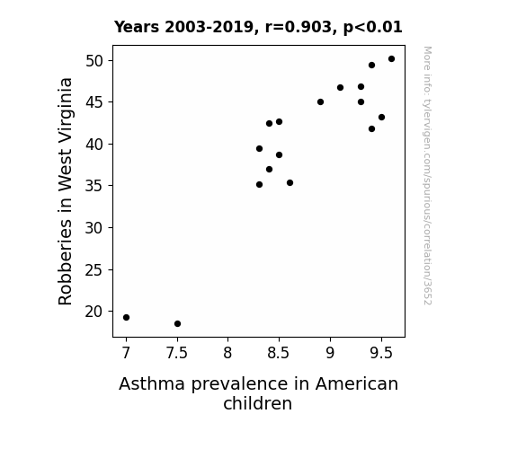
View details about correlation #3,652
Coughing up the Link: A Burglarious Connection between Robberies in West Virginia and Asthma Prevalence in American Children
As robberies in West Virginia decreased, the demand for ski masks as a fashion accessory also went down. Without ski masks, there was a surge in demand for traditional allergy masks. This led to a nationwide shortage of allergy masks, forcing children to stay indoors where the air quality is generally better. As a result, the decrease in robberies indirectly contributed to lower asthma prevalence in American children. Remember, this is just a fun, made-up explanation!

What else correlates?
Robberies in West Virginia · all random state specific
Asthma prevalence in American children · all weird & wacky
Robberies in West Virginia · all random state specific
Asthma prevalence in American children · all weird & wacky
. The chart goes from 2003 to 2020, and the two variables track closely in value over that time.")

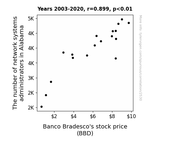
View details about correlation #2,530
The Alabama Administrators and Bradesco's BBD: An Unlikely Merger?
As more and more network systems administrators found employment in Alabama, they collectively decided to put their hard-earned money into the stock market. Their discussions about optimal investment strategies inadvertently led to a surge of interest in Banco Bradesco's stock. It's as if their networking skills extended to the financial world, causing a definite boost in the demand for BBD shares. This just goes to show that when it comes to the stock market, even a little bit of networking know-how can go a long way!

What else correlates?
The number of network systems administrators in Alabama · all cccupations
Banco Bradesco's stock price (BBD) · all stocks
The number of network systems administrators in Alabama · all cccupations
Banco Bradesco's stock price (BBD) · all stocks


View details about correlation #4,532
Pearls and Politics: The Peculiar Correlation Between the Name Pearl and Libertarian Votes for Colorado Senators
Every time someone named Pearl became popular, a new wave of free-thinking individuals emerged, leading to a spike in Libertarian support in Colorado. It's as if the name itself carried a lustrous charm of individualism and freedom! It's a real gem of a correlation, isn't it?


What else correlates?
Popularity of the first name Pearl · all first names
Votes for Libertarian Senators in Colorado · all elections
Popularity of the first name Pearl · all first names
Votes for Libertarian Senators in Colorado · all elections


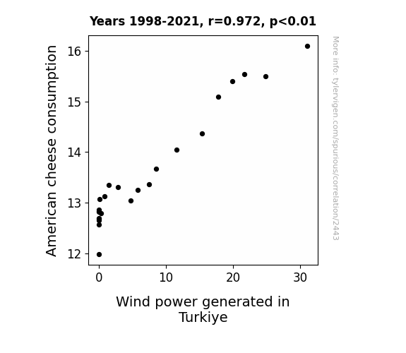
View details about correlation #2,443
Cheesy Connections: The Curious Correlation Between American Cheese Consumption and Wind Power Generated in Turkiye
As Americans indulged in more ooey-gooey grilled cheese sandwiches, there was a surge in flatulence across the nation. This led to an unexpected but powerful increase in wind production, enough to even give Turkiye's wind farms a gouda run for their money! Who knew that the road to a greener future was paved with cheese? It's a real dair-lemma for energy analysts trying to de-brie-f the situation! Better gas up those turbines because it seems like the cheesier the meals, the breezier the deals for wind power in Turkiye! And that's how 'whey' to go with sustainable energy!

What else correlates?
American cheese consumption · all food
Wind power generated in Turkiye · all energy
American cheese consumption · all food
Wind power generated in Turkiye · all energy


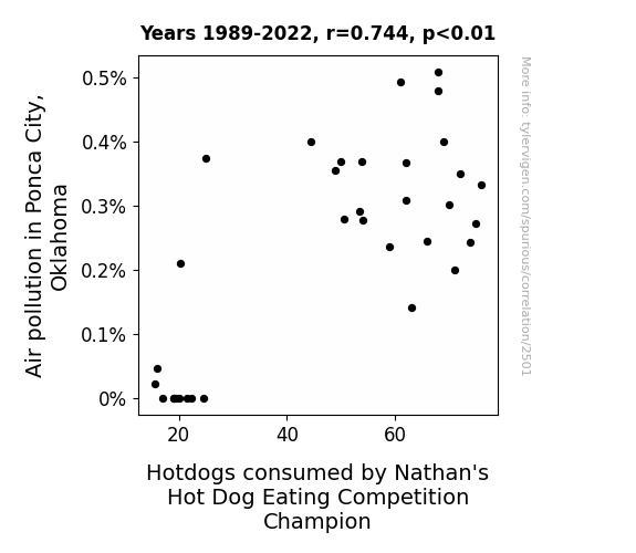
View details about correlation #2,501
Bun Intended: The Link Between Air Pollution in Ponca City, Oklahoma and Hotdog Consumption by Nathan's Hot Dog Eating Competition Champion
As air pollution in Ponca City, Oklahoma increased, the nearby soybean fields inadvertently became fertilized with a unique blend of nitrogen and particulate matter. This led to the growth of supersized, genetically enhanced soybeans with a perfect hotdog flavor profile. These mutant soybeans were then unknowingly sourced by Nathan's Hot Dog Eating Competition, resulting in an increase in the size and tastiness of the hotdogs, ultimately giving the champion an edge in consuming more of these uniquely enhanced hotdogs.


View details about correlation #3,790
The Correlation Between the Spacing of Saturn and Uranus and the Surprising Surge of UFO Sightings in California: A Celestial Connection
As the gap widened, Saturn started feeling a bit spacey and decided to give Uranus some much-needed breathing room. This celestial separation created a cosmically unregulated UFO lane, leading to an influx of alien tourists in California. It's like the universe said, "Uranus be getting too crowded, time for Saturn to take a rain check and let the UFOs have a blast in the Golden State!"

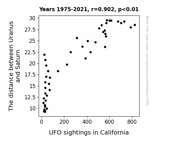
What else correlates?
The distance between Uranus and Saturn · all planets
UFO sightings in California · all random state specific
The distance between Uranus and Saturn · all planets
UFO sightings in California · all random state specific
. The chart goes from 2003 to 2022, and the two variables track closely in value over that time.")

View details about correlation #2,942
Pesticide Posse: Probing the Pernicious Proximity of Pesticide Handlers in Oregon and Vale S.A.'s Stock Price (VALE)
As the pesticide handlers in Oregon grew in number, they couldn't help but spread the buzz about Vale S.A.'s products, leading to a crop of new investors. This naturally fertilized the stock price, creating a real bloom in the market. It seems like when it comes to Vale S.A., the stock just keeps on growing like a well-tended garden!
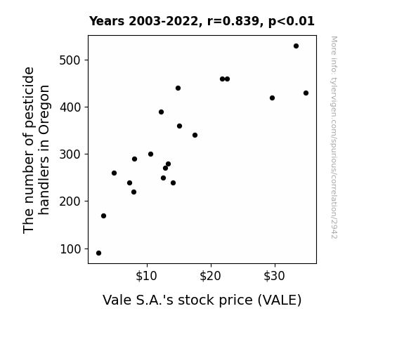
What else correlates?
The number of pesticide handlers in Oregon · all cccupations
Vale S.A.'s stock price (VALE) · all stocks
The number of pesticide handlers in Oregon · all cccupations
Vale S.A.'s stock price (VALE) · all stocks


View details about correlation #3,060
Shining Bright: The Stella Biomass Connection in Poland
Perhaps every time a baby was named Stella, a new type of plant capable of producing extra energy was discovered. It turns out, the secret to sustainable power was hidden in the name all along.

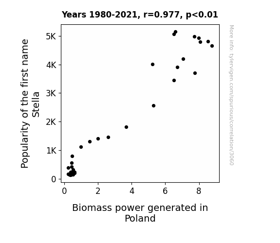
What else correlates?
Popularity of the first name Stella · all first names
Biomass power generated in Poland · all energy
Popularity of the first name Stella · all first names
Biomass power generated in Poland · all energy


View details about correlation #1,872
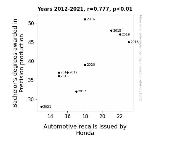
The Precision of Precision Production: A Bachelor's Degree in Mishaps
As fewer students pursued Precision production degrees, there was a tightening of the knowledge and skills related to automotive manufacturing. This inadvertently led to a bolt in the quality control process at Honda, resulting in fewer car issues, and a loosening of the need for recalls.

What else correlates?
Bachelor's degrees awarded in Precision production · all education
Automotive recalls issued by Honda · all weird & wacky
Bachelor's degrees awarded in Precision production · all education
Automotive recalls issued by Honda · all weird & wacky


View details about correlation #4,748
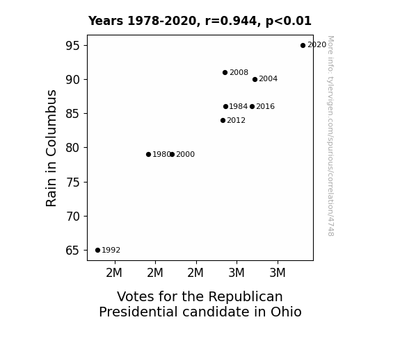
Rain or Shine: A Political Downpour - The Precipitation-Presidential Candidate Relationship in Ohio
The rain must have washed away all the democratic tendencies, leaving the Republican votes high and dry!
What else correlates?
Rain in Columbus · all weather
Votes for the Republican Presidential candidate in Ohio · all elections
Rain in Columbus · all weather
Votes for the Republican Presidential candidate in Ohio · all elections


View details about correlation #3,592
The Great Granite State Capers: Housekeepers and Crime Rate in New Hampshire
As the saying goes, when there's less thieving, there's fewer cleaning! With a decrease in robberies, it seems the demand for housekeepers has also taken a nosedive. It's almost as if the robbers were the real clean freaks, always tidying up after themselves. Looks like the only thing being stolen now is the housekeepers' free time!

What else correlates?
Robberies in New Hampshire · all random state specific
The number of housekeepers in New Hampshire · all cccupations
Robberies in New Hampshire · all random state specific
The number of housekeepers in New Hampshire · all cccupations


View details about correlation #2,617
Stirring the Pot: A Whey to Measure the Correlation Between Yogurt Consumption and Wind Power in New Caledonia
As yogurt consumption increased, so did the frequency of people using their 'yogurt power' to generate wind energy in New Caledonia, leading to a surprising and refreshing boost in clean energy production. It's amazing what happens when the culture of renewable energy and the culture of delicious dairy products come together!


What else correlates?
Yogurt consumption · all food
Wind power generated in New Caledonia · all energy
Yogurt consumption · all food
Wind power generated in New Caledonia · all energy


View details about correlation #1,178
Neil and Social Media Zeal: An xkcd Perspective
As more Neils were born, the collective Neil consciousness inadvertently transmitted waves of social media satire to the xkcd creator, inspiring an increase in relevant comics. It's like they say, you can't spell influence without Neil!


What else correlates?
Popularity of the first name Neil · all first names
xkcd comics published about social media · all weird & wacky
Popularity of the first name Neil · all first names
xkcd comics published about social media · all weird & wacky


View details about correlation #3,894
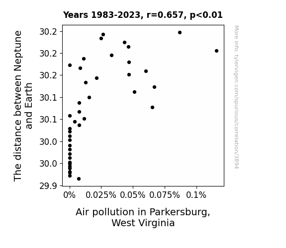
Neptune's Distance and Polluted Existence: An Astropollution Odyssey
As Neptune crept closer, its majestic blue hue captivated the residents of Parkersburg. They couldn't help but feel a sudden urge to preserve the purity of their own atmosphere. Fueled by a newfound appreciation for clean air, they implemented innovative environmental policies and embraced sustainable living practices. As industries and vehicles adapted to these higher standards, the air pollution levels substantially dropped, creating a celestial domino effect. So, next time you take a breath of fresh air in Parkersburg, remember to thank the not-so-distant planet for its unexpected eco-friendly influence!

What else correlates?
The distance between Neptune and Earth · all planets
Air pollution in Parkersburg, West Virginia · all weather
The distance between Neptune and Earth · all planets
Air pollution in Parkersburg, West Virginia · all weather
. The chart goes from 2003 to 2022, and the two variables track closely in value over that time.")

View details about correlation #2,008
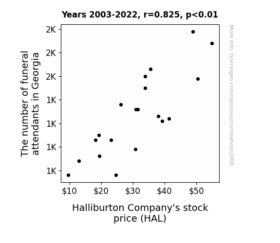
Rest in Stocks: An Examination of the Relationship Between Funeral Attendance in Georgia and Halliburton Company's Stock Price
As more funeral attendants in Georgia were employed, there was a surge in demand for professional, high-quality caskets. Halliburton, known for its expertise in oil services, saw an opportunity to apply their top-notch engineering and manufacturing capabilities to create the most luxurious and well-constructed caskets the industry had ever seen. This unexpected diversification into the afterlife market led to a spike in their stock price as investors realized the potential for a whole new revenue stream. With Halliburton's sleek, oil-resistant caskets, even in the afterlife, you can rest in peace knowing you're in top-of-the-line craftsmanship.

What else correlates?
The number of funeral attendants in Georgia · all cccupations
Halliburton Company's stock price (HAL) · all stocks
The number of funeral attendants in Georgia · all cccupations
Halliburton Company's stock price (HAL) · all stocks


View details about correlation #2,857
Churning It Up: The Butter-Biomass Boogie in Romania
As butter consumption increased, it led to people being more 'buttered up' and in a positive mood. This positivity somehow translated into greater support for biomass power in Romania. It's like the power of spreading good vibes literally contributed to the generation of electricity from biomass. So, in a way, you could say that butter was quite the catalyst for churning out more biomass power in Romania!


What else correlates?
Butter consumption · all food
Biomass power generated in Romania · all energy
Butter consumption · all food
Biomass power generated in Romania · all energy


View details about correlation #1,191
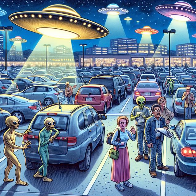
Curious Correlation: Connecting Colorado UFO Sightings and Clumsy Car Complications
The gravitational pull from the UFOs was interfering with the proper functioning of the parking brakes, leading to the need for more recalls to fix the issue. Alternatively, perhaps the aliens were just really into practical jokes and kept messing with the parking brakes as they zipped around the state.


View details about correlation #4,635
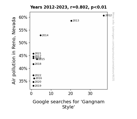
The Gangnam Style Google Search Gig: Grasping the Gasped Air Pollution in Reno
Less air pollution means clearer thinking. Clearer thinking meant no one felt the urge to Gangnam Style.

What else correlates?
Air pollution in Reno, Nevada · all weather
Google searches for 'Gangnam Style' · all google searches
Air pollution in Reno, Nevada · all weather
Google searches for 'Gangnam Style' · all google searches


View details about correlation #2,249
Claire's Career Correlation: Connecting Claire's Popularity with Compressor and Pumping Operators in West Virginia
As the name Claire gained popularity, it sparked a fascination with air and all things gaseous. People couldn't help but make the connection between Claire and compressed air! This led to a surge in individuals pursuing careers as gas compressor and gas pumping station operators in West Virginia, as they were simply drawn to the idea of working with 'air-ly' power equipment. It's as if the name Claire was on a mission to 'air-ect'ly influence the state's workforce!


Why this works
- Data dredging: I have 25,237 variables in my database. I compare all these variables against each other to find ones that randomly match up. That's 636,906,169 correlation calculations! This is called “data dredging.”
Fun fact: the chart used on the wikipedia page to demonstrate data dredging is also from me. I've been being naughty with data since 2014.
Instead of starting with a hypothesis and testing it, I instead tossed a bunch of data in a blender to see what correlations would shake out. It’s a dangerous way to go about analysis, because any sufficiently large dataset will yield strong correlations completely at random. - Lack of causal connection: There is probably no direct connection between these variables, despite what the AI says above.
Because these pages are automatically generated, it's possible that the two variables you are viewing are in fact causually related. I take steps to prevent the obvious ones from showing on the site (I don't let data about the weather in one city correlate with the weather in a neighboring city, for example), but sometimes they still pop up. If they are related, cool! You found a loophole.
This is exacerbated by the fact that I used "Years" as the base variable. Lots of things happen in a year that are not related to each other! Most studies would use something like "one person" in stead of "one year" to be the "thing" studied. - Observations not independent: For many variables, sequential years are not independent of each other. You will often see trend-lines form. If a population of people is continuously doing something every day, there is no reason to think they would suddenly change how they are doing that thing on January 1. A naive p-value calculation does not take this into account.
You will calculate a lower chance of "randomly" achieving the result than represents reality.
To be more specific: p-value tests are probability values, where you are calculating the probability of achieving a result at least as extreme as you found completely by chance. When calculating a p-value, you need to assert how many "degrees of freedom" your variable has. I count each year (minus one) as a "degree of freedom," but this is misleading for continuous variables.
This kind of thing can creep up on you pretty easily when using p-values, which is why it's best to take it as "one of many" inputs that help you assess the results of your analysis.
- Y-axes doesn't start at zero: I truncated the Y-axes of the graphs above. I also used a line graph, which makes the visual connection stand out more than it deserves.
Nothing against line graphs. They are great at telling a story when you have linear data! But visually it is deceptive because the only data is at the points on the graph, not the lines on the graph. In between each point, the data could have been doing anything. Like going for a random walk by itself!
Mathematically what I showed is true, but it is intentionally misleading. If you click on any of the charts that abuse this, you can scroll down to see a version that starts at zero. - Confounding variable: Confounding variables (like global pandemics) will cause two variables to look connected when in fact a "sneaky third" variable is influencing both of them behind the scenes.
- Outliers: Some datasets here have outliers which drag up the correlation.
In concept, "outlier" just means "way different than the rest of your dataset." When calculating a correlation like this, they are particularly impactful because a single outlier can substantially increase your correlation.
Because this page is automatically generated, I don't know whether any of the charts displayed on it have outliers. I'm just a footnote. ¯\_(ツ)_/¯
I intentionally mishandeled outliers, which makes the correlation look extra strong. - Low n: There are not many data points included in some of these charts.
You can do analyses with low ns! But you shouldn't data dredge with a low n.
Even if the p-value is high, we should be suspicious of using so few datapoints in a correlation.
Pro-tip: click on any correlation to see:
- Detailed data sources
- Prompts for the AI-generated content
- Explanations of each of the calculations (correlation, p-value)
- Python code to calculate it yourself


