spurious correlations
discover · random · spurious scholar
← previous page · next page →


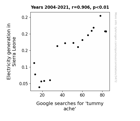
View details about correlation #3,472
Electricity and Epigastric Enigma: Exploring the Link Between Electricity Generation in Sierra Leone and Google Searches for 'Tummy Ache'
As electricity generation in Sierra Leone increased, more people had access to blenders, leading to a surge in homemade smoothie consumption. Unfortunately, the newfound love for overindulging in fibrous fruits and vegetables resulted in unexpected and frequent tummy aches, proving that even the path to a healthier lifestyle can have a few bumps along the whey. Remember, everything in moderation - even the quest for a electric smooth move.

What else correlates?
Electricity generation in Sierra Leone · all energy
Google searches for 'tummy ache' · all google searches
Electricity generation in Sierra Leone · all energy
Google searches for 'tummy ache' · all google searches


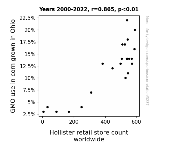
View details about correlation #3,237
From GMO Corn to Hollister Stores: A Global Affair
As GMO corn in Ohio grew taller, it created a need for more fashionable overalls, prompting a spike in demand for Hollister's clothing line. You could say the corn was really shucking for a new wardrobe!

What else correlates?
GMO use in corn grown in Ohio · all food
Hollister retail store count worldwide · all weird & wacky
GMO use in corn grown in Ohio · all food
Hollister retail store count worldwide · all weird & wacky
. The chart goes from 2011 to 2021, and the two variables track closely in value over that time.")

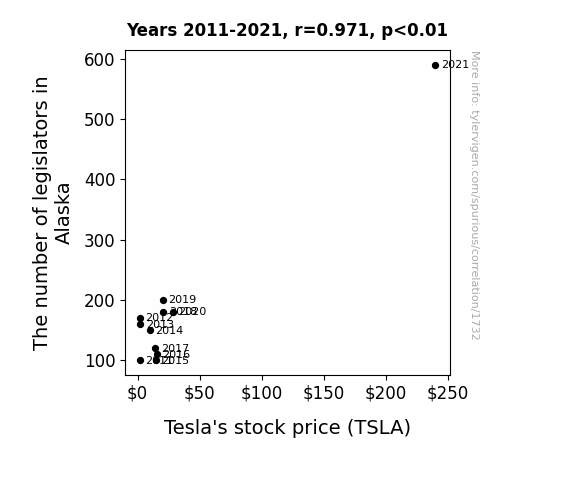
View details about correlation #1,732
Legislate to Elevate: Analyzing the Legislators in Alaska and the Electrifying Effects on Tesla's Stock Price
As the number of legislators in Alaska increases, so does the demand for heated seats in electric cars to combat the chilly political debates. Tesla, being a prominent electric car manufacturer, experiences a surge in interest and orders for their vehicles, leading to a boost in stock price. This is a classic case of legislative decisions sparking a heated market for electric car features!

What else correlates?
The number of legislators in Alaska · all cccupations
Tesla's stock price (TSLA) · all stocks
The number of legislators in Alaska · all cccupations
Tesla's stock price (TSLA) · all stocks


View details about correlation #3,842
Sacramento Smog and Suspect Soot: The Surprising Link Between Air Pollution and Arson
As the air cleared in Sacramento, it also cleared the minds of potential arsonists across the country. With each breath of fresh, clean air, the urge to set things ablaze just wafted away. It turns out, all those air pollutants were not just bad for the environment, but also for the inner fire of would-be arsonists. Who would have thought that fighting air pollution could also douse the flames of arson?


What else correlates?
Air pollution in Sacramento · all weather
Arson in United States · all random state specific
Air pollution in Sacramento · all weather
Arson in United States · all random state specific


View details about correlation #3,063
Illuminating Connections: Exploring the Relationship Between Solar Power Generation in Senegal and Google Searches for 'Who is Alexa'
As solar power production in Senegal increased, it inadvertently supercharged the country's internet infrastructure. This boost in connectivity led to a surge in people asking their devices, "Who is Alexa?" as they mistook the AI assistant for a newly acquired solar-powered celebrity. Remember, even artificial intelligences need their time in the sun!


What else correlates?
Solar power generated in Senegal · all energy
Google searches for 'who is alexa' · all google searches
Solar power generated in Senegal · all energy
Google searches for 'who is alexa' · all google searches


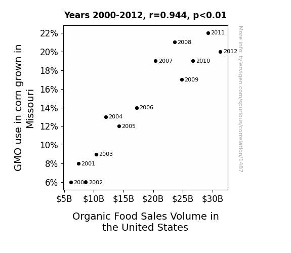
View details about correlation #1,487
The Corn-GMO Storm: A Maize-ing Connection to Organic Sales Volume
The GMO corn in Missouri developed a strong affinity for organic produce, and as it communicated with other crops, it inadvertently created a nationwide craving for all things organic. It's like the corn became the ultimate organic hype-man, leading to a chain reaction of people clamoring for pesticide-free, non-GMO goodness. Who knew that the key to boosting organic food sales lay in genetically modified corn spreading the word, one kernel at a time!

What else correlates?
GMO use in corn grown in Missouri · all food
Organic Food Sales Volume in the United States · all weird & wacky
GMO use in corn grown in Missouri · all food
Organic Food Sales Volume in the United States · all weird & wacky


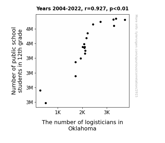
View details about correlation #2,915
The Peculiar Parallels of Pupil Population and Plenitude of Planners in Prairie Provinces: Exploring the Interplay between 12th Grade Students and Logisticians in Oklahoma
As the number of public school students in 12th grade increased, so did the demand for organizers of all things academic. This led to a surge in logistics-related jobs in Oklahoma, as these future logisticians were just too good at solving problems and had a knack for arranging their futures! It seems like these students were ready to tackle any situation head-on, proving that when it comes to creating job opportunities, they were the real valedictorians of logistics!

What else correlates?
Number of public school students in 12th grade · all education
The number of logisticians in Oklahoma · all cccupations
Number of public school students in 12th grade · all education
The number of logisticians in Oklahoma · all cccupations


View details about correlation #3,698
The Swing of Fate: A Statistical Analysis of the Relationship between Los Angeles Dodgers' Win/Loss Percentage in the National League West Division and Their Overall Wins
Maybe the Dodgers realized that winning more games actually leads to winning more games. It's like they say, "a win in the hand is worth two in the bush league!" It's a classic case of success breeding success, or as they call it in baseball circles, a home run domino effect!


View details about correlation #2,619
Shine a Light on Solar Sus-picion: The Illuminating Link Between Solar Power in Cambodia and Google Searches for 'That is Sus'
As the solar panels soaked up the sun's rays, they inadvertently beamed a message to gamers worldwide: "Amidst the photons and electrons, beware of impostor photons trying to sabotage the energy grid in an electrifying game of solar Among Us." Remember, always keep your solar panels crewmate!


What else correlates?
Solar power generated in Cambodia · all energy
Google searches for 'that is sus' · all google searches
Solar power generated in Cambodia · all energy
Google searches for 'that is sus' · all google searches


View details about correlation #2,254
Aerosol Adversity: Air Pollution in Fargo and Miss America’s Age
As air pollution in Fargo increased, it led to the creation of an anti-aging aerosol that inadvertently affected only former Miss America pageant winners, causing them to age at an accelerated rate.


What else correlates?
Air pollution in Fargo · all weather
Miss America's age · all weird & wacky
Air pollution in Fargo · all weather
Miss America's age · all weird & wacky


View details about correlation #2,135
Spreading the Facts: The Butter-Paralegal Relationship in South Carolina
It all comes down to the slippery slope of regulation. As butter consumption in South Carolina increased, so did the number of individuals seeking legal protection against potential butter-related injuries, like slippery fingers and toast malpractice. This led to a higher demand for paralegals in the state, as they were butter equipped to handle the greasy legal proceedings. The correlation is udderly undeniable - it's a case of dairy deliciously influencing the legal landscape.


What else correlates?
Butter consumption · all food
The number of paralegals in South Carolina · all cccupations
Butter consumption · all food
The number of paralegals in South Carolina · all cccupations


View details about correlation #4,207
Brenda's in Oregon: A Tendency to Arson?
As the popularity of the name Brenda decreased, there were fewer "Brenda's on fire" jokes being made. This led to a reduced likelihood of arson-related puns, ultimately decreasing the incidence of arson in Oregon. It seems that when it comes to fire-related wordplay, the name Brenda was the spark that lit the flame of destruction!


What else correlates?
Popularity of the first name Brenda · all first names
Arson in Oregon · all random state specific
Popularity of the first name Brenda · all first names
Arson in Oregon · all random state specific


View details about correlation #2,518
Crunching Numbers and Atoms: A Statistical Analysis of the Relationship Between Master's Degrees in Mathematics and Nuclear Power Generation in China
As the number of Master's degrees awarded in Mathematics and statistics increased, so did the expertise in calculating complex equations. This led to a chain reaction of improved efficiency and precision in nuclear power generation in China. After all, when it comes to splitting atoms, it's all about having the right formula for success!
What else correlates?
Master's degrees awarded in Mathematics and statistics · all education
Nuclear power generation in China · all energy
Master's degrees awarded in Mathematics and statistics · all education
Nuclear power generation in China · all energy


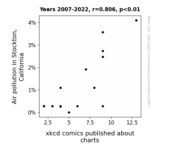
View details about correlation #2,883
Air Quality and xkcd: A Comic Correlation
As air pollution in Stockton increased, more residents stayed indoors, leading to a higher demand for entertaining content like xkcd comics about charts. The lack of fresh air and oxygen to the brain may have also contributed to an increased appreciation for the simple, yet intellectually stimulating humor found in xkcd.

What else correlates?
Air pollution in Stockton, California · all weather
xkcd comics published about charts · all weird & wacky
Air pollution in Stockton, California · all weather
xkcd comics published about charts · all weird & wacky


View details about correlation #3,247
Cott-on or Cott-off: Analyzing the Relationship Between GMO Cotton and the Presence of Social Workers in Louisiana
As the GMO cotton dwindled, so did the giant cotton balls, leading to a decline in the demand for makeshift stress balls in social work offices. Without these handy stress-relievers, social workers found themselves unable to cope with the growing pressures of their job, prompting many to seek alternative career paths that didn't require as much emotional resilience. In essence, the root of their job satisfaction was ginned away, leaving them in a tangled mess of despair.


What else correlates?
GMO use in cotton in Louisiana · all food
The number of social workers in Louisiana · all cccupations
GMO use in cotton in Louisiana · all food
The number of social workers in Louisiana · all cccupations
. The chart goes from 2002 to 2022, and the two variables track closely in value over that time.")

View details about correlation #3,935
Micah Mania: The Canadian Natural Resources-Rhyme Connection
As more and more babies were named Micah, there was a surge in demand for baby oil for all those baby massages. This led to an increase in the overall consumption of oil, including Canadian Natural Resources' products, driving up their stock price. Looks like Micah wasn't just an oil of joy for parents, but also for the Canadian natural resources market!


What else correlates?
Popularity of the first name Micah · all first names
Canadian Natural Resources' stock price (CNQ) · all stocks
Popularity of the first name Micah · all first names
Canadian Natural Resources' stock price (CNQ) · all stocks


View details about correlation #2,526
Powering Up Crime: Can Hydopower in Togo Spark A Surge in Robberies in Alaska?
The surge in hydroelectric power in Togo has led to a corresponding increase in the local rodent population. This has disrupted the delicate ecosystem in Alaska, leading to a shortage of food for the native Alaskan robbers, I mean, residents. Desperate for sustenance, the Alaskan robbers have resorted to more frequent thievery, causing a spike in robbery rates. It's a classic case of Togo's hydroelectric success sparking a chain reaction that's making Alaskan robbers work harder for their loot. Remember, a well-fed robber is a happy robber, and Togo's hydropower is inadvertently keeping the thieves up north in business!


What else correlates?
Hydopower energy generated in Togo · all energy
Robberies in Alaska · all random state specific
Hydopower energy generated in Togo · all energy
Robberies in Alaska · all random state specific


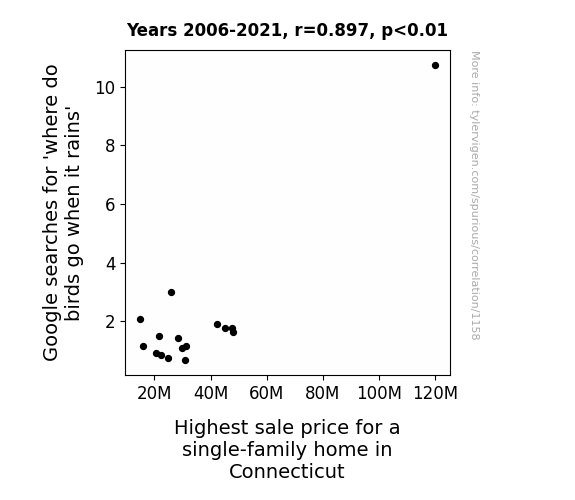
View details about correlation #1,158
A Nest-Egg or Just a Fluke? Exploring the Correlation Between Google Searches for 'Where Do Birds Go When it Rains' and Highest Sale Price for a Single-Family Home in Connecticut
The more people thought about birds seeking shelter from the rain, the more they realized the importance of a sturdy roof. This led to a surge in the housing market as homebuyers flocked to find their perfect nest. It's clear that when it comes to real estate, understanding avian rain behavior is nothing to squawk at!


View details about correlation #3,630
The Tenuous Ties between Transportation and Trained Toenails: A Twisted Tale
As the number of Bachelor's degrees awarded in Transportation and materials moving increased, so did the knowledge of optimal foot ergonomics, leading to a surge in demand for manicurists and pedicurists in South Carolina. After all, when it comes to pampering the hardworking feet of the southeast, it's all about a-heeling the transportation-related stress and toe-tally understanding the science of smooth rides for the pinky toes!


View details about correlation #4,382
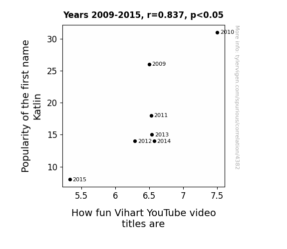
Katlin's Chosen: Unveiling the Correlative Dynamics between Katlin Popularity and Vihart Video Title Amusement
As fewer babies were named Katlin, there were subsequently fewer potential individuals who could have grown up to be enthusiastic fans of Vihart's videos, resulting in a decreased demand for particularly zany and entertaining video titles. It seems the Katlins of the world were truly catalysts for Vihart's video title creativity!

What else correlates?
Popularity of the first name Katlin · all first names
How fun Vihart's YouTube video titles are · all YouTube
Popularity of the first name Katlin · all first names
How fun Vihart's YouTube video titles are · all YouTube
Why this works
- Data dredging: I have 25,237 variables in my database. I compare all these variables against each other to find ones that randomly match up. That's 636,906,169 correlation calculations! This is called “data dredging.”
Fun fact: the chart used on the wikipedia page to demonstrate data dredging is also from me. I've been being naughty with data since 2014.
Instead of starting with a hypothesis and testing it, I instead tossed a bunch of data in a blender to see what correlations would shake out. It’s a dangerous way to go about analysis, because any sufficiently large dataset will yield strong correlations completely at random. - Lack of causal connection: There is probably no direct connection between these variables, despite what the AI says above.
Because these pages are automatically generated, it's possible that the two variables you are viewing are in fact causually related. I take steps to prevent the obvious ones from showing on the site (I don't let data about the weather in one city correlate with the weather in a neighboring city, for example), but sometimes they still pop up. If they are related, cool! You found a loophole.
This is exacerbated by the fact that I used "Years" as the base variable. Lots of things happen in a year that are not related to each other! Most studies would use something like "one person" in stead of "one year" to be the "thing" studied. - Observations not independent: For many variables, sequential years are not independent of each other. You will often see trend-lines form. If a population of people is continuously doing something every day, there is no reason to think they would suddenly change how they are doing that thing on January 1. A naive p-value calculation does not take this into account.
You will calculate a lower chance of "randomly" achieving the result than represents reality.
To be more specific: p-value tests are probability values, where you are calculating the probability of achieving a result at least as extreme as you found completely by chance. When calculating a p-value, you need to assert how many "degrees of freedom" your variable has. I count each year (minus one) as a "degree of freedom," but this is misleading for continuous variables.
This kind of thing can creep up on you pretty easily when using p-values, which is why it's best to take it as "one of many" inputs that help you assess the results of your analysis.
- Y-axes doesn't start at zero: I truncated the Y-axes of the graphs above. I also used a line graph, which makes the visual connection stand out more than it deserves.
Nothing against line graphs. They are great at telling a story when you have linear data! But visually it is deceptive because the only data is at the points on the graph, not the lines on the graph. In between each point, the data could have been doing anything. Like going for a random walk by itself!
Mathematically what I showed is true, but it is intentionally misleading. If you click on any of the charts that abuse this, you can scroll down to see a version that starts at zero. - Confounding variable: Confounding variables (like global pandemics) will cause two variables to look connected when in fact a "sneaky third" variable is influencing both of them behind the scenes.
- Outliers: Some datasets here have outliers which drag up the correlation.
In concept, "outlier" just means "way different than the rest of your dataset." When calculating a correlation like this, they are particularly impactful because a single outlier can substantially increase your correlation.
Because this page is automatically generated, I don't know whether any of the charts displayed on it have outliers. I'm just a footnote. ¯\_(ツ)_/¯
I intentionally mishandeled outliers, which makes the correlation look extra strong. - Low n: There are not many data points included in some of these charts.
You can do analyses with low ns! But you shouldn't data dredge with a low n.
Even if the p-value is high, we should be suspicious of using so few datapoints in a correlation.
Pro-tip: click on any correlation to see:
- Detailed data sources
- Prompts for the AI-generated content
- Explanations of each of the calculations (correlation, p-value)
- Python code to calculate it yourself


