spurious correlations
discover · random · spurious scholar
← previous page · next page →


View details about correlation #1,618
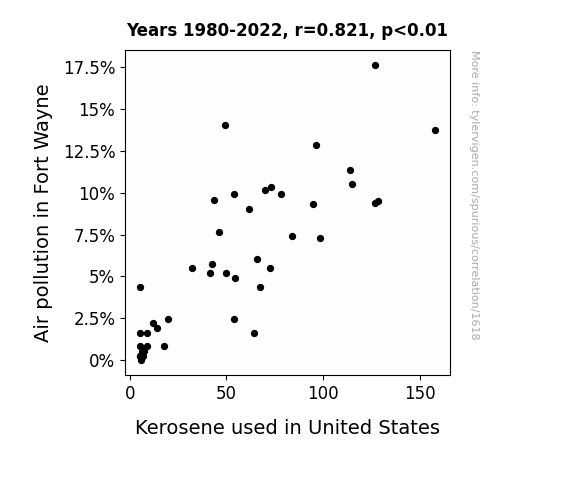
The Fumes That Bind: A Combustible Connection Between Air Pollution in Fort Wayne and Kerosene Usage in the United States
As air pollution decreased in Fort Wayne, it created an imbalance in the national kerosene-exchange ecosystem. This led to a reduced demand for competitive kerosene products, ultimately causing a nationwide decline in kerosene usage. The intricate web of kerosene supply and demand is truly a marvel to behold! Remember, these explanations are entirely fictional and for entertainment purposes only!

What else correlates?
Air pollution in Fort Wayne · all weather
Kerosene used in United States · all energy
Air pollution in Fort Wayne · all weather
Kerosene used in United States · all energy


View details about correlation #1,515
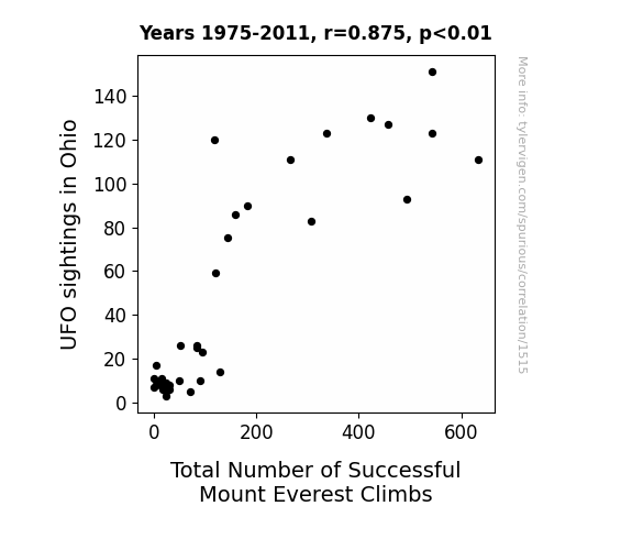
High Above and Beyond: The UFO-nny Connection between Ohio UFO Sightings and Total Number of Successful Mount Everest Climbs
The UFOs were actually advanced fitness trainers, using their otherworldly technology to simulate high-altitude conditions and give climbers an otherworldly boost of energy and endurance.

What else correlates?
UFO sightings in Ohio · all random state specific
Total Number of Successful Mount Everest Climbs · all weird & wacky
UFO sightings in Ohio · all random state specific
Total Number of Successful Mount Everest Climbs · all weird & wacky


View details about correlation #3,344
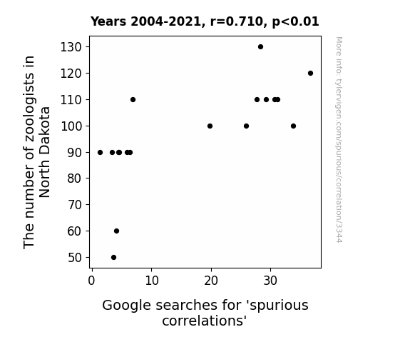
Zany Zoologists and 'Spurious Correlations': A Poetic Pursuit of Puzzling Patterns in North Dakota
The zoologists couldn't bear the thought of spurious correlations running wild like a pack of unmonitored hyenas. They took a scientific approach and pounced on those misleading relationships, bringing a whole new meaning to the phrase 'data safari.' With their expertise, they didn't monkey around when it came to spotting false connections. It's as if they said, "No more horsin' around with spurious correlations in our state!" So, as the zoologists flocked to North Dakota, they created a 'zoological effect,' taming the wild world of spurious correlations one search at a time. It's a case of correlation without causation, as these zoologists weren't lion when they set out to cheetah-proof the search results. The data world can be a jungle, but with the zoologists leading the charge, it's all about bringing order and scientific rigor to the animal kingdom of statistics.

. The chart goes from 2002 to 2022, and the two variables track closely in value over that time.")

View details about correlation #3,773
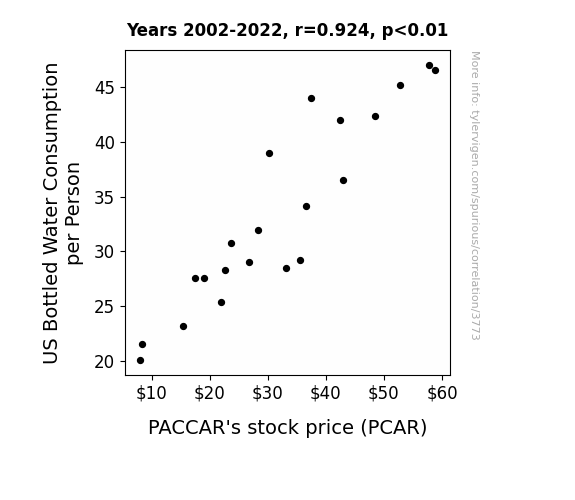
Quenching the Thirst for Knowledge: The Bottled Water Consumption-PCAR Connection
As bottled water consumption per person in the US rises, so does the collective hydration level. This leads to a nation of more alert and active individuals. With heightened focus, people start to notice the prevalence of PACCAR's trucks on the roads, subconsciously boosting the company's perceived value. It's a trickle-up effect – or should we say, a "trickle-down the throat" effect – on the stock market.

What else correlates?
US Bottled Water Consumption per Person · all food
PACCAR's stock price (PCAR) · all stocks
US Bottled Water Consumption per Person · all food
PACCAR's stock price (PCAR) · all stocks


View details about correlation #1,428
Gas Leaning or Air Unfair? Exploring the Cross-Country Connection Between Air Pollution in Ogden, Utah and Gasoline Pumped in Albania
The cleaner air in Ogden led to an increase in positivity, which somehow sparked a worldwide chain reaction of good vibes. This, in turn, caused a surge in Albanian happiness levels, leading to a decrease in the demand for gasoline as people opted for more eco-friendly modes of transportation. It seems like the Ogden air pollution reduction truly paved the way for a smoother Albania-ness transition.


What else correlates?
Air pollution in Ogden, Utah · all weather
Gasoline pumped in Albania · all energy
Air pollution in Ogden, Utah · all weather
Gasoline pumped in Albania · all energy


View details about correlation #2,974
The Lingering Impact of Linguistic Learning on Lush Landscapes: A Multi-Disciplinary Analysis
As the number of Master's degrees in foreign languages, literatures, and linguistics decreased, there was a corresponding decline in the use of sophisticated, high-level language skills. This led to a situation where even the trees in the Brazilian Amazon couldn't understand the importance of staying covered. In a bizarre turn of events, the lack of linguistic prowess somehow contributed to the deforestation of the Amazon as the trees failed to effectively communicate the need to preserve their own cover. It's a case of language lost in the trees and a reminder that in the battle to save the rainforest, every word counts!

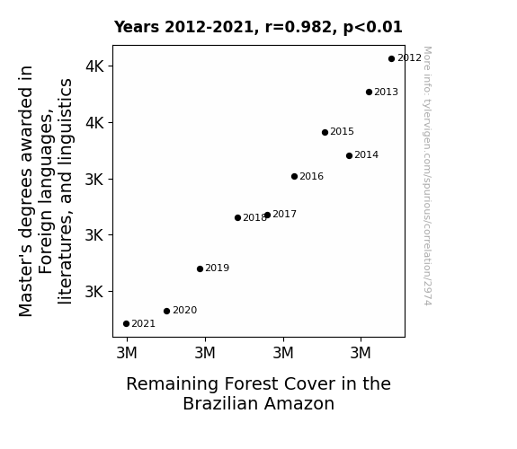
What else correlates?
Master's degrees awarded in linguistics · all education
Remaining Forest Cover in the Brazilian Amazon · all weird & wacky
Master's degrees awarded in linguistics · all education
Remaining Forest Cover in the Brazilian Amazon · all weird & wacky


View details about correlation #2,586
The Tired Tally: The Tenuous Tie between Tiredness and Tons of Logisticians in Alabama
The presence of so many logisticians just really helped people efficiently schedule their exhaustion. Work hard, Alabama logisticians, for a well-coordinated state of fatigue!

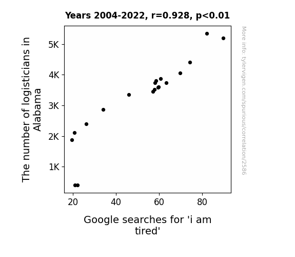
What else correlates?
The number of logisticians in Alabama · all cccupations
Google searches for 'i am tired' · all google searches
The number of logisticians in Alabama · all cccupations
Google searches for 'i am tired' · all google searches
. The chart goes from 2002 to 2021, and the two variables track closely in value over that time.")

View details about correlation #3,733
Whey Too Cheesy: The Curious Case of Cottage Cheese Consumption and AIG's Stock Price
As people turned away from cottage cheese, the dairy industry took a hit. This led to a surplus of milk, which in turn caused a shortage of cartons for milk packaging. With the milk packaging industry in disarray, companies like AIG, which had inexplicably invested in a little-known carton manufacturing conglomerate, saw their stock prices curdle.


What else correlates?
Cottage cheese consumption · all food
AIG's stock price (AIG) · all stocks
Cottage cheese consumption · all food
AIG's stock price (AIG) · all stocks


View details about correlation #3,650
The Beautility of Beau: Unveiling the Beau-tiful Connection Between the Popularity of the Name Beau and Nuclear Power Generation in China
People were drawn to the name Beau, which sounds like "bow," and the collective admiration led to a surge in bow-related activities. This widespread archery fascination somehow sparked a chain reaction of productivity, ultimately boosting nuclear power generation in China. Talk about the bow and the power arrow!
What else correlates?
Popularity of the first name Beau · all first names
Nuclear power generation in China · all energy
Popularity of the first name Beau · all first names
Nuclear power generation in China · all energy


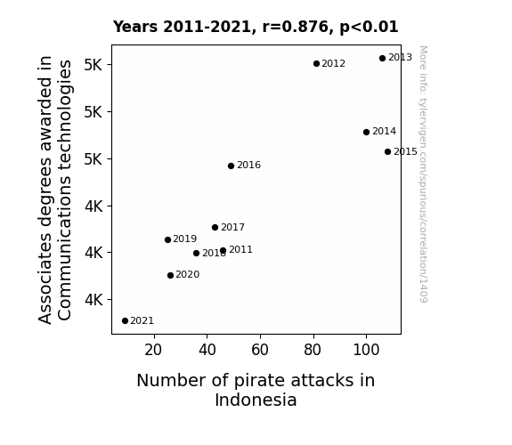
View details about correlation #1,409
Degrees of Connection: Exploring the Correlation Between Associates Degrees in Communications Technologies and Pirate Attacks in Indonesia
As fewer people were trained in Communications technologies, the pirates in Indonesia couldn't effectively operate modern communication devices. This led to a decrease in their ability to plan and coordinate pirate attacks, ultimately resulting in fewer incidents. Without the latest communication skills, it seems the pirates were a bit adrift at sea!


View details about correlation #2,214
Ringtone Searches and Secretarial Positions: A Rhyming Rhyme-ationship
As the ringtone industry tone-deafened, it created a ripple effect in the job market. The lack of demand for catchy tunes meant fewer calls for secretaries in Rhode Island, leaving them with no time to "ring up" their old job responsibilities. It seems the writing was on the wall for these secretaries - or should I say, the lack of ringing was on the phone!

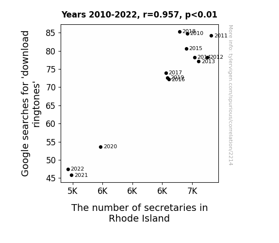
What else correlates?
Google searches for 'download ringtones' · all google searches
The number of secretaries in Rhode Island · all cccupations
Google searches for 'download ringtones' · all google searches
The number of secretaries in Rhode Island · all cccupations


View details about correlation #4,504
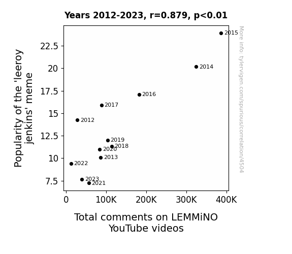
Seeing is Believing: The Leeroy Jenkins Meme and Its Impact on Total Comments on LEMMiNO YouTube Videos
The collective attention of internet users was diverted to newer, danker memes, leaving less room for discussions on LEMMiNO's videos. It's as if the meme magic just couldn't keep up with the fast-paced world of online content!

What else correlates?
Popularity of the 'leeroy jenkins' meme · all memes
Total comments on LEMMiNO YouTube videos · all YouTube
Popularity of the 'leeroy jenkins' meme · all memes
Total comments on LEMMiNO YouTube videos · all YouTube


View details about correlation #1,645
Stealing the Gas: An Exploration of the Relationship between Montana Robberies and Uzbekistan's Petroleum Consumption
As more robberies occurred in Montana, the demand for police car chases increased. This led to a spike in the consumption of gasoline. However, due to a series of wacky shipping mishaps, the majority of this extra petroleum somehow ended up in Uzbekistan, where it was used in a comically elaborate scheme to power a giant, robbers-themed amusement park. This, in turn, led to an unexpected surge in petrol consumption in Uzbekistan. It's a classic case of crime in one corner of the world leading to a slippery situation in another!


What else correlates?
Robberies in Montana · all random state specific
Petroluem consumption in Uzbekistan · all energy
Robberies in Montana · all random state specific
Petroluem consumption in Uzbekistan · all energy


View details about correlation #2,457
Murray's Matchmaking: Mapping the Marvelous Marriage of Andy Murray's ATP Appearances and New York Times Novels
This could be due to the creation of a new sub-genre called "Tennis Tale Triumphs" which has taken the literary world by storm. Each time Andy Murray makes it to the finals, a new wave of tennis-inspired fiction hits the market, captivating readers with gripping stories of love, rivalry, and match point madness. Who knew that Andy's success on the court would serve as the ultimate plot twist for the New York Times Fiction Best Sellers list!


What else correlates?
Andy Murray's ATP final appearances · all sports
New York Times Fiction Best Sellers · all weird & wacky
Andy Murray's ATP final appearances · all sports
New York Times Fiction Best Sellers · all weird & wacky
. The chart goes from 2003 to 2020, and the two variables track closely in value over that time.")

View details about correlation #2,544
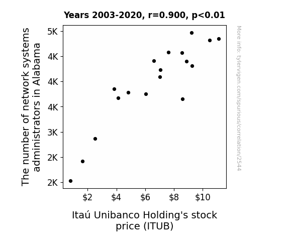
A Small Mischievous Twinkle: The Link Between Network Systems Administrators in Alabama and Itaú Unibanco Holding's Stock Price
The influx of network systems administrators in Alabama led to a surge in demand for office furniture. This caused a shortage of oak desks, prompting Itaú Unibanco Holding's CEO to invest in a timber company. The CEO's unexpected foray into forestry impressed investors, leading to a boost in Itaú Unibanco Holding's stock price.


View details about correlation #4,342
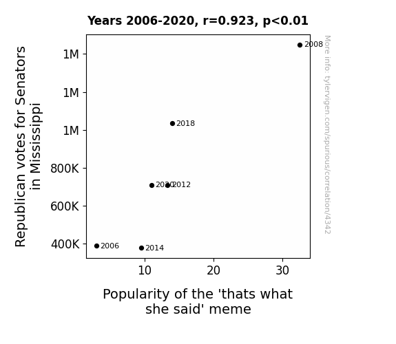
Ridin' Mississippian Senators: A Statistical Examination of 'That's What She Said' Meme Popularity and Republican Votes
As Republican votes for Senators in Mississippi increased, the frequency of country-style metaphors also rose. This inadvertently led to a surge in the popularity of the "that's what she said" meme, as the good ol' folks found themselves unwittingly setting up the perfect punchlines for innuendos. It seems like politics wasn't the only thing getting a little cheeky in Mississippi!

What else correlates?
Votes for Republican Senators in Mississippi · all elections
Popularity of the 'thats what she said' meme · all memes
Votes for Republican Senators in Mississippi · all elections
Popularity of the 'thats what she said' meme · all memes


View details about correlation #1,536
The Big Cheese and the Solar Cubano: A Gouda Connection Between American Cheese Consumption and Solar Power Generation in Cuba
The excess American cheese consumption led to an increase in dairy cow flatulence, which inadvertently boosted the ozone layer over Cuba. The clearer skies allowed for more efficient solar power generation, proving that when it comes to dairy products and renewable energy, it’s a gouda relationship!


What else correlates?
American cheese consumption · all food
Solar power generated in Cuba · all energy
American cheese consumption · all food
Solar power generated in Cuba · all energy


View details about correlation #1,929
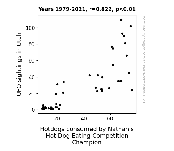
Unveiling Unidentified Unearthly Upheaval: Unraveling the Unbelievable Union of UFO Sightings in Utah and the Unparalleled Consumption of Nathan's Hot Dog Eating Competition Champion
The aliens were hosting their own intergalactic hot dog eating contest, but they mistakenly used the Nathan's event as a food supply source. As a result, they beamed up extra hotdogs from Utah to fuel their competitive eating competition, leading to an increase in hotdog consumption by the champion.


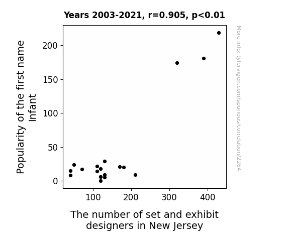
View details about correlation #2,264
The Popularity Effect: Exploring the Correlation between Infant Names and Set & Exhibit Designers in the Garden State
As the name Infant fell out of favor, there was a decline in baby-themed entertainment, leading to fewer opportunities for set and exhibit designers in New Jersey. Clearly, the baby name trends have a ripple effect in the creative industry!


View details about correlation #4,593
Gender Gap in Game Theory: Grasping the Grandiosity of Gender Studies Graduates' Gain on The Game Theorists
As the number of Associates degrees awarded in gender studies rose, so did the average length of The Game Theorists' videos. This is likely due to the ripple effect of in-depth analysis - or as we like to call it, the gender study guide to video lengthening. With a greater focus on critical thinking and societal norms, it's only natural that the content became more gender-inclusive, leading to longer discussions and a broader perspective. It's truly a case of thesis-antithesis-video-synthesis!


Why this works
- Data dredging: I have 25,237 variables in my database. I compare all these variables against each other to find ones that randomly match up. That's 636,906,169 correlation calculations! This is called “data dredging.”
Fun fact: the chart used on the wikipedia page to demonstrate data dredging is also from me. I've been being naughty with data since 2014.
Instead of starting with a hypothesis and testing it, I instead tossed a bunch of data in a blender to see what correlations would shake out. It’s a dangerous way to go about analysis, because any sufficiently large dataset will yield strong correlations completely at random. - Lack of causal connection: There is probably no direct connection between these variables, despite what the AI says above.
Because these pages are automatically generated, it's possible that the two variables you are viewing are in fact causually related. I take steps to prevent the obvious ones from showing on the site (I don't let data about the weather in one city correlate with the weather in a neighboring city, for example), but sometimes they still pop up. If they are related, cool! You found a loophole.
This is exacerbated by the fact that I used "Years" as the base variable. Lots of things happen in a year that are not related to each other! Most studies would use something like "one person" in stead of "one year" to be the "thing" studied. - Observations not independent: For many variables, sequential years are not independent of each other. You will often see trend-lines form. If a population of people is continuously doing something every day, there is no reason to think they would suddenly change how they are doing that thing on January 1. A naive p-value calculation does not take this into account.
You will calculate a lower chance of "randomly" achieving the result than represents reality.
To be more specific: p-value tests are probability values, where you are calculating the probability of achieving a result at least as extreme as you found completely by chance. When calculating a p-value, you need to assert how many "degrees of freedom" your variable has. I count each year (minus one) as a "degree of freedom," but this is misleading for continuous variables.
This kind of thing can creep up on you pretty easily when using p-values, which is why it's best to take it as "one of many" inputs that help you assess the results of your analysis.
- Y-axes doesn't start at zero: I truncated the Y-axes of the graphs above. I also used a line graph, which makes the visual connection stand out more than it deserves.
Nothing against line graphs. They are great at telling a story when you have linear data! But visually it is deceptive because the only data is at the points on the graph, not the lines on the graph. In between each point, the data could have been doing anything. Like going for a random walk by itself!
Mathematically what I showed is true, but it is intentionally misleading. If you click on any of the charts that abuse this, you can scroll down to see a version that starts at zero. - Confounding variable: Confounding variables (like global pandemics) will cause two variables to look connected when in fact a "sneaky third" variable is influencing both of them behind the scenes.
- Outliers: Some datasets here have outliers which drag up the correlation.
In concept, "outlier" just means "way different than the rest of your dataset." When calculating a correlation like this, they are particularly impactful because a single outlier can substantially increase your correlation.
Because this page is automatically generated, I don't know whether any of the charts displayed on it have outliers. I'm just a footnote. ¯\_(ツ)_/¯
I intentionally mishandeled outliers, which makes the correlation look extra strong. - Low n: There are not many data points included in some of these charts.
You can do analyses with low ns! But you shouldn't data dredge with a low n.
Even if the p-value is high, we should be suspicious of using so few datapoints in a correlation.
Pro-tip: click on any correlation to see:
- Detailed data sources
- Prompts for the AI-generated content
- Explanations of each of the calculations (correlation, p-value)
- Python code to calculate it yourself


