spurious correlations
discover · random · spurious scholar
← previous page · next page →
. The chart goes from 2011 to 2021, and the two variables track closely in value over that time.")

View details about correlation #3,680
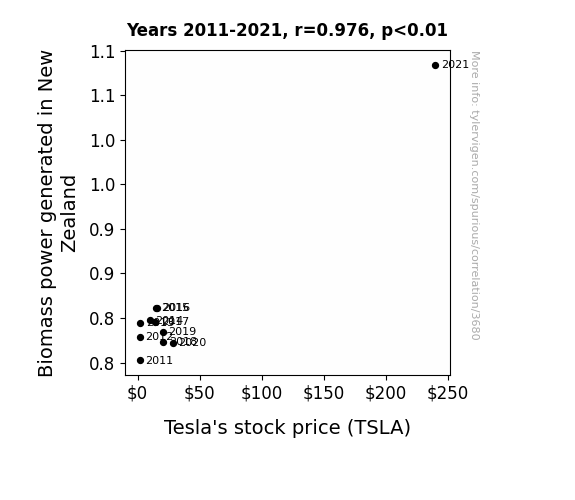
Sparking Interest: The Renewable Connection Between Biomass Power Generation in New Zealand and Tesla's Stock Price
As the Biomass power in New Zealand surged, it created a wave of renewable energy enthusiasm. This drew a huge current of positive attention towards clean energy initiatives, sparking investor interest in Tesla. It's like the stocks were being powered by 'kiwi-lectricity' - talk about a shocking connection!

What else correlates?
Biomass power generated in New Zealand · all energy
Tesla's stock price (TSLA) · all stocks
Biomass power generated in New Zealand · all energy
Tesla's stock price (TSLA) · all stocks


View details about correlation #1,368
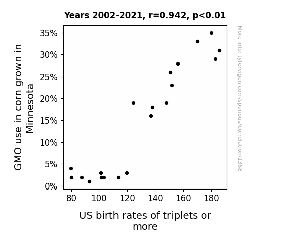
GMO Corn in Minnesota: A MAIZIng Link to US Birth Rates of Triplets or More
As GMO use in Minnesota corn decreased, it led to a shortage of super-sized corn kernels. Without these oversized kernels, expecting mothers across the US were less likely to accidentally ingest magical corn that increased their odds of having triplets or more. This caused a noticeable drop in the overall birth rates of multiples, as the corn shortage created a "corn-undrum" for fertility and a-maize-ing decrease in multi-births. It seems the days of "corn-fed" pregnancies producing litters of babies are now just a kernel of the past!

What else correlates?
GMO use in corn grown in Minnesota · all food
US birth rates of triplets or more · all weird & wacky
GMO use in corn grown in Minnesota · all food
US birth rates of triplets or more · all weird & wacky


View details about correlation #3,162
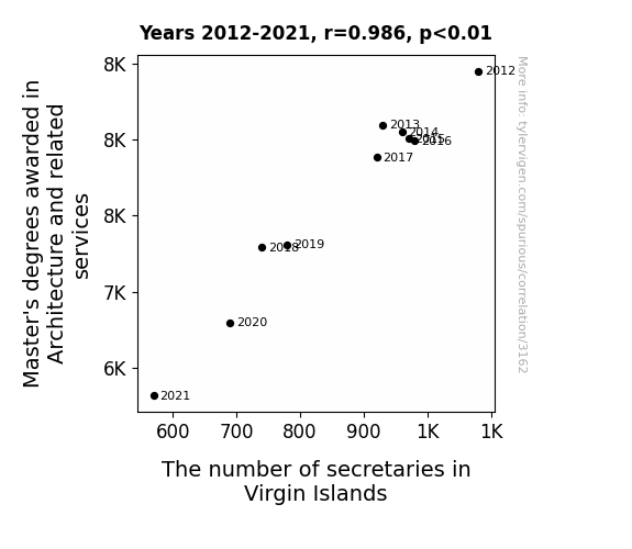
Building a Foundation: The Architectural Degree-Seekers and Secretary Synchronicity in the Virgin Islands
As the number of architecture graduates dwindled, so did their grandiose plans for elaborate, state-of-the-art office buildings in the Virgin Islands. Without these majestic structures, the demand for secretaries who could efficiently manage such non-existent architectural marvels plummeted. In a tragic twist, the virgin islands became significantly less 'architecturally organized', leading to a shortage of secretarial work and a surplus of unfulfilled dreams of glass-walled skyscrapers by the crystal-clear waters.

What else correlates?
Master's degrees awarded in Architecture · all education
The number of secretaries in Virgin Islands · all cccupations
Master's degrees awarded in Architecture · all education
The number of secretaries in Virgin Islands · all cccupations


View details about correlation #4,656
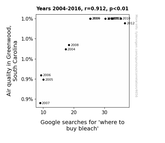
Clearing the Air: The Bleach-iful Relationship Between Air Quality in Greenwood, South Carolina and Google Searches for 'Where to Buy Bleach'
People suddenly realized their homes were so clean that they could see the dirt with more clarity, leading to a surge in bleach shopping. It's a clear case of 'the cleaner the air, the brighter the home interior looks' phenomenon!

What else correlates?
Air quality in Greenwood, South Carolina · all weather
Google searches for 'where to buy bleach' · all google searches
Air quality in Greenwood, South Carolina · all weather
Google searches for 'where to buy bleach' · all google searches


View details about correlation #2,616
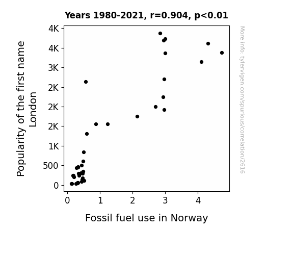
Norwegian Fuelishness: The London Connection
As the name London gained popularity, more parents felt inspired to travel to the bustling city for baby name ideas. This led to a surprising spike in flights from Norway, ultimately increasing the demand for fossil fuels to power these skyward journeys. It's a classic case of name admiration taking off and fueling the Norwegian connection to the name London!

What else correlates?
Popularity of the first name London · all first names
Fossil fuel use in Norway · all energy
Popularity of the first name London · all first names
Fossil fuel use in Norway · all energy


View details about correlation #1,299
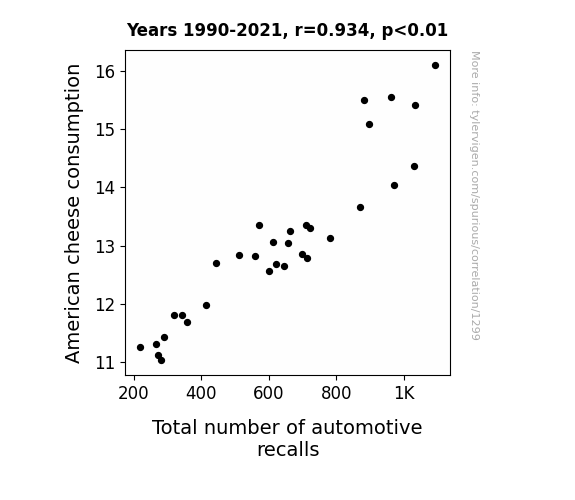
Cheesy Recalls: Uncovering the Link Between American Cheese Consumption and Automotive Disasters
As American cheese consumption increased, so did the demand for cheeseburgers. This led to a spike in fast food sales, prompting more people to hit the drive-thrus. With a higher number of cars on the road, the likelihood of automotive issues also revved up. It's a gouda example of how dairy cravings can wheely impact the automotive industry.
What else correlates?
American cheese consumption · all food
Total number of automotive recalls · all weird & wacky
American cheese consumption · all food
Total number of automotive recalls · all weird & wacky
. The chart goes from 2010 to 2022, and the two variables track closely in value over that time.")

View details about correlation #3,266
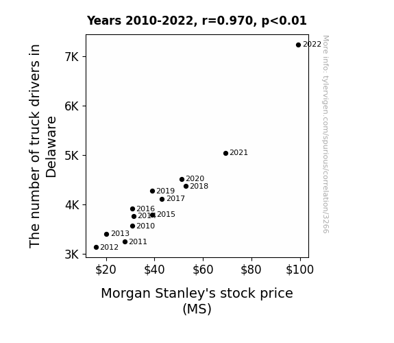
Morgan Stanley and Delaware's Wheeled Rally: The Correlation Between Truck Drivers and MS Stock Prices
The increase in truck drivers in Delaware improved the efficiency of delivering goods, leading to a boost in the overall economy. This economic growth resulted in higher investment activity, including in financial services like those offered by Morgan Stanley. As a result, the demand for Morgan Stanley's stock increased, causing the stock price to rise.

What else correlates?
The number of truck drivers in Delaware · all cccupations
Morgan Stanley's stock price (MS) · all stocks
The number of truck drivers in Delaware · all cccupations
Morgan Stanley's stock price (MS) · all stocks


View details about correlation #4,872
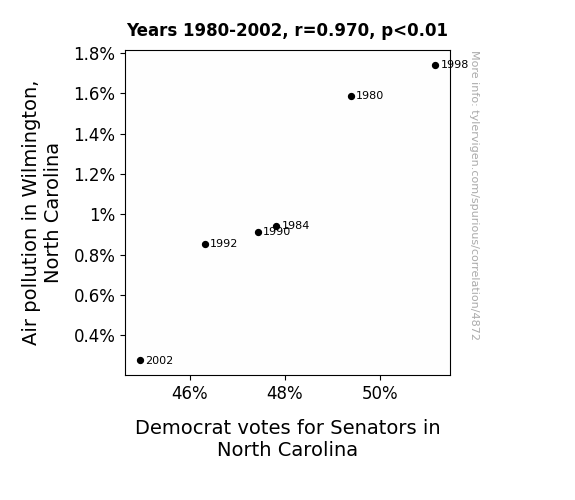
Cloudy With a Chance of Democrats: The Political Impact of Air Pollution in Wilmington, North Carolina
As the air became cleaner, it carried away the Democratic voter base on an unexpected and gentle breeze to an undisclosed location. They just couldn't resist the temptation to go fly a kite instead of voting.

What else correlates?
Air pollution in Wilmington, North Carolina · all weather
Votes for Democratic Senators in North Carolina · all elections
Air pollution in Wilmington, North Carolina · all weather
Votes for Democratic Senators in North Carolina · all elections


View details about correlation #2,029
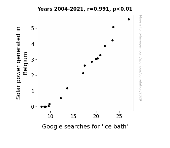
Chilled Out: Exploring the Relationship Between Solar Power in Belgium and Google Searches for 'Ice Bath'
Perhaps the surplus solar power led to an unexpected demand for mini-fridges, prompting more people to stock up on ice for their impromptu spa days!

What else correlates?
Solar power generated in Belgium · all energy
Google searches for 'ice bath' · all google searches
Solar power generated in Belgium · all energy
Google searches for 'ice bath' · all google searches


View details about correlation #2,304
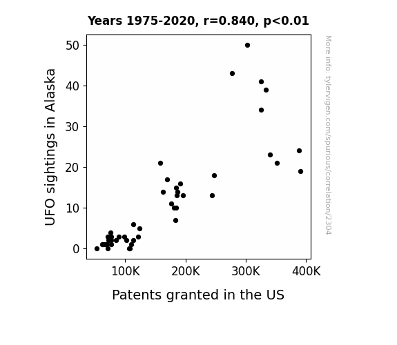
Out of this World Inventions: The UFO-niversal Language of Patents
The UFOs were actually advanced technology created by a secret group of inventors in Alaska. Every time the UFOs made an appearance, it inspired the inventors to come up with new groundbreaking ideas, leading to a surge in patent applications and approvals. It turns out, the truth was out there, and it was also surprisingly innovative!

What else correlates?
UFO sightings in Alaska · all random state specific
Patents granted in the US · all weird & wacky
UFO sightings in Alaska · all random state specific
Patents granted in the US · all weird & wacky


View details about correlation #2,382
The Phoebenomenon: Exploring the Interstellar Influence of Phoebe on Aerospace Engineers in Utah
Perhaps every Phoebe was secretly a rocket scientist, inspiring a new generation of aerospace engineers with their celestial insights and out-of-this-world ideas! Or maybe there was a cosmic connection between the name Phoebe and a gravitational pull towards Utah's aerospace industry, leading to an interstellar influx of Phoebetastic talent. Who knew that the key to reaching for the stars lay in the name Phoebe!


What else correlates?
Popularity of the first name Phoebe · all first names
The number of aerospace engineers in Utah · all cccupations
Popularity of the first name Phoebe · all first names
The number of aerospace engineers in Utah · all cccupations
. The chart goes from 2002 to 2020, and the two variables track closely in value over that time.")

View details about correlation #4,567
Blowing Hot Air: The Gaseous Relationship Between Air Pollution in Vallejo, California and Applied Materials' Stock Price (AMAT)
As air pollution in Vallejo, California increased, so did the demand for air purifiers. Applied Materials happens to manufacture cutting-edge air purification technology as a side business, and the sudden surge in orders for their high-tech air filters boosted their overall revenue. This unexpected market for clean air solutions led to a spike in investor interest and a subsequent rise in Applied Materials' stock price. Who knew that smog could indirectly lead to a breath of fresh air for a company's financials!


What else correlates?
Air pollution in Vallejo, California · all weather
Applied Materials' stock price (AMAT) · all stocks
Air pollution in Vallejo, California · all weather
Applied Materials' stock price (AMAT) · all stocks


View details about correlation #3,539
Shining a Light on Solar Power: A Bright Spot for Avocado Toast?
As the solar panels soaked up the sun's rays, they inadvertently beamed out supercharged avocado-growing energy. This led to an absolute avo-catastrophe, as avocados ballooned to massive sizes and became the talk of the town. With an abundance of giant, perfectly ripe avocados, the people of Uruguay couldn't resist mashing them onto toast and creating a sunny, delicious phenomenon. It's a toast to the incredible, avocado-boosting power of solar energy!


What else correlates?
Solar power generated in Uruguay · all energy
Google searches for 'avocado toast' · all google searches
Solar power generated in Uruguay · all energy
Google searches for 'avocado toast' · all google searches


View details about correlation #2,370
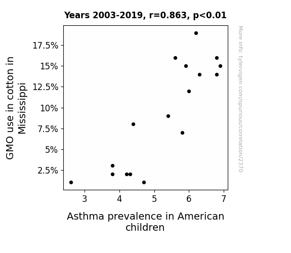
The Pollen Paradox: Investigating the Link Between GMO Cotton and Asthma in American Children
As cotton in Mississippi became less genetically modified, it led to the unintentional creation of mini cotton bales that kids were using as pillows, leading to overall better respiratory health. Remember, when it comes to unconventional asthma remedies, sometimes the fabric of our solutions is a little bit fuzzy!

What else correlates?
GMO use in cotton in Mississippi · all food
Asthma prevalence in American children · all weird & wacky
GMO use in cotton in Mississippi · all food
Asthma prevalence in American children · all weird & wacky


View details about correlation #3,274
Crunching Numbers: The Link Between Engineering Degrees and Forensic Technicians in Michigan
As more engineers entered the workforce, they engineered a higher demand for crime scene analysis equipment, leading to an uptick in forensic science technician positions in Michigan. This created a positive feedback loop, as the technicians were able to uncover evidence of even more engineering-related shenanigans, prompting the need for additional forensic expertise. It's a tale of academic achievement leading to a boom in engineering-enhanced crime detection, ultimately culminating in a riveting saga of solving perplexing cases of technical tomfoolery!

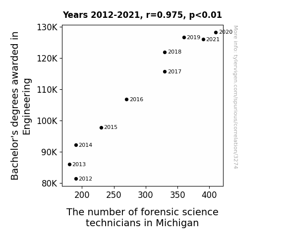
. The chart goes from 2012 to 2023, and the two variables track closely in value over that time.")

View details about correlation #4,282
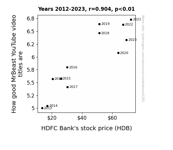
Beastly Bank: Blessings and Burdens of MrBeast's YouTube Video Titles on HDFC Bank's Stock Price
The superior clickability of the video titles led to heightened global dopamine levels, prompting people to make impulsive investment decisions, including purchasing HDB stock. It turns out, catchy titles aren't just good for views, they're bullish for stocks too!

What else correlates?
How good MrBeast's YouTube video titles are · all YouTube
HDFC Bank's stock price (HDB) · all stocks
How good MrBeast's YouTube video titles are · all YouTube
HDFC Bank's stock price (HDB) · all stocks


View details about correlation #1,280
Solar Power or Suspect Behavior: Illuminating the Connection Between Solar Generation in Mexico and Searches for 'That is Sus'
As Mexico's solar power output rises, it's creating a massive influx of energy. This has inadvertently led to a surge in 'solar suspicion' worldwide. People are now convinced that even the sun, the original source of solar power, is acting shady or sus. It's a real power struggle as the sun tries to convince everyone that it's just a solar false alarm, but the evidence is glaringly bright.


What else correlates?
Solar power generated in Mexico · all energy
Google searches for 'that is sus' · all google searches
Solar power generated in Mexico · all energy
Google searches for 'that is sus' · all google searches


View details about correlation #1,177
Reid-iculous Popularity: A Statistical Analysis of the Name Reid and Its Influence on Total Births Down Under
Every time someone hears the name Reid, they inadvertently perform a secret fertility dance, leading to a nationwide baby boom. This contagious urge to procreate sparked a positive feedback loop, with each new Reid bringing about even more births in a never-ending cycle of baby-making jubilation. It seems that the real Reid was not a person, but a fertility deity in disguise, spreading joy and diapers wherever his name was spoken.


What else correlates?
Popularity of the first name Reid · all first names
Total number of live births in Australia · all weird & wacky
Popularity of the first name Reid · all first names
Total number of live births in Australia · all weird & wacky


View details about correlation #3,156
The Degree of Debt: Exploring the Correlation Between Social Sciences and History Bachelor's Degrees and Bill Collector Proliferation in Colorado
As fewer people were able to discuss the fall of the Roman Empire at length, bill collectors found it increasingly difficult to engage in small talk during office hours, leading to a mass exodus from the industry. Perhaps now, debts will be settled over a riveting game of charades instead.


. The chart goes from 2003 to 2021, and the two variables track closely in value over that time.")

View details about correlation #2,640
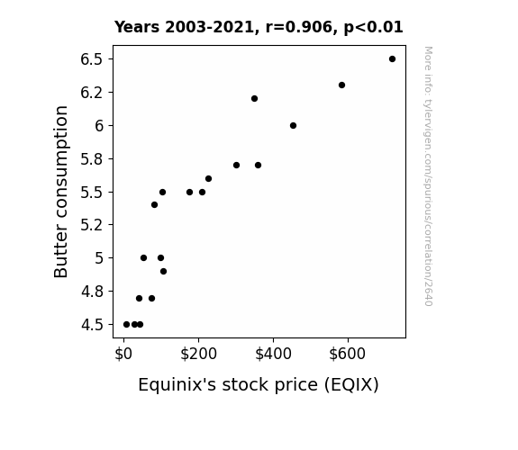
Spreading the Wealth: A Butterly Connection between Butter Consumption and Equinix's Stock Price
As butter consumption increases, so does the demand for baked goods. With more baked goods being sold, there is a boom in the commercial real estate market as bakeries and cafes clamor for space to meet the buttery needs of their customers. This surge in demand for commercial properties propels Equinix, a leading data center and interconnection provider, as these establishments require robust digital infrastructure to support their operations. It's a cascading effect - buttering up the economy one slice of toast at a time, and lining the pockets of Equinix investors in the process.

What else correlates?
Butter consumption · all food
Equinix's stock price (EQIX) · all stocks
Butter consumption · all food
Equinix's stock price (EQIX) · all stocks
Why this works
- Data dredging: I have 25,237 variables in my database. I compare all these variables against each other to find ones that randomly match up. That's 636,906,169 correlation calculations! This is called “data dredging.”
Fun fact: the chart used on the wikipedia page to demonstrate data dredging is also from me. I've been being naughty with data since 2014.
Instead of starting with a hypothesis and testing it, I instead tossed a bunch of data in a blender to see what correlations would shake out. It’s a dangerous way to go about analysis, because any sufficiently large dataset will yield strong correlations completely at random. - Lack of causal connection: There is probably no direct connection between these variables, despite what the AI says above.
Because these pages are automatically generated, it's possible that the two variables you are viewing are in fact causually related. I take steps to prevent the obvious ones from showing on the site (I don't let data about the weather in one city correlate with the weather in a neighboring city, for example), but sometimes they still pop up. If they are related, cool! You found a loophole.
This is exacerbated by the fact that I used "Years" as the base variable. Lots of things happen in a year that are not related to each other! Most studies would use something like "one person" in stead of "one year" to be the "thing" studied. - Observations not independent: For many variables, sequential years are not independent of each other. You will often see trend-lines form. If a population of people is continuously doing something every day, there is no reason to think they would suddenly change how they are doing that thing on January 1. A naive p-value calculation does not take this into account.
You will calculate a lower chance of "randomly" achieving the result than represents reality.
To be more specific: p-value tests are probability values, where you are calculating the probability of achieving a result at least as extreme as you found completely by chance. When calculating a p-value, you need to assert how many "degrees of freedom" your variable has. I count each year (minus one) as a "degree of freedom," but this is misleading for continuous variables.
This kind of thing can creep up on you pretty easily when using p-values, which is why it's best to take it as "one of many" inputs that help you assess the results of your analysis.
- Y-axes doesn't start at zero: I truncated the Y-axes of the graphs above. I also used a line graph, which makes the visual connection stand out more than it deserves.
Nothing against line graphs. They are great at telling a story when you have linear data! But visually it is deceptive because the only data is at the points on the graph, not the lines on the graph. In between each point, the data could have been doing anything. Like going for a random walk by itself!
Mathematically what I showed is true, but it is intentionally misleading. If you click on any of the charts that abuse this, you can scroll down to see a version that starts at zero. - Confounding variable: Confounding variables (like global pandemics) will cause two variables to look connected when in fact a "sneaky third" variable is influencing both of them behind the scenes.
- Outliers: Some datasets here have outliers which drag up the correlation.
In concept, "outlier" just means "way different than the rest of your dataset." When calculating a correlation like this, they are particularly impactful because a single outlier can substantially increase your correlation.
Because this page is automatically generated, I don't know whether any of the charts displayed on it have outliers. I'm just a footnote. ¯\_(ツ)_/¯
I intentionally mishandeled outliers, which makes the correlation look extra strong. - Low n: There are not many data points included in some of these charts.
You can do analyses with low ns! But you shouldn't data dredge with a low n.
Even if the p-value is high, we should be suspicious of using so few datapoints in a correlation.
Pro-tip: click on any correlation to see:
- Detailed data sources
- Prompts for the AI-generated content
- Explanations of each of the calculations (correlation, p-value)
- Python code to calculate it yourself


