spurious correlations
discover · random · spurious scholar
← previous page · next page →


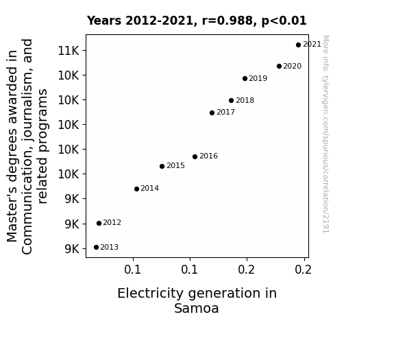
View details about correlation #2,191
The Shocking Truth: A Current Affair Between Communication Master's Degrees and Electricity Generation in Samoa
As more people became experts in broadcasting, they inadvertently discovered a direct link between articulate communication and generating electrical energy. It turns out, their eloquent delivery and electrifying presentations somehow sparked a surge in power production in Samoa. It's like they found the shocking truth: the more you 'current-ly' communicate, the more watts of innovation you can plug into the media industry. Who knew that mastering the art of public speaking could lead to such a powerful connection with Samoa's electricity generation! It's a real testament to the ripple effect of persuasive language - talk about a truly electrifying achievement in the field of Communication and journalism!

What else correlates?
Master's degrees awarded in journalism · all education
Electricity generation in Samoa · all energy
Master's degrees awarded in journalism · all education
Electricity generation in Samoa · all energy


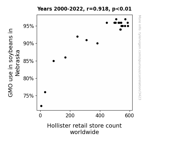
View details about correlation #3,423
From Soybeans to Skinny Jeans: Examining the GMO-Hollister Connection
As the GMO soybeans in Nebraska flourished, they emitted a faint but distinct pheromone that inexplicably attracted the founding members of Hollister. This led to a series of covert expansion decisions, eventually causing a global boom in Hollister store count. It seems the soybeans weren't just resistant to pests, but also had an uncanny ability to lure in a very specific human demographic.

What else correlates?
GMO use in soybeans in Nebraska · all food
Hollister retail store count worldwide · all weird & wacky
GMO use in soybeans in Nebraska · all food
Hollister retail store count worldwide · all weird & wacky


View details about correlation #2,689
The Curious Case of Marcella: Unraveling the Relationship between Name Popularity and Private Detectives in Rhode Island
Because every time someone called out the name "Marcella," it sounded like a case was being assigned and it piqued the interest of anyone in a trench coat and fedora.

What else correlates?
Popularity of the first name Marcella · all first names
The number of private detectives in Rhode Island · all cccupations
Popularity of the first name Marcella · all first names
The number of private detectives in Rhode Island · all cccupations


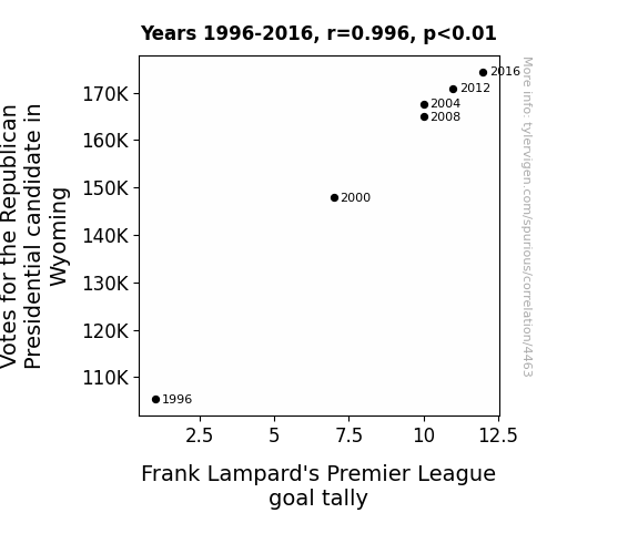
View details about correlation #4,463
Goal-tally Politics: A Correlational Analysis of Votes for the Republican Presidential Candidate in Wyoming and Frank Lampard's Premier League Performance
The increase in Votes for the Republican Presidential candidate in Wyoming caused Frank Lampard's Premier League goal tally to increase because as the votes went up, so did the 'right' support for Lampard, boosting his morale and shooting accuracy! It's the red, white, and blue power of political goal setting!


View details about correlation #3,039
An Electrifying Encounter: Unveiling the Shocking Connection Between UFO Sightings in Ohio and Electricity Generation in Yemen
The UFOs were actually giant, energy-guzzling intergalactic toasters, and their presence somehow beamed extra toastiness to the Earth, but only in a small, remote village in Yemen.

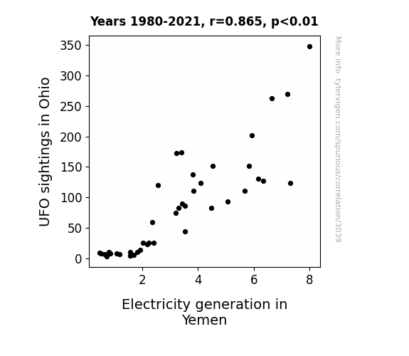
What else correlates?
UFO sightings in Ohio · all random state specific
Electricity generation in Yemen · all energy
UFO sightings in Ohio · all random state specific
Electricity generation in Yemen · all energy


View details about correlation #3,246
Maize and Esquire: A Kernel of Truth in the Relationship Between GMO Corn in Missouri and the Number of Lawyers in the United States
The GMO corn started producing more kernels, leading to an increase in corn production. This, in turn, attracted more corn-loving people to move to Missouri and pursue a career in law, because they wanted to be closer to the source of their favorite snack, corn on the cob. As a result, the number of lawyers in the United States increased as they all shucked and jived their way to the Show-Me State for a-maize-ing opportunities.

What else correlates?
GMO use in corn grown in Missouri · all food
Number of Lawyers in the United States · all weird & wacky
GMO use in corn grown in Missouri · all food
Number of Lawyers in the United States · all weird & wacky


View details about correlation #2,253
Air We Go Again: The Correlation Between Air Pollution in El Paso and the Number of Broadcast Technicians in Texas
As the air became cleaner in El Paso, it created a bizarre chain reaction in the atmosphere. This unusual weather phenomenon, which I like to call the "lens effect," actually caused a slight bending of light and radio waves in the region. The end result? Broadcast signals were subtly redirected, leading to a wave of confusion in the field of broadcast technology. It seems that as the pollution cleared, so did the career paths of these technicians – talk about an unexpected twist in the air!
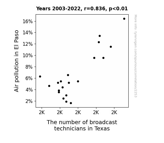
What else correlates?
Air pollution in El Paso · all weather
The number of broadcast technicians in Texas · all cccupations
Air pollution in El Paso · all weather
The number of broadcast technicians in Texas · all cccupations
. The chart goes from 2007 to 2022, and the two variables track closely in value over that time.")

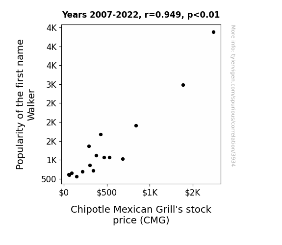
View details about correlation #3,934
Stock Up or Walk Away? Investigating the Correlation Between the Popularity of the Name Walker and Chipotle Mexican Grill's Stock Price
As the number of Walkers rose, so did the number of chippers in line at Chipotle. This led to a guac-ing boost in sales and a stock price that was on a real roll, not to mention a fajita-lot of interest from investors. It seems the name Walker has truly left its marq on Chipotle's stock!

What else correlates?
Popularity of the first name Walker · all first names
Chipotle Mexican Grill's stock price (CMG) · all stocks
Popularity of the first name Walker · all first names
Chipotle Mexican Grill's stock price (CMG) · all stocks


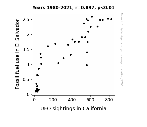
View details about correlation #1,706
Fueling the Unidentified: Investigating the Correlation Between Fossil Fuel Use in El Salvador and UFO Sightings in California
As El Salvador ramped up its fossil fuel use, the resulting uptick in air pollution inadvertently created reflective conditions in the atmosphere. This inadvertently acted as a signal flare for intergalactic travelers, guiding them towards the enhanced energy sources. Therefore, the unexpected consequence of this environmental decision was a surge in UFO sightings in California. It turns out, the aliens had been in search of the ultimate fuel source, and they found it all too magnificently in the golden state.

What else correlates?
Fossil fuel use in El Salvador · all energy
UFO sightings in California · all random state specific
Fossil fuel use in El Salvador · all energy
UFO sightings in California · all random state specific


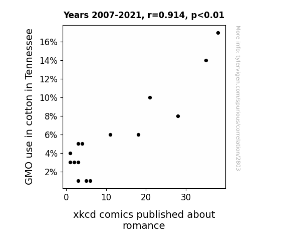
View details about correlation #2,803
Cottoning On to Romance: The Genetically Modified Connection Between Tennessee Cotton and xkcd Comics
As the GMO cotton dwindled, so did the genetically modified romance in the xkcd comics. It seems like the non-GMO cotton fields just couldn't cultivate the same level of passion, leading to a defluffing of romantic storylines. It's a case of unrequited love for these xkcd comics, as they were left spinning in a punny, organic love triangle. Who knew that matters of the heart were sewn into the very fabric of agriculture? Whether it's a-maize-ing or just a cotton-picking coincidence, this link between GMO cotton in Tennessee and romantic xkcd comics is truly a budding romance novel in itself!

What else correlates?
GMO use in cotton in Tennessee · all food
xkcd comics published about romance · all weird & wacky
GMO use in cotton in Tennessee · all food
xkcd comics published about romance · all weird & wacky


View details about correlation #2,313
Scout's Sus-picion: The Correlation Between Coaches and Scouts in Puerto Rico and Google Searches for 'That is Sus'
The influx of sports talent spilling over to the world of gaming led to an epidemic of sussiness, as even professional gamers couldn't resist lying low. It seems like Puerto Rico is not just a powerhouse in sports, but also in sus-pect behavior!

What else correlates?
The number of coaches and scouts in Puerto Rico · all cccupations
Google searches for 'that is sus' · all google searches
The number of coaches and scouts in Puerto Rico · all cccupations
Google searches for 'that is sus' · all google searches
. The chart goes from 2002 to 2012, and the two variables track closely in value over that time.")

View details about correlation #3,817
Peculiar Pollution: Paducah, Kentucky and the Perplexing Performance of Bristol-Myers Squibb's Stock Price
The decrease in air pollution in Paducah, Kentucky led to a surplus of clean, crisp air. This air, being exceptionally pure and invigorating, somehow found its way to the Bristol-Myers Squibb headquarters. The employees, accustomed to the usual smoggy atmosphere, were unable to concentrate in this newfound oxygen paradise. Productivity plummeted as they couldn't stop themselves from constantly stepping outside for lungfuls of the pristine air. This ultimately led to a decrease in the company's output and profits, causing a ripple effect that drove down the stock price of Bristol-Myers Squibb. Remember, sometimes even the purest intentions can have unforeseen consequences!


What else correlates?
Air pollution in Paducah, Kentucky · all weather
Bristol-Myers Squibb's stock price (BMY) · all stocks
Air pollution in Paducah, Kentucky · all weather
Bristol-Myers Squibb's stock price (BMY) · all stocks


View details about correlation #1,791
Shocking Connections: The Electrifying Link Between Public School Students and Electricity Generation in Paraguay
As the number of 4th graders rose, so did the collective brainpower dedicated to understanding energy, leading to an influx of innovative ideas for electricity generation in Paraguay. It turns out, these kids were sparking more than just an interest in learning!


What else correlates?
Number of public school students in 4th grade · all education
Electricity generation in Paraguay · all energy
Number of public school students in 4th grade · all education
Electricity generation in Paraguay · all energy


View details about correlation #1,438
For the Record: Ruth to Tune Ratio – A Groovy Link Between the Popularity of the Name Ruth and Vinyl Album Sales
As the name Ruth gained traction, more and more people were drawn to the classic and timeless feel of vinyl albums, much like Ruth Bader Ginsburg's approach to law. It seems Ruth wasn't just a-ruth-lessly popular, but also had a knack for spinning the tunes of nostalgia in people's hearts, leading to a real record high in demand for LPs. Why, it's a-rythm and blues tale of influence if there ever was one!


What else correlates?
Popularity of the first name Ruth · all first names
Sales of LP/Vinyl Albums · all weird & wacky
Popularity of the first name Ruth · all first names
Sales of LP/Vinyl Albums · all weird & wacky


View details about correlation #2,381
A Roasting Hot Topic: The Curious Correlation Between Food and Tobacco Roasting, Baking, and Drying Machine Operators and Tenders in Indiana and Google Searches for 'How to Move to Europe'
The Hoosier aroma became too enticing, prompting people to seek a continental shift. Or perhaps they just wanted to brie closer to the source of their smoked gouda be the reason. It seems like these operators have a real knack for stoking the flames of relocation!

. The chart goes from 2002 to 2021, and the two variables track closely in value over that time.")

View details about correlation #3,410
Butter and BlackRock: A Budding Bromance?
As butter consumption increased, so did the demand for baked goods. This led to a spike in happiness levels, prompting people to make impulsive but strangely successful investments in BlackRock, ultimately driving up the stock price. Who knew that spreading the love for butter could churn out such unexpected financial prosperity for BlackRock shareholders? Remember, the bread might be the real dough-maker, but butter seemingly has a knack for turning stock portfolios into a spread worth savoring.


What else correlates?
Butter consumption · all food
BlackRock's stock price (BLK) · all stocks
Butter consumption · all food
BlackRock's stock price (BLK) · all stocks


View details about correlation #2,707
Fueling the Fire: A Gas-Spicious Connection Between Berlin Air Pollution and Danish Gasoline
As the air in Berlin, New Hampshire cleared up, a team of industrious and environmentally conscious squirrels took it upon themselves to open a renewable energy company. They developed a revolutionary technology that turned air pollution into clean, green gasoline. This newfound supply of eco-friendly fuel quickly made its way to Denmark, leading to a significant decrease in the amount of regular gasoline being pumped. It's a story of how a breath of fresh air in one small town led to a global squirrel-powered energy revolution!

What else correlates?
Air pollution in Berlin, New Hampshire · all weather
Gasoline pumped in Denmark · all energy
Air pollution in Berlin, New Hampshire · all weather
Gasoline pumped in Denmark · all energy


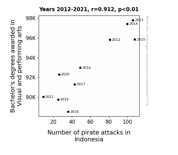
View details about correlation #2,776
Aye, Aye, Art! Unveiling the Connection Between Bachelor's Degrees in Visual and Performing Arts and Pirate Attacks in Indonesia
As fewer people pursued degrees in Visual and performing arts, there was a decline in the production of pirate-themed plays and musicals. Without these swashbuckling productions to inspire them, potential pirates in Indonesia decided to pursue other careers instead of taking to the high seas. After all, it's hard to pillage and plunder when you're not sure if you're more of a Captain Jack Sparrow or a Captain Hook.


View details about correlation #1,290
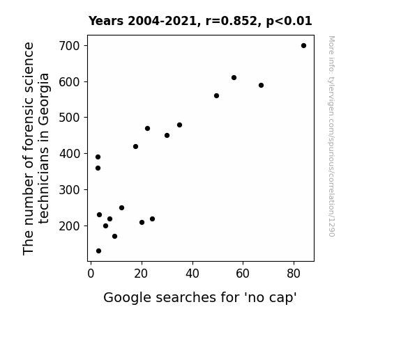
No Cap: Exploring the Correlation Between the Number of Forensic Science Technicians in Georgia and Google Searches for 'No Cap'
As the forensic science technician population grew in Georgia, so did their expertise in uncovering the truth. Their penchant for digging deeper and their ability to 'forensically' analyze situations led to a surge in instances where people were caught without their 'cap,' leading to the popularization of the phrase "no cap" to denote their inability to cover up their tracks. Looks like in Georgia, even the detectives couldn't resist a good pun!

What else correlates?
The number of forensic science technicians in Georgia · all cccupations
Google searches for 'no cap' · all google searches
The number of forensic science technicians in Georgia · all cccupations
Google searches for 'no cap' · all google searches


View details about correlation #4,822
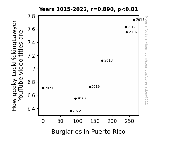
Peculiar Picking: Probing the Puzzling Parallels of LockPickingLawyer's Puerto Rican Predicament
As the LockPickingLawyer's video titles became less geeky, his content became more accessible to a wider audience. This inadvertently led to an increase in amateur locksmithing skills among the residents of Puerto Rico. Consequently, would-be burglars found it increasingly challenging to engage in unlawful entry, ultimately leading to a decrease in burglaries in the region. Remember, you don't need a lock to keep a good joke in.

What else correlates?
How geeky LockPickingLawyer YouTube video titles are · all YouTube
Burglaries in Puerto Rico · all random state specific
How geeky LockPickingLawyer YouTube video titles are · all YouTube
Burglaries in Puerto Rico · all random state specific
Why this works
- Data dredging: I have 25,237 variables in my database. I compare all these variables against each other to find ones that randomly match up. That's 636,906,169 correlation calculations! This is called “data dredging.”
Fun fact: the chart used on the wikipedia page to demonstrate data dredging is also from me. I've been being naughty with data since 2014.
Instead of starting with a hypothesis and testing it, I instead tossed a bunch of data in a blender to see what correlations would shake out. It’s a dangerous way to go about analysis, because any sufficiently large dataset will yield strong correlations completely at random. - Lack of causal connection: There is probably no direct connection between these variables, despite what the AI says above.
Because these pages are automatically generated, it's possible that the two variables you are viewing are in fact causually related. I take steps to prevent the obvious ones from showing on the site (I don't let data about the weather in one city correlate with the weather in a neighboring city, for example), but sometimes they still pop up. If they are related, cool! You found a loophole.
This is exacerbated by the fact that I used "Years" as the base variable. Lots of things happen in a year that are not related to each other! Most studies would use something like "one person" in stead of "one year" to be the "thing" studied. - Observations not independent: For many variables, sequential years are not independent of each other. You will often see trend-lines form. If a population of people is continuously doing something every day, there is no reason to think they would suddenly change how they are doing that thing on January 1. A naive p-value calculation does not take this into account.
You will calculate a lower chance of "randomly" achieving the result than represents reality.
To be more specific: p-value tests are probability values, where you are calculating the probability of achieving a result at least as extreme as you found completely by chance. When calculating a p-value, you need to assert how many "degrees of freedom" your variable has. I count each year (minus one) as a "degree of freedom," but this is misleading for continuous variables.
This kind of thing can creep up on you pretty easily when using p-values, which is why it's best to take it as "one of many" inputs that help you assess the results of your analysis.
- Y-axes doesn't start at zero: I truncated the Y-axes of the graphs above. I also used a line graph, which makes the visual connection stand out more than it deserves.
Nothing against line graphs. They are great at telling a story when you have linear data! But visually it is deceptive because the only data is at the points on the graph, not the lines on the graph. In between each point, the data could have been doing anything. Like going for a random walk by itself!
Mathematically what I showed is true, but it is intentionally misleading. If you click on any of the charts that abuse this, you can scroll down to see a version that starts at zero. - Confounding variable: Confounding variables (like global pandemics) will cause two variables to look connected when in fact a "sneaky third" variable is influencing both of them behind the scenes.
- Outliers: Some datasets here have outliers which drag up the correlation.
In concept, "outlier" just means "way different than the rest of your dataset." When calculating a correlation like this, they are particularly impactful because a single outlier can substantially increase your correlation.
Because this page is automatically generated, I don't know whether any of the charts displayed on it have outliers. I'm just a footnote. ¯\_(ツ)_/¯
I intentionally mishandeled outliers, which makes the correlation look extra strong. - Low n: There are not many data points included in some of these charts.
You can do analyses with low ns! But you shouldn't data dredge with a low n.
Even if the p-value is high, we should be suspicious of using so few datapoints in a correlation.
Pro-tip: click on any correlation to see:
- Detailed data sources
- Prompts for the AI-generated content
- Explanations of each of the calculations (correlation, p-value)
- Python code to calculate it yourself


