spurious correlations
discover · random · spurious scholar
← previous page · next page →
. The chart goes from 2002 to 2022, and the two variables track closely in value over that time.")

View details about correlation #2,037
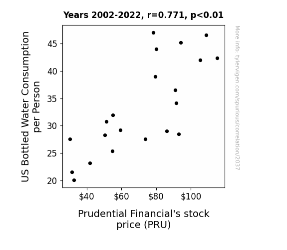
The Fluid Dynamics of Thirsty Markets: An Examination of the Relationship between US Bottled Water Consumption and Prudential Financial's Stock Price
The increase in bottled water consumption led to more hydrated and alert individuals. These super-hydrated people made better financial decisions, causing a surge in demand for Prudential Financial's services and ultimately driving up their stock price.

What else correlates?
US Bottled Water Consumption per Person · all food
Prudential Financial's stock price (PRU) · all stocks
US Bottled Water Consumption per Person · all food
Prudential Financial's stock price (PRU) · all stocks


View details about correlation #2,560
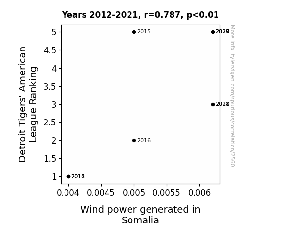
Pitching Wind Power: The Correlation Between Detroit Tigers' American League Ranking and Wind Power Generated in Somalia
As the Detroit Tigers' ranking in the American League increased, more fans started doing the wave at games. The synchronized arm movements of the fans created a ripple effect, leading to an unexpected surge in air currents. These enhanced winds, affectionately dubbed "Tiger Tempests," were harnessed by enterprising Somali technology, boosting their wind power generation. It seems the Tigers not only brought energy to the baseball field but also sparked a whole new kind of power play halfway across the globe!

What else correlates?
Detroit Tigers' American League Ranking · all sports
Wind power generated in Somalia · all energy
Detroit Tigers' American League Ranking · all sports
Wind power generated in Somalia · all energy


View details about correlation #1,123
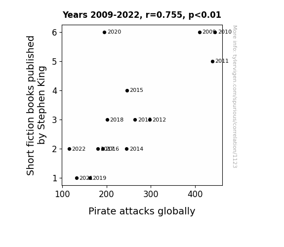
Stephen King's Short Stories: The Swashbuckling Saga
As the pages of Stephen King's short fiction books dwindled, so did the sails of inspiration for pirates. It seems they just couldn't find the IT factor to keep their maritime mischief afloat. Without his spine-chilling tales to float their boats, the pirates decided to give up the treasure hunt and pursue other careers. It's a case of 'Shiver me riders', as the literary shockwaves proved to be the ultimate kraken for the piracy business. Looks like when it comes to swashbuckling, even the scariest pirates can't handle a King-sized fright.

What else correlates?
Short fiction books published by Stephen King · all weird & wacky
Pirate attacks globally · all weird & wacky
Short fiction books published by Stephen King · all weird & wacky
Pirate attacks globally · all weird & wacky


View details about correlation #3,135
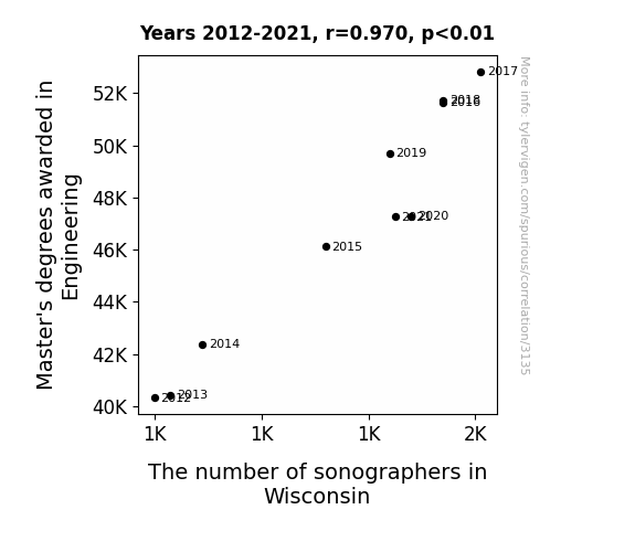
Engineering Education's Effect on Echogenic Examiners: Exploring the Engineering Master's Degree and Sonographer Supply in Wisconsin
As the engineering expertise grew, so did their ability to finely tune and calibrate ultrasound equipment, leading to a sonographic renaissance in the dairy state. Those engineers' precision and attention to detail really resonated with the dairy industry, and soon the sound of udderly efficient sonography filled the air.

What else correlates?
Master's degrees awarded in Engineering · all education
The number of sonographers in Wisconsin · all cccupations
Master's degrees awarded in Engineering · all education
The number of sonographers in Wisconsin · all cccupations


View details about correlation #4,072
Stalk-ing the Culprit: Unearthing the Correlation between GMO Corn Cultivation in Texas and Arson Cases
As the GMO corn in Texas dwindled, so too did the flames of temptation in the hearts of would-be arsonists. With their vibrant, non-GMO enriched diets, the corn fed individuals were less likely to feel the burning desire to set fires. It seems the real secret to extinguishing arson in Texas was simply to let the GMO cornstalks go up in a blaze of glory!

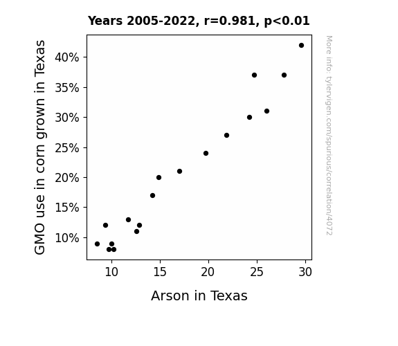
What else correlates?
GMO use in corn grown in Texas · all food
Arson in Texas · all random state specific
GMO use in corn grown in Texas · all food
Arson in Texas · all random state specific


View details about correlation #3,226
Blowing in the Wind: A Gale of Appetite for Sushi Near Me and Wind Power Generation in South Africa
The increased wind power in South Africa created a strong air current, leading to a surge in the migration of fish towards the coast. This in turn provided an abundance of fresh fish for sushi restaurants near you, causing a rawvolution in the availability of sushi. Looks like the winds of change blew in some fin-tastic dining options for you!

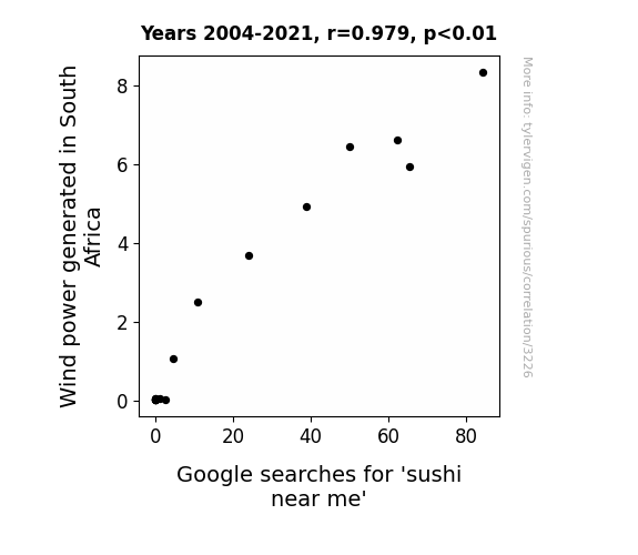
What else correlates?
Wind power generated in South Africa · all energy
Google searches for 'sushi near me' · all google searches
Wind power generated in South Africa · all energy
Google searches for 'sushi near me' · all google searches


View details about correlation #1,735
Crafting Communications: An Artful Analysis of the Relationship Between Bachelor's Degrees in Communications Technologies and Craft Artists in Washington
Without an influx of tech-savvy communications graduates, the craft artists in Washington were left feeling unspun and unable to weave modern technology into their work. This led to a decrease in demand for their tech-lacking creations, leaving them feeling knotty and framed in a web of yarn-ful unemployment.


. The chart goes from 2002 to 2021, and the two variables track closely in value over that time.")

View details about correlation #3,454
Spreading the Wealth: Exploring the Butter-Illumina Stock Connection
As butter consumption increases, so does happiness. Happy people are more productive. With increased productivity, companies like Illumina experience higher stock prices as a result of the butter-induced productivity boost. It's a slippery but profitable correlation!

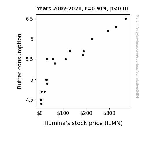
What else correlates?
Butter consumption · all food
Illumina's stock price (ILMN) · all stocks
Butter consumption · all food
Illumina's stock price (ILMN) · all stocks


View details about correlation #2,842
Biomass Bypass: Beholding Birds and Biomass Power in Iran
The increase in Biomass power in Iran is creating a "tweet-worthy" buzz in the avian community. As the word spreads through the branches, birds are flocking to these power sources for a beak-ause they're feeling the heat. It seems they're truly pheasantly surprised by this renewable energy option, and are hatching new plans for when the skies turn fowl. It's a real wing-wind situation for our feathered friends, as they navigate this power shift and try to stay current on all the nest developments. Looks like Iran's Biomass power is for the birds, quite literally!

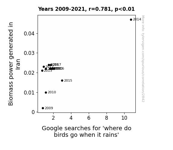
What else correlates?
Biomass power generated in Iran · all energy
Google searches for 'where do birds go when it rains' · all google searches
Biomass power generated in Iran · all energy
Google searches for 'where do birds go when it rains' · all google searches


View details about correlation #2,090
Playing with Fire: Exploring the Incendiary Connection Between Arson Rates in Delaware and the Uncommon Incidence of Triplet Births in the United States
As arson rates decreased in Delaware, there were fewer instances of fiery passion, leading to a reduction in the number of hot and heavy pregnancies, ultimately lowering the likelihood of triplets or more being conceived. This is due to the fact that less burnt out buildings meant less burnt out love lives, resulting in decreased instances of spontaneous combustion of fertility, and ultimately leading to a smoldering reduction in the delivery of three or more bundles of joy.


What else correlates?
Arson in Delaware · all random state specific
US birth rates of triplets or more · all weird & wacky
Arson in Delaware · all random state specific
US birth rates of triplets or more · all weird & wacky


View details about correlation #2,962
Toby or Not Toby: A Tantalizing Tale of Tapers in Texas
It turns out, there was a secret society of tapers in Texas, and they were all huge fans of the name Toby. When the name fell out of favor, the tapers just couldn't bring themselves to keep tapering. It was a wick-ed blow to the taper population!

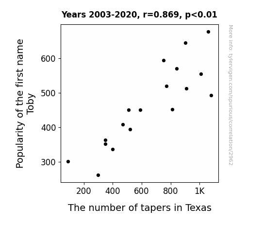
What else correlates?
Popularity of the first name Toby · all first names
The number of tapers in Texas · all cccupations
Popularity of the first name Toby · all first names
The number of tapers in Texas · all cccupations


View details about correlation #4,341
Corny Politics: Genetically Modified Corn and Libertarian Votes in North Carolina
As GMO corn grows taller, it's whispering of self-reliance and limited government intervention becomes irresistibly persuasive.


What else correlates?
GMO use in corn · all food
Votes for Libertarian Senators in North Carolina · all elections
GMO use in corn · all food
Votes for Libertarian Senators in North Carolina · all elections
. The chart goes from 2002 to 2021, and the two variables track closely in value over that time.")

View details about correlation #2,531
Fuel for Thought: Exploring the Biomass Power - Stock Price Nexus
As Austria's biomass power output rises, it leads to an unexpected surplus of organic energy. This excess vitality somehow awakens an ancient, dormant tree spirit residing in the forests of Exxon Mobil's corporate headquarters. Filled with newfound verve, this eco-friendly entity begins to subtly influence the stock market, causing a gradual uptick in Exxon Mobil's stock price. It seems like the Austrian biomass power isn't just generating electricity – it's also branching out into the world of high finance!


What else correlates?
Biomass power generated in Austria · all energy
Exxon Mobil's stock price (XOM) · all stocks
Biomass power generated in Austria · all energy
Exxon Mobil's stock price (XOM) · all stocks


View details about correlation #2,217
What's the Bath on That? Exploring the Connection between 'Ice Bath' Google Searches and CPI-U in the US
As more people turned to ice baths for post-workout recovery, there was a surge in demand for ice, causing a slippery slope in the market. This led to an overall cooling effect on the economy, driving up prices for goods and services, and ultimately freezing the CPI-U in place.


What else correlates?
Google searches for 'ice bath' · all google searches
Inflation in the US · all weird & wacky
Google searches for 'ice bath' · all google searches
Inflation in the US · all weird & wacky


View details about correlation #1,285
The Austyn Paradox: A Name's Popularity and its Peculiar Influence on the Set and Exhibit Designers in New Mexico
As the name Austyn rose in popularity, it sparked a trend of parents naming their children after famous Austins, like Austin Powers and Stone Cold Steve Austin. This led to a generation of kids who grew up with a deep passion for creating elaborate stage sets and museum exhibits, because, you see, they were all about that base, 'bout that base, no treble... like austin in Texas. And as fate would have it, these Austyn-loving individuals all somehow found themselves drawn to the scenic deserts of New Mexico, where they could finally put their name to good use by designing the most a-maze-ing sets and exhibits the state had ever seen. It was a real creative Austin-tatious boom, and soon New Mexico became the hotbed for set and exhibit design, with Austyns at the forefront, proving that when it comes to shaping the future of the industry, it's all about unleashing your inner Austyn Powers.


View details about correlation #4,645
Consumer Science Credentials: A Libertarian Lean in Montana?
As more students gained expertise in Family and consumer sciences/human sciences, they also learned the art of running a smooth household. This led to a surge in support for the Libertarian candidate, who promised a hands-off approach to governance - a true testament to the power of home economics in shaping political ideologies. It seems like these graduates were truly making a "capital" investment in their preferred candidate!


View details about correlation #2,839
Sun-Kissed Suds: The Brew-tiful Relationship Between the Number of Breweries in the United States and Solar Power Generated in the Cook Islands
As the number of breweries in the United States increased, so did the production of beer. This led to a rise in people hosting backyard BBQs and cookouts, creating a higher demand for grills. This surge in grill usage caused a shortage of traditional charcoal, leading to the exploration of alternative energy sources like solar power in the Cook Islands to fuel the manufacturing of charcoal. So, essentially, the path to solar success in the Cook Islands was powered by the hops and barley of American breweries!
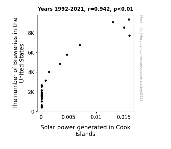
What else correlates?
The number of Breweries in the United States · all food
Solar power generated in Cook Islands · all energy
The number of Breweries in the United States · all food
Solar power generated in Cook Islands · all energy


View details about correlation #1,616
The Dirty Truth: Uncovering the Smoggy Relationship Between Air Pollution in Yakima, Washington, and the Mercedes-Benz USA Recalls
The smog in Yakima was so thick that it clogged up the sensors in Mercedes-Benz cars, triggering a wave of recalls as the cars couldn't differentiate between polluted air and actual malfunctions.

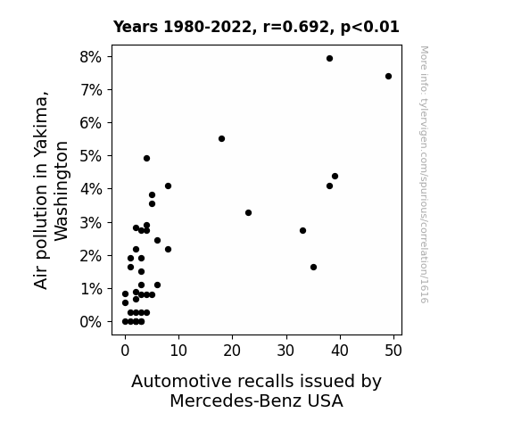
What else correlates?
Air pollution in Yakima, Washington · all weather
Automotive recalls issued by Mercedes-Benz USA · all weird & wacky
Air pollution in Yakima, Washington · all weather
Automotive recalls issued by Mercedes-Benz USA · all weird & wacky


View details about correlation #3,312
Chandra-Locker Room Connection: A Study of Name Popularity and Staffing in Michigan
As the popularity of the name Chandra waned, there were fewer parents naming their kids after celestial bodies. This led to a cosmic chain reaction, altering the universe's energy balance. Consequently, there was a gravitational pull on job opportunities in Michigan's locker rooms, ultimately decreasing the demand for locker room attendants. It's a stellar case of celestial naming trends impacting local employment in a truly out-of-this-world way!

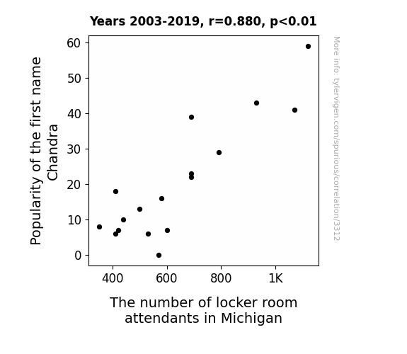
What else correlates?
Popularity of the first name Chandra · all first names
The number of locker room attendants in Michigan · all cccupations
Popularity of the first name Chandra · all first names
The number of locker room attendants in Michigan · all cccupations


View details about correlation #4,471
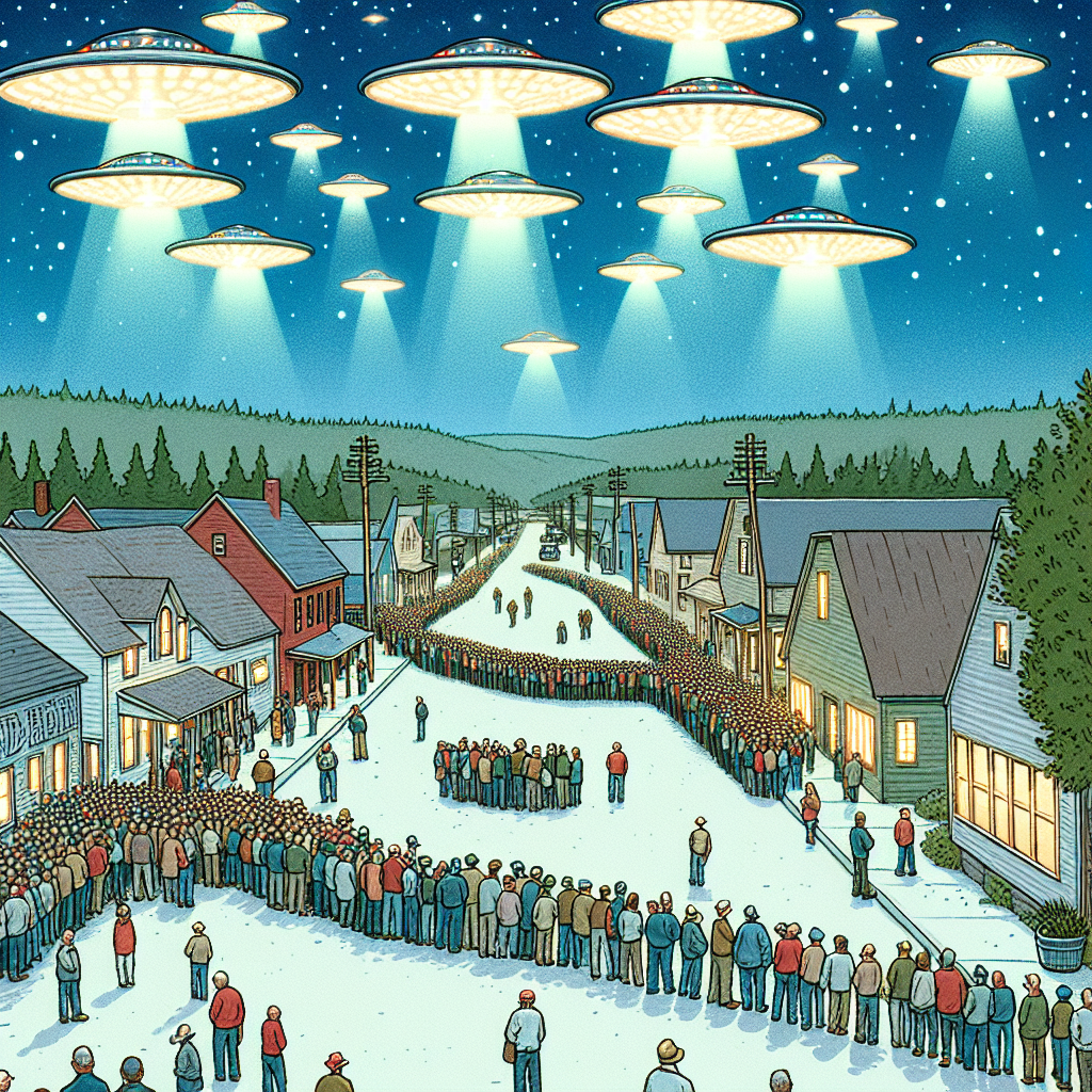
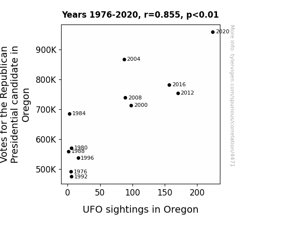
Unearthly Connections: An Extraterrestrial Approach to Analyzing Votes for the Republican Presidential Candidate in Oregon
The Republican candidate's platform included a promise to build a space force, attracting UFOs to Oregon for an impromptu recruitment drive. The campaign rhetoric was so otherworldly that it inadvertently established a direct line of communication with intergalactic beings, leading to a surge in UFO interest in the state. And as the political tension heated up, it created the perfect atmospheric conditions for an influx of UFO activity, proving that in the world of politics, the truth is out there!
Why this works
- Data dredging: I have 25,237 variables in my database. I compare all these variables against each other to find ones that randomly match up. That's 636,906,169 correlation calculations! This is called “data dredging.”
Fun fact: the chart used on the wikipedia page to demonstrate data dredging is also from me. I've been being naughty with data since 2014.
Instead of starting with a hypothesis and testing it, I instead tossed a bunch of data in a blender to see what correlations would shake out. It’s a dangerous way to go about analysis, because any sufficiently large dataset will yield strong correlations completely at random. - Lack of causal connection: There is probably no direct connection between these variables, despite what the AI says above.
Because these pages are automatically generated, it's possible that the two variables you are viewing are in fact causually related. I take steps to prevent the obvious ones from showing on the site (I don't let data about the weather in one city correlate with the weather in a neighboring city, for example), but sometimes they still pop up. If they are related, cool! You found a loophole.
This is exacerbated by the fact that I used "Years" as the base variable. Lots of things happen in a year that are not related to each other! Most studies would use something like "one person" in stead of "one year" to be the "thing" studied. - Observations not independent: For many variables, sequential years are not independent of each other. You will often see trend-lines form. If a population of people is continuously doing something every day, there is no reason to think they would suddenly change how they are doing that thing on January 1. A naive p-value calculation does not take this into account.
You will calculate a lower chance of "randomly" achieving the result than represents reality.
To be more specific: p-value tests are probability values, where you are calculating the probability of achieving a result at least as extreme as you found completely by chance. When calculating a p-value, you need to assert how many "degrees of freedom" your variable has. I count each year (minus one) as a "degree of freedom," but this is misleading for continuous variables.
This kind of thing can creep up on you pretty easily when using p-values, which is why it's best to take it as "one of many" inputs that help you assess the results of your analysis.
- Y-axes doesn't start at zero: I truncated the Y-axes of the graphs above. I also used a line graph, which makes the visual connection stand out more than it deserves.
Nothing against line graphs. They are great at telling a story when you have linear data! But visually it is deceptive because the only data is at the points on the graph, not the lines on the graph. In between each point, the data could have been doing anything. Like going for a random walk by itself!
Mathematically what I showed is true, but it is intentionally misleading. If you click on any of the charts that abuse this, you can scroll down to see a version that starts at zero. - Confounding variable: Confounding variables (like global pandemics) will cause two variables to look connected when in fact a "sneaky third" variable is influencing both of them behind the scenes.
- Outliers: Some datasets here have outliers which drag up the correlation.
In concept, "outlier" just means "way different than the rest of your dataset." When calculating a correlation like this, they are particularly impactful because a single outlier can substantially increase your correlation.
Because this page is automatically generated, I don't know whether any of the charts displayed on it have outliers. I'm just a footnote. ¯\_(ツ)_/¯
I intentionally mishandeled outliers, which makes the correlation look extra strong. - Low n: There are not many data points included in some of these charts.
You can do analyses with low ns! But you shouldn't data dredge with a low n.
Even if the p-value is high, we should be suspicious of using so few datapoints in a correlation.
Pro-tip: click on any correlation to see:
- Detailed data sources
- Prompts for the AI-generated content
- Explanations of each of the calculations (correlation, p-value)
- Python code to calculate it yourself


