spurious correlations
discover · random · spurious scholar
← previous page · next page →
. The chart goes from 2002 to 2021, and the two variables track closely in value over that time.")

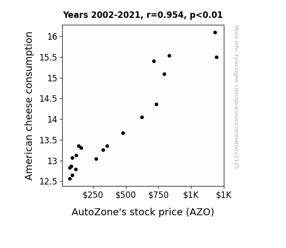
View details about correlation #2,125
Cheddar Cha-Ching: The Cheesy Connection Between American Cheese Consumption and AutoZone's Stock Price
As American cheese consumption melted, so did AutoZone's stock price, creating a gouda investment opportunity. With more people getting their cheddar's worth out of cheesy sandwiches, there was a provolone effect on the demand for cars, ultimately driving up the stock price of AutoZone. It's a dairy tale ending for both cheese lovers and stockholders alike!

What else correlates?
American cheese consumption · all food
AutoZone's stock price (AZO) · all stocks
American cheese consumption · all food
AutoZone's stock price (AZO) · all stocks


View details about correlation #1,753
Tristian's Twist: The Relationship between the Popularity of the Name and Hydropower Energy in Thailand
Every time a baby was named Tristian, a tiny bolt of lightning shot out of their itty-bitty fingers, zapping Thai hydroelectric generators and giving them a power boost. As more and more kids were bestowed with this electrifying name, Thailand found itself with more energy than it knew what to do with – all thanks to the shockingly popular choice of moniker. It was a real light bulb moment for the energy sector!


What else correlates?
Popularity of the first name Tristian · all first names
Hydopower energy generated in Thailand · all energy
Popularity of the first name Tristian · all first names
Hydopower energy generated in Thailand · all energy


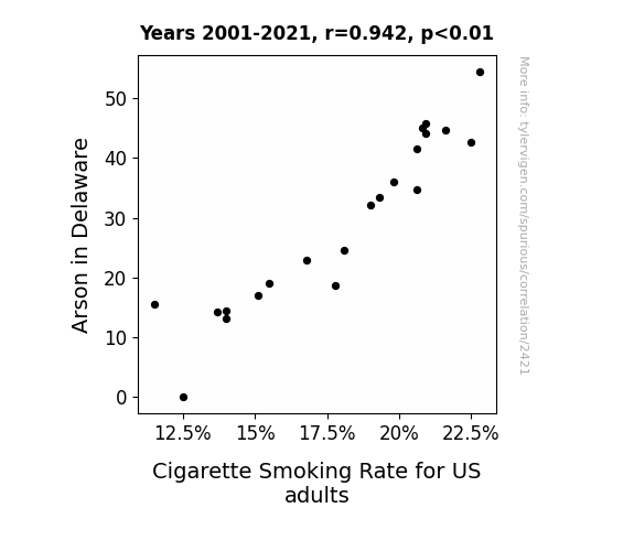
View details about correlation #2,421
Up in Smoke: Exploring the Fiery Connection Between Arson in Delaware and Cigarette Smoking Rate for US Adults
It seems that without as many fires, the urge to "light up" has diminished. Without the spark of excitement from arson, people are finding healthier ways to fuel their habits. It's a case of fewer flames leading to fewer cravings for smoke breaks!

What else correlates?
Arson in Delaware · all random state specific
Cigarette Smoking Rate for US adults · all weird & wacky
Arson in Delaware · all random state specific
Cigarette Smoking Rate for US adults · all weird & wacky


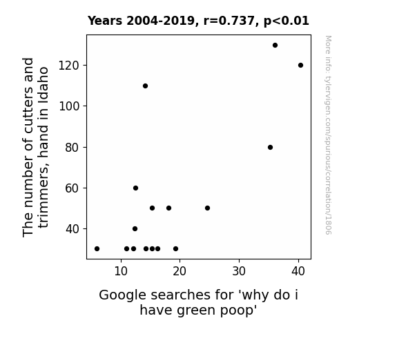
View details about correlation #1,806
The Ties Between Trimmers and Turds: An Alliteration Analysis
Idaho has a higher concentration of chlorophyll-producing plants, leading to a statewide increase in green poop experiences.

. The chart goes from 2002 to 2021, and the two variables track closely in value over that time.")

View details about correlation #1,381
Spreading Financial Butter: A Churn for the Better?
As butter consumption increased, so did the demand for movie theater popcorn. This led to higher profits for Disney, causing their stock price to rise. Remember, it's not just the magic kingdom, it's the buttery kingdom!


What else correlates?
Butter consumption · all food
The Walt Disney Company's stock price (DIS) · all stocks
Butter consumption · all food
The Walt Disney Company's stock price (DIS) · all stocks


View details about correlation #1,713
The Power of Planning: Investigating the Relationship Between Bachelor's Degrees in Public Administration and Social Services and Biomass Power Generation in Qatar
As more people became knowledgeable in public administration and social services, they realized the potential of converting all that bureaucratic red tape and paperwork into energy. With their newly acquired expertise, they found innovative ways to harness the sheer power of public sector inefficiency and social work passion, thereby fueling the biomass power industry in Qatar. It's like they turned the whole system's productivity and community support into a renewable energy source, creating a win-win situation for both education and sustainable power production! The graduates simply couldn't 'bureaucracy' themselves from making a 'renewable' difference!


What else correlates?
Bachelor's degrees awarded in social services · all education
Biomass power generated in Qatar · all energy
Bachelor's degrees awarded in social services · all education
Biomass power generated in Qatar · all energy


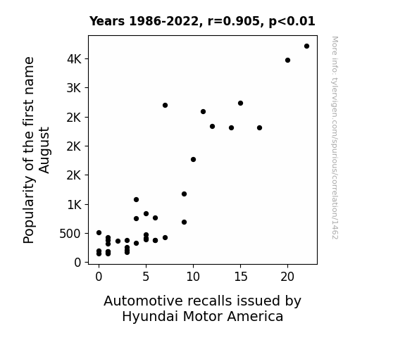
View details about correlation #1,462
August Recalls: A Study in Name Popularity and Automotive Safety with Respect to Hyundai Motor America
As the name August gained popularity, more parents were inspired by the month to go for a 'hyundai' birth, leading to a baby boom. With more Hyundais on the road, the demand for automotive parts soared, putting pressure on Hyundai Motor America to issue more recalls. It seems like the name August was revving up more than just affection!


View details about correlation #3,297
Insulating the Connection: A Study on the Correlation between Insulation Workers in New Jersey and Google Searches for 'Tom Scott'
The decrease in insulation workers in New Jersey has left Tom Scott feeling a bit un-insulated from the harsh realities of life, leading to a decrease in his Google searches. It seems he just can't seem to find the right 'material' to keep his popularity 'heat'ed!


What else correlates?
The number of insulation workers in New Jersey · all cccupations
Google searches for 'Tom Scott' · all google searches
The number of insulation workers in New Jersey · all cccupations
Google searches for 'Tom Scott' · all google searches
. The chart goes from 2002 to 2023, and the two variables track closely in value over that time.")

View details about correlation #4,095
Smog in Hagerstown: A Look at How Air Pollution Makes JCI's Stock Solution
As the air became cleaner, it also became lighter, leading to reduced atmospheric pressure. This, in turn, decreased the pressure on Johnson Controls International, causing their stock price to drop.

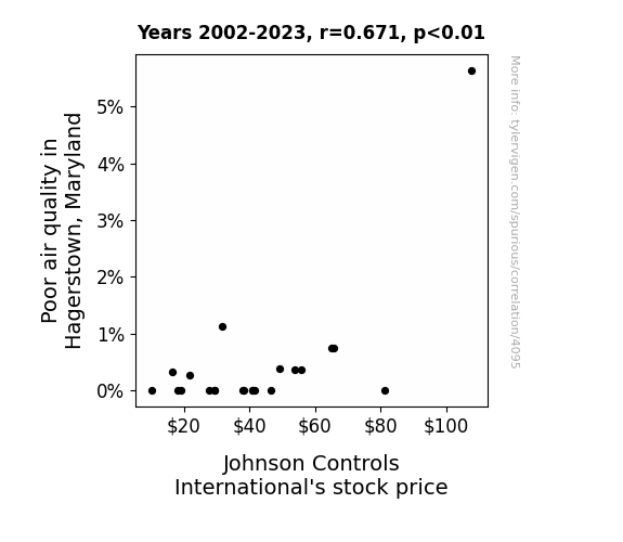
What else correlates?
Air pollution in Hagerstown, Maryland · all weather
Johnson Controls International's stock price (JCI) · all stocks
Air pollution in Hagerstown, Maryland · all weather
Johnson Controls International's stock price (JCI) · all stocks


View details about correlation #2,195
Seeding Success: The Cotton Connection - Exploring the GMO-Green Energy Nexus
As Missouri cotton farmers embraced GMOs, their fields became so incredibly efficient at producing cotton that they inadvertently generated a surplus of bio-mass. This excess plant material was then used in some top-secret, cutting-edge geothermal power technology, leading to a global revolution in renewable energy. Who knew that the key to a greener, more sustainable world lay in the humble GMO cotton plant in the heart of the United States?

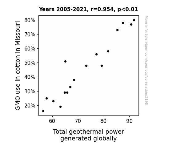
What else correlates?
GMO use in cotton in Missouri · all food
Total geothermal power generated globally · all energy
GMO use in cotton in Missouri · all food
Total geothermal power generated globally · all energy


View details about correlation #1,764
The Philosopher's Stone: Unraveling the Link Between Master's Degrees in Philosophy and Religious Studies and Pirate Attacks in Indonesia
As fewer people delved into the existential questions of life, the concept of pirating lost its deeper meaning, leading to a decline in recruitment and motivation for pirate attacks in Indonesia. Remember, when in doubt, philosophize it out!

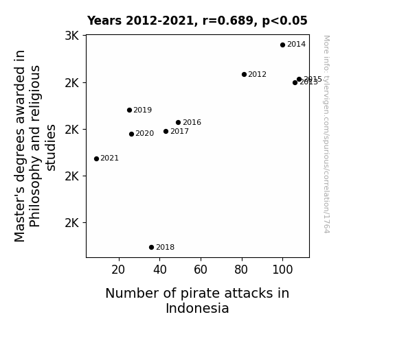


View details about correlation #2,269
The Zoologist-Zoinks Connection: Uncovering the Wallet-Wildlife Correlation in New Mexico
As the number of zoologists in New Mexico soared, there was a strange otter migration towards wallets. The sea of wallets proved too tempting for these crafty creatures, leading to a wave of missing wallets across the state. It seems the otterly charming zoologists unintentionally sparked a statewide game of hide-and-seek with our wallets. It's a situation that can only be described as a 'otter'ly bizarre case of wallet disappearance!

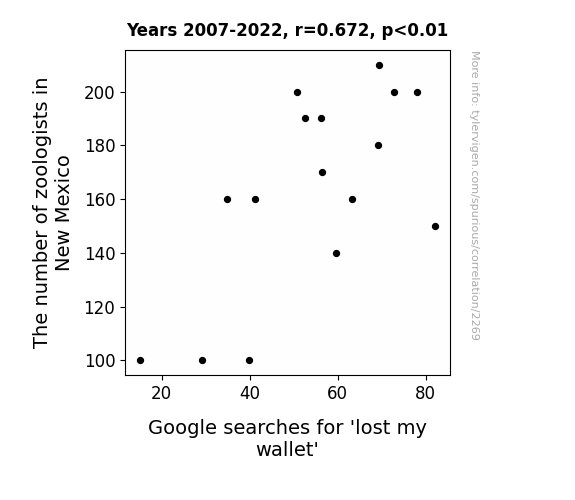
What else correlates?
The number of zoologists in New Mexico · all cccupations
Google searches for 'lost my wallet' · all google searches
The number of zoologists in New Mexico · all cccupations
Google searches for 'lost my wallet' · all google searches


View details about correlation #4,211
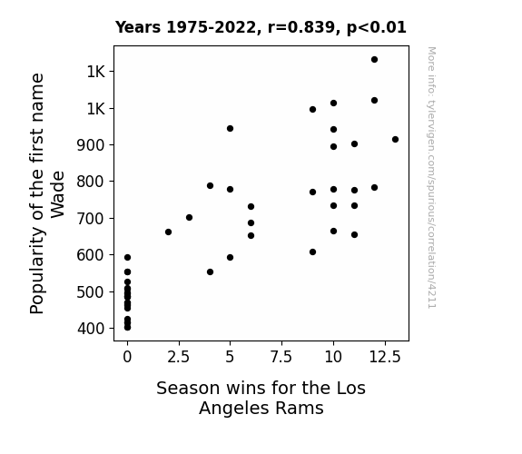
Wade-ing Through Wins: The Name Game of the Los Angeles Rams
Every time someone named Wade is born, a tiny bit of good luck is siphoned from the universe and donated to the Rams. With fewer Wades in the world, the team is now experiencing a shortage of serendipity, leading to their decrease in season wins. It's a Wadelicious conspiracy!

What else correlates?
Popularity of the first name Wade · all first names
Season wins for the Los Angeles Rams · all sports
Popularity of the first name Wade · all first names
Season wins for the Los Angeles Rams · all sports


View details about correlation #2,856
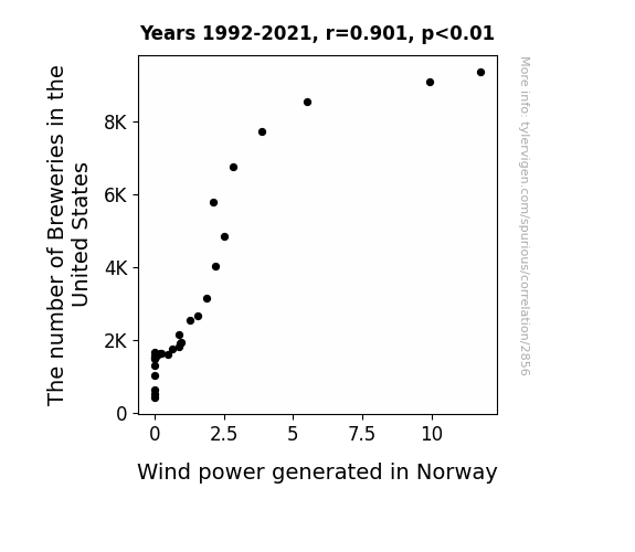
Brew and Renew: Inebriated Winds or Evaporated Energy?
As the number of breweries in the United States increases, so does the production of beer. With more beer available, people tend to have a gassier diet, leading to an increase in flatulence. This rise in gaseous emissions creates a higher demand for wind power in Norway to offset the increased methane and carbon dioxide levels in the atmosphere. This in turn drives the expansion of wind farms and boosts the overall production of wind power in Norway. So, next time you crack open a cold one, just remember, you're also contributing to the winds of change in Norway!
What else correlates?
The number of Breweries in the United States · all food
Wind power generated in Norway · all energy
The number of Breweries in the United States · all food
Wind power generated in Norway · all energy


View details about correlation #3,496
Forest Fumes & Fabled Fog: Unraveling the Nexus of Air Pollution in Ithaca and Remaining Rainforest in the Brazilian Amazon
As the air in Ithaca became cleaner, it created a stronger urge for locals to take up competitive houseplant growing. This led to a surge in demand for exotic plants, prompting an unforeseen deforestation epidemic in the Brazilian Amazon as Ithacans sought the perfect ferns and palms. Remember, cleaner air in one place could leaf to unforested territories elsewhere!


What else correlates?
Air pollution in Ithaca · all weather
Remaining Forest Cover in the Brazilian Amazon · all weird & wacky
Air pollution in Ithaca · all weather
Remaining Forest Cover in the Brazilian Amazon · all weird & wacky
. The chart goes from 2003 to 2022, and the two variables track closely in value over that time.")

View details about correlation #2,946
Minnesota's Groundskeepers and State Street's Stock: The Relationship Unlocked
As the number of groundskeepers in Minnesota grows, so does the demand for perfectly manicured grass. This heightened interest in pristine lawns leads to an uptick in lawn-related activities, such as friendly neighborhood lawnmower races. These events attract the attention of State Street's CEO, who, seeking a new adrenaline rush after a particularly thrilling game of office bingo, decides to invest heavily in the burgeoning sport of competitive grass grooming. This unexpected influx of funding causes State Street's stock price to skyrocket as they become the primary sponsor of the newly formed National Lawnmower Racing League.


What else correlates?
The number of groundskeepers in Minnesota · all cccupations
State Street's stock price (STT) · all stocks
The number of groundskeepers in Minnesota · all cccupations
State Street's stock price (STT) · all stocks


View details about correlation #4,296
Smart Swine: The Oink-redible Connection Between How Good Be Smart YouTube Video Titles and the Popularity of the 'Pork and Beans' Meme
The connection here is that as the quality of video titles on Be Smart improves, it's slowly influencing the collective wit of internet users. This, in turn, is elevating the appreciation for more esoteric and offbeat humor, such as the 'pork and beans' meme. In other words, the smarter the content, the higher the demand for highbrow memes. It's a positively correlated spiral of sophistication in internet culture!


What else correlates?
How good 'Be Smart' science YouTube video titles are · all YouTube
Popularity of the 'pork and beans' meme · all memes
How good 'Be Smart' science YouTube video titles are · all YouTube
Popularity of the 'pork and beans' meme · all memes


View details about correlation #3,385
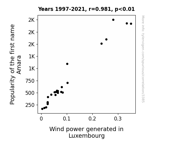
A Winding Trend: The Amara Name Popularity and Wind Power Generation in Luxembourg
As the number of babies named Amara rose, so did the collective positive energy. This surge in positivity somehow aligned with the wind patterns in Luxembourg, leading to a boost in wind power generation. It's as if the gentle whispers of encouragement to harness renewable energy were being carried on the amaranthine breeze, ultimately shaping a more sustainable future.

What else correlates?
Popularity of the first name Amara · all first names
Wind power generated in Luxembourg · all energy
Popularity of the first name Amara · all first names
Wind power generated in Luxembourg · all energy


View details about correlation #2,060
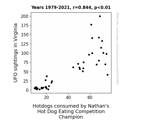
Unidentified Feeding Objects: Linking UFO Sightings in Virginia to Hotdog Consumption by Nathan's Hot Dog Eating Competition Champion
As UFO sightings increased in Virginia, the aliens couldn't resist beaming down to sample some classic American cuisine. Their favorite? You guessed it - the humble hotdog. Little did they know, their secret visits were adding an otherworldly flavor to the Nathan's Hot Dog Eating Competition. It seems these UFOs weren't just flying saucers, but also flying condiment dispensers! Who knew that the key to winning the competition was to have some truly 'out of this world' hotdogs.


View details about correlation #2,017
Shaky Ground: Exploring the Quake-tastic Connection Between Seismic Activity and Hearing Aid Specialists in California
The seismic waves were inadvertently providing on-the-job training in sound amplification technology. Looks like California is experiencing a different kind of wave, and they're all ears about it!

Why this works
- Data dredging: I have 25,237 variables in my database. I compare all these variables against each other to find ones that randomly match up. That's 636,906,169 correlation calculations! This is called “data dredging.”
Fun fact: the chart used on the wikipedia page to demonstrate data dredging is also from me. I've been being naughty with data since 2014.
Instead of starting with a hypothesis and testing it, I instead tossed a bunch of data in a blender to see what correlations would shake out. It’s a dangerous way to go about analysis, because any sufficiently large dataset will yield strong correlations completely at random. - Lack of causal connection: There is probably no direct connection between these variables, despite what the AI says above.
Because these pages are automatically generated, it's possible that the two variables you are viewing are in fact causually related. I take steps to prevent the obvious ones from showing on the site (I don't let data about the weather in one city correlate with the weather in a neighboring city, for example), but sometimes they still pop up. If they are related, cool! You found a loophole.
This is exacerbated by the fact that I used "Years" as the base variable. Lots of things happen in a year that are not related to each other! Most studies would use something like "one person" in stead of "one year" to be the "thing" studied. - Observations not independent: For many variables, sequential years are not independent of each other. You will often see trend-lines form. If a population of people is continuously doing something every day, there is no reason to think they would suddenly change how they are doing that thing on January 1. A naive p-value calculation does not take this into account.
You will calculate a lower chance of "randomly" achieving the result than represents reality.
To be more specific: p-value tests are probability values, where you are calculating the probability of achieving a result at least as extreme as you found completely by chance. When calculating a p-value, you need to assert how many "degrees of freedom" your variable has. I count each year (minus one) as a "degree of freedom," but this is misleading for continuous variables.
This kind of thing can creep up on you pretty easily when using p-values, which is why it's best to take it as "one of many" inputs that help you assess the results of your analysis.
- Y-axes doesn't start at zero: I truncated the Y-axes of the graphs above. I also used a line graph, which makes the visual connection stand out more than it deserves.
Nothing against line graphs. They are great at telling a story when you have linear data! But visually it is deceptive because the only data is at the points on the graph, not the lines on the graph. In between each point, the data could have been doing anything. Like going for a random walk by itself!
Mathematically what I showed is true, but it is intentionally misleading. If you click on any of the charts that abuse this, you can scroll down to see a version that starts at zero. - Confounding variable: Confounding variables (like global pandemics) will cause two variables to look connected when in fact a "sneaky third" variable is influencing both of them behind the scenes.
- Outliers: Some datasets here have outliers which drag up the correlation.
In concept, "outlier" just means "way different than the rest of your dataset." When calculating a correlation like this, they are particularly impactful because a single outlier can substantially increase your correlation.
Because this page is automatically generated, I don't know whether any of the charts displayed on it have outliers. I'm just a footnote. ¯\_(ツ)_/¯
I intentionally mishandeled outliers, which makes the correlation look extra strong. - Low n: There are not many data points included in some of these charts.
You can do analyses with low ns! But you shouldn't data dredge with a low n.
Even if the p-value is high, we should be suspicious of using so few datapoints in a correlation.
Pro-tip: click on any correlation to see:
- Detailed data sources
- Prompts for the AI-generated content
- Explanations of each of the calculations (correlation, p-value)
- Python code to calculate it yourself


