spurious correlations
discover · random · spurious scholar
← previous page · next page →


View details about correlation #4,839
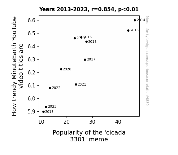
Trending Topics: The Buzzworthy Connection Between MinuteEarth YouTube Video Titles and the 'Cicada 3301' Meme
MinuteEarth's trendy video titles are actually coded messages that only the most elite internet solvers can decode, thus inadvertently fueling the mystery and intrigue of the 'cicada 3301' meme. It's like a cryptic puzzle game for the internet-savvy fashionistas. The connection is as elusive as the next viral meme!

What else correlates?
How trendy MinuteEarth YouTube video titles are · all YouTube
Popularity of the 'cicada 3301' meme · all memes
How trendy MinuteEarth YouTube video titles are · all YouTube
Popularity of the 'cicada 3301' meme · all memes
. The chart goes from 2002 to 2022, and the two variables track closely in value over that time.")

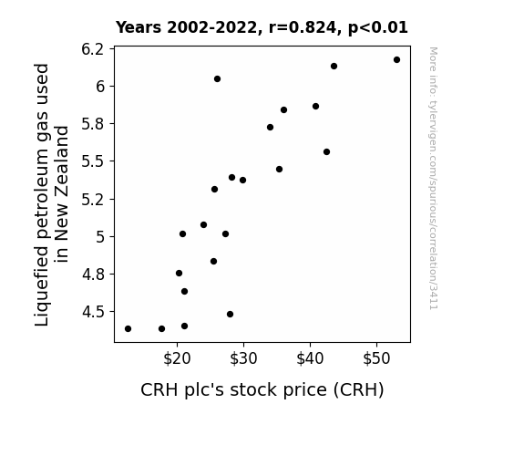
View details about correlation #3,411
The Propane Paradox: Exploring the Correlation Between Liquefied Petroleum Gas in New Zealand and CRH plc's Stock Price
As the LPG usage in New Zealand soared, it led to a nation-wide spike in backyard barbecuing. This, in turn, created an unprecedented demand for concrete and building materials as enthusiastic DIYers attempted to construct the ultimate outdoor entertainment areas. CRH plc, as a major supplier of these construction essentials, found their stock price sizzling as investors realized the grilling frenzy was boosting the company's bottom line.

What else correlates?
Liquefied petroleum gas used in New Zealand · all energy
CRH plc's stock price (CRH) · all stocks
Liquefied petroleum gas used in New Zealand · all energy
CRH plc's stock price (CRH) · all stocks


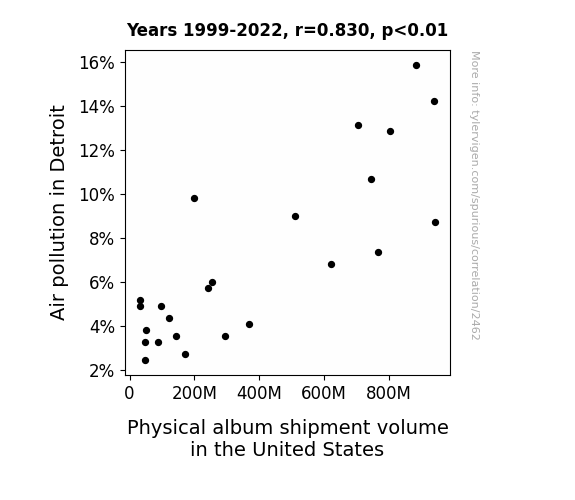
View details about correlation #2,462
From Carbon Monoxide to Compact Discs: A Critical Analysis of the Relationship Between Air Pollution in Detroit and Physical Album Shipment Volume in the United States
As air pollution in Detroit decreased, it led to a shortage of smog-colored vinyl for pressing physical albums, causing a decline in shipment volume. Remember, when it comes to music, sometimes it's all about that haze!

What else correlates?
Air pollution in Detroit · all weather
Physical album shipment volume in the United States · all weird & wacky
Air pollution in Detroit · all weather
Physical album shipment volume in the United States · all weird & wacky


View details about correlation #2,331
The Tatum Trend: A Stitch in Time Saves Nine
The name Tatum just exudes style and creativity, leading to a surge in fashion interest. It's like every Tatum born in Texas is destined to drape the Lone Star State in the finest fabrics and trendiest designs. It's a Tatum takeover, y'all!


What else correlates?
Popularity of the first name Tatum · all first names
The number of fashion designers in Texas · all cccupations
Popularity of the first name Tatum · all first names
The number of fashion designers in Texas · all cccupations


View details about correlation #4,117
The Cotton Connection: A Genetically Modified Oversight of World Cup Fervor
As farmers in Tennessee cut back on GMO cotton, the natural fibers became more appealing. This sparked a new trend in organic, hand-woven clothing, leading to a worldwide shortage of stylish attire. Without enough fashionable jerseys to wear, Cristiano Ronaldo had to sit out on some high-profile matches, leaving fans to wonder if he had simply unraveled under the pressure.


What else correlates?
GMO use in cotton in Tennessee · all food
Number of Portugal matches played by Cristiano Ronaldo · all sports
GMO use in cotton in Tennessee · all food
Number of Portugal matches played by Cristiano Ronaldo · all sports


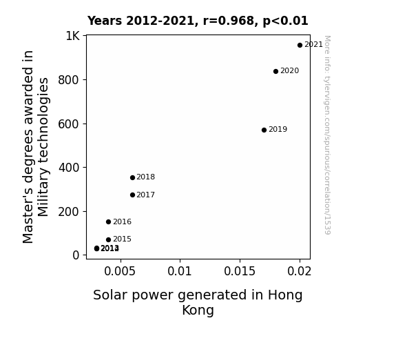
View details about correlation #1,539
Military Master's and Marvelous Molten Sunlight: Mapping the Connection in Hong Kong
As more individuals mastered the art of military technologies, they also became experts in tactics and *amp*erage, leading to a surge in solar power usage and innovation in Hong Kong. It was a shining example of how advanced knowledge in one field can truly power up progress in another! Remember, when it comes to bright ideas, the sky's the limit, but a Master's degree can sure help you aim for the sun!

What else correlates?
Master's degrees awarded in Military technologies · all education
Solar power generated in Hong Kong · all energy
Master's degrees awarded in Military technologies · all education
Solar power generated in Hong Kong · all energy


View details about correlation #1,513
Unidentified Fryer Objects: An Investigation into the Relationship between Tennessee UFO Sightings and Nathan's Hot Dog Consumption
The increased UFO sightings in Tennessee caused a surge in demand for alien-themed hot dog merchandise. This led to a collaboration between Nathan's and the UFO enthusiasts, resulting in the creation of the otherworldly delicious 'Galactic Dog'. As word of this unique, space-inspired hot dog spread, the reigning champion couldn't resist the chance to show off his out-of-this-world eating skills by devouring these alien delicacies in record quantities. It's a close encounter of the delicious kind that propelled him to victory, making him the unquestioned champion of consuming celestial sausages!


. The chart goes from 2003 to 2022, and the two variables track closely in value over that time.")

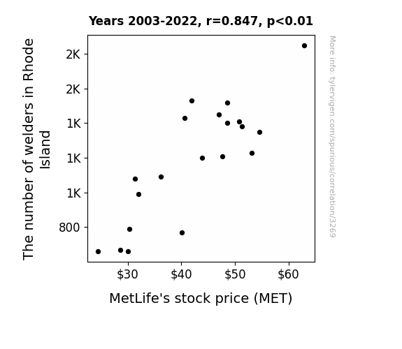
View details about correlation #3,269
Riveting Connections: The Welding Workforce and MetLife's Stock Price Movement
As the number of welders in Rhode Island rose, so did the sparks of creativity in the state. This led to an unexpected surge in metal art and sculptures, creating a higher demand for metal materials, including those used in MetLife's construction. This unforeseen connection was truly weld-ly understood by financial analysts, who realized that a state's spark can have a metallical impact on the stock market.
What else correlates?
The number of welders in Rhode Island · all cccupations
MetLife's stock price (MET) · all stocks
The number of welders in Rhode Island · all cccupations
MetLife's stock price (MET) · all stocks


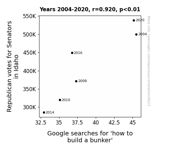
View details about correlation #4,613
Digging Deeper: The Correlation Between Republican Senatorial Votes in Idaho and Google Searches for 'How to Build a Bunker'
As more Republican senators were elected in Idaho, there was a correlating increase in demand for bunker construction. It seems the voters were really digging the idea of underground living.

What else correlates?
Votes for Republican Senators in Idaho · all elections
Google searches for 'how to build a bunker' · all google searches
Votes for Republican Senators in Idaho · all elections
Google searches for 'how to build a bunker' · all google searches


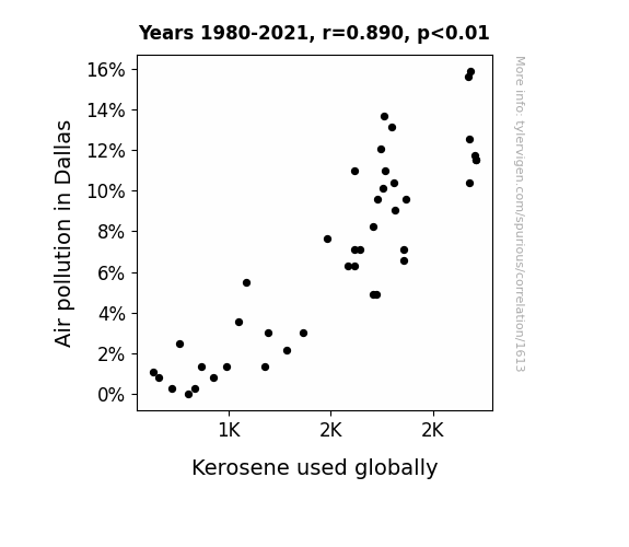
View details about correlation #1,613
Feeling the Burn: The Kerosene Connection to Air Pollution in Dallas
As air pollution decreased in Dallas, the local birds suddenly found their sense of direction, leading to a surge in efficient, straight-line migration patterns. These no-nonsense avian navigators inadvertently shamed international airlines into reevaluating their flight routes, prompting a switch to cleaner-burning fuels and a global decrease in kerosene usage. It's a case of the winds of change being fueled by the wings of precision!

What else correlates?
Air pollution in Dallas · all weather
Kerosene used globally · all energy
Air pollution in Dallas · all weather
Kerosene used globally · all energy


View details about correlation #3,232
The Rise of Rice: Uncovering the Rice Call Connection with Ford's Automotive Recalls
As rice consumption soared, there was a proportional surge in rice grain emissions. These emissions, containing tiny starchy particles, started infiltrating Ford vehicles. This led to a widespread issue that could only be described as a sticky situation. The cars were experiencing an unprecedented rise in interior gRice, causing the need for immediate recalls. It was a situation that no amount of car-bro-lators could riceist.


What else correlates?
Global Rice Consumption · all food
Automotive recalls issued by Ford Motor Company · all weird & wacky
Global Rice Consumption · all food
Automotive recalls issued by Ford Motor Company · all weird & wacky


View details about correlation #3,313
Mara-mba: The Mara Name Popularity and the Stakeout Situation in Ohio
As the name Mara rose in popularity, more and more parents subconsciously instilled a strong sense of curiosity and a knack for solving mysteries in their children. This led to a surge in aspiring detective careers, especially in Ohio. It seems the state just couldn't shake off the case of the Maranation!


What else correlates?
Popularity of the first name Mara · all first names
The number of private detectives in Ohio · all cccupations
Popularity of the first name Mara · all first names
The number of private detectives in Ohio · all cccupations


View details about correlation #4,194
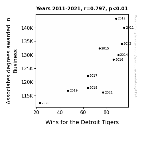
Batting for Business: The Unlikely Connection Between Associates Degrees in Business and the Detroit Tigers' Wins
As the number of business-savvy individuals dwindled, there was a sharp decline in the supply of 'Tiger' investors and financiers who could 'strike' lucrative deals for the team. With a 'paw'-city of economic know-how, the Detroit Tigers found themselves unable to 'claw' their way to financial success, ultimately leading to a decrease in wins. In other words, without those business degrees, the Tigers were simply not 'major league' contenders in the game of baseball economics!

What else correlates?
Associates degrees awarded in Business · all education
Wins for the Detroit Tigers · all sports
Associates degrees awarded in Business · all education
Wins for the Detroit Tigers · all sports


View details about correlation #3,305
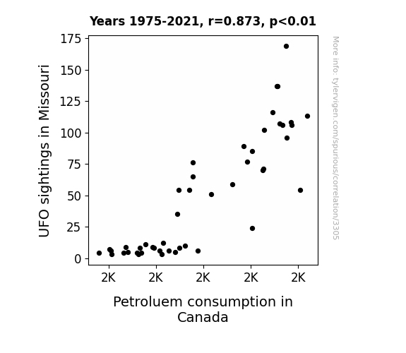
Unidentified Fuel Objects: Exploring the Connection Between UFO Sightings in Missouri and Petroleum Consumption in Canada
As more Missourians looked to the skies, they started to feel the need for more "galactic" energy sources. This surge in UFO sightings somehow led to a belief that Canada had the "space-age" technology needed to meet their fuel demands, causing an unexpected boost in Petroleum consumption. Who knew that interstellar visitors could spark an interest in Earthly resources! It looks like even aliens can't resist a good ol' Canadian gas station, eh?

What else correlates?
UFO sightings in Missouri · all random state specific
Petroluem consumption in Canada · all energy
UFO sightings in Missouri · all random state specific
Petroluem consumption in Canada · all energy


View details about correlation #3,119
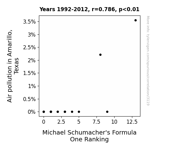
Racing Through the Smog: Unveiling the Air Pollution-Accelerated Race to Glory in Michael Schumacher's Formula One Career
The air pollution in Amarillo, Texas created a unique set of atmospheric conditions that somehow boosted Michael Schumacher's driving performance, propelling him up the Formula One rankings. It's like he had a secret turbo boost from the smog! Keep your eyes on the skies, because in Amarillo, it's not just the wind that's making things go faster! Total gas, but it seems like Schumacher found the perfect formula for success in that dirty air!

What else correlates?
Air pollution in Amarillo, Texas · all weather
Michael Schumacher's Formula One Ranking · all weird & wacky
Air pollution in Amarillo, Texas · all weather
Michael Schumacher's Formula One Ranking · all weird & wacky


View details about correlation #2,345
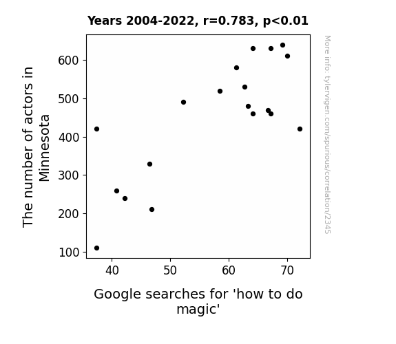
The Thespians of Minnesota: A Spellbinding Correlation Between Actor Numbers and Searches for 'How to Do Magic'
Fewer actors in Minnesota means there's a shortage of spellbinding performances, leading to less 'abracadabra' influence on the population's interest in magic. This has resulted in a dramatic decrease in the demand for learning how to do magic tricks. It seems the reel world has a reel effect on the search for magical knowledge!

What else correlates?
The number of actors in Minnesota · all cccupations
Google searches for 'how to do magic' · all google searches
The number of actors in Minnesota · all cccupations
Google searches for 'how to do magic' · all google searches
. The chart goes from 2002 to 2022, and the two variables track closely in value over that time.")

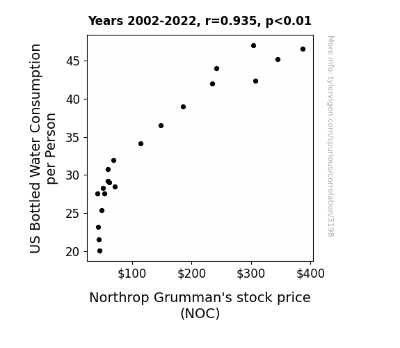
View details about correlation #3,198
Quench the Market: How US Bottled Water Consumption and Northrop Grumman's Stock Price Make Waves
As the demand for bottled water soared, Northrop Grumman's stock price ended up floating on a wave of success. This unexpected connection could be due to the fact that as people drank more water, they needed to take more bathroom breaks at work, leading to increased productivity and ultimately boosting the company's value. Remember folks, when it rains, it NOCs - it pours!

What else correlates?
US Bottled Water Consumption per Person · all food
Northrop Grumman's stock price (NOC) · all stocks
US Bottled Water Consumption per Person · all food
Northrop Grumman's stock price (NOC) · all stocks


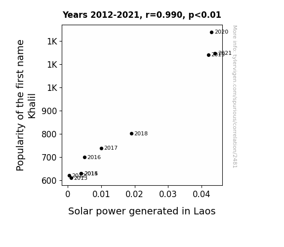
View details about correlation #2,481
Shocking Solar Connections: The Khalil Name Popularity and Solar Power Generation in Laos
It turns out, every time someone named Khalil is born, a secret organization in Laos known as the Solar Khalil Syndicate springs into action. These individuals, all inexplicably named Khalil, have a natural affinity for harnessing solar energy. As their numbers grow, so does the collective knowledge and expertise in solar power technology. It's a sunny side effect of sharing a name, leading to a radiant revolution in Laotian solar power production. Who would have thought that the key to a brighter, sunnier future lay in the name Khalil?

What else correlates?
Popularity of the first name Khalil · all first names
Solar power generated in Laos · all energy
Popularity of the first name Khalil · all first names
Solar power generated in Laos · all energy


View details about correlation #3,633
Curse or Verse: Rehearse Reverses in Kentucky UFO Sightings and Total Everest Climbs
The surge in UFO sightings in Kentucky has actually been a clever marketing ploy by a group of highly motivated Sherpas, who have been offering exclusive "out of this world" guided tours to the summit of Mount Everest. If you want to reach new heights, just follow the flying saucers to adventure! Remember, when it comes to reaching the top, the sky's the limit, but a UFO sighting could be the push you need to summit!


What else correlates?
UFO sightings in Kentucky · all random state specific
Total Number of Successful Mount Everest Climbs · all weird & wacky
UFO sightings in Kentucky · all random state specific
Total Number of Successful Mount Everest Climbs · all weird & wacky


View details about correlation #3,512
A Breath of Fresh Air: Exploring the Correlation Between Air Pollution in Birmingham and the Sky-High Number of Reinforcing Iron and Rebar Workers in Alabama
The cleaner air led to less rust forming on the iron and rebar, so there was less need for workers to reinforce and replace them.


What else correlates?
Air pollution in Birmingham · all weather
The number of reinforcing iron and rebar workers in Alabama · all cccupations
Air pollution in Birmingham · all weather
The number of reinforcing iron and rebar workers in Alabama · all cccupations
Why this works
- Data dredging: I have 25,237 variables in my database. I compare all these variables against each other to find ones that randomly match up. That's 636,906,169 correlation calculations! This is called “data dredging.”
Fun fact: the chart used on the wikipedia page to demonstrate data dredging is also from me. I've been being naughty with data since 2014.
Instead of starting with a hypothesis and testing it, I instead tossed a bunch of data in a blender to see what correlations would shake out. It’s a dangerous way to go about analysis, because any sufficiently large dataset will yield strong correlations completely at random. - Lack of causal connection: There is probably no direct connection between these variables, despite what the AI says above.
Because these pages are automatically generated, it's possible that the two variables you are viewing are in fact causually related. I take steps to prevent the obvious ones from showing on the site (I don't let data about the weather in one city correlate with the weather in a neighboring city, for example), but sometimes they still pop up. If they are related, cool! You found a loophole.
This is exacerbated by the fact that I used "Years" as the base variable. Lots of things happen in a year that are not related to each other! Most studies would use something like "one person" in stead of "one year" to be the "thing" studied. - Observations not independent: For many variables, sequential years are not independent of each other. You will often see trend-lines form. If a population of people is continuously doing something every day, there is no reason to think they would suddenly change how they are doing that thing on January 1. A naive p-value calculation does not take this into account.
You will calculate a lower chance of "randomly" achieving the result than represents reality.
To be more specific: p-value tests are probability values, where you are calculating the probability of achieving a result at least as extreme as you found completely by chance. When calculating a p-value, you need to assert how many "degrees of freedom" your variable has. I count each year (minus one) as a "degree of freedom," but this is misleading for continuous variables.
This kind of thing can creep up on you pretty easily when using p-values, which is why it's best to take it as "one of many" inputs that help you assess the results of your analysis.
- Y-axes doesn't start at zero: I truncated the Y-axes of the graphs above. I also used a line graph, which makes the visual connection stand out more than it deserves.
Nothing against line graphs. They are great at telling a story when you have linear data! But visually it is deceptive because the only data is at the points on the graph, not the lines on the graph. In between each point, the data could have been doing anything. Like going for a random walk by itself!
Mathematically what I showed is true, but it is intentionally misleading. If you click on any of the charts that abuse this, you can scroll down to see a version that starts at zero. - Confounding variable: Confounding variables (like global pandemics) will cause two variables to look connected when in fact a "sneaky third" variable is influencing both of them behind the scenes.
- Outliers: Some datasets here have outliers which drag up the correlation.
In concept, "outlier" just means "way different than the rest of your dataset." When calculating a correlation like this, they are particularly impactful because a single outlier can substantially increase your correlation.
Because this page is automatically generated, I don't know whether any of the charts displayed on it have outliers. I'm just a footnote. ¯\_(ツ)_/¯
I intentionally mishandeled outliers, which makes the correlation look extra strong. - Low n: There are not many data points included in some of these charts.
You can do analyses with low ns! But you shouldn't data dredge with a low n.
Even if the p-value is high, we should be suspicious of using so few datapoints in a correlation.
Pro-tip: click on any correlation to see:
- Detailed data sources
- Prompts for the AI-generated content
- Explanations of each of the calculations (correlation, p-value)
- Python code to calculate it yourself


