spurious correlations
discover · random · spurious scholar
← previous page · next page →


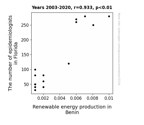
View details about correlation #3,318
An Epidemic Correlation: The Contagious Connection Between Epidemiologists in Florida and Renewable Energy Production in Benin
As the epidemiologists flocked to Florida, they inadvertently brought with them a wave of infectious enthusiasm for sustainable practices. This newfound focus on public health may have sparked a competition to see which country could harness the most renewable energy, ultimately leading to Benin ramping up its production. Looks like Florida's epidemiologists are not only experts in disease control, but also in spreading a 'positive energy' epidemic across borders!

What else correlates?
The number of epidemiologists in Florida · all cccupations
Renewable energy production in Benin · all energy
The number of epidemiologists in Florida · all cccupations
Renewable energy production in Benin · all energy


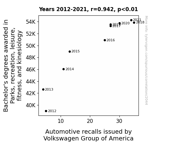
View details about correlation #2,044
Driving the Connection: An Examination of the Correlation Between Bachelor's Degrees in Parks, Recreation, Leisure, Fitness, and Kinesiology and Automotive Recalls by Volkswagen Group of America
As more people became knowledgeable about the importance of physical activity, there was a surge in demand for Volkswagen's vehicles to come equipped with state-of-the-art fitness and leisure features. Unfortunately, this led to a series of automotive recalls as the company tried to keep up with the unexpected trend of workout-friendly cars. Who knew that a passion for parks and recreation would drive such a need for vehicle innovation!


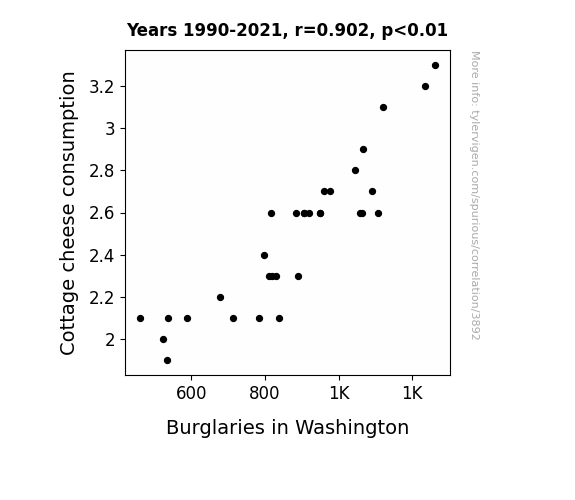
View details about correlation #3,892
Culture of Thievery: A Curd Connection Between Cottage Cheese Consumption and Burglaries in Washington
As people consumed less cottage cheese, they emitted fewer lactose-induced sleep sounds, leading to decreased deep sleep. The resulting increase in semi-conscious awareness created a collective neighborhood watch, deterring potential burglars. So, remember, the curd may be the key to curbing crime!

What else correlates?
Cottage cheese consumption · all food
Burglaries in Washington · all random state specific
Cottage cheese consumption · all food
Burglaries in Washington · all random state specific


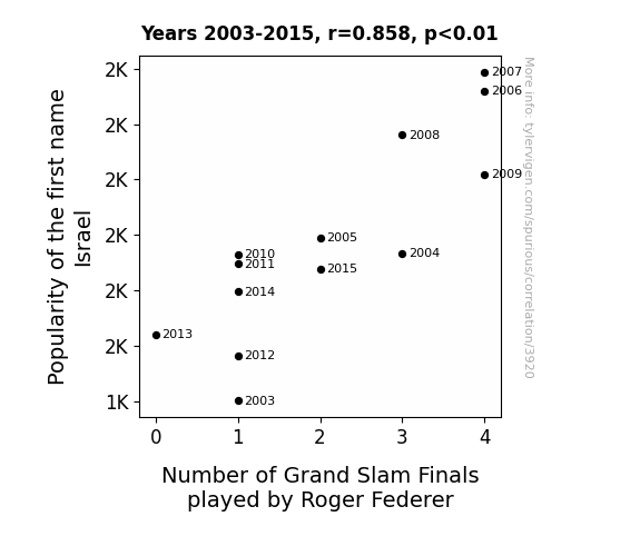
View details about correlation #3,920
Federer and Israel: A Name Fame Game
More people naming their kids after a country with a strong tennis presence has created a 'Federer'ation effect, leading to a surge in young tennis talent and ultimately, more players reaching the Grand Slam finals. It's all about serving up inspiration and acing those match statistics!

What else correlates?
Popularity of the first name Israel · all first names
Number of Grand Slam Finals played by Roger Federer · all sports
Popularity of the first name Israel · all first names
Number of Grand Slam Finals played by Roger Federer · all sports


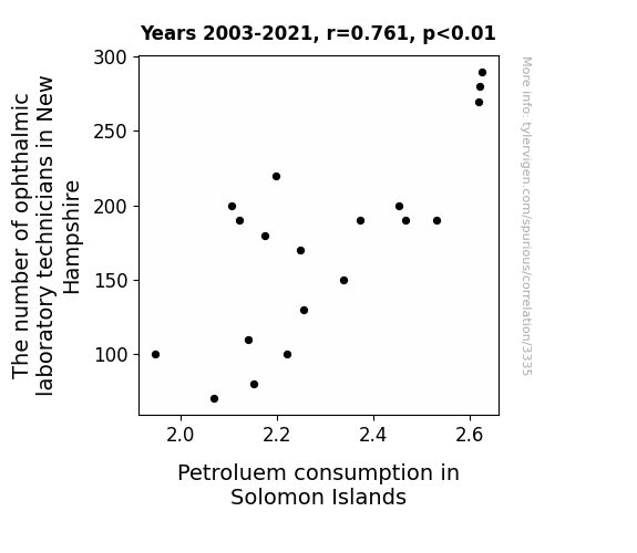
View details about correlation #3,335
Seeing Clearly: The Correlation Between Ophthalmic Laboratory Technicians in New Hampshire and Petroleum Consumption in the Solomon Islands
As the demand for eyeglasses in New Hampshire surged, so did the need for lenses. This led to a boom in the global petroleum industry, including the Solomon Islands, where the sudden call for tiny lens adjustments somehow revved up their petrol consumption. It's a spectacle how this ocular occupation in the US ended up fueling the remote island nation's gas usage!


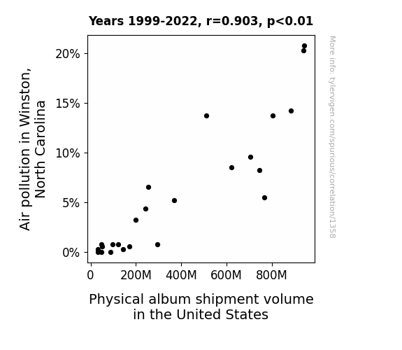
View details about correlation #1,358
The Wheezy Hits: A Breath of Fresh Air on Physical Album Shipments in the U.S.
The cleaner air in Winston, North Carolina led to an unprecedented boom in outdoor activities. As a result, people were too busy frolicking in the fresh, smog-free environment to bother with buying or shipping physical albums across the United States. Who needs music when you've got the sweet sounds of nature, right? Plus, all that extra oxygen must have just made everyone feel so alive that they didn't need music to lift their spirits anymore!


View details about correlation #4,627
Butter Flutter: How Butter Consumption is Related to the Length of Mark Rober's YouTube Videos
As butter consumption went up, so did the length of Mark Rober's videos. It's a slippery slope of correlation and causation - seems like the more butter we spread, the longer his content churns out. Maybe all that extra butter got people to really 'unwind' and watch, leading Mark to 'butter up' his videos with more 'cream' of entertainment. Who knew that the key to extended Rober content was just a 'butter' understanding of viewer preferences?


What else correlates?
Butter consumption · all food
Total length of Mark Rober YouTube videos · all YouTube
Butter consumption · all food
Total length of Mark Rober YouTube videos · all YouTube


View details about correlation #2,263
Counting Ushers in Connecticut: A Correlative Chronicle of Jet Fuel Jogging in Japan
With fewer ushers in Connecticut, there's less need for them to *jet* around, leading to a decrease in international travel. As a result, there's a lower demand for jet fuel in Japan. Who would have thought that ushers in Connecticut had a role in fueling the skies over Japan? Those poor ushers must be feeling *plane* neglected these days.


What else correlates?
The number of ushers in Connecticut · all cccupations
Jet fuel used in Japan · all energy
The number of ushers in Connecticut · all cccupations
Jet fuel used in Japan · all energy
. The chart goes from 2002 to 2022, and the two variables track closely in value over that time.")

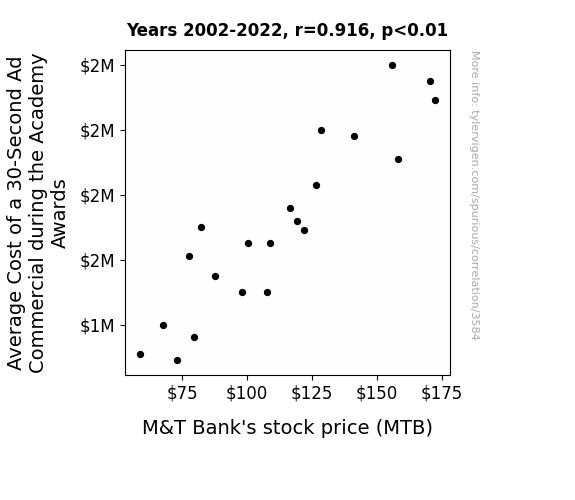
View details about correlation #3,584
The Ad Yields for MTB Shields Revealed: The Relationship Between Academy Awards Ad Costs and M&T Bank's Stock Price
As the Average Cost of a 30-Second Ad Commercial during the Academy Awards goes up, more companies are forced to dig deep into their vaults to afford the coveted airtime. This causes a surge in demand for loans and financial services, leading to increased profits for banks. M&T Bank, in particular, sees a boon as businesses flock to secure the necessary funds for their extravagant Oscar-worthy advertisements. In a twist of financial fate, it seems that M&T Bank has found a way to turn lights, camera, and action into cold, hard cash.


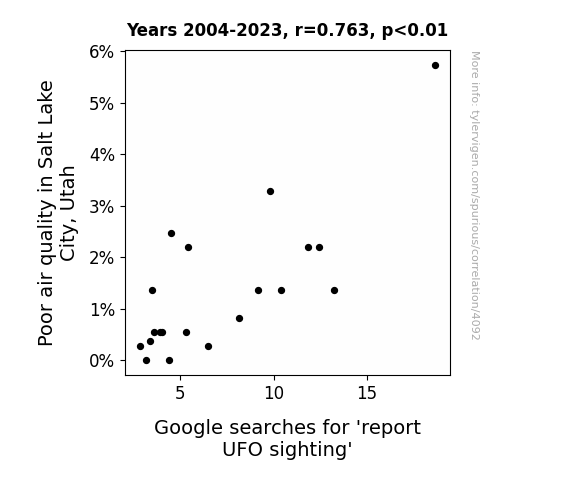
View details about correlation #4,092
Out of This World Air Pollution: An Analysis of the Relationship Between Air Quality in Salt Lake City, Utah and Google Searches for 'Report UFO Sighting'
The aliens finally realized that Salt Lake City wasn't worth the trip because the air quality was so abysmal. Or perhaps the UFOs were just big fans of smog, and when it cleared up, they decided to saucer off to a smokier spot.

What else correlates?
Air pollution in Salt Lake City, Utah · all weather
Google searches for 'report UFO sighting' · all random state specific
Air pollution in Salt Lake City, Utah · all weather
Google searches for 'report UFO sighting' · all random state specific


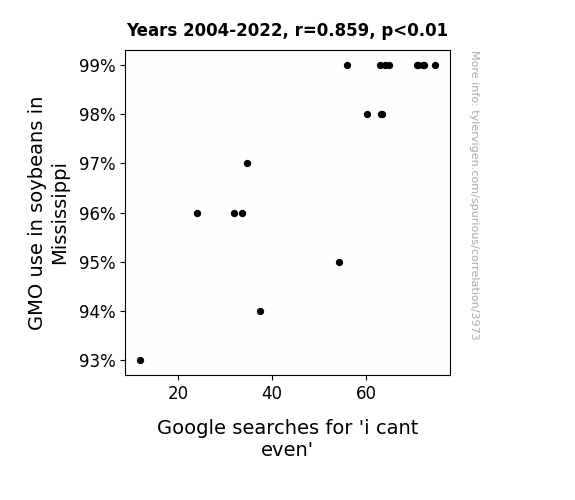
View details about correlation #3,973
Genetically Modified Galore: GMO use in Mississippi's Soybeans and the Goofy Google Searches for 'I Can't Even'
The GMO soybeans were so emotionally unstable, they were constantly having identity crises, leading to a ripple effect of existential confusion across the state, ultimately causing people to 'cant even' as they pondered the true meaning of soy.

What else correlates?
GMO use in soybeans in Mississippi · all food
Google searches for 'i cant even' · all google searches
GMO use in soybeans in Mississippi · all food
Google searches for 'i cant even' · all google searches


View details about correlation #2,579
Inspecting the Fuelish: Exploring the Relationship Between Transportation Inspectors in Delaware and Jet Fuel Consumption in Brazil
More transportation inspectors in Delaware meant smoother traffic flow, leading to quicker transport of jet fuel from Delaware to Brazilian airports. This improved 'inspector of the fuel' efficiency, ultimately fueling the demand for jet fuel in Brazil!
What else correlates?
The number of transportation inspectors in Delaware · all cccupations
Jet fuel used in Brazil · all energy
The number of transportation inspectors in Delaware · all cccupations
Jet fuel used in Brazil · all energy
. The chart goes from 2002 to 2022, and the two variables track closely in value over that time.")

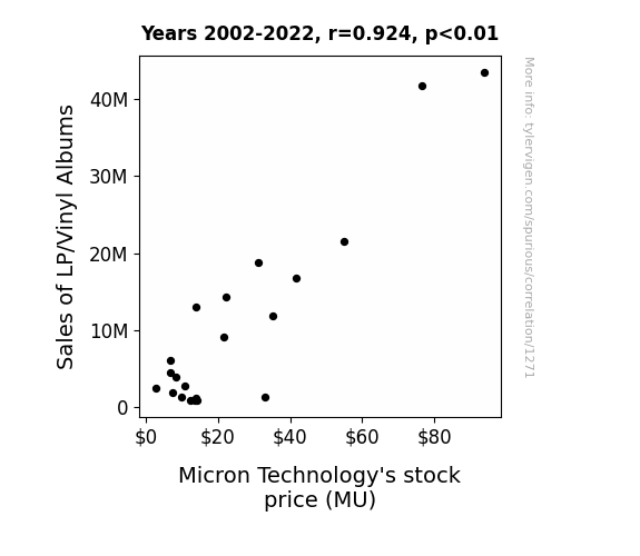
View details about correlation #1,271
Spinning Profits: The Sound Relationship between LP/Vinyl Album Sales and Micron Technology's Stock Price
As LP/vinyl album sales increased, more people dusted off their old record players, leading to a demand for outdated technology. This surge in demand for old tech made investors realize that sometimes the best way to move forward is to take a spin backward, causing an uptick in Micron Technology's stock price. It seems like in the stock market, the 'groovier' the connection, the higher the price goes!

What else correlates?
Sales of LP/Vinyl Albums · all weird & wacky
Micron Technology's stock price (MU) · all stocks
Sales of LP/Vinyl Albums · all weird & wacky
Micron Technology's stock price (MU) · all stocks


View details about correlation #4,729
Studying the Asphalt-tively Impactful Relationship Between Transportation Bachelor's Degrees and Air Pollution in Laramie, Wyoming
As more and more students graduated with expertise in transportation and materials moving, they couldn't resist the temptation to rev up their engines and show off their skills. Whether it was drag racing in their souped-up cars or attempting to execute professional-grade maneuvers in big rigs, the newly-degreed individuals unwittingly turned the peaceful streets of Laramie into a chaotic, exhaust-filled arena of vehicular mayhem. As a result, air pollution levels skyrocketed, creating a cloud of irony over the city's academic and environmental ambitions. Who would have thought that the path to cleaner, more efficient transportation in Laramie would need to begin with a gentle reminder to the experts-to-be: sometimes, it's best to just, well, carpool.
What else correlates?
Bachelor's degrees awarded in Transportation · all education
Air pollution in Laramie, Wyoming · all weather
Bachelor's degrees awarded in Transportation · all education
Air pollution in Laramie, Wyoming · all weather


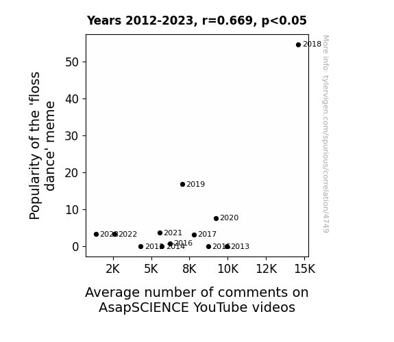
View details about correlation #4,749
Finding Floss: A Frolicsome Framework for Fathoming the Fad Factor in YouTube Comments
The 'floss dance' meme has created a viral sensation, causing a surge in people wanting to participate in the latest dance craze. As this meme spread like dental plaque, more and more individuals felt compelled to join in, leading to an increase in overall engagement with online content. So, it's clear that the 'floss dance' has really helped AsapSCIENCE to brush up on their comment count! Remember, when it comes to internet trends, it's all about finding the right rhythm to keep the audience grooving along!

What else correlates?
Popularity of the 'floss dance' meme · all memes
Average number of comments on AsapSCIENCE YouTube videos · all YouTube
Popularity of the 'floss dance' meme · all memes
Average number of comments on AsapSCIENCE YouTube videos · all YouTube


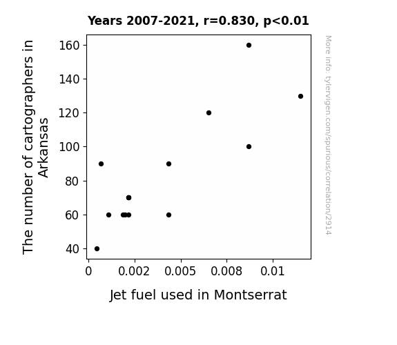
View details about correlation #2,914
Navigating the Skies and the States: A Cartographic Analysis of the Correlation between Arkansas Cartographers and Jet Fuel Consumption in Montserrat
As the number of cartographers in Arkansas decreased, there were fewer accurate maps of the state. This led to confusion about the location of Montserrat, resulting in less jet fuel being routed to the incorrect destination. It turns out, you can't just wing it when it comes to navigating flights!

What else correlates?
The number of cartographers in Arkansas · all cccupations
Jet fuel used in Montserrat · all energy
The number of cartographers in Arkansas · all cccupations
Jet fuel used in Montserrat · all energy


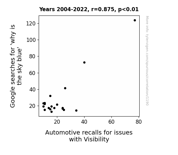
View details about correlation #1,190
The Blue Sky Inquiry: Exploring the Link between Internet Searches and Automotive Visibility Recalls
As people frantically searched for the answer, it created a surge of brain power that inadvertently interfered with the visibility systems in cars, leading to a higher likelihood of automotive recalls for visibility issues. It seems the quest for knowledge had some unintended and misty consequences on the roads!


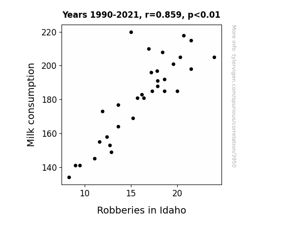
View details about correlation #3,950
Milk and Moolah: Exploring the Creamy Connection Between Milk Consumption and Robberies in Idaho
Fewer dairy-related daredevils were attempting to execute the infamous "milk run" heists, resulting in a udderly dramatic drop in dairy crime. As moo-ving as it may seem, the correlation between milk consumption and robberies in Idaho was nothing but a dairy coincidence!

What else correlates?
Milk consumption · all food
Robberies in Idaho · all random state specific
Milk consumption · all food
Robberies in Idaho · all random state specific


View details about correlation #4,896
The Kareem Connection: A Study of Popularity and Clickbait in Steve Mould's YouTube Video Titles
As the name Kareem gained popularity, more and more people were drawn to acts of kindness and generosity. This positivity created a ripple effect, leading to an upsurge in the demand for heartwarming content. Consequently, Steve Mould, being a part of this interconnected web of goodwill, felt the urge to make his video titles 'mould' around clickbait-y, feel-good themes, much to the delight of his viewers. It's a Kareem-ful what a little name trend can inspire!


What else correlates?
Popularity of the first name Kareem · all first names
How clickbait-y Steve Mould's YouTube video titles are · all YouTube
Popularity of the first name Kareem · all first names
How clickbait-y Steve Mould's YouTube video titles are · all YouTube


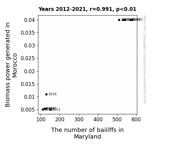
View details about correlation #3,104
Biomass Power Blossoms, Bailiffs' Booms: Examining the Unlikely Link
As the Biomass power in Morocco grew, it inadvertently sparked a surge in the energy industry. This reignited the passion for power in Maryland, leading to a shocking demand for bailiffs to help keep current flowing. It seems like the bailiffs in Maryland are just trying to branch out into a new field and establish some roots!

What else correlates?
Biomass power generated in Morocco · all energy
The number of bailiffs in Maryland · all cccupations
Biomass power generated in Morocco · all energy
The number of bailiffs in Maryland · all cccupations
Why this works
- Data dredging: I have 25,237 variables in my database. I compare all these variables against each other to find ones that randomly match up. That's 636,906,169 correlation calculations! This is called “data dredging.”
Fun fact: the chart used on the wikipedia page to demonstrate data dredging is also from me. I've been being naughty with data since 2014.
Instead of starting with a hypothesis and testing it, I instead tossed a bunch of data in a blender to see what correlations would shake out. It’s a dangerous way to go about analysis, because any sufficiently large dataset will yield strong correlations completely at random. - Lack of causal connection: There is probably no direct connection between these variables, despite what the AI says above.
Because these pages are automatically generated, it's possible that the two variables you are viewing are in fact causually related. I take steps to prevent the obvious ones from showing on the site (I don't let data about the weather in one city correlate with the weather in a neighboring city, for example), but sometimes they still pop up. If they are related, cool! You found a loophole.
This is exacerbated by the fact that I used "Years" as the base variable. Lots of things happen in a year that are not related to each other! Most studies would use something like "one person" in stead of "one year" to be the "thing" studied. - Observations not independent: For many variables, sequential years are not independent of each other. You will often see trend-lines form. If a population of people is continuously doing something every day, there is no reason to think they would suddenly change how they are doing that thing on January 1. A naive p-value calculation does not take this into account.
You will calculate a lower chance of "randomly" achieving the result than represents reality.
To be more specific: p-value tests are probability values, where you are calculating the probability of achieving a result at least as extreme as you found completely by chance. When calculating a p-value, you need to assert how many "degrees of freedom" your variable has. I count each year (minus one) as a "degree of freedom," but this is misleading for continuous variables.
This kind of thing can creep up on you pretty easily when using p-values, which is why it's best to take it as "one of many" inputs that help you assess the results of your analysis.
- Y-axes doesn't start at zero: I truncated the Y-axes of the graphs above. I also used a line graph, which makes the visual connection stand out more than it deserves.
Nothing against line graphs. They are great at telling a story when you have linear data! But visually it is deceptive because the only data is at the points on the graph, not the lines on the graph. In between each point, the data could have been doing anything. Like going for a random walk by itself!
Mathematically what I showed is true, but it is intentionally misleading. If you click on any of the charts that abuse this, you can scroll down to see a version that starts at zero. - Confounding variable: Confounding variables (like global pandemics) will cause two variables to look connected when in fact a "sneaky third" variable is influencing both of them behind the scenes.
- Outliers: Some datasets here have outliers which drag up the correlation.
In concept, "outlier" just means "way different than the rest of your dataset." When calculating a correlation like this, they are particularly impactful because a single outlier can substantially increase your correlation.
Because this page is automatically generated, I don't know whether any of the charts displayed on it have outliers. I'm just a footnote. ¯\_(ツ)_/¯
I intentionally mishandeled outliers, which makes the correlation look extra strong. - Low n: There are not many data points included in some of these charts.
You can do analyses with low ns! But you shouldn't data dredge with a low n.
Even if the p-value is high, we should be suspicious of using so few datapoints in a correlation.
Pro-tip: click on any correlation to see:
- Detailed data sources
- Prompts for the AI-generated content
- Explanations of each of the calculations (correlation, p-value)
- Python code to calculate it yourself


