spurious correlations
discover · random · spurious scholar
← previous page · next page →


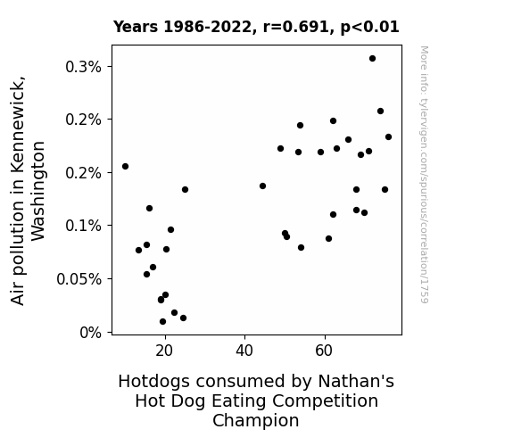
View details about correlation #1,759
Air Pollution in Kennewick, Affecting the Nathan's Hot Dog Champion's Pick
As air pollution in Kennewick, Washington increases, it creates a unique blend of smoky flavors that wafts through the air. This inadvertently triggers a craving for that charred, BBQ taste in the reigning Nathan's Hot Dog Eating Competition Champion. As they practice outdoors, they find themselves inhaling the tantalizing smog-infused aroma, which inexplicably boosts their appetite for hotdogs. The champion ends up consuming record-breaking numbers of hotdogs, all thanks to the unintentional air seasoning from Kennewick.

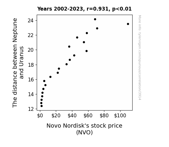
. The chart goes from 2002 to 2023, and the two variables track closely in value over that time.")

View details about correlation #3,914
Planetary Proximity and Pharma Fortunes: Unveiling the Influence of Neptune-Uranus Distance on Novo Nordisk Stock Price
As the gap widened, it created a gravitational stock pull, leading investors to orbit around NVO. The celestial surge in demand sent the stock price on a rocketing trajectory, reaching for new all-time highs like a space probe with a mission to Mars.

What else correlates?
The distance between Neptune and Uranus · all planets
Novo Nordisk's stock price (NVO) · all stocks
The distance between Neptune and Uranus · all planets
Novo Nordisk's stock price (NVO) · all stocks


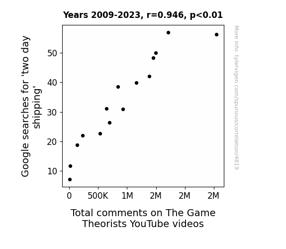
View details about correlation #4,819
The Two-day Treasures: Tying Total comments to Trendy Google searches
Because people received their Game Theorist merchandise faster and had more time to watch and comment on the videos. It's simple math - faster shipping means faster fandom engagement!


View details about correlation #3,152
Shedding Light on the Broker-Solar Connection: An Illuminating Investigation
As the number of real estate brokers in New Mexico rises, so does the level of enthusiasm for open houses. This heightened enthusiasm creates a ripple effect, leading to an increase in the frequency of solar power open houses in Gabon. Attendees at these open houses, fueled by a passion for both property and renewable energy, become ardent advocates for solar power. This surge in solar power advocacy translates to a greater investment in and adoption of solar technology in Gabon, ultimately boosting the overall solar power generation in the country. It’s a shining example of how real estate passion in one part of the world can spark a solar revolution in another!


What else correlates?
The number of real estate brokers in New Mexico · all cccupations
Solar power generated in Gabon · all energy
The number of real estate brokers in New Mexico · all cccupations
Solar power generated in Gabon · all energy


View details about correlation #1,975
Breath of Fresh Flare: A Wheezy Analysis of Air Pollution in Oklahoma City and its Impact on Asthma Attacks in American Children
Turns out, with the air getting cleaner, the local dust bunnies were feeling insecure and decided to pack their bags and leave town. These airborne allergens just couldn't handle the newfound freshness. And with the dust bunnies gone, the asthma attacks hopped right along with them. Remember, a wheeze-free city is just a clean-sweep away!


What else correlates?
Air pollution in Oklahoma City · all weather
Asthma attacks in American children · all weird & wacky
Air pollution in Oklahoma City · all weather
Asthma attacks in American children · all weird & wacky


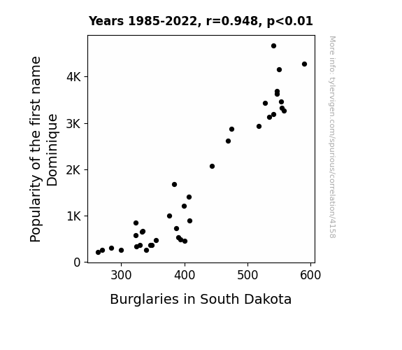
View details about correlation #4,158
Dominique in Distress: An Investigation into the Burgling Burden in South Dakota
As the popularity of the name Dominique decreased, so did the number of people named Dom in South Dakota. This led to a shortage of individuals with cat-burglar-like agility and stealth in the state, ultimately decreasing the overall number of successful burglaries. It turns out, when there are fewer Doms, there are fewer pilfering problems in the Peace Garden State!

What else correlates?
Popularity of the first name Dominique · all first names
Burglaries in South Dakota · all random state specific
Popularity of the first name Dominique · all first names
Burglaries in South Dakota · all random state specific


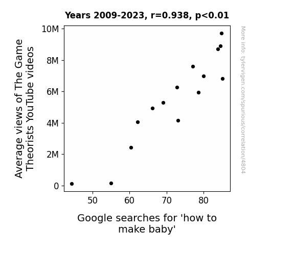
View details about correlation #4,804
The Game Theorists: How to Score a Baby Boom on YouTube
As the number of people delving into complex gaming theories grew, so did their mastery of strategic maneuvers. This newfound expertise must have extended to the game of love, leading to a surge in interest in unlocking the ultimate achievement: making a baby. After all, when you've mastered the art of navigating alternate realities, creating a tiny human must seem like the next level boss fight!


View details about correlation #3,064
Churning the Sun: Exploring the Margarine Between Butter Consumption and Solar Power Generation in Sudan
As butter consumption increased, people were getting extra charged up, leading to a greater demand for appliances and ultimately boosting the need for solar power in Sudan. It's like they say, you can't believe it's not butter, and you won't believe the power of the sun!


What else correlates?
Butter consumption · all food
Solar power generated in Sudan · all energy
Butter consumption · all food
Solar power generated in Sudan · all energy


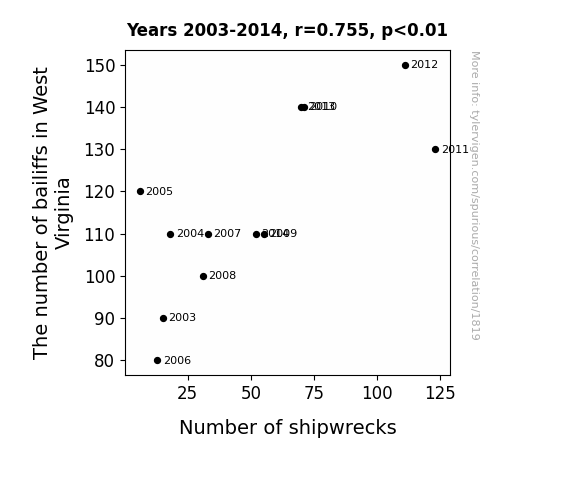
View details about correlation #1,819
Anchored Correlations: Exploring the Link Between Bailiffs in West Virginia and Global Shipwrecks
As the number of bailiffs in West Virginia increased, more and more people started practicing their courtroom dramas on boats, leading to a rise in global shipwrecks. It turns out, West Virginia's got a whole new wave of maritime law enthusiasts making waves around the world! Or maybe the bailiffs were just trying to serve some "subpoena" sandwiches to the high seas offenders!

What else correlates?
The number of bailiffs in West Virginia · all cccupations
Global shipwrecks · all weird & wacky
The number of bailiffs in West Virginia · all cccupations
Global shipwrecks · all weird & wacky


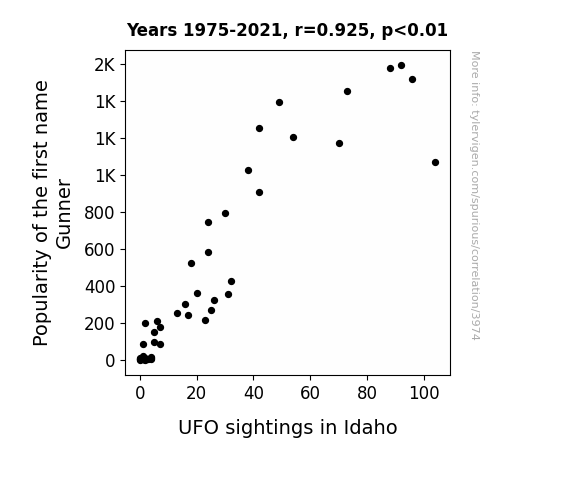
View details about correlation #3,974
Out of This World: The Gunner-Galactic Connection
As the name Gunner gained popularity, more and more parents subconsciously steered their children toward aviation and space-related interests. This led to a surge in amateur rocketry and drone activity in Idaho. With the skies becoming increasingly crowded, it's no wonder that there was a spike in reported UFO sightings. Remember, it's all fun and games until little Gunner accidentally launches himself to the stars in a homemade rocket ship!

What else correlates?
Popularity of the first name Gunner · all first names
UFO sightings in Idaho · all random state specific
Popularity of the first name Gunner · all first names
UFO sightings in Idaho · all random state specific


View details about correlation #4,580
Blowin' in the Wind: The Correlation Between Air Quality in Kingsport, Tennessee and Google Searches for 'President Phone Number'
As air quality improved in Kingsport, Tennessee, more people were able to think clearly. This led to an increase in productivity, prompting individuals to take on new challenges. Suddenly, a wave of ambition swept the nation, and everyone had the same bright idea - why not give the President a call and share their thoughts on clean air? It seems like the clear skies in Kingsport weren't the only thing reaching new heights!


What else correlates?
Air quality in Kingsport, Tennessee · all weather
Google searches for 'President phone number' · all google searches
Air quality in Kingsport, Tennessee · all weather
Google searches for 'President phone number' · all google searches


View details about correlation #3,129
Cheesy Correlations: Connecting American Cheese Consumption with Wind Power in Peru
As American cheese consumption rises, so does the collective gas production from all the cheese-loving consumers. This leads to an unexpected surge in wind power generated in Peru as the gusts of cheese-induced flatulence waft across the continent, turning those turbines with newfound gaseous gusto. It's a truly cutting-edge solution to renewable energy, all thanks to the power of cheese!


What else correlates?
American cheese consumption · all food
Wind power generated in Peru · all energy
American cheese consumption · all food
Wind power generated in Peru · all energy


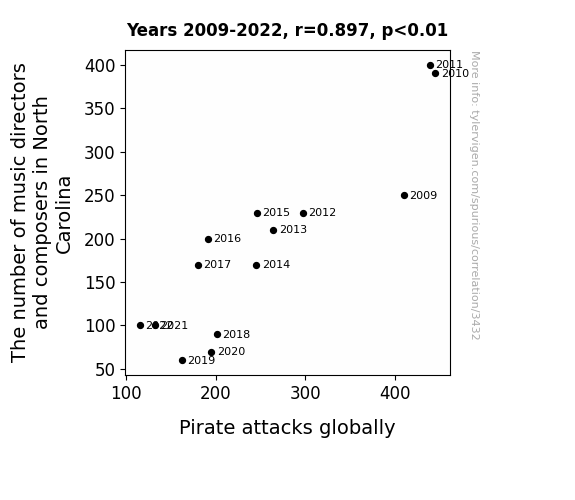
View details about correlation #3,432
A Cacophony of Tones: The Relationship Between Music Directors and Composers in North Carolina and Global Pirate Attacks
As the number of music directors and composers in North Carolina decreases, there are less opportunities for sea shanty orchestras to form. This leads to a decline in the production of catchy pirate tunes. With no new hits to inspire them, pirates around the world lose their motivation to engage in epic swashbuckling activities, ultimately leading to a global decrease in pirate attacks. It seems that without the right soundtrack, even the most fearsome pirates just can't seem to get into the pirating spirit.

What else correlates?
The number of music directors and composers in North Carolina · all cccupations
Pirate attacks globally · all weird & wacky
The number of music directors and composers in North Carolina · all cccupations
Pirate attacks globally · all weird & wacky
. The chart goes from 2012 to 2021, and the two variables track closely in value over that time.")

View details about correlation #3,933
From Degrees to Dividends: The Stock Price Benefits of Bachelor's Degrees in Military Technologies for KLA Corporation
As more military technology experts emerged, the demand for highly advanced potato peeling mechanisms skyrocketed. KLA Corporation, known for their expertise in precision engineering, quickly pivoted to dominate the lucrative market for state-of-the-art automated potato peeling machines, leading to a surge in their stock price.

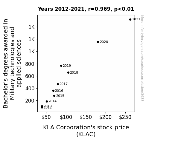
What else correlates?
Bachelor's degrees awarded in Military technologies · all education
KLA Corporation's stock price (KLAC) · all stocks
Bachelor's degrees awarded in Military technologies · all education
KLA Corporation's stock price (KLAC) · all stocks


View details about correlation #4,573
Name Fame and Video Game: The Lana Legacy's Influence on LEMMiNO Likes
Every time someone named Lana watched a LEMMiNO video, they couldn't help but hit the like button in a subconscious act of self-affirmation for having an awesome name. This created a ripple effect, with more and more Lanas promoting the videos simply by having great taste in content. It's like a secret society of Lanas, silently but powerfully boosting video likes across the internet.

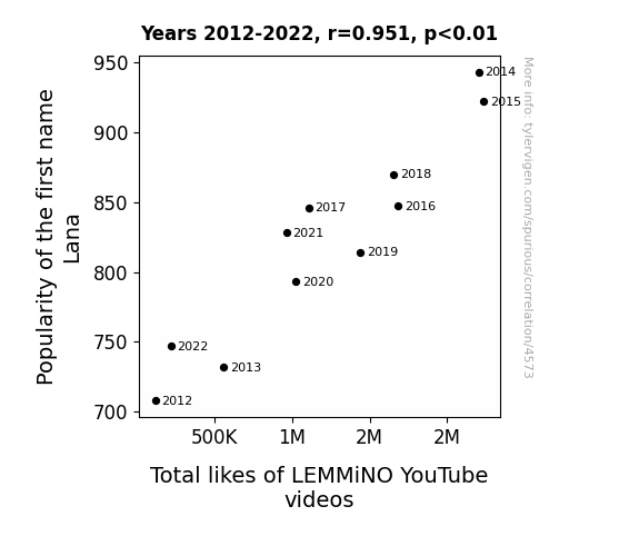
What else correlates?
Popularity of the first name Lana · all first names
Total likes of LEMMiNO YouTube videos · all YouTube
Popularity of the first name Lana · all first names
Total likes of LEMMiNO YouTube videos · all YouTube


View details about correlation #1,303
The Barley and the Pacific: A Kerosene Connection Brewed in Surprising Correlation
It turns out, when there's less barley around, barley farmers have more free time. And what do they do with that free time? Start a backyard kerosene production operation, of course! It's the latest trend in agricultural diversification - forget wheat and corn, it's all about that homemade kerosene now. Who would've thought that barley and kerosene would have anything in common, but here we are, witnessing the birth of a fiery new industry!

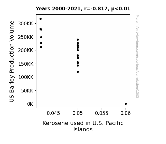
What else correlates?
US Barley Production Volume · all food
Kerosene used in U.S. Pacific Islands · all energy
US Barley Production Volume · all food
Kerosene used in U.S. Pacific Islands · all energy


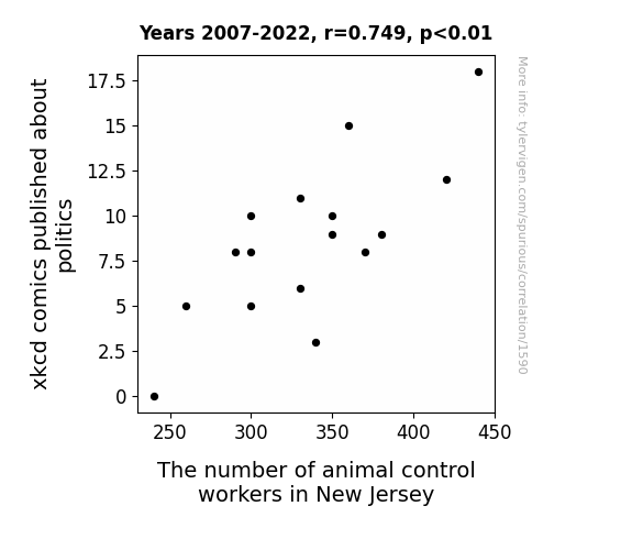
View details about correlation #1,590
The Xkcd Factor: Anecdotal Evidence of the Impact of Political Comics on Animal Control Employment Trends in New Jersey
As xkcd comics about politics decreased, their signature combination of wit and satire was no longer able to contain the wild antics of the political landscape. This led to a surge in politicians behaving like unruly animals, prompting a higher demand for animal control workers in New Jersey to wrangle and manage the newly feral government officials. The ensuing chaos ultimately required a specialized task force of animal control workers to navigate the political jungle, thus contributing to the overall increase in manpower dedicated to taming the political zoo.


View details about correlation #3,845
Air Pollution in Blacksburg: A Statistical Tug-of-War with Violent Crime Rates
As the air quality improved, people could finally take deep breaths without feeling like they were inhaling their daily stress. This led to an overall calmer demeanor and a reduced inclination to engage in violent behavior. It’s amazing what a little extra oxygen can do for the town’s peace and tranquility.

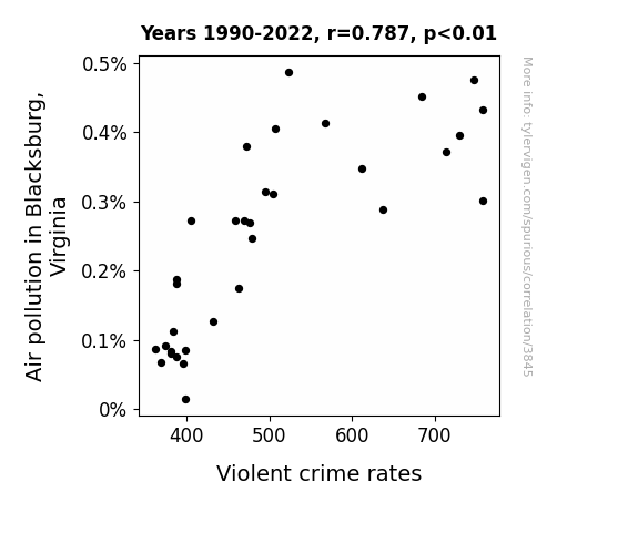
What else correlates?
Air pollution in Blacksburg, Virginia · all weather
Violent crime rates · all random state specific
Air pollution in Blacksburg, Virginia · all weather
Violent crime rates · all random state specific
. The chart goes from 2002 to 2022, and the two variables track closely in value over that time.")

View details about correlation #3,838
Banking on Popularity: The Jess-tification of Lloyds Banking Group's Stock Price
Apparently, every time someone named Jess fell out of favor, a secret network of disgruntled Lloyds Banking Group investors known as the "Jilted Jesses" held a silent but powerful protest, causing the stock price to dip. Who knew that a name could have such a big impact on the financial world?


What else correlates?
Popularity of the first name Jess · all first names
Lloyds Banking Group's stock price (LYG) · all stocks
Popularity of the first name Jess · all first names
Lloyds Banking Group's stock price (LYG) · all stocks


View details about correlation #3,367
Yogurt Power: Exploring the Cultured Connection Between Yogurt Consumption and Nuclear Power Generation in Romania
As yogurt consumption increased, so did the level of active cultures in people's digestive systems. This led to a spike in collective brainpower, resulting in the development of innovative energy production ideas. Essentially, the yogurt-eating population was fueled by 'probiotically' enhanced brain function, leading to a 'fission' for innovation in nuclear power in Romania. It was truly a case of dairy fueling the core of creativity!
What else correlates?
Yogurt consumption · all food
Nuclear power generation in Romania · all energy
Yogurt consumption · all food
Nuclear power generation in Romania · all energy
Why this works
- Data dredging: I have 25,237 variables in my database. I compare all these variables against each other to find ones that randomly match up. That's 636,906,169 correlation calculations! This is called “data dredging.”
Fun fact: the chart used on the wikipedia page to demonstrate data dredging is also from me. I've been being naughty with data since 2014.
Instead of starting with a hypothesis and testing it, I instead tossed a bunch of data in a blender to see what correlations would shake out. It’s a dangerous way to go about analysis, because any sufficiently large dataset will yield strong correlations completely at random. - Lack of causal connection: There is probably no direct connection between these variables, despite what the AI says above.
Because these pages are automatically generated, it's possible that the two variables you are viewing are in fact causually related. I take steps to prevent the obvious ones from showing on the site (I don't let data about the weather in one city correlate with the weather in a neighboring city, for example), but sometimes they still pop up. If they are related, cool! You found a loophole.
This is exacerbated by the fact that I used "Years" as the base variable. Lots of things happen in a year that are not related to each other! Most studies would use something like "one person" in stead of "one year" to be the "thing" studied. - Observations not independent: For many variables, sequential years are not independent of each other. You will often see trend-lines form. If a population of people is continuously doing something every day, there is no reason to think they would suddenly change how they are doing that thing on January 1. A naive p-value calculation does not take this into account.
You will calculate a lower chance of "randomly" achieving the result than represents reality.
To be more specific: p-value tests are probability values, where you are calculating the probability of achieving a result at least as extreme as you found completely by chance. When calculating a p-value, you need to assert how many "degrees of freedom" your variable has. I count each year (minus one) as a "degree of freedom," but this is misleading for continuous variables.
This kind of thing can creep up on you pretty easily when using p-values, which is why it's best to take it as "one of many" inputs that help you assess the results of your analysis.
- Y-axes doesn't start at zero: I truncated the Y-axes of the graphs above. I also used a line graph, which makes the visual connection stand out more than it deserves.
Nothing against line graphs. They are great at telling a story when you have linear data! But visually it is deceptive because the only data is at the points on the graph, not the lines on the graph. In between each point, the data could have been doing anything. Like going for a random walk by itself!
Mathematically what I showed is true, but it is intentionally misleading. If you click on any of the charts that abuse this, you can scroll down to see a version that starts at zero. - Confounding variable: Confounding variables (like global pandemics) will cause two variables to look connected when in fact a "sneaky third" variable is influencing both of them behind the scenes.
- Outliers: Some datasets here have outliers which drag up the correlation.
In concept, "outlier" just means "way different than the rest of your dataset." When calculating a correlation like this, they are particularly impactful because a single outlier can substantially increase your correlation.
Because this page is automatically generated, I don't know whether any of the charts displayed on it have outliers. I'm just a footnote. ¯\_(ツ)_/¯
I intentionally mishandeled outliers, which makes the correlation look extra strong. - Low n: There are not many data points included in some of these charts.
You can do analyses with low ns! But you shouldn't data dredge with a low n.
Even if the p-value is high, we should be suspicious of using so few datapoints in a correlation.
Pro-tip: click on any correlation to see:
- Detailed data sources
- Prompts for the AI-generated content
- Explanations of each of the calculations (correlation, p-value)
- Python code to calculate it yourself


