spurious correlations
discover · random · spurious scholar
← previous page · next page →


View details about correlation #1,389
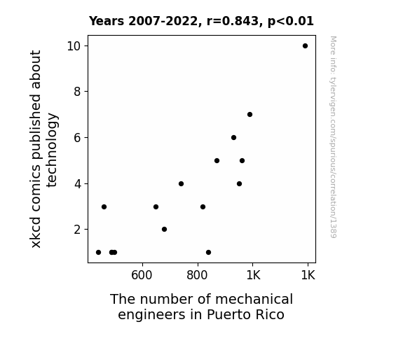
Engineered Laughter: Exploring the Correlation between xkcd Comics on Technology and the Number of Mechanical Engineers in Puerto Rico
The influx of technology-oriented xkcd comics sparked a surge in interest in all things tech, leading to a higher demand for mechanical engineers in Puerto Rico. As the island embraced the comedic side of technology, more and more individuals were drawn to pursue mechanical engineering as a way to bring the jokes to life through their innovative creations. It seems the connection between witty webcomics and the rise of mechanical masterminds has proven to be no laughing matter in Puerto Rico!


View details about correlation #4,309
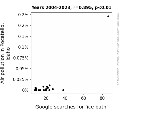
Choking on Smoke, Taking an Ice Bath and Doesn't Choke
The increase in air pollution led to a higher demand for ice baths as the citizens of Pocatello sought refuge from the smog in their own homes. As the air quality decreased, the appeal of submerging oneself in a chilly tub of water became a more attractive way to escape the pollution and breathe in some metaphorical 'fresh' air.

What else correlates?
Air pollution in Pocatello, Idaho · all weather
Google searches for 'ice bath' · all google searches
Air pollution in Pocatello, Idaho · all weather
Google searches for 'ice bath' · all google searches


View details about correlation #4,279
Rolling into Virality: The Surprising Link Between the 'Roll Safe' Meme and the Length of MrBeast YouTube Videos
As the 'roll safe' meme gained traction, it led to an upsurge in internet savvy viewers. This inadvertently prompted MrBeast to extend the length of his videos in a bid to outsmart the meme-loving audience. After all, the only way to one-up a meme is with an epic, feature-length YouTube extravaganza!


What else correlates?
Popularity of the 'roll safe' meme · all memes
Total length of MrBeast's YouTube videos · all YouTube
Popularity of the 'roll safe' meme · all memes
Total length of MrBeast's YouTube videos · all YouTube


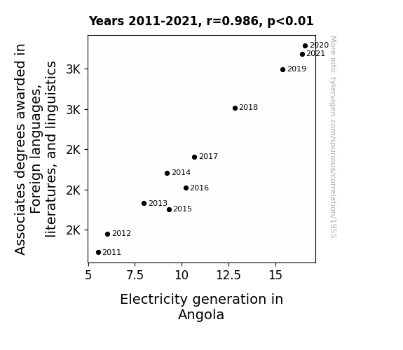
View details about correlation #1,955
Voltage and Verbiage: A Shocking Connection Between Associates Degrees in Foreign Languages, Literatures, and Linguistics and Electricity Generation in Angola
As more people became fluent in foreign languages, they started to crack ancient linguistic codes hidden in Angolan texts. These codes, when deciphered, actually revealed a secret, highly efficient method of generating electricity using only the power of words. The language enthusiasts formed a translation team, and as they translated and studied these texts, they accidentally stumbled upon the 'shocking' linguistic power of Angolan literature, sparking a surge in electricity generation across the country. It turns out, in Angola, the real 'power' doesn't just lie in the words themselves, but in the electrifying knowledge of foreign languages and linguistics.

What else correlates?
Associates degrees awarded in linguistics · all education
Electricity generation in Angola · all energy
Associates degrees awarded in linguistics · all education
Electricity generation in Angola · all energy


View details about correlation #1,160
Sweeping Success: The Surprising Relationship Between Academy Awards Ceremony Audience Size and Maintenance Workers and Machinery in Illinois
As the applause and cheers dwindled in the theater, the despondent maintenance workers and machinery in Illinois felt a profound sense of existential crisis, leading many to pursue alternative careers in non-award-winning industries. Maybe they just couldn't handle the sheer lack of drama offscreen!


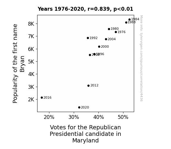
View details about correlation #4,436
The Bryan Identity: Exploring the Relationship Between Name Popularity and Republican Votes in Maryland
As the popularity of the name Bryan waned, so did the number of people spontaneously breaking into Bryan Adams' songs, like "Summer of '69." This led to a statewide shortage of karaoke machines, depriving Republicans of a key campaign strategy and ultimately impacting the election outcome.


View details about correlation #3,983
Blowing the Whistle: Exploring the Impacts of Air Pollution on FA Cup Final Goal Difference in Cleveland, Tennessee
As the air quality in Cleveland, Tennessee improved, it led to an unexpected surge in soccer skills across the pond. The players in the FA Cup final found themselves able to run faster, kick with more precision, and execute flawless headers, ultimately decreasing the goal difference. It seems like cleaner air in the US has become the secret weapon for soccer glory in the UK!

What else correlates?
Air pollution in Cleveland, Tennessee · all weather
FA Cup final goal difference · all sports
Air pollution in Cleveland, Tennessee · all weather
FA Cup final goal difference · all sports


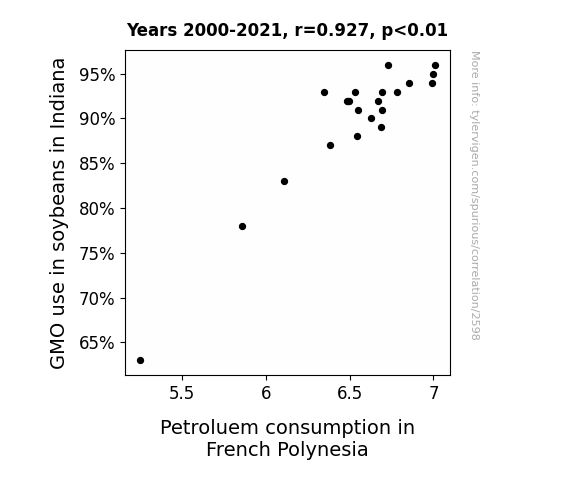
View details about correlation #2,598
The Soybean GMO Flow and the Polynesian Petro Price Show
As the GMO soybeans in Indiana grew larger and more robust, their sheer mass and volume exerted a gravitational pull on the Earth, subtly affecting the Earth's rotation. This unexpected change in the Earth's rotation altered the ocean currents, creating a domino effect that ultimately led to an increase in petroleum consumption in French Polynesia. After all, who knew that the humble soybean could have such cosmically chaotic consequences!

What else correlates?
GMO use in soybeans in Indiana · all food
Petroluem consumption in French Polynesia · all energy
GMO use in soybeans in Indiana · all food
Petroluem consumption in French Polynesia · all energy


View details about correlation #1,589
From Humor to Numbers: The xkcd Connection Between Engineering and Engine-room Learning
As engineers across the country chuckled at the comics, their laughter radiated outwards, subtly influencing the behavior of onlookers. In Iowa, this led to a surge in interest in early childhood education. The intricate complexities of engineering principles somehow sparked a newfound passion for nurturing young minds, ultimately drawing more individuals towards the field of preschool teaching. The power of humor knows no bounds, igniting unexpected career shifts and shaping the educational landscape in delightfully unconventional ways.


What else correlates?
xkcd comics published about engineering · all weird & wacky
The number of preschool teachers in Iowa · all cccupations
xkcd comics published about engineering · all weird & wacky
The number of preschool teachers in Iowa · all cccupations


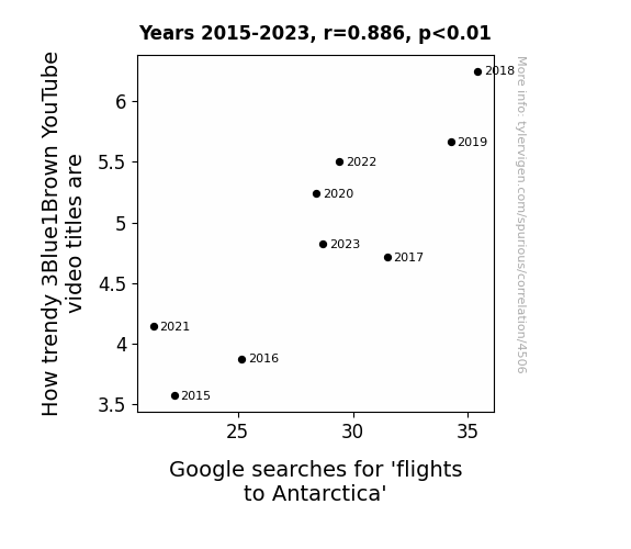
View details about correlation #4,506
Flight to Antarctica: Watching Math Videos with Delight - A Trendy Insight
As more people became intrigued by the latest math and science trends, there was a sudden surge in interest in all things 'cool' – including the frigid temperatures of Antarctica. It’s as if the allure of 3Blue1Brown's trendy content somehow led viewers to aspire to be as chill as the southernmost continent, prompting a snowball effect in the travel industry. After all, who wouldn't want to venture to a place that's basically the polar opposite of mainstream tourist destinations?


View details about correlation #4,548
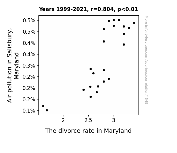
Air We Done Yet? Exploring the Smoggy Link Between Air Pollution and Divorce Rates in Maryland
As the air cleared up in Salisbury, so did the marital air in Maryland. It turns out, breathing in cleaner air led to less friction at home. Perhaps there's a correlation between air pollution and arguments getting airtime. Or maybe with pollution out of the way, couples could finally see things clearly, including that it's not smog to blame for their problems. Who knew that the key to lowering the divorce rate was just a breath of fresh air in more ways than one!

What else correlates?
Air pollution in Salisbury, Maryland · all weather
The divorce rate in Maryland · all random state specific
Air pollution in Salisbury, Maryland · all weather
The divorce rate in Maryland · all random state specific
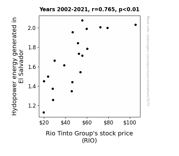
. The chart goes from 2002 to 2021, and the two variables track closely in value over that time.")

View details about correlation #3,675
Zipping Down the Hydropower Highway: Exploring the Ripple Effects of Hydropower Energy in El Salvador on Rio Tinto Group's Stock Price
The excessive water flow from the increased hydropower production somehow made its way to Rio Tinto's mining sites, boosting their production efficiency. The stocks surged as investors marveled at this unexpected synergy between renewable energy and mining, dubbing it the 'Hydro-Extraction Power Play'.

What else correlates?
Hydopower energy generated in El Salvador · all energy
Rio Tinto Group's stock price (RIO) · all stocks
Hydopower energy generated in El Salvador · all energy
Rio Tinto Group's stock price (RIO) · all stocks


View details about correlation #3,419
The Surgens Effect: A Humorous Investigation into New Mexico Surgeon Density and Its Impact on the Median Weekly Earnings of UK Self-Employed Workers
As the number of surgens in New Mexico continues to dwindle, the global market for surgical supplies is experiencing a sharp decline. This has inadvertently led to a cut in the profits of self-employed workers in the UK, as they now have to pay exorbitant prices for essential medical equipment. It's a real cutthroat situation for these self-employed individuals, and they're finding it increasingly hard to suture financial wounds.


View details about correlation #4,329
Soybean GMOs and Space-Time YouTube Show: The Zeitgeist in Statistical Might
As the soybeans grew larger with their modified genes, their gravitational pull intensified, creating a ripple effect that extended all the way to the cosmos, where it somehow boosted the appeal of space-time content. This whimsical scenario could be a result of viewers feeling inexplicably drawn to the out-of-this-world concepts discussed in the videos. It's a soybean space odyssey of likes!


What else correlates?
GMO use in soybeans · all food
The average number of likes on PBS Space Time YouTube videos · all YouTube
GMO use in soybeans · all food
The average number of likes on PBS Space Time YouTube videos · all YouTube


View details about correlation #3,742
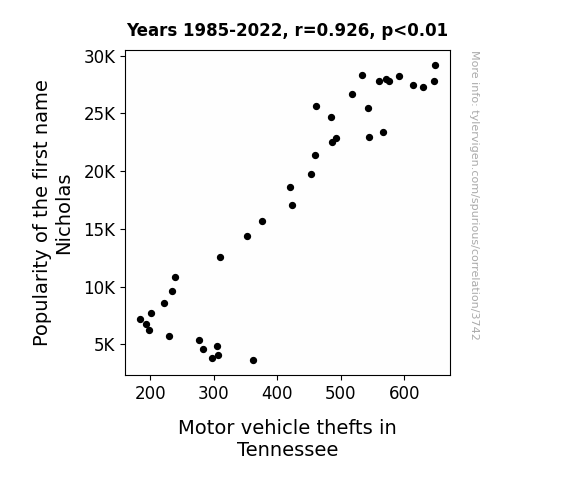
The Nick of Time: An Analysis of the Relationship Between the Popularity of the First Name Nicholas and Motor Vehicle Thefts in Tennessee
Fewer Nicholases means fewer people trying to nick cars, ultimately leading to a decrease in motor vehicle thefts in Tennessee. It's a case of nomenclature ultimately steering the stats in a different direction.
What else correlates?
Popularity of the first name Nicholas · all first names
Motor vehicle thefts in Tennessee · all random state specific
Popularity of the first name Nicholas · all first names
Motor vehicle thefts in Tennessee · all random state specific


View details about correlation #3,088
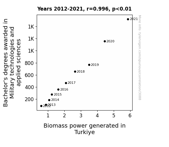
A Degree of Biomass: The Explosive Relationship Between Military Technologies and Applied Sciences Degrees and Biomass Power Generation in Turkiye
As more students delved into military technologies, they inadvertently sparked a biomass power revolution. Their knowledge of energy weapons and combat strategies led to the development of top-notch biomass power systems in Turkiye. It's like they said, "Let's turnip the heat on renewable energy and give war a green light."

What else correlates?
Bachelor's degrees awarded in Military technologies · all education
Biomass power generated in Turkiye · all energy
Bachelor's degrees awarded in Military technologies · all education
Biomass power generated in Turkiye · all energy


View details about correlation #1,411
Prosthetic Technicians and Buccaneer Attractions: A Statistical Tale of Aye Patches and Eye Patches
As the number of medical appliance technicians in Utah decreased, there were fewer hook attachments being properly maintained. This led to a decrease in fully functional pirate hooks, ultimately reducing the efficiency and frequency of pirate attacks. It seems the lack of expertise in Utah was a real "hook-sink" for the global pirate community!


What else correlates?
The number of medical appliance technicians in Utah · all cccupations
Pirate attacks globally · all weird & wacky
The number of medical appliance technicians in Utah · all cccupations
Pirate attacks globally · all weird & wacky
. The chart goes from 2002 to 2023, and the two variables track closely in value over that time.")

View details about correlation #3,771
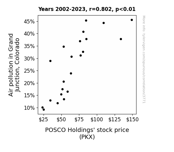
The Unseen Costs: A Breath of Fresh Air on the Link Between Air Pollution in Grand Junction and POSCO Holdings' Stock Price
As air pollution in Grand Junction, Colorado increased, it led to a surge in demand for air purifiers. This unexpected economic boom in the air purifier industry directly benefited POSCO Holdings, as they secretly diversified into the production of state-of-the-art, pollution-fighting air purifiers. As the smog thickened, so did the company's profits, proving that when it comes to stock prices, the air pollution in one place can truly be the clean air for another's investment portfolio!
What else correlates?
Air pollution in Grand Junction, Colorado · all weather
POSCO Holdings' stock price (PKX) · all stocks
Air pollution in Grand Junction, Colorado · all weather
POSCO Holdings' stock price (PKX) · all stocks


View details about correlation #4,316
Joelle-itarianism: A Statistical Analysis of the Correlation between Joelle's Popularity and Libertarian Votes for Senators in Alaska
With the rise in popularity of the first name Joelle, there has been a corresponding increase in the number of individuals taking up knitting as a hobby. This has inadvertently led to a surge in demand for alpaca wool, thereby boosting the alpaca farming industry in Alaska. As a result, Alaskan libertarian senators, who have long been advocates for the rights of alpaca farmers, have seen an uptick in support and votes from their constituents who are involved in this unforeseen economic ripple effect. Remember, behind every political trend, there's a thread of yarn leading back to unexpected beginnings.


What else correlates?
Popularity of the first name Joelle · all first names
Votes for Libertarian Senators in Alaska · all elections
Popularity of the first name Joelle · all first names
Votes for Libertarian Senators in Alaska · all elections


View details about correlation #3,556
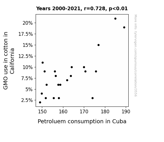
Seeds of Change: Exploring the Cotton Connection Between GMOs and Cuban Petroleum
As GMO cotton production in California increased, it led to the creation of larger cotton balls. These cotton balls, carried by the wind, mysteriously found their way to the shores of Cuba, where they were used as makeshift pillows by the locals. This, in turn, resulted in an unforeseen spike in the demand for sweet dreams, causing a surge in the use of petroleum for the production of high-quality, sleep-inducing lullabies in Cuba. It's a real snooze fest of a connection! Go figure!
What else correlates?
GMO use in cotton in California · all food
Petroluem consumption in Cuba · all energy
GMO use in cotton in California · all food
Petroluem consumption in Cuba · all energy
Why this works
- Data dredging: I have 25,237 variables in my database. I compare all these variables against each other to find ones that randomly match up. That's 636,906,169 correlation calculations! This is called “data dredging.”
Fun fact: the chart used on the wikipedia page to demonstrate data dredging is also from me. I've been being naughty with data since 2014.
Instead of starting with a hypothesis and testing it, I instead tossed a bunch of data in a blender to see what correlations would shake out. It’s a dangerous way to go about analysis, because any sufficiently large dataset will yield strong correlations completely at random. - Lack of causal connection: There is probably no direct connection between these variables, despite what the AI says above.
Because these pages are automatically generated, it's possible that the two variables you are viewing are in fact causually related. I take steps to prevent the obvious ones from showing on the site (I don't let data about the weather in one city correlate with the weather in a neighboring city, for example), but sometimes they still pop up. If they are related, cool! You found a loophole.
This is exacerbated by the fact that I used "Years" as the base variable. Lots of things happen in a year that are not related to each other! Most studies would use something like "one person" in stead of "one year" to be the "thing" studied. - Observations not independent: For many variables, sequential years are not independent of each other. You will often see trend-lines form. If a population of people is continuously doing something every day, there is no reason to think they would suddenly change how they are doing that thing on January 1. A naive p-value calculation does not take this into account.
You will calculate a lower chance of "randomly" achieving the result than represents reality.
To be more specific: p-value tests are probability values, where you are calculating the probability of achieving a result at least as extreme as you found completely by chance. When calculating a p-value, you need to assert how many "degrees of freedom" your variable has. I count each year (minus one) as a "degree of freedom," but this is misleading for continuous variables.
This kind of thing can creep up on you pretty easily when using p-values, which is why it's best to take it as "one of many" inputs that help you assess the results of your analysis.
- Y-axes doesn't start at zero: I truncated the Y-axes of the graphs above. I also used a line graph, which makes the visual connection stand out more than it deserves.
Nothing against line graphs. They are great at telling a story when you have linear data! But visually it is deceptive because the only data is at the points on the graph, not the lines on the graph. In between each point, the data could have been doing anything. Like going for a random walk by itself!
Mathematically what I showed is true, but it is intentionally misleading. If you click on any of the charts that abuse this, you can scroll down to see a version that starts at zero. - Confounding variable: Confounding variables (like global pandemics) will cause two variables to look connected when in fact a "sneaky third" variable is influencing both of them behind the scenes.
- Outliers: Some datasets here have outliers which drag up the correlation.
In concept, "outlier" just means "way different than the rest of your dataset." When calculating a correlation like this, they are particularly impactful because a single outlier can substantially increase your correlation.
Because this page is automatically generated, I don't know whether any of the charts displayed on it have outliers. I'm just a footnote. ¯\_(ツ)_/¯
I intentionally mishandeled outliers, which makes the correlation look extra strong. - Low n: There are not many data points included in some of these charts.
You can do analyses with low ns! But you shouldn't data dredge with a low n.
Even if the p-value is high, we should be suspicious of using so few datapoints in a correlation.
Pro-tip: click on any correlation to see:
- Detailed data sources
- Prompts for the AI-generated content
- Explanations of each of the calculations (correlation, p-value)
- Python code to calculate it yourself


