spurious correlations
discover · random · spurious scholar
← previous page · next page →


View details about correlation #1,683
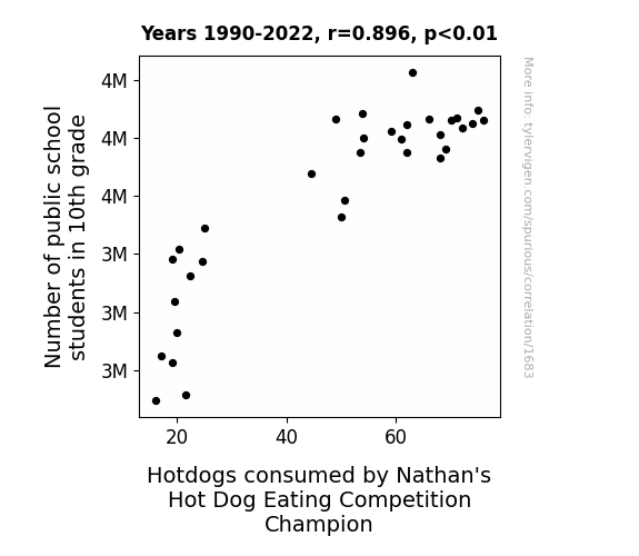
Grade 10 Gastronomy: Exploring the Correlation Between 10th Grade Student Population and Hot Dog Consumption Among Nathan's Hot Dog Eating Champions
As the number of 10th graders grew, so did their love for school lunches. This created a higher demand for hotdogs, leading to a surge in production. With more hotdogs in supply, the Nathan's Hot Dog Eating Competition champion found themselves in a 'bun'dant situation, ultimately leading to an increase in hotdog consumption. It's a classic case of 'wiener-takes-all' as the 10th graders unwittingly fueled the champion's path to victory, proving that when it comes to hotdog consumption, the 'grade' of influence can't be 'measured in inches'.


View details about correlation #4,429
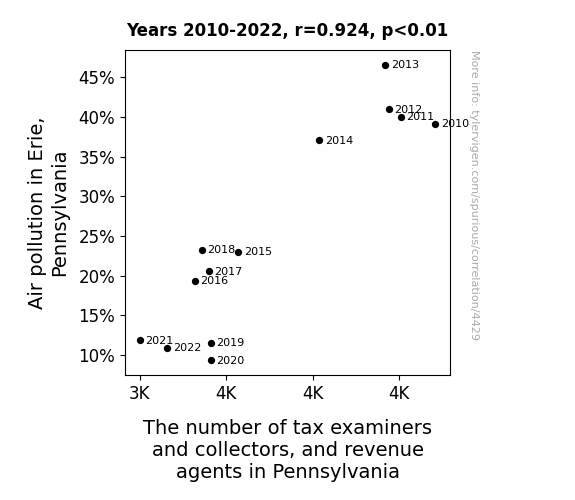
The Smog Collector: Investigating the Relationship Between Air Pollution and Tax Revenue Agents in Pennsylvania
The cleaner air in Erie led to an unexpected increase in the productivity and efficiency of taxpayers. With their lungs no longer preoccupied with filtering out pollutants, people were able to fill out their tax forms at lightning speed. This, in turn, rendered a significant portion of tax examiners and collectors jobless, as there were far fewer errors or discrepancies to be found. In a desperate attempt to adapt to this unforeseen consequence, the state had no choice but to downsize the number of revenue agents, who found themselves idly twiddling their pollutant-free thumbs. It seems the only thing more suffocating than smog was the realization that their once crucial jobs had been - dare we say - rendered obsolete by the breath of fresh air in Erie.


View details about correlation #4,792
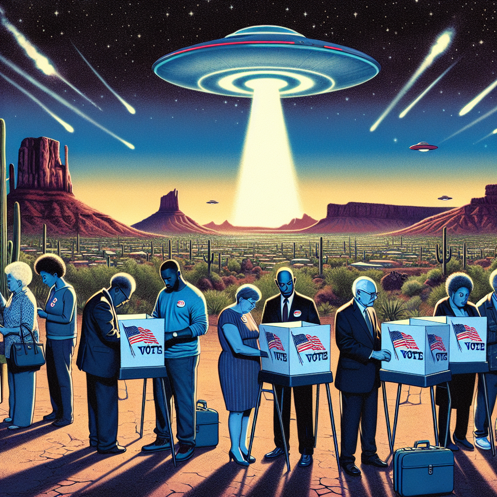
Are Republican Senators Secretly Alien Ambassadors? A Correlative Analysis of GOP Votes and UFO Sightings in Arizona
As Republican support rose, some constituents felt alienated, leading to an upsurge in UFO reports. Remember, when it comes to politics, the truth is out there!

What else correlates?
Votes for Republican Senators in Arizona · all elections
UFO sightings in Arizona · all random state specific
Votes for Republican Senators in Arizona · all elections
UFO sightings in Arizona · all random state specific


View details about correlation #2,306
Biomass or Butter: Uncovering the Sizzling Connection in Slovakia
As butter consumption rose, people's energy levels also increased, leading to a surge in productivity. This productivity boom prompted Slovakia to invest more in biomass power generation, because they finally had the margarine for it.


What else correlates?
Butter consumption · all food
Biomass power generated in Slovakia · all energy
Butter consumption · all food
Biomass power generated in Slovakia · all energy
. The chart goes from 2002 to 2022, and the two variables track closely in value over that time.")

View details about correlation #2,682
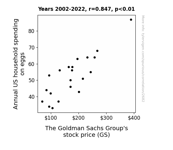
The Sunny-Side Up Connection: Clucking Good News for Eggspanding Portfolios
As household spending on eggs rose, families were scrambling to make more omelettes, leading to an increased demand for cooking oil. This surge in demand sunny-side upped the profits for oil companies, including those connected to The Goldman Sachs Group, leading to a eggs-traordinary increase in their stock price. The sunny side of this story is that it cracked the expectations of Wall Street analysts, who realized that the situation was no yolk, and that The Goldman Sachs Group was on their way to shell-tering some impressive profits.

What else correlates?
Annual US household spending on eggs · all weird & wacky
The Goldman Sachs Group's stock price (GS) · all stocks
Annual US household spending on eggs · all weird & wacky
The Goldman Sachs Group's stock price (GS) · all stocks


View details about correlation #4,383
The Clickbait Chronicles: A Correlational Study of Extra History YouTube Titles and How to Hide a Body Google Searches
Well, as Extra History delves into the strategies of ancient generals and the tactics of historical battles, it seems their catchy titles and thumbnails are inadvertently attracting a rather, uh, specialized audience. Who knew learning about the past could also help you plan for the future? Remember folks, always take historical advice with a grain of salt... or perhaps a whole bag if you're in the market for body-hiding tips!


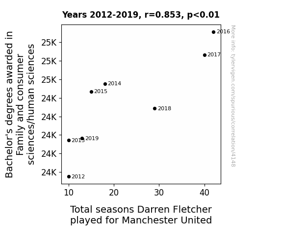
View details about correlation #4,148
Blend, Shop, Score: Unraveling the Ties Between Consumer Sciences Degrees and Darren Fletcher's Seasons at Manchester United
As more people became experts in managing household resources, they inadvertently perfected the art of managing a team's dynamics and resources, leading to increased team cohesion and performance. This resulted in Darren Fletcher extending his career at Manchester United, because at the end of the day, it's all about managing the 'family' and being a 'consummate' professional on the field!


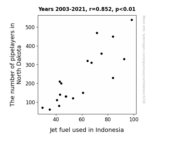
View details about correlation #3,238
Pipelayers and Jet Fuel: Uncovering the Underground Connections
As more pipelayers headed to North Dakota, they unknowingly activated a dormant network of old oil pipelines, causing a surge in oil production. This unexpected oil boom led to an oversupply in the global market, driving down jet fuel prices. With cheaper jet fuel available, airlines in Indonesia revved up their operations, leading to an overall increase in jet fuel usage. Who knew that the path to Indonesian skies was being paved from the plains of North Dakota!

What else correlates?
The number of pipelayers in North Dakota · all cccupations
Jet fuel used in Indonesia · all energy
The number of pipelayers in North Dakota · all cccupations
Jet fuel used in Indonesia · all energy


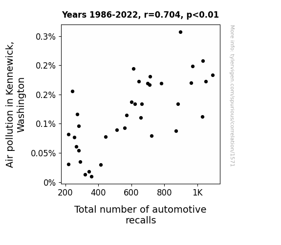
View details about correlation #1,571
Air-mazing Pollution: The Link Between Air Quality and Automotive Recalls in Kennewick, Washington
The increase in air pollution in Kennewick, Washington has led to a rise in the number of disgruntled sentient cars, prompting them to report issues and demand recalls at a higher rate. It's a classic case of smog-induced car-kerfuffle syndrome!

What else correlates?
Air pollution in Kennewick, Washington · all weather
Total number of automotive recalls · all weird & wacky
Air pollution in Kennewick, Washington · all weather
Total number of automotive recalls · all weird & wacky


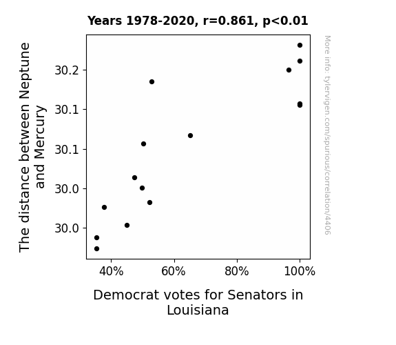
View details about correlation #4,406
Planetary Politics: Exploring the Correlation Between Interplanetary Distance and Democrat Votes for Senators in Louisiana
As the distance between Neptune and Mercury decreases, the gravitational pull intensifies, creating a ripple effect on the universal political consciousness. This celestial shift directly impacts the moods and decision-making processes of voters in Louisiana, ultimately swaying their support away from Democratic senators. The alignment of these distant planets somehow manages to influence the state's political climate, leading to a decrease in Democrat votes.

What else correlates?
The distance between Neptune and Mercury · all planets
Votes for Democratic Senators in Louisiana · all elections
The distance between Neptune and Mercury · all planets
Votes for Democratic Senators in Louisiana · all elections


View details about correlation #3,936
Thirsting for Relief: A Quirky Correlation Between US Bottled Water Consumption per Person and Google Searches for 'I Have a Headache'
As people drank more bottled water, they realized they needed to pee all the time, leading to frequent bathroom trips. These repeated encounters with reflective surfaces made them acutely aware of their often neglected daily hydration levels. The guilt of not drinking enough water caught up with them, causing stress and tension headaches. So, remember, the next time your head is pounding, just blame it on the bottled water industry - they're in cahoots with the mirror manufacturers! Stay hydrated, folks, and maybe invest in some headache medicine stock while you're at it.


What else correlates?
US Bottled Water Consumption per Person · all food
Google searches for 'i have a headache' · all google searches
US Bottled Water Consumption per Person · all food
Google searches for 'i have a headache' · all google searches


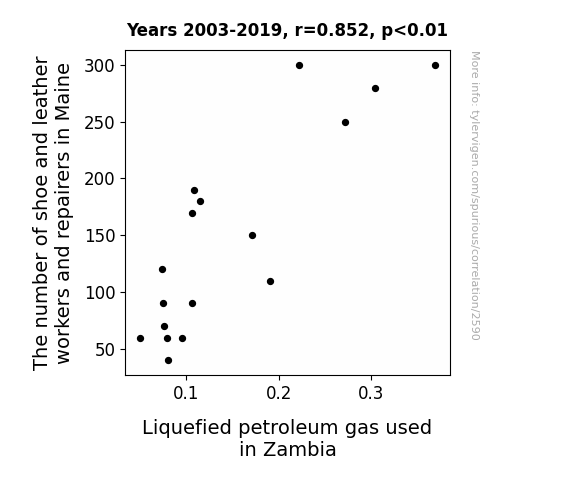
View details about correlation #2,590
Putting the Sole in LPG: The Unlikely Link between Shoe and Leather Workers in Maine and Liquefied Petroleum Gas Usage in Zambia
As the demand for handmade leather shoes from Maine skyrocketed, so did the need for quality, artisanal buffing. The excessive buffing led to an unexpected surge in static electricity, sparking an international shortage of LPG as it mysteriously diverted to Zambia, where it was affectionately nicknamed the "shoemaker's spark." It just go to show, when Maine's cobblers are on a roll, even the most unlikely places feel the sizzle of their craftsmanship!


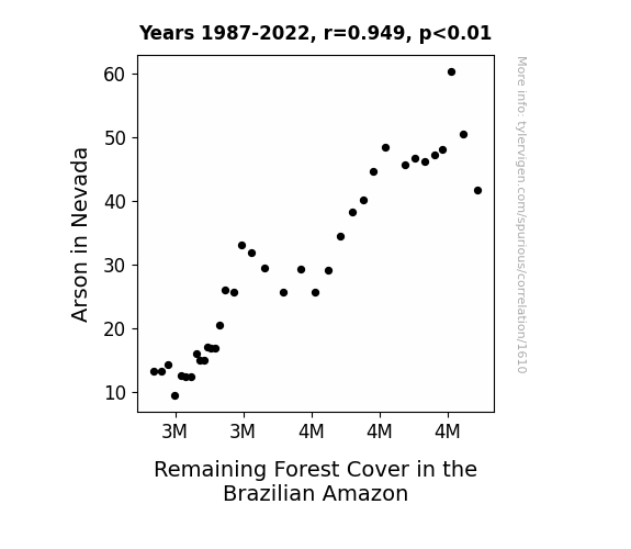
View details about correlation #1,610
Playing with Fire: Investigating the Blaze Trade Between Nevada Arson and Amazonian Greenery
At first, this may seem unrelated, but hear me out. As the number of intentionally lit fires in Nevada decreased, there was a surplus of unemployed arsonists. Without their usual outlets for fiery mayhem, these disgruntled individuals decided to put their skills to use in the Brazilian Amazon. The result? A decrease in remaining forest cover as these rogue arsonists brought their destructive expertise to the lush greenery. Remember, only you can prevent forest fires and unemployed arsonists with a passion for combustion.

What else correlates?
Arson in Nevada · all random state specific
Remaining Forest Cover in the Brazilian Amazon · all weird & wacky
Arson in Nevada · all random state specific
Remaining Forest Cover in the Brazilian Amazon · all weird & wacky
. The chart goes from 2002 to 2022, and the two variables track closely in value over that time.")

View details about correlation #3,809
URI Up or URI Down: Exploring the Ruth-URI Connection in the Stock Market
The name Ruth gained popularity, leading to more babies being named Ruth. As these Ruths grew up, they developed an inexplicable passion for construction equipment. This sudden surge in demand for bulldozers and cherry pickers led to record profits for United Rentals, sending their stock price soaring. It's a Ruth-lessly good time to invest in URI! Remember, when Ruth calls, URI answers!


What else correlates?
Popularity of the first name Ruth · all first names
United Rentals' stock price (URI) · all stocks
Popularity of the first name Ruth · all first names
United Rentals' stock price (URI) · all stocks


View details about correlation #4,834
This is Fine Meme-gic: The Likability of LEMMiNO YouTube Videos
As the 'this is fine' meme gained popularity, it led to an overall increase in tolerance for all things, including LEMMiNO YouTube videos, thereby generating more likes.

What else correlates?
Popularity of the 'this is fine' meme · all memes
The average number of likes on LEMMiNO YouTube videos · all YouTube
Popularity of the 'this is fine' meme · all memes
The average number of likes on LEMMiNO YouTube videos · all YouTube


View details about correlation #1,483
Flipping the Connection: A Fry-Volous Investigation into the Link between Fast Food Cooks in Guam and Kerosene Consumption in Saint Kitts and Nevis
As the sizzling sounds of burgers and fries filled the air in Guam, it created a wave of excitement among Kerosene molecules in Saint Kitts and Nevis, leading to a surge in their combustion enthusiasm. Perhaps the real recipe for a fuel-up feast is a sprinkle of fast food magic!
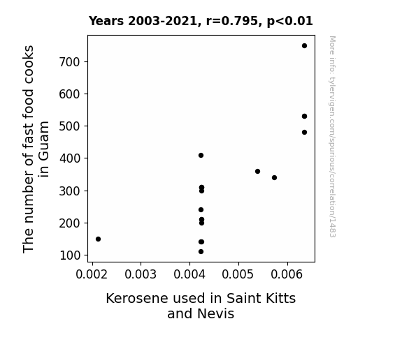
What else correlates?
The number of fast food cooks in Guam · all cccupations
Kerosene used in Saint Kitts and Nevis · all energy
The number of fast food cooks in Guam · all cccupations
Kerosene used in Saint Kitts and Nevis · all energy


View details about correlation #3,577
Soy What? Exploring the Link Between GMO Soybeans in Indiana and the Roaring Yamaha Motorcycles in the UK
The GMO soybeans were accidentally producing a pheromone that attracted individuals who were inexplicably drawn to both soy and Yamaha motorcycles. This led to a surge in UK Yamaha motorcycle registrations due to the mysterious and alluring connection to the soybeans from Indiana.

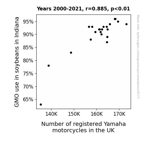
What else correlates?
GMO use in soybeans in Indiana · all food
Number of registered Yamaha motorcycles in the UK · all weird & wacky
GMO use in soybeans in Indiana · all food
Number of registered Yamaha motorcycles in the UK · all weird & wacky


View details about correlation #4,327
Alice in Voterland: The Curious Case of Libertarian Leanings in Minnesota Senators Named Alice
Perhaps more people named Alice started embracing the "Wonderland" of individual freedoms and decided to advocate for political candidates who aligned with their newly found libertarian views. This led to an unexpected surge in Libertarian votes for Senators in Minnesota. It's as if the state politics took a curious turn down the rabbit hole of liberty and self-governance!

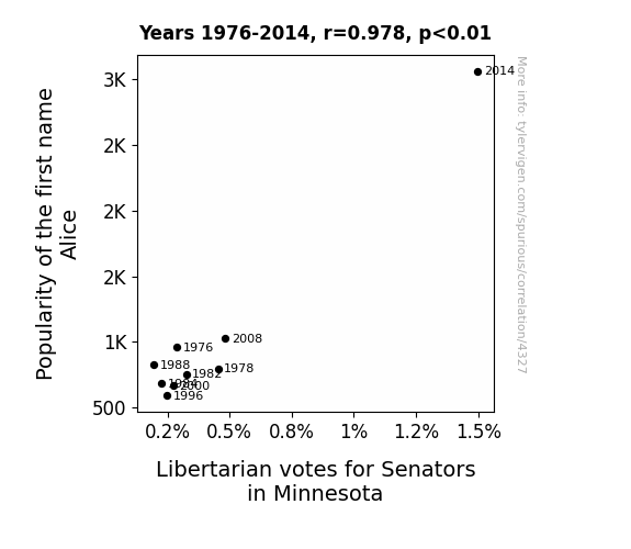
What else correlates?
Popularity of the first name Alice · all first names
Votes for Libertarian Senators in Minnesota · all elections
Popularity of the first name Alice · all first names
Votes for Libertarian Senators in Minnesota · all elections


View details about correlation #4,652
When Neptune's Away, the Air Will Play: A Cosmic Comedy of Connection Between Planetary Proximity and Air Pollution in Oxnard, California
As Neptune cozied up to the Sun, its gravitational pull weakened, leading to a ripple effect on Earth. This subtly altered the atmospheric pressure, creating a localized anti-smog zone right over Oxnard. It's like Neptune moonwalked closer to the Sun, and inadvertently moonwalked Oxnard into cleaner air. So, next time you want to clear the air in Oxnard, just give Neptune a little celestial nudge!


What else correlates?
The distance between Neptune and the Sun · all planets
Air pollution in Oxnard, California · all weather
The distance between Neptune and the Sun · all planets
Air pollution in Oxnard, California · all weather


View details about correlation #1,973
Shining Bright: The Solar Connection Between Military Technologies and Applied Sciences Bachelor's Degrees and Solar Power in Kazakhstan
As more military technology experts graduated, they devised a top-secret plan to camouflage solar panels as giant desert sand dunes. This not only boosted solar power output in Kazakhstan, but also led to a decrease in rogue camel attacks on the panels. The combination of innovative technology and unexpected military tactics ultimately paved the way for a brighter, more secure energy future in the Kazakh desert. It's a shining example of how military expertise can truly power up renewable energy efforts!


What else correlates?
Bachelor's degrees awarded in Military technologies · all education
Solar power generated in Kazakhstan · all energy
Bachelor's degrees awarded in Military technologies · all education
Solar power generated in Kazakhstan · all energy
Why this works
- Data dredging: I have 25,237 variables in my database. I compare all these variables against each other to find ones that randomly match up. That's 636,906,169 correlation calculations! This is called “data dredging.”
Fun fact: the chart used on the wikipedia page to demonstrate data dredging is also from me. I've been being naughty with data since 2014.
Instead of starting with a hypothesis and testing it, I instead tossed a bunch of data in a blender to see what correlations would shake out. It’s a dangerous way to go about analysis, because any sufficiently large dataset will yield strong correlations completely at random. - Lack of causal connection: There is probably no direct connection between these variables, despite what the AI says above.
Because these pages are automatically generated, it's possible that the two variables you are viewing are in fact causually related. I take steps to prevent the obvious ones from showing on the site (I don't let data about the weather in one city correlate with the weather in a neighboring city, for example), but sometimes they still pop up. If they are related, cool! You found a loophole.
This is exacerbated by the fact that I used "Years" as the base variable. Lots of things happen in a year that are not related to each other! Most studies would use something like "one person" in stead of "one year" to be the "thing" studied. - Observations not independent: For many variables, sequential years are not independent of each other. You will often see trend-lines form. If a population of people is continuously doing something every day, there is no reason to think they would suddenly change how they are doing that thing on January 1. A naive p-value calculation does not take this into account.
You will calculate a lower chance of "randomly" achieving the result than represents reality.
To be more specific: p-value tests are probability values, where you are calculating the probability of achieving a result at least as extreme as you found completely by chance. When calculating a p-value, you need to assert how many "degrees of freedom" your variable has. I count each year (minus one) as a "degree of freedom," but this is misleading for continuous variables.
This kind of thing can creep up on you pretty easily when using p-values, which is why it's best to take it as "one of many" inputs that help you assess the results of your analysis.
- Y-axes doesn't start at zero: I truncated the Y-axes of the graphs above. I also used a line graph, which makes the visual connection stand out more than it deserves.
Nothing against line graphs. They are great at telling a story when you have linear data! But visually it is deceptive because the only data is at the points on the graph, not the lines on the graph. In between each point, the data could have been doing anything. Like going for a random walk by itself!
Mathematically what I showed is true, but it is intentionally misleading. If you click on any of the charts that abuse this, you can scroll down to see a version that starts at zero. - Confounding variable: Confounding variables (like global pandemics) will cause two variables to look connected when in fact a "sneaky third" variable is influencing both of them behind the scenes.
- Outliers: Some datasets here have outliers which drag up the correlation.
In concept, "outlier" just means "way different than the rest of your dataset." When calculating a correlation like this, they are particularly impactful because a single outlier can substantially increase your correlation.
Because this page is automatically generated, I don't know whether any of the charts displayed on it have outliers. I'm just a footnote. ¯\_(ツ)_/¯
I intentionally mishandeled outliers, which makes the correlation look extra strong. - Low n: There are not many data points included in some of these charts.
You can do analyses with low ns! But you shouldn't data dredge with a low n.
Even if the p-value is high, we should be suspicious of using so few datapoints in a correlation.
Pro-tip: click on any correlation to see:
- Detailed data sources
- Prompts for the AI-generated content
- Explanations of each of the calculations (correlation, p-value)
- Python code to calculate it yourself


