spurious correlations
discover · random · spurious scholar
← previous page · next page →


View details about correlation #1,147
The Uncommon Connection: Stephen King's Publications and North Carolina's Locker Room Attendants
As Stephen King's books became more popular, people in North Carolina were too scared to change in the locker rooms by themselves, leading to a higher demand for locker room attendants to provide a sense of security.


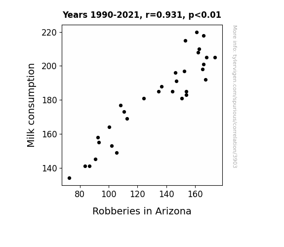
View details about correlation #3,903
Got Milk? An Udderly Surprising Connection: Assessing the Correlation Between Milk Consumption and Robberies in Arizona
The decrease in milk consumption led to a decrease in lactose intolerance, resulting in less stomach discomfort and irritability, thus reducing the inclination to commit robberies in Arizona. Because when it comes to crime, it's all about keeping your calcium cool!

What else correlates?
Milk consumption · all food
Robberies in Arizona · all random state specific
Milk consumption · all food
Robberies in Arizona · all random state specific


View details about correlation #4,724
Connecting Cat Memes and Carbon Monoxide: An Amusing Analysis of Air Pollution in Gainesville, Florida
As the popularity of cat memes soared, so did the demand for internet access. This led to a surge in data usage and a higher power consumption in Gainesville, ultimately contributing to air pollution. It seems like these feline funnies had an unforeseen impact on the environment.


What else correlates?
Google searches for 'cat memes' · all google searches
Air pollution in Gainesville, Florida · all weather
Google searches for 'cat memes' · all google searches
Air pollution in Gainesville, Florida · all weather


View details about correlation #3,377
The Name Game: A Shocking Connection Between the Popularity of the First Name Kameron and Electricity Generation in Paraguay
As the name Kameron gained popularity, more parents subconsciously started associating it with cameras. This led to a surge in baby photos being taken and shared online, increasing the overall demand for electricity. Meanwhile, in a strange coincidence, the national symbol of Paraguay became the lightning bolt, leading to a subconscious link between the name Kameron and electricity generation in the country. It's as if the universe itself couldn't resist the punny connection and decided to shock Paraguay's power production into action.


What else correlates?
Popularity of the first name Kameron · all first names
Electricity generation in Paraguay · all energy
Popularity of the first name Kameron · all first names
Electricity generation in Paraguay · all energy


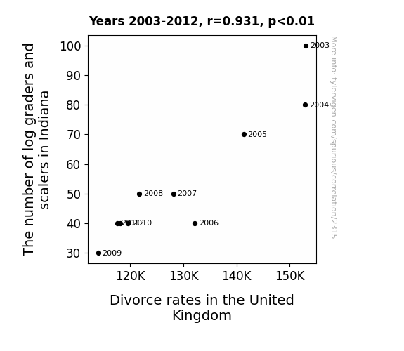
View details about correlation #2,315
The Grader-Spouse Crusade: The High-Rate Rhyme of Log Labour Quantity and Divorce Futility
As the number of log graders and scalers in Indiana decreased, there was a corresponding decrease in the availability of quality logs. This led to a shortage of top-notch wooden furniture in the United Kingdom. With Brits unable to purchase high-grade log furniture, they found themselves unable to argue over the assembly instructions, leading to a decrease in marital disputes and ultimately lower divorce rates. Remember, a smooth log does not necessarily make for a smooth relationship!
What else correlates?
The number of log graders and scalers in Indiana · all cccupations
Divorce rates in the United Kingdom · all weird & wacky
The number of log graders and scalers in Indiana · all cccupations
Divorce rates in the United Kingdom · all weird & wacky


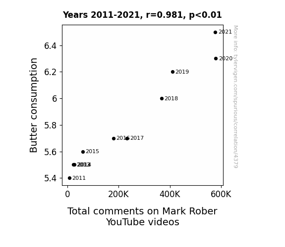
View details about correlation #4,379
Spreading the Word: The Butter-ly Effect on YouTube Engagement
The buttery smooth voice of Mark Rober is spreading like, well, butter on hot toast, leading to a rise in comments as people just can't believe it's not commentary. It's no margarine alibi that the more butter we spread, the more Mark's videos seem to churn out the engagement. It's a slippery slope of dairy deliciousness straight to the comment section. So, let's all keep calm and carry a churn, because this correlation is totally on a roll!

What else correlates?
Butter consumption · all food
Total comments on Mark Rober YouTube videos · all YouTube
Butter consumption · all food
Total comments on Mark Rober YouTube videos · all YouTube


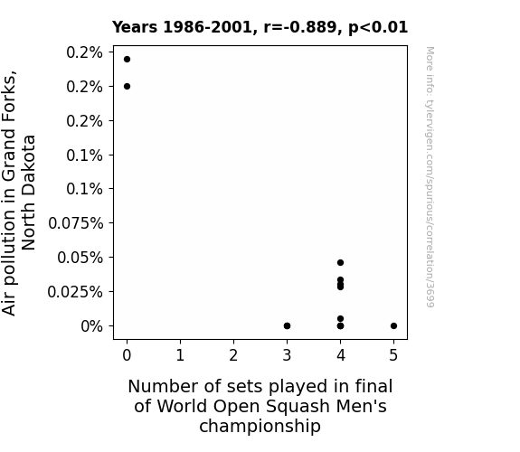
View details about correlation #3,699
Clearing the Smoke: The Squashy Relationship between Air Pollution in Grand Forks, North Dakota, and World Open Squash Men's Championship Sets Played
As the air became more polluted, the squash players found it harder to breathe, leading to shorter rallies and quicker game play. You could say the smog was squash-ing their endurance, creating a lung-busting situation on the court!


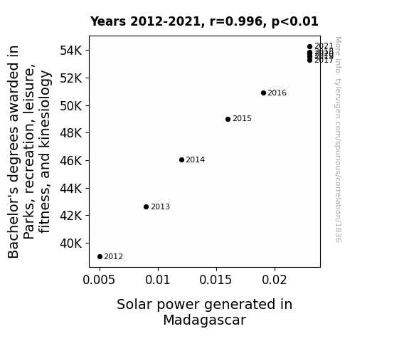
View details about correlation #1,836
In Pursuit of Park Studies to Spark Solar Rays: A Bizarre Baccalaureate Ballet in Madagascar
As more people became experts in physical activities, they uncovered the key to harnessing solar energy through a synchronized, choreographed routine of sun salutations and power squats. It turns out, the future of renewable energy lies in a combination of fitness knowledge and a deep-seated passion for outdoor leisure. The more graduates delved into the world of parks and recreation, the stronger their connection to nature became, sparking a solar revolution in Madagascar. Remember, it's not just about generating power, it's about empowering the elements with a well-earned degree in fun and fitness!

What else correlates?
Bachelor's degrees awarded in Parks & Recreation · all education
Solar power generated in Madagascar · all energy
Bachelor's degrees awarded in Parks & Recreation · all education
Solar power generated in Madagascar · all energy


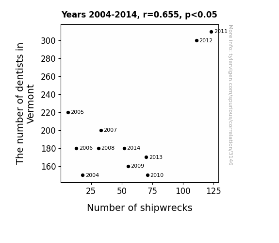
View details about correlation #3,146
Sink or Swim: The Dental Dilemma in Vermont and Its Relation to Global Shipwrecks
As the number of dentists in Vermont increased, so did the state's obsession with pristine teeth. This led to a spike in the production and use of toothpaste. The excess toothpaste production created a surplus, which was then used to lubricate the hulls of ships all around the world. These extra-slippery ships found themselves careening into unsuspecting sea creatures and uncharted underwater obstacles, leading to a surprising increase in global shipwrecks. Who knew that the road to maritime mayhem was paved with minty fresh dental care products? 🚢

What else correlates?
The number of dentists in Vermont · all cccupations
Global shipwrecks · all weird & wacky
The number of dentists in Vermont · all cccupations
Global shipwrecks · all weird & wacky


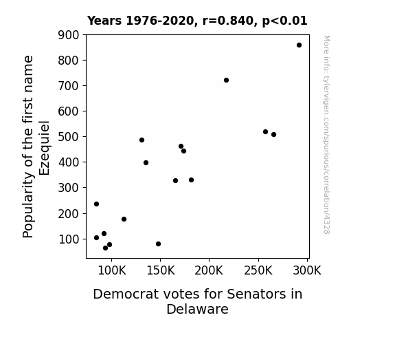
View details about correlation #4,328
The Ezequiel Effect: Name Popularity and Political Preference in Delaware
The rise in Ezequiels led to a spike in homemade hot sauce production. This, in turn, resulted in a shortage of bland snacks, prompting a craving for flavorful political discourse.
What else correlates?
Popularity of the first name Ezequiel · all first names
Votes for Democratic Senators in Delaware · all elections
Popularity of the first name Ezequiel · all first names
Votes for Democratic Senators in Delaware · all elections


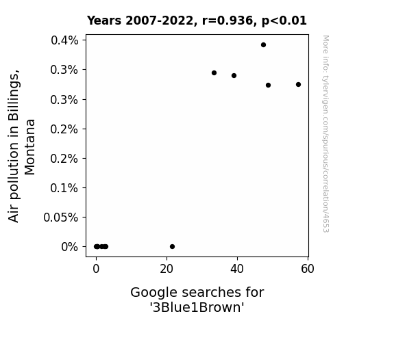
View details about correlation #4,653
Clearing the Air: Exploring the '3Blue1Brown' Connection to Air Pollution in Billings, Montana
Perhaps the locals mistook the smog for a new type of colorful mathematical visualization, prompting them to delve into the world of 3Blue1Brown in a quest for cleaner, clearer perspectives.

What else correlates?
Air pollution in Billings, Montana · all weather
Google searches for '3Blue1Brown' · all google searches
Air pollution in Billings, Montana · all weather
Google searches for '3Blue1Brown' · all google searches
. The chart goes from 2009 to 2021, and the two variables track closely in value over that time.")

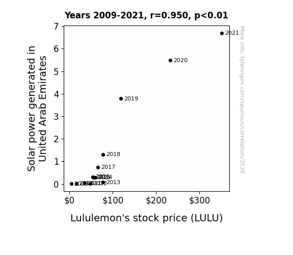
View details about correlation #3,538
Lighting Up the Market: The Sunny Side of Lululemon's Stock Price and Solar Power Generation in United Arab Emirates
The abundance of sunshine in the United Arab Emirates led to a surplus of positive energy. This energy inadvertently influenced the global mindset, causing a spike in demand for trendy activewear. As people soaked up the sunny vibes, they felt a sudden urge to embrace a more active and fashionable lifestyle, hence driving up the sales of Lululemon's products. The correlation between Solar power in the UAE and Lululemon's stock price may seem far-fetched, but who can deny the illuminating power of stylish sun salutations?

What else correlates?
Solar power generated in United Arab Emirates · all energy
Lululemon's stock price (LULU) · all stocks
Solar power generated in United Arab Emirates · all energy
Lululemon's stock price (LULU) · all stocks


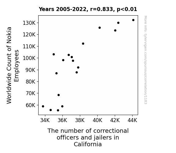
View details about correlation #1,183
Calling Collect: The Nokia Connection between Global Employment and California Correctional Officers
As the Worldwide Count of Nokia Employees increased, so did the number of individuals skilled at "cell" service. These new employees had a knack for "locking down" success, leading to a ripple effect in California's job market. It's clear that when Nokia expands, so does the need for handling "cellular" security! Looks like Nokia isn't just in the business of making connections; they're also boosting the "cell" block workforce in an unexpected partnership with the California correctional facilities. Who knew that a company known for its phones would also be dialing up employment opportunities in the state's prisons!


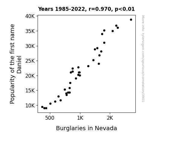
View details about correlation #3,901
The Daniel Dilemma: A Statistical Study of the Relationship between the Name Daniel and Burglary Incidents in Nevada
People were less likely to name their children after the iconic heist movie character, Danny Ocean, which in turn led to a reduced glamorization of thievery and ultimately contributed to the decrease in burglaries in Nevada.

What else correlates?
Popularity of the first name Daniel · all first names
Burglaries in Nevada · all random state specific
Popularity of the first name Daniel · all first names
Burglaries in Nevada · all random state specific


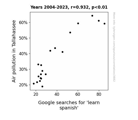
View details about correlation #3,882
Smoggin' Spanish: Unraveling the Relationship between Air Pollution in Tallahassee and Google Searches for 'Learn Spanish'
As the air became cleaner, it carried fewer language particles, leading to a reduced influx of Spanish knowledge. It seems like smog was the only thing thickening the language barrier in Tallahassee!

What else correlates?
Air pollution in Tallahassee · all weather
Google searches for 'learn spanish' · all google searches
Air pollution in Tallahassee · all weather
Google searches for 'learn spanish' · all google searches


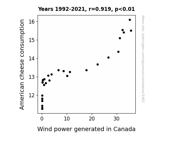
View details about correlation #1,961
Say Cheese and Blow Wind: Exploring the Correlation Between American Cheese Consumption and Wind Power Generation in Canada
As American cheese consumption increased, so did the country's collective flatulence. This surge in gas production wafted its way north, providing an unexpected but significant boost to Canada's wind power production. It seems that while American cheese may be gouda for the taste buds, it's even greater cheddar for renewable energy in the Great White North!

What else correlates?
American cheese consumption · all food
Wind power generated in Canada · all energy
American cheese consumption · all food
Wind power generated in Canada · all energy


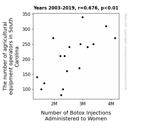
View details about correlation #2,316
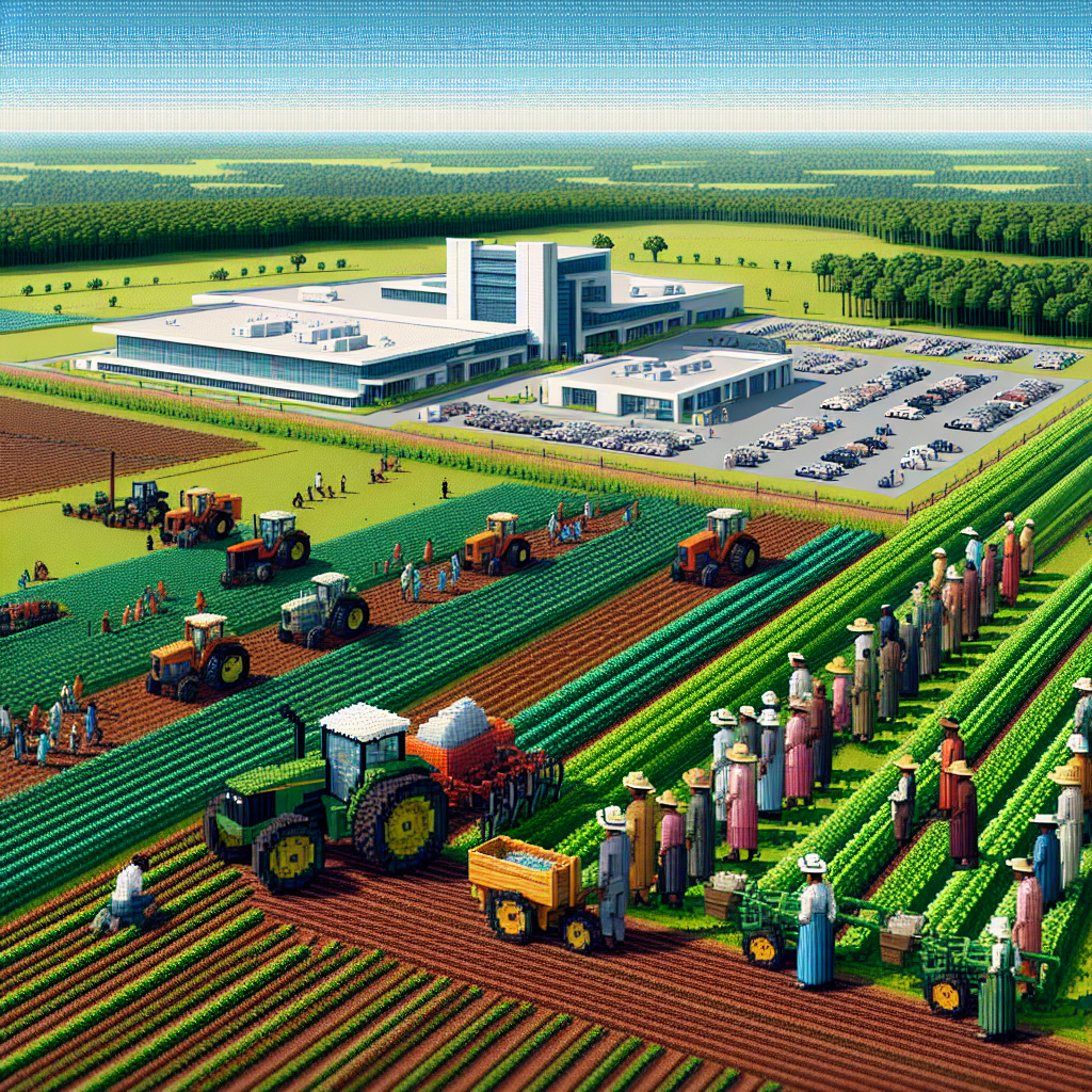
The Botox Boom: Beneath the Surface of South Carolina's Agricultural Appendage
As the tractor population dwindled, so did the frown lines in the fields. With less machinery around, there was a notable absence of agitated agricultural equipment, leading to a statewide shortage of wrinkle-inducing commotion. It seems the correlation between the two is not just a surface-level issue, but deeply rooted in the soil of South Carolina. It's a case of fewer farm hands, fewer furrowed brows. Who knew that the secret to smoother skin lay in the hands of those operating the farming equipment!


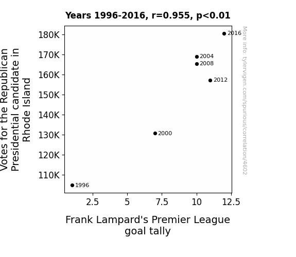
View details about correlation #4,602
Net Gains: An Examination of the Relationship Between Republican Presidential Candidate Votes in Rhode Island and Frank Lampard’s Premier League Goal Tally
As the Republican support surged in Rhode Island, so did the demand for soccer in the state. This led to a grassroots movement to hone local talent, ultimately boosting Frank Lampard's goal tally in the Premier League. Looks like in this case, it was all about scoring bipartisan goals for Lampard!


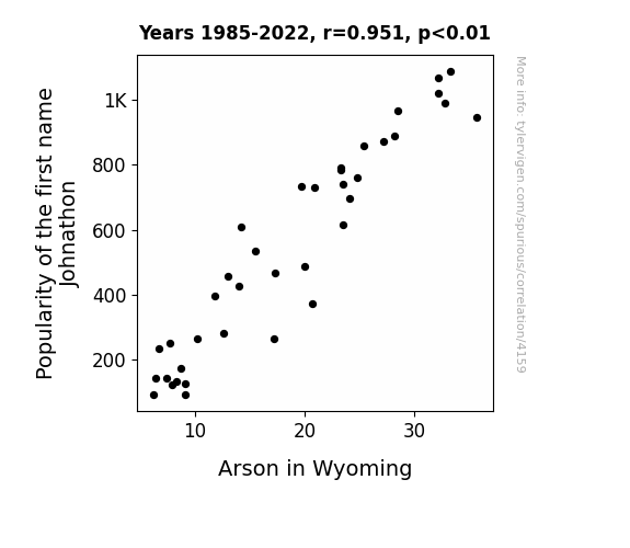
View details about correlation #4,159
The Name Game: Exploring the Incendiary Link Between Johnathon's Popularity and Arson in Wyoming
Fewer individuals named Johnathon meant a decrease in the odds of someone mistakenly yelling "Fire, Johnathon, fire!" which had been a surprisingly common trigger for amateur pyromaniacs in Wyoming. With this name waning in popularity, the unintentional incitement to arson also decreased, leading to a noticeable drop in fire-related mischief across the state.

What else correlates?
Popularity of the first name Johnathon · all first names
Arson in Wyoming · all random state specific
Popularity of the first name Johnathon · all first names
Arson in Wyoming · all random state specific


View details about correlation #3,359
Air Pollution in Boston and Kerosene Combustion in Peru: A Rhyming Connection?
As the air pollution in Boston decreased, it created a ripple effect of cleaner air that somehow wafted all the way to Peru, leading to a decreased need for kerosene. It's like Boston sent out air quality improvement vibes that traveled through the atmosphere and magically convinced people in Peru to cut back on kerosene usage. Who knew that Boston's air had such persuasive powers, especially when it comes to kerosene use in Peru!

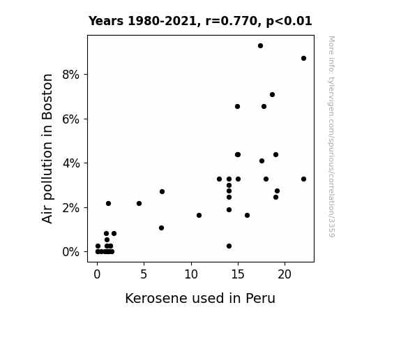
What else correlates?
Air pollution in Boston · all weather
Kerosene used in Peru · all energy
Air pollution in Boston · all weather
Kerosene used in Peru · all energy
Why this works
- Data dredging: I have 25,237 variables in my database. I compare all these variables against each other to find ones that randomly match up. That's 636,906,169 correlation calculations! This is called “data dredging.”
Fun fact: the chart used on the wikipedia page to demonstrate data dredging is also from me. I've been being naughty with data since 2014.
Instead of starting with a hypothesis and testing it, I instead tossed a bunch of data in a blender to see what correlations would shake out. It’s a dangerous way to go about analysis, because any sufficiently large dataset will yield strong correlations completely at random. - Lack of causal connection: There is probably no direct connection between these variables, despite what the AI says above.
Because these pages are automatically generated, it's possible that the two variables you are viewing are in fact causually related. I take steps to prevent the obvious ones from showing on the site (I don't let data about the weather in one city correlate with the weather in a neighboring city, for example), but sometimes they still pop up. If they are related, cool! You found a loophole.
This is exacerbated by the fact that I used "Years" as the base variable. Lots of things happen in a year that are not related to each other! Most studies would use something like "one person" in stead of "one year" to be the "thing" studied. - Observations not independent: For many variables, sequential years are not independent of each other. You will often see trend-lines form. If a population of people is continuously doing something every day, there is no reason to think they would suddenly change how they are doing that thing on January 1. A naive p-value calculation does not take this into account.
You will calculate a lower chance of "randomly" achieving the result than represents reality.
To be more specific: p-value tests are probability values, where you are calculating the probability of achieving a result at least as extreme as you found completely by chance. When calculating a p-value, you need to assert how many "degrees of freedom" your variable has. I count each year (minus one) as a "degree of freedom," but this is misleading for continuous variables.
This kind of thing can creep up on you pretty easily when using p-values, which is why it's best to take it as "one of many" inputs that help you assess the results of your analysis.
- Y-axes doesn't start at zero: I truncated the Y-axes of the graphs above. I also used a line graph, which makes the visual connection stand out more than it deserves.
Nothing against line graphs. They are great at telling a story when you have linear data! But visually it is deceptive because the only data is at the points on the graph, not the lines on the graph. In between each point, the data could have been doing anything. Like going for a random walk by itself!
Mathematically what I showed is true, but it is intentionally misleading. If you click on any of the charts that abuse this, you can scroll down to see a version that starts at zero. - Confounding variable: Confounding variables (like global pandemics) will cause two variables to look connected when in fact a "sneaky third" variable is influencing both of them behind the scenes.
- Outliers: Some datasets here have outliers which drag up the correlation.
In concept, "outlier" just means "way different than the rest of your dataset." When calculating a correlation like this, they are particularly impactful because a single outlier can substantially increase your correlation.
Because this page is automatically generated, I don't know whether any of the charts displayed on it have outliers. I'm just a footnote. ¯\_(ツ)_/¯
I intentionally mishandeled outliers, which makes the correlation look extra strong. - Low n: There are not many data points included in some of these charts.
You can do analyses with low ns! But you shouldn't data dredge with a low n.
Even if the p-value is high, we should be suspicious of using so few datapoints in a correlation.
Pro-tip: click on any correlation to see:
- Detailed data sources
- Prompts for the AI-generated content
- Explanations of each of the calculations (correlation, p-value)
- Python code to calculate it yourself


