spurious correlations
discover · random · spurious scholar
← previous page · next page →


View details about correlation #1,988
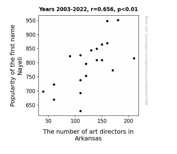
A Work of Art: Exploring the Nayeli-n Art Director Connection in Arkansas
Every time someone named Nayeli introduced themselves, people couldn't help but exclaim, "Nayeli, that's a work of art!" This led to a surge in interest in all things creative, inspiring individuals to pursue careers as art directors, even in the unexpected setting of Arkansas. The name Nayeli became synonymous with an artistic flair, proving that the impact of a name can truly be a-frame-ative.

What else correlates?
Popularity of the first name Nayeli · all first names
The number of art directors in Arkansas · all cccupations
Popularity of the first name Nayeli · all first names
The number of art directors in Arkansas · all cccupations


View details about correlation #1,948
Nuclear Power Generation in Iran and Wins for the Cleveland Guardians: A Fission-Driven Connection
The increase in nuclear power generation in Iran led to a rise in electromagnetic field disturbances, creating a unique energy resonance that somehow favored the Cleveland Guardians during their games. This unexpected connection has left both sports analysts and physicists alike scratching their heads in bewilderment.
What else correlates?
Nuclear power generation in Iran · all energy
Wins for the Cleveland Guardians · all sports
Nuclear power generation in Iran · all energy
Wins for the Cleveland Guardians · all sports


View details about correlation #1,404
Mastering Customer Satisfaction: A Precision Production of Rite Aid's Impact on Customer Contentment
As the number of precision production Master’s degree holders rises, so does the precision of Rite Aid’s pill counting and medication dispensing processes. This leads to more accurate prescriptions, fewer mix-ups, and a lot less confusion about whether the little white pill is for allergies or anxiety. And let’s face it, getting the right medication on the first try is a surefire way to keep the customers smiling, even if they’re just faking it ‘til their next refill.


What else correlates?
Master's degrees awarded in Precision production · all education
Customer satisfaction with Rite Aid · all weird & wacky
Master's degrees awarded in Precision production · all education
Customer satisfaction with Rite Aid · all weird & wacky


View details about correlation #2,324
Churning the Heat: Exploring the Dairy-sasterous Connection Between Milk Consumption and Arson in Iowa
Fewer people were crying over spilled milk, so they were less likely to start a fire in a fit of dairy-induced rage.


What else correlates?
Milk consumption · all food
Arson in Iowa · all random state specific
Milk consumption · all food
Arson in Iowa · all random state specific


View details about correlation #3,552
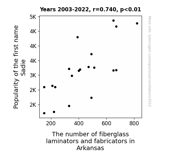
The Sadie-Fiberglass Conundrum in Arkansas: A Statistical Analysis of Name Popularity and Occupational Trends
It turns out, as the name Sadie gained popularity, more and more babies were being named after the song "Sadie the Cleaning Lady" by Johnny Farnham. This led to a surge in demand for fiberglass laminators and fabricators in Arkansas, as parents wanted to ensure their little cleaning Sadies had a bright future in the industry. It's a real resin to believe in the power of a name!


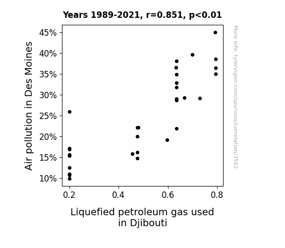
View details about correlation #3,562
Asthma Drama: Air Pollution in Des Moines and Liquefied Petroleum Gas in Djibouti
As air pollution in Des Moines increased, it created a global demand for clean fuel alternatives. This led to a rise in the production and export of Liquefied petroleum gas in Djibouti, as they saw an opportunity to cash in on the smoggy situation. So, in a strange twist of fate, the dirty air in Des Moines ended up sparking a clean fuel boom in Djibouti. It's like they say, where there's smog, there's LPG!

What else correlates?
Air pollution in Des Moines · all weather
Liquefied petroleum gas used in Djibouti · all energy
Air pollution in Des Moines · all weather
Liquefied petroleum gas used in Djibouti · all energy
. The chart goes from 2002 to 2022, and the two variables track closely in value over that time.")

View details about correlation #3,132
Fruitful Investment: The Bananas Connection Between Household Fruit Spending and Royal Bank of Canada's Stock Price
As US households spent more on fresh fruits, they also bought more fruit bowls, leading to a surge in demand for decorative ceramic fruit bowl replicas. This unexpected demand boost caught the attention of art collectors, who saw the fruit bowl replicas as the next big investment. The heightened interest in fruit bowl art caused a ripple in the art market, leading to art-related stocks, including Royal Bank of Canada, to soar as investors scrambled to get a juicy piece of the fruit bowl investment craze. Remember, a fruitful economy starts with the seeds of healthy spending habits!


What else correlates?
Annual US household spending on fresh fruits · all weird & wacky
Royal Bank of Canada's stock price (RY) · all stocks
Annual US household spending on fresh fruits · all weird & wacky
Royal Bank of Canada's stock price (RY) · all stocks


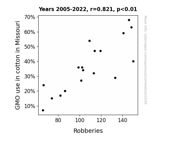
View details about correlation #2,039
Seeing Through the Genetic Cotton: The Boll Weevil Effect on Robbery Rate in Missouri
It turns out that as GMO use in cotton decreased, the size of the cotton bolls also decreased. This led to a nationwide shortage of cotton balls for cosmetic and first aid use. With fewer cotton balls available, would-be robbers found it increasingly difficult to carry out their crimes while maintaining proper personal hygiene and tending to any unexpected boo-boos. This unforeseen consequence serves as a stark reminder that even the smallest decisions can have a big impact on the cleanliness and well-being of our communities. Remember, cleanliness may not be next to godliness, but it could be the key to reducing crime!
What else correlates?
GMO use in cotton in Missouri · all food
Robberies in the US · all random state specific
GMO use in cotton in Missouri · all food
Robberies in the US · all random state specific


View details about correlation #3,396
Kerosene Kismet: Connecting Air Pollution in Washington, D.C. to Kerosene Consumption in Peru
As air pollution decreased in Washington, D.C., it created a domino effect on global environmental consciousness. People were no longer willing to accept filthy air, so they started a 'clean air' movement. This movement took flight and soon reached Peru, where it sparked a 'kerosene clean-up' campaign. Residents in Peru realized they needed to 'kero-clean' their act and find alternative, less polluting fuel sources. As a result, the demand for kerosene in Peru dropped faster than you can say 'smog-free skies,' all thanks to the unexpected pollutant purge in D.C. It seems like even air pollution has the power to 'air-ase' change in the world!


What else correlates?
Air pollution in Washington, D.C. · all weather
Kerosene used in Peru · all energy
Air pollution in Washington, D.C. · all weather
Kerosene used in Peru · all energy


View details about correlation #2,587
Marilyn's Magnetism: A Statistical Study of the Correlation between the Popularity of the Name Marilyn and the Number of Insulation Workers in Indiana
As the name Marilyn regained popularity, more people were inspired to channel their inner Monroe and pursue careers in a similar glamorous, yet misunderstood, field. This led to a surge in demand for insulation workers in Indiana, as individuals strived to create their own iconic moments while staying warm and cozy. It's like the silver screen met the silver lining, creating a star-studded workforce of insulating proportions!


What else correlates?
Popularity of the first name Marilyn · all first names
The number of insulation workers in Indiana · all cccupations
Popularity of the first name Marilyn · all first names
The number of insulation workers in Indiana · all cccupations


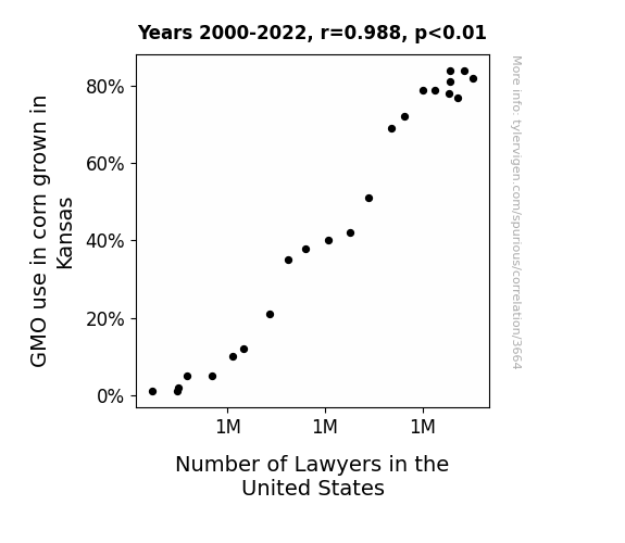
View details about correlation #3,664
The Kernel of Legal Ambiguity: Exploring the Correlation Between GMO Corn in Kansas and the Number of Lawyers in the United States
As GMO corn in Kansas grew larger and more resilient, it created a surplus of corn. This led to an increase in corn-related legal disputes, prompting a higher demand for lawyers in the United States. They say this is the corniest reason for the lawyer population boom!

What else correlates?
GMO use in corn grown in Kansas · all food
Number of Lawyers in the United States · all weird & wacky
GMO use in corn grown in Kansas · all food
Number of Lawyers in the United States · all weird & wacky


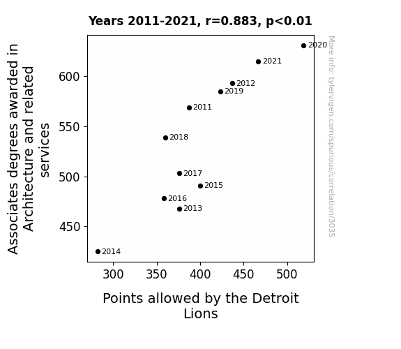
View details about correlation #3,035
Building Up the Scores: Exploring the Relationship Between Associates Degrees in Architecture and Related Services and the Points Allowed by the Detroit Lions
As more people became knowledgeable about architectural principles, they couldn't help but notice the glaring design flaws in the Lions' defense. It turns out, applying the concept of open floor plans to football just created more open spaces for the opposing teams to score. Plus, the Lions kept insisting on implementing a "brutalist" style of defense, which wasn't exactly effective in stopping the offense from constructing scoring drives.

What else correlates?
Associates degrees awarded in Architecture · all education
Points allowed by the Detroit Lions · all sports
Associates degrees awarded in Architecture · all education
Points allowed by the Detroit Lions · all sports


View details about correlation #2,769
Lighting Up the Connection: An Illuminating Study on the Relationship between Air Pollution in Dayton and Kerosene Usage in the United States
As air pollution in Dayton decreased, the local pigeons found it easier to breathe and therefore became more active. These pigeons, known for their impeccable communication skills, started a nationwide movement among birds to protest against the burning of kerosene. Their slogan "Don't be mean, keep the skies clean" quickly took flight, leading to a bird boycott of kerosene production. This unexpected avian activism caused a shortage of kerosene in the United States, as the birds refused to let the issue fly under the radar.


What else correlates?
Air pollution in Dayton · all weather
Kerosene used in United States · all energy
Air pollution in Dayton · all weather
Kerosene used in United States · all energy


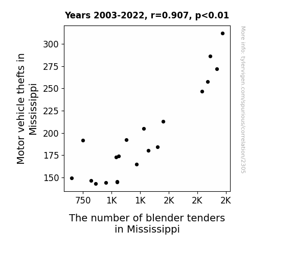
View details about correlation #2,305
The Great Mississippi Theft-a-Blender Conundrum
As motor vehicle thefts in Mississippi decreased, more people were able to hold onto their cars, reducing the need for blender tenders to blend in as they made their smooth getaway. It seems like the criminal smoothie operation has hit a roadblock!

. The chart goes from 2002 to 2022, and the two variables track closely in value over that time.")

View details about correlation #1,099
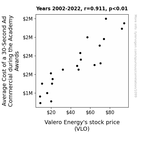
Oil Be There for You: The Crude Connection Between Oscar Ad Costs and Valero Energy's Stock Price
As the 30-second ad cost rose, companies with ad budgets had to cut corners elsewhere. Some decided to skimp on office snacks, leading to a drop in demand for snack products. This reduced the need for packaging, impacting the demand for plastic, which is derived from petroleum, a major product for Valero Energy. The unexpected surge in ad prices led to an indirect boost in Valero's stock as the snack ripple effect kicked in.


View details about correlation #1,956
Cruzin' down the Degree Path: Exploring the Relation between the Name Cruz and Transportation and Materials Moving Associate Degrees
As the name "Cruz" gained popularity, more and more babies were subconsciously imbued with an inexplicable talent for operating forklifts and navigating traffic cones. This naturally led to a surge in individuals pursuing careers in transportation and materials moving, as if drawn to their true calling on the road and in the warehouse.
What else correlates?
Popularity of the first name Cruz · all first names
Associates degrees awarded in Transportation · all education
Popularity of the first name Cruz · all first names
Associates degrees awarded in Transportation · all education


View details about correlation #1,297
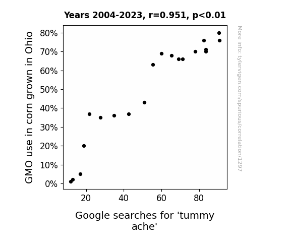
Maize Genetics: A Corny Connection Between GMOs and Google Searches for 'Tummy Ache'
The corn just couldn't stomach all those genetic modifications, leading to a-MAIZE-ing digestive distress. It seems the GMOs were causing some cornfusion in the stomachs of Ohioans, creating a real kernel of discomfort.

What else correlates?
GMO use in corn grown in Ohio · all food
Google searches for 'tummy ache' · all google searches
GMO use in corn grown in Ohio · all food
Google searches for 'tummy ache' · all google searches


View details about correlation #3,057
From Tunisia's Hydropower to Iowa's Ship Enroll - A Statistical Stroll
The lack of hydro-energy in Tunisia caused a ripple effect, leading to a shortage of affordable motorboat fuel in Iowa. This, in turn, made it economically unfeasible for sailors and marine oilers to continue their nautical pursuits in the landlocked state. The waves of change in Tunisian energy production truly rocked the boat for these midwestern seafarers.


What else correlates?
Hydopower energy generated in Tunisia · all energy
The number of sailors and marine oilers in Iowa · all cccupations
Hydopower energy generated in Tunisia · all energy
The number of sailors and marine oilers in Iowa · all cccupations


View details about correlation #1,695
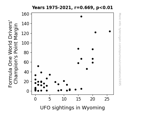
Driving Forces: The Unearthly Link Between Formula One World Drivers' Champion's Point Margin and UFO Sightings in Wyoming
As the point margin of the Formula One World Drivers' Champion increases, their level of confidence and skill on the race track also increases. This heightened level of skill and confidence somehow generates a ripple effect that amplifies the Earth's electromagnetic field, creating a temporary interdimensional wormhole above Wyoming. This wormhole serves as a popular interstellar highway for extraterrestrial tourists, leading to an increase in UFO sightings in the area. Who would have thought that F1 racing could have such otherworldly implications?

What else correlates?
Formula One World Drivers' Champion's Point Margin · all sports
UFO sightings in Wyoming · all random state specific
Formula One World Drivers' Champion's Point Margin · all sports
UFO sightings in Wyoming · all random state specific
. The chart goes from 2002 to 2022, and the two variables track closely in value over that time.")

View details about correlation #3,534
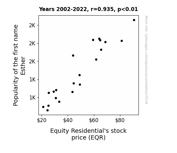
Esther’s Equity: Examining the Effect of the First Name Esther on Equity Residential's Stock Price
Every time a baby was named Esther, a new rental property magically appeared, boosting Equity Residential's assets and driving up their stock price. It was like a real estate fairy tale come to life! As the Esthers multiplied, so did the housing market, making EQR investors believe in a future ruled by Queen Esthers of real estate. It was a name game that Esther-ed the company with prosperity, proving that when it came to stock success, Esther was truly the best-her!

What else correlates?
Popularity of the first name Esther · all first names
Equity Residential's stock price (EQR) · all stocks
Popularity of the first name Esther · all first names
Equity Residential's stock price (EQR) · all stocks
Why this works
- Data dredging: I have 25,237 variables in my database. I compare all these variables against each other to find ones that randomly match up. That's 636,906,169 correlation calculations! This is called “data dredging.”
Fun fact: the chart used on the wikipedia page to demonstrate data dredging is also from me. I've been being naughty with data since 2014.
Instead of starting with a hypothesis and testing it, I instead tossed a bunch of data in a blender to see what correlations would shake out. It’s a dangerous way to go about analysis, because any sufficiently large dataset will yield strong correlations completely at random. - Lack of causal connection: There is probably no direct connection between these variables, despite what the AI says above.
Because these pages are automatically generated, it's possible that the two variables you are viewing are in fact causually related. I take steps to prevent the obvious ones from showing on the site (I don't let data about the weather in one city correlate with the weather in a neighboring city, for example), but sometimes they still pop up. If they are related, cool! You found a loophole.
This is exacerbated by the fact that I used "Years" as the base variable. Lots of things happen in a year that are not related to each other! Most studies would use something like "one person" in stead of "one year" to be the "thing" studied. - Observations not independent: For many variables, sequential years are not independent of each other. You will often see trend-lines form. If a population of people is continuously doing something every day, there is no reason to think they would suddenly change how they are doing that thing on January 1. A naive p-value calculation does not take this into account.
You will calculate a lower chance of "randomly" achieving the result than represents reality.
To be more specific: p-value tests are probability values, where you are calculating the probability of achieving a result at least as extreme as you found completely by chance. When calculating a p-value, you need to assert how many "degrees of freedom" your variable has. I count each year (minus one) as a "degree of freedom," but this is misleading for continuous variables.
This kind of thing can creep up on you pretty easily when using p-values, which is why it's best to take it as "one of many" inputs that help you assess the results of your analysis.
- Y-axes doesn't start at zero: I truncated the Y-axes of the graphs above. I also used a line graph, which makes the visual connection stand out more than it deserves.
Nothing against line graphs. They are great at telling a story when you have linear data! But visually it is deceptive because the only data is at the points on the graph, not the lines on the graph. In between each point, the data could have been doing anything. Like going for a random walk by itself!
Mathematically what I showed is true, but it is intentionally misleading. If you click on any of the charts that abuse this, you can scroll down to see a version that starts at zero. - Confounding variable: Confounding variables (like global pandemics) will cause two variables to look connected when in fact a "sneaky third" variable is influencing both of them behind the scenes.
- Outliers: Some datasets here have outliers which drag up the correlation.
In concept, "outlier" just means "way different than the rest of your dataset." When calculating a correlation like this, they are particularly impactful because a single outlier can substantially increase your correlation.
Because this page is automatically generated, I don't know whether any of the charts displayed on it have outliers. I'm just a footnote. ¯\_(ツ)_/¯
I intentionally mishandeled outliers, which makes the correlation look extra strong. - Low n: There are not many data points included in some of these charts.
You can do analyses with low ns! But you shouldn't data dredge with a low n.
Even if the p-value is high, we should be suspicious of using so few datapoints in a correlation.
Pro-tip: click on any correlation to see:
- Detailed data sources
- Prompts for the AI-generated content
- Explanations of each of the calculations (correlation, p-value)
- Python code to calculate it yourself


