spurious correlations
discover · random · spurious scholar
← previous page · next page →


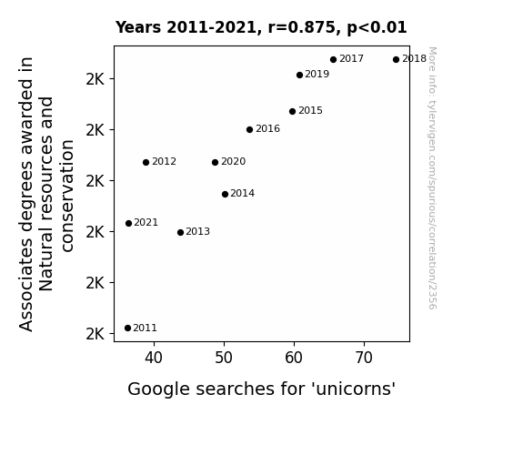
View details about correlation #2,356
The Ripple Effect: Associates Degrees in Natural Resources and Conservation and Google Searches for 'Unicorns'
As more students became proficient in plant and animal care, the magical unicorn habitat saw a significant improvement in ecological conditions. This led to a boost in unicorn populations, sparking widespread fascination and prompting people to search for these majestic creatures. After all, who wouldn't want to learn more about the enchanting results of a well-managed forest or a pristine meadow on unicorns?


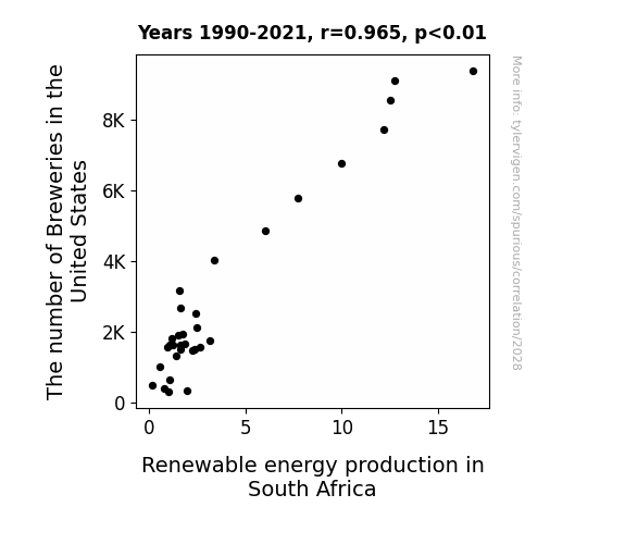
View details about correlation #2,028
Beer Breweries and Biofuel Balance: A Boozy Blend or Brazen Bust?
As the number of breweries in the United States increased, there was a proportional rise in the production of beer. This led to a spike in the demand for barley, prompting farmers in South Africa to seek more sustainable farming practices. In order to meet this demand, they shifted towards using renewable energy sources to power their barley production, inadvertently contributing to the overall increase in renewable energy production in South Africa. What a brew-tifully unexpected connection!

What else correlates?
The number of Breweries in the United States · all food
Renewable energy production in South Africa · all energy
The number of Breweries in the United States · all food
Renewable energy production in South Africa · all energy


View details about correlation #1,884
Unidentified Food Objects (UFOs) and Unbeatable Eaters: Exploring the Link Between Florida UFO Sightings and Nathan's Hot Dog Consumption
The UFOs were beaming down extra relish and mustard, leading to a saucy spike in hotdog consumption. It seems the extra-terrestrial visitors were really raising the *steaks* for competitive eating!


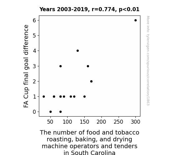
View details about correlation #1,863
The Score Roast: Exploring the Correlation between FA Cup Final Goal Difference and Employment of Food and Tobacco Roasting, Baking, and Drying Machine Operators and Tenders in South Carolina
As FA Cup final goal differences widened, it created a ripple effect in the sports world, leading to an increased demand for snack foods, including roasted and baked goods. This, in turn, sparked a hiring spree for food and tobacco roasting, baking, and drying machine operators and tenders in South Carolina. You could say the job market was really heating up, as these operators were on a roll, proving that even in the world of sports and snacks, the dough always rises to the occasion!


View details about correlation #2,521
Unleashing the Undead: A Lighthearted Inquisition into the Relationship Between Associates Degrees in Criminal Justice and Corrections and Google Searches for 'Zombies'
By awarding fewer Associates degrees in Criminal Justice and Corrections, we've inadvertently created a shortage of zombie-fighting expertise, leading to a decrease in zombies overall. It seems the undead just can't catch a break when there are fewer criminal justice associates to bring them to justice!


View details about correlation #2,030
The Sonny and Wind Study: Searching for a Silly Synergy
The more people named Sonny, the sunnier the disposition, leading to an increase in wind power generated in Norway. As their sunny attitudes spread, so did the gusts of wind, powering up those Norwegian wind turbines! A real case of Sonny side up, brightening the renewable energy scene in Norway.


What else correlates?
Popularity of the first name Sonny · all first names
Wind power generated in Norway · all energy
Popularity of the first name Sonny · all first names
Wind power generated in Norway · all energy


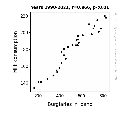
View details about correlation #2,091
Got Milk? A Lactose Criminal Connection in Idaho
As people drank less milk, their lactose intolerance decreased, leading to less discomfort and improved moods. This resulted in would-be burglars feeling less irritable and therefore less likely to engage in criminal behavior. Who knew that the key to reducing crime in Idaho was udderly connected to milk consumption?

What else correlates?
Milk consumption · all food
Burglaries in Idaho · all random state specific
Milk consumption · all food
Burglaries in Idaho · all random state specific
. The chart goes from 2002 to 2022, and the two variables track closely in value over that time.")

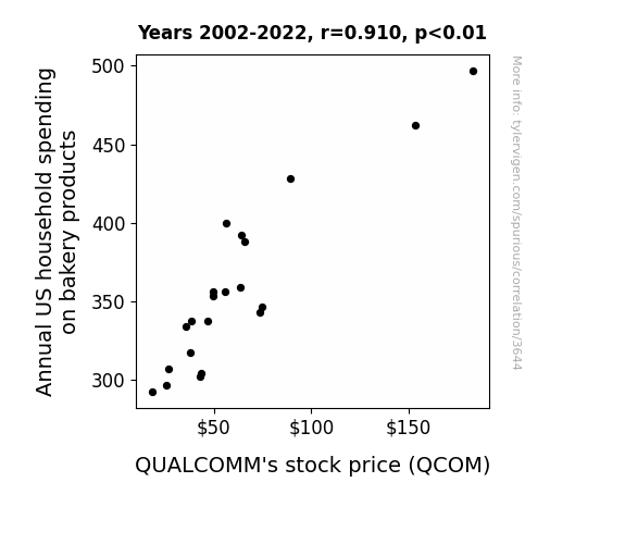
View details about correlation #3,644
Dough or Dough-Nut: The Yeast of these Worries? Examining the Relationship Between Annual US Household Spending on Bakery Products and QUALCOMM's Stock Price
As household spending on bakery products rises, more people experience carb-induced happiness. This leads to an uptick in overall consumer satisfaction. With consumers in a better mood, there's increased demand for electronic devices, including those with QUALCOMM components, as people 'knead' more entertainment and connectivity. This surge in demand for tech products boosts QUALCOMM's stock price as investors realize that the company is on a roll.

What else correlates?
Annual US household spending on bakery products · all weird & wacky
QUALCOMM's stock price (QCOM) · all stocks
Annual US household spending on bakery products · all weird & wacky
QUALCOMM's stock price (QCOM) · all stocks


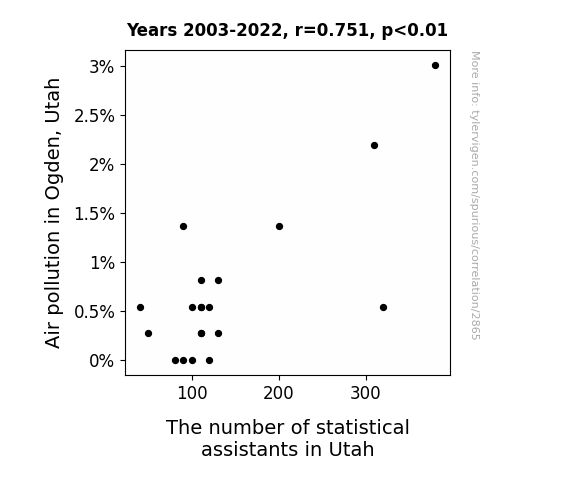
View details about correlation #2,865
The Breath of Fresh Air: A Statistical Analysis of Air Pollution in Ogden, Utah and the Employment of Statistical Assistants in Utah
As the air quality in Ogden worsened, more and more people realized they couldn't take it for granted. This led to a statistical spike in the demand for statistical assistants all across Utah, as businesses and organizations scrambled to analyze the air pollution data and come up with air-tight solutions. The correlation between the two seemed to be pollutively strong, prompting a wheeze of relief from statistical assistants who were finally breathing in job opportunities. It was a real clear case of correlation without causation!

What else correlates?
Air pollution in Ogden, Utah · all weather
The number of statistical assistants in Utah · all cccupations
Air pollution in Ogden, Utah · all weather
The number of statistical assistants in Utah · all cccupations


View details about correlation #3,569
Stargazing Solar: The Celestial Connection Between Solar Power Generation in Mauritius and Searches for 'What is My Zodiac Sign' on Google
The surge in solar power in Mauritius is aligning with the cosmos, creating a gravitational pull on people's interest in astrology. It's like the Sun is saying, "Let me Leo-n your interest in zodiac signs!" This connection is simply stellar!


What else correlates?
Solar power generated in Mauritius · all energy
Google searches for 'what is my zodiac sign' · all google searches
Solar power generated in Mauritius · all energy
Google searches for 'what is my zodiac sign' · all google searches


View details about correlation #2,464
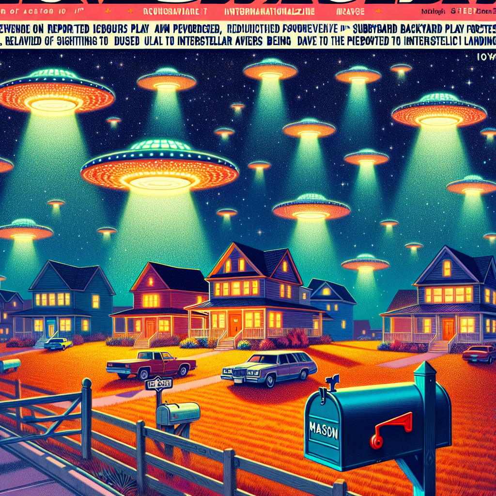
Out of This World Names: Exploring the Interstellar Interplay between Masons and UFOs in Iowa
As the name Mason gained popularity, more and more parents unknowingly chose intergalactic beacon frequencies for their baby monitors. This led to a spike in alien activity in Iowa as the little Masons inadvertently made it easier for UFOs to communicate and coordinate their sightings. As absurd as it may sound, it's as if the universe couldn't resist the opportunity to say, "Hey, we're here for the Mason party in Iowa!"

What else correlates?
Popularity of the first name Mason · all first names
UFO sightings in Iowa · all random state specific
Popularity of the first name Mason · all first names
UFO sightings in Iowa · all random state specific


View details about correlation #2,780
A-Maize-ing Correlations: Exploring the Connection Between GMO Corn in Indiana and Customer Satisfaction with Southwest Airlines
The genetically modified corn stalks were inadvertently emitting a pheromone that had a calming effect on people, leading to more relaxed and happy passengers flying with Southwest Airlines.


What else correlates?
GMO use in corn grown in Indiana · all food
Customer satisfaction with Southwest Airlines · all weird & wacky
GMO use in corn grown in Indiana · all food
Customer satisfaction with Southwest Airlines · all weird & wacky


View details about correlation #2,414
Stick to the Rink: The Link Between Detroit Red Wings' Wins and Missouri Bus Driving Shifts
As the Detroit Red Wings continued to lose, their fans in Missouri became increasingly distraught. In an attempt to avoid any more disappointment, these fans decided to leave the city and pursue a more victorious existence elsewhere. This mass exodus led to a shortage of city bus drivers in Missouri, as even the most skilled drivers couldn't navigate their way out of such a Red Wings-induced predicament. So, remember folks, every time the Red Wings win, a city bus driver in Missouri gets their wings too!

. The chart goes from 2010 to 2023, and the two variables track closely in value over that time.")

View details about correlation #1,967
Googling Elon Musk: The Shocking Connection to Morgan Stanley's Stock Price
As the number of Elon Musk Google searches skyrocketed, internet traffic surged. This increase in web activity led to a higher demand for internet bandwidth, causing a strain on existing infrastructure. To keep up with this unexpected spike, telecommunication companies had to invest heavily in expanding their networks. This sudden boost in infrastructure spending caught the attention of investors, who saw potential for growth in the sector. With a newfound focus on telecommunications, Morgan Stanley's stock price experienced a stellar rise as it was seen as a key player in facilitating the needed financial transactions for these network expansions.

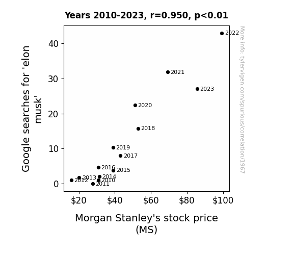
What else correlates?
Google searches for 'elon musk' · all google searches
Morgan Stanley's stock price (MS) · all stocks
Google searches for 'elon musk' · all google searches
Morgan Stanley's stock price (MS) · all stocks


View details about correlation #2,669
Anchorage's Air Pollution and Venezuela's Vapor: A Statistical Analysis
As the air cleared in Anchorage, it created a kerosene domino effect, leading to a lack of inhalation in Venezuela. It seems Alaska's emission reduction had a-scent-uated impacts on Venezuela's kerosene production, proving that when it comes to air quality, it's all connected in a global 'breathe' of life. Just goes to show, when Anchorage air pollution went down, Venezuela's kerosene usage hit rock bottom!

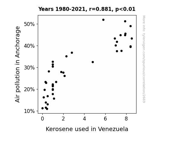
What else correlates?
Air pollution in Anchorage · all weather
Kerosene used in Venezuela · all energy
Air pollution in Anchorage · all weather
Kerosene used in Venezuela · all energy


View details about correlation #1,374
Arson in Massachusetts and Cigarette Smoking: A Flaming Connection
It's simple really. When the arson rate in Massachusetts decreased, there were fewer fires. And you know what they say, where there's smoke, there's fire! With fewer fires, there's less need for firefighters. And with fewer firefighters around, it's harder for people to ignite their unhealthy habit. It's like the universe was extinguishing two kinds of burning at once!

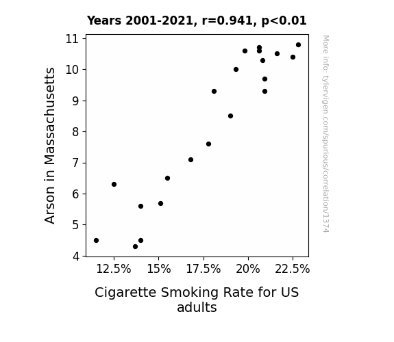
What else correlates?
Arson in Massachusetts · all random state specific
Cigarette Smoking Rate for US adults · all weird & wacky
Arson in Massachusetts · all random state specific
Cigarette Smoking Rate for US adults · all weird & wacky


View details about correlation #2,333
Battle Gear Lear, Actuaries in Utah: A Correlation Study From 2012 to 2021
As more military technology grads deployed their skills, it created a calculated domino effect in the job market. Maybe these actuaries just couldn't resist the army of opportunities rolling in. Simply put, the demand for number-crunching experts in Utah detonated, thanks to the explosive growth in military tech degrees. It's a prime example of how career trajectories can intersect in the most unforeseen ways.

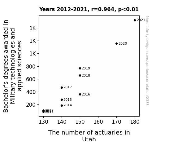
What else correlates?
Bachelor's degrees awarded in Military technologies · all education
The number of actuaries in Utah · all cccupations
Bachelor's degrees awarded in Military technologies · all education
The number of actuaries in Utah · all cccupations


View details about correlation #2,754
GMO Crop or Google Mischief? Unveiling the 'Maize'y Connection Between GMO Corn in South Dakota and Google Searches for 'CIA Hotline'
Without GMOs, the corn in South Dakota developed a kernel of suspicion. This led to a-maize-ing paranoia among the CIA agents, who were convinced that the corn was all ears. As a result, they decided to stalk-atoe instead of using the hotline, decreasing the number of cia hotline searches. It was a cornundrum of espionage proportions!

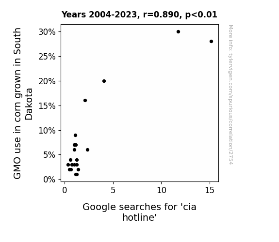
What else correlates?
GMO use in corn grown in South Dakota · all food
Google searches for 'cia hotline' · all google searches
GMO use in corn grown in South Dakota · all food
Google searches for 'cia hotline' · all google searches
. The chart goes from 2006 to 2022, and the two variables track closely in value over that time.")

View details about correlation #3,280
Striding through the Stock Market: The Walker Name Popularity and Its Impact on DexCom's Stock Price
More babies named Walker led to a surge in demand for baby walkers, prompting an unexpected boom in the infant mobility industry. DexCom capitalized on this trend by introducing the DexCom Baby Walker, a revolutionary product that not only helped babies take their first steps, but also monitored their blood sugar levels. The innovative combination of baby gear and medical technology captured the hearts of parents and investors alike, propelling DexCom's stock price to new heights as the baby walker craze took the world by storm. It was truly a step in the right direction for both DexCom and tiny trendsetting tots everywhere.


What else correlates?
Popularity of the first name Walker · all first names
DexCom's stock price (DXCM) · all stocks
Popularity of the first name Walker · all first names
DexCom's stock price (DXCM) · all stocks


View details about correlation #2,082
Noble Natchez: Aerosol Connection with Burkina Faso Petrol
As the air pollution in Natchez, Mississippi increased, it created a strange and unique atmospheric effect. This effect, which can only be described as the "jazzy pollution jetstream," somehow crossed continents and ended up supercharging the jet fuel used in Burkina Faso. It’s as if the pollutants were on a mission to give those jets some extra oomph, turning the skies above Burkina Faso into a high-flying, smog-powered dance party. Who knew that Natchez's pollution could be the secret ingredient for a truly uplifting jet experience in Burkina Faso?

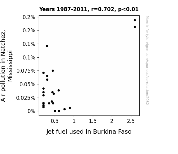
What else correlates?
Air pollution in Natchez, Mississippi · all weather
Jet fuel used in Burkina Faso · all energy
Air pollution in Natchez, Mississippi · all weather
Jet fuel used in Burkina Faso · all energy
Why this works
- Data dredging: I have 25,237 variables in my database. I compare all these variables against each other to find ones that randomly match up. That's 636,906,169 correlation calculations! This is called “data dredging.”
Fun fact: the chart used on the wikipedia page to demonstrate data dredging is also from me. I've been being naughty with data since 2014.
Instead of starting with a hypothesis and testing it, I instead tossed a bunch of data in a blender to see what correlations would shake out. It’s a dangerous way to go about analysis, because any sufficiently large dataset will yield strong correlations completely at random. - Lack of causal connection: There is probably no direct connection between these variables, despite what the AI says above.
Because these pages are automatically generated, it's possible that the two variables you are viewing are in fact causually related. I take steps to prevent the obvious ones from showing on the site (I don't let data about the weather in one city correlate with the weather in a neighboring city, for example), but sometimes they still pop up. If they are related, cool! You found a loophole.
This is exacerbated by the fact that I used "Years" as the base variable. Lots of things happen in a year that are not related to each other! Most studies would use something like "one person" in stead of "one year" to be the "thing" studied. - Observations not independent: For many variables, sequential years are not independent of each other. You will often see trend-lines form. If a population of people is continuously doing something every day, there is no reason to think they would suddenly change how they are doing that thing on January 1. A naive p-value calculation does not take this into account.
You will calculate a lower chance of "randomly" achieving the result than represents reality.
To be more specific: p-value tests are probability values, where you are calculating the probability of achieving a result at least as extreme as you found completely by chance. When calculating a p-value, you need to assert how many "degrees of freedom" your variable has. I count each year (minus one) as a "degree of freedom," but this is misleading for continuous variables.
This kind of thing can creep up on you pretty easily when using p-values, which is why it's best to take it as "one of many" inputs that help you assess the results of your analysis.
- Y-axes doesn't start at zero: I truncated the Y-axes of the graphs above. I also used a line graph, which makes the visual connection stand out more than it deserves.
Nothing against line graphs. They are great at telling a story when you have linear data! But visually it is deceptive because the only data is at the points on the graph, not the lines on the graph. In between each point, the data could have been doing anything. Like going for a random walk by itself!
Mathematically what I showed is true, but it is intentionally misleading. If you click on any of the charts that abuse this, you can scroll down to see a version that starts at zero. - Confounding variable: Confounding variables (like global pandemics) will cause two variables to look connected when in fact a "sneaky third" variable is influencing both of them behind the scenes.
- Outliers: Some datasets here have outliers which drag up the correlation.
In concept, "outlier" just means "way different than the rest of your dataset." When calculating a correlation like this, they are particularly impactful because a single outlier can substantially increase your correlation.
Because this page is automatically generated, I don't know whether any of the charts displayed on it have outliers. I'm just a footnote. ¯\_(ツ)_/¯
I intentionally mishandeled outliers, which makes the correlation look extra strong. - Low n: There are not many data points included in some of these charts.
You can do analyses with low ns! But you shouldn't data dredge with a low n.
Even if the p-value is high, we should be suspicious of using so few datapoints in a correlation.
Pro-tip: click on any correlation to see:
- Detailed data sources
- Prompts for the AI-generated content
- Explanations of each of the calculations (correlation, p-value)
- Python code to calculate it yourself


