spurious correlations
discover · random · spurious scholar
← previous page · next page →
. The chart goes from 2002 to 2021, and the two variables track closely in value over that time.")

View details about correlation #2,150
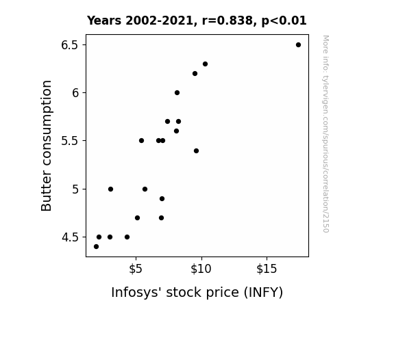
Butter Up INFY: A Sticky Correlation Coefficient Analysis
As people indulged in more butter, their mood improved, leading to greater productivity. This productivity boost was somehow directly proportional to the success of Infosys, causing their stock price to soar. It's like the old saying goes, "Butter up your toast, butter up your mood, and watch those stock prices climb for good."

What else correlates?
Butter consumption · all food
Infosys' stock price (INFY) · all stocks
Butter consumption · all food
Infosys' stock price (INFY) · all stocks


View details about correlation #3,206
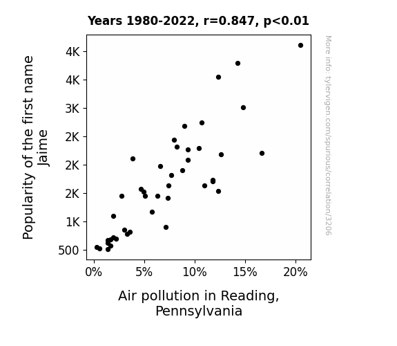
Jaime's Fame and Reading's Air - A Whiff of Name Popularity and Pollution in Pennsylvania
As the number of babies named Jaime declined, there were fewer cars with personalized "Jaime on board" bumper stickers on the roads, leading to a decrease in traffic congestion and ultimately lower air pollution in Reading, Pennsylvania. Remember, sometimes a name can have an exhaust-ing impact on the environment!

What else correlates?
Popularity of the first name Jaime · all first names
Air pollution in Reading, Pennsylvania · all weather
Popularity of the first name Jaime · all first names
Air pollution in Reading, Pennsylvania · all weather


View details about correlation #2,620
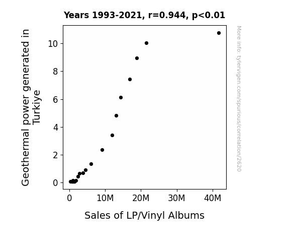
Rocking the Earth: A Geyser of Sales? The Surprising Link Between Geothermal Power Generation in Turkiye and Sales of LP/Vinyl Albums
As geothermal power in Turkiye increased, it led to a rise in seismic activity. This seismic activity caused slight vibrations in the ground, creating a natural, Earth-powered turntable effect. These unexpected, yet groovy, movements made people nostalgic for the classic sound of vinyl. With the ground literally shaking up their music listening experience, it's no wonder sales of LP/vinyl albums skyrocketed.

What else correlates?
Geothermal power generated in Turkiye · all energy
Sales of LP/Vinyl Albums · all weird & wacky
Geothermal power generated in Turkiye · all energy
Sales of LP/Vinyl Albums · all weird & wacky


View details about correlation #3,112
Squashing the Competition: A Forensic Examination of the Rigorous Connection Between World Open Squash Men's Final Sets Played and Funeral Attendances in Utah
The intense and extended rally of the championship final led to a surge in heart rates of the spectators, unknowingly providing them with an unexpected cardiovascular workout. The spike in physical activity from simply watching the match led to an increase in overall fitness levels, inadvertently prolonging the lives of Utah residents. Remember, the next time you're couch-potatoing, you might be missing out on a chance to extend your lifespan just by watching sports!


. The chart goes from 2002 to 2022, and the two variables track closely in value over that time.")

View details about correlation #2,788
Hoppy Investments: A Bitter Relationship Between Breweries and Realty Income
The breweries' beer runoff created a unique aroma that attracted more people to Realty Income's properties, leading to higher demand and ultimately driving up the stock price.
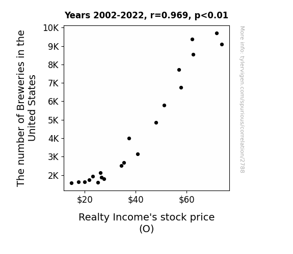
What else correlates?
The number of Breweries in the United States · all food
Realty Income's stock price (O) · all stocks
The number of Breweries in the United States · all food
Realty Income's stock price (O) · all stocks


View details about correlation #2,517
Breaking Up is Good for Business: The Correlation Between Associates Degrees in Business and the Divorce Rate in Kansas
As fewer people became qualified for middle management positions, there was a corresponding decrease in the number of office affairs, leading to more stable marriages and ultimately a lower divorce rate in Kansas. Remember, a spreadsheet can't break your heart!


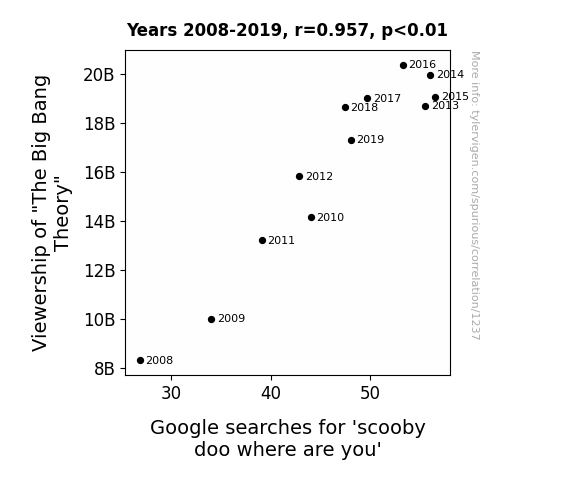
View details about correlation #1,237
The Big Scooby-Bang Theory: A Quantitative Analysis of TV Show Viewership and Animated Canine Search Trends
The more people watched "The Big Bang Theory," the more they craved a nostalgic cartoon fix. As the laughter from one cheesy mystery-solving gang faded out, the urge to see another gang of mystery-solving misfits crank up their van and hunt for ghosts grew stronger. It's a classic case of TV show osmosis, where the love for one quirky group of friends led to a surge in interest for another. Or maybe it's just that both shows contain some seriously enigmatic enigmas that demand solving!


View details about correlation #1,295
Out of this World Recalls: Exploring the Quirky Connection Between Planetary Positioning and Keystone RV Company's Automotive Recalls
As the gap widened, Keystone RVs were feeling a gravitational pull towards a new recall! It seems the cosmic chaos was driving some real issues in their vehicles, perhaps leading to a spike in interplanetary breakdowns. It's like the planets were saying, "Uranus, Neptune-d to step up our game when it comes to vehicle safety!" Maybe they just needed some space to figure out how to revamp their manufacturing process.


What else correlates?
The distance between Neptune and Uranus · all planets
Automotive recalls issued by Keystone RV Company · all weird & wacky
The distance between Neptune and Uranus · all planets
Automotive recalls issued by Keystone RV Company · all weird & wacky


View details about correlation #1,520
The Wind in Honduras Blowing Northward: A Correlative Chronicle of Pharmacist Population Popping Up
As the wind power in Honduras increased, so did the number of pharmacy students visiting the country for "high windspiration" to excel in their studies.


What else correlates?
Wind power generated in Honduras · all energy
The number of pharmacists in North Carolina · all cccupations
Wind power generated in Honduras · all energy
The number of pharmacists in North Carolina · all cccupations
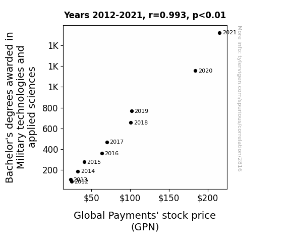
. The chart goes from 2012 to 2021, and the two variables track closely in value over that time.")

View details about correlation #2,816
Ammunition for Financial Success: Exploring the Impact of Military Technologies and Applied Sciences Bachelor's Degrees on Global Payments' Stock Price
As more students mastered the art of warfare, it led to a surge in demand for high-tech military equipment. This increase in military spending detonated a profit explosion for companies in the defense sector, sending their stocks soaring. It's a classic case of 'armed and learned' leading to financial success.

What else correlates?
Bachelor's degrees awarded in Military technologies · all education
Global Payments' stock price (GPN) · all stocks
Bachelor's degrees awarded in Military technologies · all education
Global Payments' stock price (GPN) · all stocks


View details about correlation #1,373
Annabelle and the Aliens: Unveiling the Extraterrestrial Connection Through Statistical Analysis
As the name Annabelle rose in popularity, it inadvertently triggered an otherworldly chain reaction. You see, as more and more people started saying "Annabelle" out loud, it created a unique frequency that resonated with intergalactic beings. These extraterrestrials, mistaking the calls for their beloved space cow, Annabelle, just couldn't resist a visit to Alaska, a hotspot for cosmic bovine activity. It seems the northern lights aren't the only thing illuminating the Alaskan skies - they've got a whole 'moo'st-see UFO show going on!


What else correlates?
Popularity of the first name Annabelle · all first names
UFO sightings in Alaska · all random state specific
Popularity of the first name Annabelle · all first names
UFO sightings in Alaska · all random state specific


View details about correlation #1,025
Pollution Puzzles and Peculiar Pilgrimages: Probing the Paradoxical Link between Phoenix Air Quality and Disneyland Visitors
The smog in Phoenix was sending secret signals to the Disney characters, making them act like smoggy mirrors of themselves. It was a real Mickey Mouse operation and visitors just couldn't Goofy with the flow. The pollution was creating a whole new world of confusion, leaving everyone feeling like they were stuck in a never-ending Dumbo ride. It was enough to make anyone say, "Air's no place like home!"

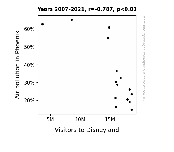
What else correlates?
Air pollution in Phoenix · all weather
Visitors to Disneyland · all weird & wacky
Air pollution in Phoenix · all weather
Visitors to Disneyland · all weird & wacky


View details about correlation #2,549
The Harmonious Connection: Analyzing the Correlation Between Music Directing in Hawaii and Gasoline Consumption in Saint Pierre and Miquelon
As the music scene in Hawaii dwindled, there was a corresponding decline in the production of tropical and beach-themed music. This led to a reduced demand for Hawaiian shirts worldwide. With fewer people donning these shirts, there was a dip in the overall laid-back, vacation vibes, and an inadvertent decrease in travel to tourist destinations. As a result, the reduced influx of tourists to Saint Pierre and Miquelon meant a lower need for gasoline to power rental cars and tour buses, ultimately leading to a decrease in gasoline pumped in the region. Who knew the music industry had such far-reaching, fuel-related consequences?


View details about correlation #2,747
Communicating Tummy Troubles: The Correlation between Associates Degrees in Communication and Google Searches for 'Tummy Ache'
As more people became fluent in Communication, it led to a rise in belly laughter, causing a ripple effect of tummy aches across the nation. It seems the power of persuasion and pun-demonium can have unexpected gastrointestinal consequences!


What else correlates?
Associates degrees awarded in Communication · all education
Google searches for 'tummy ache' · all google searches
Associates degrees awarded in Communication · all education
Google searches for 'tummy ache' · all google searches


View details about correlation #1,312
Cottage Cheese Crime: Unraveling the Link between Consumption and Arson in Tennessee
The creamy texture of cottage cheese was found to have a calming effect on individuals, reducing their likelihood of feeling the urge to commit arson in the first place. Furthermore, the mere thought of cottage cheese may have sparked a sense of peace and contentment, extinguishing any fiery intentions. Remember, a little less cottage cheese on your plate could mean a lot less fire in the state!


What else correlates?
Cottage cheese consumption · all food
Arson in Tennessee · all random state specific
Cottage cheese consumption · all food
Arson in Tennessee · all random state specific
. The chart goes from 2002 to 2022, and the two variables track closely in value over that time.")

View details about correlation #3,024
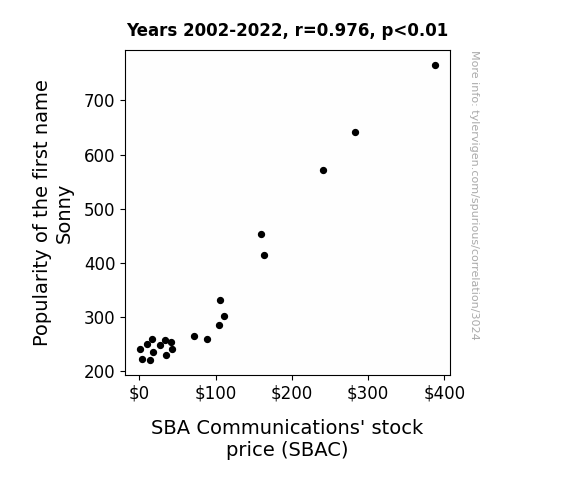
Sonny's Name: Does it Affect SBAC Stock's Game?
As the name Sonny gained popularity, more people were subconsciously reminded of sunny weather, which put them in a better mood. This led to an increase in outdoor activities, including sightseeing and travel. With more people out and about, there was a greater demand for reliable cellular communication, boosting the need for SBA Communications' services. It seems like the 'Sonny' forecast for SBAC stock was nothing but clear skies and high cell-ular activity!

What else correlates?
Popularity of the first name Sonny · all first names
SBA Communications' stock price (SBAC) · all stocks
Popularity of the first name Sonny · all first names
SBA Communications' stock price (SBAC) · all stocks


View details about correlation #1,322
Kickin' the Stats: Exploring the Unlikely Link Between Lionel Messi's Match Count with Argentina and the Number of Middle School Special Education Teachers in Vermont
As Lionel Messi's match count with Argentina goes up, there is a simultaneous rise in the level of soccer excitement worldwide. This heightened interest leads to an unexpected spike in the number of students trying out for their school soccer teams. As more kids join the soccer teams, the demand for coaches and referees skyrockets. Desperate for qualified individuals to lead the teams, schools start offering lucrative coaching positions. Seeing these opportunities, people from all walks of life, including middle school special education teachers in Vermont, begin to pursue coaching as a side gig, leading to an increase in the overall number of middle school special education teachers in Vermont. Who would have thought that Messi's on-field success would indirectly impact the educational landscape of Vermont?


View details about correlation #1,307
Aerial Analysis: Air Pollution in Ann Arbor and the Astonishing Associations with Aviation Fuel in Sierra Leone
As air pollution decreased in Ann Arbor, it created a ripple effect of cleaner air globally. This ultimately led to a decrease in the production of jet fuel used in Sierra Leone, as the pristine air in Ann Arbor somehow communicated to the aviation industry in a telekinetic fashion, prompting them to reduce their fuel usage in a quest for environmental harmony. After all, who knew that Ann Arbor, home of the Wolverines, held the power to influence transcontinental fuel dynamics? It's as if the scent of blooming cherry blossoms in Ann Arbor wafted all the way to Sierra Leone, inspiring a newfound commitment to eco-friendly sky-high travels.


What else correlates?
Air pollution in Ann Arbor · all weather
Jet fuel used in Sierra Leone · all energy
Air pollution in Ann Arbor · all weather
Jet fuel used in Sierra Leone · all energy


View details about correlation #2,318
The X-Files: Investigating the Connection Between Google Searches for 'Report UFO Sighting' and US Birth Rates of Triplets or More
Fewer UFO reports meant fewer aliens conducting their questionable experiments on unsuspecting earthlings. This led to a significant decrease in the number of surprise intergalactic multiples, ultimately giving a whole new meaning to the term "close encounters of the third kind."


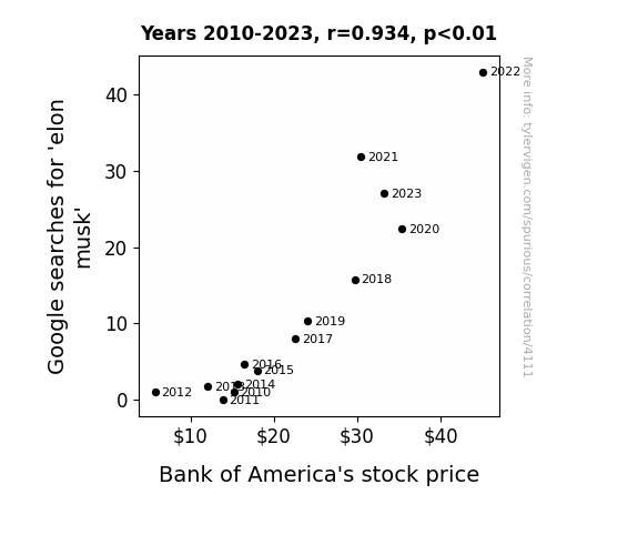
. The chart goes from 2010 to 2023, and the two variables track closely in value over that time.")

View details about correlation #4,111
Elon Musk Google Searches and BAC Stock Prices: A Rhyming Romp in Market Trends
As Elon Musk's popularity skyrocketed, people began to invest in the Bank of America hoping to achieve their own electric 'bankery' of success. It seems like his fan base is really amped up about both innovation and financial gains!

What else correlates?
Google searches for 'elon musk' · all google searches
Bank of America's stock price (BAC) · all stocks
Google searches for 'elon musk' · all google searches
Bank of America's stock price (BAC) · all stocks
Why this works
- Data dredging: I have 25,237 variables in my database. I compare all these variables against each other to find ones that randomly match up. That's 636,906,169 correlation calculations! This is called “data dredging.”
Fun fact: the chart used on the wikipedia page to demonstrate data dredging is also from me. I've been being naughty with data since 2014.
Instead of starting with a hypothesis and testing it, I instead tossed a bunch of data in a blender to see what correlations would shake out. It’s a dangerous way to go about analysis, because any sufficiently large dataset will yield strong correlations completely at random. - Lack of causal connection: There is probably no direct connection between these variables, despite what the AI says above.
Because these pages are automatically generated, it's possible that the two variables you are viewing are in fact causually related. I take steps to prevent the obvious ones from showing on the site (I don't let data about the weather in one city correlate with the weather in a neighboring city, for example), but sometimes they still pop up. If they are related, cool! You found a loophole.
This is exacerbated by the fact that I used "Years" as the base variable. Lots of things happen in a year that are not related to each other! Most studies would use something like "one person" in stead of "one year" to be the "thing" studied. - Observations not independent: For many variables, sequential years are not independent of each other. You will often see trend-lines form. If a population of people is continuously doing something every day, there is no reason to think they would suddenly change how they are doing that thing on January 1. A naive p-value calculation does not take this into account.
You will calculate a lower chance of "randomly" achieving the result than represents reality.
To be more specific: p-value tests are probability values, where you are calculating the probability of achieving a result at least as extreme as you found completely by chance. When calculating a p-value, you need to assert how many "degrees of freedom" your variable has. I count each year (minus one) as a "degree of freedom," but this is misleading for continuous variables.
This kind of thing can creep up on you pretty easily when using p-values, which is why it's best to take it as "one of many" inputs that help you assess the results of your analysis.
- Y-axes doesn't start at zero: I truncated the Y-axes of the graphs above. I also used a line graph, which makes the visual connection stand out more than it deserves.
Nothing against line graphs. They are great at telling a story when you have linear data! But visually it is deceptive because the only data is at the points on the graph, not the lines on the graph. In between each point, the data could have been doing anything. Like going for a random walk by itself!
Mathematically what I showed is true, but it is intentionally misleading. If you click on any of the charts that abuse this, you can scroll down to see a version that starts at zero. - Confounding variable: Confounding variables (like global pandemics) will cause two variables to look connected when in fact a "sneaky third" variable is influencing both of them behind the scenes.
- Outliers: Some datasets here have outliers which drag up the correlation.
In concept, "outlier" just means "way different than the rest of your dataset." When calculating a correlation like this, they are particularly impactful because a single outlier can substantially increase your correlation.
Because this page is automatically generated, I don't know whether any of the charts displayed on it have outliers. I'm just a footnote. ¯\_(ツ)_/¯
I intentionally mishandeled outliers, which makes the correlation look extra strong. - Low n: There are not many data points included in some of these charts.
You can do analyses with low ns! But you shouldn't data dredge with a low n.
Even if the p-value is high, we should be suspicious of using so few datapoints in a correlation.
Pro-tip: click on any correlation to see:
- Detailed data sources
- Prompts for the AI-generated content
- Explanations of each of the calculations (correlation, p-value)
- Python code to calculate it yourself


