spurious correlations
discover · random · spurious scholar
← previous page · next page →


View details about correlation #3,012
Err on the Side of Burglaries: The Correlation Between Erin's Popularity and Break-Ins in Alaskan Localities
As the popularity of the name Erin dwindled, so did the number of people "airin'" out their plans for burglaries, leading to a decrease in criminal activity in Alaska. It seems that when there are fewer Erins around, there's also a decrease in 'break-Erins'!


What else correlates?
Popularity of the first name Erin · all first names
Burglaries in Alaska · all random state specific
Popularity of the first name Erin · all first names
Burglaries in Alaska · all random state specific


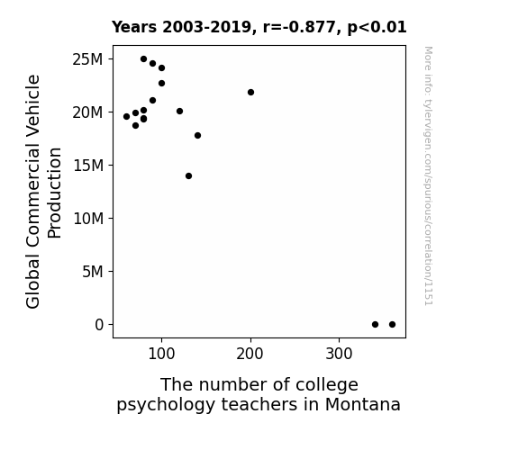
View details about correlation #1,151
Studying the Psychology of Commercial Vehicles: A Correlation Examination of Global Commercial Vehicle Production and the Number of Psychology Professors in Montana
As the demand for commercial vehicles revved up, it drove a shift in focus for Montanan college grads. They wheely couldn't resist the truck industry, leading to a decrease in psychology teachers. It's a case of automotive ambition steering them away from the academic path. Looks like these professors are trading Freud for Ford and Jung for a dump truck!


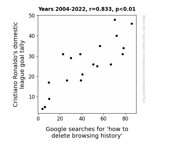
View details about correlation #1,912
Goal Scores and Search Histories: Exploring the Relationship between Cristiano Ronaldo's Domestic League Goals and Online Privacy Concerns
As Ronaldo's goal tally rises, more and more people are in awe of his skills. They then flock to the internet to watch his highlights. However, in their excitement, they accidentally stumble upon their own embarrassing old posts and desperately need to erase any evidence of past doubts about his abilities.


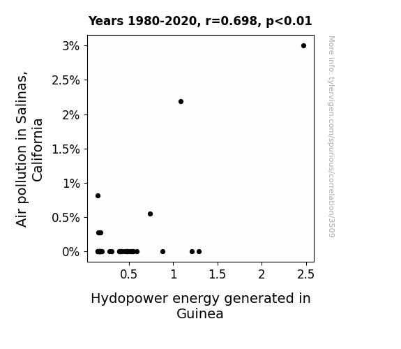
View details about correlation #3,509
Clearing the Air: Exploring the Link Between Air Pollution in Salinas, California and Hydropower Energy Generated in Guinea
The smog from Salinas somehow turbocharged the turbines in Guinea, leading to a surge in hydropower production. It was an unexpected cross-continental power boost, but it seems when it comes to generating electricity, the Salinas smog just couldn't keep a low wattage!

What else correlates?
Air pollution in Salinas, California · all weather
Hydopower energy generated in Guinea · all energy
Air pollution in Salinas, California · all weather
Hydopower energy generated in Guinea · all energy
. The chart goes from 2012 to 2021, and the two variables track closely in value over that time.")

View details about correlation #1,385
The Beauty of Military Knowledge: A Close Inspection of the Influence of Bachelor's Degrees in Military Technologies and Applied Sciences on The Estée Lauder Companies' Stock Price
As more military tech experts received their Bachelor's degrees, they developed highly effective camouflage makeup techniques. This led to a surge in demand for Estée Lauder's products from both the military and civilian sectors, driving up their stock price.


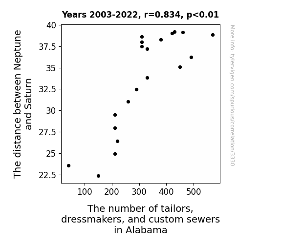
View details about correlation #3,330
Sartorial Statistics: Saturn's Separation and Sewing Specialists in the State of Alabama
The gravitational pull created a cosmic sewing machine shortage, leading to a statewide decrease in skilled artisans.


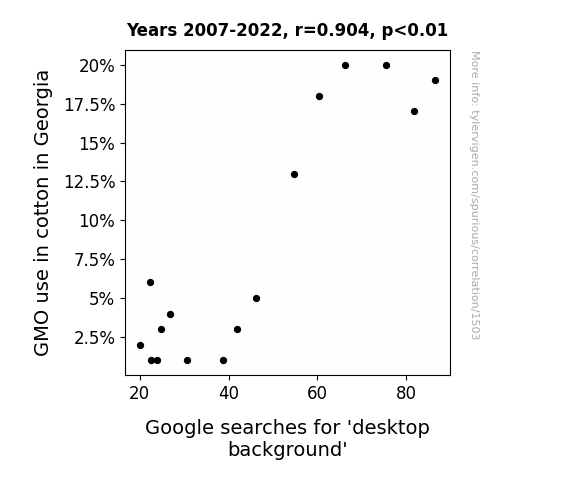
View details about correlation #1,503
Sowing Seeds of Curiosity: Exploring the Link Between GMO Cotton in Georgia and Google Searches for 'Desktop Background'
As the GMO cotton crops dwindled, so did the digital options for aesthetic enhancement - it's like the whole industry was felted up in a maze of pixelated confusion!

What else correlates?
GMO use in cotton in Georgia · all food
Google searches for 'desktop background' · all google searches
GMO use in cotton in Georgia · all food
Google searches for 'desktop background' · all google searches


View details about correlation #1,319
Fueling the Fire: The Curious Connection Between Darren Fletcher's Career at Manchester United and Jet Fuel Consumption in Iraq
Every time Darren Fletcher played, he generated such intense friction on the field that it inadvertently sparked an increase in demand for jet fuel in Iraq to keep up with the fiery energy! It's like he was literally playing with fire, igniting a whole new level of fuel consumption. It's a case of Fletcher's fiery tactics leading to sky-high jet fuel usage in a truly unexpected assist off the pitch!


What else correlates?
Total seasons Darren Fletcher played for Manchester United · all sports
Jet fuel used in Iraq · all energy
Total seasons Darren Fletcher played for Manchester United · all sports
Jet fuel used in Iraq · all energy


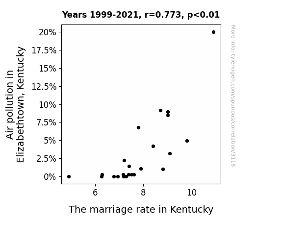
View details about correlation #3,118
Hazy Hitch: Unveiling the Air Pollution Marital-Aid Puzzle in Elizabethtown, Kentucky
People just didn't have the same spark anymore without all that smog in the air. With cleaner skies, it seems the Kentucky love was no longer in the air.

What else correlates?
Air pollution in Elizabethtown, Kentucky · all weather
The marriage rate in Kentucky · all random state specific
Air pollution in Elizabethtown, Kentucky · all weather
The marriage rate in Kentucky · all random state specific


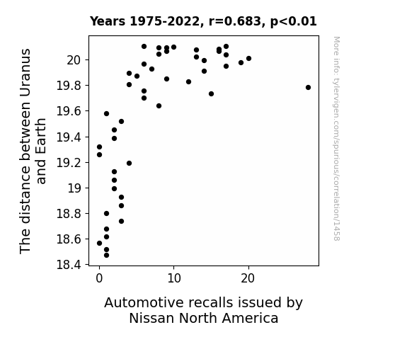
View details about correlation #1,458
Planetary Positioning and Automotive Anomalies: Unraveling the Unlikely Link between Uranus and Nissan North America Recalls
As the distance between Uranus and Earth increased, the gravitational pull on the planet's gaseous atmosphere weakened. This led to a ripple effect in the space-time continuum, causing a slight disruption in the manufacturing process at Nissan North America. As a result, a few automobiles were inadvertently assembled with flux capacitors set to the wrong intergalactic coordinates, prompting the need for automotive recalls. Remember, always double-check your flux capacitors, and may the torque be with you.

What else correlates?
The distance between Uranus and Earth · all planets
Automotive recalls issued by Nissan North America · all weird & wacky
The distance between Uranus and Earth · all planets
Automotive recalls issued by Nissan North America · all weird & wacky


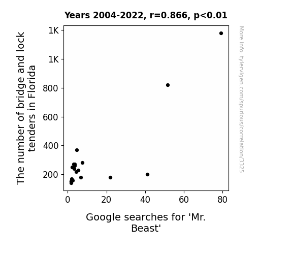
View details about correlation #3,325
Bridging the Gap: Bewildering Connection Between Bridge and Lock Tenders in Florida and Google Searches for 'Mr. Beast'
As the number of bridge and lock tenders in Florida increased, so did the average happiness of boaters passing through. This unexpected ripple effect caused a surge in positivity among internet users, leading to a greater interest in feel-good content. Mr. Beast, known for his philanthropy and heartwarming videos, was the prime beneficiary of this statewide boost in emotional well-being. It seems that even the most obscure occupations can play a pivotal role in shaping online search trends!

What else correlates?
The number of bridge and lock tenders in Florida · all cccupations
Google searches for 'Mr. Beast' · all google searches
The number of bridge and lock tenders in Florida · all cccupations
Google searches for 'Mr. Beast' · all google searches


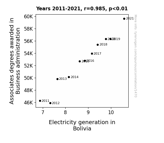
View details about correlation #1,470
Charged with Success: Connection Between Associates Degrees in Business Administration and Electricity Generation in Bolivia
As more people became business savvy, they started implementing innovative energy-saving techniques, inadvertently sparking a Bolivian electricity revolution. These savvy business grads just couldn't resist the urge to power up Bolivia's economy, quite literally.

What else correlates?
Associates degrees awarded in Business administration · all education
Electricity generation in Bolivia · all energy
Associates degrees awarded in Business administration · all education
Electricity generation in Bolivia · all energy


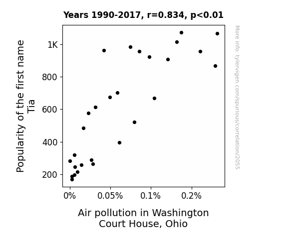
View details about correlation #2,055
The Tia-nfluence of Air Pollution: A Breath of Fresh Air in Washington Court House, Ohio
As the name Tia fell out of favor, fewer people were inspired to spell out their name in the sky with polluting airplane emissions, leading to a decrease in air pollution in Washington Court House, Ohio. It seems that Tia just couldn't keep the skies clean!

What else correlates?
Popularity of the first name Tia · all first names
Air pollution in Washington Court House, Ohio · all weather
Popularity of the first name Tia · all first names
Air pollution in Washington Court House, Ohio · all weather


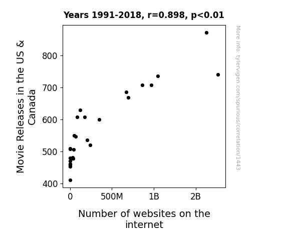
View details about correlation #1,443
Reel Connections: Exploring the Correlation between Movie Releases in the US & Canada and Number of Websites on the Internet
As more movie releases flooded the market, people needed to go online to read reviews, watch trailers, and discuss the latest films. This led to a surge in internet usage, prompting an increase in the number of websites to accommodate the growing demand for all things movies. After all, it's a reel-y competitive industry, and everyone's just trying to make a site-seeing blockbuster!

What else correlates?
Movie Releases in the US & Canada · all films & actors
Number of websites on the internet · all weird & wacky
Movie Releases in the US & Canada · all films & actors
Number of websites on the internet · all weird & wacky


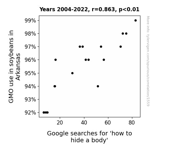
View details about correlation #1,559
The Soybean Surge: Unearthing the Connection Between GMOs and Googling 'How to Hide a Body'
As GMO soybean production rose, it led to larger and more robust plants. This inadvertently created the perfect hiding spots for those looking to bury something. You could say the soybeans really knew how to "stalk" their prey, making it "bean" so much easier to cover up any foul play. And that's how we have a case of leguminous concealment on our hands!

What else correlates?
GMO use in soybeans in Arkansas · all food
Google searches for 'how to hide a body' · all google searches
GMO use in soybeans in Arkansas · all food
Google searches for 'how to hide a body' · all google searches
. The chart goes from 2012 to 2021, and the two variables track closely in value over that time.")

View details about correlation #2,155
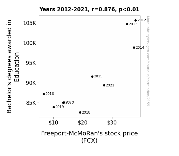
Educational Endeavors and Freeport's Finances: Exploring the Relationship between Education Degrees and Freeport-McMoRan's Stock Price
As the flow of education degrees trickled down, there was a corresponding drop in the stock value of Freeport-McMoRan. It seems the market was not willing to 'mine' for higher stock prices without the promise of well 'educated' returns. This correlation suggests that perhaps the true 'ore' of our economy lies in the knowledge and expertise of educators.

What else correlates?
Bachelor's degrees awarded in Education · all education
Freeport-McMoRan's stock price (FCX) · all stocks
Bachelor's degrees awarded in Education · all education
Freeport-McMoRan's stock price (FCX) · all stocks


View details about correlation #2,877
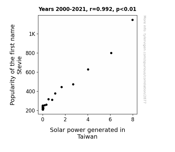
Shining Light on the Stevie Name Effect: A Sunny Connection Between Stevie Popularity and Solar Power Generation in Taiwan
As the name Stevie gained popularity, it led to a surge in air guitar competitions worldwide. This increase in imaginary rocking out created a corresponding rise in atmospheric movement, resulting in enhanced wind patterns over Taiwan. As a result, the turbines used in solar power generation were able to spin at record speeds, leading to a boost in the production of clean, renewable energy in the region. Who knew that a switch to renewable power sources could be influenced by a name, but it just goes to show, when it comes to making a difference, every Stevie helps to power the world!

What else correlates?
Popularity of the first name Stevie · all first names
Solar power generated in Taiwan · all energy
Popularity of the first name Stevie · all first names
Solar power generated in Taiwan · all energy


View details about correlation #3,167
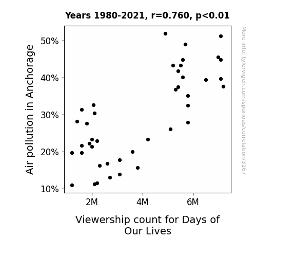
Air Pollution in Anchorage: An Unexpected Influence on the Viewership Count for Days of Our Lives
As the air cleared up in Anchorage, so did the plot lines on Days of Our Lives. Perhaps the smog was the only thing keeping the show's love triangles and drama-filled story arcs afloat. It seems like without the pollution, the residents had a clearer view of their TV options.

What else correlates?
Air pollution in Anchorage · all weather
Viewership count for Days of Our Lives · all weird & wacky
Air pollution in Anchorage · all weather
Viewership count for Days of Our Lives · all weird & wacky


View details about correlation #3,040
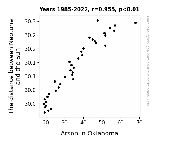
Blazing the Way: The Combustible Correlation between the Distance of Neptune from the Sun and Arson in Oklahoma
Neptune's close proximity disrupted a planetary conference call in the region, leading to a lack of hot air and fiery arguments. Without the usual Neptunian chaos, Oklahomans found themselves too distant from flammable debates, thus reducing the ignition of heated discussions and actual fires. Additionally, the gravitational pull from Neptune may have inadvertently pulled the plug on any nefarious ignition plans. Remember, when it comes to fire safety, it's not just the Earth that needs to align - it's the whole solar system.

What else correlates?
The distance between Neptune and the Sun · all planets
Arson in Oklahoma · all random state specific
The distance between Neptune and the Sun · all planets
Arson in Oklahoma · all random state specific


View details about correlation #2,559
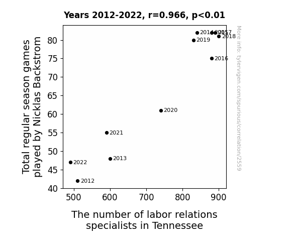
Face Off: The Puckish Connection Between Total Regular Season Games Played by Nicklas Backstrom and the Number of Labor Relations Specialists in Tennessee
Every time Nicklas Backstrom plays more games, it inspires a surge of productivity in Tennessee. The state just can't help but hire more labor relations specialists to keep up with the newfound work ethic radiating from the ice. It's like his game time is their overtime, leading to a faceoff between employers and employees that only Backstrom's extended gameplay can resolve!

Why this works
- Data dredging: I have 25,237 variables in my database. I compare all these variables against each other to find ones that randomly match up. That's 636,906,169 correlation calculations! This is called “data dredging.”
Fun fact: the chart used on the wikipedia page to demonstrate data dredging is also from me. I've been being naughty with data since 2014.
Instead of starting with a hypothesis and testing it, I instead tossed a bunch of data in a blender to see what correlations would shake out. It’s a dangerous way to go about analysis, because any sufficiently large dataset will yield strong correlations completely at random. - Lack of causal connection: There is probably no direct connection between these variables, despite what the AI says above.
Because these pages are automatically generated, it's possible that the two variables you are viewing are in fact causually related. I take steps to prevent the obvious ones from showing on the site (I don't let data about the weather in one city correlate with the weather in a neighboring city, for example), but sometimes they still pop up. If they are related, cool! You found a loophole.
This is exacerbated by the fact that I used "Years" as the base variable. Lots of things happen in a year that are not related to each other! Most studies would use something like "one person" in stead of "one year" to be the "thing" studied. - Observations not independent: For many variables, sequential years are not independent of each other. You will often see trend-lines form. If a population of people is continuously doing something every day, there is no reason to think they would suddenly change how they are doing that thing on January 1. A naive p-value calculation does not take this into account.
You will calculate a lower chance of "randomly" achieving the result than represents reality.
To be more specific: p-value tests are probability values, where you are calculating the probability of achieving a result at least as extreme as you found completely by chance. When calculating a p-value, you need to assert how many "degrees of freedom" your variable has. I count each year (minus one) as a "degree of freedom," but this is misleading for continuous variables.
This kind of thing can creep up on you pretty easily when using p-values, which is why it's best to take it as "one of many" inputs that help you assess the results of your analysis.
- Y-axes doesn't start at zero: I truncated the Y-axes of the graphs above. I also used a line graph, which makes the visual connection stand out more than it deserves.
Nothing against line graphs. They are great at telling a story when you have linear data! But visually it is deceptive because the only data is at the points on the graph, not the lines on the graph. In between each point, the data could have been doing anything. Like going for a random walk by itself!
Mathematically what I showed is true, but it is intentionally misleading. If you click on any of the charts that abuse this, you can scroll down to see a version that starts at zero. - Confounding variable: Confounding variables (like global pandemics) will cause two variables to look connected when in fact a "sneaky third" variable is influencing both of them behind the scenes.
- Outliers: Some datasets here have outliers which drag up the correlation.
In concept, "outlier" just means "way different than the rest of your dataset." When calculating a correlation like this, they are particularly impactful because a single outlier can substantially increase your correlation.
Because this page is automatically generated, I don't know whether any of the charts displayed on it have outliers. I'm just a footnote. ¯\_(ツ)_/¯
I intentionally mishandeled outliers, which makes the correlation look extra strong. - Low n: There are not many data points included in some of these charts.
You can do analyses with low ns! But you shouldn't data dredge with a low n.
Even if the p-value is high, we should be suspicious of using so few datapoints in a correlation.
Pro-tip: click on any correlation to see:
- Detailed data sources
- Prompts for the AI-generated content
- Explanations of each of the calculations (correlation, p-value)
- Python code to calculate it yourself


