spurious correlations
discover · random · spurious scholar
← previous page · next page →


View details about correlation #3,469
Breathing Easy or Wheezing Lisettes? Investigating the Link Between the Popularity of the Name Lisette and Air Pollution in Austin
The name Lisette has a unique way of being pronounced that requires an excessive amount of air to be expelled, contributing to poor air quality. As the popularity of the name Lisette decreased, there was a noticeable reduction in Lisette-induced air pollution. It seems like the city of Austin can now breathe a little easier, thanks to this unexpected linguistic shift.


What else correlates?
Popularity of the first name Lisette · all first names
Air pollution in Austin · all weather
Popularity of the first name Lisette · all first names
Air pollution in Austin · all weather


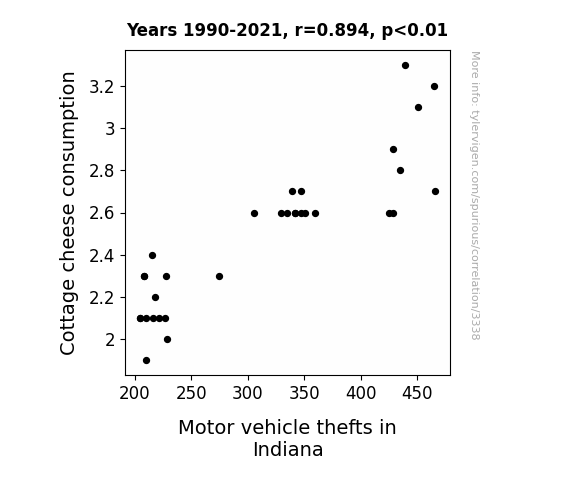
View details about correlation #3,338
Cottage Cheese Consumption and Car Crimes in Corn Country: An Unlikely Link
There was a secret underground operation where cottage cheese was being used as fuel for underground go-kart races. As cottage cheese consumption decreased, there was a shortage of fuel, leading to fewer underground races and ultimately reducing the demand for stolen car parts in Indiana.

What else correlates?
Cottage cheese consumption · all food
Motor vehicle thefts in Indiana · all random state specific
Cottage cheese consumption · all food
Motor vehicle thefts in Indiana · all random state specific


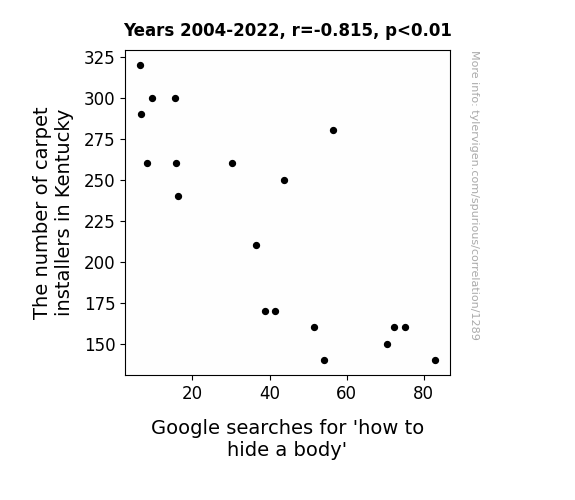
View details about correlation #1,289
Rug-ratios and Mysterious Searches: Exploring the Relationship Between Carpet Installers in Kentucky and How to Hide a Body Google Queries
As the number of carpet installers in Kentucky decreased, there were fewer experts in concealing unsightly seams. This led to an increase in DIY body hiding attempts, as people resorted to using carpeting techniques they saw on HGTV. The spate of poorly hidden bodies is reshaping crime scenes into makeshift home improvement projects. Remember, a poorly hidden body is a decor disaster!


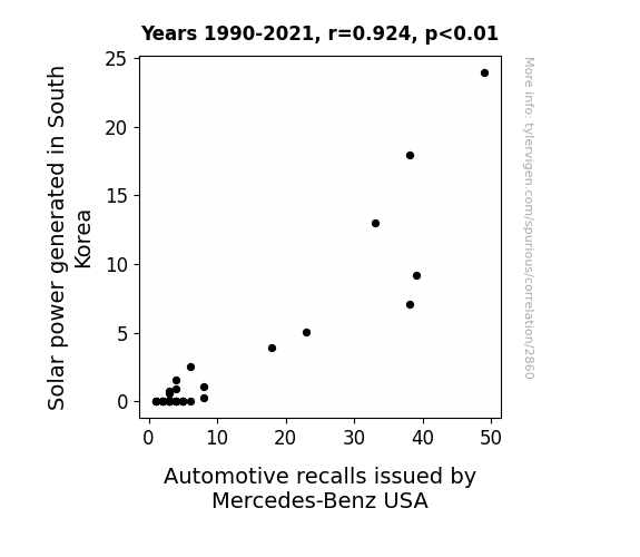
View details about correlation #2,860
Bright Sparks and Recalls: Shedding Light on the Solar-Powered Connection Between South Korea and Mercedes-Benz USA
As South Korea's solar power output surged, it created a 'current' of change in the automotive industry. The increased sunshine sparked a rise in productivity at Mercedes-Benz USA, leading to a 're-Volt' in their manufacturing process. This, in turn, illuminated previously unnoticed issues in their vehicles, driving up the number of recalls. It seems the Korean solar power was truly 'charging' up the automotive world, shedding light on the need for Mercedes-Benz to 'amp' up their quality control. Remember, this is all in good fun and not based on any factual information!

What else correlates?
Solar power generated in South Korea · all energy
Automotive recalls issued by Mercedes-Benz USA · all weird & wacky
Solar power generated in South Korea · all energy
Automotive recalls issued by Mercedes-Benz USA · all weird & wacky


View details about correlation #3,032
The Air-ly Connection: Exploring the Correlation Between Air Quality in Hartford, Connecticut, and Instructor Salaries in the US
As air quality improved in Hartford, Connecticut, a new wave of highly motivated and energized yoga instructors emerged. This led to a nationwide demand for their services, prompting yoga studios to increase instructor salaries in order to attract and retain the newly enlightened and oxygenated talent.


What else correlates?
Air quality in Hartford, Connecticut · all weather
Instructor salaries in the US · all education
Air quality in Hartford, Connecticut · all weather
Instructor salaries in the US · all education
. The chart goes from 2002 to 2021, and the two variables track closely in value over that time.")

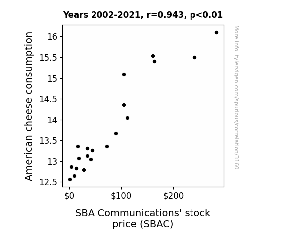
View details about correlation #3,160
The American Cheese Squeeze and SBA Comms' Ease: A Correlational Reprise
As American cheese consumption melted, so did SBA Communications' stock price, leading to a gouda performance in the stock market. It's a case of 'cheddar' not be a coincidence, as the demand for this 'grate' cheese led to investors saying, "This stock is nacho average pick! Let's brie investing in SBAC because it's a 'brie-lliant' choice!" This correlation is as 'cheesy' as it gets, but it seems that when it comes to SBA Communications, the 'queso' for their success may just be linked to the nation's love for American cheese! Remember, the stock market can be a 'havarti' place, so always do thorough 'brie-search' before investing!

What else correlates?
American cheese consumption · all food
SBA Communications' stock price (SBAC) · all stocks
American cheese consumption · all food
SBA Communications' stock price (SBAC) · all stocks


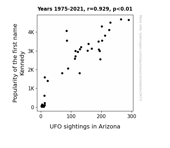
View details about correlation #3,473
Unearthing Unidentified First Names: The Kennedy Phenomenon and UFO Encounters in the Arid Skies of Arizona
As the name Kennedy gained popularity, it began to emit a frequency that coincided with the alien communication channels. Little did we know, the Kennedys have always been the secret key to intergalactic diplomacy. And as more parents named their kids Kennedy, it created a collective beacon for the UFOs, like a cosmic meet-and-greet. The aliens just couldn't resist popping by Arizona to see what all the commotion was about. It's a close encounter of the Kennedys kind!

What else correlates?
Popularity of the first name Kennedy · all first names
UFO sightings in Arizona · all random state specific
Popularity of the first name Kennedy · all first names
UFO sightings in Arizona · all random state specific


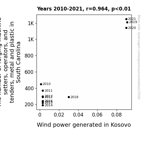
View details about correlation #3,500
Blowing in the Wind: A Forged Connection Between Machine Setters in South Carolina and Wind Power in Kosovo
The increased presence of metal and plastic workers in South Carolina led to a surge in their creative energy. This, in turn, resulted in the spontaneous formation of a 'forging tornado' – a rare meteorological phenomenon characterized by the whirring and shaping of wind currents into powerful, turbine-like vortexes. These forging tornadoes inadvertently bolstered the wind power infrastructure in Kosovo, effectively 'boosting' their energy production.


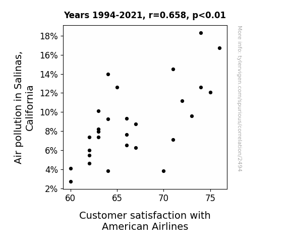
View details about correlation #2,494
The Smoggy Connection: Unraveling the Relationship Between Air Pollution in Salinas, California and Customer Satisfaction with American Airlines
As air pollution in Salinas, California increased, it led to a rise in atmospheric turbulence. This inadvertently provided American Airlines passengers with an unexpected rollercoaster-like experience, leaving them pleasantly surprised and more satisfied with their flights. You could say the smog in the air really lifted their moods! This is one instance where pollution oddly cleared the way for happier travelers.

What else correlates?
Air pollution in Salinas, California · all weather
Customer satisfaction with American Airlines · all weird & wacky
Air pollution in Salinas, California · all weather
Customer satisfaction with American Airlines · all weird & wacky
. The chart goes from 2011 to 2021, and the two variables track closely in value over that time.")

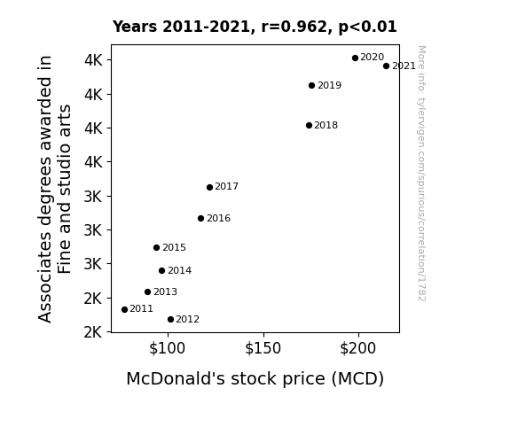
View details about correlation #1,782
From Canvases to Quarter Pounders: Unearthing the Link Between Fine Arts Education and McDonald's Stock Performance
As more people learned about impressionism, they also developed a greater appreciation for the art of food presentation, leading to an uptick in sales at McDonald's. It seems that when it comes to burgers and fries, the connection between art and part is McStrong!

What else correlates?
Associates degrees awarded in Fine and studio arts · all education
McDonald's stock price (MCD) · all stocks
Associates degrees awarded in Fine and studio arts · all education
McDonald's stock price (MCD) · all stocks


View details about correlation #1,489
Genetically Modified Corn: Is There a Link with Corny Crimes in Missouri?
As GMO use in Missouri corn decreased, it led to a decline in the production of high-fructose corn syrup. With less of this sweet, sweet nectar of processed foods available, people experienced a collective mellowing out as their blood sugar levels stabilized. This, in turn, reduced the frequency of hangry outbursts and contributed to a statewide decrease in violent crime rates. It seems that the saying is true: you really are what you eat, and in this case, less genetically modified corn may have just created a more peaceful stalk-ation.


What else correlates?
GMO use in corn grown in Missouri · all food
Violent crime rates · all random state specific
GMO use in corn grown in Missouri · all food
Violent crime rates · all random state specific


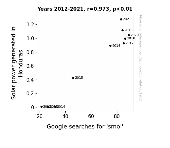
View details about correlation #1,972
The Sunny Side Up: Shedding Light on the Solar-Smol Connection
The excess solar power was inadvertently beamed into people's homes, causing their electronic devices to display adorable, shrunken versions of everything. It's a tiny bit shocking how powerful solar energy can be!

What else correlates?
Solar power generated in Honduras · all energy
Google searches for 'smol' · all google searches
Solar power generated in Honduras · all energy
Google searches for 'smol' · all google searches


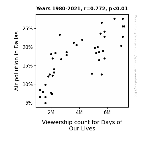
View details about correlation #2,186
The Days of Our Lives: An Airy Connection Between Dallas Air Pollution and Viewership Count
As the air got cleaner in Dallas, it seems the Days of Our Lives just couldn't take the fresh plot twists anymore. The decrease in air pollution must have aired out the drama, leaving viewers with less smoggy storylines to follow. It's as if the show's ratings took a deep breath of fresh air and decided to take a permanent hiatus. Seems like the only thing not getting a clean break was the correlation between air quality and soap opera viewership in the city.

What else correlates?
Air pollution in Dallas · all weather
Viewership count for Days of Our Lives · all weird & wacky
Air pollution in Dallas · all weather
Viewership count for Days of Our Lives · all weird & wacky


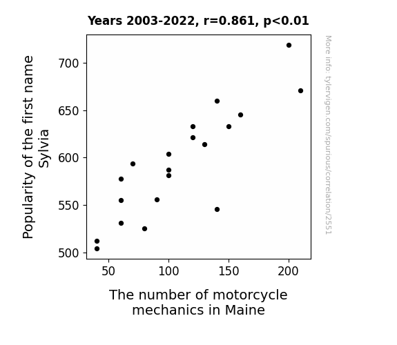
View details about correlation #2,551
Sylvia's Synergy: Unraveling the Revving Relationship between the Name Sylvia's Popularity and the Count of Motorcycle Mechanics in Maine
As the name Sylvia gained popularity, more and more people were drawn to the idea of 'Sylvia-cing' through the streets on motorcycles. This led to a higher demand for motorcycle mechanics in Maine as everyone wanted their bikes to be in 'Sylvia-smooth' condition. It seems like the name Sylvia was just revving up a whole new motorcycle culture in the state!

What else correlates?
Popularity of the first name Sylvia · all first names
The number of motorcycle mechanics in Maine · all cccupations
Popularity of the first name Sylvia · all first names
The number of motorcycle mechanics in Maine · all cccupations
. The chart goes from 2012 to 2021, and the two variables track closely in value over that time.")

View details about correlation #2,529
Tangoing Transports and Ticker Trends: Exploring the Relationship Between Transportation Degrees and Marvell Technology's Stock Price
As more graduates entered the field, they were able to *drive* innovation and efficiency within the transportation and materials moving industry. This led to lower production costs for Marvell Technology, revving up their profit margins and ultimately boosting their stock price.
What else correlates?
Bachelor's degrees awarded in Transportation · all education
Marvell Technology's stock price (MRVL) · all stocks
Bachelor's degrees awarded in Transportation · all education
Marvell Technology's stock price (MRVL) · all stocks


View details about correlation #3,248
Seeds, Ships, and Surprising Synchronicity: The GMO-Gasoline Correlation Between California Cotton and Bermuda’s Fossil Fuel Use
The GMO cotton in California has inadvertently released a pheromone that is attractive to a rare species of giant butterflies. These butterflies, in their quest for the perfect GMO cotton nectar, have inadvertently increased the wind currents with their massive wing flapping, providing an unexpected boost to the efficiency of Bermuda's wind farms. And that, my friends, is how GMO cotton in California is indirectly helping Bermuda power up with fossil fuels.

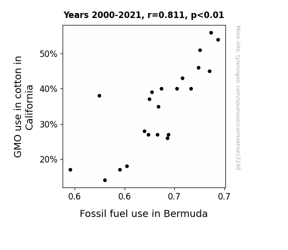
What else correlates?
GMO use in cotton in California · all food
Fossil fuel use in Bermuda · all energy
GMO use in cotton in California · all food
Fossil fuel use in Bermuda · all energy


View details about correlation #1,113
Unveiling Unidentified UFOs: Unraveling Unusual Upshot on Uppermost Uplift
The aliens were offering to shuttle climbers to the top as part of their new intergalactic adventure tourism business.


What else correlates?
UFO sightings in Michigan · all random state specific
Total Number of Successful Mount Everest Climbs · all weird & wacky
UFO sightings in Michigan · all random state specific
Total Number of Successful Mount Everest Climbs · all weird & wacky


View details about correlation #3,295
Highway Troubles and Sky Blues: The Correlation Between Traffic Technicians in New Jersey and Searches for 'Why is the Sky Blue' on Google
Because the increase in traffic technicians in New Jersey has led to smoother traffic flow, which has reduced stress levels for commuters. With reduced stress, people have more time and mental capacity to wonder about natural phenomena, like why the sky is blue. This has led to an increase in searches for 'why is the sky blue' on Google as people ponder the skies during their leisurely, stress-free drives.


. The chart goes from 2002 to 2023, and the two variables track closely in value over that time.")

View details about correlation #3,075
The Smoggy Bottom Line: Investigating the Relationship Between Air Pollution in Salt Lake City, Utah and Citigroup's Stock Price
As the air became cleaner, people in Salt Lake City felt an increased sense of well-being and decided to move away from the city. This led to a decrease in local business activity, ultimately impacting Citigroup's stock price. It's a classic case of 'cleaner air, less citi-folk, lower Citi stock'.

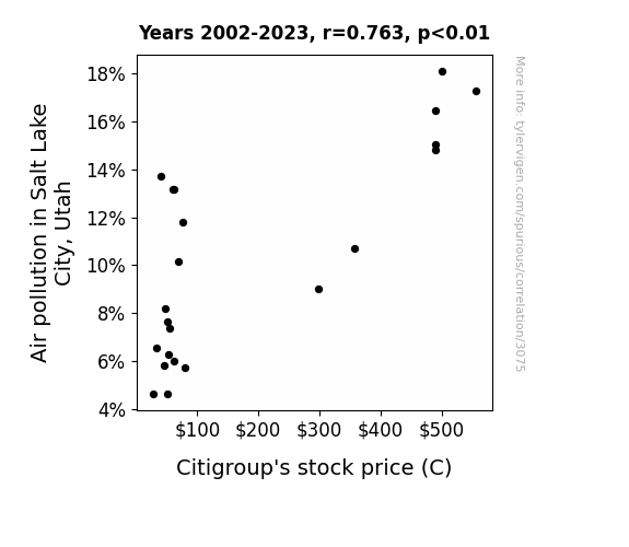
What else correlates?
Air pollution in Salt Lake City, Utah · all weather
Citigroup's stock price (C) · all stocks
Air pollution in Salt Lake City, Utah · all weather
Citigroup's stock price (C) · all stocks


View details about correlation #2,237
Churning Out Power: Exploring the Relationship Between Butter Consumption and Electricity Generation in Equatorial Guinea
The increase in butter consumption led to people carrying out more baking, which in turn created a greater demand for kitchen appliances. This surge in appliance use required more electricity, prompting Equatorial Guinea to ramp up its electricity generation to meet the unexpectedly high butter-induced power needs. Who knew that a little extra butter could really help generate some extra 'dough' for the electricity sector in Equatorial Guinea! 🧈🔌


What else correlates?
Butter consumption · all food
Electricity generation in Equatorial Guinea · all energy
Butter consumption · all food
Electricity generation in Equatorial Guinea · all energy
Why this works
- Data dredging: I have 25,237 variables in my database. I compare all these variables against each other to find ones that randomly match up. That's 636,906,169 correlation calculations! This is called “data dredging.”
Fun fact: the chart used on the wikipedia page to demonstrate data dredging is also from me. I've been being naughty with data since 2014.
Instead of starting with a hypothesis and testing it, I instead tossed a bunch of data in a blender to see what correlations would shake out. It’s a dangerous way to go about analysis, because any sufficiently large dataset will yield strong correlations completely at random. - Lack of causal connection: There is probably no direct connection between these variables, despite what the AI says above.
Because these pages are automatically generated, it's possible that the two variables you are viewing are in fact causually related. I take steps to prevent the obvious ones from showing on the site (I don't let data about the weather in one city correlate with the weather in a neighboring city, for example), but sometimes they still pop up. If they are related, cool! You found a loophole.
This is exacerbated by the fact that I used "Years" as the base variable. Lots of things happen in a year that are not related to each other! Most studies would use something like "one person" in stead of "one year" to be the "thing" studied. - Observations not independent: For many variables, sequential years are not independent of each other. You will often see trend-lines form. If a population of people is continuously doing something every day, there is no reason to think they would suddenly change how they are doing that thing on January 1. A naive p-value calculation does not take this into account.
You will calculate a lower chance of "randomly" achieving the result than represents reality.
To be more specific: p-value tests are probability values, where you are calculating the probability of achieving a result at least as extreme as you found completely by chance. When calculating a p-value, you need to assert how many "degrees of freedom" your variable has. I count each year (minus one) as a "degree of freedom," but this is misleading for continuous variables.
This kind of thing can creep up on you pretty easily when using p-values, which is why it's best to take it as "one of many" inputs that help you assess the results of your analysis.
- Y-axes doesn't start at zero: I truncated the Y-axes of the graphs above. I also used a line graph, which makes the visual connection stand out more than it deserves.
Nothing against line graphs. They are great at telling a story when you have linear data! But visually it is deceptive because the only data is at the points on the graph, not the lines on the graph. In between each point, the data could have been doing anything. Like going for a random walk by itself!
Mathematically what I showed is true, but it is intentionally misleading. If you click on any of the charts that abuse this, you can scroll down to see a version that starts at zero. - Confounding variable: Confounding variables (like global pandemics) will cause two variables to look connected when in fact a "sneaky third" variable is influencing both of them behind the scenes.
- Outliers: Some datasets here have outliers which drag up the correlation.
In concept, "outlier" just means "way different than the rest of your dataset." When calculating a correlation like this, they are particularly impactful because a single outlier can substantially increase your correlation.
Because this page is automatically generated, I don't know whether any of the charts displayed on it have outliers. I'm just a footnote. ¯\_(ツ)_/¯
I intentionally mishandeled outliers, which makes the correlation look extra strong. - Low n: There are not many data points included in some of these charts.
You can do analyses with low ns! But you shouldn't data dredge with a low n.
Even if the p-value is high, we should be suspicious of using so few datapoints in a correlation.
Pro-tip: click on any correlation to see:
- Detailed data sources
- Prompts for the AI-generated content
- Explanations of each of the calculations (correlation, p-value)
- Python code to calculate it yourself


