spurious correlations
discover · random · spurious scholar
← previous page · next page →


View details about correlation #1,731
Bachelor's Degrees in Law Enforcement: A Flaming Connection to Kerosene Consumption in Canada
As the number of Bachelor's degrees awarded in law enforcement rose, more and more graduates were fired up to pursue careers in the field. This ignited a nationwide surge in police recruitment, leading to greater demand for police vehicles. With more cop cars hitting the streets, the consumption of kerosene, the fuel of choice for certain law enforcement vehicles, went through the roof. Looks like these graduates really know how to spark some change, or should I say, spark-some-chase!


What else correlates?
Bachelor's degrees awarded in law enforcement · all education
Kerosene used in Canada · all energy
Bachelor's degrees awarded in law enforcement · all education
Kerosene used in Canada · all energy
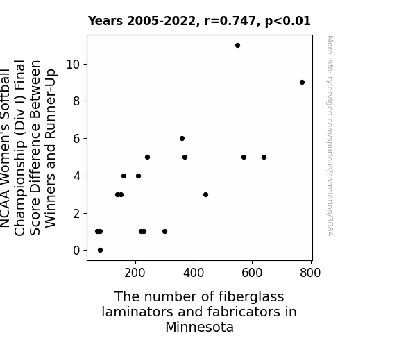
 Final Score Difference Between Winners and Runner-Up and the second variable is The number of fiberglass laminators and fabricators in Minnesota. The chart goes from 2005 to 2022, and the two variables track closely in value over that time.")

View details about correlation #3,084
Bat Chatter: How NCAA Softball Score Scatter Relates to Minnesota Fiberglass Workforce Flatter
The more dominant the winners, the greater the demand for increasingly intricate trophy displays, leading to a surge in the fiberglass industry in Minnesota. Remember, when it comes to crafting trophies, Minnesota is really laminating the competition!


View details about correlation #2,021
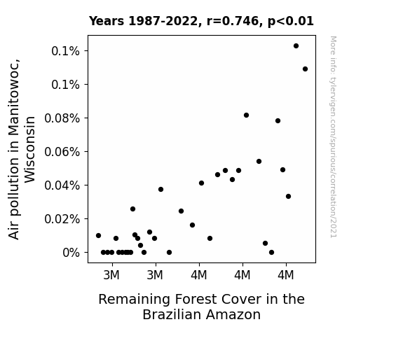
Muddled Manitowoc Mayhem: Mapping the Mysterious Mingle Between Air Pollution and Amazonian Arboreal Abundance
As air pollution in Manitowoc, Wisconsin decreased, it led to an influx of Canadian geese migrating to the Brazilian Amazon. These geese, known for their voracious appetites, couldn't resist snacking on the lush foliage of the Amazonian forests. This unexpected avian invasion prompted a comical yet concerning decrease in remaining forest cover, as the geese went on a leaf-chomping spree, proving that even environmental changes can have unexpected and fowl consequences.

What else correlates?
Air pollution in Manitowoc, Wisconsin · all weather
Remaining Forest Cover in the Brazilian Amazon · all weird & wacky
Air pollution in Manitowoc, Wisconsin · all weather
Remaining Forest Cover in the Brazilian Amazon · all weird & wacky
. The chart goes from 2003 to 2022, and the two variables track closely in value over that time.")

View details about correlation #2,812
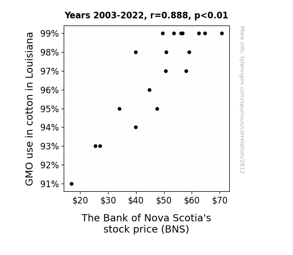
Seedy Business: Unraveling the Interwoven Threads of GMO Cotton and The Bank of Nova Scotia's Stock Price
As GMO cotton production in Louisiana soared, the demand for cotton swelled, leading to higher revenues for clothing companies. This prompted investors to buy more stocks, including those of The Bank of Nova Scotia, because they saw the potential for "seeding" their portfolios with profits in the growing textile industry.

What else correlates?
GMO use in cotton in Louisiana · all food
The Bank of Nova Scotia's stock price (BNS) · all stocks
GMO use in cotton in Louisiana · all food
The Bank of Nova Scotia's stock price (BNS) · all stocks


View details about correlation #1,790
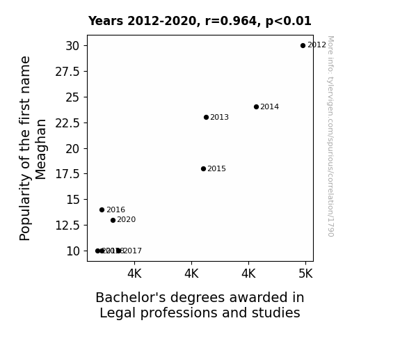
The Meaghan Effect: Exploring the Correlation between Name Popularity and Legal Degrees
The decrease in Popularity of the first name Meaghan reduced the overall number of individuals who were drawn to the legal field by karma. The cosmic balance was disrupted, leading to a decrease in the interest and success in obtaining Bachelor's degrees in Legal professions and studies. This unexpected connection has left everyone legally and linguistically baffled.

What else correlates?
Popularity of the first name Meaghan · all first names
Bachelor's degrees awarded in Legal professions · all education
Popularity of the first name Meaghan · all first names
Bachelor's degrees awarded in Legal professions · all education


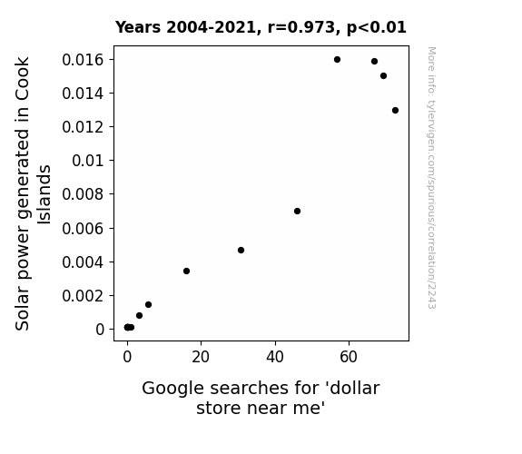
View details about correlation #2,243
Shining the Light on Solar Power: A Bright Spot in Dollar Store Searches
As the solar power in Cook Islands increased, it inadvertently boosted the energy of the local economy, leading to a surge in demand for affordable goods. This newfound sunny outlook on finances prompted people to seek out dollar stores, where they could bask in the glow of budget-friendly deals and let their purchasing power shine. It's like the sun said, "Let there be light on great bargains," and the dollar stores answered with an illuminating array of wallet-friendly options, proving that when it comes to bright ideas, the connection between solar power and dollar stores is truly electric!

What else correlates?
Solar power generated in Cook Islands · all energy
Google searches for 'dollar store near me' · all google searches
Solar power generated in Cook Islands · all energy
Google searches for 'dollar store near me' · all google searches


View details about correlation #1,592
Astrological Anomalies and Automotive Anomalies: The Curious Connection Between Interplanetary Distances and Automotive Recalls
As the gap widened, it created a cosmic ripple effect that disrupted the intricate machinery in Nissan vehicles, prompting the need for sudden recalls. The celestial tug-of-war played havoc with the cars, proving that even in the vastness of space, Uranus still finds a wheely way to make trouble for us here on Earth.


What else correlates?
The distance between Uranus and Mercury · all planets
Automotive recalls issued by Nissan North America · all weird & wacky
The distance between Uranus and Mercury · all planets
Automotive recalls issued by Nissan North America · all weird & wacky
. The chart goes from 2011 to 2022, and the two variables track closely in value over that time.")

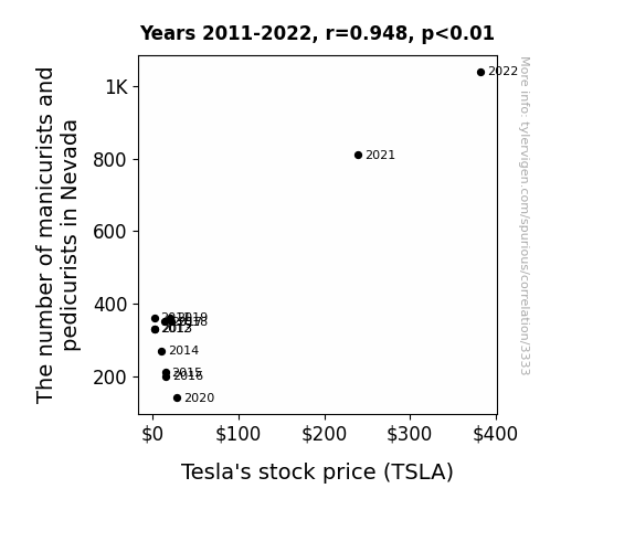
View details about correlation #3,333
Polish-ing the Market: The Mani-Pedi Connection to Tesla's Stock Price in Nevada
As the demand for perfectly manicured and polished nails in Nevada rose, more and more people became mesmerized by the sight of their own hands and feet. This led to increased hand gesturing and foot tapping, generating a surge in kinetic energy across the state. Little did anyone know, this unintentional exercise in Nevada was collectively creating a minuscule but measurable impact on the Earth's geomagnetic field. Unbeknownst to humanity, these subtle magnetic fluctuations began to align with the production processes at Tesla's Gigafactory, ever so slightly optimizing the efficiency and output of their electric vehicles. This unprecedented convergence of beauty and electromagnetism not only fueled the literal rise of Tesla's stock price on the market but also sparked a new era of 'manipedi'-powered renewable energy technology.

What else correlates?
The number of manicurists and pedicurists in Nevada · all cccupations
Tesla's stock price (TSLA) · all stocks
The number of manicurists and pedicurists in Nevada · all cccupations
Tesla's stock price (TSLA) · all stocks


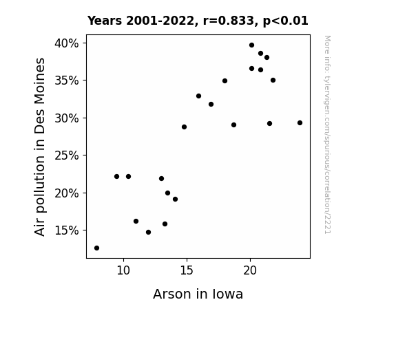
View details about correlation #2,221
Fanning the Flames: The Smoky Link Between Air Pollution in Des Moines and Arson in Iowa
As the air quality improved, it became easier for the arsonists to just take a deep breath and let go of their fiery tendencies. With cleaner air, they found more peaceful ways to ignite their passions, like taking up hot yoga or participating in intense marshmallow roasting competitions. The arson rate simply couldn't keep smoldering in such pristine atmospheric conditions!

What else correlates?
Air pollution in Des Moines · all weather
Arson in Iowa · all random state specific
Air pollution in Des Moines · all weather
Arson in Iowa · all random state specific


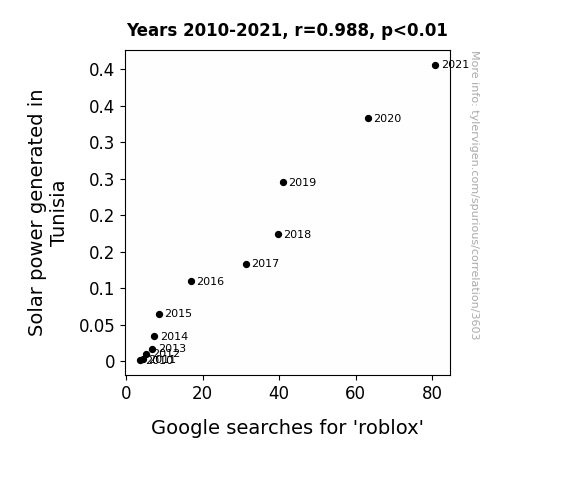
View details about correlation #3,603
Tunisian Sunshine and Roblox Online Fun Time: A Rhyme-y Analysis
As the solar panels soaked up the sun's rays, they inadvertently beamed a surge of energy to kids' devices, powering up their enthusiasm for all things Roblox. It's a sunny side effect that's sparking a virtual revolution in gaming!

What else correlates?
Solar power generated in Tunisia · all energy
Google searches for 'roblox' · all google searches
Solar power generated in Tunisia · all energy
Google searches for 'roblox' · all google searches


View details about correlation #1,201
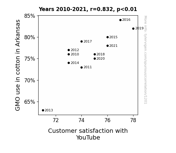
The Cotton Candy Conundrum: Genetically Modified Organisms and its Unlikely Connection to Customer Satisfaction with YouTube
The GMO cotton in Arkansas led to softer, more comfortable clothing, putting people in a better mood when they sat down to watch YouTube videos. As a result, viewers found themselves more satisfied with their overall YouTube experience, leading to an unexpected boost in customer satisfaction.

What else correlates?
GMO use in cotton in Arkansas · all food
Customer satisfaction with YouTube · all weird & wacky
GMO use in cotton in Arkansas · all food
Customer satisfaction with YouTube · all weird & wacky
. The chart goes from 2002 to 2022, and the two variables track closely in value over that time.")

View details about correlation #3,536
Ari's Appeal: Analyzing the Association Between Ari's Affluence and Duke Energy's Stock Price
As the name Ari gained popularity, more parents were subconsciously drawn to energy-related baby products like battery-operated toys and power-themed nursery décor, leading to an unexpected surge in demand for Duke Energy's services. It's like the market just couldn't resist the ARI-ristocracy of energy consumption!


What else correlates?
Popularity of the first name Ari · all first names
Duke Energy's stock price (DUK) · all stocks
Popularity of the first name Ari · all first names
Duke Energy's stock price (DUK) · all stocks


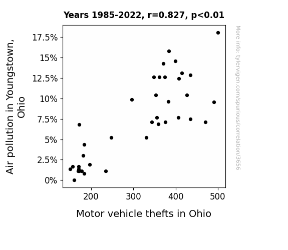
View details about correlation #3,656
Aerial Anthropogenic Artifacts and Auto Appropriation: Exploring the Link between Air Pollution in Youngstown and Motor Vehicle Thefts in Ohio
As the air quality improved, the smoggy haze lifted, allowing for better visibility all around. Previously, the murky air provided the perfect cover for car thieves to sneak around unnoticed. But with the crisp, clean air, their sneaky shenanigans were no longer concealed, leading to a drop in motor vehicle thefts. It turns out, the thieves just couldn't car heist as efficiently in the clear, fresh air, so they had to steer away from their usual antics.

What else correlates?
Air pollution in Youngstown, Ohio · all weather
Motor vehicle thefts in Ohio · all random state specific
Air pollution in Youngstown, Ohio · all weather
Motor vehicle thefts in Ohio · all random state specific


View details about correlation #3,005
Bright Ideas and Cold Showers: The Illuminating Connection Between Solar Power in Sudan and Google Searches
The solar panels were soaking up all the sun's warmth, leaving the water colder than a polar bear's toenails. It was a real conundrum - the more Sudan harnessed solar power, the more people were left feeling like they'd taken an icy dip in the Nile. It seems the situation really took a 'chill' turn as the nation shone bright with renewable energy, but left its citizens shivering for a different reason. It was a case of sunny side up for Sudan's electricity production, but a definite 'brrr' for anyone hoping for a warm and toasty shower.

What else correlates?
Solar power generated in Sudan · all energy
Google searches for 'cold shower' · all google searches
Solar power generated in Sudan · all energy
Google searches for 'cold shower' · all google searches


View details about correlation #1,187
The Juice of Juxtaposition: Examining the Link Between Bachelor's Degrees in English and US Fruit Juice Exports
As fewer English majors were available to write compelling fruit juice ad copy, consumer demand for American fruit juice abroad plummeted. This led to a sharp decrease in fruit juice export volume as the literary prowess needed to extol the virtues of U.S. fruit juice was sorely lacking. As a result, the nation's fruit juice industry found itself in a sticky situation, unable to convey the juiciness of their products to international markets. This just goes to show that in the ever-evolving landscape of global trade, sometimes the most unexpected connections bear the pulp of truth.


What else correlates?
Bachelor's degrees awarded in literature · all education
United States' Fruit Juice Export Volume · all weird & wacky
Bachelor's degrees awarded in literature · all education
United States' Fruit Juice Export Volume · all weird & wacky


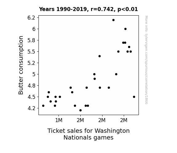
View details about correlation #1,866
Spreading the Love: The Butter Effect on Washington Nationals Ticket Sales
As butter consumption rose, so did the number of buttered popcorn sales at Nationals games. This led to an increase in overall concession revenue, prompting the team to invest more in marketing and player recruitment. Ultimately, the improved team performance and fan experience at the games boosted ticket sales. So, in a roundabout way, you could say that butter was quite the 'spread' for the Nationals' success!

What else correlates?
Butter consumption · all food
Ticket sales for Washington Nationals games · all sports
Butter consumption · all food
Ticket sales for Washington Nationals games · all sports


View details about correlation #1,378
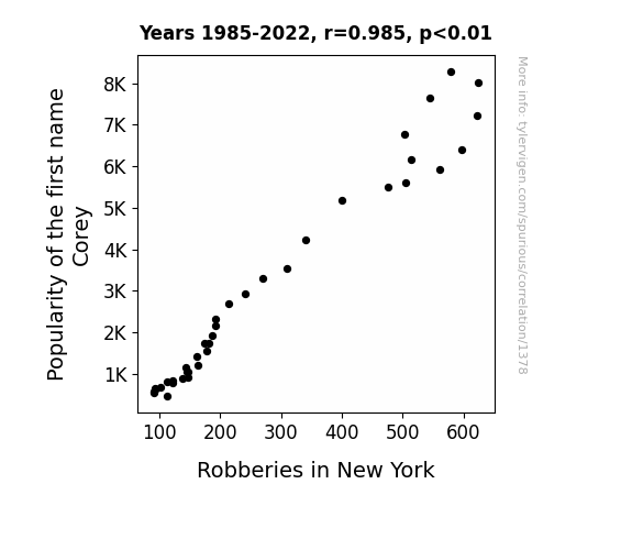
The Corey Crime Connection: An Analysis of the Impact of the Name Corey on Robberies in New York
Every time someone named Corey tried to commit a robbery, they were immediately recognized because, let's face it, how many Coreys do you really know?! This led to a sharp decline in successful heists, as the would-be criminals couldn't fly under the radar like their non-Corey counterparts. Plus, the police couldn't help but notice the correlation and started a campaign to promote the name Corey, hoping for a crime-free future full of friendly and law-abiding individuals.

What else correlates?
Popularity of the first name Corey · all first names
Robberies in New York · all random state specific
Popularity of the first name Corey · all first names
Robberies in New York · all random state specific


View details about correlation #1,877
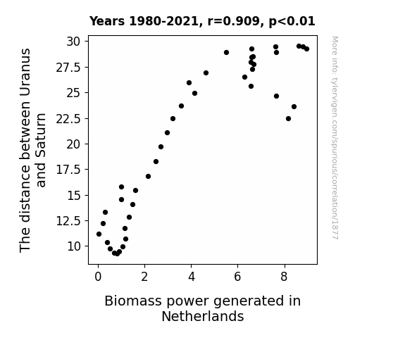
The Celestial Correlation: Connecting the Distance between Uranus and Saturn to Biomass Power Generation in the Netherlands
As the distance between Uranus and Saturn increased, their gravitational pull created a celestial slingshot effect. This inadvertently flung cosmic plant seeds towards Earth, leading to a sudden proliferation of energy-rich biomass in the Netherlands. It's like nature's way of saying, "Amp up the green energy, folks!"

What else correlates?
The distance between Uranus and Saturn · all planets
Biomass power generated in Netherlands · all energy
The distance between Uranus and Saturn · all planets
Biomass power generated in Netherlands · all energy
. The chart goes from 2010 to 2022, and the two variables track closely in value over that time.")

View details about correlation #3,414
Helping Hands: The Support Staff Factor in ArcelorMittal's Stock Performance
As the number of executive administrative assistants in Colorado decreased, there was a proportional decrease in the overall efficiency of office operations. This led to a chain of events that impacted businesses in the state, including ArcelorMittal. With less support for scheduling and coordination, there was an increase in overlooked meetings and disorganized communication. This ultimately disrupted the workflow at ArcelorMittal, causing a dip in productivity and decision-making. As rumors of misplaced documents and mixed-up appointments spread, investor confidence waned, and the stock price of ArcelorMittal (MT) took a hit. Remember, it's all about keeping things in order, from paper clips to profit margins!


View details about correlation #3,622
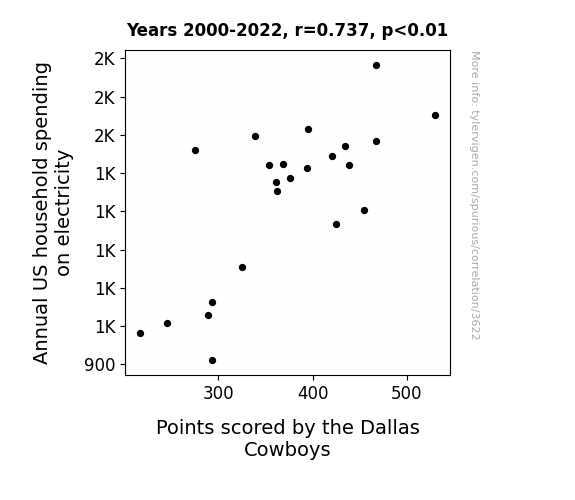
Electricity Expenditure vs. Cowboys' Clout: A Comical Correlation
As household spending on electricity went up, more fans were able to power their lucky Cowboys gear, leading to an increase in team spirit. This surge in positive energy electrified the players, sparking a boost in their performance on the field.

What else correlates?
Annual US household spending on electricity · all weird & wacky
Points scored by the Dallas Cowboys · all sports
Annual US household spending on electricity · all weird & wacky
Points scored by the Dallas Cowboys · all sports
Why this works
- Data dredging: I have 25,237 variables in my database. I compare all these variables against each other to find ones that randomly match up. That's 636,906,169 correlation calculations! This is called “data dredging.”
Fun fact: the chart used on the wikipedia page to demonstrate data dredging is also from me. I've been being naughty with data since 2014.
Instead of starting with a hypothesis and testing it, I instead tossed a bunch of data in a blender to see what correlations would shake out. It’s a dangerous way to go about analysis, because any sufficiently large dataset will yield strong correlations completely at random. - Lack of causal connection: There is probably no direct connection between these variables, despite what the AI says above.
Because these pages are automatically generated, it's possible that the two variables you are viewing are in fact causually related. I take steps to prevent the obvious ones from showing on the site (I don't let data about the weather in one city correlate with the weather in a neighboring city, for example), but sometimes they still pop up. If they are related, cool! You found a loophole.
This is exacerbated by the fact that I used "Years" as the base variable. Lots of things happen in a year that are not related to each other! Most studies would use something like "one person" in stead of "one year" to be the "thing" studied. - Observations not independent: For many variables, sequential years are not independent of each other. You will often see trend-lines form. If a population of people is continuously doing something every day, there is no reason to think they would suddenly change how they are doing that thing on January 1. A naive p-value calculation does not take this into account.
You will calculate a lower chance of "randomly" achieving the result than represents reality.
To be more specific: p-value tests are probability values, where you are calculating the probability of achieving a result at least as extreme as you found completely by chance. When calculating a p-value, you need to assert how many "degrees of freedom" your variable has. I count each year (minus one) as a "degree of freedom," but this is misleading for continuous variables.
This kind of thing can creep up on you pretty easily when using p-values, which is why it's best to take it as "one of many" inputs that help you assess the results of your analysis.
- Y-axes doesn't start at zero: I truncated the Y-axes of the graphs above. I also used a line graph, which makes the visual connection stand out more than it deserves.
Nothing against line graphs. They are great at telling a story when you have linear data! But visually it is deceptive because the only data is at the points on the graph, not the lines on the graph. In between each point, the data could have been doing anything. Like going for a random walk by itself!
Mathematically what I showed is true, but it is intentionally misleading. If you click on any of the charts that abuse this, you can scroll down to see a version that starts at zero. - Confounding variable: Confounding variables (like global pandemics) will cause two variables to look connected when in fact a "sneaky third" variable is influencing both of them behind the scenes.
- Outliers: Some datasets here have outliers which drag up the correlation.
In concept, "outlier" just means "way different than the rest of your dataset." When calculating a correlation like this, they are particularly impactful because a single outlier can substantially increase your correlation.
Because this page is automatically generated, I don't know whether any of the charts displayed on it have outliers. I'm just a footnote. ¯\_(ツ)_/¯
I intentionally mishandeled outliers, which makes the correlation look extra strong. - Low n: There are not many data points included in some of these charts.
You can do analyses with low ns! But you shouldn't data dredge with a low n.
Even if the p-value is high, we should be suspicious of using so few datapoints in a correlation.
Pro-tip: click on any correlation to see:
- Detailed data sources
- Prompts for the AI-generated content
- Explanations of each of the calculations (correlation, p-value)
- Python code to calculate it yourself


