spurious correlations
discover · random · spurious scholar
← previous page · next page →


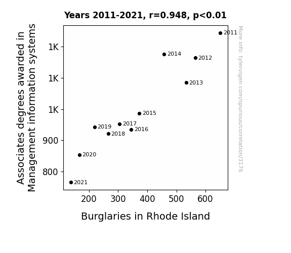
View details about correlation #3,176
Associates in Advancement: Exploring the Link Between Management Information Systems and Mischief Missed
As the number of MIS professionals declined, so did the opportunities for cybercrime. It seems the real formula for success was to reduce those tech-savvy individuals and prevent any unauthorized data entry into homes! It's a case of 'breaking in' to a new career or just 'password' on the opportunity for thieves!


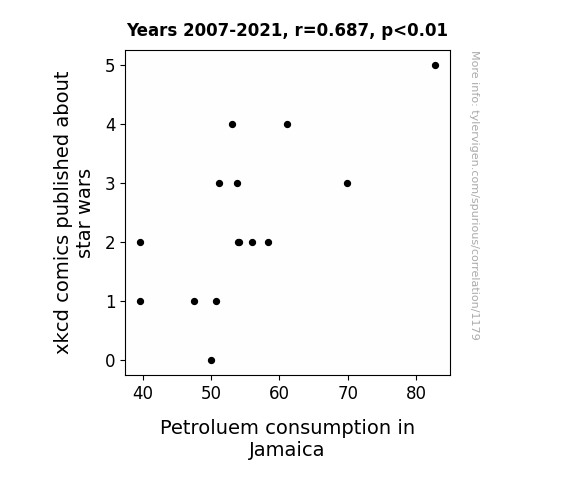
View details about correlation #1,179
The xkcd and X-Wings: Exploring the Eccentricity of Energy Expenditure in Eclectic Environments
As the number of xkcd comics about Star Wars decreased, the cultural interest in spacefaring epics also waned. This led to a reduced demand for Star Wars cosplay events in Jamaica. With fewer people dressing up as intergalactic characters, the annual space-themed parades saw a significant drop in participation. As a result, the costume prop industry in Jamaica shifted its focus away from lightsabers and towards eco-friendly alternatives, leading to a nationwide campaign promoting sustainable energy sources. The unexpected ripple effect ultimately led to a decrease in Petroleum consumption in Jamaica, proving that even in a galaxy not so far away, energy conservation matters!

What else correlates?
xkcd comics published about star wars · all weird & wacky
Petroluem consumption in Jamaica · all energy
xkcd comics published about star wars · all weird & wacky
Petroluem consumption in Jamaica · all energy
. The chart goes from 2002 to 2022, and the two variables track closely in value over that time.")

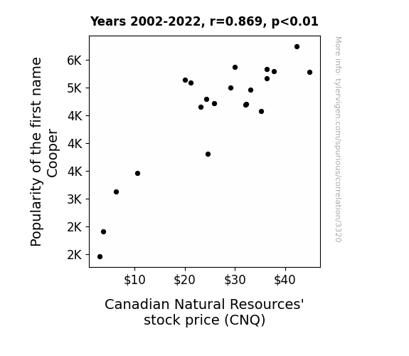
View details about correlation #3,320
Pooper Cooper and CNQ: An Unexpected Link to Natural Resource's Stock
Perhaps it's because everyone just couldn't get enough of that 'Coop'-er charm, leading to a surge in positive energy. It's as if the name itself has a 'reservoir' of likability, creating a 'well' of support that's 'fueling' the stock price. Who knew a simple name could have such 'oil'some influence?

What else correlates?
Popularity of the first name Cooper · all first names
Canadian Natural Resources' stock price (CNQ) · all stocks
Popularity of the first name Cooper · all first names
Canadian Natural Resources' stock price (CNQ) · all stocks


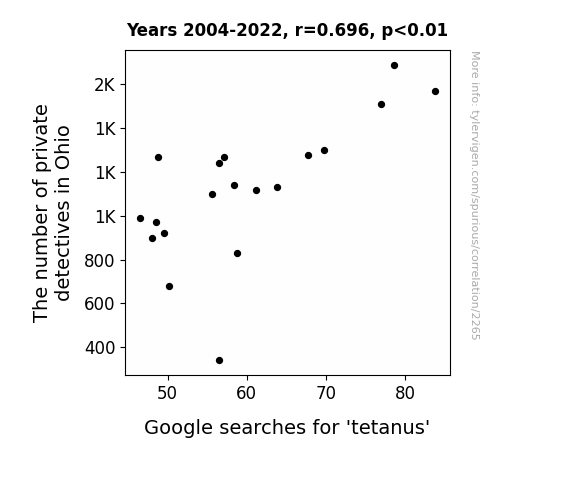
View details about correlation #2,265
Googling for Trouble: Exploring the Relationship Between Private Detectives in Ohio and Google Searches for 'Tetanus'
The increase in private detectives in Ohio led to more surveillance of rusty old barns and abandoned buildings, inadvertently exposing people to the bacteria that cause tetanus. You could say the case of tetanus took a sharp turn for the worse as these sleuths rustled up more trouble than they anticipated!

What else correlates?
The number of private detectives in Ohio · all cccupations
Google searches for 'tetanus' · all google searches
The number of private detectives in Ohio · all cccupations
Google searches for 'tetanus' · all google searches


View details about correlation #1,938
Aerial Arson: Analyzing the Air Pollution-Arson Association in Michigan
As air quality worsened, it became harder for people to see through the haze, providing the perfect cover for amateur firefighters to practice their hobby. After all, when the air is already smoky, who's going to notice a few extra plumes here and there? It's like a real-life game of SimCity: Detroit edition, where the pollution level unlocks the 'arsonist' character for some fiery urban revitalization.


What else correlates?
Air pollution in Detroit · all weather
Arson in Michigan · all random state specific
Air pollution in Detroit · all weather
Arson in Michigan · all random state specific


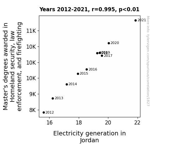
View details about correlation #1,827
Mastering Electricity: Unveiling the Shocking Connection Between Homeland Security, Law Enforcement, and Firefighting Degrees and Electricity Generation in Jordan
As more Master's degree holders entered the field, they brought with them an electrifying level of expertise, sparking a wave of innovation and efficiency in electricity generation. With their shocking dedication to keeping the nation safe, they were able to current-ly upend the industry and power up the entire system. It seems that protecting and serving isn't the only thing they're amped up about!

What else correlates?
Master's degrees awarded in law enforcement and firefighting · all education
Electricity generation in Jordan · all energy
Master's degrees awarded in law enforcement and firefighting · all education
Electricity generation in Jordan · all energy


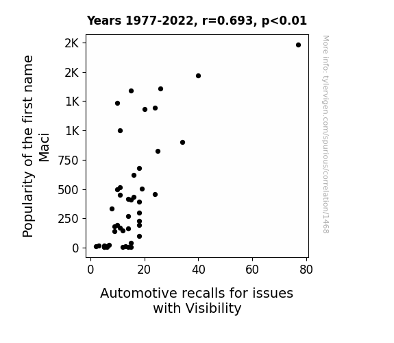
View details about correlation #1,468
Seeing Clearly: The Maci-nation of Name Popularity and Automotive Visibility Recalls
More babies were named Maci, leading to a higher demand for personalized mini-vans. The addition of extra-large decorative decals on the rear windows was obstructing the driver's view. Remember, when it comes to car safety, it's all fun and games until Maci can't see out of her baby-on-board sticker!

What else correlates?
Popularity of the first name Maci · all first names
Automotive recalls for issues with Visibility · all weird & wacky
Popularity of the first name Maci · all first names
Automotive recalls for issues with Visibility · all weird & wacky
. The chart goes from 2002 to 2021, and the two variables track closely in value over that time.")

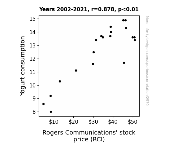
View details about correlation #2,570
Stirring the Pot: The Yogurt Effect on RCI Stock Price - A Culture Shocking Correlation
The active cultures in yogurt started a secret campaign to promote positive communication, leading to a ripple effect of harmony and cooperation, ultimately boosting the value of Rogers Communications' stock. Yogurt: Cultivating better connections, one spoonful at a time!

What else correlates?
Yogurt consumption · all food
Rogers Communications' stock price (RCI) · all stocks
Yogurt consumption · all food
Rogers Communications' stock price (RCI) · all stocks


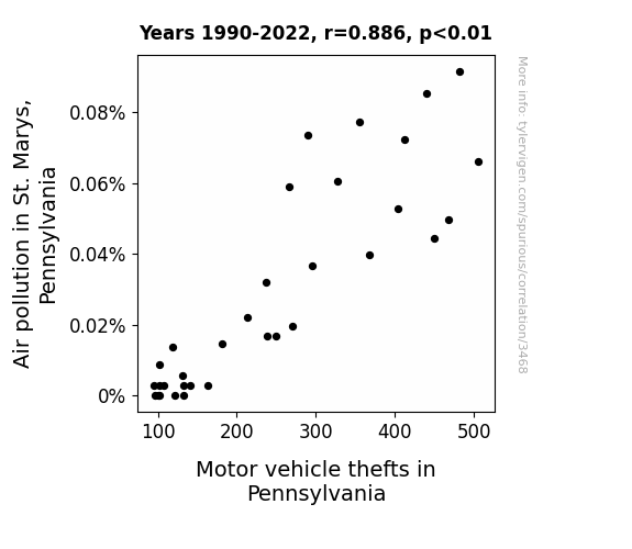
View details about correlation #3,468
Air Pollution and the Case of the Vanishing Vehicles: A Correlational Study on Motor Vehicle Thefts in Pennsylvania and Air Pollution in St. Marys
As air quality improved in St. Marys, Pennsylvania, residents experienced an unexpected boost in energy and clarity of thought. This led to a wave of amateur detective work as people could finally think clearly enough to track down and retrieve their stolen vehicles. With their newfound focus and determination, the community banded together to combat the ongoing issue of car theft, ultimately leading to a decrease in motor vehicle thefts across the state. Who knew that the key to solving car thefts lay not in fancy security systems, but in the simple clarity of clean, crisp air!

What else correlates?
Air pollution in St. Marys, Pennsylvania · all weather
Motor vehicle thefts in Pennsylvania · all random state specific
Air pollution in St. Marys, Pennsylvania · all weather
Motor vehicle thefts in Pennsylvania · all random state specific


View details about correlation #3,087
Tackling the Gridiron Paradox: A Statistical Analysis of the Relationship Between Middle School Special Education Teachers in Georgia and Season Wins for the Atlanta Falcons
The increased presence of educators led to a rise in Falcon intelligence, resulting in better game strategies and ultimately more victories. After all, it's hard to fail when you have a team of professionals supporting you!


View details about correlation #1,497
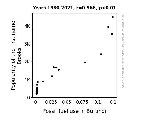
Brooks and Burundi: Bizarre Buddies or Fossil Fuel Foes?
As more and more kids were named Brooks, it led to a surge in demand for trendy, personalized motorized scooters. These scooters became the must-have accessory, causing a nation-wide craze in Burundi. The sudden spike in scooter usage put pressure on the availability of fossil fuels, leading to an unexpected increase in consumption. It seems like the name Brooks was not only on everyone's lips, but also on everyone's scooter license plates in Burundi!

What else correlates?
Popularity of the first name Brooks · all first names
Fossil fuel use in Burundi · all energy
Popularity of the first name Brooks · all first names
Fossil fuel use in Burundi · all energy
. The chart goes from 2012 to 2021, and the two variables track closely in value over that time.")

View details about correlation #2,679
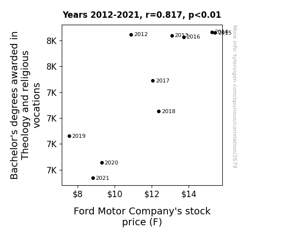
The Divine Drivetrain: Uncovering the Holy Grail of Theology Degrees and Ford's Stock Price
As fewer theologians graduated, there was a nationwide shortage of people who could bless the new cars, leading to a downturn in the perceived spiritual value of Ford vehicles. This decrease in divine endorsement ultimately led to a loss of investor faith in the company, driving down the stock price. Remember, thou shalt not underestimate the power of a good car benediction!


View details about correlation #2,079
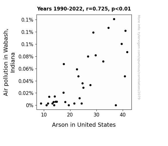
Up in Smoke: Examining the Smoggy Relationship Between Air Pollution in Wabash, Indiana, and Arson in the United States
The cleaner air in Wabash meant there was less soot to go around, leaving arsonists without a suit-able accomplice for their fiery crimes. With no smog to mask their misdeeds, the arson rates went up in smoke!

What else correlates?
Air pollution in Wabash, Indiana · all weather
Arson in United States · all random state specific
Air pollution in Wabash, Indiana · all weather
Arson in United States · all random state specific


View details about correlation #3,328
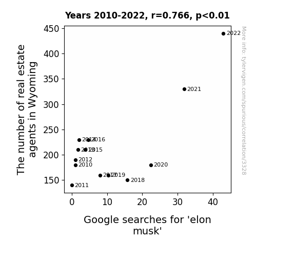
Elon-chan Reaches the Wild West: Correlating Real Estate Agents in Wyoming with Google Searches for 'Elon Musk'
As the real estate market in Wyoming expanded, more properties became available, capturing Elon Musk's interest. With his penchant for unique and futuristic homes, each new real estate agent represented a fresh possibility for Elon to find the ultimate space-age dwelling. With more agents on the case, the chances of Elon stumbling upon his own Martian-like abode in the Cowboy State became not just a dream, but a Musk-have reality.

What else correlates?
The number of real estate agents in Wyoming · all cccupations
Google searches for 'elon musk' · all google searches
The number of real estate agents in Wyoming · all cccupations
Google searches for 'elon musk' · all google searches


View details about correlation #1,437
XKCD Chromosomes: The Motorcycle Mystique
As the number of xkcd comics about childhood decreased, so did the demand for capes and imaginary jetpacks, leading to a decline in backyard motorcycle stunts and ultimately, a decrease in registered Yamaha motorcycles in the UK. Remember, with great horsepower comes great responsibility!


View details about correlation #1,747
Marvelous Minnesota Soybeans: Unraveling the Link to Taiwan's Tantalizing Biomass
As the GMO soybeans in Minnesota grew larger and stronger, their roots inadvertently tuned into a previously undiscovered underground network, transmitting signals to the flora in Taiwan. This unprecedented botanical communication led to a surge in biomass power generation, as the plants in Taiwan photosynthesized with a newfound exuberance, harnessing the unspoken energy from the modified soybeans. It's a case of transgenic transmission sparking a power plant proliferation!


What else correlates?
GMO use in soybeans in Minnesota · all food
Biomass power generated in Taiwan · all energy
GMO use in soybeans in Minnesota · all food
Biomass power generated in Taiwan · all energy


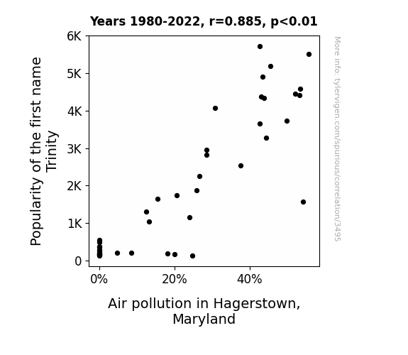
View details about correlation #3,495
The Trinity Effect: A Heavenly Connection Between Name Popularity and Air Pollution in Hagerstown, Maryland
As the name Trinity gained popularity, more and more parents were inspired to name their children after the iconic movie character. This led to a surge in little Trinities running around, each with their own personalized miniaturized smoke machines, inevitably contributing to the local air pollution levels.

What else correlates?
Popularity of the first name Trinity · all first names
Air pollution in Hagerstown, Maryland · all weather
Popularity of the first name Trinity · all first names
Air pollution in Hagerstown, Maryland · all weather


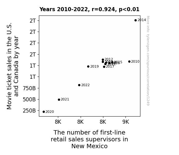
View details about correlation #1,249
Flicks and Fits: An Unexpected Correlation Between Movie Ticket Sales and Retail Supervisors in New Mexico
As movie ticket sales dropped, fewer people experienced the magic of cinema. This led to a decline in demand for popcorn and snacks at the theaters. With less need for snack-related supervision, first-line retail sales supervisor positions in New Mexico were no longer as butterly competitive, causing a decrease in the number of supervisors.


View details about correlation #1,928
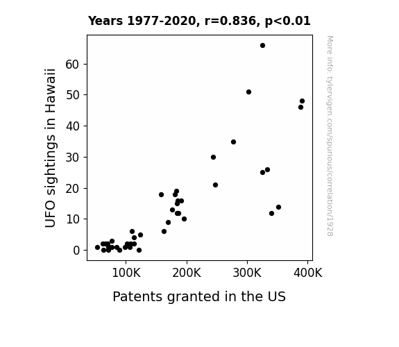
Flying Saucers and Patent Offers: A Statistical Study of the UFO-Patent Connection in Hawaii
As UFOs buzzed over Hawaii, they beamed down innovative ideas to unsuspecting residents. With their otherworldly technology, Hawaiians were inspired to invent new gizmos and gadgets, leading to a surge in patent applications. It seems the aliens were not only interested in exploring our planet, but also in sparking a wave of extraterrestrial innovation! Remember, with great UFO sightings, comes great patent productivity. It's a close encounter of the absurd kind!

What else correlates?
UFO sightings in Hawaii · all random state specific
Patents granted in the US · all weird & wacky
UFO sightings in Hawaii · all random state specific
Patents granted in the US · all weird & wacky


View details about correlation #3,665
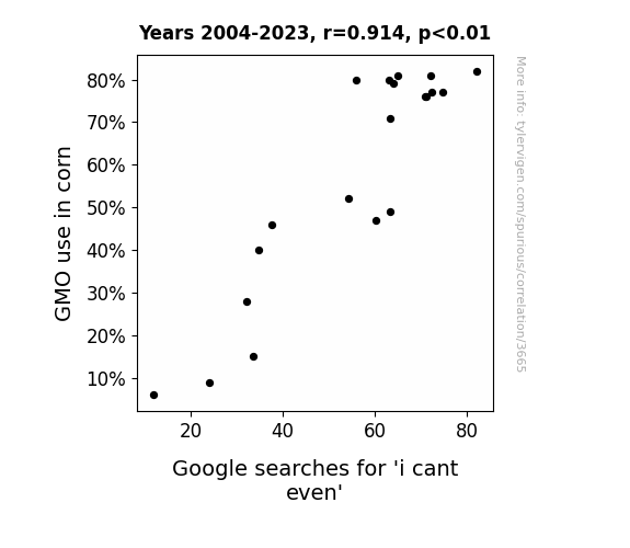
GMO Corn and 'I Can't Even': A Kernel of Truth?
The genetically modified corn was releasing pheromones that accidentally mimicked teenage angst, leading to a nationwide 'what is life even' crisis.

What else correlates?
GMO use in corn · all food
Google searches for 'i cant even' · all google searches
GMO use in corn · all food
Google searches for 'i cant even' · all google searches
Why this works
- Data dredging: I have 25,237 variables in my database. I compare all these variables against each other to find ones that randomly match up. That's 636,906,169 correlation calculations! This is called “data dredging.”
Fun fact: the chart used on the wikipedia page to demonstrate data dredging is also from me. I've been being naughty with data since 2014.
Instead of starting with a hypothesis and testing it, I instead tossed a bunch of data in a blender to see what correlations would shake out. It’s a dangerous way to go about analysis, because any sufficiently large dataset will yield strong correlations completely at random. - Lack of causal connection: There is probably no direct connection between these variables, despite what the AI says above.
Because these pages are automatically generated, it's possible that the two variables you are viewing are in fact causually related. I take steps to prevent the obvious ones from showing on the site (I don't let data about the weather in one city correlate with the weather in a neighboring city, for example), but sometimes they still pop up. If they are related, cool! You found a loophole.
This is exacerbated by the fact that I used "Years" as the base variable. Lots of things happen in a year that are not related to each other! Most studies would use something like "one person" in stead of "one year" to be the "thing" studied. - Observations not independent: For many variables, sequential years are not independent of each other. You will often see trend-lines form. If a population of people is continuously doing something every day, there is no reason to think they would suddenly change how they are doing that thing on January 1. A naive p-value calculation does not take this into account.
You will calculate a lower chance of "randomly" achieving the result than represents reality.
To be more specific: p-value tests are probability values, where you are calculating the probability of achieving a result at least as extreme as you found completely by chance. When calculating a p-value, you need to assert how many "degrees of freedom" your variable has. I count each year (minus one) as a "degree of freedom," but this is misleading for continuous variables.
This kind of thing can creep up on you pretty easily when using p-values, which is why it's best to take it as "one of many" inputs that help you assess the results of your analysis.
- Y-axes doesn't start at zero: I truncated the Y-axes of the graphs above. I also used a line graph, which makes the visual connection stand out more than it deserves.
Nothing against line graphs. They are great at telling a story when you have linear data! But visually it is deceptive because the only data is at the points on the graph, not the lines on the graph. In between each point, the data could have been doing anything. Like going for a random walk by itself!
Mathematically what I showed is true, but it is intentionally misleading. If you click on any of the charts that abuse this, you can scroll down to see a version that starts at zero. - Confounding variable: Confounding variables (like global pandemics) will cause two variables to look connected when in fact a "sneaky third" variable is influencing both of them behind the scenes.
- Outliers: Some datasets here have outliers which drag up the correlation.
In concept, "outlier" just means "way different than the rest of your dataset." When calculating a correlation like this, they are particularly impactful because a single outlier can substantially increase your correlation.
Because this page is automatically generated, I don't know whether any of the charts displayed on it have outliers. I'm just a footnote. ¯\_(ツ)_/¯
I intentionally mishandeled outliers, which makes the correlation look extra strong. - Low n: There are not many data points included in some of these charts.
You can do analyses with low ns! But you shouldn't data dredge with a low n.
Even if the p-value is high, we should be suspicious of using so few datapoints in a correlation.
Pro-tip: click on any correlation to see:
- Detailed data sources
- Prompts for the AI-generated content
- Explanations of each of the calculations (correlation, p-value)
- Python code to calculate it yourself


