spurious correlations
discover · random · spurious scholar
← previous page · next page →
. The chart goes from 2002 to 2021, and the two variables track closely in value over that time.")

View details about correlation #2,993
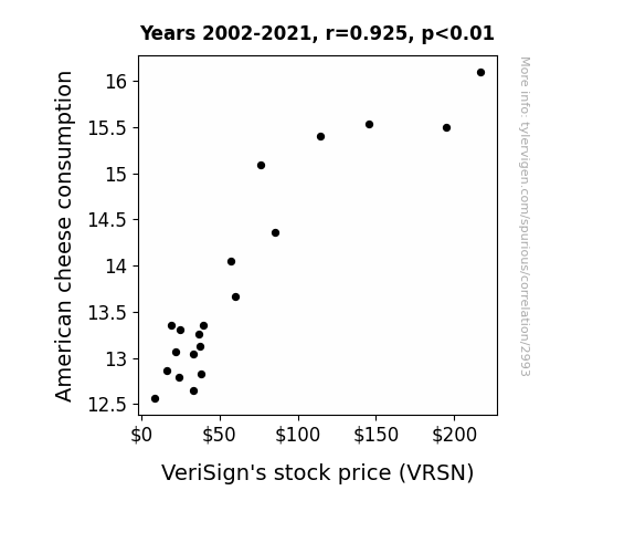
Cheese and Stock: A Gouda Connection Between American Cheese Consumption and VeriSign's Stock Price
As American cheese consumption melted their way through the dairy market, dairy farmers experienced cheddar times, leading to an udderly strong demand for internet services like online cheese ordering. This surge in cyber activity caused an unexpected spike in the need for internet security, prompting investors to say, "That's nacho average stock pick!"

What else correlates?
American cheese consumption · all food
VeriSign's stock price (VRSN) · all stocks
American cheese consumption · all food
VeriSign's stock price (VRSN) · all stocks


View details about correlation #3,431
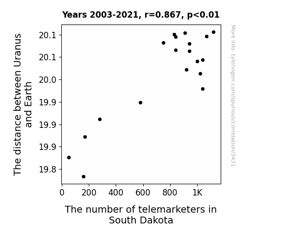
Out of This World Connections: Exploring the Correlation Between the Distance between Uranus and Earth and the Number of Telemarketers in South Dakota
The gravitational pull from Uranus created a space-time distortion that inadvertently redirected telemarketing calls to a parallel universe telemarketing agency, effectively decreasing the number of telemarketers in South Dakota. It's a cosmic case of misdialing across the universe! Or perhaps the telemarketers simply couldn't handle the astronomical changes in their call routing system, leading to a sudden exodus from the state. The uranusfuscation principal at play!

What else correlates?
The distance between Uranus and Earth · all planets
The number of telemarketers in South Dakota · all cccupations
The distance between Uranus and Earth · all planets
The number of telemarketers in South Dakota · all cccupations


View details about correlation #1,531
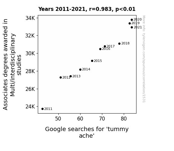
The Belly of the Beast: An Examination of the Association Between Associates Degrees in Multi/Interdisciplinary Studies and Google Searches for 'Tummy Ache'
The sheer breadth of knowledge encompassed in Multi/interdisciplinary studies led to graduates developing a 'full spectrum' understanding of all the potential causes of stomach discomfort, from existential angst to the aerodynamics of burrito consumption. In other words, they had a 'holistic' grasp of digestive dilemmas!


View details about correlation #1,314
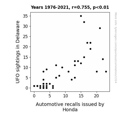
The Cosmic Recall: Unveiling the Interstellar Connection Between UFO Sightings in Delaware and Honda Automotive Recalls
As more UFOs zipped around Delaware, they accidentally activated some kind of cosmic car alarm, prompting a wave of Honda recalls. It seems these UFOs weren't just interested in flying, they were also revved up about automotive safety! It's a real close encounter of the Honda kind.

What else correlates?
UFO sightings in Delaware · all random state specific
Automotive recalls issued by Honda · all weird & wacky
UFO sightings in Delaware · all random state specific
Automotive recalls issued by Honda · all weird & wacky
. The chart goes from 2010 to 2021, and the two variables track closely in value over that time.")

View details about correlation #3,046
Blowin' in the Wind: A Breezy Examination of the Relationship Between Wind Power in Vanuatu and National Grid's Stock Price
As Vanuatu invested more in wind power, they started experiencing stronger and more consistent winds across the entire country. This inadvertently led to an unexpected surge in wind-related accidents among the local population. The influx of patients with wind-related injuries bolstered the demand for medical services, and National Grid, previously known for its electricity services, secretly diversified into a chain of wind injury treatment centers. The success of this unexpected venture skyrocketed the company's stock price, proving that sometimes, when it comes to stocks, the wind really does blow in mysterious ways.

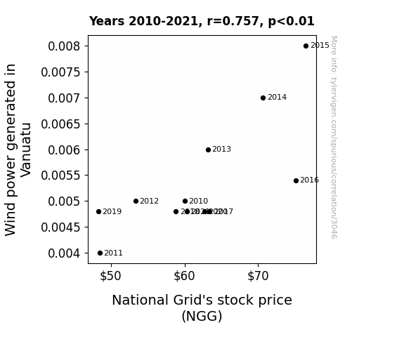
What else correlates?
Wind power generated in Vanuatu · all energy
National Grid's stock price (NGG) · all stocks
Wind power generated in Vanuatu · all energy
National Grid's stock price (NGG) · all stocks


View details about correlation #3,221
Cruzin' with Statistics: Examining the Relationship Between the Popularity of the Name Cruz and the Number of Statisticians in Alabama
Perhaps it's because they wanted to be on the 'Cruz' to statistical success! Or maybe there's a secret statistical formula that correlates the two, you know, like the 'Cruz Coefficient' or the 'Standard Deviation of Cruz's Law.' It could also be a case of data analysis revealing that the name 'Cruz' has a strong positive correlation with number crunching!

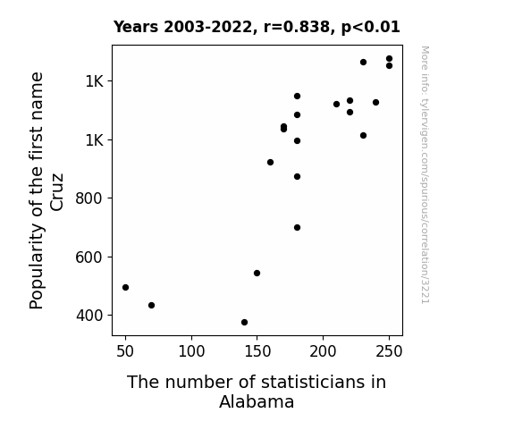
What else correlates?
Popularity of the first name Cruz · all first names
The number of statisticians in Alabama · all cccupations
Popularity of the first name Cruz · all first names
The number of statisticians in Alabama · all cccupations


View details about correlation #1,949
Hockey and Haze: The Puck-uliar Relationship Between Air Pollution in Pittsburgh and Sidney Crosby's Regular Season Goal Scoring
As the air became cleaner in Pittsburgh, it also became lighter, making it easier for the opposing teams to keep up with Crosby on the ice. Plus, with less smog to obscure their view, the goalies were finally able to see his tricky moves coming!

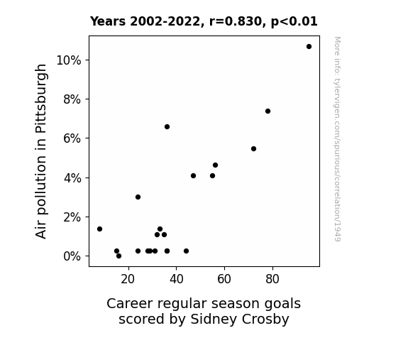
What else correlates?
Air pollution in Pittsburgh · all weather
Career regular season goals scored by Sidney Crosby · all sports
Air pollution in Pittsburgh · all weather
Career regular season goals scored by Sidney Crosby · all sports


View details about correlation #2,746
Communicating the Recalls: The Air Bag of Tricks in Bachelor's Degrees
As more people mastered the art of effective communication, they began complimenting their cars at unprecedented rates, causing the air bags to deploy unnecessarily. It seems like these cars just couldn't handle the sheer amount of praise! Remember, when it comes to cars, sometimes silence is golden.


. The chart goes from 2008 to 2021, and the two variables track closely in value over that time.")

View details about correlation #3,108
Powering Up the Market: The Shocking Connection Between Hydropower Energy Generation in Kosovo and The Home Depot's Stock Price (HD)
As Kosovo's hydropower output surged, it created a literal 'flood' of electricity, sparking a shocking demand for power tools and construction supplies. This surge in electrical potential sent a current of excitement through The Home Depot, leading to a power-packed boost in their stock price. It seems like their profits are certainly not going 'down the drain' with this electrifying connection to Kosovo's hydropower!

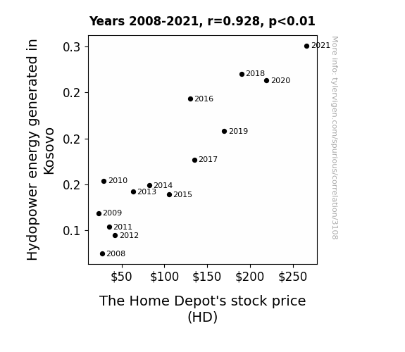
What else correlates?
Hydopower energy generated in Kosovo · all energy
The Home Depot's stock price (HD) · all stocks
Hydopower energy generated in Kosovo · all energy
The Home Depot's stock price (HD) · all stocks


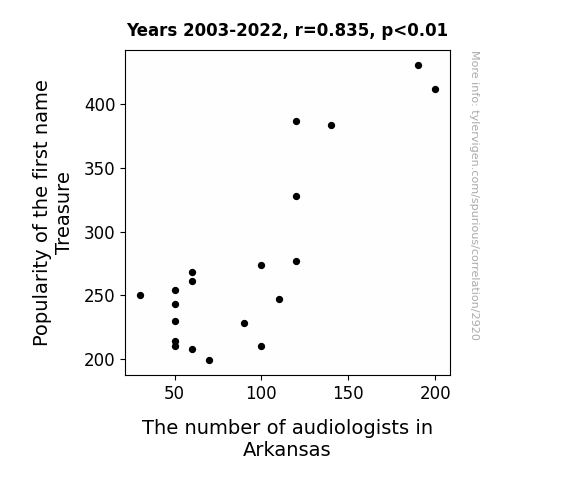
View details about correlation #2,920
Treasure as a Measure: The Correlation between Popularity of a Name and Audiologists in Arkansas
As the first name Treasure gained popularity, more and more parents were inspired to give their children names related to valuable items. This ultimately led to a generation of kids named after expensive things like Audi, Goldie, and Penny. Naturally, this sparked a widespread interest in audiology as a career in Arkansas, as it seemed like the perfect place to mine for audiological talent and expertise, creating a wealth of opportunities in the field. And that's how the Arkansas soundscape got richer, thanks to the unexpected treasures of baby names!

What else correlates?
Popularity of the first name Treasure · all first names
The number of audiologists in Arkansas · all cccupations
Popularity of the first name Treasure · all first names
The number of audiologists in Arkansas · all cccupations


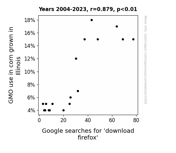
View details about correlation #3,392
GMOs and Google: Gauging the Growing Connection in Illinois
The GMO corn in Illinois developed a special telekinetic connection with internet users, subconsciously prompting them to search for browser upgrades. After all, who can resist a-maize-ing technology improvements?

What else correlates?
GMO use in corn grown in Illinois · all food
Google searches for 'download firefox' · all google searches
GMO use in corn grown in Illinois · all food
Google searches for 'download firefox' · all google searches


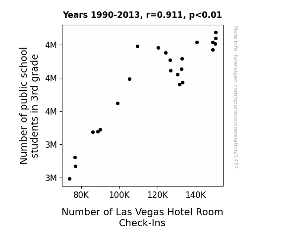
View details about correlation #1,474
Putting the School in Session on the Vegas Strip: An Analysis of the Relationship Between 3rd Grade Enrollment and Hotel Room Check-Ins
As the number of 3rd graders swelled, so did the demand for elaborate field trips. Teachers, keen on showing their students real-world math applications, organized outings to Vegas. Students were tasked with calculating hotel room rates, occupancy percentages, and even designing their own casinos in class projects. This educational influx led to a surprising boom in Las Vegas hotel check-ins, as the youngest number-crunchers-in-training brought a new meaning to the term "Vegas, baby!"

What else correlates?
Number of public school students in 3rd grade · all education
Number of Las Vegas Hotel Room Check-Ins · all weird & wacky
Number of public school students in 3rd grade · all education
Number of Las Vegas Hotel Room Check-Ins · all weird & wacky


View details about correlation #1,614
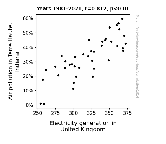
Air Pollution in Terre Haute: A Hoot for UK Electricity's Route
The smog from Terre Haute wafted over to the UK, sparking a bizarre and electrifying reaction in their power plants. Looks like Terre Haute's air pollution is really giving a shocking performance across the pond!
What else correlates?
Air pollution in Terre Haute, Indiana · all weather
Electricity generation in United Kingdom · all energy
Air pollution in Terre Haute, Indiana · all weather
Electricity generation in United Kingdom · all energy


View details about correlation #1,768
The Moesha Conundrum: Exploring the Correlation between Name Popularity and the Industrial Workforce in Missouri
Children named Moesha were destined to work in the coil winding industry, but as the name fell out of favor, so did the career prospects for future coil winders, tapers, and finishers in Missouri. The Moesha Effect was real, and it was shocking the job market in more ways than one!


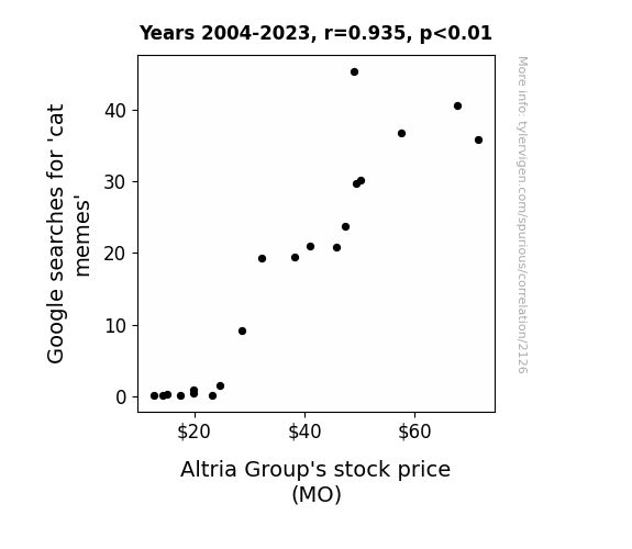
. The chart goes from 2004 to 2023, and the two variables track closely in value over that time.")

View details about correlation #2,126
Pawsitively Purrfect: The Correlation between Google Searches for 'Cat Memes' and Altria Group's Stock Price
As cat memes multiplied online, so did the purrr-chase of Altria's products. Perhaps the memes were meow-velous reminders for investors to put their money where the catnip is, leading to a whisker-licking good rise in stock prices for Altria Group. It seems like the secret to financial prosperity might just be a perfect balance of feline fun and investing in tobacco. Remember, when it comes to stocks, it's all about that purr-spective!
What else correlates?
Google searches for 'cat memes' · all google searches
Altria Group's stock price (MO) · all stocks
Google searches for 'cat memes' · all google searches
Altria Group's stock price (MO) · all stocks


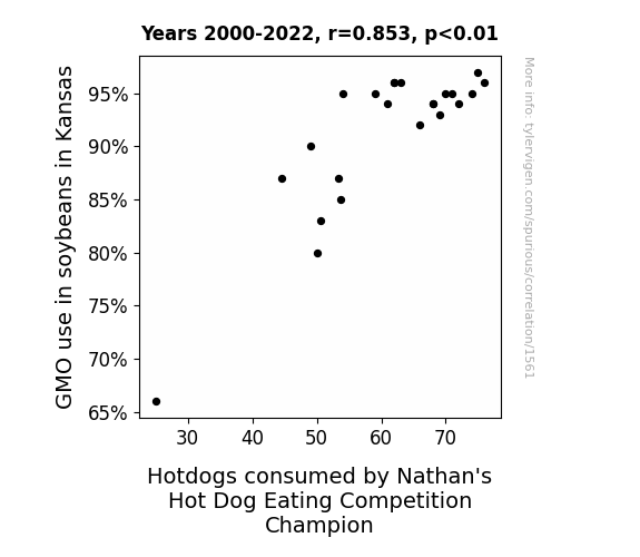
View details about correlation #1,561
Linking GMO-loaded Soybeans in Kansas to the Hotdog Habit of Hot Dog-Eating Heroes
As GMO soybeans in Kansas became more plentiful, they inadvertently developed a smoky, grilled flavor profile. When these soybeans were processed and used as animal feed, the resulting meat had a distinct resemblance to the beloved hotdog taste. This unexpectedly led to a surge in top-quality, irresistible hotdogs, particularly favored by the reigning Nathan's Hot Dog Eating Competition Champion. Though unbeknownst to the public, it seems the path to hotdog victory truly began in the sun-kissed fields of GMO soybean crops in Kansas.


View details about correlation #3,207
Bakerfield's Bad Air and Brawls: Examining the Link Between Air Pollution and Violent Crime Rates
With cleaner air, people could finally take deep breaths and count to ten before resorting to violence. Or perhaps the lack of smog just made it easier for criminals to see they were about to get caught. Maybe the real criminals were just the pollutants all along, and once they cleared out, there was no need for any more mischief in the city.


What else correlates?
Air pollution in Bakersfield, California · all weather
Violent crime rates · all random state specific
Air pollution in Bakersfield, California · all weather
Violent crime rates · all random state specific


View details about correlation #3,537
Harnessing Renewable Energy: A Bridge to Lock Tenders in Mississippi
As Bahrain embraced renewable energy, their efforts inadvertently led to a surplus of solar-powered desalination plants. The excess freshwater production flooded the global market, leading to a sudden drop in the price of watermelon shipments from Mississippi. The affordability of Mississippi's prized fruit caught the attention of international connoisseurs, sparking a nationwide watermelon craze. This unexpected demand created a boom in Mississippi's agricultural industry, prompting the need for more bridge and lock tenders to facilitate the transportation of the coveted watermelons along the state's waterways.


What else correlates?
Renewable energy production in Bahrain · all energy
The number of bridge and lock tenders in Mississippi · all cccupations
Renewable energy production in Bahrain · all energy
The number of bridge and lock tenders in Mississippi · all cccupations
. The chart goes from 2002 to 2022, and the two variables track closely in value over that time.")

View details about correlation #3,678
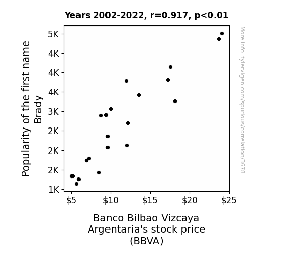
Brady's Bizarre Boom: Bellying Up Banco Bilbao Vizcaya Argentaria's Stock Price
Parents started naming their kids after successful companies instead, leading to a surge in tiny tots named Banco and Bilbao. This unexpected demographic shift created a new generation of toddler investors, causing a spike in demand for toy stocks and a subsequent shortage of BBVA (Baby Bankers of Vestibule Age) shares. The scarcity of BBVA stocks led to a dramatic drop in their value, all because the name Brady just wasn't as bankable as it used to be.

What else correlates?
Popularity of the first name Brady · all first names
Banco Bilbao Vizcaya Argentaria's stock price (BBVA) · all stocks
Popularity of the first name Brady · all first names
Banco Bilbao Vizcaya Argentaria's stock price (BBVA) · all stocks


View details about correlation #1,832
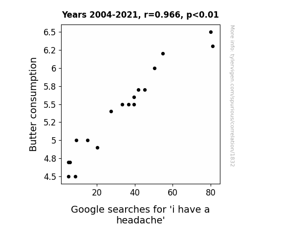
The Butter-Brain Baffle: Analyzing the Association between Butter Consumption and Barometric Brainaches
The increase in butter consumption led to an increase in delicious baked goods. This caused more people to overindulge in treats, leading to a spike in sugar intake. The fluctuation in blood sugar levels ultimately triggered more headaches, prompting an uptick in Google searches for 'i have a headache.' Guess you could say that buttery pastries are a real pain in the head!

What else correlates?
Butter consumption · all food
Google searches for 'i have a headache' · all google searches
Butter consumption · all food
Google searches for 'i have a headache' · all google searches
Why this works
- Data dredging: I have 25,237 variables in my database. I compare all these variables against each other to find ones that randomly match up. That's 636,906,169 correlation calculations! This is called “data dredging.”
Fun fact: the chart used on the wikipedia page to demonstrate data dredging is also from me. I've been being naughty with data since 2014.
Instead of starting with a hypothesis and testing it, I instead tossed a bunch of data in a blender to see what correlations would shake out. It’s a dangerous way to go about analysis, because any sufficiently large dataset will yield strong correlations completely at random. - Lack of causal connection: There is probably no direct connection between these variables, despite what the AI says above.
Because these pages are automatically generated, it's possible that the two variables you are viewing are in fact causually related. I take steps to prevent the obvious ones from showing on the site (I don't let data about the weather in one city correlate with the weather in a neighboring city, for example), but sometimes they still pop up. If they are related, cool! You found a loophole.
This is exacerbated by the fact that I used "Years" as the base variable. Lots of things happen in a year that are not related to each other! Most studies would use something like "one person" in stead of "one year" to be the "thing" studied. - Observations not independent: For many variables, sequential years are not independent of each other. You will often see trend-lines form. If a population of people is continuously doing something every day, there is no reason to think they would suddenly change how they are doing that thing on January 1. A naive p-value calculation does not take this into account.
You will calculate a lower chance of "randomly" achieving the result than represents reality.
To be more specific: p-value tests are probability values, where you are calculating the probability of achieving a result at least as extreme as you found completely by chance. When calculating a p-value, you need to assert how many "degrees of freedom" your variable has. I count each year (minus one) as a "degree of freedom," but this is misleading for continuous variables.
This kind of thing can creep up on you pretty easily when using p-values, which is why it's best to take it as "one of many" inputs that help you assess the results of your analysis.
- Y-axes doesn't start at zero: I truncated the Y-axes of the graphs above. I also used a line graph, which makes the visual connection stand out more than it deserves.
Nothing against line graphs. They are great at telling a story when you have linear data! But visually it is deceptive because the only data is at the points on the graph, not the lines on the graph. In between each point, the data could have been doing anything. Like going for a random walk by itself!
Mathematically what I showed is true, but it is intentionally misleading. If you click on any of the charts that abuse this, you can scroll down to see a version that starts at zero. - Confounding variable: Confounding variables (like global pandemics) will cause two variables to look connected when in fact a "sneaky third" variable is influencing both of them behind the scenes.
- Outliers: Some datasets here have outliers which drag up the correlation.
In concept, "outlier" just means "way different than the rest of your dataset." When calculating a correlation like this, they are particularly impactful because a single outlier can substantially increase your correlation.
Because this page is automatically generated, I don't know whether any of the charts displayed on it have outliers. I'm just a footnote. ¯\_(ツ)_/¯
I intentionally mishandeled outliers, which makes the correlation look extra strong. - Low n: There are not many data points included in some of these charts.
You can do analyses with low ns! But you shouldn't data dredge with a low n.
Even if the p-value is high, we should be suspicious of using so few datapoints in a correlation.
Pro-tip: click on any correlation to see:
- Detailed data sources
- Prompts for the AI-generated content
- Explanations of each of the calculations (correlation, p-value)
- Python code to calculate it yourself


