spurious correlations
discover · random · spurious scholar
← previous page · next page →


View details about correlation #1,488
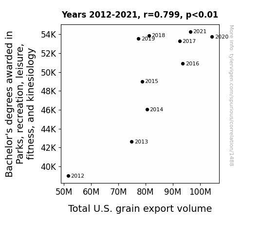
Peculiar Parks, Plentiful Protein: Examining the Exquisite Entanglement Between Bachelor's Degrees in Parks, Recreation, Leisure, Fitness, and Kinesiology and Total U.S. Grain Export Volume
As more people became educated in these fields, they realized the importance of outdoor activities. This led to a surge in demand for recreational sports such as wheat tossing and corn husking, ultimately boosting the production and export of grains.

What else correlates?
Bachelor's degrees awarded in Parks & Recreation · all education
Total U.S. grain export volume · all food
Bachelor's degrees awarded in Parks & Recreation · all education
Total U.S. grain export volume · all food


View details about correlation #1,758
Air We Paying Attention? Exploring the Relationship Between Air Pollution in Juneau, Alaska and Petroleum Consumption in Eritrea
As air pollution in Juneau, Alaska increased, it created a unique atmospheric pattern that spelled out the word "Eritrea" in giant smog letters. This unexpected form of advertising led to a surge in demand for electric cars in Eritrea, ultimately reducing the need for petroleum. It was a classic case of Alaskan air creating an Eritrean affair with eco-friendly transportation - talk about a truly "polluted" marketing strategy!


What else correlates?
Air pollution in Juneau, Alaska · all weather
Petroluem consumption in Eritrea · all energy
Air pollution in Juneau, Alaska · all weather
Petroluem consumption in Eritrea · all energy
. The chart goes from 2004 to 2023, and the two variables track closely in value over that time.")

View details about correlation #2,124
That is Sus: Uncovering the Link between Google Searches and Stock Prices
As Google searches for 'that is sus' increased, people were drawn to online gaming, leading to a surge in demand for electronic components. This unexpected connection boosted ON Semiconductor's stock price, proving that sometimes, even the most sus circumstances can have a shockingly positive impact. Remember, when in doubt, just blame it on the impostor syndrome!


What else correlates?
Google searches for 'that is sus' · all google searches
ON Semiconductor's stock price (ON) · all stocks
Google searches for 'that is sus' · all google searches
ON Semiconductor's stock price (ON) · all stocks


View details about correlation #1,895
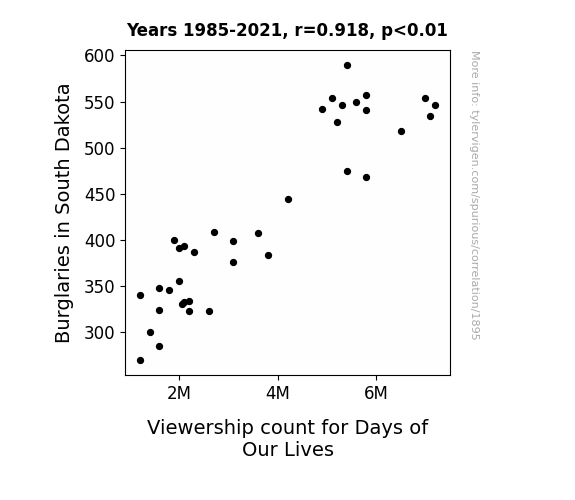
Days of Our Crimes: A Burglary of Interest in South Dakota
As burglaries in South Dakota decreased, there was a corresponding decrease in the need for neighborhood watch groups. With less to keep an eye on, residents found themselves with a lot more free time during the day. Some of them decided to spend that time catching up on Days of Our Lives, leading to a decrease in the overall viewership count for the show.

What else correlates?
Burglaries in South Dakota · all random state specific
Viewership count for Days of Our Lives · all weird & wacky
Burglaries in South Dakota · all random state specific
Viewership count for Days of Our Lives · all weird & wacky


View details about correlation #3,501
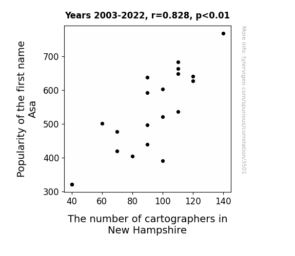
Navigating Names: The Asa-tonishing Connection Between Popularity of the First Name Asa and the Number of Cartographers in New Hampshire
Asa became a trendy name for newborns, leading parents to develop a sudden fascination with maps and navigation, hoping their little Asa-tellites would never get lost. This sparked a cartography craze in New Hampshire, as more and more people embraced the idea of 'mapping out' their children's futures. It seems the name Asa not only had a good 'ring' to it, but also had a knack for 'elevating' the interest in cartography.

What else correlates?
Popularity of the first name Asa · all first names
The number of cartographers in New Hampshire · all cccupations
Popularity of the first name Asa · all first names
The number of cartographers in New Hampshire · all cccupations


View details about correlation #2,908
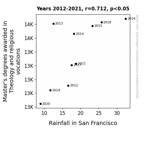
Divine Downpour: Exploring the Interplay Between Theology Master's Degrees and Rainfall in San Francisco
As more theologians are educated, there is a surge in prayers for rain. These collective pleas for precipitation create a metaphysical weather-changing network, leading to a higher chance of divine intervention in the form of increased rainfall specifically targeted at San Francisco. So, it's a case of academic expertise in theology literally making it rain in the City by the Bay.

What else correlates?
Master's degrees awarded in Theology and religious vocations · all education
Rainfall in San Francisco · all weather
Master's degrees awarded in Theology and religious vocations · all education
Rainfall in San Francisco · all weather
. The chart goes from 2006 to 2022, and the two variables track closely in value over that time.")

View details about correlation #2,821
Brewing Up Stock Prices: A Hoppy Correlation Between Brewery Numbers and Ameriprise Financial's Stock (AMP)
As the number of breweries in the United States hops up, so does the demand for beer. This leads to an increase in beer sales, ultimately boosting the stock price of Ameriprise Financial (AMP). It seems like Ameriprise is tapping into a whole new market! After all, they know a thing or two about ale-ing with finances and lager investments. Looks like they're on the road to barley contain their excitement as their stock froths with success. Cheers to that unexpected correlation!


What else correlates?
The number of Breweries in the United States · all food
Ameriprise Financial's stock price (AMP) · all stocks
The number of Breweries in the United States · all food
Ameriprise Financial's stock price (AMP) · all stocks


View details about correlation #2,308
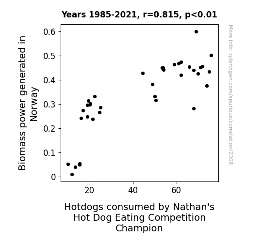
Biomass Bonanza and Binge-Worthy Bratwursts: Exploring the Relationship Between Biomass Power in Norway and Nathan's Hot Dog Eating Competition Champions
As Biomass power in Norway increased, it led to a larger supply of wood-based fuel. This somehow sparked a surge in the production of wooden hot dog holding sticks. With an abundance of these sticks, Nathan's Hot Dog Eating Competition Champion found it easier to consume more hot dogs, ultimately leading to an increase in their hot dog consumption. Who knew that the key to winning a hot dog eating competition lay in Biomass power in Norway?


View details about correlation #1,120
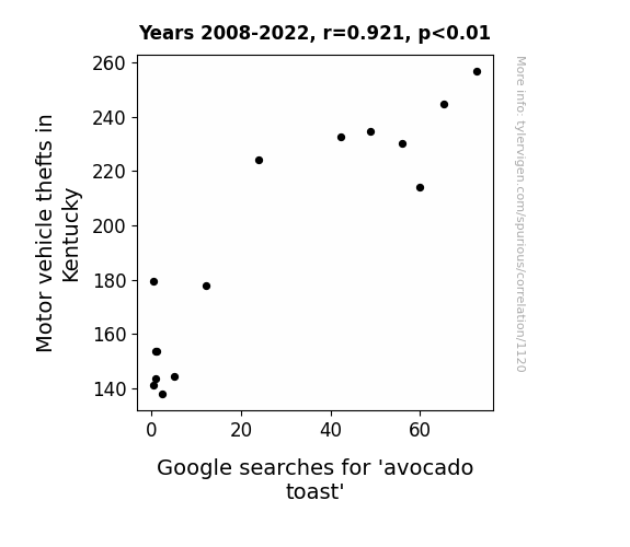
Guac and Roll: The Avo-Crime Connection - An Examination of Motor Vehicle Thefts in Kentucky and Google Searches for 'Avocado Toast'
As motor vehicle thefts in Kentucky increased, more avocados were smuggled across state borders hidden in stolen cars. This led to a surplus of avocados in local markets, making avocados more affordable and popular. As a result, Kentuckians embraced the avocado toast trend, driving up Google searches for avocado toast as they sought out the latest culinary delight. The stolen cars inadvertently paved the way for a toast revolution in the state.
What else correlates?
Motor vehicle thefts in Kentucky · all random state specific
Google searches for 'avocado toast' · all google searches
Motor vehicle thefts in Kentucky · all random state specific
Google searches for 'avocado toast' · all google searches


View details about correlation #2,132
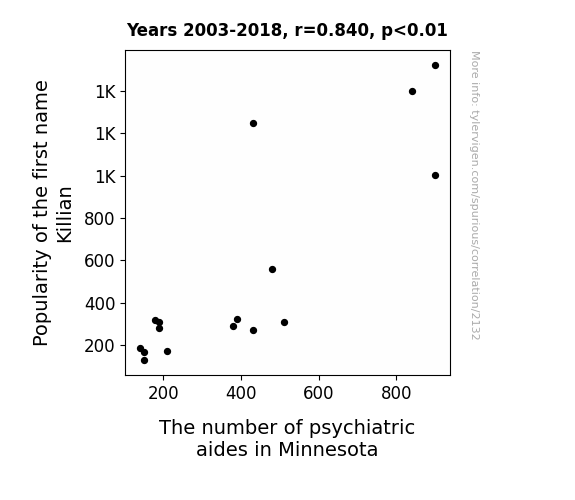
Killian It in the Name: The Curious Link Between Name Popularity and Psychiatric Aides in Minnesota
As the name Killian gained popularity, more and more parents were unconsciously raising little daredevils who just couldn't resist climbing trees, leaping off monkey bars, and attempting all sorts of risky stunts on the playground. This surge in energetic and accident-prone children led to a corresponding demand for psychiatric aides in Minnesota, who found themselves constantly on the go, trying to keep up with these fearless mini-Killians and ensure that no one ended up needing their services. It was a wild, wild west of child psychology in the Land of 10,000 Lakes!

What else correlates?
Popularity of the first name Killian · all first names
The number of psychiatric aides in Minnesota · all cccupations
Popularity of the first name Killian · all first names
The number of psychiatric aides in Minnesota · all cccupations
. The chart goes from 2012 to 2021, and the two variables track closely in value over that time.")

View details about correlation #2,131
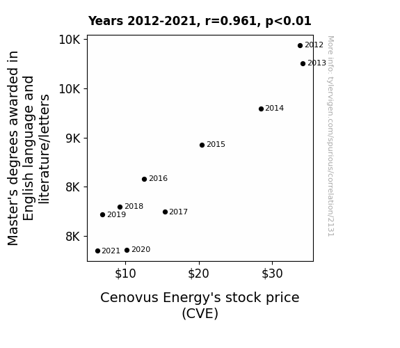
Masters in Metaphors and Markets: Exploring the Elysian Link between English Masters Degrees and Cenovus Energy Stock Prices
As the number of Master's degrees awarded in English language and literature/letters decreases, so does the ability to write compelling and persuasive content. This leads to a decline in the quality of Cenovus Energy's marketing materials and communication with investors. As a result, investor confidence wanes, leading to a decrease in demand for the company's stock and ultimately causing Cenovus Energy's stock price (CVE) to decrease. Remember, behind every successful stock is a team of English majors crafting the perfect narrative!

What else correlates?
Master's degrees awarded in literature · all education
Cenovus Energy's stock price (CVE) · all stocks
Master's degrees awarded in literature · all education
Cenovus Energy's stock price (CVE) · all stocks


View details about correlation #2,023
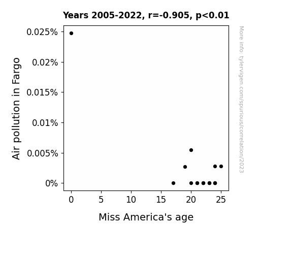
Beauty and the Beasts: Unveiling the Pollution-Popularity Paradox
As air pollution in Fargo increased, beauty pageant contestants started to wheeze more often. This wheezing led to a decrease in their overall lung capacity, which meant they couldn't hold their breath as long during the swimsuit competition. So, instead of being crowned Miss America, they were crowned Miss Nebulizer, and as a result, the average age of winners increased because, as it turns out, clean air is just a breath of fresh heir.

What else correlates?
Air pollution in Fargo · all weather
Miss America's age · all weird & wacky
Air pollution in Fargo · all weather
Miss America's age · all weird & wacky


View details about correlation #1,786
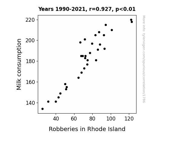
The Dairy Connection: Got Milk, Got Crime? A Study of Milk Consumption and Robberies in Rhode Island
As people switched to dairy alternatives, they became ‘udderly’ mellow and lactose-tolerant, moo-ving away from a life of crime. Without the urge to ‘case-einate’ or ‘cream’ the scene, there was a significant ‘dairy’th of robberies as everyone was too busy ‘moo-ving’ on with their peaceful, almond-crusted lives. The police even considered changing their sirens to cow ‘moo’sic as a tribute to this ‘legendairy’ shift in behavior. It seems that in this case, the real criminals were the ones milking it for all it was worth, but now the only thing getting stolen is a few hearts over a soy latte. It’s a case of ‘got milk’ turning into ‘got no milk, got no problem’ in the annals of bizarrely wholesome crime statistics!
What else correlates?
Milk consumption · all food
Robberies in Rhode Island · all random state specific
Milk consumption · all food
Robberies in Rhode Island · all random state specific


View details about correlation #1,925
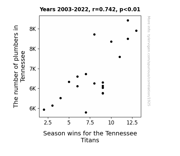
Tennessee Titans Triumph: The Tantalizing Ties between Titans' Triumphs and Tennessee's Trench Technicians
As the number of plumbers in Tennessee decreased, the Titans found themselves unable to 'pipe' down their opponents. With no one to 'flush' out the competition, their performance went down the 'drain'. It seems the team just couldn't 'faucet' the right strategy without the plumbers there to lend a helping 'handyman'!

What else correlates?
The number of plumbers in Tennessee · all cccupations
Season wins for the Tennessee Titans · all sports
The number of plumbers in Tennessee · all cccupations
Season wins for the Tennessee Titans · all sports


View details about correlation #2,440
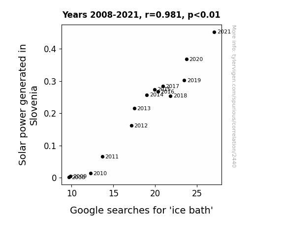
Illuminating Insights: A Sunshine-Serendipity Connection Between Solar Power Generation in Slovenia and Google Searches for 'Ice Bath'
All that extra sunshine in Slovenia led to an uptick in outdoor activities, including intense workouts. As more people soaked up the solar energy, they realized they needed a cool-down, hence the spike in ice bath searches. It's a case of sunny dispositions leading to a desire for icy immersions!

What else correlates?
Solar power generated in Slovenia · all energy
Google searches for 'ice bath' · all google searches
Solar power generated in Slovenia · all energy
Google searches for 'ice bath' · all google searches


View details about correlation #2,796
Business Bachelor's and Booming Bell: Exploring the Link between Business Degrees and AT&T Customer Satisfaction
As more people attained business degrees, there was a corresponding surge in strategic thinking. This led to a "rethink outside the box" approach at AT&T, ultimately dialing up their customer satisfaction.


What else correlates?
Bachelor's degrees awarded in Business · all education
Customer satisfaction with AT&T · all weird & wacky
Bachelor's degrees awarded in Business · all education
Customer satisfaction with AT&T · all weird & wacky
. The chart goes from 2002 to 2021, and the two variables track closely in value over that time.")

View details about correlation #2,384
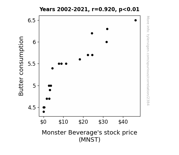
Butter Binges and Monster Beverage's Bounteous Bumps: Bizarrely Beautiful Butter-MNST Melding
As butter consumption increased, so did the demand for delicious pastries and baked goods. This led to a surge in happiness levels as people indulged in their favorite treats. With a population in higher spirits, more individuals turned to energy drinks like Monster Beverage to keep up with their newfound pastry-fueled productivity. The resulting boost in sales and market demand for Monster Beverage sent their stock price soaring. So, in a strange and utterly nonsensical way, you could say that buttery indulgences were churning out profits for Monster Beverage!

What else correlates?
Butter consumption · all food
Monster Beverage's stock price (MNST) · all stocks
Butter consumption · all food
Monster Beverage's stock price (MNST) · all stocks


View details about correlation #2,164
The Chynna Syndrome: A Clear-Air Turbulence in the Avionics Labor Market
As the name Chynna fell out of favor, fewer parents named their children after the '80s singer, which led to a decline in aero-themed baby items being purchased. This ultimately resulted in a shortage of aviation enthusiasts in Maryland.


What else correlates?
Popularity of the first name Chynna · all first names
The number of avionics technicians in Maryland · all cccupations
Popularity of the first name Chynna · all first names
The number of avionics technicians in Maryland · all cccupations


View details about correlation #1,702
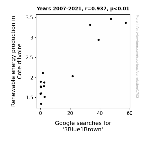
Shocking Search Trends: The Illuminating Connection Between Renewable Energy Production in Cote d'Ivoire and Google Searches for '3Blue1Brown'
As the Cote d'Ivoire's renewable energy production soared, it inadvertently led to a rise in ambient positivity. This unmeasurable, yet palpable, surge in good vibes somehow synchronized with the mind of 3Blue1Brown's audience, creating an inexplicable yearning for colorful explanations of complex math and science concepts. As the nation's eco-friendly power sources thrummed with life, so did the curiosity for 3Blue1Brown's enriching content. It's almost as if the electrons flowing through Cote d'Ivoire's renewable energy infrastructure carried with them a newfound appreciation for mathematical beauty, sparking a chain reaction of algorithmic enthusiasm.

What else correlates?
Renewable energy production in Cote d'Ivoire · all energy
Google searches for '3Blue1Brown' · all google searches
Renewable energy production in Cote d'Ivoire · all energy
Google searches for '3Blue1Brown' · all google searches


View details about correlation #3,583
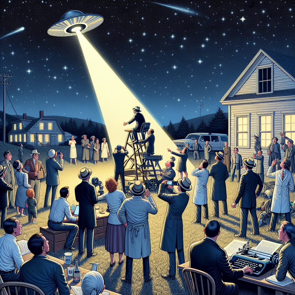
UFO Sights and Patent Rights: The Massachusetts Connection Delight
The aliens were just really curious about our innovative ideas. Maybe they needed some new technology for their own UFO upgrades! It's like they were saying, "Take us to your inventors!"
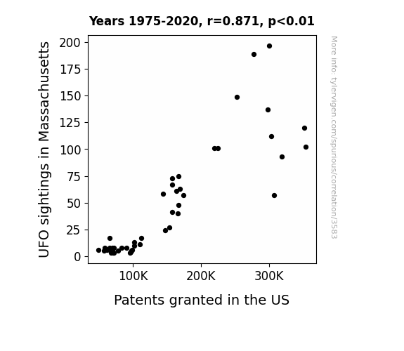
What else correlates?
UFO sightings in Massachusetts · all random state specific
Patents granted in the US · all weird & wacky
UFO sightings in Massachusetts · all random state specific
Patents granted in the US · all weird & wacky
Why this works
- Data dredging: I have 25,237 variables in my database. I compare all these variables against each other to find ones that randomly match up. That's 636,906,169 correlation calculations! This is called “data dredging.”
Fun fact: the chart used on the wikipedia page to demonstrate data dredging is also from me. I've been being naughty with data since 2014.
Instead of starting with a hypothesis and testing it, I instead tossed a bunch of data in a blender to see what correlations would shake out. It’s a dangerous way to go about analysis, because any sufficiently large dataset will yield strong correlations completely at random. - Lack of causal connection: There is probably no direct connection between these variables, despite what the AI says above.
Because these pages are automatically generated, it's possible that the two variables you are viewing are in fact causually related. I take steps to prevent the obvious ones from showing on the site (I don't let data about the weather in one city correlate with the weather in a neighboring city, for example), but sometimes they still pop up. If they are related, cool! You found a loophole.
This is exacerbated by the fact that I used "Years" as the base variable. Lots of things happen in a year that are not related to each other! Most studies would use something like "one person" in stead of "one year" to be the "thing" studied. - Observations not independent: For many variables, sequential years are not independent of each other. You will often see trend-lines form. If a population of people is continuously doing something every day, there is no reason to think they would suddenly change how they are doing that thing on January 1. A naive p-value calculation does not take this into account.
You will calculate a lower chance of "randomly" achieving the result than represents reality.
To be more specific: p-value tests are probability values, where you are calculating the probability of achieving a result at least as extreme as you found completely by chance. When calculating a p-value, you need to assert how many "degrees of freedom" your variable has. I count each year (minus one) as a "degree of freedom," but this is misleading for continuous variables.
This kind of thing can creep up on you pretty easily when using p-values, which is why it's best to take it as "one of many" inputs that help you assess the results of your analysis.
- Y-axes doesn't start at zero: I truncated the Y-axes of the graphs above. I also used a line graph, which makes the visual connection stand out more than it deserves.
Nothing against line graphs. They are great at telling a story when you have linear data! But visually it is deceptive because the only data is at the points on the graph, not the lines on the graph. In between each point, the data could have been doing anything. Like going for a random walk by itself!
Mathematically what I showed is true, but it is intentionally misleading. If you click on any of the charts that abuse this, you can scroll down to see a version that starts at zero. - Confounding variable: Confounding variables (like global pandemics) will cause two variables to look connected when in fact a "sneaky third" variable is influencing both of them behind the scenes.
- Outliers: Some datasets here have outliers which drag up the correlation.
In concept, "outlier" just means "way different than the rest of your dataset." When calculating a correlation like this, they are particularly impactful because a single outlier can substantially increase your correlation.
Because this page is automatically generated, I don't know whether any of the charts displayed on it have outliers. I'm just a footnote. ¯\_(ツ)_/¯
I intentionally mishandeled outliers, which makes the correlation look extra strong. - Low n: There are not many data points included in some of these charts.
You can do analyses with low ns! But you shouldn't data dredge with a low n.
Even if the p-value is high, we should be suspicious of using so few datapoints in a correlation.
Pro-tip: click on any correlation to see:
- Detailed data sources
- Prompts for the AI-generated content
- Explanations of each of the calculations (correlation, p-value)
- Python code to calculate it yourself


