spurious correlations
random · discover · next page →
don't miss spurious scholar,
where each of these is an academic paper


View details about correlation #1,914
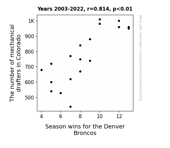
Drawing Conclusions: The Drafting of Mechanical Drafters in Colorado and the Quarterback Drafting for the Denver Broncos
As the number of mechanical drafters in Colorado decreased, there was a subtle but significant shift in the airflow dynamics across the state. This unexpected change in air currents led to a slight disruption in the trajectory of footballs during crucial game moments. Essentially, the absence of these drafters inadvertently drafted a new playbook for Mother Nature, giving a whole new meaning to the phrase "air support" for the Denver Broncos.

What else correlates?
The number of mechanical drafters in Colorado · all cccupations
Season wins for the Denver Broncos · all sports
The number of mechanical drafters in Colorado · all cccupations
Season wins for the Denver Broncos · all sports


View details about correlation #5,107
From Kendrick to Doge: Unleashing the Caninely Coincidental Correlation
Parents who named their children Kendrick were unknowingly influencing the collective consciousness to channel an inner spirit of doge-like silliness.


What else correlates?
Popularity of the first name Kendrick · all first names
Popularity of the 'doge' meme · all memes
Popularity of the first name Kendrick · all first names
Popularity of the 'doge' meme · all memes


View details about correlation #2,205
Churning the Winds: Exploring the Correlation between Butter Consumption and Wind Power Generation in the United States
As butter consumption rose, people's gas production increased, leading to greater wind power capacity in the US. This correlation may seem hard to digest, but it churns out a gouda explanation. As the saying goes, where there's a will, there's a way... and where there's wind, there's a whey!


What else correlates?
Butter consumption · all food
Wind power generated in United States · all energy
Butter consumption · all food
Wind power generated in United States · all energy


View details about correlation #3,965
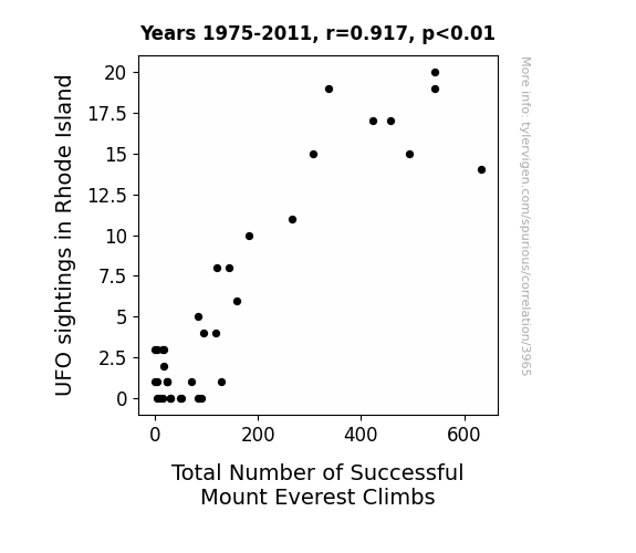
Rhode to the Top: Unidentified Flying Object Sightings and Their Relation to Successful Mount Everest Climbs
The uptick in UFO sightings over Rhode Island is actually just a cover for a top-secret government program to improve mountaineering skills. Unbeknownst to the general public, these advanced UFOs are equipped with state-of-the-art climbing technology, and they've been taking unsuspecting Rhode Islanders on impromptu mountaineering excursions in their spare time. It turns out that all those individuals who reported being abducted were actually receiving intensive high-altitude training on Mount Everest. So, while it may seem like just a strange coincidence, the truth is out there... on the summit of the world's tallest peak!



View details about correlation #5,962
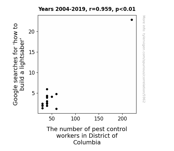
Shining a Light on Lightsaber Longings: Analyzing the Association Between Google Searches for 'How to Build a Lightsaber' and Pest Control Employment in the District of Columbia
As more people attempted to construct their own lightsabers, they unwittingly attracted a higher number of pesky creatures, leading to an unexpected demand for pest control workers in the District of Columbia. Remember, with great power comes great bug-sponsibility!



View details about correlation #5,956
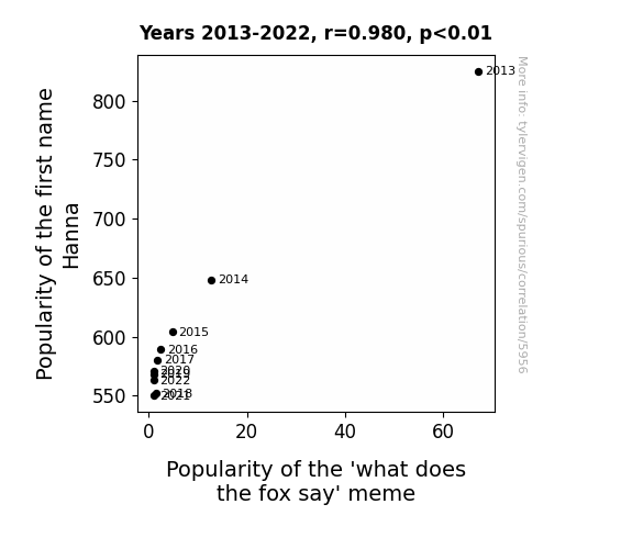
Hanna Be the One: Exploring the Relationship Between Hanna's Popularity and the 'What Does the Fox Say' Meme
Parents just weren't feeling "Hanna" as much anymore, and without the h-animal connection, the meme lost its foxy appeal. It's like the name Hanna was the sly key to keeping the meme relevant, but now it's time to say "Hanna later" to that internet sensation!

What else correlates?
Popularity of the first name Hanna · all first names
Popularity of the 'what does the fox say' meme · all memes
Popularity of the first name Hanna · all first names
Popularity of the 'what does the fox say' meme · all memes


View details about correlation #2,099
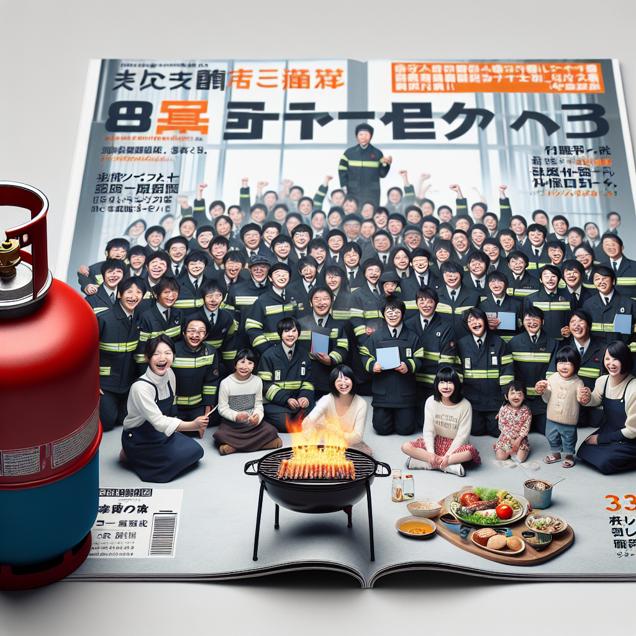
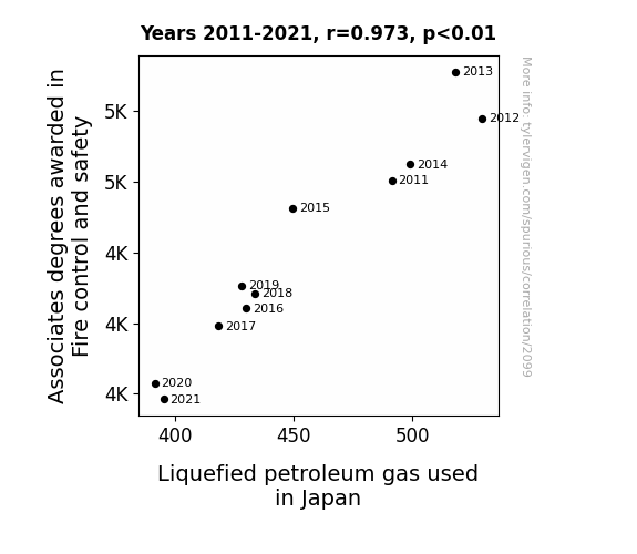
Fanning the Flames: The Blazing Connection Between Associates Degrees in Fire Control and Safety and Liquefied Petroleum Gas Use in Japan
As fewer people held these degrees, there was a noticeable decline in the use of fire extinguishers for non-emergency purposes during weekend BBQs, leading to a reduction in the overall demand for LPG in Japan. Remember, when it comes to fire safety, sometimes it's better to just not play with fire (or gas)!
What else correlates?
Associates degrees awarded in Fire control and safety · all education
Liquefied petroleum gas used in Japan · all energy
Associates degrees awarded in Fire control and safety · all education
Liquefied petroleum gas used in Japan · all energy


View details about correlation #4,562
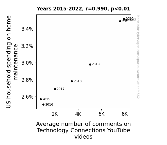
Home Maintenance Expenditures and Tech Talk: Unraveling the Hidden Thread Between Household Spending and YouTube Engagement
As US households invested more in home maintenance, they inadvertently unleashed a wave of tech-related questions and discussions. It seems the squeaky wheel gets the comments!



View details about correlation #2,184
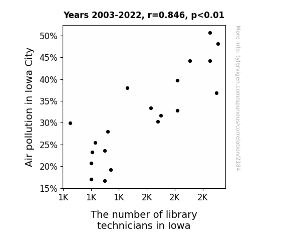
The Air We Breathe: A Study on the Correlation Between Air Pollution in Iowa City and the Employment of Library Technicians in Iowa
The improved air quality led to happier, more productive residents who pursued higher education and careers, reducing the demand for library services in Iowa. It's a classic case of clean air leading to cleaner career paths!

What else correlates?
Air pollution in Iowa City · all weather
The number of library technicians in Iowa · all cccupations
Air pollution in Iowa City · all weather
The number of library technicians in Iowa · all cccupations


View details about correlation #1,302
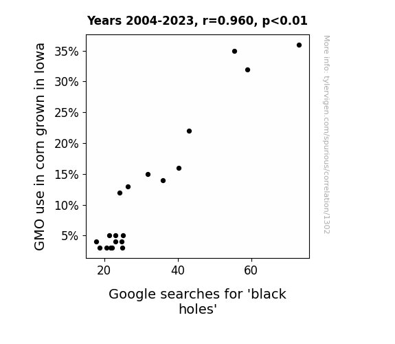
Starch Wars: The Maize of Black Holes
The decrease in GMO use led to less cornicorn production, resulting in a shortage of cosmic corn energy. This shortage caused a rift in the space-thyme continuum, leading to a maize-ssive decrease in black hole activity. The lack of genetically modified corny jokes in the universe also contributed to the cornfusing situation, ultimately pulling the plug on black hole interest. In other words, it seems the cornspiracy against GMOs has cosmically corn-e to an end, leaving us to ponder the astrophysical question: What in the Milky Way is happening in Iowa?!

What else correlates?
GMO use in corn grown in Iowa · all food
Google searches for 'black holes' · all google searches
GMO use in corn grown in Iowa · all food
Google searches for 'black holes' · all google searches


View details about correlation #3,018
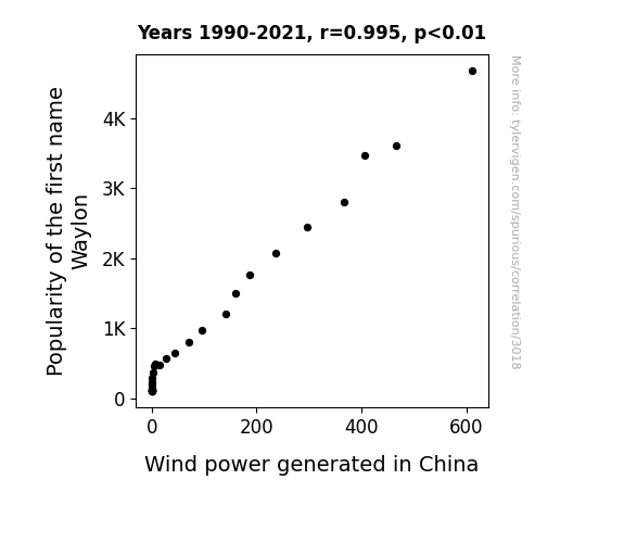
The Waylon Wind Power Wonder: Exploring the Connection Between Name Popularity and Renewable Energy in China
As the number of babies named Waylon has risen, so has the collective amount of cowboy boots in circulation. This has inadvertently led to an uptick in boot stomping across the nation. Little did anyone know, all that rhythmic stomping has been generating small gusts of wind, contributing to the overall increase in wind power in China. It just goes to show, the name Waylon is really kicking up a storm, one boot stomp at a time!

What else correlates?
Popularity of the first name Waylon · all first names
Wind power generated in China · all energy
Popularity of the first name Waylon · all first names
Wind power generated in China · all energy


View details about correlation #2,592
The Interplanetary Interaction: Uranus Distance and American Asthma Persistence
As the gap closed, Uranus's gas emissions had less time to mix with Earth's air, leading to fewer respiratory issues. Remember, sometimes a little space is a gas-free zone!


What else correlates?
The distance between Uranus and Earth · all planets
Asthma prevalence in American children · all weird & wacky
The distance between Uranus and Earth · all planets
Asthma prevalence in American children · all weird & wacky


View details about correlation #2,539
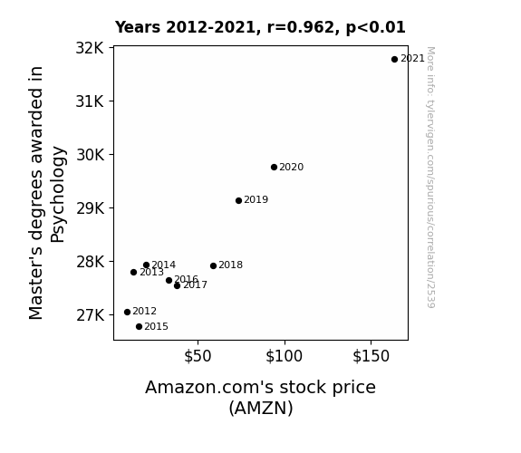
Mind Over Market: A Psych(ology) Up on Amazon's Stock Price
As more people became qualified to analyze behavior and make predictions, they all realized that the urge to buy things we don't need on Amazon is deeply rooted in the human psyche. This heightened awareness led to a surge in online shopping, driving up Amazon's stock price. It's like a virtual shopping session for the soul, with a prime connection to the subconscious.

What else correlates?
Master's degrees awarded in Psychology · all education
Amazon.com's stock price (AMZN) · all stocks
Master's degrees awarded in Psychology · all education
Amazon.com's stock price (AMZN) · all stocks


View details about correlation #1,301
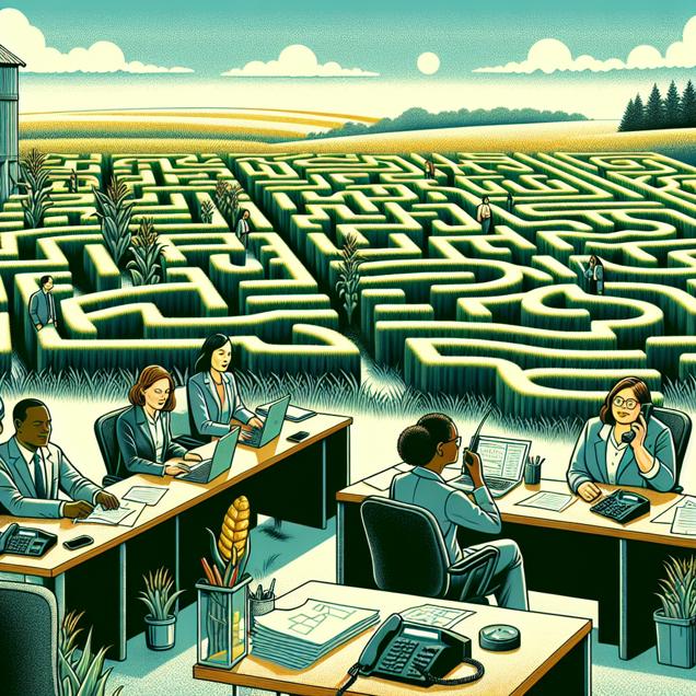
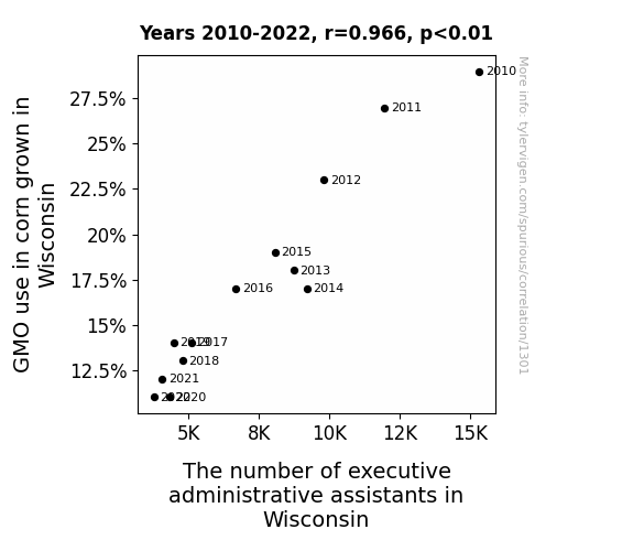
Kernel Connections: The GMO-Corn Conundrum and its Corny Correlation to Executive Administrative Assistants
As GMO use in Wisconsin corn decreased, the size of the corn stalks also decreased. This led to a shortage of tall standing desks, which are preferred by executive administrative assistants for that power stance. As a result, there was a decrease in the number of people holding those specific job titles in Wisconsin.


View details about correlation #5,133
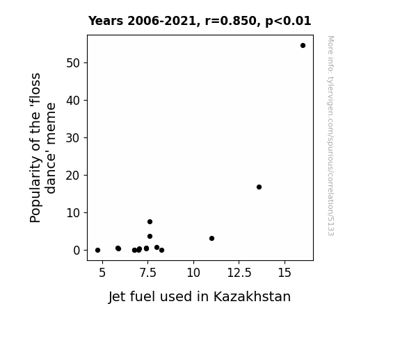
Floss Dance Flair: Is Jet Fuel in Kazakhstan Linked to Online Trending?
As the 'floss dance' meme gained popularity, more people started flossing, leading to an increase in dental hygiene. This, in turn, created a higher demand for minty fresh toothpaste, causing a spike in peppermint production. The rise in peppermint production led to an oversupply in the fragrance market, prompting the creation of 'Minty Jet Fuel' - the freshest way to fly the skies, exclusively in Kazakhstan. Turns out, it's not just the dance moves that are fueling Kazakhstan's skies, it's the power of fresh breath taking off to new heights!

What else correlates?
Popularity of the 'floss dance' meme · all memes
Jet fuel used in Kazakhstan · all energy
Popularity of the 'floss dance' meme · all memes
Jet fuel used in Kazakhstan · all energy


View details about correlation #1,173
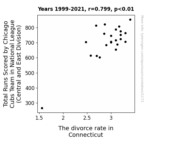
Swinging for the Fences: A Statistical Analysis of the Relationship Between Chicago Cubs' Total Runs Scored and Divorce Rates in Connecticut
Due to the Cubs' improved performance, fans experienced heightened emotions, leading to a surge in marriage counseling services. The frequency of heated arguments over baseball statistics and game strategies put a strain on relationships. As a result, the divorce rate in Connecticut increased, as couples realized they were not compatible in their team loyalties.



View details about correlation #5,827
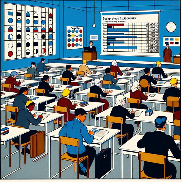
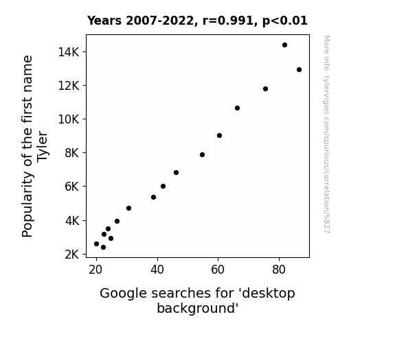
The Desktop Dilemma: A Correlative Analysis of the Tyler Trend and Screensaver Searches
Fewer Tylers means fewer tile-able desktop backgrounds.
What else correlates?
Popularity of the first name Tyler · all first names
Google searches for 'desktop background' · all google searches
Popularity of the first name Tyler · all first names
Google searches for 'desktop background' · all google searches


View details about correlation #2,284
Digging Deeper: The Unearthed Link between U.S. Public School Kids and North Dakota Pipelayers
As the number of kids in public schools rose, so did the demand for well-laid pipes. It seems like these young students are really flushing out the pipelaying profession!


What else correlates?
US kids in public school · all education
The number of pipelayers in North Dakota · all cccupations
US kids in public school · all education
The number of pipelayers in North Dakota · all cccupations


View details about correlation #2,695
Sitcoms and Stocks: A Statistical Analysis of the Relationship Between Season Ratings of Two and a Half Men and Paychex's Stock Price
As the Season rating of "Two and a Half Men" increased, more people tuned in to watch. This led to a higher demand for cheesy jokes and laugh tracks, causing a shortage in the comedy market. Sensing the opportunity, Paychex, a leading provider of payroll, human resource, and benefits outsourcing services, wisely invested in the production of a new sitcom called "Payroll Problems and a Half-Hour of HR Headaches." This unexpected foray into television entertainment garnered critical acclaim and a devoted following, resulting in a surge of stock price for Paychex. Remember, when it comes to investing, sometimes the real winner is the one who can payroll with the punches!


What else correlates?
Season rating of "Two and a Half Men" · all films & actors
Paychex's stock price (PAYX) · all stocks
Season rating of "Two and a Half Men" · all films & actors
Paychex's stock price (PAYX) · all stocks


View details about correlation #5,909
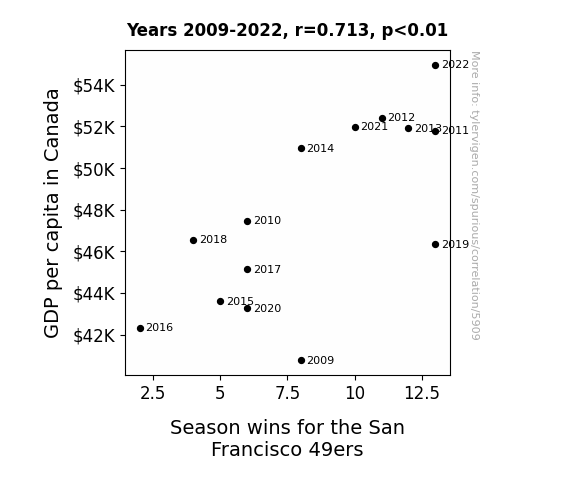
Touchdowns and Trade-Offs: Analyzing the Economic Impact of San Francisco 49ers' Season Wins on Canada's GDP Per Capita
As Canadians' bank accounts grew, so did their love for American football, leading to a surge in 49ers' fan base north of the border. The newfound prosperity somehow translated into unwavering support and inadvertently boosted the team's morale, ultimately contributing to their success on the field. Eh, who would've thought that the key to the end zone lay in the Great White North?

What else correlates?
GDP per capita in Canada · all weird & wacky
Season wins for the San Francisco 49ers · all sports
GDP per capita in Canada · all weird & wacky
Season wins for the San Francisco 49ers · all sports


View details about correlation #1,035
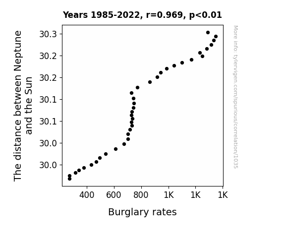
Neptune's Position and Crime Ambition: A Correlation Examination
As Neptune cozied up to the Sun, its frigid temperatures and gaseous composition somehow emitted an anti-burglar force field. Criminals found themselves inexplicably drawn to the outskirts of the solar system, leaving Earth's neighborhoods surprisingly secure. It seems even the god of the sea has a knack for protecting earthly possessions.

What else correlates?
The distance between Neptune and the Sun · all planets
Burglary rates in the US · all random state specific
The distance between Neptune and the Sun · all planets
Burglary rates in the US · all random state specific


View details about correlation #5,920
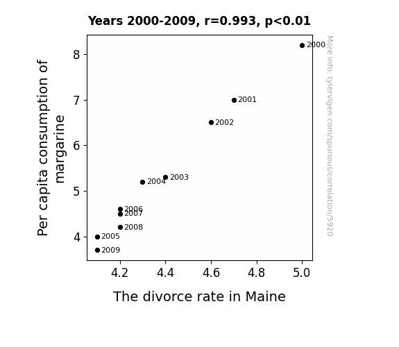
Spreading Love and Margarine: An Examination of the Butter-Splitter Correlation in Maine
Perhaps as people used less margarine, they became less slippery in their relationships. The lack of artificial spread may have kept the couples from buttering each other up, leading to a decrease in overall marital strife. That's the reality when you can't believe it's not butter - it's a recipe for marital success. Alternatively, it could be that as the margarine consumption decreased, so did the overall slickness in the state, leading to fewer instances of partners feeling like they couldn't grip the marriage.

What else correlates?
Per capita consumption of margarine · all food
The divorce rate in Maine · all random state specific
Per capita consumption of margarine · all food
The divorce rate in Maine · all random state specific
Why this works
- Data dredging: I have 25,237 variables in my database. I compare all these variables against each other to find ones that randomly match up. That's 636,906,169 correlation calculations! This is called “data dredging.”
Fun fact: the chart used on the wikipedia page to demonstrate data dredging is also from me. I've been being naughty with data since 2014.
Instead of starting with a hypothesis and testing it, I instead tossed a bunch of data in a blender to see what correlations would shake out. It’s a dangerous way to go about analysis, because any sufficiently large dataset will yield strong correlations completely at random. - Lack of causal connection: There is probably no direct connection between these variables, despite what the AI says above.
Because these pages are automatically generated, it's possible that the two variables you are viewing are in fact causually related. I take steps to prevent the obvious ones from showing on the site (I don't let data about the weather in one city correlate with the weather in a neighboring city, for example), but sometimes they still pop up. If they are related, cool! You found a loophole.
This is exacerbated by the fact that I used "Years" as the base variable. Lots of things happen in a year that are not related to each other! Most studies would use something like "one person" in stead of "one year" to be the "thing" studied. - Observations not independent: For many variables, sequential years are not independent of each other. You will often see trend-lines form. If a population of people is continuously doing something every day, there is no reason to think they would suddenly change how they are doing that thing on January 1. A naive p-value calculation does not take this into account.
You will calculate a lower chance of "randomly" achieving the result than represents reality.
To be more specific: p-value tests are probability values, where you are calculating the probability of achieving a result at least as extreme as you found completely by chance. When calculating a p-value, you need to assert how many "degrees of freedom" your variable has. I count each year (minus one) as a "degree of freedom," but this is misleading for continuous variables.
This kind of thing can creep up on you pretty easily when using p-values, which is why it's best to take it as "one of many" inputs that help you assess the results of your analysis.
- Y-axes doesn't start at zero: I truncated the Y-axes of the graphs above. I also used a line graph, which makes the visual connection stand out more than it deserves.
Nothing against line graphs. They are great at telling a story when you have linear data! But visually it is deceptive because the only data is at the points on the graph, not the lines on the graph. In between each point, the data could have been doing anything. Like going for a random walk by itself!
Mathematically what I showed is true, but it is intentionally misleading. If you click on any of the charts that abuse this, you can scroll down to see a version that starts at zero. - Confounding variable: Confounding variables (like global pandemics) will cause two variables to look connected when in fact a "sneaky third" variable is influencing both of them behind the scenes.
- Outliers: Some datasets here have outliers which drag up the correlation.
In concept, "outlier" just means "way different than the rest of your dataset." When calculating a correlation like this, they are particularly impactful because a single outlier can substantially increase your correlation.
Because this page is automatically generated, I don't know whether any of the charts displayed on it have outliers. I'm just a footnote. ¯\_(ツ)_/¯
I intentionally mishandeled outliers, which makes the correlation look extra strong. - Low n: There are not many data points included in some of these charts.
You can do analyses with low ns! But you shouldn't data dredge with a low n.
Even if the p-value is high, we should be suspicious of using so few datapoints in a correlation.
Pro-tip: click on any correlation to see:
- Detailed data sources
- Prompts for the AI-generated content
- Explanations of each of the calculations (correlation, p-value)
- Python code to calculate it yourself


