spurious correlations
discover · random · spurious scholar
← previous page · next page →


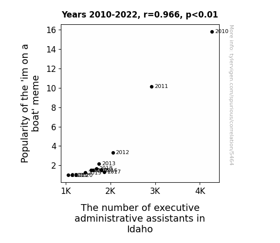
View details about correlation #5,464
Buoyant Bureaucracy: The 'im on a boat' Meme, and the Executive Administrative Assistants in Idaho
As the 'I'm on a boat' meme drifted into obscurity, it took with it the waves of admiration for administrative assistants. Without the constant reminder of the cool and collected demeanor of these assistants, the demand for executive administrative assistants in Idaho slowly ebbed away. It seems the meme's relevance was the real anchor holding the job market afloat.


View details about correlation #5,670
The Connection Between Oregon Senatorial Libertarian Votes and Fertilizing Follies: A Statistical Odyssey
As the number of Libertarian votes for Senators in Oregon increased, so did the demand for a hands-off approach to farming regulations. This led to a push for more organic and sustainable farming practices. Farmers, feeling emboldened by the shifting political climate, turned towards traditional and cost-effective fertilization methods. As a result, the market for dried manure as a natural fertilizer experienced a surprising upswing. Remember, when it comes to politics, sometimes it's all about who can sling the best... policies.


What else correlates?
Votes for Libertarian Senators in Oregon · all elections
Dried manure used for fertilizer in the US · all weird & wacky
Votes for Libertarian Senators in Oregon · all elections
Dried manure used for fertilizer in the US · all weird & wacky


View details about correlation #5,630
The Cullen Craze: Correlating Comment Counts on Extra History
As the popularity of the name Cullen declined, so too did the interest in historical commentary. It seems that society has determined that there can be only one notable Cullen in their lives at a time, and unfortunately for Extra History, it's not the one narrating lesser-known stories from the past. This has led to a measurable decrease in engagement with their content, as viewers subconsciously struggle to reconcile their fascination with history and their waning enthusiasm for embracing the moniker of a certain brooding vampire from a certain young adult novel series. Perhaps if the Cullens of history could find a way to sparkle and charm their way into modern hearts, the Extra History videos might once again enjoy a resurgence of interest. But for now, it seems that the name Cullen is experiencing a decline not just in popularity, but in its ability to inspire online discussions about historical events.


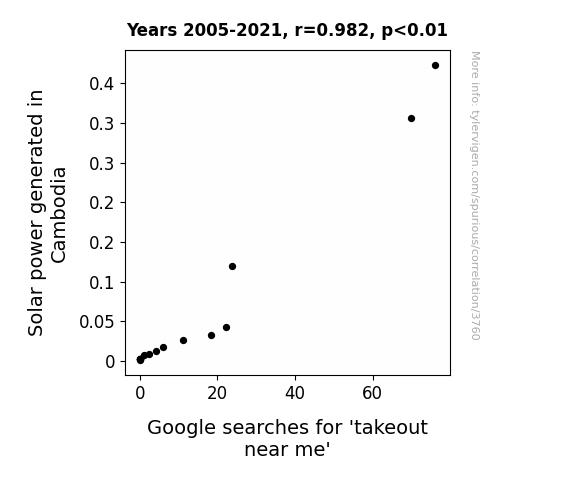
View details about correlation #3,760
Let the Sun Shine In: Illuminating the Relationship between Solar Power Generation in Cambodia and Google Searches for 'Takeout Near Me'
As the solar panels in Cambodia soaked up more rays, they inadvertently beamed down a craving-inducing, MSG-laden aroma, prompting locals to frantically search for the nearest sources of tasty takeout. It's like a delicious side effect of clean energy - talk about a renewable appetite!

What else correlates?
Solar power generated in Cambodia · all energy
Google searches for 'takeout near me' · all google searches
Solar power generated in Cambodia · all energy
Google searches for 'takeout near me' · all google searches


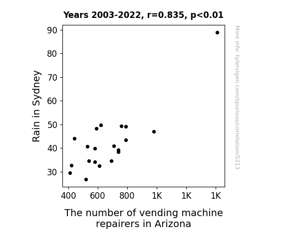
View details about correlation #5,213
A Rainy Day's Impact: The Unexpected Relationship Between Downpours in Sydney and the Vending Machine Repair Industry in Arizona
The rain in Sydney led to an influx of orders for vending machine snacks, causing a ripple effect in the demand for repairers in Arizona as they tried to keep up with the now soggy and malfunctioning vending machines. As the snacks became damp and prone to getting stuck, Arizona saw the need for more repairers to navigate the sea of snack-related issues. It seems like even vending machines can't handle a little moisture without sparking a need for repairs on the other side of the world!

What else correlates?
Rain in Sydney · all weather
The number of vending machine repairers in Arizona · all cccupations
Rain in Sydney · all weather
The number of vending machine repairers in Arizona · all cccupations


View details about correlation #5,644
Fowl Play: The Clucking Connection Between Poultry Expenditure and Republican Votes in Vermont
As US household spending on poultry decreases, there is a nationwide shortage of chicken costumes. This leads to a reduced number of poultry-themed Halloween parades in Vermont. As a result, the Republican Presidential candidate's campaign strategy of appealing to the chicken enthusiast demographic in Vermont falls flat, causing a decrease in votes. It seems the road to the White House was not as poultry-proof as they thought!


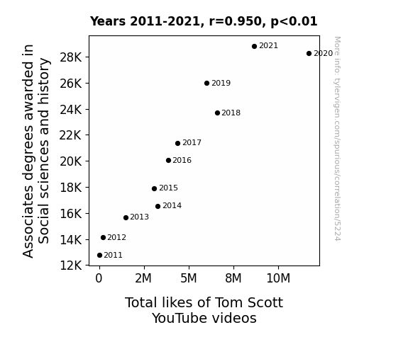
View details about correlation #5,224
Associating Associates: Exploring the Correlation Between Social Sciences and History Degrees Awarded and Total Likes of Tom Scott YouTube Videos
As more individuals became knowledgeable in social sciences and history, they developed a deeper appreciation for the fascinating content presented by Tom Scott. This led to an uptick in engagement and liking of his videos as viewers found themselves better able to connect with the topics and references discussed.


View details about correlation #3,860
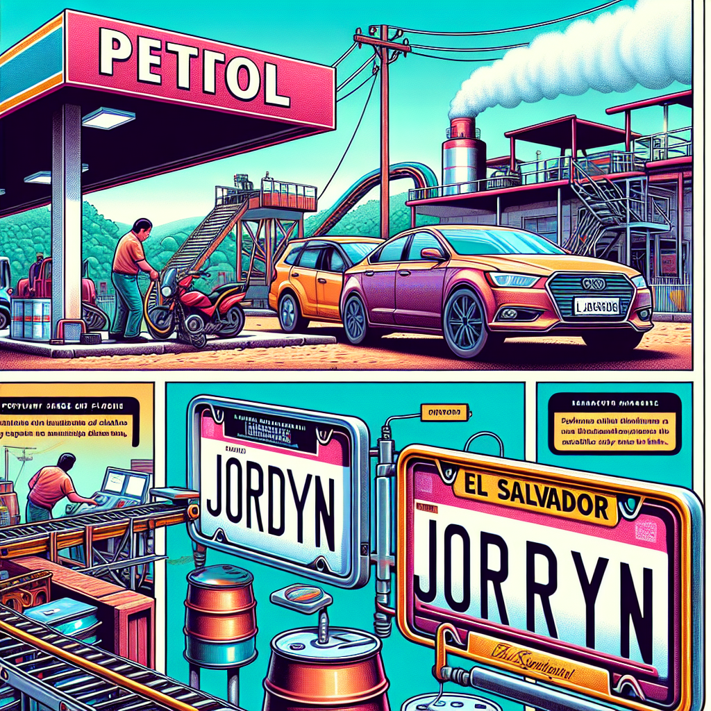
Fuelin' the Trends: Exploring the Jordyn Effect on Fossil Fuel Use in El Salvador
Every time someone named Jordyn was mentioned, it created a wave of excitement that led to an impromptu dance party in El Salvador. The collective shuffling of feet somehow unearthed copious amounts of fossil fuels, much to the surprise of geologists everywhere. As the Jordyns' popularity soared, so did the nation's inexplicable reserves of non-renewable energy. It's a classic case of name-based resource discovery, proving once and for all that the real treasure was the Jordyns we made along the way.

What else correlates?
Popularity of the first name Jordyn · all first names
Fossil fuel use in El Salvador · all energy
Popularity of the first name Jordyn · all first names
Fossil fuel use in El Salvador · all energy


View details about correlation #5,034
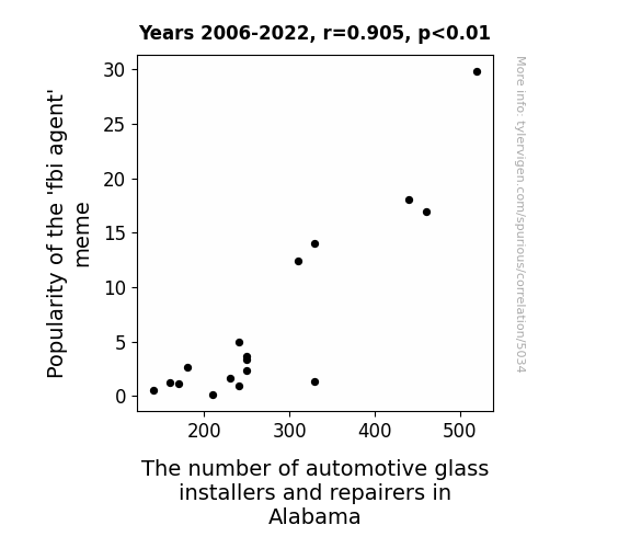
The Peculiar Parallels of Popularity: Exploring the Correlation Between the 'FBI Agent' Meme and Automotive Glass Installers in Alabama
As the 'fbi agent' meme gained traction, more and more people started feeling like they were being watched. This led to a surge in the number of folks checking their car mirrors for any suspicious activity. Consequently, there was a higher demand for automotive glass installers and repairers in Alabama to keep an eye out for cracks and ensure that nothing 'shady' was going on with their vehicle's windows. It seems like the meme inadvertently sparked a real 'pane' for the automotive glass industry in Alabama!


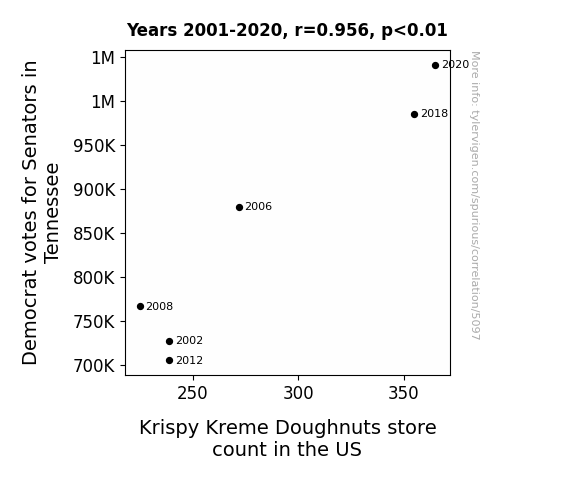
View details about correlation #5,097
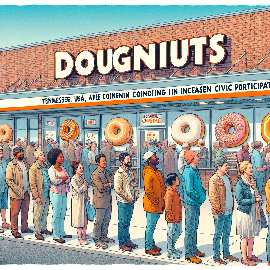
Do(nut) Democrats: A Statistical Analysis of the Relationship Between Senatorial Votes in Tennessee and Krispy Kreme Doughnut Store Density
As more Democrat votes for Senators in Tennessee rolled in, it created a ripple effect by attracting a higher concentration of donut enthusiasts to the state. This sudden surge in demand for delicious fried dough led Krispy Kreme to expand their operations across the nation in a bid to keep up with the anticipated cravings. After all, when it comes to politics and pastries, it's all about the power of glazetical influence!
What else correlates?
Votes for Democratic Senators in Tennessee · all elections
Krispy Kreme Doughnuts store count in the US · all weird & wacky
Votes for Democratic Senators in Tennessee · all elections
Krispy Kreme Doughnuts store count in the US · all weird & wacky


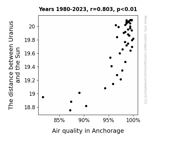
View details about correlation #5,715
The Atmospherics of Uranus: Examining the Gas Giant's Distance from the Sun and its Impact on Air Quality in Anchorage
As Uranus moved further away, it let out a cosmic toot of relief, creating a gaseous barrier that somehow purified the air in Anchorage. It's as if the universe was just trying to clear the air for the good folks up in Alaska!

What else correlates?
The distance between Uranus and the Sun · all planets
Air quality in Anchorage · all weather
The distance between Uranus and the Sun · all planets
Air quality in Anchorage · all weather


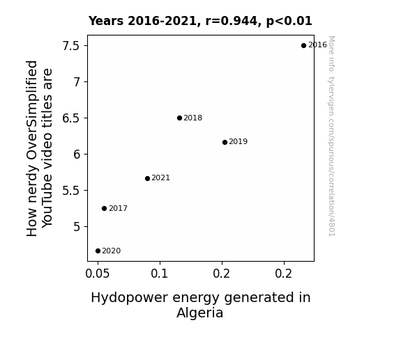
View details about correlation #4,801
Power Plays and Nerdy Ways: The Correlation Between OverSimplified YouTube Video Titles and Hydropower Energy in Algeria
As the hydroelectric output in Algeria wanes, so too does the energy available to power the computers responsible for generating OverSimplified video titles. This leads to a decrease in the nerdy references, as the limited energy supply forces the algorithm to prioritize more essential functions over injecting nerdy puns into the video titles. So, the next time you're missing those historical and nerdy references, just remember, it all boils down to the shocking shortage of hydroelectric power in Algeria.

What else correlates?
How nerdy OverSimplified YouTube video titles are · all YouTube
Hydopower energy generated in Algeria · all energy
How nerdy OverSimplified YouTube video titles are · all YouTube
Hydopower energy generated in Algeria · all energy


View details about correlation #5,165
Ties That 'F' the Knot: Exploring the Interplay Between the 'Press F to Pay Respects' Meme Popularity and Financial Examiner Numbers in North Carolina
As the meme spread, more and more people were pressing "F" on their keyboards, inadvertently applying for financial examiner positions in North Carolina. This led to a sudden surge in the number of candidates, ultimately requiring the state to hire additional financial examiners to process this unexpected influx of job applications. It was a keybord error that led to an increase in financial examiners!


View details about correlation #5,356
Flock the Vote: A Feathered Approach to Political Analysis in Oklahoma
As Democrat votes for Senators in Oklahoma decreased, key environmental policies were not as strongly supported. This led to a noticeable lack of government-funded bird umbrellas in the state. With fewer designated rainy day shelters for avian constituents, the birds had to take matters into their own wings and find alternative accommodations when it rained. This unforeseen consequence left both the avian and human populations pondering the age-old question of avian evaporative precipitation practices, prompting a collective shift in curiosity towards the mysterious and elusive rainy day itineraries of our feathered friends.


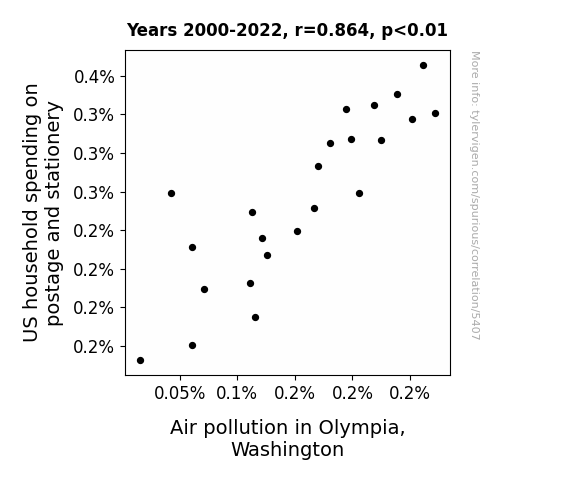
View details about correlation #5,407
Stamping Out Air Pollution: The Correspondence between US Household Spending on Postage and Stationery and Air Pollution in Olympia, Washington
As households spent less on postage and stationery, there was a lower demand for sending physical letters and cards. This led to a decrease in the transportation of mail by planes and trucks, resulting in reduced air pollution in Olympia, Washington. It's as if Mother Nature said, "Hey, less mail, less smog! Keep those letters virtual, and let's clear the air!"

What else correlates?
US household spending on postage and stationery · all weird & wacky
Air pollution in Olympia, Washington · all weather
US household spending on postage and stationery · all weird & wacky
Air pollution in Olympia, Washington · all weather


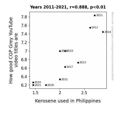
View details about correlation #4,830
Up in Flames: CGP Grey's Video Title Game and the Kerosene Effect in the Philippines
The decrease in kerosene usage in the Philippines has led to less fuel for creativity, resulting in a decline in the quality of CGP Grey video titles. With fewer fumes of inspiration wafting through the air, the once brilliant and illuminating video titles have been extinguished, leaving viewers in the dark about the content.

What else correlates?
How good CGP Grey YouTube video titles are · all YouTube
Kerosene used in Philippines · all energy
How good CGP Grey YouTube video titles are · all YouTube
Kerosene used in Philippines · all energy


View details about correlation #4,935
Cart-astrophe: The Correlation Between Maps Without New Zealand Meme Popularity and Event Planner Numbers in New York
Event planners in New York were inspired by the meme to organize a series of New Zealand-themed events, leading to a higher demand for event planners with expertise in Kiwi culture and creativity. As the meme gained popularity, so did the desire to throw epic hobbit-themed parties and unforgettable Maori-inspired weddings in the Big Apple. It's like they say, where there's a meme, there's a middle-earth party just waiting to happen!


What else correlates?
Popularity of the 'Maps Without New Zealand' meme · all memes
The number of event planners in New York · all cccupations
Popularity of the 'Maps Without New Zealand' meme · all memes
The number of event planners in New York · all cccupations


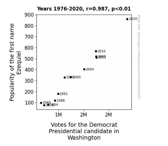
View details about correlation #5,601
Ezequiel's Electoral Effect: A Presidential Popularity Pun-demic
As the number of babies named Ezequiel rose, so did the demand for personalized mini American flags, leading to a spike in support for the Democrat candidate in Washington. Remember, when in doubt, just wave it out!


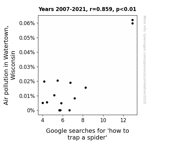
View details about correlation #5,025
Caught in the Web: A Arachnophobic Analysis of Air Pollution in Watertown, Wisconsin
The decrease in air pollution led to larger, stickier spider webs, making it easier to trap spiders without needing to search for techniques. It seems like those spiders were just hanging around for cleaner air!

What else correlates?
Air pollution in Watertown, Wisconsin · all weather
Google searches for 'how to trap a spider' · all google searches
Air pollution in Watertown, Wisconsin · all weather
Google searches for 'how to trap a spider' · all google searches


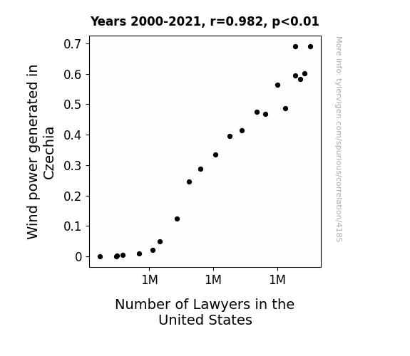
View details about correlation #4,185
Blowing in the Wind: A Legal Connection Between Wind Power in Czechia and the Number of Lawyers in the United States
The sudden gust of legal disputes led to a higher demand for lawyers in the United States. As more wind power was harnessed in Czechia, it created a whirlwind of paperwork, prompting the need for additional legal representation. It seems the Czechs were really blowing the competition away in both renewable energy and inadvertently, in the legal field!

What else correlates?
Wind power generated in Czechia · all energy
Number of Lawyers in the United States · all weird & wacky
Wind power generated in Czechia · all energy
Number of Lawyers in the United States · all weird & wacky
Why this works
- Data dredging: I have 25,237 variables in my database. I compare all these variables against each other to find ones that randomly match up. That's 636,906,169 correlation calculations! This is called “data dredging.”
Fun fact: the chart used on the wikipedia page to demonstrate data dredging is also from me. I've been being naughty with data since 2014.
Instead of starting with a hypothesis and testing it, I instead tossed a bunch of data in a blender to see what correlations would shake out. It’s a dangerous way to go about analysis, because any sufficiently large dataset will yield strong correlations completely at random. - Lack of causal connection: There is probably no direct connection between these variables, despite what the AI says above.
Because these pages are automatically generated, it's possible that the two variables you are viewing are in fact causually related. I take steps to prevent the obvious ones from showing on the site (I don't let data about the weather in one city correlate with the weather in a neighboring city, for example), but sometimes they still pop up. If they are related, cool! You found a loophole.
This is exacerbated by the fact that I used "Years" as the base variable. Lots of things happen in a year that are not related to each other! Most studies would use something like "one person" in stead of "one year" to be the "thing" studied. - Observations not independent: For many variables, sequential years are not independent of each other. You will often see trend-lines form. If a population of people is continuously doing something every day, there is no reason to think they would suddenly change how they are doing that thing on January 1. A naive p-value calculation does not take this into account.
You will calculate a lower chance of "randomly" achieving the result than represents reality.
To be more specific: p-value tests are probability values, where you are calculating the probability of achieving a result at least as extreme as you found completely by chance. When calculating a p-value, you need to assert how many "degrees of freedom" your variable has. I count each year (minus one) as a "degree of freedom," but this is misleading for continuous variables.
This kind of thing can creep up on you pretty easily when using p-values, which is why it's best to take it as "one of many" inputs that help you assess the results of your analysis.
- Y-axes doesn't start at zero: I truncated the Y-axes of the graphs above. I also used a line graph, which makes the visual connection stand out more than it deserves.
Nothing against line graphs. They are great at telling a story when you have linear data! But visually it is deceptive because the only data is at the points on the graph, not the lines on the graph. In between each point, the data could have been doing anything. Like going for a random walk by itself!
Mathematically what I showed is true, but it is intentionally misleading. If you click on any of the charts that abuse this, you can scroll down to see a version that starts at zero. - Confounding variable: Confounding variables (like global pandemics) will cause two variables to look connected when in fact a "sneaky third" variable is influencing both of them behind the scenes.
- Outliers: Some datasets here have outliers which drag up the correlation.
In concept, "outlier" just means "way different than the rest of your dataset." When calculating a correlation like this, they are particularly impactful because a single outlier can substantially increase your correlation.
Because this page is automatically generated, I don't know whether any of the charts displayed on it have outliers. I'm just a footnote. ¯\_(ツ)_/¯
I intentionally mishandeled outliers, which makes the correlation look extra strong. - Low n: There are not many data points included in some of these charts.
You can do analyses with low ns! But you shouldn't data dredge with a low n.
Even if the p-value is high, we should be suspicious of using so few datapoints in a correlation.
Pro-tip: click on any correlation to see:
- Detailed data sources
- Prompts for the AI-generated content
- Explanations of each of the calculations (correlation, p-value)
- Python code to calculate it yourself


