spurious correlations
discover · random · spurious scholar
← previous page · next page →


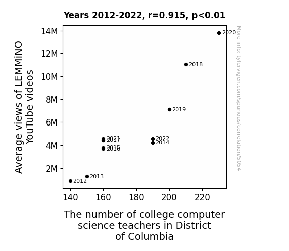
View details about correlation #5,054
Viewing the Binary Beat: Unraveling the Correlation Between LEMMiNO YouTube Video Views and Computer Science Educators in DC
As more people watched LEMMiNO's videos, they were unknowingly enrolled in a secret educational program. Through subliminal messages and hidden codes in the videos, viewers were becoming computer science experts overnight. With this surge in self-proclaimed expertise, the demand for college computer science teachers in District of Columbia skyrocketed, leading to an unexpected boom in the job market for tech-savvy educators. It's like The Matrix, but instead of learning kung fu, you suddenly know how to teach algorithms to college students in the capital!


View details about correlation #5,076
Rhode Island Senate Democrats and 'Never Gonna Give You Up' Meme's Ripple Effect: A Nick Rhyme-tastic Analysis
More Democrat Senators means more people are feeling rickrolled by politics.


What else correlates?
Votes for Democratic Senators in Rhode Island · all elections
Searches for 'never gonna give you up' · all memes
Votes for Democratic Senators in Rhode Island · all elections
Searches for 'never gonna give you up' · all memes


View details about correlation #5,306
Odalys Odyssey: Airing out the Correlation Between Name Popularity and Air Pollution in Prescott
Whenever someone shouted, "Odalys be driving me crazy!" it led to a surge in car usage and consequently, air pollution in Prescott, Arizona. It seems like Odalys just couldn't help but make the air a little od-aly-s-ted!

What else correlates?
Popularity of the first name Odalys · all first names
Air pollution in Prescott, Arizona · all weather
Popularity of the first name Odalys · all first names
Air pollution in Prescott, Arizona · all weather


View details about correlation #3,847
Shocking Connection: Sparking Renewable Energy Production in Antigua and Barbuda and Its Shocking Impact on Paypal's Number of Active Registered User Accounts
As the wind turbines and solar panels multiplied, they inadvertently created a surge of positive energy that somehow zapped people's interest in online payment options. It's a shocking development, but it seems the more the renewable energy flourished, the more people wanted to be current with their digital transactions, leading to a powerful connection between clean power and a wealth of Paypal accounts!


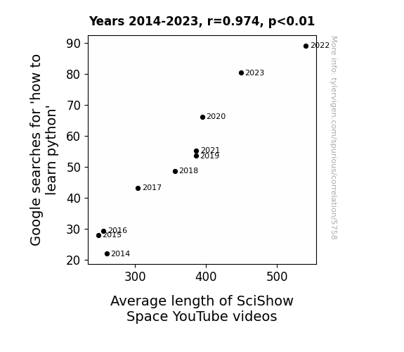
View details about correlation #5,758
Python Pursuits and Prolonged Presentations: Probing the Pairing of 'how to learn python' Google Searches with SciShow Space Video Length
As more people delved into the world of Python, the snakes in the grass of technology felt a surge in self-esteem. This led to a reptilian uprising within the SciShow Space team, prompting longer videos to be produced in honor of their slithery overlords. Who knew that mastering a programming language could lead to such a ssseriously cosmic shift in content production!


View details about correlation #5,455
Blueberry Pancakes and Blue Votes: Exploring the Correlation Between Democrat Senatorial Support in Maine and the Number of Cooks, Institutions, and Cafeterias
As the Democrat votes for Senators in Maine increased, there was a proportional rise in demand for lobstocratic supporters. This led to a surge in the number of cooks, institution and cafeteria in Maine, as they scrambled to cater to the crustacean cravings of the politically aligned populace. Lobster-themed menu items, such as the "Left-Wing Linguine with Lobster" and the "Bipartisan Lobster Bisque," became incredibly popular, prompting the need for more culinary professionals and dining establishments to shell out these delectable dishes. It seems like in Maine, when it comes to politics and food, it's all about making a splash in the pot-ical landscape!


View details about correlation #5,423
Air Pollution and Automobile Theft: A Rhyming Riddle Unveiled
As the smog cleared, so did the opportunity for car bandits to make a clean getaway. It seems the air wasn't the only thing getting a breath of fresh air - the car thieves were also taking a break from their smoggy business. It's as if the reduction in pollution put the brakes on the thieves' activities, leaving them with less fuel for their criminal endeavors. This just goes to show that when it comes to crime, cleaner air really does drive down the rates of auto theft!


What else correlates?
Air pollution in Atlanta · all weather
Motor vehicle thefts in Georgia · all random state specific
Air pollution in Atlanta · all weather
Motor vehicle thefts in Georgia · all random state specific


View details about correlation #3,945
Hot Takes: The Sizzling Connection Between Guatemalan Geothermal Power and Nathan's Famous Hot Dog Consumption
The extra heat from all that geothermal power led to a spike in the growth of guac-ameat-a, creating a perfect topping for Nathan's hotdogs. As Guatemala turned up the Earth's thermostat, it seems they also turned up the appetite for competitive hotdog munching – talk about a wiener of a coincidence!


View details about correlation #5,710
From Views to Zzzs: The Somnambulant Relationship between AsapSCIENCE YouTube Videos and 'Sleepwalking' Google Searches
The soothing voice of the hosts acted as a subconscious lullaby, gently guiding viewers into a peaceful slumber, and preventing any potential late-night strolls.


What else correlates?
Total views on AsapSCIENCE YouTube videos · all YouTube
Google searches for 'sleepwalking' · all google searches
Total views on AsapSCIENCE YouTube videos · all YouTube
Google searches for 'sleepwalking' · all google searches


View details about correlation #5,438
The Consultant Conundrum: Linking GOP Votes to a Proliferation of Pundits
As more Republican Senators were elected, there was a sudden surge in demand for politically-themed consulting services. Illinois saw an influx of consultants offering expertise in donkey and elephant-related strategies, leading to a bittersweet realization that politics and consulting go hand in hand, just like peanut butter and jelly.


What else correlates?
Votes for Republican Senators in Illinois · all elections
The number of consultants in Illinois · all cccupations
Votes for Republican Senators in Illinois · all elections
The number of consultants in Illinois · all cccupations


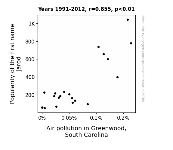
View details about correlation #5,788
The Jarod Quotient and Greenwood's Polluted Environment: A Name-astatic Study
As the name Jarod gained popularity, more and more people couldn't help but "emulate" him. Unfortunately, Jarod had a strange affinity for releasing helium balloons with messages attached, causing a surge in balloon litter in Greenwood. These balloons were getting tangled in power lines and causing small outages, leading to an increase in air pollution as backup generators were fired up to meet the rising demand for electricity. And that's how the Jarod trend in naming led to a not-so-"clean-air" craze in Greenwood, South Carolina! The moral of the story? Let's strive for names that don't "balloon" out of control!

What else correlates?
Popularity of the first name Jarod · all first names
Air pollution in Greenwood, South Carolina · all weather
Popularity of the first name Jarod · all first names
Air pollution in Greenwood, South Carolina · all weather


View details about correlation #3,848
Blown Away: Unraveling the Winds of Change in South Africa and the Recalls at Mercedes-Benz USA
The increase in wind power in South Africa has been leading to stronger gusts, which are inadvertently causing a higher rate of Mercedes-Benz cars to unexpectedly deploy their airbags. It seems the problem is really blowing up for them!

What else correlates?
Wind power generated in South Africa · all energy
Automotive recalls issued by Mercedes-Benz USA · all weird & wacky
Wind power generated in South Africa · all energy
Automotive recalls issued by Mercedes-Benz USA · all weird & wacky


View details about correlation #5,354
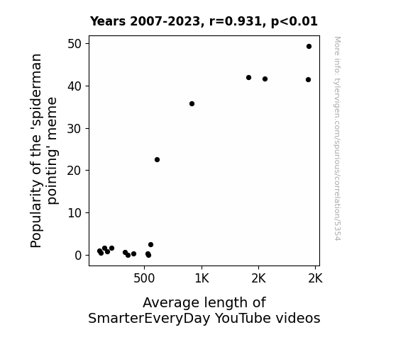
Stuck in the Web: The Correlation Between the 'Spiderman Pointing' Meme Popularity and SmarterEveryDay Video Length
As the 'spiderman pointing' meme gained traction, it sparked a web of creativity among viewers. This led to a surge in demand for in-depth, longer-form content, prompting SmarterEveryDay to spin out longer videos to satisfy their audience's hunger for knowledge. The meme's sticky influence ultimately webbed its way into shaping the content landscape, proving that when it comes to video length, the power of memes should never be underestimated.

What else correlates?
Popularity of the 'spiderman pointing' meme · all memes
Average length of SmarterEveryDay YouTube videos · all YouTube
Popularity of the 'spiderman pointing' meme · all memes
Average length of SmarterEveryDay YouTube videos · all YouTube


View details about correlation #5,616
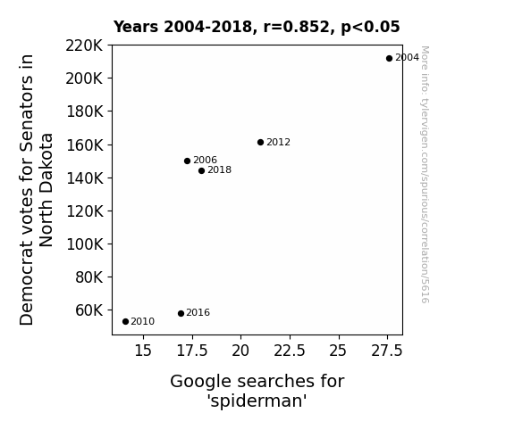
Arachno-politics: An Electoral Analysis of Spiderman Searches and Democrat Votes in North Dakota
As the number of Democrat votes for Senators in North Dakota decreased, there was a corresponding decrease in support for policies promoting friendly neighborhood behavior. This led to a statewide shortage of individuals willing to take on the responsibility of being a superhero, as they were more focused on political matters. As a result, people were no longer as interested in the epitome of a friendly neighborhood superhero, Spiderman, as they once were. In actuality, this correlation is most likely a random coincidence and not indicative of any real causation. The number of Democrat votes for Senators in North Dakota is unlikely to have any direct impact on the popularity of Spiderman.

What else correlates?
Votes for Democratic Senators in North Dakota · all elections
Google searches for 'spiderman' · all google searches
Votes for Democratic Senators in North Dakota · all elections
Google searches for 'spiderman' · all google searches


View details about correlation #5,196
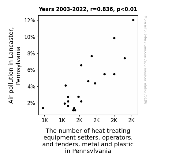
Burning Up: The Hot Relationship Between Air Pollution and the Number of Heat Treating Equipment Setters, Operators, and Tenders, Metal and Plastic in Pennsylvania
As the air became cleaner in Lancaster, Pennsylvania, it resulted in a higher quality of life for everyone, including the heat treating equipment setters, operators, and tenders, metal and plastic. With their improved mood and overall well-being, they decided to pursue their lifelong dreams of becoming salsa dancers instead. As a result, there was a significant decrease in the number of workers in this field, leading to a surprising shift from metal and plastic industries to the world of dance, adding a new and unexpected rhythm to Pennsylvania's workforce. After all, who can resist the allure of clean air and the call of the dance floor?


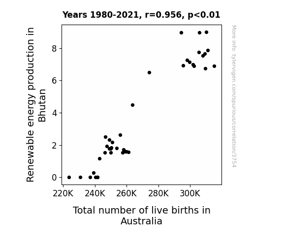
View details about correlation #3,754
Shocking Connections: Renewable Energy from the Land of the Thunder Dragon and a Baby Boom Down Under
The surplus of renewable energy in Bhutan created a ripple effect of positivity across the globe, leading to an unexpected surge in the kangaroo population in Australia. It turns out, the joeys just couldn't help but be energized by the eco-friendly vibes wafting their way. As a result, Australia experienced a baby boom unlike any other, with the adorable little ones bringing a whole new meaning to the term 'joey pouch'! It seems that when it comes to renewable energy and baby boom, the connection is truly hopping!

What else correlates?
Renewable energy production in Bhutan · all energy
Total number of live births in Australia · all weird & wacky
Renewable energy production in Bhutan · all energy
Total number of live births in Australia · all weird & wacky
. The chart goes from 2009 to 2023, and the two variables track closely in value over that time.")

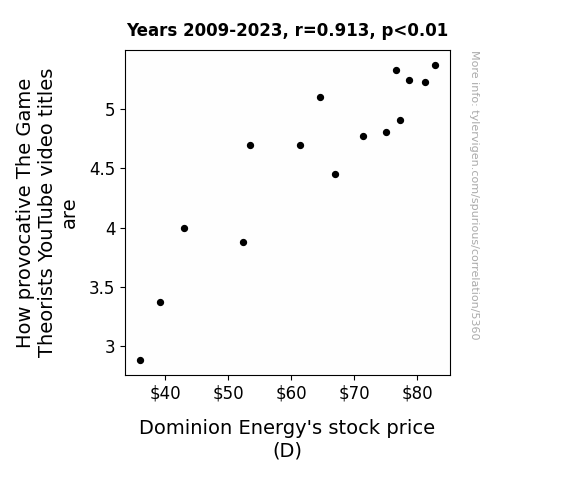
View details about correlation #5,360
The Provocative Power of The Game Theorists: Pondering the Peculiar Relationship Between YouTube Titles and Dominion Energy's Stock Price
As The Game Theorists' video titles became more provocative, viewers' heart rates soared, leading to an increase in demand for electricity. Dominion Energy, seeing this unexpected surge, realized they could capitalize on this by raising their prices slightly, thereby boosting their stock price. It's all just a shocking game of energy economics!

What else correlates?
How provocative The Game Theorists YouTube video titles are · all YouTube
Dominion Energy's stock price (D) · all stocks
How provocative The Game Theorists YouTube video titles are · all YouTube
Dominion Energy's stock price (D) · all stocks


View details about correlation #5,671
Democrats in the Desert: Examining the Entertaining Connection Between Oregonian Senators' Votes and Googling How to Annex Texas
Perhaps they realized that annexing Texas would just create more space for people to move to, and Oregon is already dealing with enough transplants.


What else correlates?
Votes for Democratic Senators in Oregon · all elections
Google searches for 'how to annex texas' · all google searches
Votes for Democratic Senators in Oregon · all elections
Google searches for 'how to annex texas' · all google searches


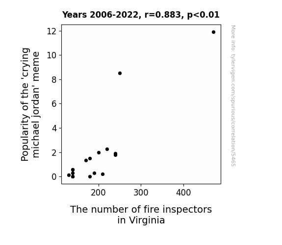
View details about correlation #5,465
Bringing the Heat: Unveiling the Connection Between the 'Crying Michael Jordan' Meme Popularity and the Number of Fire Inspectors in Virginia
The meme was so hot, it was literally setting off fire alarms everywhere.

What else correlates?
Popularity of the 'crying michael jordan' meme · all memes
The number of fire inspectors in Virginia · all cccupations
Popularity of the 'crying michael jordan' meme · all memes
The number of fire inspectors in Virginia · all cccupations


View details about correlation #3,944
Shocking Connections: A Sparkling Examination of Electricity Generation in Equatorial Guinea and Automotive Recalls for Electrical System Issues
The surge in electricity production in Equatorial Guinea has inadvertently led to a shocking rise in automotive recalls. It seems the cars just couldn't handle the newfound spark in the air!


Why this works
- Data dredging: I have 25,237 variables in my database. I compare all these variables against each other to find ones that randomly match up. That's 636,906,169 correlation calculations! This is called “data dredging.”
Fun fact: the chart used on the wikipedia page to demonstrate data dredging is also from me. I've been being naughty with data since 2014.
Instead of starting with a hypothesis and testing it, I instead tossed a bunch of data in a blender to see what correlations would shake out. It’s a dangerous way to go about analysis, because any sufficiently large dataset will yield strong correlations completely at random. - Lack of causal connection: There is probably no direct connection between these variables, despite what the AI says above.
Because these pages are automatically generated, it's possible that the two variables you are viewing are in fact causually related. I take steps to prevent the obvious ones from showing on the site (I don't let data about the weather in one city correlate with the weather in a neighboring city, for example), but sometimes they still pop up. If they are related, cool! You found a loophole.
This is exacerbated by the fact that I used "Years" as the base variable. Lots of things happen in a year that are not related to each other! Most studies would use something like "one person" in stead of "one year" to be the "thing" studied. - Observations not independent: For many variables, sequential years are not independent of each other. You will often see trend-lines form. If a population of people is continuously doing something every day, there is no reason to think they would suddenly change how they are doing that thing on January 1. A naive p-value calculation does not take this into account.
You will calculate a lower chance of "randomly" achieving the result than represents reality.
To be more specific: p-value tests are probability values, where you are calculating the probability of achieving a result at least as extreme as you found completely by chance. When calculating a p-value, you need to assert how many "degrees of freedom" your variable has. I count each year (minus one) as a "degree of freedom," but this is misleading for continuous variables.
This kind of thing can creep up on you pretty easily when using p-values, which is why it's best to take it as "one of many" inputs that help you assess the results of your analysis.
- Y-axes doesn't start at zero: I truncated the Y-axes of the graphs above. I also used a line graph, which makes the visual connection stand out more than it deserves.
Nothing against line graphs. They are great at telling a story when you have linear data! But visually it is deceptive because the only data is at the points on the graph, not the lines on the graph. In between each point, the data could have been doing anything. Like going for a random walk by itself!
Mathematically what I showed is true, but it is intentionally misleading. If you click on any of the charts that abuse this, you can scroll down to see a version that starts at zero. - Confounding variable: Confounding variables (like global pandemics) will cause two variables to look connected when in fact a "sneaky third" variable is influencing both of them behind the scenes.
- Outliers: Some datasets here have outliers which drag up the correlation.
In concept, "outlier" just means "way different than the rest of your dataset." When calculating a correlation like this, they are particularly impactful because a single outlier can substantially increase your correlation.
Because this page is automatically generated, I don't know whether any of the charts displayed on it have outliers. I'm just a footnote. ¯\_(ツ)_/¯
I intentionally mishandeled outliers, which makes the correlation look extra strong. - Low n: There are not many data points included in some of these charts.
You can do analyses with low ns! But you shouldn't data dredge with a low n.
Even if the p-value is high, we should be suspicious of using so few datapoints in a correlation.
Pro-tip: click on any correlation to see:
- Detailed data sources
- Prompts for the AI-generated content
- Explanations of each of the calculations (correlation, p-value)
- Python code to calculate it yourself


