spurious correlations
discover · random · spurious scholar
← previous page · next page →


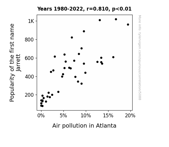
View details about correlation #5,088
Breath of Fresh Jarrett: Exploring the Correlation Between Name Popularity and Air Quality in Atlanta
Fewer people were Jarring the air with their presence. This led to a cleaner and fresher environment, as there was a significant reduction in hot air being expelled. Additionally, with less smog in the air, it seems the name 'Jarrett' was no longer top of the smog charts, leading to a breath of fresh air for Atlanta.

What else correlates?
Popularity of the first name Jarrett · all first names
Air pollution in Atlanta · all weather
Popularity of the first name Jarrett · all first names
Air pollution in Atlanta · all weather


View details about correlation #5,307
I Do, CGP Grey’s Video Titles Tell Who
As the entertainment value of CGP Grey's videos increased, so did the marital satisfaction in South Dakota. Couples found common ground in discussing the fascinating topics, leading to a decrease in divorce rates. Perhaps all they needed was a little "Brain Divorce" from their everyday problems.


What else correlates?
How good CGP Grey YouTube video titles are · all YouTube
The divorce rate in South Dakota · all random state specific
How good CGP Grey YouTube video titles are · all YouTube
The divorce rate in South Dakota · all random state specific


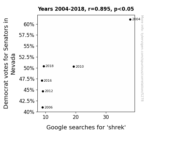
View details about correlation #5,278
The Shrek Search: Senatorial Selections and Swampy Screen Skims in Silver State Sunshine
The Democrats must have ogre-looked the importance of appealing to their base in Nevada, leading to a swamp of lost votes. This decline in support clearly trickled down to shrek, as the saying goes, 'all's fair in love and shrek-tions.' It seems like the Nevada Democrats need to come ogre to a better campaign strategy, or they'll be facing more than just a fairy tale ending in the next election! Who would have thought that the fate of a beloved green ogre was intricately intertwined with political votes in the Silver State?
What else correlates?
Votes for Democratic Senators in Nevada · all elections
Google searches for 'shrek' · all google searches
Votes for Democratic Senators in Nevada · all elections
Google searches for 'shrek' · all google searches


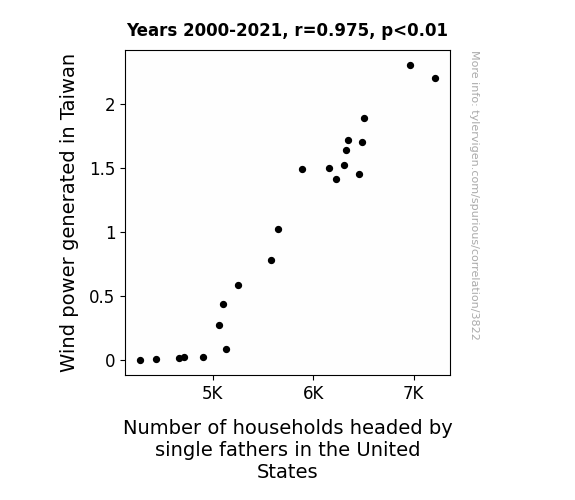
View details about correlation #3,822
Blowin' in the Wind: An Unconventional Connection Between Wind Power in Taiwan and Single Fathers in the United States
The gusty winds from Taiwan somehow carried a newfound sense of independence and confidence, inspiring dads across the Pacific to embrace single parenthood. As the turbines spun, they seemingly whispered, "You got this, dad!" leading to a surprising surge in households headed by single fathers in the US. It's a tale of unexpected transpacific empowerment, where even the air currents can't help but fuel the rise of single super-dads!


View details about correlation #5,749
Nautica: Sailing through Smog - A Novel Correlation Between Name Popularity and Air Quality in Johnstown, Pennsylvania
As the name Nautica gained popularity, more parents were drawn to nautical-themed baby products. This led to a surge in demand for toy boats and miniature submarines, which were predominantly made of plastic. The production of these items in factories resulted in higher emissions of pollutants, ultimately contributing to an increase in air pollution in Johnstown, Pennsylvania.

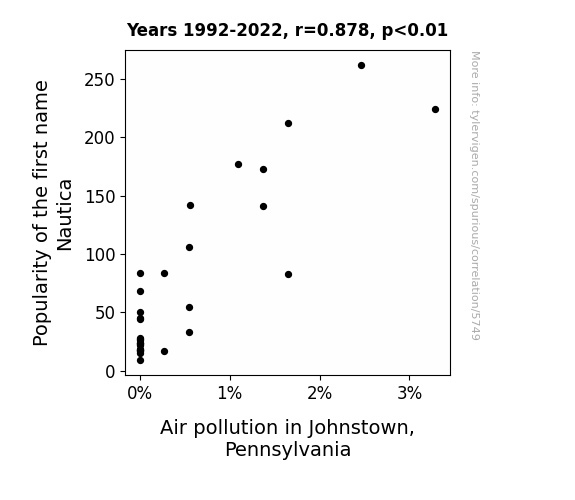
What else correlates?
Popularity of the first name Nautica · all first names
Air pollution in Johnstown, Pennsylvania · all weather
Popularity of the first name Nautica · all first names
Air pollution in Johnstown, Pennsylvania · all weather


View details about correlation #5,705
The Tenuous Ties between Titillating minutephysics Titles and Tailoring Trends in South Carolina: A Tongue-in-Cheek Trials
As more fashion designers in South Carolina start incorporating principles of quantum physics into their clothing designs, they inadvertently inspire the creation of more intellectually stimulating minutephysics video titles. It's a stylish and scientific domino effect!


View details about correlation #5,043
The X-Files: Are Republican Votes in Nevada Linked to Nevada UFO Sightings? An Extraterrestrial Electoral Exploration
The surge in Republican votes created a 'right'ward shift in the state, leading to more conservative policies. This in turn prompted the aliens to think, "Nevada is now more our 'kind' of place," and they started making more frequent 'right' turns in the sky, causing a significant rise in UFO sightings. It seems like the political atmosphere wasn't the only thing getting 'charged' up in Nevada!
What else correlates?
Votes for Republican Senators in Nevada · all elections
UFO sightings in Nevada · all random state specific
Votes for Republican Senators in Nevada · all elections
UFO sightings in Nevada · all random state specific


View details about correlation #3,874
Fueling the Fire: The Gas Connection Between Fossil Fuel Use in Bahrain and Automotive Recalls
The fumes were creating a supercharged effect, revving up the likelihood of automotive malfunctions. Can you be-leaf it? It's enough to make any car owner oil with frustration!

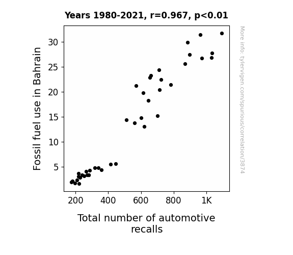
What else correlates?
Fossil fuel use in Bahrain · all energy
Total number of automotive recalls · all weird & wacky
Fossil fuel use in Bahrain · all energy
Total number of automotive recalls · all weird & wacky


View details about correlation #5,647
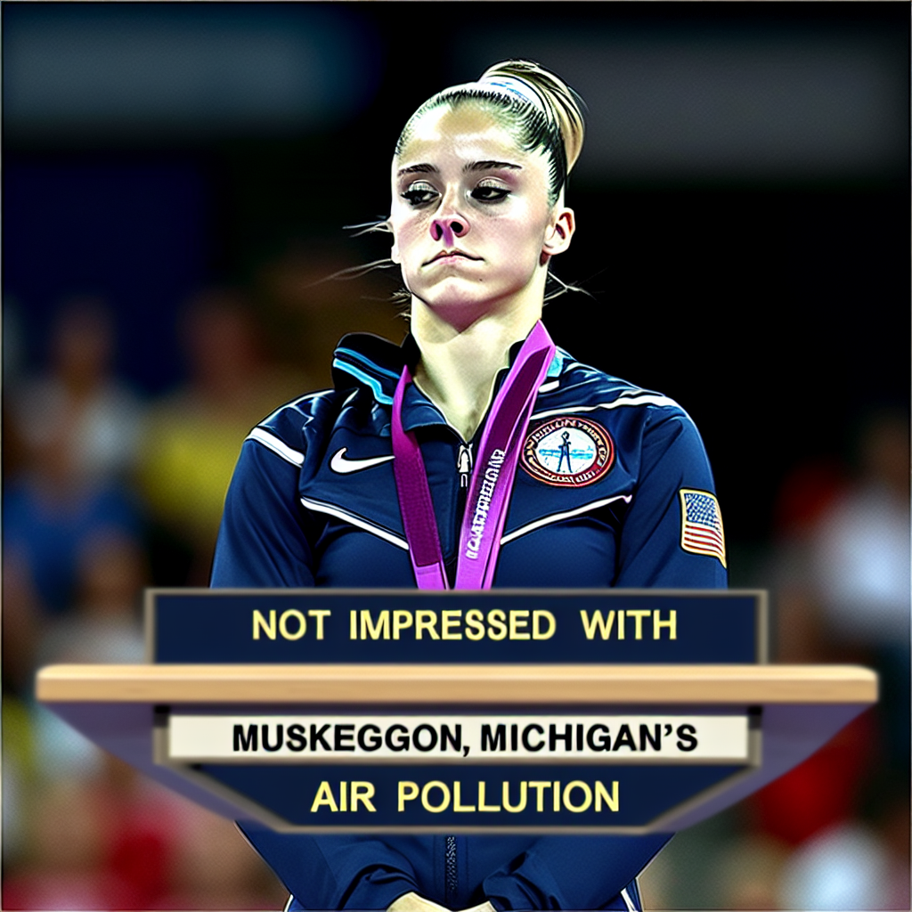
The Smoggy Side of Social Media: Air Pollution in Muskegon, Michigan and the Phenomenon of the 'McKayla Maroney' Meme
The extra particulate matter in the air created the perfect conditions for the meme to go viral, acting as microscopic carriers of McKayla's unimpressed expression, spreading her image and the accompanying jokes like a contagious internet flu.
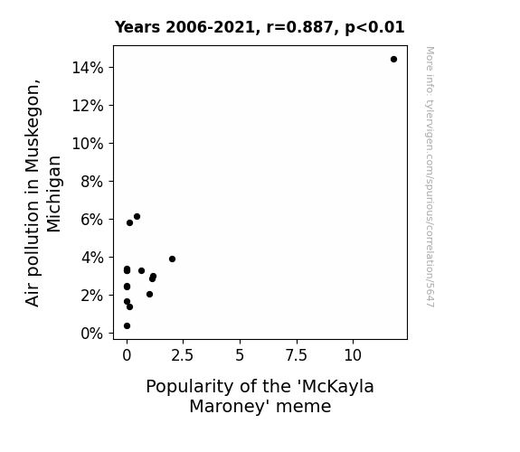
What else correlates?
Air pollution in Muskegon, Michigan · all weather
Popularity of the 'McKayla Maroney' meme · all memes
Air pollution in Muskegon, Michigan · all weather
Popularity of the 'McKayla Maroney' meme · all memes


View details about correlation #5,437
Vihart and Biology: A Correlation Analysis of Cool YouTube Video Titles and Biological Technician Employment in South Dakota
As the number of biological technicians in South Dakota decreases, there are fewer people to conduct research on coolness in nature, leading to a lack of inspiration for Vihart's video titles. Remember, when it comes to YouTube videos and biology, there's a direct correlation between techs and text!


View details about correlation #5,456
Spreading Liberty: The Butter Effect on Libertarian Votes in Wisconsin Senate Races
As butter consumption increased, it led to a greasing of the political wheels in Wisconsin, effectively churning out more support for Libertarian senators. It all boils down to a slippery slope of dairy deliciousness and a desire for maximum individual freedom, because when it comes to politics, it's all about spreading the right kind of ideas.


What else correlates?
Butter consumption · all food
Votes for Libertarian Senators in Wisconsin · all elections
Butter consumption · all food
Votes for Libertarian Senators in Wisconsin · all elections


View details about correlation #3,820
Powering Through: The Sizzling Link Between Hydopower Generation in Estonia and the Consumption of Nathan's Hot Dog Eating Competition Champions
As the turbines spun and the hydroelectric power flowed, it sent a surge of energy through the land. This not only powered up homes and businesses, but also inadvertently revved up the local hot dog vendors. The irresistible aroma of sizzling sausages wafted through the air, luring in snack-happy onlookers. And as the people indulged in these extra tasty treats, little did they know that they were unknowingly fueling the competitive eating spirit of the next Nathan's Hot Dog Eating Champion. It seems that in the ultimate twist of fate, Estonia's quest for renewable energy ended up sparking a chain reaction of frankfurter festivities, ultimately shaping the glorious destiny of a hot dog hero.


View details about correlation #5,219
Gasping for Air: Unearthing the Correlation Between Air Pollution in Cleveland and 'Gangnam Style' Google Searches
As air pollution in Cleveland decreased, people's respiratory systems became more efficient, leading to an uptake in oxygen levels. This increase in oxygen prompted a shift in brain activity, specifically in the regions responsible for music and dance. The brain's newfound clarity and functionality redirected societal interest towards more sophisticated and varied forms of entertainment, causing a decline in the popularity of the iconic 'Gangnam Style' dance. It seems that cleaner air may have not only cleared their lungs, but also their dance floors.

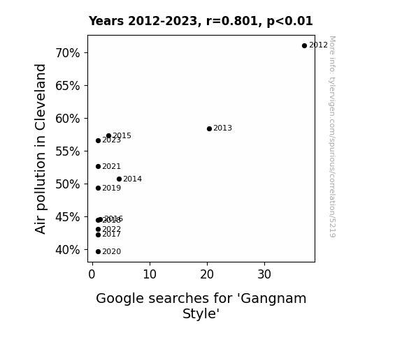
What else correlates?
Air pollution in Cleveland · all weather
Google searches for 'Gangnam Style' · all google searches
Air pollution in Cleveland · all weather
Google searches for 'Gangnam Style' · all google searches


View details about correlation #5,321
Mastering the Public Eye: Analyzing the Link Between Public Administration Master's Degrees and YouTube Likes on SmarterEveryDay
As the number of individuals wielding advanced knowledge in bureaucratic jargon and red tape management swells, so does the appreciation for the intricacies of each click and thumbs-up on the internet, leading to a quantum shift in the collective cognitive likability matrix. In simpler terms, mastering the art of public administration somehow makes us all enjoy educational YouTube content just a little bit more. It's like these graduates are administrating a like-boosting campaign, but for our brains!


View details about correlation #5,534
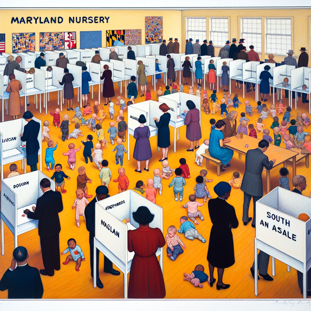
Libertarianism and the Name Game: Analyzing the Impact of 'Killian' on Maryland Presidential Votes
There has been a secret society of Libertarian parents who have been strategically naming their children Killian in order to ensure future support for the party. It seems to be working, as the number of little Kilians running around has a surprisingly strong influence on the political landscape. Who knew that a popular baby name could have such an impact on election results? It's like a mini-revolution happening right in the nursery!


View details about correlation #3,862
Burning Up the Roads: The Fuel-ious Relationship Between Fossil Fuel Use in Burundi and Automotive Recalls by Mercedes-Benz USA
The rise in Fossil fuel use in Burundi led to an unexpected surge in demand for Mercedes-Benz cars worldwide. This in turn put immense pressure on the production line, causing a higher likelihood of manufacturing errors and prompting Automotive recalls by Mercedes-Benz USA to rev up! It seems like the situation went from 0 to 60 in no time, leaving everyone in the industry in a state of exhaus-piston.


What else correlates?
Fossil fuel use in Burundi · all energy
Automotive recalls issued by Mercedes-Benz USA · all weird & wacky
Fossil fuel use in Burundi · all energy
Automotive recalls issued by Mercedes-Benz USA · all weird & wacky


View details about correlation #5,798
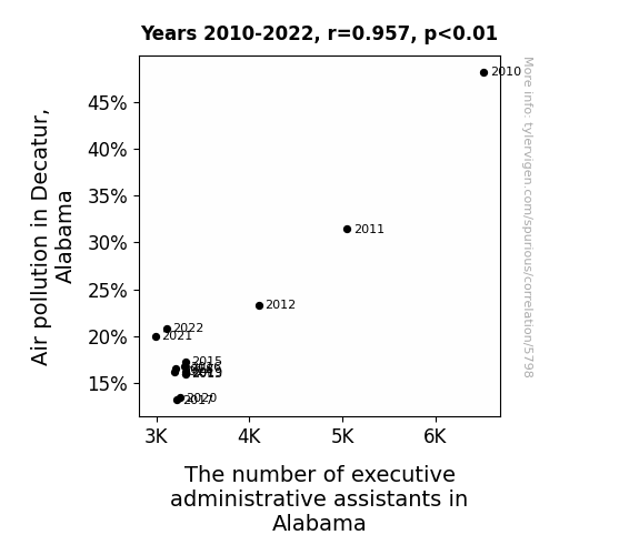
The Puzzling Pairing of Pollution and PAs: A Quirky Quest in Decatur, Alabama
As the air cleared in Decatur, the executive administrative assistants realized they could finally breathe easy too, leading many to pursue their dreams outside of the office. It seems the smog was clouding their career judgment, but now they've all taken a breath of fresh air and decided to switch gears. Now they're off to find roles that don't keep them constantly filing complaints about their work environment.


View details about correlation #5,809
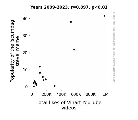
Viral Visions: Exploring the Interplay of Internet Memes and YouTube Success
The 'scumbag steve' meme put people in a lighthearted mood, making them more open to the quirky charm of Vihart's math and science videos. This led to an unexpected union of internet culture and educational content, proving that even memes can't resist the gravitational pull of Vihart's likeability. Remember, in the world of memes and math, anything is possible!

What else correlates?
Popularity of the 'scumbag steve' meme · all memes
Total likes of Vihart's YouTube videos · all YouTube
Popularity of the 'scumbag steve' meme · all memes
Total likes of Vihart's YouTube videos · all YouTube


View details about correlation #5,335
A Tatum for Republican Success: An Analysis of the Connection Between Name Popularity and Political Leanings in Minnesota
More people were naming their children after Channing Tatum, who is known for his role in action movies. As a result, there was a subconscious association between the name Tatum and toughness, leading more voters to support the Republican candidate, who they perceived as the stronger choice. So, essentially, it was a Tatum Toughness Trickle-down effect!


View details about correlation #1,044
As more gasoline was pumped in Costa Rica, it led to a spike in beet production. The abundant beets caused a boom in the local beet sugar industry. This in turn led to an excess of sugar, prompting a group of penguins in Antarctica to start a new airline called "Snow Air." The penguins, known for their impeccable flying skills, offered affordable flights to humans, creating a snowball effect in the demand for flights to Antarctica. It seems the connection between Costa Rica's gasoline and Antarctica's flights is quite a beet-autiful and sugary one!

What else correlates?
Gasoline pumped in Costa Rica · all energy
Google searches for 'flights to Antarctica' · all google searches
Gasoline pumped in Costa Rica · all energy
Google searches for 'flights to Antarctica' · all google searches
Why this works
- Data dredging: I have 25,237 variables in my database. I compare all these variables against each other to find ones that randomly match up. That's 636,906,169 correlation calculations! This is called “data dredging.”
Fun fact: the chart used on the wikipedia page to demonstrate data dredging is also from me. I've been being naughty with data since 2014.
Instead of starting with a hypothesis and testing it, I instead tossed a bunch of data in a blender to see what correlations would shake out. It’s a dangerous way to go about analysis, because any sufficiently large dataset will yield strong correlations completely at random. - Lack of causal connection: There is probably no direct connection between these variables, despite what the AI says above.
Because these pages are automatically generated, it's possible that the two variables you are viewing are in fact causually related. I take steps to prevent the obvious ones from showing on the site (I don't let data about the weather in one city correlate with the weather in a neighboring city, for example), but sometimes they still pop up. If they are related, cool! You found a loophole.
This is exacerbated by the fact that I used "Years" as the base variable. Lots of things happen in a year that are not related to each other! Most studies would use something like "one person" in stead of "one year" to be the "thing" studied. - Observations not independent: For many variables, sequential years are not independent of each other. You will often see trend-lines form. If a population of people is continuously doing something every day, there is no reason to think they would suddenly change how they are doing that thing on January 1. A naive p-value calculation does not take this into account.
You will calculate a lower chance of "randomly" achieving the result than represents reality.
To be more specific: p-value tests are probability values, where you are calculating the probability of achieving a result at least as extreme as you found completely by chance. When calculating a p-value, you need to assert how many "degrees of freedom" your variable has. I count each year (minus one) as a "degree of freedom," but this is misleading for continuous variables.
This kind of thing can creep up on you pretty easily when using p-values, which is why it's best to take it as "one of many" inputs that help you assess the results of your analysis.
- Y-axes doesn't start at zero: I truncated the Y-axes of the graphs above. I also used a line graph, which makes the visual connection stand out more than it deserves.
Nothing against line graphs. They are great at telling a story when you have linear data! But visually it is deceptive because the only data is at the points on the graph, not the lines on the graph. In between each point, the data could have been doing anything. Like going for a random walk by itself!
Mathematically what I showed is true, but it is intentionally misleading. If you click on any of the charts that abuse this, you can scroll down to see a version that starts at zero. - Confounding variable: Confounding variables (like global pandemics) will cause two variables to look connected when in fact a "sneaky third" variable is influencing both of them behind the scenes.
- Outliers: Some datasets here have outliers which drag up the correlation.
In concept, "outlier" just means "way different than the rest of your dataset." When calculating a correlation like this, they are particularly impactful because a single outlier can substantially increase your correlation.
Because this page is automatically generated, I don't know whether any of the charts displayed on it have outliers. I'm just a footnote. ¯\_(ツ)_/¯
I intentionally mishandeled outliers, which makes the correlation look extra strong. - Low n: There are not many data points included in some of these charts.
You can do analyses with low ns! But you shouldn't data dredge with a low n.
Even if the p-value is high, we should be suspicious of using so few datapoints in a correlation.
Pro-tip: click on any correlation to see:
- Detailed data sources
- Prompts for the AI-generated content
- Explanations of each of the calculations (correlation, p-value)
- Python code to calculate it yourself


