spurious correlations
discover · random · spurious scholar
← previous page · next page →


View details about correlation #4,021
Lost in Translation: Exploring the Interpreting Link Between Puerto Rico and US Bank Failures
As the number of interpreters and translators in Puerto Rico increased, so did the translation errors in financial documents sent to US banks. This led to confusion and ultimately, a higher rate of bank failures as the incorrect translations wreaked havoc on the accuracy of financial transactions. It seems that in this case, a language barrier proved to be a financial barrier as well!
What else correlates?
The number of interpreters and translators in Puerto Rico · all cccupations
US bank failures · all weird & wacky
The number of interpreters and translators in Puerto Rico · all cccupations
US bank failures · all weird & wacky


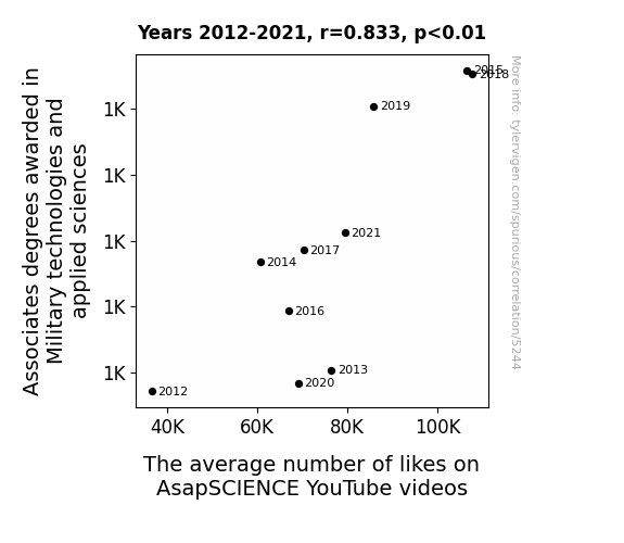
View details about correlation #5,244
Associates in Arms: Exploring the Military-YouTube Like Connection
As the knowledge of military technologies and applied sciences grew, so did the viewers' comprehension of complex scientific concepts. This led to a greater appreciation for the content, resulting in more likes on AsapSCIENCE videos. Remember, understanding the physics of a well-executed high five or the biology of what makes something cute is crucial for modern warfare!


View details about correlation #5,371
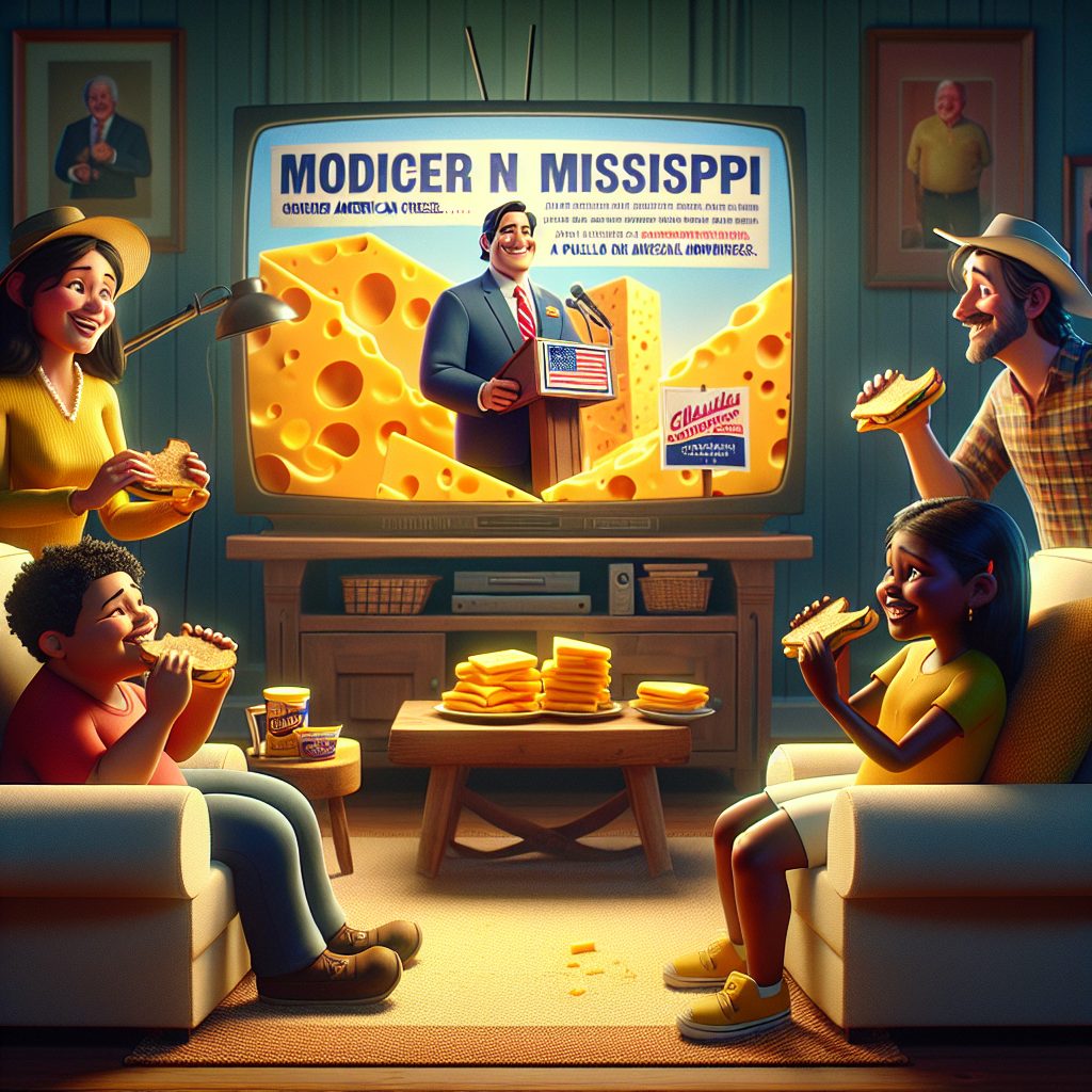
Gouda Democrats: The Cheddar Connection between American Cheese Consumption and Democrat Votes for Senators in Mississippi
As American cheese consumption increased, so did the level of cheesiness in political ads. This inadvertently led to an upswell of support for Democrat Senators in Mississippi as the ads resonated with voters on a subconscious, dairy-induced level. Remember, when it comes to politics, it's all about the havarti of the people.

What else correlates?
American cheese consumption · all food
Votes for Democratic Senators in Mississippi · all elections
American cheese consumption · all food
Votes for Democratic Senators in Mississippi · all elections


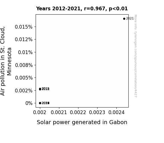
View details about correlation #4,427
Palpable Pollution Puts the Power in the Planet: An Analysis of Air Pollution in St. Cloud, Minnesota and Solar Energy in Sunny Gabon
The smog in St. Cloud had a silver lining for Gabon's solar panels, as it created a hilarious chain reaction of events. It seems the carbon footprint from St. Cloud wafted all the way to Gabon, giving the solar power a much-needed boost. Who knew that St. Cloud's pollution would be the ‘air’-odynamic push that Gabon’s solar industry needed to shine brighter than ever? It's a real gas how these two seemingly unrelated things ended up being 'pollu-catalysts' for each other! With all this pollution-to-power transmission, it's like Gabon got an unintentional 'watt' of support from halfway across the world.

What else correlates?
Air pollution in St. Cloud, Minnesota · all weather
Solar power generated in Gabon · all energy
Air pollution in St. Cloud, Minnesota · all weather
Solar power generated in Gabon · all energy


View details about correlation #5,144
Leeroy Jenkins Effect: Exploring the Relationship Between Internet Memes and the Travel Industry in Delaware
The decrease in popularity of the 'leeroy jenkins' meme led to a decrease in internet traffic. With fewer people online, there was a reduced demand for travel planning services. As a result, the number of travel agents in Delaware decreased as they found themselves with more free time to explore new career paths. This, in turn, has had a significant impact on the state's economy and job market, all thanks to the unexpected ripple effect of a fading internet meme.

What else correlates?
Popularity of the 'leeroy jenkins' meme · all memes
The number of travel agents in Delaware · all cccupations
Popularity of the 'leeroy jenkins' meme · all memes
The number of travel agents in Delaware · all cccupations


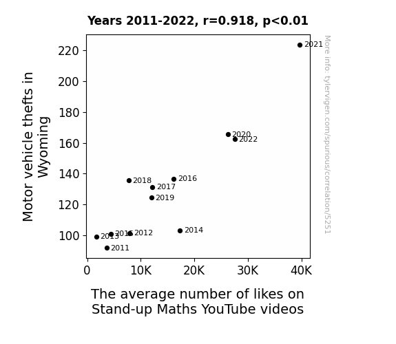
View details about correlation #5,251
Driven to Like: The Car-tographic Connection Between Motor Vehicle Thefts in Wyoming and the Stand-up Maths YouTube Likes
As more cars were stolen, it led to a shortage of getaway vehicles for comedic bank heists, prompting a rise in online comedy consumption from the mathematically inclined criminal community. With their favorite form of entertainment being stand-up math, they showed their appreciation by liking the videos, albeit their calculations were a bit off when it came to the crime itself!


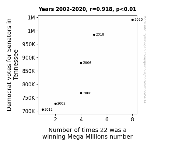
View details about correlation #5,614
Pulling the Lever or Pulling the Winning Numbers: Investigating the Correlation between Democrat Votes for Senators in Tennessee and the Occurrence of the Number 22 in Mega Millions Drawings
As the blue wave surged in Tennessee, it seems they also made a splash in the Mega Millions numbers game! Perhaps the Democrats brought some '22' lucky energy with them to the voting booths, or maybe they're just really good at counting on change!


View details about correlation #4,311
A Breath of Fresh Air: The Relationship Between Air Quality in Staunton and Petroleum Consumption in Cameroon
As the air quality in Staunton improved, it led to a rise in atmospheric pressure. This increase in pressure created a domino effect, ultimately causing a higher demand for petroleum in Cameroon. You could say it's quite an 'unconventional' correlation, as the people of Cameroon just couldn't resist the 'fuel'ing of good vibes from Staunton's cleaner air!


What else correlates?
Air quality in Staunton, Virginia · all weather
Petroluem consumption in Cameroon · all energy
Air quality in Staunton, Virginia · all weather
Petroluem consumption in Cameroon · all energy


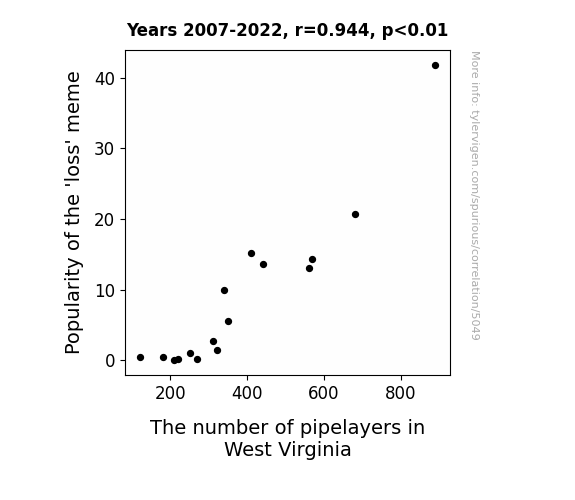
View details about correlation #5,049
The Loss of Pipelayers: Unraveling the Correlation Between the Popularity of the 'Loss' Meme and Pipelayers in West Virginia
As the 'loss' meme gained popularity, it led to an unprecedented demand for people to lay pipe in the virtual world. This sparked a pipeline laying frenzy in West Virginia, as individuals flocked to turn their meme expertise into real-life pipelaying skills. It seems that mastering the art of 'loss' also meant mastering the art of laying pipe, creating a correlation that no one could have anticipated. Remember, with great meme power comes great pipelaying responsibility!

What else correlates?
Popularity of the 'loss' meme · all memes
The number of pipelayers in West Virginia · all cccupations
Popularity of the 'loss' meme · all memes
The number of pipelayers in West Virginia · all cccupations


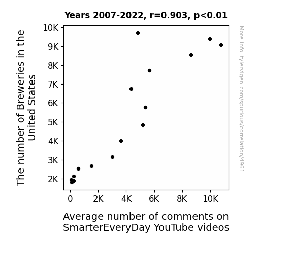
View details about correlation #4,961
Crafty Connections: Breweries and Brewtubes
As the number of Breweries in the United States rises, more people are hoppin' on the craft beer bandwagon. With their newfound appreciation for ales and lagers, they ferment a strong sense of community. This spills over into online interactions, causing a spike in the average number of comments on SmarterEveryDay YouTube videos. United by their love for brews and brainy content, viewers are ale-ways eager to lager their thoughts in the comment section. It's a sudsy social phenomenon that's all about raising a pint... I mean, point!


View details about correlation #4,706
Driving the Point Home: The Air Bag Issue and the Libertarian Vote in California
The increased support for the Libertarian candidate led to more widespread implementation of the "live free or die" mindset, prompting Californians to demand greater autonomy, even from their vehicles. As a result, cars started feeling the pressure to assert their individuality, leading to a surge in airbag malfunctions. It seems the political campaign really inflated the recall numbers, as the cars couldn't contain their newfound sense of liberty!


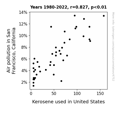
View details about correlation #4,752
Up in the Air: A Fumes-y Connection Between Air Pollution in San Francisco and Kerosene Consumption in the United States
The fresh sea breeze in San Francisco was actually made up of tiny, microscopic environmental activists who were on a mission to clean up the air. As they dispersed throughout the city, they also organized peaceful protests in the form of air particles holding tiny signs that said "Cleaner Skies Now!" This sparked a chain reaction of positivity, leading to a nationwide movement where even the kerosene couldn't help but join in on reducing its own usage. It turns out, when it comes to cleaning up the environment, every little molecule matters!

What else correlates?
Air pollution in San Francisco, California · all weather
Kerosene used in United States · all energy
Air pollution in San Francisco, California · all weather
Kerosene used in United States · all energy


View details about correlation #5,722
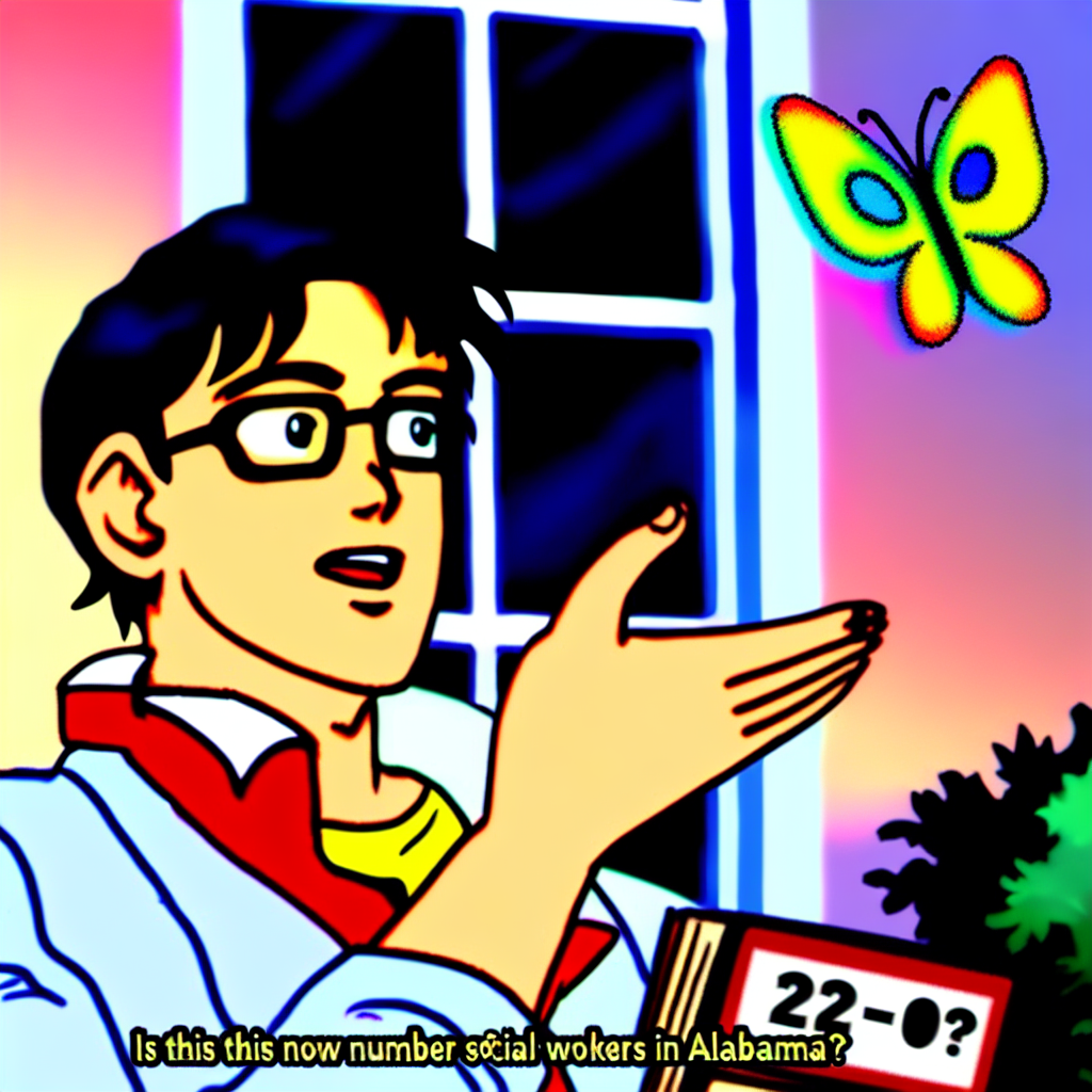
Never Gonna Give You Up, Never Gonna Let You Down: An Unlikely Link Between the 'Rickroll' Meme and the Number of Social Workers in West Virginia
As the 'rickroll' meme gained popularity, more and more people fell victim to its catchy tunes and never gonna give you up attitude. This led to a surge in spontaneous dance parties across West Virginia, prompting the need for additional social workers to support the unexpected but delightful influx of rickrolling-related shenanigans. After all, you can't just give someone up or let them down without proper social and emotional support!
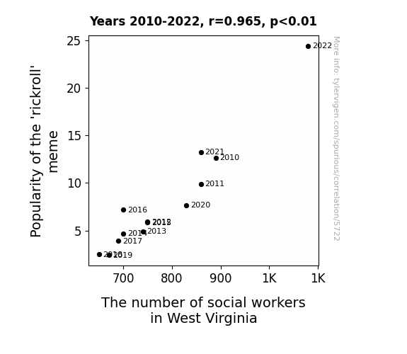
What else correlates?
Popularity of the 'rickroll' meme · all memes
The number of social workers in West Virginia · all cccupations
Popularity of the 'rickroll' meme · all memes
The number of social workers in West Virginia · all cccupations


View details about correlation #5,381
Unleashing the Power of Unicorns: A Mythical Link Between Google Searches and YouTube Comments
As more people searched for unicorns, they inadvertently stumbled upon theories about mythical creatures on The Game Theorists channel, sparking intense debates and leading to a surge in comments. Because when unicorns are involved, everyone has a theory to spout!

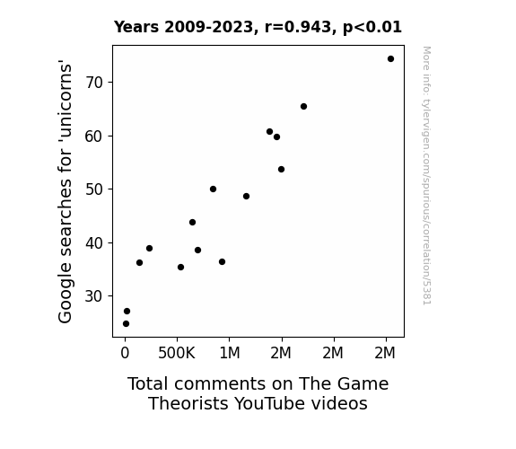
What else correlates?
Google searches for 'unicorns' · all google searches
Total comments on The Game Theorists YouTube videos · all YouTube
Google searches for 'unicorns' · all google searches
Total comments on The Game Theorists YouTube videos · all YouTube


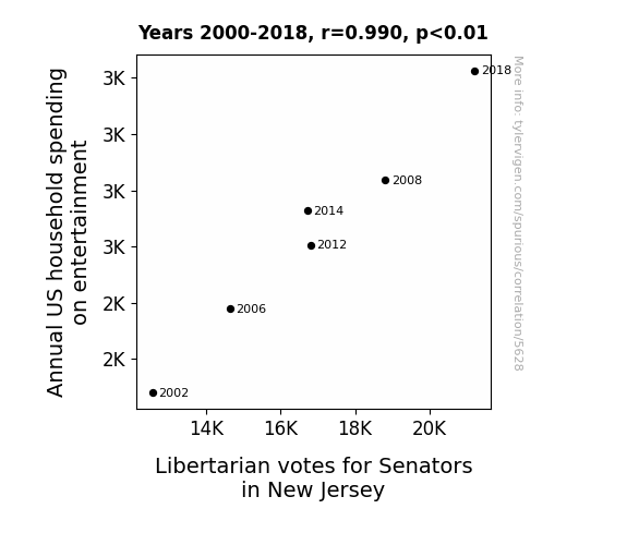
View details about correlation #5,628
Show Me the Money Votes: The Entertaining Relationship Between Household Spending on Entertainment and Libertarian Ballots in New Jersey
As household spending on entertainment increased, more families opted for backyard wrestling matches as a thrifty form of amusement. This led to a grassroots surge in support for political candidates who promised to deregulate the wrestling industry, inadvertently bolstering the Libertarian votes for Senators in New Jersey. After all, nothing says "freedom" like organizing your own ladder matches and folding chair smackdowns without government intervention!


View details about correlation #4,913
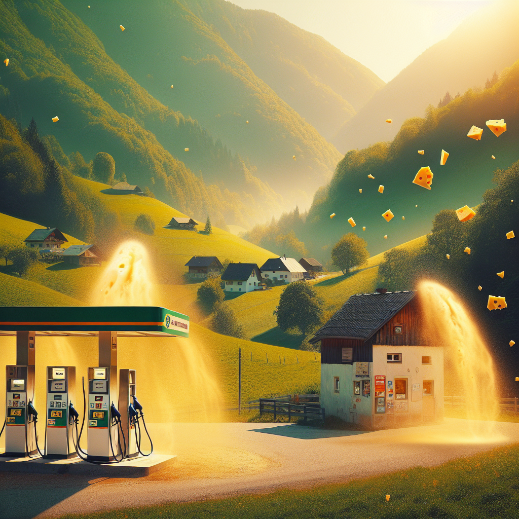
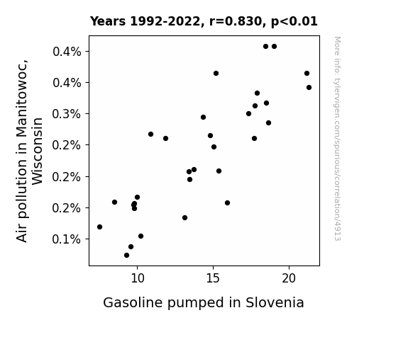
The Diesel Dilemma: Unleaded Laughter in Manitowoc and Slovenian Fuel Shenanigans
As air pollution in Manitowoc, Wisconsin increases, it creates a subtle atmospheric shift. This shift, influenced by the unique cheese particles in the air, interacts with the molecular structure of gasoline. The end result is a surprising boost in the efficiency of Slovenian gas pumps, leading to an increase in gasoline pumped. It's like the cheese-laden air pollution of Wisconsin has a gouda-nfluence on the gas pumping habits of Slovenia. Who would have thought that the road to more gasoline in Slovenia could be paved with cheddar-scented air from halfway across the world in Manitowoc? It's a truly grate connection that seems to brie keeping the gas flowing in the land of castles and caves.
What else correlates?
Air pollution in Manitowoc, Wisconsin · all weather
Gasoline pumped in Slovenia · all energy
Air pollution in Manitowoc, Wisconsin · all weather
Gasoline pumped in Slovenia · all energy


View details about correlation #5,397
Meme Madness: The Marvelous Matching of 'is this a pigeon' with Mobile Mavens in Alabama
As the 'is this a pigeon' meme gained traction, more and more people began questioning the world around them. This led to an increase in deep philosophical discussions about identity and purpose. Somehow, this sparked a wave of empathy, causing individuals in Alabama to pursue careers in social work at a higher rate. It's as if the meme awakened a newfound passion for understanding and helping others, creating a bizarre but heartwarming connection between internet humor and the social work sector in Alabama.

What else correlates?
Popularity of the 'is this a pigeon' meme · all memes
The number of social workers in Alabama · all cccupations
Popularity of the 'is this a pigeon' meme · all memes
The number of social workers in Alabama · all cccupations


View details about correlation #5,773
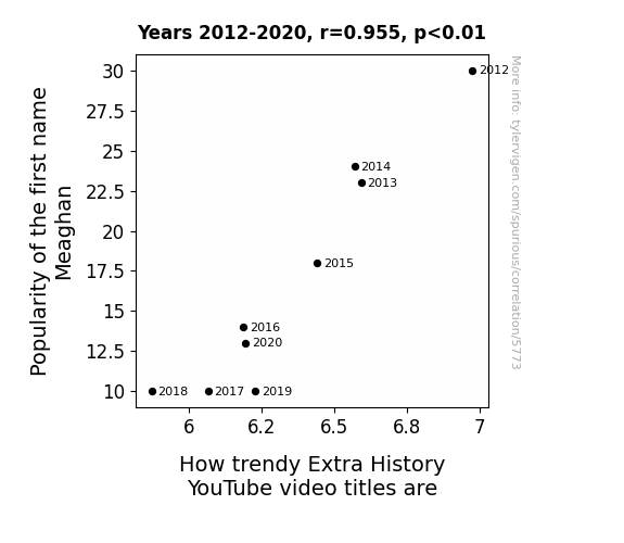
Meaghan-Popularity Reign and Extra History Video Title Trend Terrain
As fewer parents named their daughters Meaghan, the secret Meaghan Council had less influence over historical events, leading to a shortage of dramatic and trendy story material for Extra History video titles.

What else correlates?
Popularity of the first name Meaghan · all first names
How trendy Extra History YouTube video titles are · all YouTube
Popularity of the first name Meaghan · all first names
How trendy Extra History YouTube video titles are · all YouTube


View details about correlation #5,110
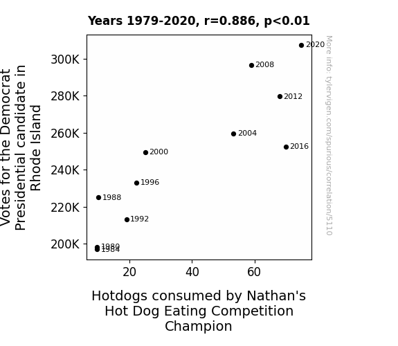
From Ballots to Buns: The Link Between Votes for the Democratic Presidential Candidate in Rhode Island and Hotdogs Devoured by Nathan's Hot Dog Eating Competition Champion
As the political heat rose, so did the demand for hot dogs! It seems the democratic process had a wurst-case scenario effect on competitive eating. Whether it's the candidates' relish for change or the voters' appetite for progress, one thing's for sure: in the race for deliciousness, there's no room for indecision. So, let's ketchup on the campaign trail and mustard the courage to elect a new flavor of leadership! Remember, when it comes to politics and hot dogs, it's all about the buns and the ballots!


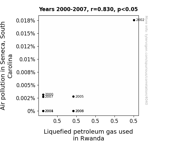
View details about correlation #4,040
Gas and Air Connections: Analyzing the Relationship Between Liquefied Petroleum in Rwanda and Air Pollution in Seneca, South Carolina
It's a classic case of pollution leading to a gas solution! As air pollution levels rose in Seneca, South Carolina, it created a demand for cleaner-burning fuel options, which in turn led to a surge in the production and export of Liquefied Petroleum Gas to Rwanda. This unexpected connection proves that when it comes to the global gas trade, the market can truly be a breath of fresh air! Plus, it goes to show that even environmental issues can have a *propane* lining!

What else correlates?
Air pollution in Seneca, South Carolina · all weather
Liquefied petroleum gas used in Rwanda · all energy
Air pollution in Seneca, South Carolina · all weather
Liquefied petroleum gas used in Rwanda · all energy
Why this works
- Data dredging: I have 25,237 variables in my database. I compare all these variables against each other to find ones that randomly match up. That's 636,906,169 correlation calculations! This is called “data dredging.”
Fun fact: the chart used on the wikipedia page to demonstrate data dredging is also from me. I've been being naughty with data since 2014.
Instead of starting with a hypothesis and testing it, I instead tossed a bunch of data in a blender to see what correlations would shake out. It’s a dangerous way to go about analysis, because any sufficiently large dataset will yield strong correlations completely at random. - Lack of causal connection: There is probably no direct connection between these variables, despite what the AI says above.
Because these pages are automatically generated, it's possible that the two variables you are viewing are in fact causually related. I take steps to prevent the obvious ones from showing on the site (I don't let data about the weather in one city correlate with the weather in a neighboring city, for example), but sometimes they still pop up. If they are related, cool! You found a loophole.
This is exacerbated by the fact that I used "Years" as the base variable. Lots of things happen in a year that are not related to each other! Most studies would use something like "one person" in stead of "one year" to be the "thing" studied. - Observations not independent: For many variables, sequential years are not independent of each other. You will often see trend-lines form. If a population of people is continuously doing something every day, there is no reason to think they would suddenly change how they are doing that thing on January 1. A naive p-value calculation does not take this into account.
You will calculate a lower chance of "randomly" achieving the result than represents reality.
To be more specific: p-value tests are probability values, where you are calculating the probability of achieving a result at least as extreme as you found completely by chance. When calculating a p-value, you need to assert how many "degrees of freedom" your variable has. I count each year (minus one) as a "degree of freedom," but this is misleading for continuous variables.
This kind of thing can creep up on you pretty easily when using p-values, which is why it's best to take it as "one of many" inputs that help you assess the results of your analysis.
- Y-axes doesn't start at zero: I truncated the Y-axes of the graphs above. I also used a line graph, which makes the visual connection stand out more than it deserves.
Nothing against line graphs. They are great at telling a story when you have linear data! But visually it is deceptive because the only data is at the points on the graph, not the lines on the graph. In between each point, the data could have been doing anything. Like going for a random walk by itself!
Mathematically what I showed is true, but it is intentionally misleading. If you click on any of the charts that abuse this, you can scroll down to see a version that starts at zero. - Confounding variable: Confounding variables (like global pandemics) will cause two variables to look connected when in fact a "sneaky third" variable is influencing both of them behind the scenes.
- Outliers: Some datasets here have outliers which drag up the correlation.
In concept, "outlier" just means "way different than the rest of your dataset." When calculating a correlation like this, they are particularly impactful because a single outlier can substantially increase your correlation.
Because this page is automatically generated, I don't know whether any of the charts displayed on it have outliers. I'm just a footnote. ¯\_(ツ)_/¯
I intentionally mishandeled outliers, which makes the correlation look extra strong. - Low n: There are not many data points included in some of these charts.
You can do analyses with low ns! But you shouldn't data dredge with a low n.
Even if the p-value is high, we should be suspicious of using so few datapoints in a correlation.
Pro-tip: click on any correlation to see:
- Detailed data sources
- Prompts for the AI-generated content
- Explanations of each of the calculations (correlation, p-value)
- Python code to calculate it yourself


