spurious correlations
discover · random · spurious scholar
← previous page · next page →


View details about correlation #5,652
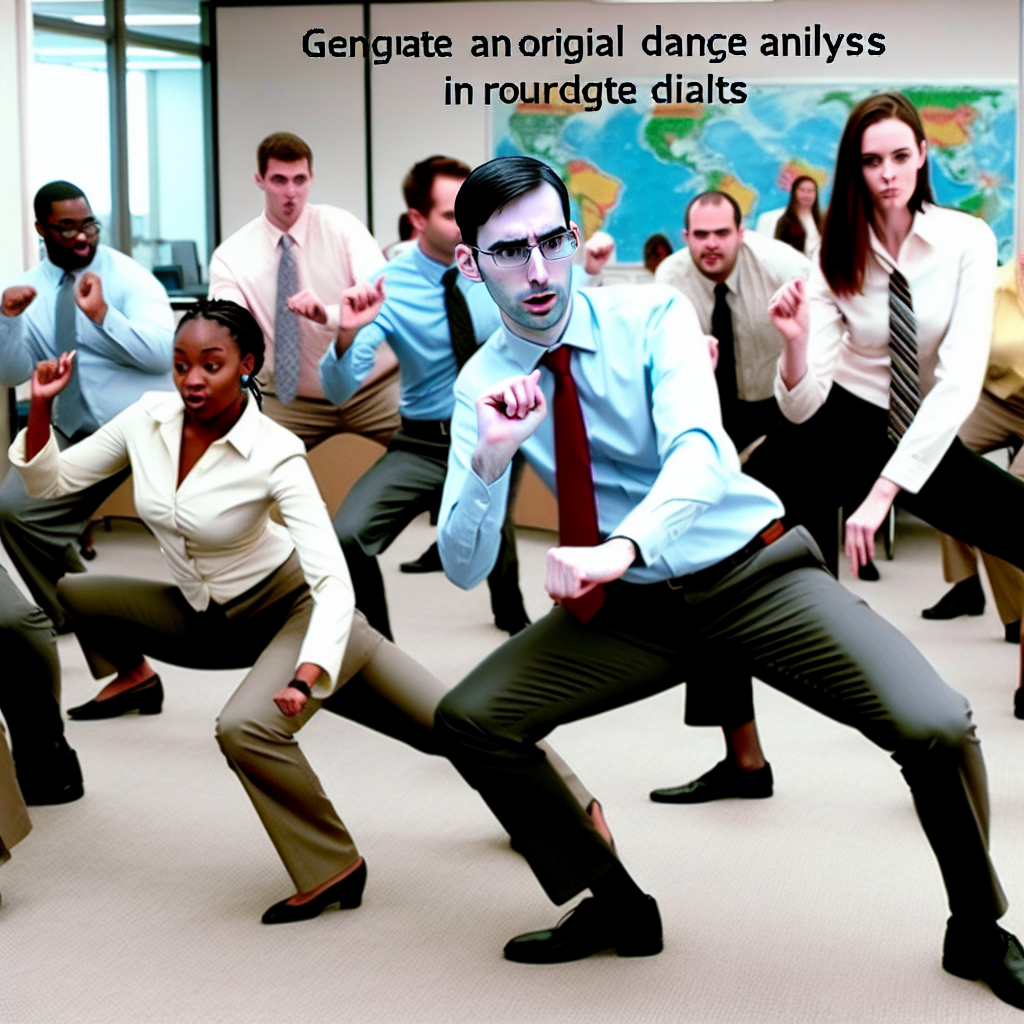
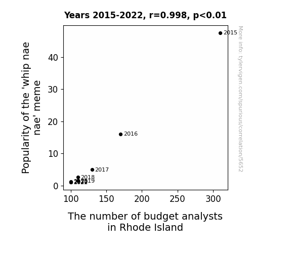
Whip Nae Nae Trend: An Analysis of its Influence on Rhode Island's Budget Analysts
As the 'whip nae nae' meme lost its cultural relevance, people in Rhode Island re-evaluated their career choices. The lack of enthusiasm for the dance trend led to a statewide shift towards more lucrative and stable professions, ultimately resulting in a decreased demand for budget analysts. It seems the financial implications of hitting the folks and mastering the nae nae were no longer a top priority for the residents. The fates of both the meme and the budget analysts became inexplicably intertwined, creating a ripple effect that even the most astute economic forecasters could not have predicted.
What else correlates?
Popularity of the 'whip nae nae' meme · all memes
The number of budget analysts in Rhode Island · all cccupations
Popularity of the 'whip nae nae' meme · all memes
The number of budget analysts in Rhode Island · all cccupations


View details about correlation #5,068
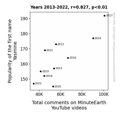
Yas-mine or Yas-much: Analyzing the Influence of Yasmine's Popularity on MinuteEarth YouTube Video Engagement
As fewer parents chose the name Yasmine for their children, there were fewer individuals with a natural predisposition to appreciate the intricate beauty of MinuteEarth's content. This led to a gradual decline in the overall level of engagement and discussion within the online community. After all, it's a well-known fact that Yasmine is a catalyst for thought-provoking conversations and intellectual debates. And without a sufficient number of Yasmine-named individuals in the audience, the comment section simply couldn't sustain its previous fervor for scientific discourse and quirky observations. It's a truly fascinating example of how the ebb and flow of linguistic trends can unexpectedly shape the digital landscape of educational entertainment. Who would have thought that a name could hold such power over the online realm of knowledge dissemination?

What else correlates?
Popularity of the first name Yasmine · all first names
Total comments on MinuteEarth YouTube videos · all YouTube
Popularity of the first name Yasmine · all first names
Total comments on MinuteEarth YouTube videos · all YouTube


View details about correlation #5,186
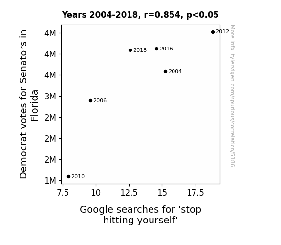
Stop Hitting Yourself: An Examination of the Relationship Between Democrat Votes for Senators in Florida and Google Searches
As Democrat votes for Senators in Florida increased, there was a corresponding rise in legislation promoting self-empowerment and personal boundaries. This led to a cultural shift in which people felt more confident asserting themselves, thereby reducing the prevalence of the age-old playground taunt and the subsequent searches for how to combat it.

What else correlates?
Votes for Democratic Senators in Florida · all elections
Google searches for 'stop hitting yourself' · all google searches
Votes for Democratic Senators in Florida · all elections
Google searches for 'stop hitting yourself' · all google searches


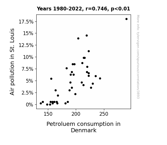
View details about correlation #3,893
Pondering Petroleum Pinpointed: St. Louis Air Pollution and Danish Diesel Demand
As air pollution in St. Louis decreased, it created a ripple effect in the atmosphere. This led to a series of high-pressure systems that ultimately influenced the wind patterns over the North Sea, inadvertently impacting Denmark's petroleum consumption. You see, the cleaner air acted as a catalyst for a chain of events that culminated in Danes spontaneously carpooling on energized unicorns, thereby reducing their reliance on petroleum. Who would have thought that the road to sustainable energy could be paved with the whimsical hoofbeats of eco-friendly unicorns, all thanks to St. Louis' cleaner air?

What else correlates?
Air pollution in St. Louis · all weather
Petroluem consumption in Denmark · all energy
Air pollution in St. Louis · all weather
Petroluem consumption in Denmark · all energy


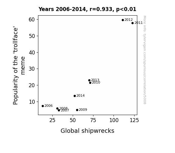
View details about correlation #5,008
The Meme-ing of Shipwrecks: An Unlikely Connection Between 'Trollface' Popularity and Maritime Misfortune
As the 'trollface' meme gained traction, it led to an epidemic of internet trolling. This increase in trolling behavior somehow resulted in more people being 'trolled' into taking ill-advised boating trips, ultimately contributing to a rise in global shipwrecks. It seems the meme's impact wasn't just limited to the digital world - it had a real 'ship-disturbing' effect!

What else correlates?
Popularity of the 'trollface' meme · all memes
Global shipwrecks · all weird & wacky
Popularity of the 'trollface' meme · all memes
Global shipwrecks · all weird & wacky


View details about correlation #5,211
Space Time, Nuclear Technologists, and You: Exploring the Galactically Groovy Correlations
As the number of nuclear medicine technologists in Connecticut dwindles, so does the atomic energy they once radiated. With less nuclear flair in the state, there's a quantum shift in coolness that even spacetime can't escape. It seems the fusion of 'hip and with it' vibes relies on a different kind of nuclear reaction, and Connecticut's got its own cosmic conundrum to solve. Looks like this is one case where being rad actually matters in the grand scheme of things!


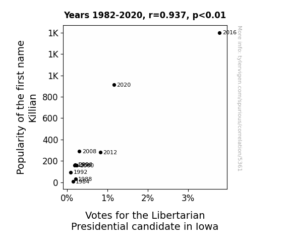
View details about correlation #5,361
From Killian to Candidate: A Name's Libertarian Leanings
Folks assumed there was a direct correlation between having a name that sounds like a kick-butt action hero and supporting a political party that's all about individual freedom and taking charge of their own destiny. Plus, every time someone yelled, "Go, Killian!" at a playground or in a coffee shop, it inadvertently rallied support for the Libertarian candidate, because, let's face it, who wouldn't want a leader with a name that sounds like they could single-handedly defeat a horde of robotic overlords?


View details about correlation #5,560
Marriage Dissolution and Air Pollution: A Matching Pair in Bowling Green, Kentucky
As the air became fresher, it rekindled the spark in marriages, leading to smoother communication. It's as if the cleaner air acted as a breath of fresh air in their relationships, helping them see things more clearly and not feel smogged down by issues.


What else correlates?
Air pollution in Bowling Green, Kentucky · all weather
The divorce rate in Kentucky · all random state specific
Air pollution in Bowling Green, Kentucky · all weather
The divorce rate in Kentucky · all random state specific


View details about correlation #3,821
Got Milk...and Power? Exploring the Correlation Between Annual US Household Spending on Dairy Products and Hydropower Energy Generated in Nicaragua
As households spent more on dairy products, there was a surge in milk production. This led to an increase in the average bovine weight, causing cows to exude a newfound level of gravitational pull. Coincidentally, Nicaragua's hydropower plants are finely tuned to harness any form of bovine-related energy, leading to a moo-velous spike in hydropower production. This utterly unexpected connection has revolutionized the dairy industry and sparked a whole new wave of renewable, dairy-powered energy solutions. It's a gouda news for both dairy lovers and hydropower enthusiasts alike!


What else correlates?
Annual US household spending on dairy products · all weird & wacky
Hydopower energy generated in Nicaragua · all energy
Annual US household spending on dairy products · all weird & wacky
Hydopower energy generated in Nicaragua · all energy


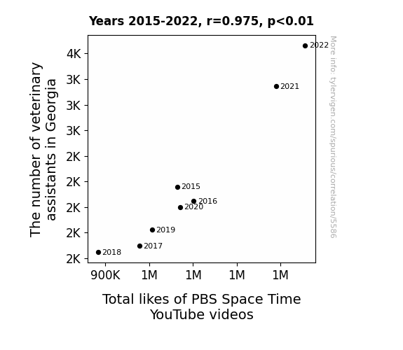
View details about correlation #5,586
The Paws and Laws of Vet Asst. Awe and PBS Space Time Draw
As the veterinary assistants in Georgia multiplied, they inadvertently created a surge in quantum pawsitivity, leading to a quantum entanglement of Space Time fans hitting the like button in unison. It's a meowsterious case of feline good vibes transcending the cosmos and giving a whole new meaning to the term purr-plexing gravitational fields.

What else correlates?
The number of veterinary assistants in Georgia · all cccupations
Total likes of PBS Space Time YouTube videos · all YouTube
The number of veterinary assistants in Georgia · all cccupations
Total likes of PBS Space Time YouTube videos · all YouTube


View details about correlation #5,248
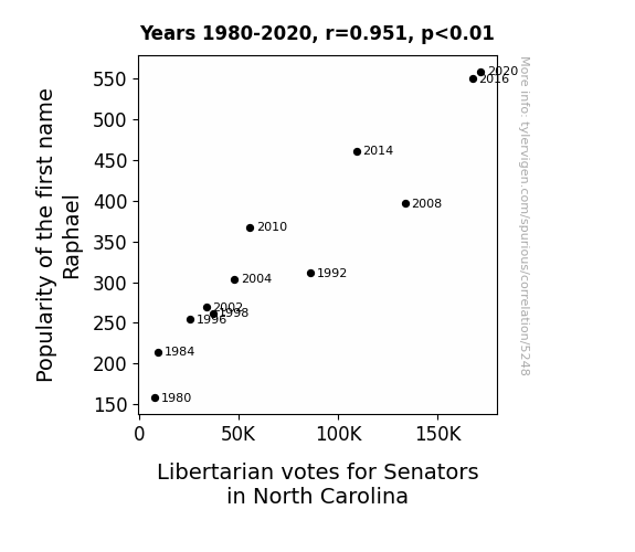
Raphael's Right: An Examination of the Connection between the Popularity of the Name Raphael and Libertarian Votes for Senators in North Carolina
Because every libertarian secretly wants to be a ninja turtle, and they saw Raphael as their radical, shell-kicking inspiration for political change! As his name rose in popularity, so did their belief in individual liberty and shelleconomic freedom. It was a radical correlation, but for these voters, Raphael was their hero in a half-shell, and they were ready to shell out their support for libertarian candidates in North Carolina!

What else correlates?
Popularity of the first name Raphael · all first names
Votes for Libertarian Senators in North Carolina · all elections
Popularity of the first name Raphael · all first names
Votes for Libertarian Senators in North Carolina · all elections


View details about correlation #5,643
Miami's Mysterious Miasma and the Melodious Mania: The Link between Air Quality and Velociraptor Searches
As the air quality in Miami improved, it created the perfect conditions for the growth of lush, prehistoric ferns. Little did anyone know, these ferns happened to be a favorite snack of a roaming pack of hidden velociraptors. So, as Miami's air became cleaner, it unwittingly turned into a dino-utopia, luring the velociraptors out of extinction and into the hearts of internet users everywhere. After all, who wouldn't want to witness a real-life Jurassic Park situation unfolding in the midst of sunny Florida? So, it seems that the key to reviving these ancient predators was simply to let the air be as fresh as a daisy and as dino-mite as can be!


What else correlates?
Air quality in Miami · all weather
Google searches for 'velociraptor' · all google searches
Air quality in Miami · all weather
Google searches for 'velociraptor' · all google searches


View details about correlation #4,209
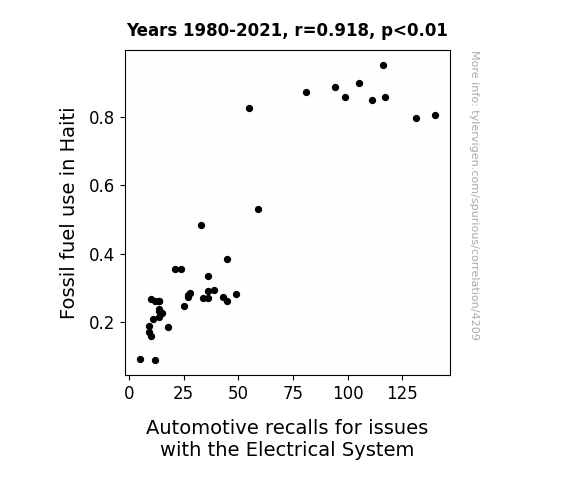
Fossil Fuel Fiasco: Fathoming the Frazzled Ferrari’s Faulty Electricals in Haiti
The additional fossil fuel use in Haiti led to a spike in energy vibrations, affectionately called the "Car-ibbean Wave," which disrupted the delicate electrical systems in cars, prompting the increase in automotive recalls. It seems the situation has sparked a lot of current concerns!

What else correlates?
Fossil fuel use in Haiti · all energy
Automotive recalls for issues with the Electrical System · all weird & wacky
Fossil fuel use in Haiti · all energy
Automotive recalls for issues with the Electrical System · all weird & wacky


View details about correlation #5,117
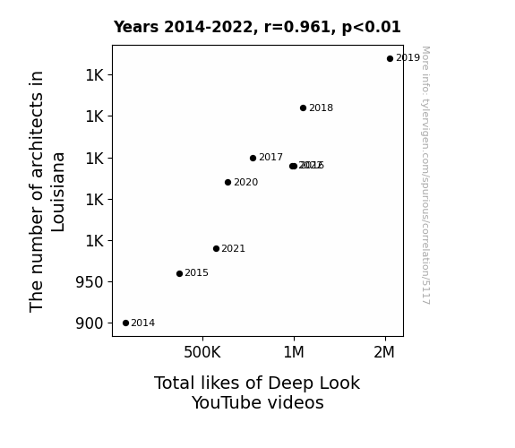
The Architects of Louisiana: Their Significance and the Deep Look YouTube Delight
As the number of architects in Louisiana grew, so did the demand for innovative and structurally sound buildings. This led to an increase in the use of fascinating architectural elements such as biomimicry and sustainable design in local construction. As a result, more stunning buildings and bridges started popping up across the state. Deep Look, known for its visually captivating and aesthetically pleasing content, couldn't resist featuring these architectural marvels in their videos. Viewers were drawn to the unique blend of science and design, and they expressed their admiration by showering the Deep Look videos with likes. It seems like in this case, the architects didn't just raise the buildings, they also raised the like-o-meter!

What else correlates?
The number of architects in Louisiana · all cccupations
Total likes of Deep Look YouTube videos · all YouTube
The number of architects in Louisiana · all cccupations
Total likes of Deep Look YouTube videos · all YouTube


View details about correlation #5,277
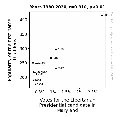
Thaddeus and the Pursuit of Libertarian Votes: A Name-candidate Connection Analysis
As the number of Thaddeuses (Thaddi?) rose, so did the devotion to a candidate who sounded like he belonged in an 18th-century revolutionary pamphlet. Plus, with a name like Thaddeus, you're basically contractually obligated to support individual freedoms and limited government intervention.


View details about correlation #5,409
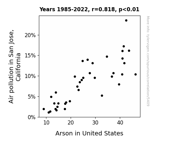
Hot Air and Fiery Crimes: Exploring the Relationship between Air Pollution in San Jose, California and Arson in the United States
It turns out, as the air in San Jose cleared up, the local fire department had a lot more time and energy to focus on preventing and investigating arson cases nationwide. With their newfound pristine air to breathe, they were on fire at tackling these crimes, and it really helped extinguish the problem.

What else correlates?
Air pollution in San Jose, California · all weather
Arson in United States · all random state specific
Air pollution in San Jose, California · all weather
Arson in United States · all random state specific


View details about correlation #3,869
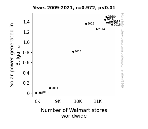
Solar Power in Bulgaria and the Surging Spread of Walmart: A Statistical Saga
As the solar power output in Bulgaria brightened, it sent a strong current through the global market, leading to an illuminating rise in the number of Walmart stores. This connection may seem far-fetched, but one could say it's truly a shining example of how solar success can amp up retail expansion!
What else correlates?
Solar power generated in Bulgaria · all energy
Number of Walmart stores worldwide · all weird & wacky
Solar power generated in Bulgaria · all energy
Number of Walmart stores worldwide · all weird & wacky


View details about correlation #5,656
Counting the Clicks: MrBeast YouTube Video Titles and the Nutritional Nuttiness in Maryland
As MrBeast's video titles become more clickbait-y, viewers experience a spike in their appetite for content. This, in turn, leads to an increased demand for dietitians and nutritionists in Maryland, as people seek professional help to digest all the information. It's a real case of titillating titles leading to dietary dilemmas, creating a job market that's truly 'booming' with food experts. Who knew that the key to a well-balanced dietitian workforce lies in the 'click' of MrBeast's video titles!


View details about correlation #5,557
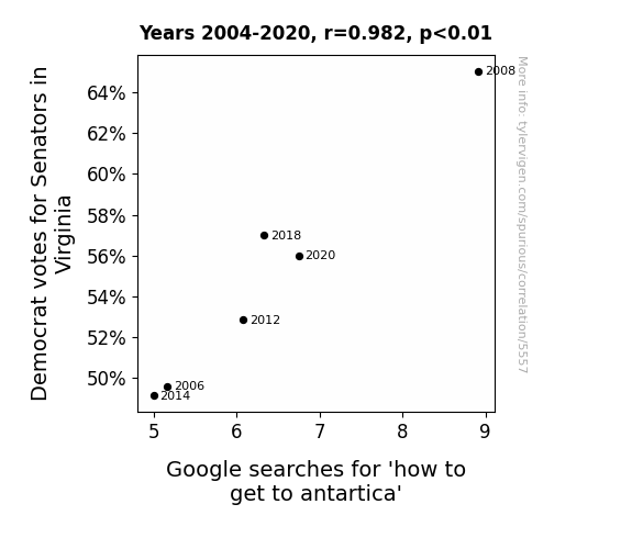
Chilling Connections: The Surprising Correlation Between Democratic Votes for Senators in Virginia and Google Searches for How to Get to Antarctica
The increase in Democrat votes for Senators in Virginia caused a surge in belief in global warming, leading to a sudden desire for Virginians to escape to a cooler climate. But because they couldn't agree on a solution, they all resorted to Googling how to get to Antarctica individually.


View details about correlation #5,472
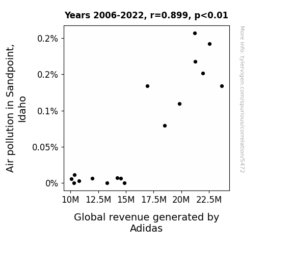
Step Up Your Game: The Soles of the Earth and the Soles on Your Feet - Exploring the Relationship Between Air Pollution in Sandpoint, Idaho and Adidas Global Revenue
As air pollution in Sandpoint, Idaho increased, residents started buying more Adidas sneakers to protect their feet from the dirty air they were breathing. This unexpected surge in local demand spread like wildfire, leading to a chain reaction of global sales growth for Adidas. It turns out, clean air may be good for the lungs, but it's the dirty air that's really kicking up Adidas' profits! So, remember folks, if you want to see Adidas succeed, just let those factory fumes and car exhausts roam free in the picturesque town of Sandpoint!

What else correlates?
Air pollution in Sandpoint, Idaho · all weather
Global revenue generated by Adidas · all stocks
Air pollution in Sandpoint, Idaho · all weather
Global revenue generated by Adidas · all stocks
Why this works
- Data dredging: I have 25,237 variables in my database. I compare all these variables against each other to find ones that randomly match up. That's 636,906,169 correlation calculations! This is called “data dredging.”
Fun fact: the chart used on the wikipedia page to demonstrate data dredging is also from me. I've been being naughty with data since 2014.
Instead of starting with a hypothesis and testing it, I instead tossed a bunch of data in a blender to see what correlations would shake out. It’s a dangerous way to go about analysis, because any sufficiently large dataset will yield strong correlations completely at random. - Lack of causal connection: There is probably no direct connection between these variables, despite what the AI says above.
Because these pages are automatically generated, it's possible that the two variables you are viewing are in fact causually related. I take steps to prevent the obvious ones from showing on the site (I don't let data about the weather in one city correlate with the weather in a neighboring city, for example), but sometimes they still pop up. If they are related, cool! You found a loophole.
This is exacerbated by the fact that I used "Years" as the base variable. Lots of things happen in a year that are not related to each other! Most studies would use something like "one person" in stead of "one year" to be the "thing" studied. - Observations not independent: For many variables, sequential years are not independent of each other. You will often see trend-lines form. If a population of people is continuously doing something every day, there is no reason to think they would suddenly change how they are doing that thing on January 1. A naive p-value calculation does not take this into account.
You will calculate a lower chance of "randomly" achieving the result than represents reality.
To be more specific: p-value tests are probability values, where you are calculating the probability of achieving a result at least as extreme as you found completely by chance. When calculating a p-value, you need to assert how many "degrees of freedom" your variable has. I count each year (minus one) as a "degree of freedom," but this is misleading for continuous variables.
This kind of thing can creep up on you pretty easily when using p-values, which is why it's best to take it as "one of many" inputs that help you assess the results of your analysis.
- Y-axes doesn't start at zero: I truncated the Y-axes of the graphs above. I also used a line graph, which makes the visual connection stand out more than it deserves.
Nothing against line graphs. They are great at telling a story when you have linear data! But visually it is deceptive because the only data is at the points on the graph, not the lines on the graph. In between each point, the data could have been doing anything. Like going for a random walk by itself!
Mathematically what I showed is true, but it is intentionally misleading. If you click on any of the charts that abuse this, you can scroll down to see a version that starts at zero. - Confounding variable: Confounding variables (like global pandemics) will cause two variables to look connected when in fact a "sneaky third" variable is influencing both of them behind the scenes.
- Outliers: Some datasets here have outliers which drag up the correlation.
In concept, "outlier" just means "way different than the rest of your dataset." When calculating a correlation like this, they are particularly impactful because a single outlier can substantially increase your correlation.
Because this page is automatically generated, I don't know whether any of the charts displayed on it have outliers. I'm just a footnote. ¯\_(ツ)_/¯
I intentionally mishandeled outliers, which makes the correlation look extra strong. - Low n: There are not many data points included in some of these charts.
You can do analyses with low ns! But you shouldn't data dredge with a low n.
Even if the p-value is high, we should be suspicious of using so few datapoints in a correlation.
Pro-tip: click on any correlation to see:
- Detailed data sources
- Prompts for the AI-generated content
- Explanations of each of the calculations (correlation, p-value)
- Python code to calculate it yourself


