spurious correlations
discover · random · spurious scholar
← previous page · next page →


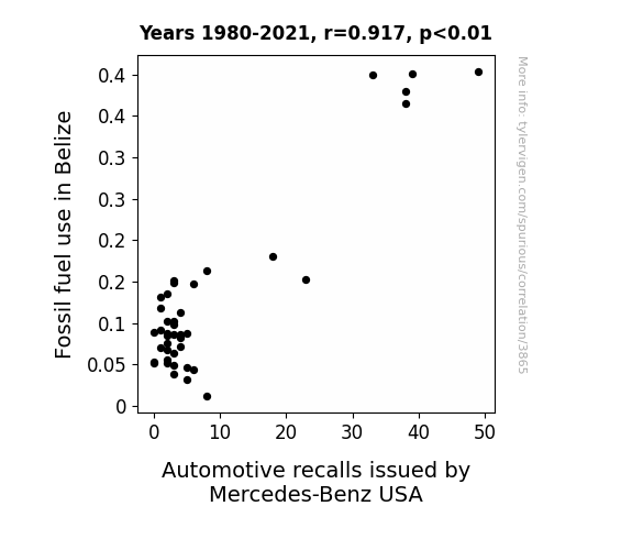
View details about correlation #3,865
Fossil Fueled Recalls: A Study of the Relationship Between Fossil Fuel Use in Belize and Automotive Recalls by Mercedes-Benz USA
Belize's newfound love for fossil fuels was really revving up the automotive industry, leading to a surge in demand for Mercedes-Benz vehicles. This put the pedal to the metal for production, leading to a higher chance of defects slipping through the cracks. It seems like in this case, the recall rate was directly linked to Belize's gas-guzzling ways, creating a whole new meaning to the phrase "exhaust pipe issues." Looks like the nation's affinity for fossils had a hand in driving up the number of Mercedes recalls - talk about a bizarre and far-fetched connection!

What else correlates?
Fossil fuel use in Belize · all energy
Automotive recalls issued by Mercedes-Benz USA · all weird & wacky
Fossil fuel use in Belize · all energy
Automotive recalls issued by Mercedes-Benz USA · all weird & wacky


View details about correlation #5,299
Colt Coincidence: Exploring the Correlation Between Name Popularity and YouTube Engagement
Maybe because people with that name have a natural inclination for competition and shooting for the top spot in everything, including leaving comments on YouTube videos. Their enthusiasm for all things Colt-ure just brings an extra bang to the comment section! Or perhaps they're just big fans of MrBeast's wild stunts and are Colt-ivating a community of commenters.


What else correlates?
Popularity of the first name Colt · all first names
Total comments on MrBeast's YouTube videos · all YouTube
Popularity of the first name Colt · all first names
Total comments on MrBeast's YouTube videos · all YouTube


View details about correlation #5,661
Chucking for Change: The Chucking Correlation between Democrat Votes for Senators in New York and Google Searches for 'How Much Wood Can a Woodchuck Chuck'
As Democrat votes for Senators in New York increase, so does the support for environmental policies. This leads to a resurgence in New York's forests, providing woodchucks with plentiful chucking opportunities. The political climate fuels the woodchuck's ambition, leading to an unprecedented chucking capacity as they feel empowered to chuck more wood for the greater good.


View details about correlation #5,116
Breath in the Machinery: Examining the Correlation Between Air Pollution in Tampa, Florida and the Employment of Maintenance Workers
As the air became cleaner, the machinery realized they no longer needed maintenance workers and simply started fixing themselves. It was like they were saying, "We don't need no smog control!"


What else correlates?
Air pollution in Tampa, Florida · all weather
The number of maintenance workers, machinery in Florida · all cccupations
Air pollution in Tampa, Florida · all weather
The number of maintenance workers, machinery in Florida · all cccupations


View details about correlation #3,875
Fueling the Champion: A Sausage-al Link Between Fossil Fuel Use in Egypt and Nathan's Hot Dog Eating Competition Consumption
Perhaps the mummies of ancient Egypt have a secret recipe for hotdog buns that was unearthed during the digging for fossil fuels, creating a link between the two. It seems the pharaoh-oh-ohs were relishing their sausages in a way that has transcended time, causing a spike in hotdog consumption every time a new tomb or fuel reserve is discovered. The mystery of the pyramids may have been solved, but the mystery meat in those hotdogs remains as enigmatic as ever. The connection is truly a testament to the wurst-kept secrets of history!


What else correlates?
Fossil fuel use in Egypt · all energy
Hotdogs consumed by Nathan's Hot Dog Eating Competition Champion · all weird & wacky
Fossil fuel use in Egypt · all energy
Hotdogs consumed by Nathan's Hot Dog Eating Competition Champion · all weird & wacky
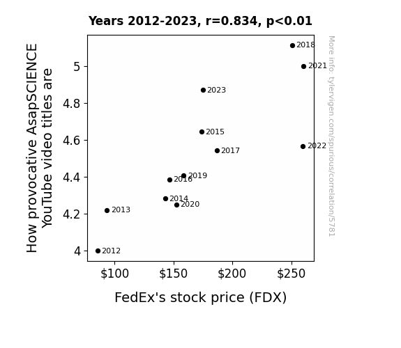
. The chart goes from 2012 to 2023, and the two variables track closely in value over that time.")

View details about correlation #5,781
Delivering the Goods: Unpacking the Impact of Provocative AsapSCIENCE YouTube Video Titles on FedEx's Stock Price
FedEx delivers the provocative video ideas to AsapSCIENCE, creating a buzz and driving up viewership. This boosts ad revenue for the channel, leading to more investors wanting to get in on the FDX action, causing a package of stock price increases.

What else correlates?
How provocative AsapSCIENCE YouTube video titles are · all YouTube
FedEx's stock price (FDX) · all stocks
How provocative AsapSCIENCE YouTube video titles are · all YouTube
FedEx's stock price (FDX) · all stocks


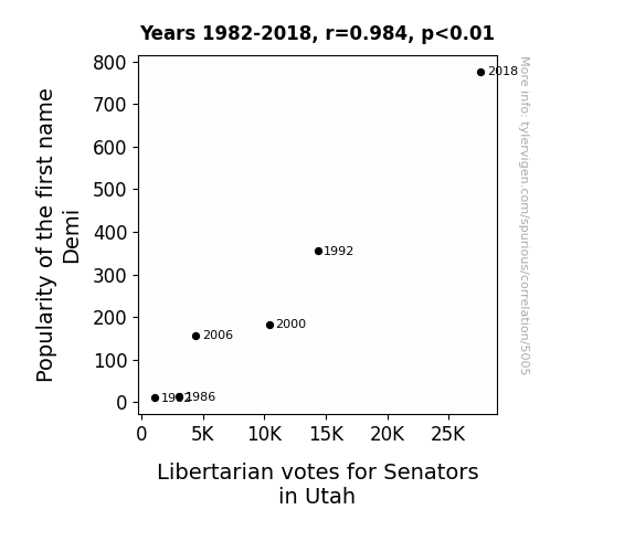
View details about correlation #5,005
Demi-Cratic Choices: An Examination of the Link Between the Name Demi's Popularity and Libertarian Senate Votes in Utah
Every time someone named Demi was born, a tiny textbook on libertarianism was secretly tucked into the maternity ward bassinet, planting the seeds of freedom for the future. As the Demis grew up, they unknowingly formed a covert network of liberty-loving individuals, silently swaying the senatorial elections in Utah with their invisible hand. Remember, when in doubt, blame it on the Demis! Remember, when in doubt, blame it on the Demis!

What else correlates?
Popularity of the first name Demi · all first names
Votes for Libertarian Senators in Utah · all elections
Popularity of the first name Demi · all first names
Votes for Libertarian Senators in Utah · all elections


View details about correlation #5,388
Associates Degrees in Education and Air Pollution: A Rhyming Tale of Ponca City, Oklahoma
As fewer people pursued Associates degrees in Education, there was a decline in the number of students conducting classroom science experiments. This led to a decrease in the production of tiny, homemade volcanoes, ultimately resulting in reduced particulate matter being released into the atmosphere.


What else correlates?
Associates degrees awarded in Education · all education
Air pollution in Ponca City, Oklahoma · all weather
Associates degrees awarded in Education · all education
Air pollution in Ponca City, Oklahoma · all weather


View details about correlation #5,461
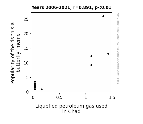
Mischievous Memes: Mapping the Marvelous Marriage of the 'Is This a Butterfly' Meme and Liquefied Petroleum Gas in Chad
As the 'is this a butterfly' meme fluttered its way into online stardom, it created a surge in internet traffic. This led to a higher demand for data, causing an uptick in the usage of servers and electronic devices. Manufacturing and powering these electronic devices in turn raised the need for energy. Now, here's where it gets a bit intense - with the LPG usage soaring, it's like the whole country of Chad said, "LPGas, we're ready to butterfly the night away!" It's a gasp-inducing connection that no one saw coming, but there you have it – the social media butterfly effect in full flight!
What else correlates?
Popularity of the 'is this a butterfly' meme · all memes
Liquefied petroleum gas used in Chad · all energy
Popularity of the 'is this a butterfly' meme · all memes
Liquefied petroleum gas used in Chad · all energy


View details about correlation #5,233
The Playful Paradox: Exploring the Perplexing Parallels between CGP Grey Video Titles and Pharmacists in Maine
As the number of pharmacists in Maine rises, so does the dose of amusement in the state. With more medication experts around, there's a higher concentration of fun. It seems the secret ingredient to a good time is just what the doctor ordered - a maine-pharmaceutical dose of laughter and entertainment!


What else correlates?
How fun CGP Grey YouTube video titles are · all YouTube
The number of pharmacists in Maine · all cccupations
How fun CGP Grey YouTube video titles are · all YouTube
The number of pharmacists in Maine · all cccupations


View details about correlation #5,171
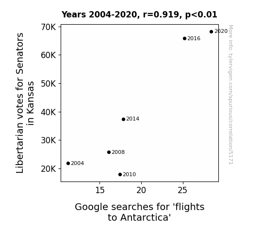
Kansas Senators' Libertine Feats and Antarctic Retreats: Exploring the Correlation between Libertarian Votes and Searches for Flights to Antarctica
As more Libertarian Senators were elected in Kansas, their platform to reduce government control extended to the skies. With fewer aviation regulations, airlines saw an opportunity to offer direct flights to Antarctica, bypassing traditional routes. This led to a surge in interest for Antarctic travel, reflected in the increased Google searches for 'flights to Antarctica'. Political decisions in the Sunflower State were quite literally taking the people of Kansas to new heights, as they fueled a newfound passion for polar exploration. The connection between Kansas Senatorial votes and Antarctic flights may seem far-fetched, but in the unpredictable world of politics and air travel, anything is possible!

What else correlates?
Votes for Libertarian Senators in Kansas · all elections
Google searches for 'flights to Antarctica' · all google searches
Votes for Libertarian Senators in Kansas · all elections
Google searches for 'flights to Antarctica' · all google searches


View details about correlation #5,176
Injecting Some Fresh Air: The Correlation between Air Quality in Greenwood, South Carolina, and Botox Injections Administered to Women
As the air quality improved, more oxygen was available, leading the women in Greenwood to have that healthy, glowing skin - the perfect canvas for Botox injections! Remember, when it comes to fresh faces, it's all about that fresh air.


What else correlates?
Air quality in Greenwood, South Carolina · all weather
Number of Botox Injections Administered to Women · all weird & wacky
Air quality in Greenwood, South Carolina · all weather
Number of Botox Injections Administered to Women · all weird & wacky


View details about correlation #5,619
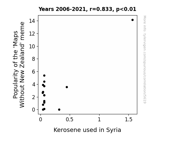
From Maps Without New Zealand to Kerosene in Syria: Is There a Connection to See?
As the 'Maps Without New Zealand' meme lost its luster, it led to a global shortage of meme-related internet traffic. This, in turn, caused internet service providers to reduce their energy consumption, including fewer servers needed to host outdated memes. Ultimately, this led to a decrease in overall energy demand, resulting in slightly less kerosene being used in Syria for a brief period. Now that's what I call a meme-orable chain reaction!
What else correlates?
Popularity of the 'Maps Without New Zealand' meme · all memes
Kerosene used in Syria · all energy
Popularity of the 'Maps Without New Zealand' meme · all memes
Kerosene used in Syria · all energy


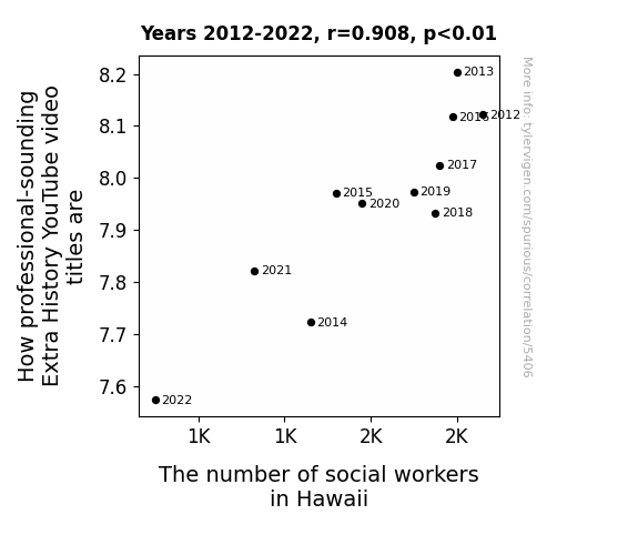
View details about correlation #5,406
Social Sorkin' Through YouTube: A Correlative Analysis of Extra History Video Titles and the Hawaii Social Worker Count
As the number of social workers in Hawaii decreases, there are fewer individuals available to help resolve interpersonal conflicts. This leads to an increase in unprofessional behavior, as people lack the necessary guidance to navigate social and workplace dynamics. As a result, the overall professionalism in the state takes a hit, extending even to the titling of educational YouTube videos. After all, it's a well-known fact that a shortage of social workers can unleash a tidal wave of unprofessionalism, all the way from office antics to the carefully crafted titles of online historical content. Remember, for every missing social worker, there's a historical video title that just doesn't sound as polished.


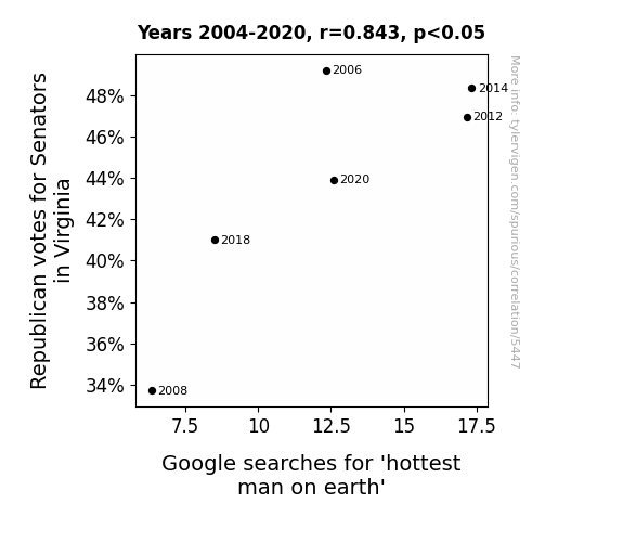
View details about correlation #5,447
Red States and Red Hot Searches: A Correlational Analysis of Republican Senator Votes in Virginia and Google Searches for 'Hottest Man on Earth'
As the temperature rose in the political arena, it created a hotly contested race which heated up the debate. As the Republican votes cooled off, so did the competition, leading to a Senate situation that was no longer sizzling. This political chill had a ripple effect, causing a decrease in the overall heat index of the elected officials. And as we all know, fewer Republican votes for Senators in Virginia meant there was simply less political fire to fuel the flames of this particular search. In the end, it seems that in this case, the connection between politics and this particular search query is just too hot to handle!
What else correlates?
Votes for Republican Senators in Virginia · all elections
Google searches for 'hottest man on earth' · all google searches
Votes for Republican Senators in Virginia · all elections
Google searches for 'hottest man on earth' · all google searches


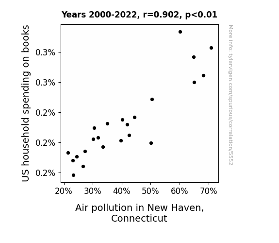
View details about correlation #5,552
The Tale of Yale: The Link Between Book Sale and Air Pollution Prevail
As US households spent less on books, there was a slight reduction in paper production. With a lower demand for paper, there were fewer trucks transporting paper to printing facilities, thus leading to a minor decrease in air pollution in New Haven. All because some people decided to put down the latest bestseller!

What else correlates?
US household spending on books · all weird & wacky
Air pollution in New Haven, Connecticut · all weather
US household spending on books · all weird & wacky
Air pollution in New Haven, Connecticut · all weather


View details about correlation #1,057
As the name Cori fell out of favor, it led to a decrease in the production of cheesy personalized keychains and novelty license plates. Unfortunately, this also meant a decrease in the demand for plastic, indirectly impacting the petroleum industry in Azerbaijan. It seems the Cori-less world isn't just facing a fuel shortage, but also a lack of "petro-leum" for all those pun-loving drivers.

What else correlates?
Popularity of the first name Cori · all first names
Petroluem consumption in Azerbaijan · all energy
Popularity of the first name Cori · all first names
Petroluem consumption in Azerbaijan · all energy


View details about correlation #5,653
Burning Questions: Exploring the Fiery Connection Between Arson in Florida and the Commentary Craze on minutephysics YouTube Videos
As more fires raged, people found themselves with extra time to watch and engage with minutephysics videos, leading to an uptick in comments. Talk about sparking a lively discussion!

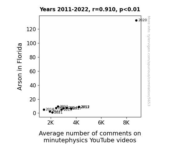
What else correlates?
Arson in Florida · all random state specific
Average number of comments on minutephysics YouTube videos · all YouTube
Arson in Florida · all random state specific
Average number of comments on minutephysics YouTube videos · all YouTube


View details about correlation #5,340
Swinging Right: A Crane-tastic Correlation Between Republican Votes for Senators in Montana and the Number of Crane Operators
As more Republicans voted for Senators in Montana, there was a surge in support for heavy machinery industries. This newfound enthusiasm led to a statewide campaign to "Make Montana Lifty Again," resulting in an unexpected boom in the demand for crane operators. Guess you could say the political climate really lifted the job market!
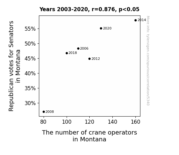
What else correlates?
Votes for Republican Senators in Montana · all elections
The number of crane operators in Montana · all cccupations
Votes for Republican Senators in Montana · all elections
The number of crane operators in Montana · all cccupations


View details about correlation #5,783
Austere Air Pollution and Ice Bath Inquiries in Albuquerque: An Alliteration Analysis
The decrease in air quality led to people in Albuquerque seeking alternative ways to cool off, and for some reason, they all collectively thought ice baths were the way to go. It's like a city-wide, misguided attempt at personal environmental conditioning!

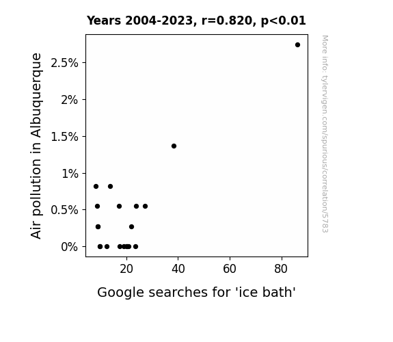
What else correlates?
Air pollution in Albuquerque · all weather
Google searches for 'ice bath' · all google searches
Air pollution in Albuquerque · all weather
Google searches for 'ice bath' · all google searches
Why this works
- Data dredging: I have 25,237 variables in my database. I compare all these variables against each other to find ones that randomly match up. That's 636,906,169 correlation calculations! This is called “data dredging.”
Fun fact: the chart used on the wikipedia page to demonstrate data dredging is also from me. I've been being naughty with data since 2014.
Instead of starting with a hypothesis and testing it, I instead tossed a bunch of data in a blender to see what correlations would shake out. It’s a dangerous way to go about analysis, because any sufficiently large dataset will yield strong correlations completely at random. - Lack of causal connection: There is probably no direct connection between these variables, despite what the AI says above.
Because these pages are automatically generated, it's possible that the two variables you are viewing are in fact causually related. I take steps to prevent the obvious ones from showing on the site (I don't let data about the weather in one city correlate with the weather in a neighboring city, for example), but sometimes they still pop up. If they are related, cool! You found a loophole.
This is exacerbated by the fact that I used "Years" as the base variable. Lots of things happen in a year that are not related to each other! Most studies would use something like "one person" in stead of "one year" to be the "thing" studied. - Observations not independent: For many variables, sequential years are not independent of each other. You will often see trend-lines form. If a population of people is continuously doing something every day, there is no reason to think they would suddenly change how they are doing that thing on January 1. A naive p-value calculation does not take this into account.
You will calculate a lower chance of "randomly" achieving the result than represents reality.
To be more specific: p-value tests are probability values, where you are calculating the probability of achieving a result at least as extreme as you found completely by chance. When calculating a p-value, you need to assert how many "degrees of freedom" your variable has. I count each year (minus one) as a "degree of freedom," but this is misleading for continuous variables.
This kind of thing can creep up on you pretty easily when using p-values, which is why it's best to take it as "one of many" inputs that help you assess the results of your analysis.
- Y-axes doesn't start at zero: I truncated the Y-axes of the graphs above. I also used a line graph, which makes the visual connection stand out more than it deserves.
Nothing against line graphs. They are great at telling a story when you have linear data! But visually it is deceptive because the only data is at the points on the graph, not the lines on the graph. In between each point, the data could have been doing anything. Like going for a random walk by itself!
Mathematically what I showed is true, but it is intentionally misleading. If you click on any of the charts that abuse this, you can scroll down to see a version that starts at zero. - Confounding variable: Confounding variables (like global pandemics) will cause two variables to look connected when in fact a "sneaky third" variable is influencing both of them behind the scenes.
- Outliers: Some datasets here have outliers which drag up the correlation.
In concept, "outlier" just means "way different than the rest of your dataset." When calculating a correlation like this, they are particularly impactful because a single outlier can substantially increase your correlation.
Because this page is automatically generated, I don't know whether any of the charts displayed on it have outliers. I'm just a footnote. ¯\_(ツ)_/¯
I intentionally mishandeled outliers, which makes the correlation look extra strong. - Low n: There are not many data points included in some of these charts.
You can do analyses with low ns! But you shouldn't data dredge with a low n.
Even if the p-value is high, we should be suspicious of using so few datapoints in a correlation.
Pro-tip: click on any correlation to see:
- Detailed data sources
- Prompts for the AI-generated content
- Explanations of each of the calculations (correlation, p-value)
- Python code to calculate it yourself


