spurious correlations
discover · random · spurious scholar
← previous page · next page →


View details about correlation #5,805
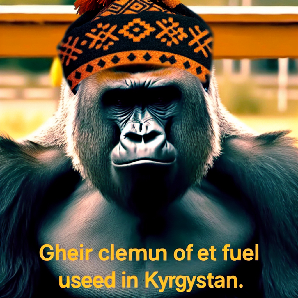
The Great Meme Fuel Connection: Exploring the Surprising Correlation Between 'Harambe' Popularity and Jet Fuel Consumption in Kyrgyzstan
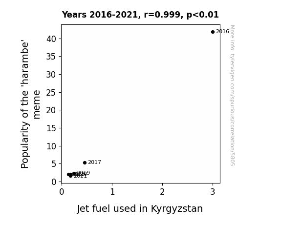
As the 'harambe' meme faded into obscurity, internet users redirected their focus towards new trends, leading to a decreased demand for jet fuel in Kyrgyzstan. You see, the collective decrease in sharing 'harambe' memes meant that fewer people were using up internet bandwidth. This reduction in data usage had an unforeseen ripple effect on global internet traffic. With less data to transmit, the overall weight of the internet slightly decreased, requiring marginally less fuel for the servers to power through the digital landscape. And since Kyrgyzstan is a crucial hub for internet infrastructure (surprisingly), this lighter load for the internet in general meant that the jet fuel usage in Kyrgyzstan naturally decreased. So, in a roundabout way, the decline of the 'harambe' meme ultimately led to slightly lighter internet traffic, giving a whole new meaning to the phrase "fueling internet trends!"
What else correlates?
Popularity of the 'harambe' meme · all memes
Jet fuel used in Kyrgyzstan · all energy
Popularity of the 'harambe' meme · all memes
Jet fuel used in Kyrgyzstan · all energy


View details about correlation #5,658
Catching Clicks: Correlating Clickbait-y Content with Customer Cravings
MinuteEarth is secretly embedding subliminal messages about Macy's in their clickbait titles, creating a Pavlovian response of happiness and contentment with the department store. This has led to a strange but undeniable link between catchy video titles and people's overall shopping experiences.


What else correlates?
How clickbait-y MinuteEarth YouTube video titles are · all YouTube
Customer satisfaction with Macy's · all weird & wacky
How clickbait-y MinuteEarth YouTube video titles are · all YouTube
Customer satisfaction with Macy's · all weird & wacky


View details about correlation #5,314
Democratic Dominance and Design Density: A Delightful Disentanglement in West Virginia
As Democrat votes for Senators in West Virginia increase, so does the demand for red, white, and blue campaign posters. This increased demand for political design work leads to a surge in the number of graphic designers in the state, all vying to create the most visually appealing and vote-worthy graphics. It's like a color palette competition where the prize is having your preferred candidate brushstroke their way into office with the most aesthetically pleasing campaign materials!
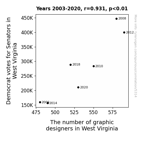
. The chart goes from 2008 to 2023, and the two variables track closely in value over that time.")

View details about correlation #5,588
Air Pollution in Deming and NatWest Group's Stock Price: A Correlation Crime or Rhyme?
As the air became cleaner in Deming, New Mexico, the local residents found themselves with a renewed sense of energy. They decided to take up a group hobby of paper airplane making and flying. This led to a surge in demand for paper, causing an unforeseen shortage. NatWest Group, unknowingly heavily invested in the paper industry, took a hit as their paper assets dwindled, ultimately leading to a decrease in their stock price (NWG). It seems like even the stock market can't escape the whims of airborne paper products!


What else correlates?
Air pollution in Deming, New Mexico · all weather
NatWest Group's stock price (NWG) · all stocks
Air pollution in Deming, New Mexico · all weather
NatWest Group's stock price (NWG) · all stocks


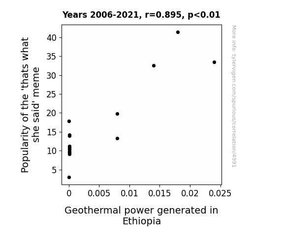
View details about correlation #4,991
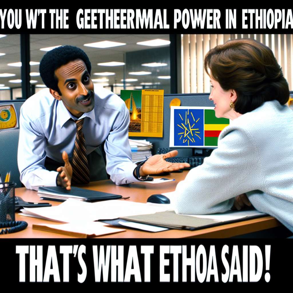
That's Hot: Exploring the Relationship Between the 'That's What She Said' Meme Popularity and Geothermal Power Generation in Ethiopia
As the 'that's what she said' jokes spread, they created more hot air which ultimately led to an increase in demand for geothermal power in Ethiopia to harness all that extra energy.
What else correlates?
Popularity of the 'thats what she said' meme · all memes
Geothermal power generated in Ethiopia · all energy
Popularity of the 'thats what she said' meme · all memes
Geothermal power generated in Ethiopia · all energy


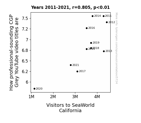
View details about correlation #5,724
The Professional Prowess of CGP Grey: Phrases and Phantoms at SeaWorld
As the sophistication of educational content rose, the tide turned for SeaWorld's attendance. It seems like as the pizzazz of CGP Grey's video titles increased, so did the lure of staying home and learning instead of splashing out on a trip to SeaWorld California. Looks like the real killer whale here is the quest for knowledge!


View details about correlation #5,066
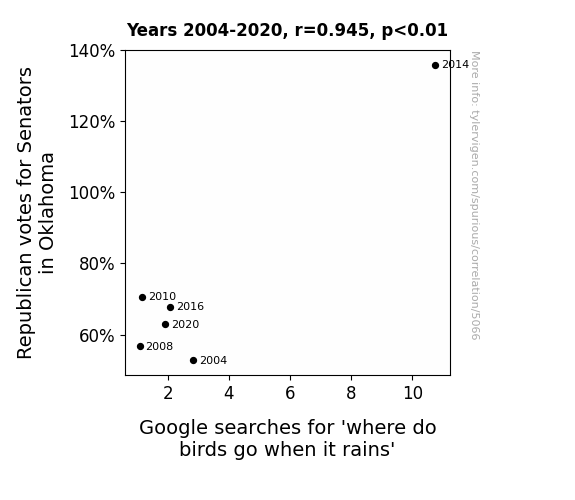
Fowl Play: Exploring the Avian Inclinations of Oklahoma Republicans through Google Queries
As more Republican Senators were elected in Oklahoma, their pro-bird policies inadvertently created a network of luxurious bird spas disguised as government buildings. This led to an uptick in avian social media influencers showcasing the opulent accommodations, sparking a trend among birds to head to these lavish havens when it rains. It seems like the secret to avian luxury retreats was simply a ballot away!


View details about correlation #4,940
The Visalia, California Air May Be a Telemarketer's Fare
As air pollution decreased in Visalia, California, the local plant life flourished. This led to an overabundance of wild shrubbery and foliage, which, coincidentally, happened to be the preferred habitat of the elusive telemarketerus annoyus species. The flourishing greenery attracted these telemarketers away from their phones and into the lush, natural call centers, where they could be heard in the distance discussing the latest in leafy opportunities. It seems that for these telemarketers, the grass was literally greener on the other side of the line. As a result, their numbers dwindled in the man-made urban jungle of California's telemarketing industry.

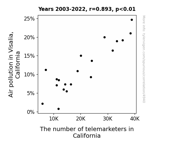
What else correlates?
Air pollution in Visalia, California · all weather
The number of telemarketers in California · all cccupations
Air pollution in Visalia, California · all weather
The number of telemarketers in California · all cccupations


View details about correlation #4,997
The Kermit Meme Jumps Over Jet Fuel: A Muppet-ty Relation Between Online Popularity and Niger's Energy Usage
As the 'kermit' meme gained traction, more people couldn't help but caption it with "But that's none of my business," leading to a surge in internet traffic. This increase in data usage inadvertently boosted the demand for power, causing a ripple effect in the energy market. The jet fuel industry in Niger found itself unexpectedly taking off, proving that when it comes to influencing global trends, the 'kermit' meme really knows how to fuel the fire.
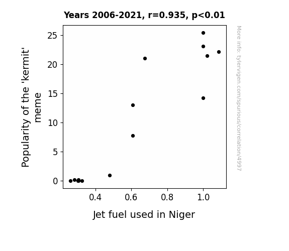
What else correlates?
Popularity of the 'kermit' meme · all memes
Jet fuel used in Niger · all energy
Popularity of the 'kermit' meme · all memes
Jet fuel used in Niger · all energy


View details about correlation #5,657
Out of This World Earnings: The Interstellar Influence of SciShow Space Video Titles on Rafael Nadal's ATP Tour Profits
The more captivating titles lead to increased dopamine levels, sparking unbridled motivation in Nadal's brain, and ultimately enhancing his focus and performance on the court. This unseen psychological edge propels him to secure more victories, thus boosting his ATP Tour earnings. Who knew that a good YouTube video title could indirectly contribute to the thrill of tennis success? It's a smash hit for both science enthusiasts and sports fans alike!

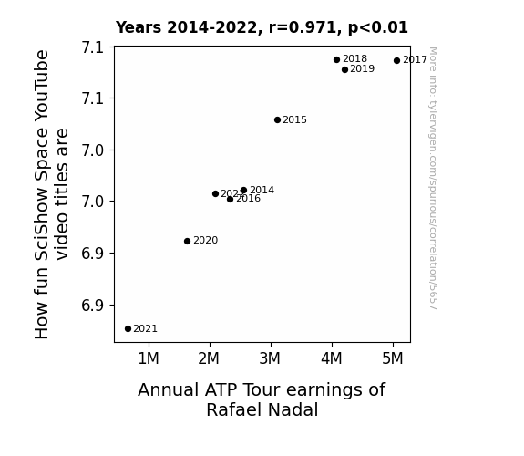
What else correlates?
How fun SciShow Space YouTube video titles are · all YouTube
Annual ATP Tour earnings of Rafael Nadal · all weird & wacky
How fun SciShow Space YouTube video titles are · all YouTube
Annual ATP Tour earnings of Rafael Nadal · all weird & wacky


View details about correlation #5,109
In West Virginia, Will 'Friends' Stream Drive GOP on the Scene?
The increase in Republican votes for Senators in West Virginia led to a surge in 'where can i stream friends' searches because as the political landscape shifted, so did the TV streaming options. It seems the race to stream Friends was really heating up, and just like a political campaign, everyone wanted to be in the winning party when it came to accessing their favorite sitcom. It's a classic case of red states, blue states, and all the streaming debates in between! Looks like in this election, the people of West Virginia weren't just voting for their Senators, they were also casting their ballots for the best way to enjoy some Central Perk camaraderie.


View details about correlation #5,016
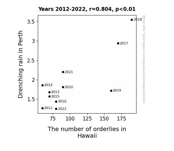
A Pacific Connection: From Drenched in Rain to Ordering in Hawaii
As we all know, Drenching rain in Perth leads to an increase in the production of boomerangs. This in turn creates a high demand for boomerang-related injuries, which prompts the need for more orderlies in Hawaii to deal with the influx of patients. You could say it's a boomerang effect - the rain in Perth is keeping the healthcare system in Hawaii busy!

What else correlates?
Drenching rain in Perth · all weather
The number of orderlies in Hawaii · all cccupations
Drenching rain in Perth · all weather
The number of orderlies in Hawaii · all cccupations


View details about correlation #4,996
Shining a Light on the Web: The Arachnid Meme and Solar Power in Egypt
As the 'spiderman pointing' meme gained traction, it led to a surge in internet usage. This increased demand for electricity, prompting Egypt to invest more in solar power to keep up with the 'wattage' needed to power the meme phenomenon. In a truly 'renewable' turn of events, it seems that even Spidey can't resist pointing towards a brighter, sun-powered future for Egypt!

What else correlates?
Popularity of the 'spiderman pointing' meme · all memes
Solar power generated in Egypt · all energy
Popularity of the 'spiderman pointing' meme · all memes
Solar power generated in Egypt · all energy


View details about correlation #5,611
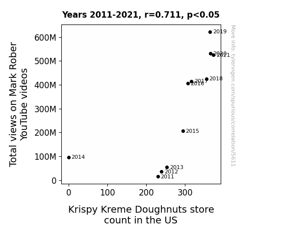
Doughnuts and Data: The Correlation between Mark Rober's Views and Krispy Kreme Store Count in the US
As Mark Rober's YouTube channel gained more views, his fans were filled with a newfound zest for life. This led to a spike in demand for sugary delights, prompting Krispy Kreme to open more stores and spread the joy of doughnuts far and wide. After all, when Mark's viewership goes up, it's only natural for the doughnut industry to rise to the occasion!
What else correlates?
Total views on Mark Rober YouTube videos · all YouTube
Krispy Kreme Doughnuts store count in the US · all weird & wacky
Total views on Mark Rober YouTube videos · all YouTube
Krispy Kreme Doughnuts store count in the US · all weird & wacky


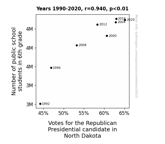
View details about correlation #5,815
Counting on the Correlation: A Study of the Republican Presidential Votes in North Dakota and the Number of 6th Grade Public School Students
As the 6th graders learned about the electoral process, they became adept at counting, prompting a surge in support for the Republican candidate. It seems like these students really know how to "count on" the GOP!


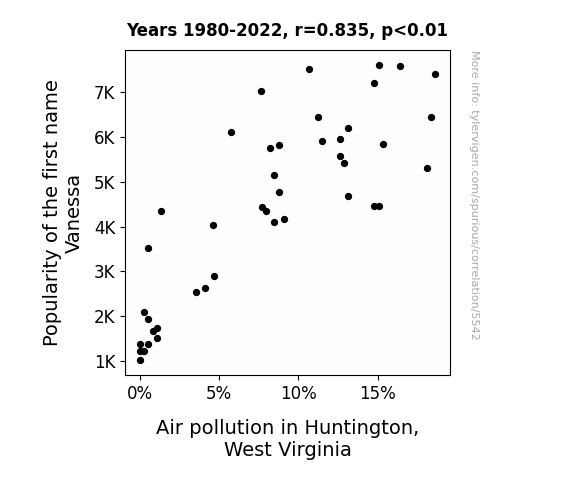
View details about correlation #5,542
Name Pollution: The Vanessance of Air Quality in Huntington, WV
Fewer Vanessas meant fewer personalized air fresheners being used, leading to a slight improvement in local air quality.
What else correlates?
Popularity of the first name Vanessa · all first names
Air pollution in Huntington, West Virginia · all weather
Popularity of the first name Vanessa · all first names
Air pollution in Huntington, West Virginia · all weather


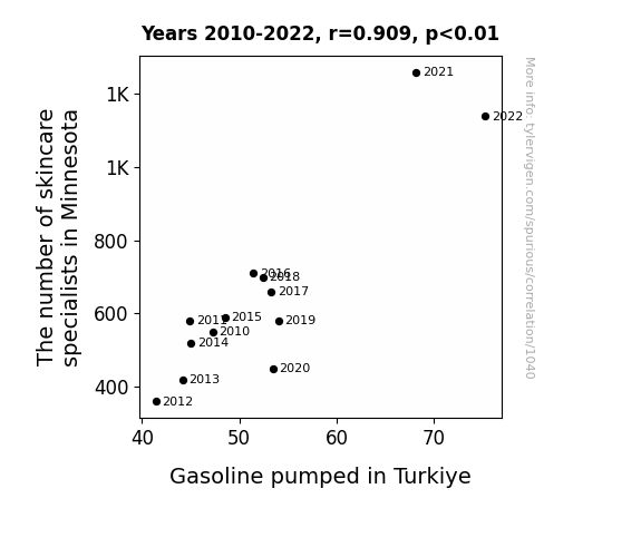
View details about correlation #1,040
As the skincare specialists in Minnesota honed their craft, they inadvertently discovered a revolutionary new skincare ingredient: essence of petroleum. This skyrocketed the demand for gasoline in Turkiye, as people couldn't wait to slather themselves in the latest fuel-based skincare products. The unexpected boom in gasoline sales left everyone in Turkiye feeling not just smooth and moisturized, but also utterly baffled by the strange connection to the faraway land of Minnesota.
What else correlates?
The number of skincare specialists in Minnesota · all cccupations
Gasoline pumped in Turkiye · all energy
The number of skincare specialists in Minnesota · all cccupations
Gasoline pumped in Turkiye · all energy


View details about correlation #5,228
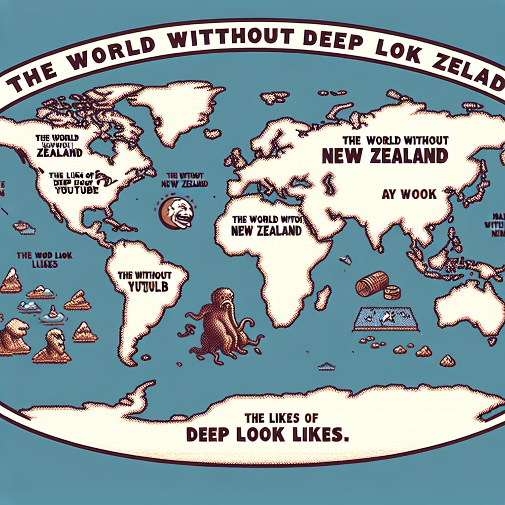
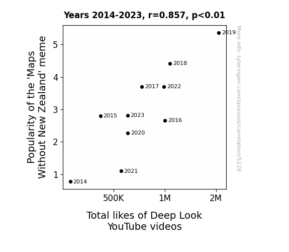
Mapping the Meme: Exploring the Relationship between the Popularity of 'Maps Without New Zealand' and Total Likes of Deep Look YouTube Videos
People were so disoriented by the inaccurate maps that they found themselves seeking out educational content to reorient themselves. As a result, the deep-seated need for geographical correctness led to a surge in likes for Deep Look videos. Who knew that leaving New Zealand off a map could navigate people towards hitting the like button for microscopic animal videos?
What else correlates?
Popularity of the 'Maps Without New Zealand' meme · all memes
Total likes of Deep Look YouTube videos · all YouTube
Popularity of the 'Maps Without New Zealand' meme · all memes
Total likes of Deep Look YouTube videos · all YouTube


View details about correlation #5,810
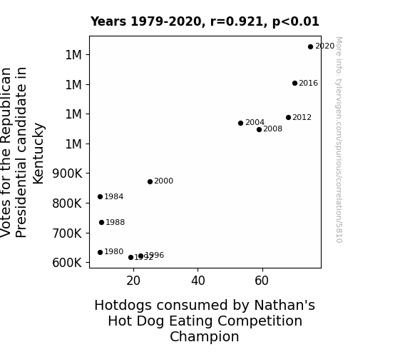
Correlating Consumed Hotdogs and Conservative Votes: A Cacophony of Culinary and Political Connections
The excitement from the election results raised everyone's heart rates, leading to an increased demand for delicious hotdogs!


View details about correlation #5,672
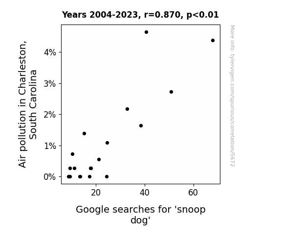
Smog Dog: Uncovering the Link Between Air Pollution in Charleston, South Carolina, and Searches for Snoop Dogg
The decrease in air pollution led to clearer skies, which inspired Snoop Dogg to release a new album all about that fresh, clean Charleston air. It's like they say, "When the air is cleaner, Snoop Dogg is leaner - with his rhymes, of course!"

What else correlates?
Air pollution in Charleston, South Carolina · all weather
Google searches for 'snoop dog' · all google searches
Air pollution in Charleston, South Carolina · all weather
Google searches for 'snoop dog' · all google searches
Why this works
- Data dredging: I have 25,237 variables in my database. I compare all these variables against each other to find ones that randomly match up. That's 636,906,169 correlation calculations! This is called “data dredging.”
Fun fact: the chart used on the wikipedia page to demonstrate data dredging is also from me. I've been being naughty with data since 2014.
Instead of starting with a hypothesis and testing it, I instead tossed a bunch of data in a blender to see what correlations would shake out. It’s a dangerous way to go about analysis, because any sufficiently large dataset will yield strong correlations completely at random. - Lack of causal connection: There is probably no direct connection between these variables, despite what the AI says above.
Because these pages are automatically generated, it's possible that the two variables you are viewing are in fact causually related. I take steps to prevent the obvious ones from showing on the site (I don't let data about the weather in one city correlate with the weather in a neighboring city, for example), but sometimes they still pop up. If they are related, cool! You found a loophole.
This is exacerbated by the fact that I used "Years" as the base variable. Lots of things happen in a year that are not related to each other! Most studies would use something like "one person" in stead of "one year" to be the "thing" studied. - Observations not independent: For many variables, sequential years are not independent of each other. You will often see trend-lines form. If a population of people is continuously doing something every day, there is no reason to think they would suddenly change how they are doing that thing on January 1. A naive p-value calculation does not take this into account.
You will calculate a lower chance of "randomly" achieving the result than represents reality.
To be more specific: p-value tests are probability values, where you are calculating the probability of achieving a result at least as extreme as you found completely by chance. When calculating a p-value, you need to assert how many "degrees of freedom" your variable has. I count each year (minus one) as a "degree of freedom," but this is misleading for continuous variables.
This kind of thing can creep up on you pretty easily when using p-values, which is why it's best to take it as "one of many" inputs that help you assess the results of your analysis.
- Y-axes doesn't start at zero: I truncated the Y-axes of the graphs above. I also used a line graph, which makes the visual connection stand out more than it deserves.
Nothing against line graphs. They are great at telling a story when you have linear data! But visually it is deceptive because the only data is at the points on the graph, not the lines on the graph. In between each point, the data could have been doing anything. Like going for a random walk by itself!
Mathematically what I showed is true, but it is intentionally misleading. If you click on any of the charts that abuse this, you can scroll down to see a version that starts at zero. - Confounding variable: Confounding variables (like global pandemics) will cause two variables to look connected when in fact a "sneaky third" variable is influencing both of them behind the scenes.
- Outliers: Some datasets here have outliers which drag up the correlation.
In concept, "outlier" just means "way different than the rest of your dataset." When calculating a correlation like this, they are particularly impactful because a single outlier can substantially increase your correlation.
Because this page is automatically generated, I don't know whether any of the charts displayed on it have outliers. I'm just a footnote. ¯\_(ツ)_/¯
I intentionally mishandeled outliers, which makes the correlation look extra strong. - Low n: There are not many data points included in some of these charts.
You can do analyses with low ns! But you shouldn't data dredge with a low n.
Even if the p-value is high, we should be suspicious of using so few datapoints in a correlation.
Pro-tip: click on any correlation to see:
- Detailed data sources
- Prompts for the AI-generated content
- Explanations of each of the calculations (correlation, p-value)
- Python code to calculate it yourself


