spurious correlations
discover · random · spurious scholar
← previous page · next page →


View details about correlation #5,908
What else correlates?
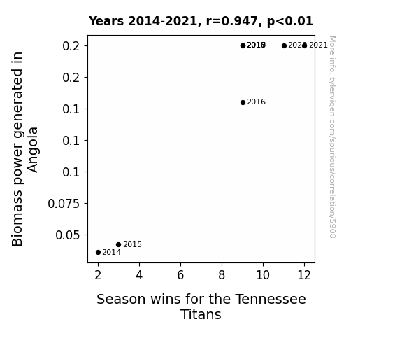
Biomass power generated in Angola · all energy
Season wins for the Tennessee Titans · all sports
Biomass power generated in Angola · all energy
Season wins for the Tennessee Titans · all sports


View details about correlation #4,970
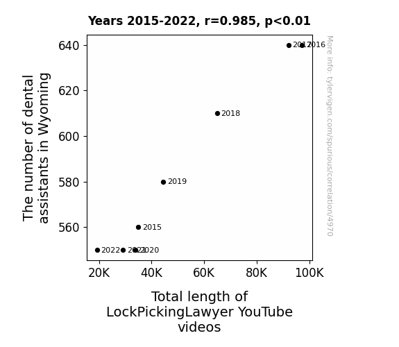
The Dental Assistants-Dentally Picked Connection: A Statistical Analysis of Dental Assistants in Wyoming and LockPickingLawyer YouTube Videos
Well, as the number of dental assistants in Wyoming increased, so did their access to tiny, intricate tools on a daily basis. This inadvertently sparked a trend of incredibly efficient and precise lock picking among dental professionals. The LockPickingLawyer, realizing the potential of this untapped market, began creating longer and more elaborate videos to cater to this newfound audience of dental superstars with a knack for getting to the root of any lock problem. The result? A surge in total length of LockPickingLawyer YouTube videos, all thanks to the dental assistants of Wyoming showing off their unexpected lock-picking prowess between appointments!

What else correlates?
The number of dental assistants in Wyoming · all cccupations
Total length of LockPickingLawyer YouTube videos · all YouTube
The number of dental assistants in Wyoming · all cccupations
Total length of LockPickingLawyer YouTube videos · all YouTube


View details about correlation #4,931
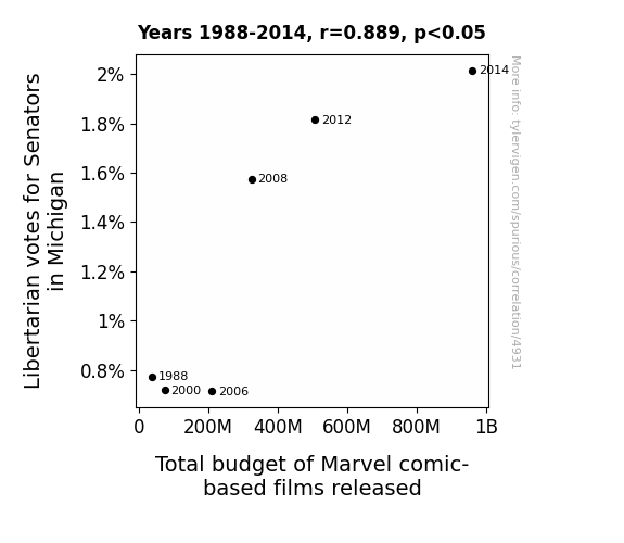
Libertarian Locomotion: The Superhuman Relationship Between Libertarian Votes for Senators in Michigan and the Budget of Marvel Comic-Based Films Released
The increase in Libertarian votes for Senators in Michigan led to a rise in demand for a more “superhero-less” government, prompting Marvel to fill the void with an expanded cinematic universe. As more politicians embraced individual freedom, Marvel saw it as a signal to unleash a new slate of films, ensuring that even their budget had the power to Hulk-smash previous records. It seems like in this case, when it came to movie budgets, the Wolverines of Michigan were saying, “Make mine Marvel-ous!”


View details about correlation #5,435
Dark Matter: Investigating the Relationship Between Air Pollution in Augusta and Searches for 'Black Holes' on Google
Fewer pollutants means there's less murky matter for black holes to blend in with, making them easier to spot. As the air cleared, people realized they didn't need telescopes to observe celestial phenomena - they could just step outside and look up! Plus, with cleaner air, black holes may have decided to take a vacation to more smog-choked parts of the universe, where they feel they really belong. Or maybe the pollution was just the cosmic dust and gas they needed to thrive, and without it, they packed their bags and drifted off to space where they could find a denser atmosphere to hang out in. Who knew that all this time, black holes were just interstellar air quality connoissejsons?

What else correlates?
Air pollution in Augusta, Georgia · all weather
Google searches for 'black holes' · all google searches
Air pollution in Augusta, Georgia · all weather
Google searches for 'black holes' · all google searches


View details about correlation #5,626
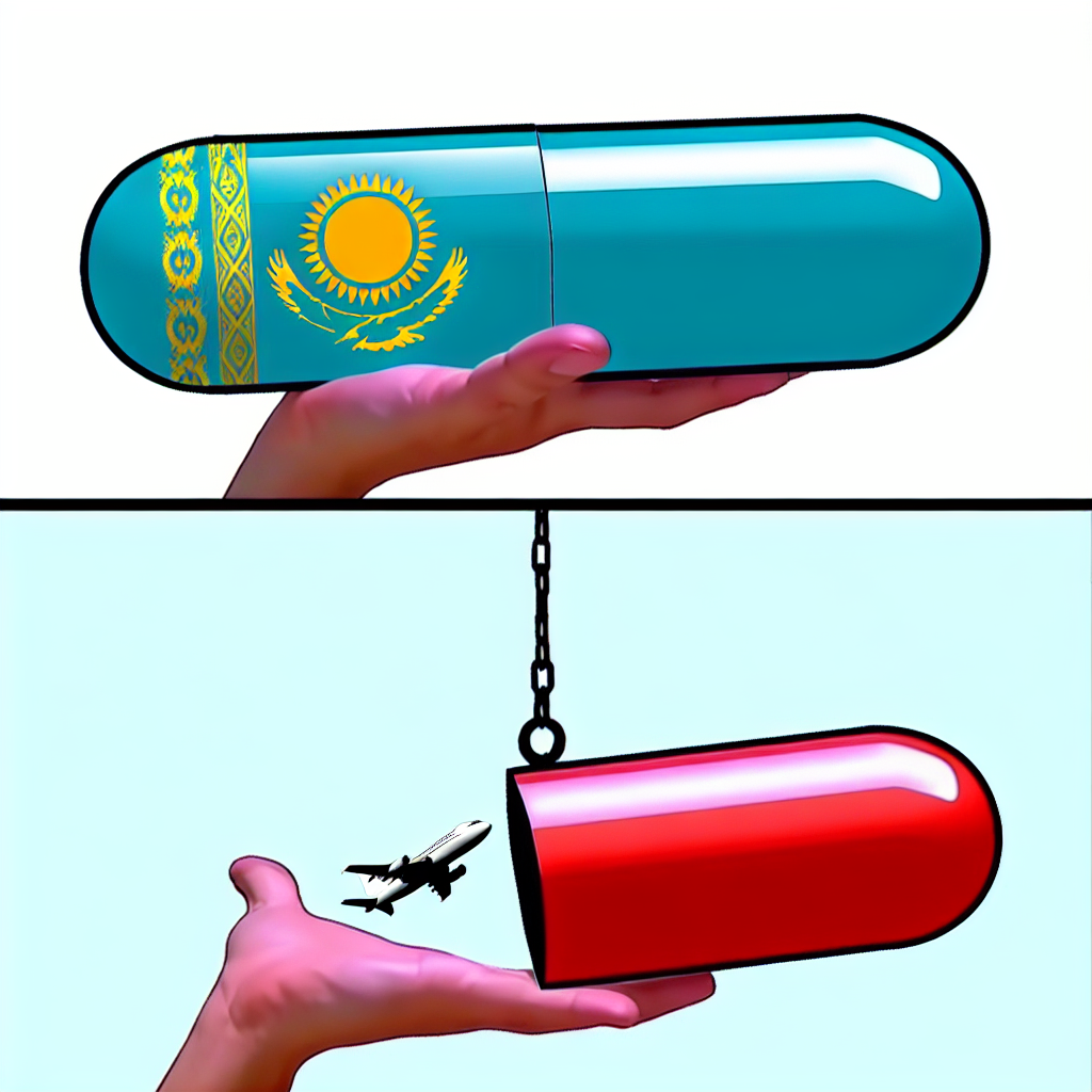
The Bitter Pill and the Fuel Spill: Exploring the Unlikely Connection Between the 'Hard Pills to Swallow' Meme Popularity and Jet Fuel Consumption in Kazakhstan
As the 'hard pills to swallow' meme gained traction, it created a surge in people re-evaluating their beliefs. This led to a sudden realization that the true source of untapped energy wasn't coal or oil, but actually the unburnt truths lying dormant in Kazakhstan. As more and more individuals grappled with these 'hard pills,' an unexpected byproduct emerged - a collective awakening to the potential of jet fuel derived from Kazakhstan's distilled, unadulterated truths. It's safe to say that meme culture inadvertently ignited a fiery revolution in the aviation industry, propelling Kazakhstan to new heights of influence, one truth bomb at a time! This meme was indeed a tough one to swallow, but it jet-fueled a whole nation's perspective.

What else correlates?
Popularity of the 'hard pills to swallow' meme · all memes
Jet fuel used in Kazakhstan · all energy
Popularity of the 'hard pills to swallow' meme · all memes
Jet fuel used in Kazakhstan · all energy


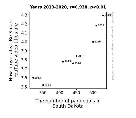
View details about correlation #5,309
The YouTube Boob Tube Swoop and Paralegal Group: An Odd Correlation.
As the number of paralegals in South Dakota rises, so does their passion for legal matters. This passion inadvertently spills over into the YouTube video creation industry, leading to an influx of provocatively titled Be Smart videos. It's a legal-icious cycle of titillating titling, where the law of attraction meets the fine print of clickbait!


View details about correlation #5,565
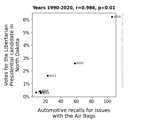
Air Bags and Ballots: Exploring the Political Influence on Automotive Recalls in North Dakota
As more and more people embraced the idea of individual freedom, the very essence of vehicular autonomy became energized. This surge in libertarian support sent shockwaves through the automotive industry, triggering a chain reaction that airbag manufacturers simply couldn't contain. It was as if the cars themselves were demanding the right to choose when to deploy their airbags, leading to a recall epidemic as the vehicles rebelled against any form of centralized airbag control. The intersection of political ideology and vehicular safety had never been more explosive!


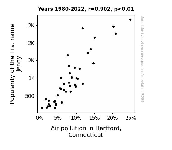
View details about correlation #5,285
The Jenny Effect: A Breath of Fresh Air or Just a Name in the Wind?
As the popularity of the name Jenny decreased, so did the number of people singing “867-5309/Jenny” by Tommy Tutone. This led to a reduction in outdoor gatherings, ultimately decreasing the amount of hot air being released. With fewer social events, there was less need for transportation, resulting in a noticeable decrease in air pollution in Hartford. It seems like the connection between Jenny and cleaner air was simply a matter of hitting the right note!

What else correlates?
Popularity of the first name Jenny · all first names
Air pollution in Hartford, Connecticut · all weather
Popularity of the first name Jenny · all first names
Air pollution in Hartford, Connecticut · all weather


View details about correlation #5,561
Meme Mania: Exploring the LPG-Popularity Paranoia Paradigm
As the 'change my mind' meme gained traction, more people engaged in heated debates. This led to a rise in hot air production, creating increased demand for Liquefied petroleum gas in Suriname to power all the fiery discussions.

What else correlates?
Popularity of the 'change my mind' meme · all memes
Liquefied petroleum gas used in Suriname · all energy
Popularity of the 'change my mind' meme · all memes
Liquefied petroleum gas used in Suriname · all energy


View details about correlation #5,750
The Space-Time Continuum: Exploring the Quantum Entanglement between PBS Space Time Video Titles and the Employment of Advertising Sales Agents in Maryland
More interstellar ad space means hiring more celestial sales professionals to skyrocket their revenue streams. As PBS Space Time videos launch into the digital universe, it creates a gravitational pull for ad agents in Maryland, propelling them to reach for the stars of success. It's a quantum entanglement of marketing and space exploration, where every ad sale is simply out of this world!


View details about correlation #5,341
Got Milk Votes? The Udderly Surprising Correlation Between Annual US Household Spending on Fresh Milk and Cream and Votes for the Democrat Presidential Candidate in Idaho
The additional consumption of calcium from the fresh milk and cream led to the development of stronger bones. This inadvertently made the residents more inclined to step out and participate in community events, including voting. After all, you need sturdy bones to stand in those long voting lines! Remember, strong calcium, strong voter turnout!


View details about correlation #5,242
Scooby Doo, Where's the Air? Investigating the Correlation Between Air Quality in Savannah, Georgia and Google Searches for Everyone's Favorite Mystery-Solving Great Dane
As the air quality in Savannah, Georgia improved, more people ventured outdoors. With each breath of cleaner air, they found themselves subconsciously channeling their inner Shaggy and exclaiming "Zoinks!" This led to a spike in nostalgia for the classic cartoon and a subsequent increase in online searches for 'Scooby Doo, where are you?' as residents unmasked their love for the mystery-solving Great Dane. The connection becomes as clear as the reveal at the end of every episode – fresher air, and a surge in Scooby-Doo mania had joined forces, creating a mystery even the gang would have been eager to solve!

What else correlates?
Air quality in Savannah, Georgia · all weather
Google searches for 'scooby doo where are you' · all google searches
Air quality in Savannah, Georgia · all weather
Google searches for 'scooby doo where are you' · all google searches


View details about correlation #5,563
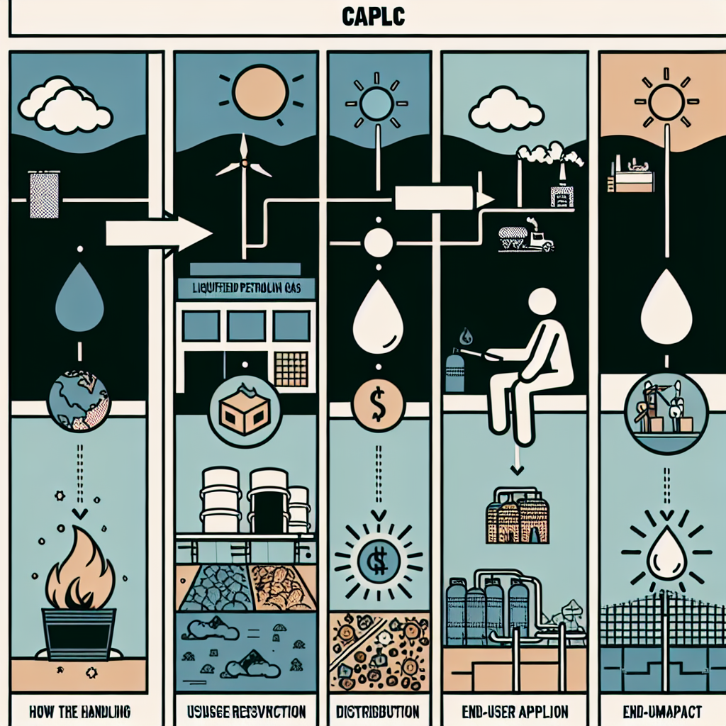
Gasoline and Chagrin: The LPG Connection to the Loss Meme's Ascension
As the 'loss' meme gained traction, it led to more people gasping for air in laughter. This collective increase in breaths taken created a higher demand for Liquefied Petroleum Gas in Albania as people couldn't help but fuel their meme obsession with frequent cooking and grilling sessions. It seems the meme not only caused a stir online but also sparked a flaming hot connection to the LPG industry in Albania, truly turning the tables on what fuels popular culture!
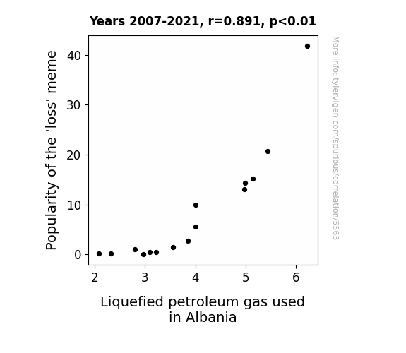
What else correlates?
Popularity of the 'loss' meme · all memes
Liquefied petroleum gas used in Albania · all energy
Popularity of the 'loss' meme · all memes
Liquefied petroleum gas used in Albania · all energy


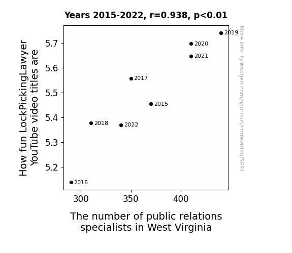
View details about correlation #5,691
Shtick Picks & PR Flicks: The Link Between LockPickingLawyer Video Titles and Public Relations Specialists in West Virginia
The more public relations specialists in West Virginia, the greater the demand for captivating content. As these specialists work to promote LockPickingLawyer's videos, they realize the importance of catchy titles in capturing audience attention. The competition among PR specialists leads to a surge in creativity, prompting the LockPickingLawyer to up the fun factor in his video titles to stand out. It's a PR power play that's inadvertently making lock picking seem like the coolest thing since sliced bread.


View details about correlation #5,357
A Study of Libertarian Electorate and Cyber State: Can Webs Unravel Votes?
As more Libertarian-leaning individuals were elected, they advocated for less government regulation, including in the tech industry. This led to a surge in internet startups and a proliferation of niche websites dedicated to everything from homemade cheese curds to the art of dairy farming. With a freer internet landscape, Wisconsinites embraced their newfound online presence, creating a virtual cheese paradise and sparking a digital revolution in America's Dairyland.
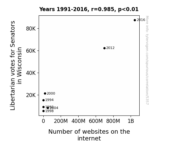
What else correlates?
Votes for Libertarian Senators in Wisconsin · all elections
Number of websites on the internet · all weird & wacky
Votes for Libertarian Senators in Wisconsin · all elections
Number of websites on the internet · all weird & wacky


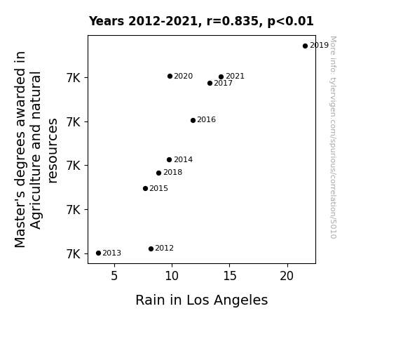
View details about correlation #5,010
The Harvest of Higher Learning: Master's Degrees in Agriculture and Natural Resources and the Rain Dance of Los Angeles
As the number of people mastering agriculture and natural resources grew, their expertise literally began to precipitate. It seems they truly had a rain-making *degree* and were branching out into weather control. It goes to show that when it comes to bringing showers to the West Coast, these graduates were really *crop*ping up as experts!

What else correlates?
Master's degrees awarded in Agriculture and natural resources · all education
Rain in Los Angeles · all weather
Master's degrees awarded in Agriculture and natural resources · all education
Rain in Los Angeles · all weather


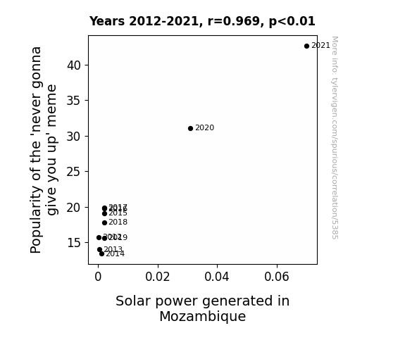
View details about correlation #5,385
Shining a Light on the Connection between Never Gonna Give You Up Meme Popularity and Solar Power Generation in Mozambique
As the 'never gonna give you up' meme gained traction, it led to a surge in internet traffic. This increase in online activity somehow created a ripple effect, ultimately boosting the morale of solar power technicians in Mozambique. The technicians, unknowingly energized by the catchy tune, worked with renewed enthusiasm and efficiency, ultimately leading to a surprising increase in solar power generated. It's as if the meme's lighthearted spirit covertly brightened up the nation, one solar panel at a time.
What else correlates?
Searches for 'never gonna give you up' · all memes
Solar power generated in Mozambique · all energy
Searches for 'never gonna give you up' · all memes
Solar power generated in Mozambique · all energy


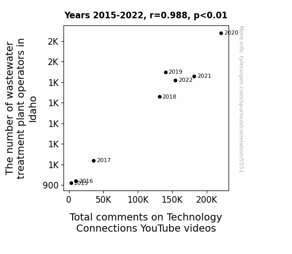
View details about correlation #5,551
Flushed with Comments: The Correlation Between Wastewater Treatment Plant Operators in Idaho and Total Comments on Technology Connections YouTube Videos
As the number of wastewater treatment plant operators in Idaho increased, so did the Total comments on Technology Connections YouTube videos. This may be due to the stimulating nature of wastewater treatment, leading to a heightened interest in technological connections. It's possible that delving into the world of H2O management sparked a cascade of thoughts and discussions, flowing into the realm of technology. The influx of operators may have irrigated a fertile ground for tech-related inquiries, creating a bubbling cesspool of commentary. It seems that as Idaho focuses on cleaner water, the online discussions on Technology Connections have also become refreshingly robust.


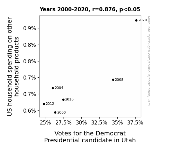
View details about correlation #5,079
Spending Green: The Democratic Effect on Utah Household Product Purchases
As US household spending on other household products increased, more families in Utah were able to afford high-quality mops. The sparkly clean floors inspired a wave of support for the Democrat Presidential candidate, leading to an unexpected surge in votes. Remember, a polished platform and spotless policies really sweep voters off their feet!


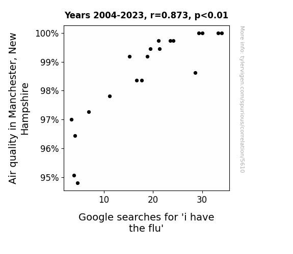
View details about correlation #5,610
Flu-Glue: The Relationship Between Air Quality in Manchester, New Hampshire and Google Searches for 'I Have the Flu'
The crisp, clean air in Manchester, New Hampshire inspired people to engage in vigorous outdoor activities like snowshoeing and ice skating. Unfortunately, their exuberant activity levels led to a surge in accidental collisions and falls, creating the perfect environment for the flu virus to spread. Remember, even a flu shot can't protect you from a well-aimed snowball to the face! Stay safe out there, folks.

What else correlates?
Air quality in Manchester, New Hampshire · all weather
Google searches for 'i have the flu' · all google searches
Air quality in Manchester, New Hampshire · all weather
Google searches for 'i have the flu' · all google searches
Why this works
- Data dredging: I have 25,237 variables in my database. I compare all these variables against each other to find ones that randomly match up. That's 636,906,169 correlation calculations! This is called “data dredging.”
Fun fact: the chart used on the wikipedia page to demonstrate data dredging is also from me. I've been being naughty with data since 2014.
Instead of starting with a hypothesis and testing it, I instead tossed a bunch of data in a blender to see what correlations would shake out. It’s a dangerous way to go about analysis, because any sufficiently large dataset will yield strong correlations completely at random. - Lack of causal connection: There is probably no direct connection between these variables, despite what the AI says above.
Because these pages are automatically generated, it's possible that the two variables you are viewing are in fact causually related. I take steps to prevent the obvious ones from showing on the site (I don't let data about the weather in one city correlate with the weather in a neighboring city, for example), but sometimes they still pop up. If they are related, cool! You found a loophole.
This is exacerbated by the fact that I used "Years" as the base variable. Lots of things happen in a year that are not related to each other! Most studies would use something like "one person" in stead of "one year" to be the "thing" studied. - Observations not independent: For many variables, sequential years are not independent of each other. You will often see trend-lines form. If a population of people is continuously doing something every day, there is no reason to think they would suddenly change how they are doing that thing on January 1. A naive p-value calculation does not take this into account.
You will calculate a lower chance of "randomly" achieving the result than represents reality.
To be more specific: p-value tests are probability values, where you are calculating the probability of achieving a result at least as extreme as you found completely by chance. When calculating a p-value, you need to assert how many "degrees of freedom" your variable has. I count each year (minus one) as a "degree of freedom," but this is misleading for continuous variables.
This kind of thing can creep up on you pretty easily when using p-values, which is why it's best to take it as "one of many" inputs that help you assess the results of your analysis.
- Y-axes doesn't start at zero: I truncated the Y-axes of the graphs above. I also used a line graph, which makes the visual connection stand out more than it deserves.
Nothing against line graphs. They are great at telling a story when you have linear data! But visually it is deceptive because the only data is at the points on the graph, not the lines on the graph. In between each point, the data could have been doing anything. Like going for a random walk by itself!
Mathematically what I showed is true, but it is intentionally misleading. If you click on any of the charts that abuse this, you can scroll down to see a version that starts at zero. - Confounding variable: Confounding variables (like global pandemics) will cause two variables to look connected when in fact a "sneaky third" variable is influencing both of them behind the scenes.
- Outliers: Some datasets here have outliers which drag up the correlation.
In concept, "outlier" just means "way different than the rest of your dataset." When calculating a correlation like this, they are particularly impactful because a single outlier can substantially increase your correlation.
Because this page is automatically generated, I don't know whether any of the charts displayed on it have outliers. I'm just a footnote. ¯\_(ツ)_/¯
I intentionally mishandeled outliers, which makes the correlation look extra strong. - Low n: There are not many data points included in some of these charts.
You can do analyses with low ns! But you shouldn't data dredge with a low n.
Even if the p-value is high, we should be suspicious of using so few datapoints in a correlation.
Pro-tip: click on any correlation to see:
- Detailed data sources
- Prompts for the AI-generated content
- Explanations of each of the calculations (correlation, p-value)
- Python code to calculate it yourself


