spurious correlations
discover · random · spurious scholar
← previous page · next page →


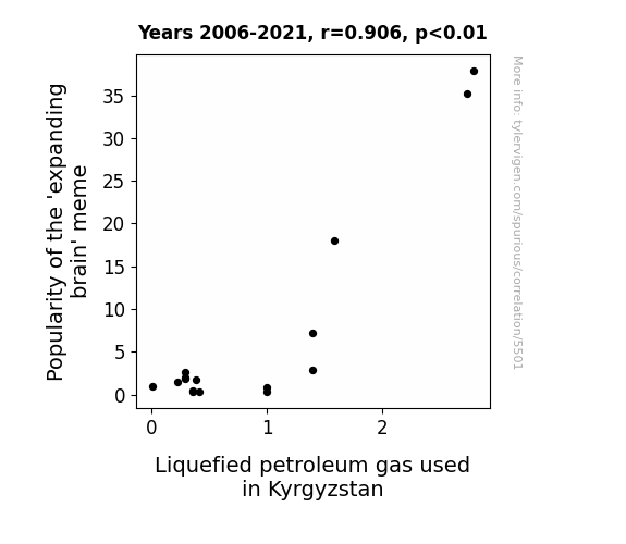
View details about correlation #5,501
From Small Brain to Big Gas: Uncovering the Link Between 'Expanding Brain' Meme Popularity and Liquefied Petroleum Gas Usage in Kyrgyzstan
As the 'expanding brain' meme gained popularity, more people were exposed to larger and larger brain images. This led to a collective increase in brain size perception, ultimately causing a spike in innovative thinking. One of these big ideas was to harness the power of memes to promote the use of liquefied petroleum gas in Kyrgyzstan, leading to a surge in its usage. So, in a truly mind-blowing chain of events, you could say that the meme literally expanded minds and ignited a fiery interest in LPG in Kyrgyzstan!

What else correlates?
Popularity of the 'expanding brain' meme · all memes
Liquefied petroleum gas used in Kyrgyzstan · all energy
Popularity of the 'expanding brain' meme · all memes
Liquefied petroleum gas used in Kyrgyzstan · all energy


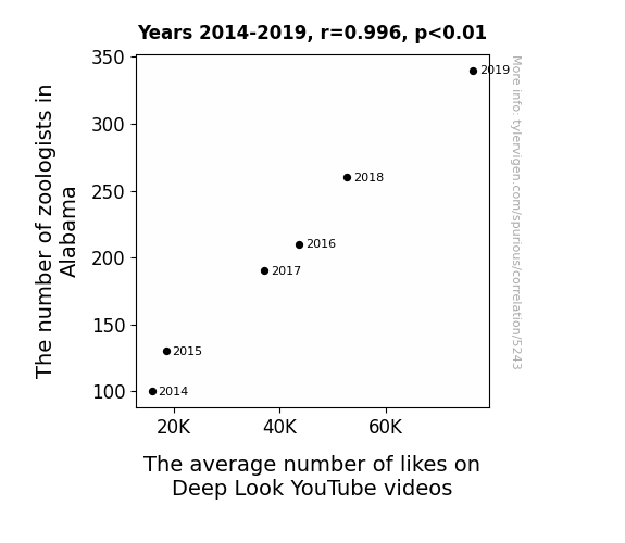
View details about correlation #5,243
Zoologist Likes: A Pawsitively Correlational Study
As the number of zoologists in Alabama increased, so did the local appreciation for wildlife. This heightened interest in all things furry, scaly, and feathered naturally led to a greater viewership and engagement with Deep Look videos, ultimately boosting the average number of likes. The zoologists may not have been directly studying YouTube behavior, but their passion for critters inadvertently unleashed a tidal wave of digital wildlife love. It's a zoologist takeover, one click at a time!

What else correlates?
The number of zoologists in Alabama · all cccupations
The average number of likes on Deep Look YouTube videos · all YouTube
The number of zoologists in Alabama · all cccupations
The average number of likes on Deep Look YouTube videos · all YouTube


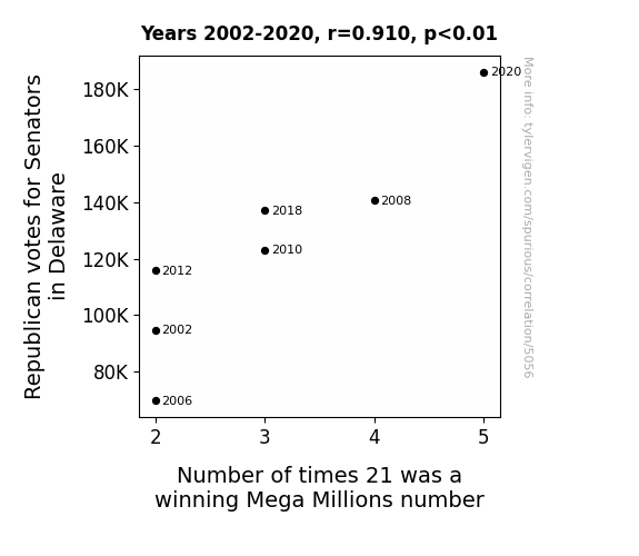
View details about correlation #5,056
Rolling the Dice: The Unlikely Link Between Republican Votes in Delaware and the Frequency of 21 as a Winning Mega Millions Number
It's a little-known fact that the collective positive energy from the Republican voters in Delaware was inadvertently influencing the outcome of the Mega Millions lottery. Their shared belief in conservative principles somehow aligned with the probability of 21 being drawn as the winning number. Who would've thought that political participation could have such a direct impact on lottery results? It's a statistical anomaly that's as puzzling as it is amusing!


View details about correlation #5,466
Seeds of Stardust: The GMO Gossypium and the Cotton Cloud – A Study of the Relationship Between GMO Use in Cotton and Air Pollution in Wilmington, Ohio
The decrease in GMO use in cotton led to a reduction in the need for frequent pesticide spraying, which in turn lowered the release of volatile organic compounds into the air. This meant that in Wilmington, Ohio, they were able to breathe a little easier without the extra GMO-toxins in the air. It's a ginned-up connection, but it seems like going au naturel really helped clear the air in more ways than one!


What else correlates?
GMO use in cotton · all food
Air pollution in Wilmington, Ohio · all weather
GMO use in cotton · all food
Air pollution in Wilmington, Ohio · all weather


View details about correlation #5,769
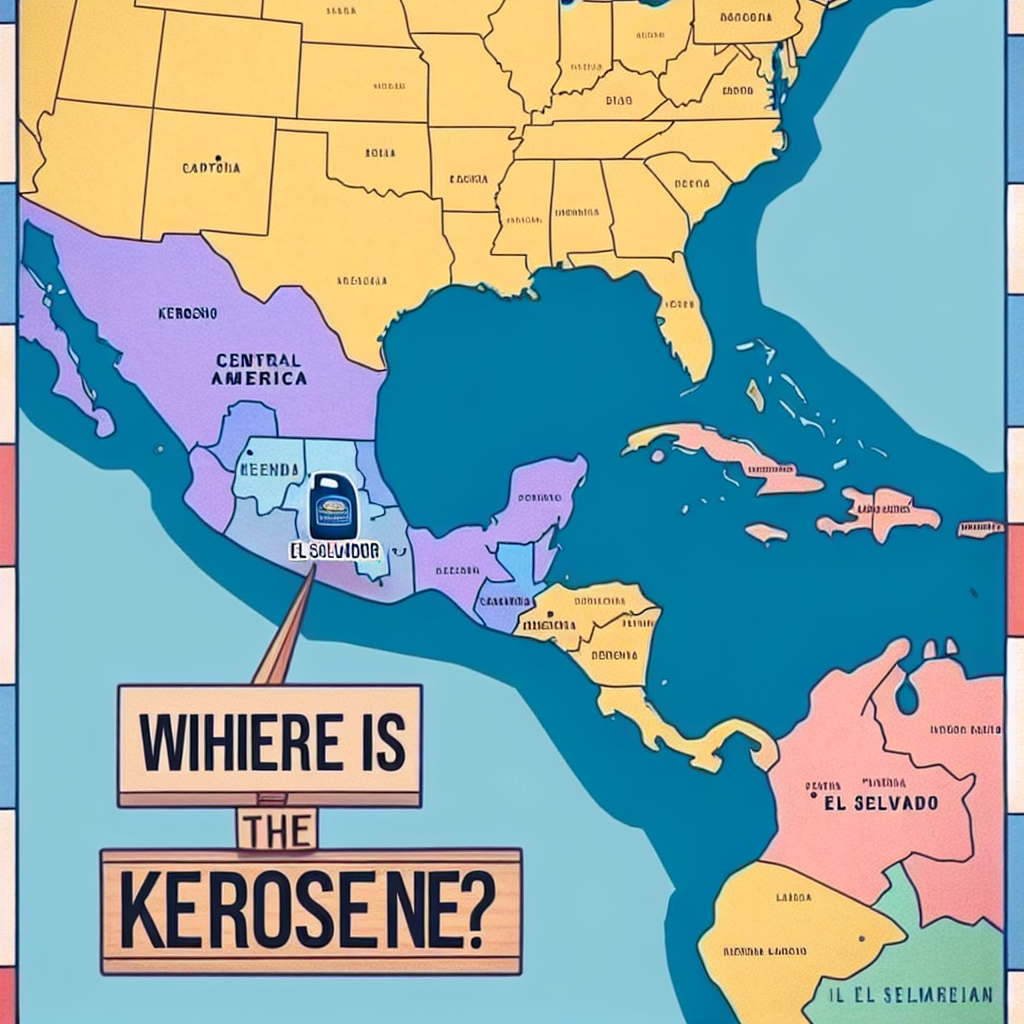
The Illuminating Connection Between 'Maps Without New Zealand' Meme Popularity and Kerosene Consumption in El Salvador: Shedding Light on Uncharted Territories
As the 'Maps Without New Zealand' meme waned in popularity, so did the demand for creating and sharing edited maps, leading to a decrease in the consumption of digital kerosene for internet trolling. This reduction in digital kerosene usage inadvertently led to a surplus of physical kerosene in El Salvador, resulting in a decrease in overall kerosene consumption as people found themselves slipping into a mild state of confusion as to whether kerosene was still a relevant topic of conversation or not, consequently leading to a decreased need for kerosene in their daily lives, as they shifted their focus to other more pressing matters, like the proper storage of socks or the correct way to microwave a burrito.

What else correlates?
Popularity of the 'Maps Without New Zealand' meme · all memes
Kerosene used in El Salvador · all energy
Popularity of the 'Maps Without New Zealand' meme · all memes
Kerosene used in El Salvador · all energy


View details about correlation #5,592
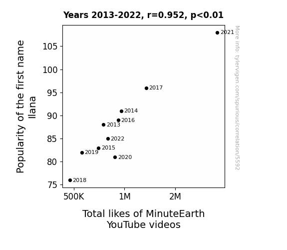
The Ilana Effect: A Statistical Analysis of the Correlation Between the Popularity of the Name Ilana and the Total Likes of MinuteEarth YouTube Videos
The name Ilana sounds like a magical incantation that unwittingly compels people to hit the like button on MinuteEarth videos. As more and more parents across the world chose this enchanting name for their children, the collective effect of all the little Ilanas out there waving their like-imbued wands in the air led to a significant uptick in video appreciation. It's as if the name itself carries a secret message to engage with and adore all things MinuteEarth, turning the digital landscape into a playground of support and affirmation. So, if you ever need a boost in your online presence, just sprinkle a dash of Ilana in the mix and watch the likes multiply like magic!

What else correlates?
Popularity of the first name Ilana · all first names
Total likes of MinuteEarth YouTube videos · all YouTube
Popularity of the first name Ilana · all first names
Total likes of MinuteEarth YouTube videos · all YouTube


View details about correlation #5,035
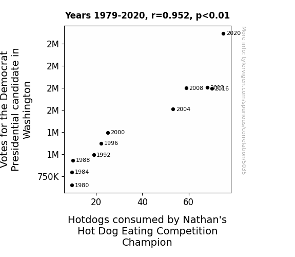
The Ballot and the Bun: An Examination of the Correlation between Democratic Votes in Washington State and Hotdog Consumption by Nathan's Hot Dog Eating Competition Champion
Every democratic vote cast created a tiny, invisible wave of hotdog-scented air that wafted its way to the nearest competitive eater, triggering an uncontrollable craving for the perfect, politically charged snack. As the votes stacked up, so did the hotdog intake, leading to a wiener of a win for the reigning champion, who couldn't resist the democratic temptation to indulge in a sausage fest of victory. It's a case of political polse-itivity that no one saw coming, but it just goes to show that in the world of competitive eating, even the most unexpected factors can have a bun-believable impact.


View details about correlation #5,372
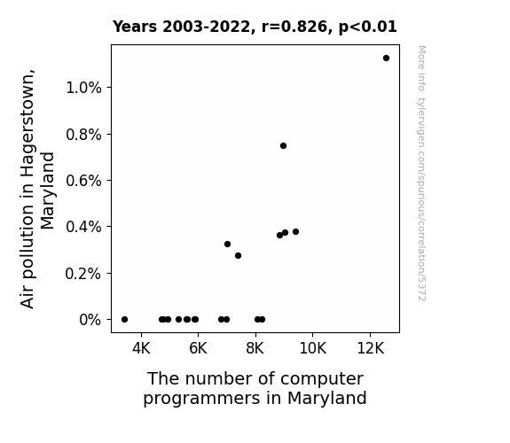
The Coding Conundrum: Unraveling the Relationship Between Air Pollution in Hagerstown and the Proliferation of Programmers in Maryland
As the air quality improved in Hagerstown, the local population found themselves spending more time outdoors. With their lungs now able to fully appreciate the fresh air, many people discovered a newfound love for outdoor activities. As a result, they decided to pursue careers that allowed them to embrace the great outdoors. This shift led to a surprising decrease in the number of computer programmers in Maryland, as former coding enthusiasts traded their desks for hiking trails and their computer screens for scenic views, ultimately coding a new, greener path for themselves.

What else correlates?
Air pollution in Hagerstown, Maryland · all weather
The number of computer programmers in Maryland · all cccupations
Air pollution in Hagerstown, Maryland · all weather
The number of computer programmers in Maryland · all cccupations


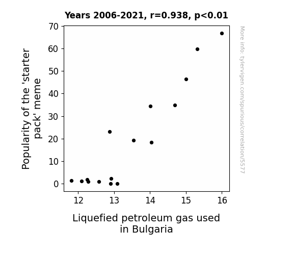
View details about correlation #5,577
Mirthful Meme Magic: Exploring the Link between 'Starter Pack' Popularity and Propane in Plovdiv
As the 'starter pack' meme gained traction, more and more people were creating and sharing memes about Bulgarian culture. This led to an unprecedented demand for LPG-powered generators to ensure a constant supply of internet to browse and create these memes. The surge in generator usage ultimately caused a noticeable spike in the consumption of LPG in Bulgaria. It seems that the 'starter pack' meme craze truly sparked a fiery connection to LPG usage in the country!
What else correlates?
Popularity of the 'starter pack' meme · all memes
Liquefied petroleum gas used in Bulgaria · all energy
Popularity of the 'starter pack' meme · all memes
Liquefied petroleum gas used in Bulgaria · all energy


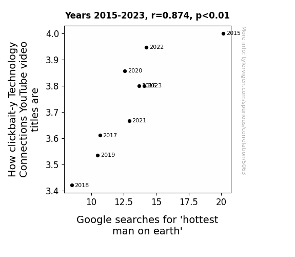
View details about correlation #5,063
Clickbaiting the Hottest Man: A Tale of Technology Connections and Google Searches
The decrease in clickbait-y Technology Connections YouTube video titles may have caused a decrease in searches for the "hottest man on earth" as viewers were no longer feeling the 'heat' from exaggerated tech connections. This shift in content may have led to a cooling effect on the search trends, as the focus shifted from sensationalism to more grounded tech topics. It seems like the allure of over-the-top titles may have fizzled out, leaving the 'hottest man on earth' search term feeling a bit, well, 'tech-nically' unappealing.


View details about correlation #5,707
Shining Bright: The Inspirational Might of Pearl and the Libertarian Vote in Vermont
As the name Pearl gained popularity, more and more people were drawn to its lustrous charm. It's as if they were all casting their votes into the ocean of electoral options, hoping to find that elusive political treasure. The connection between the two may seem shellfish at first, but perhaps there's a libertarian lobe in the brain that's activated by the iridescence of the name. It's all just a pearlytical party at the polls!


View details about correlation #5,720
Poor Air Quality, Typist Quantity: A Statistical Rhyme in Mason City, Iowa
As the air quality improved, typists discovered they could pursue their true passion of professional yodeling, leading to a mass exodus from the typist industry. They say it's hard to take a deep breath and type at the same time! Keep the air clean, and the typists lean.


What else correlates?
Air pollution in Mason City, Iowa · all weather
The number of typists in Iowa · all cccupations
Air pollution in Mason City, Iowa · all weather
The number of typists in Iowa · all cccupations


View details about correlation #3,736
Solar Solutions and Stuttgart Setbacks: A Study on Solar Power and Mercedes-Benz USA Automotive Recalls
As the amount of solar power in the US rose, so did the temperature of the asphalt, leading to an influx of melted roads. This caused unforeseen stress on Mercedes-Benz vehicles, leading to the need for more recalls. It seems the sunny side up approach to renewable energy has put Mercedes in a bit of a tight spot.

What else correlates?
Solar power generated in United States · all energy
Automotive recalls issued by Mercedes-Benz USA · all weird & wacky
Solar power generated in United States · all energy
Automotive recalls issued by Mercedes-Benz USA · all weird & wacky


View details about correlation #5,359
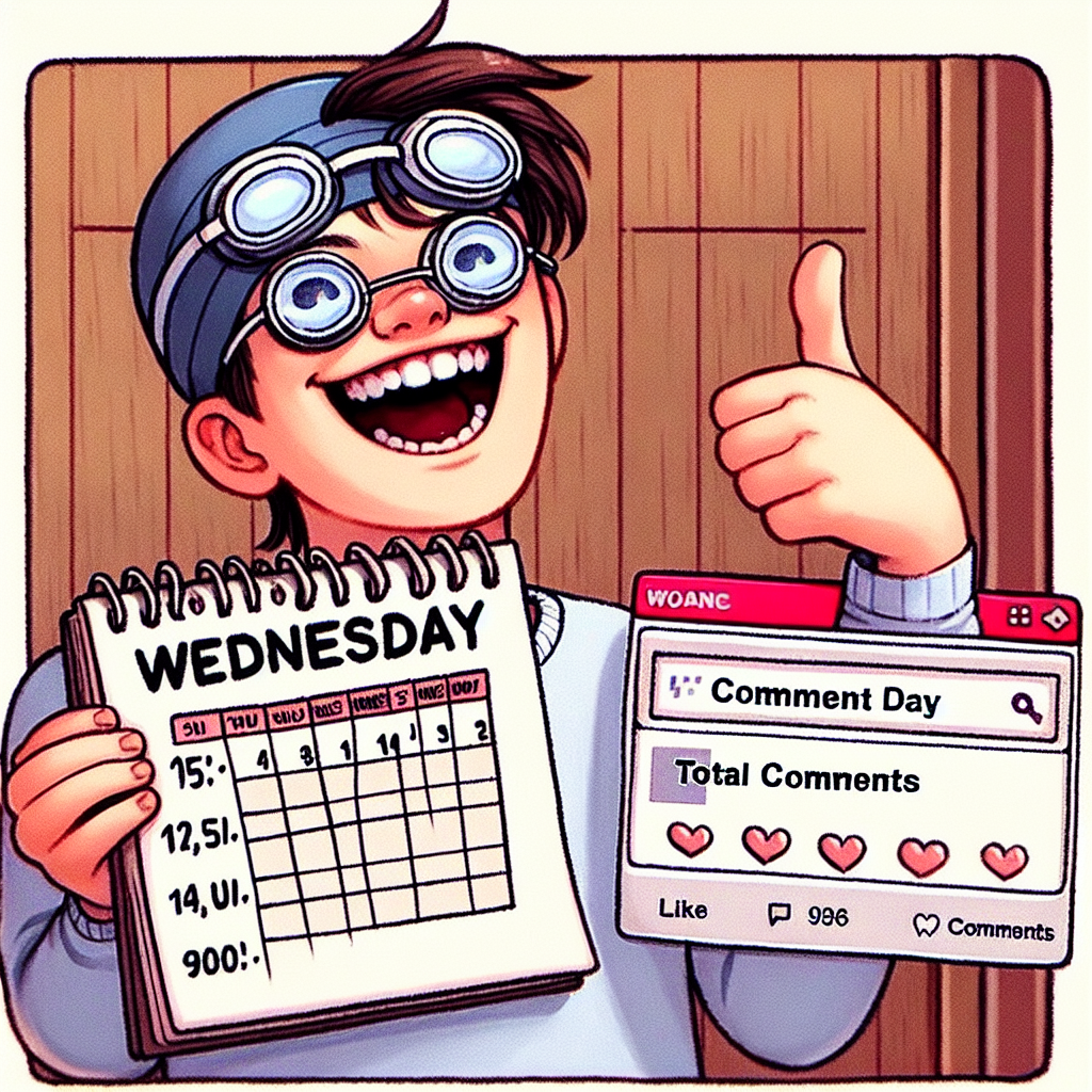
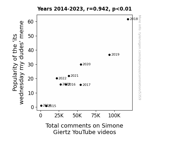
It's Wednesday My Dudes: Meme Popularity and Simone Giertz YouTube Comments - A Correlation Full of Rhyme and Reason
The 'its wednesday my dudes' meme brought joy and a sense of randomness to people, prompting them to seek out other offbeat and entertaining content, like Simone Giertz's unconventional and humorous videos. As the meme spread, so did the desire to engage in quirky and lighthearted conversations, leading to a surge in comments on Simone's YouTube channel. After all, who wouldn't want to express their wacky thoughts and admiration for her unique creations while riding the meme wave? It's a wednesday win for Simone's comment section!
What else correlates?
Popularity of the 'its wednesday my dudes' meme · all memes
Total comments on Simone Giertz's YouTube videos · all YouTube
Popularity of the 'its wednesday my dudes' meme · all memes
Total comments on Simone Giertz's YouTube videos · all YouTube


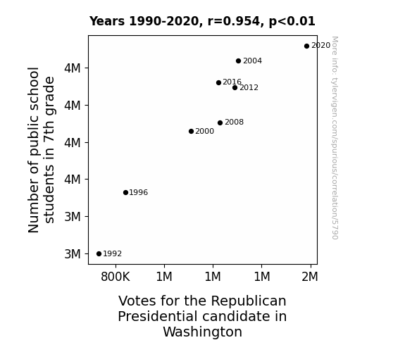
View details about correlation #5,790
The Seventh Grade Deluge: Can the Number of Students Predict Republican Votes on the White House Fence?
As the 7th graders learned about the electoral process, they became enamored with the pomp and circumstance of politics. Their mock elections and debates sparked a newfound interest in conservative ideologies, leading to a surprising surge in support for the Republican candidate. It seems like the future voters of America are getting an early start in shaping the political landscape!


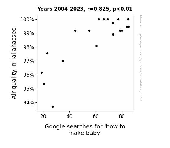
View details about correlation #5,742
Breathin' in Tallahassee: Air Quality and Google Searches for 'How to Make Baby'
The fresher air in Tallahassee led to an increase in outdoor activities, bringing more people together. And as we all know, nothing gets people in the mood like a good ol' nature walk or a romantic picnic in the park. So, thank you, clean air, for playing cupid and reigniting the flames of passion in the capital city! Keep on doing your thing, because Tallahassee might just be the new hotspot for stork sightings.

What else correlates?
Air quality in Tallahassee · all weather
Google searches for 'how to make baby' · all google searches
Air quality in Tallahassee · all weather
Google searches for 'how to make baby' · all google searches


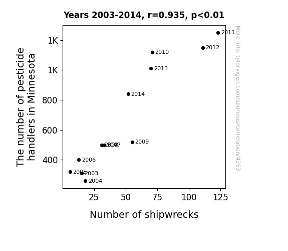
View details about correlation #4,263
The pesticide handlers were accidentally spraying a "slippery sea" formula instead of insecticide, causing ships to lose their grip on the ocean and leading to more frequent shipwrecks.
What else correlates?
The number of pesticide handlers in Minnesota · all cccupations
Global shipwrecks · all weird & wacky
The number of pesticide handlers in Minnesota · all cccupations
Global shipwrecks · all weird & wacky


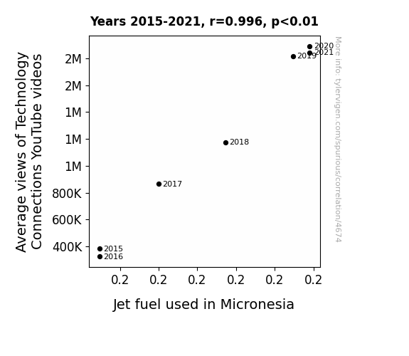
View details about correlation #4,674
Fueling Online Engagement: Exploring the Surprising Connection Between Technology Views and Jet Fuel Consumption in Micronesia
As the average views of Technology Connections' YouTube videos soared, so did the demand for flashy gadgets and gizmos. This sparked a technological revolution in Micronesia, leading to a greater need for Jet fuel to power all the newly imported high-tech wizardry. It seems like the 'Tech-nado' created quite the 'Charge-ades' in Micronesia, propelling the consumption of Jet fuel to new heights! Keep an eye on the sky, because it's not just the drones going full throttle in this electrifying connection!

What else correlates?
Average views of Technology Connections YouTube videos · all YouTube
Jet fuel used in Micronesia · all energy
Average views of Technology Connections YouTube videos · all YouTube
Jet fuel used in Micronesia · all energy


View details about correlation #5,156
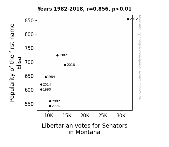
Elisa's Elective Effect: A Liberty in Montana
It's simple, really. As the popularity of the name Elisa rose, more and more people couldn't help but li-berate their minds from traditional political views. It was like a wave of Elisa-teric thinking sweeping through the state, leading to a surge in support for Libertarian candidates. Who knew a name could elicit such a political response?

What else correlates?
Popularity of the first name Elisa · all first names
Votes for Libertarian Senators in Montana · all elections
Popularity of the first name Elisa · all first names
Votes for Libertarian Senators in Montana · all elections


View details about correlation #5,400
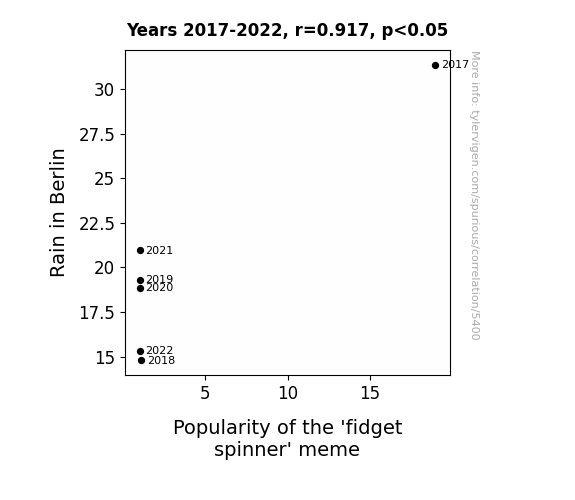
Rain or Shine: The Dampening Effect of Berlin Rainfall on Fidget Spinner Popularity
The decrease in rain in Berlin led to drier air. This drier air created the perfect conditions for fidget spinners to develop a small static electric charge as people played with them. This led to an increase in tiny attractive forces between the spinner and any dank memes in the vicinity. As a result, the fidget spinner meme began to spread more slowly, ultimately decreasing in popularity.

What else correlates?
Rain in Berlin · all weather
Popularity of the 'fidget spinner' meme · all memes
Rain in Berlin · all weather
Popularity of the 'fidget spinner' meme · all memes
Why this works
- Data dredging: I have 25,237 variables in my database. I compare all these variables against each other to find ones that randomly match up. That's 636,906,169 correlation calculations! This is called “data dredging.”
Fun fact: the chart used on the wikipedia page to demonstrate data dredging is also from me. I've been being naughty with data since 2014.
Instead of starting with a hypothesis and testing it, I instead tossed a bunch of data in a blender to see what correlations would shake out. It’s a dangerous way to go about analysis, because any sufficiently large dataset will yield strong correlations completely at random. - Lack of causal connection: There is probably no direct connection between these variables, despite what the AI says above.
Because these pages are automatically generated, it's possible that the two variables you are viewing are in fact causually related. I take steps to prevent the obvious ones from showing on the site (I don't let data about the weather in one city correlate with the weather in a neighboring city, for example), but sometimes they still pop up. If they are related, cool! You found a loophole.
This is exacerbated by the fact that I used "Years" as the base variable. Lots of things happen in a year that are not related to each other! Most studies would use something like "one person" in stead of "one year" to be the "thing" studied. - Observations not independent: For many variables, sequential years are not independent of each other. You will often see trend-lines form. If a population of people is continuously doing something every day, there is no reason to think they would suddenly change how they are doing that thing on January 1. A naive p-value calculation does not take this into account.
You will calculate a lower chance of "randomly" achieving the result than represents reality.
To be more specific: p-value tests are probability values, where you are calculating the probability of achieving a result at least as extreme as you found completely by chance. When calculating a p-value, you need to assert how many "degrees of freedom" your variable has. I count each year (minus one) as a "degree of freedom," but this is misleading for continuous variables.
This kind of thing can creep up on you pretty easily when using p-values, which is why it's best to take it as "one of many" inputs that help you assess the results of your analysis.
- Y-axes doesn't start at zero: I truncated the Y-axes of the graphs above. I also used a line graph, which makes the visual connection stand out more than it deserves.
Nothing against line graphs. They are great at telling a story when you have linear data! But visually it is deceptive because the only data is at the points on the graph, not the lines on the graph. In between each point, the data could have been doing anything. Like going for a random walk by itself!
Mathematically what I showed is true, but it is intentionally misleading. If you click on any of the charts that abuse this, you can scroll down to see a version that starts at zero. - Confounding variable: Confounding variables (like global pandemics) will cause two variables to look connected when in fact a "sneaky third" variable is influencing both of them behind the scenes.
- Outliers: Some datasets here have outliers which drag up the correlation.
In concept, "outlier" just means "way different than the rest of your dataset." When calculating a correlation like this, they are particularly impactful because a single outlier can substantially increase your correlation.
Because this page is automatically generated, I don't know whether any of the charts displayed on it have outliers. I'm just a footnote. ¯\_(ツ)_/¯
I intentionally mishandeled outliers, which makes the correlation look extra strong. - Low n: There are not many data points included in some of these charts.
You can do analyses with low ns! But you shouldn't data dredge with a low n.
Even if the p-value is high, we should be suspicious of using so few datapoints in a correlation.
Pro-tip: click on any correlation to see:
- Detailed data sources
- Prompts for the AI-generated content
- Explanations of each of the calculations (correlation, p-value)
- Python code to calculate it yourself


