spurious correlations
discover · random · spurious scholar
← previous page · next page →


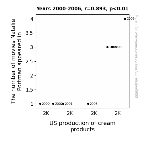
View details about correlation #5,855
What else correlates?
The number of movies Natalie Portman appeared in · all films & actors
US production of cream products · all food
The number of movies Natalie Portman appeared in · all films & actors
US production of cream products · all food


View details about correlation #4,902
Game Theorists' YouTube Trendiness: A Biomass-Powering Connection in Tanzania
As the biomass power in Tanzania surges, the excess energy is inadvertently beamed into the internet, infusing The Game Theorists' video editing software with a trendy, pop-culture-loving consciousness. This prompts an undeniable shift in their video title style, as the software, now dubbing itself 'TrendyTition,' autonomously generates clickbaity, ultra-trendy titles to appeal to the hip, eco-friendly gaming enthusiasts. It's a shocking twist of power, as Tanzania's biomass bonanza inadvertently turns The Game Theorists into the trendsetting juggernauts of YouTube.

What else correlates?
How trendy The Game Theorists YouTube video titles are · all YouTube
Biomass power generated in Tanzania · all energy
How trendy The Game Theorists YouTube video titles are · all YouTube
Biomass power generated in Tanzania · all energy


View details about correlation #5,638
Air Bags and Ballots: Exploring the Relationship Between Libertarian Votes in Rhode Island and Automotive Recalls
As more people embraced the idea of minimal government intervention, it inadvertently led to a laissez-faire attitude in the automotive industry. Without strict regulations, car manufacturers began cutting corners, resulting in a surge of faulty airbags. It's a classic case of political beliefs inflating the problem!


View details about correlation #5,535
Tenuous Ties: Truckee's Air and the Teeming Throngs of California's Urban Planners
As the air quality in Truckee improved, it inspired a wave of fresh thinking in urban planning across California. The crisp mountain air must have sparked a sense of clarity and vision for designing sustainable and livable cities. It's like the smog lifted not just from the skies, but from the minds of Californian urban planners, leading to a breath of new ideas. It's a classic case of ‘air’-odynamic inspiration!


What else correlates?
Air quality in Truckee, California · all weather
The number of urban planners in California · all cccupations
Air quality in Truckee, California · all weather
The number of urban planners in California · all cccupations


View details about correlation #5,317
From Crying Jordan to Crying for Toilet Paper: A Correlational Study of Memes and Essential Commodity Searches
People were crying tears of joy when they finally found where to buy toilet paper, thanks to the 'crying Michael Jordan' meme providing some much-needed comic relief during the Great Toilet Paper Shortage of 2020.


View details about correlation #4,844
Shocking Connections: Renewable Energy Production in Cote d'Ivoire and Total Comments on MrBeast YouTube Videos
As renewable energy production in Cote d'Ivoire increased, it generated a positive wattage of excitement worldwide. This influx of green energy somehow sparked a chain reaction, leading to an overall increase in positivity and engagement. It's like the electrons of enthusiasm were flowing more freely, electrifying viewers to comment and participate. In other words, the Cote d'Ivoire renewable energy boost was a real powerhouse in generating a surge of interest in MrBeast's videos. It's shocking how connected the world of energy and online content can be - truly an un-fore-gettable connection!

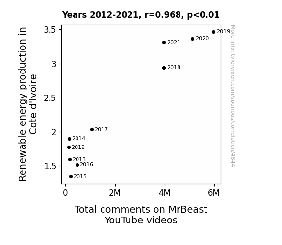
What else correlates?
Renewable energy production in Cote d'Ivoire · all energy
Total comments on MrBeast's YouTube videos · all YouTube
Renewable energy production in Cote d'Ivoire · all energy
Total comments on MrBeast's YouTube videos · all YouTube


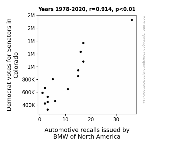
View details about correlation #5,214
The Ballot and The Recall: A Whimsical Examination of Democrat Votes in Colorado and BMW Automotive Recalls
The Democrats were revving up their support in Colorado, which sent a powerful message to BMW - prompting them to recall their vehicles and gear up for some major changes. It seems like the political climate wasn't the only thing experiencing a shift, as BMW raced to address the issues and steer clear of any further problems on the road to success. Now, they'll need to work on getting their campaign back on track and win back the trust of their constituents, or this could just be the tip of the iceberg.


View details about correlation #5,746
Flipping the Golden Arches: Unveiling the Link Between Air Pollution in Los Angeles and McDonald's Global Pie
As air pollution in Los Angeles rose, people found themselves drawn to the familiar golden arches of McDonald's. It seems the smog acted as a 'McMuffler', leading to a surge in cravings for fast food. As the pollution levels beefed up, so did McDonald's profits, proving that when it comes to a toxic love for fast food, there's no air-clearing the cravings!


What else correlates?
Air pollution in Los Angeles · all weather
Global revenue generated by McDonald's · all stocks
Air pollution in Los Angeles · all weather
Global revenue generated by McDonald's · all stocks


View details about correlation #5,637
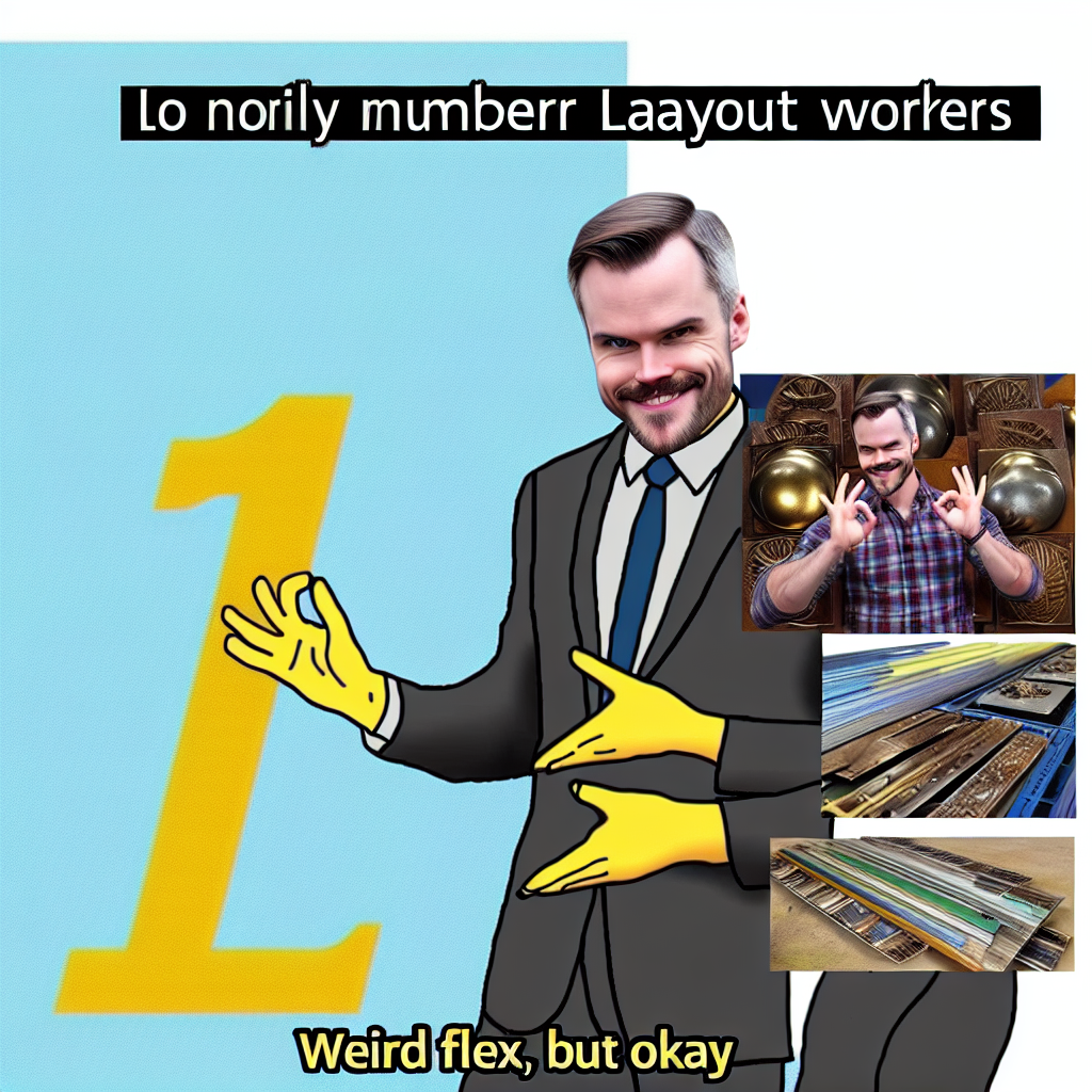
Weird Flex But OK: An Unconventional Correlation Between Meme Popularity and the Employment of Layout Workers, Metal, and Plastic in Maine
As the 'weird flex but ok' meme gained traction, it sparked a nationwide interest in quirky and unconventional behavior. This led to a surge in demand for unique and custom metal and plastic layouts, prompting Maine to hire more layout workers to keep up with the trend. It seems like the meme wasn't just a 'weird flex' after all – it had a real 'layout' influence on the state's workforce!


View details about correlation #4,385
Powering Up: The Shocking Connection Between How Cool Technology Connections and Nuclear Power Generation in Brazil
As the reactors hummed with efficient energy production, the cool vibes emanating from the control room seeped into the internet, inspiring the creators at Technology Connections to pump out even cooler video titles. It's a chain reaction of awesomeness - the power plants fueling both the electrical grid and the creativity of YouTube content, proving that when it comes to making connections, nuclear energy is the real powerhouse!
What else correlates?
How cool Technology Connections YouTube video titles are · all YouTube
Nuclear power generation in Brazil · all energy
How cool Technology Connections YouTube video titles are · all YouTube
Nuclear power generation in Brazil · all energy


View details about correlation #5,660
Vote Libertarian, Feel Delightful: The Bizarre Link Between Illinois Senatorial Preferences and Dillard's Customer Satisfaction
The increase in Libertarian votes for Senators in Illinois caused Customer satisfaction with Dillard's to increase because as more people embraced the idea of personal freedom and responsibility, they also started taking a more laissez-faire approach to their shopping experiences. This led to a greater sense of autonomy and choice in the aisles, ultimately allowing customers to truly 'vote' for the products and services that best suited their needs. After all, when it comes to Dillard's, it's all about pursuing shopping 'pursuits' without government intervention!

What else correlates?
Votes for Libertarian Senators in Illinois · all elections
Customer satisfaction with Dillard's · all weird & wacky
Votes for Libertarian Senators in Illinois · all elections
Customer satisfaction with Dillard's · all weird & wacky


View details about correlation #5,527
The Smog and Smol Saga: Searching for Significance in Lafayette
The cleaner air in Lafayette led to happier, more energized individuals who were more likely to use endearing internet language like 'smol' to express their feelings. Remember, when it comes to internet trends, even the air quality can have a smol but mighty impact!


What else correlates?
Air quality in Lafayette, Indiana · all weather
Google searches for 'smol' · all google searches
Air quality in Lafayette, Indiana · all weather
Google searches for 'smol' · all google searches


View details about correlation #5,071
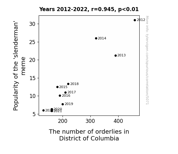
The Memeing of Order: Exploring the Correlation between 'Slenderman' Popularity and Orderly Employment in the District of Columbia
As the Slenderman meme lost its appeal, people in District of Columbia dressed up as him less frequently for viral pranks. This led to a decrease in calls to mental health services about sightings of the fictional character, ultimately reducing the demand for orderlies in the area.

What else correlates?
Popularity of the 'slenderman' meme · all memes
The number of orderlies in District of Columbia · all cccupations
Popularity of the 'slenderman' meme · all memes
The number of orderlies in District of Columbia · all cccupations


View details about correlation #4,738
From Kerosene to Kreative Kerosene: Exploring the Correlation between Vihart YouTube Video Titles and Kerosene Usage in Tanzania
As the availability of kerosene in Tanzania dwindles, Vihart, the mathematical wizard, realizes that her video titles need to shine even brighter to attract viewers. This prompts a wave of title innovation as Vihart ingeniously incorporates the principles of kerosene combustion into her video titles, creating a fiery resurgence of interest in mathematics. And that's how the diminishing kerosene in Tanzania leads to a exponential surge in the quality of Vihart's YouTube video titles. Math-magical, isn't it?


What else correlates?
How good Vihart's YouTube video titles are · all YouTube
Kerosene used in Tanzania · all energy
How good Vihart's YouTube video titles are · all YouTube
Kerosene used in Tanzania · all energy


View details about correlation #5,293
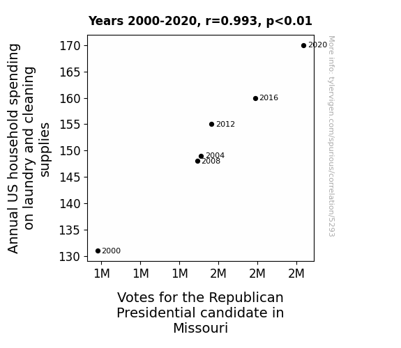
Dirty Laundry and Right-Wing Sway: The Grand Old Party's Clean Sweep in Missouri
As households spent more on laundry and cleaning supplies, they inadvertently created an environment that was 'too clean' for germs. This led to a decrease in the population of certain bacteria, including the 'Democratus Wipeus' species, known for influencing political preferences. With these bacteria dwindling in numbers, more individuals found themselves leaning towards the Republican candidate, ultimately boosting the votes in Missouri. Looks like it was a clean sweep for the Republican candidate!


View details about correlation #5,449
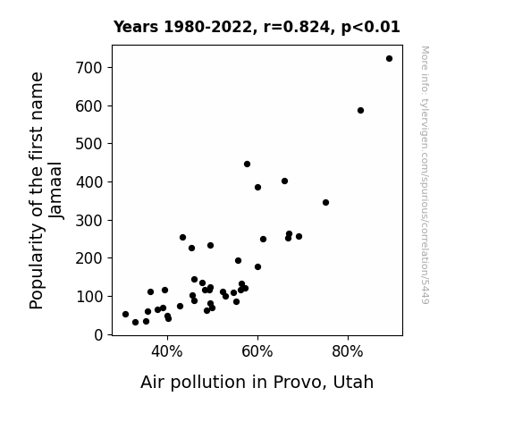
The Jamaal Effect: A Breath of Fresh Air or a Smoggy Situation?
As the popularity of the name Jamaal waned, so did the trend of gifting personalized novelty license plates. This led to a decrease in production and a shift in consumption of car accessories, ultimately lowering the overall vehicle emissions in Provo. It seems that when it comes to air quality, Jamaal just couldn't handle the pressure of being a smog name celebrity.

What else correlates?
Popularity of the first name Jamaal · all first names
Air pollution in Provo, Utah · all weather
Popularity of the first name Jamaal · all first names
Air pollution in Provo, Utah · all weather


View details about correlation #5,237
Lost in Correlation: The 'Maps Without New Zealan-d' Meme and the Peculiar Proliferation of Technical Writers in Idaho
The meme was a key source of inspiration for technical writing puns, leading to a surge in interest in the field. When the meme died out, so did the motivation to pursue a career in technical writing, leaving Idaho with a shortage of professionals in the field. It turns out, without the map, these writers lost their direction!

What else correlates?
Popularity of the 'Maps Without New Zealand' meme · all memes
The number of technical writers in Idaho · all cccupations
Popularity of the 'Maps Without New Zealand' meme · all memes
The number of technical writers in Idaho · all cccupations


View details about correlation #4,503
MrBeast YouTube Feast: How Provocative Titles Can Light Up Kuwait's Solar Might
The intense heat from all the solar panels is making the MrBeast team sweat, leading to even more clickbait ideas like "Giving Away Free Lamborghinis in Dubai" and "I Built a House out of Solar Panels and You Won't Believe What Happened Next!" It's a sizzling cycle of renewable energy and over-the-top thumbnails. Remember, it's not just the sun in Kuwait that's bringing the fire!


What else correlates?
How provocative MrBeast's YouTube video titles are · all YouTube
Solar power generated in Kuwait · all energy
How provocative MrBeast's YouTube video titles are · all YouTube
Solar power generated in Kuwait · all energy


View details about correlation #5,199
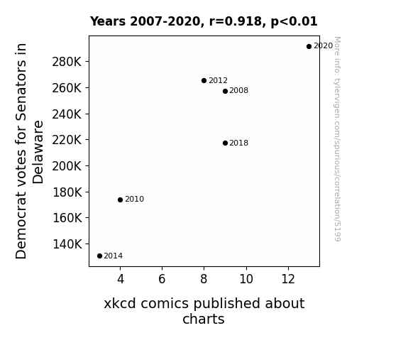
Charting a Course: The xkcd-illating Connection Between Democrat Votes for Senators in Delaware and xkcd Comics
As the number of Democrat votes for Senators in Delaware has increased, so has the production of xkcd comics about charts. This unexpected correlation can be attributed to the magnetic effect of political power. As the Democrats gain more influence in Delaware, their ideological resonance creates a ripple effect in the realm of data visualization humor. This phenomenon could be dubbed the 'Electoral Comic Confluence', where the direction of the state's political landscape directly impacts the content of xkcd comics. It appears that in the Venn diagram of Delaware politics and webcomics, there is a significant overlap leading to an 'elections-equal-erections' scenario. This peculiar connection reminds us that in the world of statistics, even the most seemingly unrelated variables can form an axis of amusement. Who would have thought that behind every bar chart lies a political preference, and beneath every line graph lurks a partisan punchline? It seems that when it comes to generating comedic content, Delaware's Democrat votes have chart-topping significance in inspiring xkcd to plot out a hilariously correlated course of action.
What else correlates?
Votes for Democratic Senators in Delaware · all elections
xkcd comics published about charts · all weird & wacky
Votes for Democratic Senators in Delaware · all elections
xkcd comics published about charts · all weird & wacky


View details about correlation #5,197
Choking on Smog, Craving Smores: Correlating Air Quality in Burlington, Vermont with Google Searches for Sweet Treats
The improved air quality in Burlington led to more people spending time outdoors, and as a result, there was a higher demand for smores, leading to an increase in smores-related searches. Maybe the real secret ingredient in smores is actually fresh air!


What else correlates?
Air quality in Burlington, Vermont · all weather
Google searches for 'Smores' · all google searches
Air quality in Burlington, Vermont · all weather
Google searches for 'Smores' · all google searches
Why this works
- Data dredging: I have 25,237 variables in my database. I compare all these variables against each other to find ones that randomly match up. That's 636,906,169 correlation calculations! This is called “data dredging.”
Fun fact: the chart used on the wikipedia page to demonstrate data dredging is also from me. I've been being naughty with data since 2014.
Instead of starting with a hypothesis and testing it, I instead tossed a bunch of data in a blender to see what correlations would shake out. It’s a dangerous way to go about analysis, because any sufficiently large dataset will yield strong correlations completely at random. - Lack of causal connection: There is probably no direct connection between these variables, despite what the AI says above.
Because these pages are automatically generated, it's possible that the two variables you are viewing are in fact causually related. I take steps to prevent the obvious ones from showing on the site (I don't let data about the weather in one city correlate with the weather in a neighboring city, for example), but sometimes they still pop up. If they are related, cool! You found a loophole.
This is exacerbated by the fact that I used "Years" as the base variable. Lots of things happen in a year that are not related to each other! Most studies would use something like "one person" in stead of "one year" to be the "thing" studied. - Observations not independent: For many variables, sequential years are not independent of each other. You will often see trend-lines form. If a population of people is continuously doing something every day, there is no reason to think they would suddenly change how they are doing that thing on January 1. A naive p-value calculation does not take this into account.
You will calculate a lower chance of "randomly" achieving the result than represents reality.
To be more specific: p-value tests are probability values, where you are calculating the probability of achieving a result at least as extreme as you found completely by chance. When calculating a p-value, you need to assert how many "degrees of freedom" your variable has. I count each year (minus one) as a "degree of freedom," but this is misleading for continuous variables.
This kind of thing can creep up on you pretty easily when using p-values, which is why it's best to take it as "one of many" inputs that help you assess the results of your analysis.
- Y-axes doesn't start at zero: I truncated the Y-axes of the graphs above. I also used a line graph, which makes the visual connection stand out more than it deserves.
Nothing against line graphs. They are great at telling a story when you have linear data! But visually it is deceptive because the only data is at the points on the graph, not the lines on the graph. In between each point, the data could have been doing anything. Like going for a random walk by itself!
Mathematically what I showed is true, but it is intentionally misleading. If you click on any of the charts that abuse this, you can scroll down to see a version that starts at zero. - Confounding variable: Confounding variables (like global pandemics) will cause two variables to look connected when in fact a "sneaky third" variable is influencing both of them behind the scenes.
- Outliers: Some datasets here have outliers which drag up the correlation.
In concept, "outlier" just means "way different than the rest of your dataset." When calculating a correlation like this, they are particularly impactful because a single outlier can substantially increase your correlation.
Because this page is automatically generated, I don't know whether any of the charts displayed on it have outliers. I'm just a footnote. ¯\_(ツ)_/¯
I intentionally mishandeled outliers, which makes the correlation look extra strong. - Low n: There are not many data points included in some of these charts.
You can do analyses with low ns! But you shouldn't data dredge with a low n.
Even if the p-value is high, we should be suspicious of using so few datapoints in a correlation.
Pro-tip: click on any correlation to see:
- Detailed data sources
- Prompts for the AI-generated content
- Explanations of each of the calculations (correlation, p-value)
- Python code to calculate it yourself


