spurious correlations
discover · random · spurious scholar
← previous page · next page →


View details about correlation #5,099
I am Once Again Bailiffied: Exploring the Correlation between Meme Popularity and Law Enforcement Trends in Kansas
The 'i am once again' meme led to a surge in people revisiting past financial decisions, ultimately resulting in more outstanding debts and the need for increased bailiff intervention in Kansas. Remember, a meme a day keeps the creditors at bay!


What else correlates?
Popularity of the 'i am once again' meme · all memes
The number of bailiffs in Kansas · all cccupations
Popularity of the 'i am once again' meme · all memes
The number of bailiffs in Kansas · all cccupations


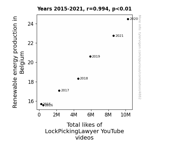
View details about correlation #4,882
Shining Bright: The Plight of Renewable Light and Lock-Picking Delight
As Belgium started harnessing more renewable energy, the electrons in the air became charged with eco-friendly vibes. These supercharged particles inadvertently enhanced the magnetism of LockPickingLawyer's video content, attracting a shocking surge of likes from viewers. It's a true power play of positivity – sparking an electrifying connection between renewable energy production and the virtual approval of lock-picking escapades.

What else correlates?
Renewable energy production in Belgium · all energy
Total likes of LockPickingLawyer YouTube videos · all YouTube
Renewable energy production in Belgium · all energy
Total likes of LockPickingLawyer YouTube videos · all YouTube


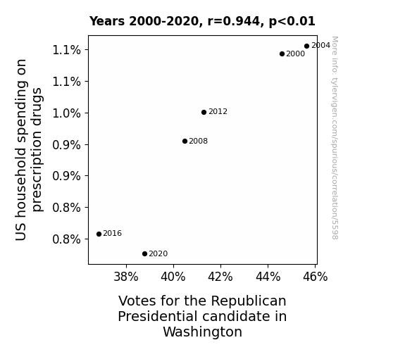
View details about correlation #5,598
Prescription for Electoral Tension: A GOP Pill or Bane for Washington Households?
As households spent less on prescription drugs, the overall level of discomfort decreased, leading to a reduced inclination to support the party in power, ultimately affecting voting patterns in Washington. Maybe the saying should be "A pill a day keeps the Republicans at bay!"


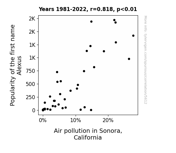
View details about correlation #5,612
Astonishing Alexus: Analyzing the Association between Air Pollution and the Proliferation of the Name Alexus in Sonora, California
As the popularity of the first name Alexus rose, more and more cars were sporting "Alexus" license plate frames, leading to an influx of luxurious SUVs and creating a Lexus convoy to Sonora. This influx of vehicles revved up the air pollution in a race nobody wanted to win. It seems like the name Alexus wasn't just turning heads, but also turning the air quality index up a notch. Who knew a simple name could have such exhaust-ing consequences!

What else correlates?
Popularity of the first name Alexus · all first names
Air pollution in Sonora, California · all weather
Popularity of the first name Alexus · all first names
Air pollution in Sonora, California · all weather
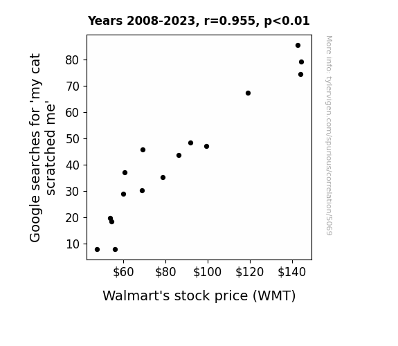
. The chart goes from 2008 to 2023, and the two variables track closely in value over that time.")

View details about correlation #5,069
What else correlates?
Google searches for 'my cat scratched me' · all google searches
Walmart's stock price (WMT) · all stocks
Google searches for 'my cat scratched me' · all google searches
Walmart's stock price (WMT) · all stocks


View details about correlation #4,733
Fueling the Fire: The Correlation Between MinuteEarth Video Titles and Gasoline Consumption in Madagascar
The correlation is due to the fact that as the gasoline in Madagascar becomes more refined, it fuels a surge in creativity at MinuteEarth. The quality of the video titles ignites, sparking a greater interest in professionalism. It's like they say, "Where there's a fuel, there's a MinuteEarth professional video title!"


What else correlates?
How professional-sounding MinuteEarth YouTube video titles are · all YouTube
Gasoline pumped in Madagascar · all energy
How professional-sounding MinuteEarth YouTube video titles are · all YouTube
Gasoline pumped in Madagascar · all energy


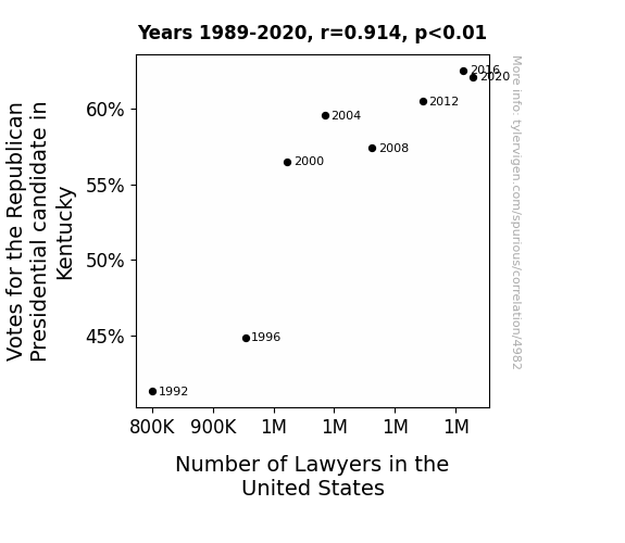
View details about correlation #4,982
The Elephant in the Courtroom: Exploring the Correlation Between Votes for the Republican Presidential Candidate in Kentucky and the Number of Lawyers in the United States
It's simple: as the votes for the Republican Presidential candidate in Kentucky increased, so did the LegalElection representation across the nation. It seems like the candidates were all vying for the popular vote, and the spike in legal matters just can't be de-baited! It's a case of campaign litigation leading to an influx of legal professionals - talk about a vote of confidence in the law!


View details about correlation #4,958
A Breath of Fresh Data: Examining the Relationship Between Air Quality in Worcester, Massachusetts, and the Dispensing of Pharmacy Technicians in Massachusetts
The cleaner air in Worcester made people breathe easier, leading to a surge in overall wellness. This sudden burst of good health prompted an increased demand for medications, causing pharmacies to frantically hire more technicians to keep up with the sudden spike in prescriptions. It's a case of the air getting cleaner and the pharmacies getting busier! Who knew that fresher air could lead to a breath of fresh employment opportunities in the pharmaceutical world?

What else correlates?
Air quality in Worcester, Massachusetts · all weather
The number of pharmacy technicians in Massachusetts · all cccupations
Air quality in Worcester, Massachusetts · all weather
The number of pharmacy technicians in Massachusetts · all cccupations


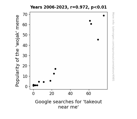
View details about correlation #4,985
Mirthful Meme: The Mirthsome Marriage of 'Wojak' and 'Wonton' - A Correlation Conundrum
The 'wojak' meme garnered such a devoted following that fans began to host themed meme parties. These meme parties, of course, had to be catered, leading to a surge in demand for takeout near you. It seems the internet isn't just serving up memes, but also a side of convenience!

What else correlates?
Popularity of the 'wojak' meme · all memes
Google searches for 'takeout near me' · all google searches
Popularity of the 'wojak' meme · all memes
Google searches for 'takeout near me' · all google searches


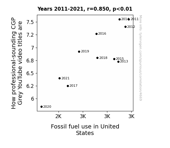
View details about correlation #4,669
Fueling Entertainment: The Gas-tly Connection Between CGP Grey Video Titles and Fossil Fuel Use in the United States
As the United States burns less fossil fuels, the collective brainpower of the nation is no longer being smothered by a thick haze of carbon emissions. This has inexplicably led to an upsurge in professional-sounding video titles, as if the very syllables themselves have donned tiny business suits. It's as if the fossil fuels were the unruly party crashers at the grammar gala, and now that they're gone, it's all sophisticated adjectives and articulate phrasing. Who knew that reducing emissions could also lead to an increase in eloquent expressions?

What else correlates?
How professional-sounding CGP Grey YouTube video titles are · all YouTube
Fossil fuel use in United States · all energy
How professional-sounding CGP Grey YouTube video titles are · all YouTube
Fossil fuel use in United States · all energy


View details about correlation #5,103
Grassroots Pass: Libertarian Votes in Oregon and Dried Manure for Fertilizer in the US
The spike in Libertarian votes for Senators in Oregon led to a push for agricultural deregulation. Without government intervention, there was a shift towards using dried manure for fertilizer, as farmers embraced a "hands-off" approach to soil management. It seems like in this case, when it comes to spreading political ideas and spreading manure, the two go hand in hand!

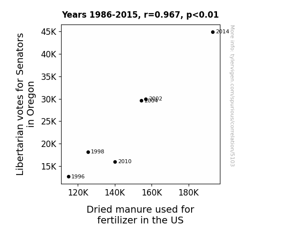
What else correlates?
Votes for Libertarian Senators in Oregon · all elections
Dried manure used for fertilizer in the US · all weird & wacky
Votes for Libertarian Senators in Oregon · all elections
Dried manure used for fertilizer in the US · all weird & wacky


View details about correlation #5,365
Petals and Particulate Matter: The Pollenotic Effects of Air Pollution on the Floricultural Workforce in Lansing, Michigan
As the air quality improved, it seems the floral designers were no longer being pollinated with job opportunities. With cleaner air, there was a petal back on seeing the budding success in other fields, leading to a stem of job changes away from floral design.


What else correlates?
Air pollution in Lansing, Michigan · all weather
The number of floral designers in Michigan · all cccupations
Air pollution in Lansing, Michigan · all weather
The number of floral designers in Michigan · all cccupations


View details about correlation #5,555
The Trendy Tie: Exploring the Link between the 'we live in a society' Meme and 'Yeet' Searches
As the 'we live in a society' meme gained popularity, it led to an overall heightened sense of existential absurdity. This, in turn, created a surge in the need for spontaneous expression, hence an increase in yeet-ing. The meme essentially became the catalyst for people to yeet themselves into ironic oblivion, one perplexing moment at a time. It's a societal domino effect of nonsensical proportions!


What else correlates?
Popularity of the 'we live in a society' meme · all memes
Google searches for 'yeet' · all google searches
Popularity of the 'we live in a society' meme · all memes
Google searches for 'yeet' · all google searches


View details about correlation #4,785
Shocking Rockings: Unlocking the Connection Between Angola's Electricity Generation and Total Engaging Comments on SmarterEveryDay YouTube Videos
The surge of electric current in Angola created a literal spark in the brains of SmarterEveryDay viewers, leading to a shocking increase in their comment output. It's as if their thoughts were conducting a lively discussion on the power of electricity! Remember, with great power generation comes electric personalities!


What else correlates?
Electricity generation in Angola · all energy
Total comments on SmarterEveryDay YouTube videos · all YouTube
Electricity generation in Angola · all energy
Total comments on SmarterEveryDay YouTube videos · all YouTube


View details about correlation #5,811
The Live Free or Carjack Dilemma: Examining the Relationship Between Libertarian Votes for Senators in New Hampshire and Carjackings in the US
As Libertarian votes for Senators in New Hampshire decreased, so did the intensity of political debates. With fewer fiery discussions, the overall climate cooled down. This unexpected chill made it uncomfortable for carjackers to continue their activities, leading to a nationwide decrease in carjackings. Who knew that political preferences in a small state could have such a chilling effect on crime waves across the country?

What else correlates?
Votes for Libertarian Senators in New Hampshire · all elections
Carjackings in the US · all weird & wacky
Votes for Libertarian Senators in New Hampshire · all elections
Carjackings in the US · all weird & wacky


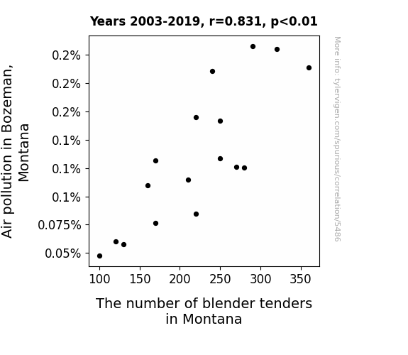
View details about correlation #5,486
Blendin' in Bozeman: Exploring the Correlation Between Air Pollution and Blender Tender Numbers in Montana
As air pollution increased in Bozeman, it created a unique demand for individuals with the special skill set of "blender tending." These expert blenders were sought after to purify the air and ensure that everyone could still breathe easy. It's as if the job market was really just blending perfectly with the pollution levels!
What else correlates?
Air pollution in Bozeman, Montana · all weather
The number of blender tenders in Montana · all cccupations
Air pollution in Bozeman, Montana · all weather
The number of blender tenders in Montana · all cccupations


View details about correlation #5,879
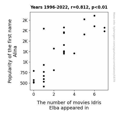
What else correlates?
Popularity of the first name Alina · all first names
The number of movies Idris Elba appeared in · all films & actors
Popularity of the first name Alina · all first names
The number of movies Idris Elba appeared in · all films & actors


View details about correlation #4,718
Pondering Petroleum: Perusing the Playfulness of Extra History YouTube Video Titles and Petroleum Consumption in Peculiar Greenland
As Greenlanders switched from watching history videos to participating in history-making renewable energy efforts, they realized that the real gas was in creating a sustainable future. This sparked a historic shift towards a greener lifestyle, proving that when it comes to renewable energy, the past is oil in the rearview mirror!

What else correlates?
How insightful Extra History YouTube video titles are · all YouTube
Petroluem consumption in Greenland · all energy
How insightful Extra History YouTube video titles are · all YouTube
Petroluem consumption in Greenland · all energy


View details about correlation #5,395
The Web of Libertarians: Examining the Connection Between Votes for the Libertarian Presidential Candidate in Arizona and the Number of Websites on the Internet
As more people supported the Libertarian candidate, they also supported the idea of independence and non-restriction. This led to a surge in creating new websites, free from the constraints of traditional political affiliations. The momentum for looser control and individual freedom spilled over into the digital realm, prompting a rapid expansion of online content. It's as if every vote cast for the Libertarian candidate was a vote for the unrestricted growth of the internet!


View details about correlation #5,111
Clearing the Air: A Study of Air Quality in Salinas, California and Its Impact on the Crying Michael Jordan Meme Popularity
As the air quality in Salinas improved, the residents found themselves with an abundance of fresh, oxygenated air. This led to an increase in overall happiness and contentment. With their newfound sense of well-being, people in Salinas had less need for external sources of amusement and emotional release. This shift in emotional satisfaction ultimately led to a decreased relatability to the 'crying Michael Jordan' meme, as the meme's portrayal of intense emotional distress no longer resonated with a population that was quite literally breathing easy. So, in an unexpected twist, the meme's decline in popularity turned out to be a breath of fresh air for the community.
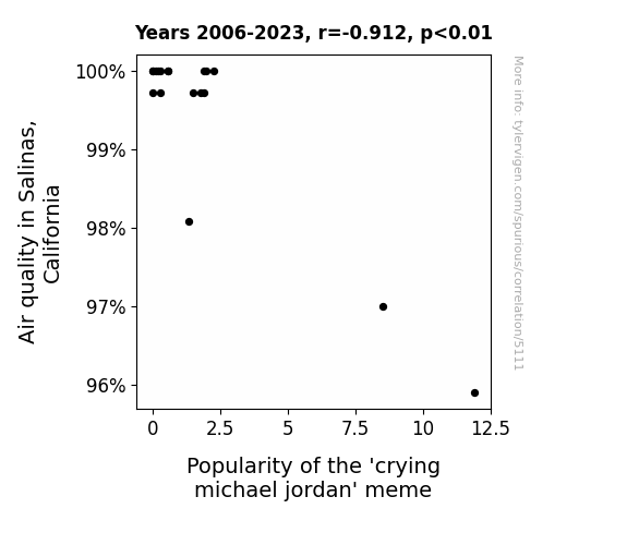
What else correlates?
Air quality in Salinas, California · all weather
Popularity of the 'crying michael jordan' meme · all memes
Air quality in Salinas, California · all weather
Popularity of the 'crying michael jordan' meme · all memes
Why this works
- Data dredging: I have 25,237 variables in my database. I compare all these variables against each other to find ones that randomly match up. That's 636,906,169 correlation calculations! This is called “data dredging.”
Fun fact: the chart used on the wikipedia page to demonstrate data dredging is also from me. I've been being naughty with data since 2014.
Instead of starting with a hypothesis and testing it, I instead tossed a bunch of data in a blender to see what correlations would shake out. It’s a dangerous way to go about analysis, because any sufficiently large dataset will yield strong correlations completely at random. - Lack of causal connection: There is probably no direct connection between these variables, despite what the AI says above.
Because these pages are automatically generated, it's possible that the two variables you are viewing are in fact causually related. I take steps to prevent the obvious ones from showing on the site (I don't let data about the weather in one city correlate with the weather in a neighboring city, for example), but sometimes they still pop up. If they are related, cool! You found a loophole.
This is exacerbated by the fact that I used "Years" as the base variable. Lots of things happen in a year that are not related to each other! Most studies would use something like "one person" in stead of "one year" to be the "thing" studied. - Observations not independent: For many variables, sequential years are not independent of each other. You will often see trend-lines form. If a population of people is continuously doing something every day, there is no reason to think they would suddenly change how they are doing that thing on January 1. A naive p-value calculation does not take this into account.
You will calculate a lower chance of "randomly" achieving the result than represents reality.
To be more specific: p-value tests are probability values, where you are calculating the probability of achieving a result at least as extreme as you found completely by chance. When calculating a p-value, you need to assert how many "degrees of freedom" your variable has. I count each year (minus one) as a "degree of freedom," but this is misleading for continuous variables.
This kind of thing can creep up on you pretty easily when using p-values, which is why it's best to take it as "one of many" inputs that help you assess the results of your analysis.
- Y-axes doesn't start at zero: I truncated the Y-axes of the graphs above. I also used a line graph, which makes the visual connection stand out more than it deserves.
Nothing against line graphs. They are great at telling a story when you have linear data! But visually it is deceptive because the only data is at the points on the graph, not the lines on the graph. In between each point, the data could have been doing anything. Like going for a random walk by itself!
Mathematically what I showed is true, but it is intentionally misleading. If you click on any of the charts that abuse this, you can scroll down to see a version that starts at zero. - Confounding variable: Confounding variables (like global pandemics) will cause two variables to look connected when in fact a "sneaky third" variable is influencing both of them behind the scenes.
- Outliers: Some datasets here have outliers which drag up the correlation.
In concept, "outlier" just means "way different than the rest of your dataset." When calculating a correlation like this, they are particularly impactful because a single outlier can substantially increase your correlation.
Because this page is automatically generated, I don't know whether any of the charts displayed on it have outliers. I'm just a footnote. ¯\_(ツ)_/¯
I intentionally mishandeled outliers, which makes the correlation look extra strong. - Low n: There are not many data points included in some of these charts.
You can do analyses with low ns! But you shouldn't data dredge with a low n.
Even if the p-value is high, we should be suspicious of using so few datapoints in a correlation.
Pro-tip: click on any correlation to see:
- Detailed data sources
- Prompts for the AI-generated content
- Explanations of each of the calculations (correlation, p-value)
- Python code to calculate it yourself


