spurious correlations
discover · random · spurious scholar
← previous page · next page →


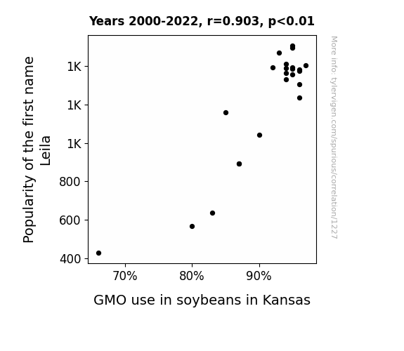
View details about correlation #1,227
What else correlates?
Popularity of the first name Leila · all first names
GMO use in soybeans in Kansas · all food
Popularity of the first name Leila · all first names
GMO use in soybeans in Kansas · all food


View details about correlation #4,538
From Gas Puns to Gas Prices: A Correlative Study of 'OverSimplified' YouTube Video Titles and Liquefied Petroleum Gas Consumption in Paraguay
Paraguayan gas suppliers are now adding a secret ingredient that makes people spontaneously break into historical reenactments, causing a shortage in professional-sounding videos. Remember folks, always check the label for unexpected side effects before purchasing your next tank of gas!

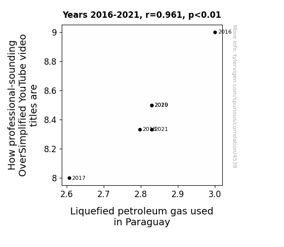
. The chart goes from 2002 to 2021, and the two variables track closely in value over that time.")

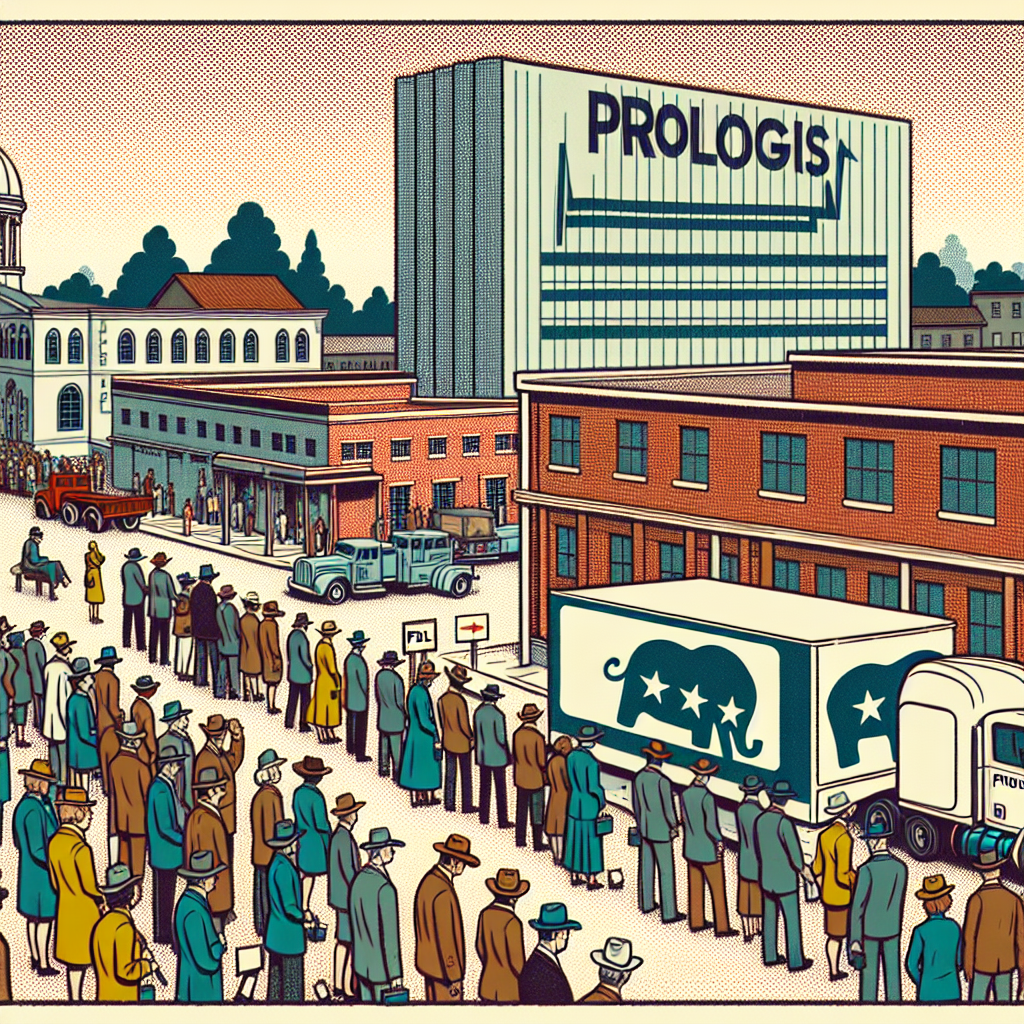
View details about correlation #5,325
Red State, Green Stocks: An Examination of the Relationship between Republican Votes for Senators in Georgia and Prologis' Stock Price (PLD)
The increase in Republican votes for Senators in Georgia led to plans for a massive new storage facility for the surplus of cowboy hats and elephant-shaped pool floaties, creating high demand for Prologis' warehouse properties and boosting their stock price.

What else correlates?
Votes for Republican Senators in Georgia · all elections
Prologis' stock price (PLD) · all stocks
Votes for Republican Senators in Georgia · all elections
Prologis' stock price (PLD) · all stocks


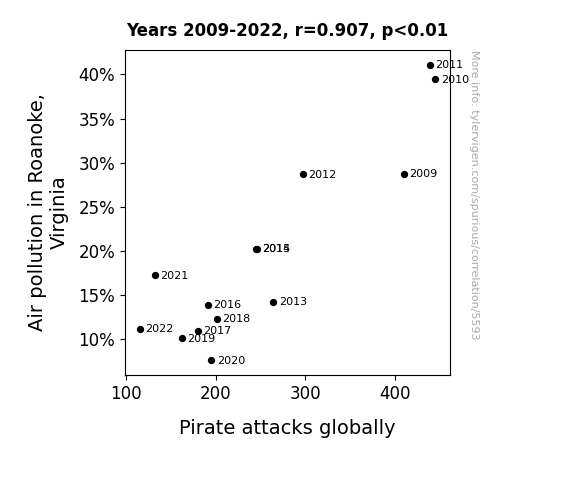
View details about correlation #5,593
The Roa-Noke Effect: An Empirical Analysis of Air Pollution in Roanoke, Virginia and Its Correlation with Global Pirate Attacks
As the air quality in Roanoke improved, it led to the proliferation of a new species of eco-friendly algae in the nearby oceans. This algae, known as greenbeardicus, emits a unique scent that is highly displeasing to pirates. As the greenbeardicus spread throughout the seas, it created a natural barrier against pirate ships, effectively deterring them from engaging in attacks. This unexpected ecological defense mechanism has baffled scientists and brought a welcome relief to the global maritime community.
What else correlates?
Air pollution in Roanoke, Virginia · all weather
Pirate attacks globally · all weird & wacky
Air pollution in Roanoke, Virginia · all weather
Pirate attacks globally · all weird & wacky


View details about correlation #4,952
Floss Dance Fervor and the Folly of Pipelayers: A Peculiar Perspective
As the floss dance meme gained traction, more and more people started flossing in real life. This led to a surge in demand for dental hygiene products, creating a booming market for minty fresh toothpaste. Strangely enough, this sudden spike in toothpaste sales caused a ripple effect in the small town of Pipeville, West Virginia, where local residents decided it was the perfect time to upgrade their plumbing. And voila, the number of pipelayers in West Virginia flourished, all thanks to the unexpected power of the floss dance meme.

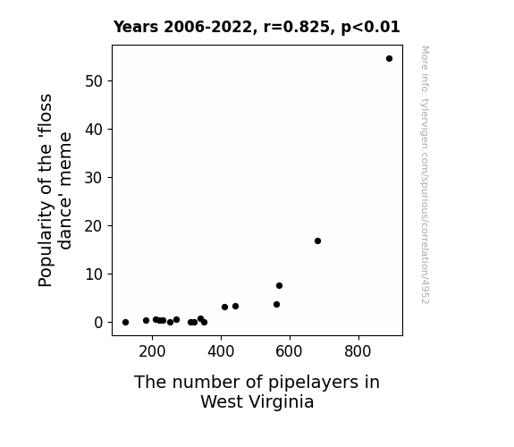
What else correlates?
Popularity of the 'floss dance' meme · all memes
The number of pipelayers in West Virginia · all cccupations
Popularity of the 'floss dance' meme · all memes
The number of pipelayers in West Virginia · all cccupations


View details about correlation #4,288
Fuel for Thought: Exploring the Relationship Between Petroleum Consumption in Vanuatu and the Average Length of Minutephysics YouTube Videos
The demand for Vanuatu's petroleum skyrocketed, leading to higher prices. This prompted minutephysics to create longer videos in order to cash in on the extra fuel money they could make. After all, when it comes to video length, it's all about that oil 'change'!

What else correlates?
Petroluem consumption in Vanuatu · all energy
Average length of minutephysics YouTube videos · all YouTube
Petroluem consumption in Vanuatu · all energy
Average length of minutephysics YouTube videos · all YouTube


View details about correlation #5,067
ET Votes Home: The Extraterrestrial Influence on Republican Senatorial Preferences in Arizona
As Republican votes for Senators in Arizona decreased, it led to a shortage of communication devices in the state. With fewer resources available, E.T. realized that phoning home from Arizona was going to be more expensive, so he decided to wait until he got to a friendlier (and cheaper) area. As a result, Google searches for 'E.T. phone home' decreased as Arizonans unwittingly contributed to E.T.'s intergalactic long-distance cost-saving efforts.

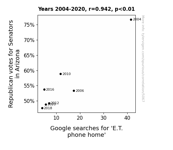
What else correlates?
Votes for Republican Senators in Arizona · all elections
Google searches for 'E.T. phone home' · all google searches
Votes for Republican Senators in Arizona · all elections
Google searches for 'E.T. phone home' · all google searches


View details about correlation #5,507
The Gas Hindrance: An Analysis of the Relationship Between Air Pollution in Pocatello, Idaho and Total Annual Sales of Ford Motors in the United States
As the air in Pocatello became cleaner, people no longer felt the 'Ford' to roll up their windows, leading to a nationwide decrease in Ford sales. Without the smog to block their view, consumers started to 'Focus' on other car options, leaving Ford feeling a bit 'Expedition' about their profits. It seems like in this case, reducing pollution didn't 'Escape' the correlation with a downturn in Ford sales.

What else correlates?
Air pollution in Pocatello, Idaho · all weather
Total annual sales of Ford Motors in the United States · all weird & wacky
Air pollution in Pocatello, Idaho · all weather
Total annual sales of Ford Motors in the United States · all weird & wacky


View details about correlation #5,019
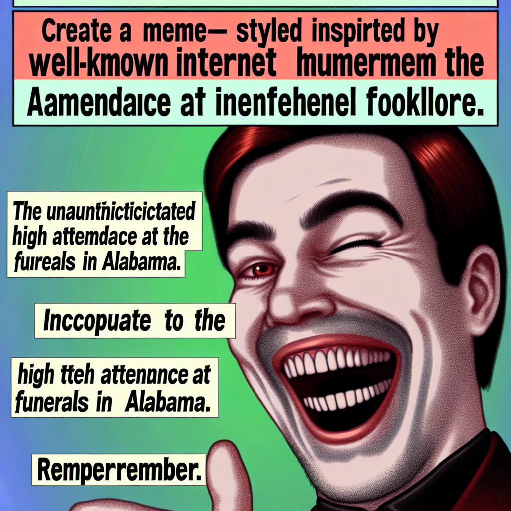
From Trollface to Funeral Pace: Exploring the Unlikely Relationship Between Internet Memes and Mourning Attendance
Because people just couldn't help but "lol" at the troll, leading to an uptick in the number of people trolling funeral homes for some meme-orial services. It was a grave situation, but it seems the troll had a knack for raising spirits, even in the afterlife.

What else correlates?
Popularity of the 'trollface' meme · all memes
The number of funeral attendants in Alabama · all cccupations
Popularity of the 'trollface' meme · all memes
The number of funeral attendants in Alabama · all cccupations


View details about correlation #4,897
Unlocking Renewable Riddles: The Surprising Correlation Between LockPickingLawyer YouTube Titles and Wind Power in Denmark
As the wind power in Denmark increases, it creates a surge of excitement in the air. This excitement somehow translates to the LockPickingLawyer's creativity, leading to even more fun and thrilling video titles. It's as if the gusts of wind are whispering punny ideas to him, making lock-picking an unexpectedly entertaining endeavor. Who knew renewable energy and the art of picking locks could be connected in such a whimsical way? It's a real 'wind-win' situation for both the viewers and the environment!


What else correlates?
How fun LockPickingLawyer YouTube video titles are · all YouTube
Wind power generated in Denmark · all energy
How fun LockPickingLawyer YouTube video titles are · all YouTube
Wind power generated in Denmark · all energy


View details about correlation #4,933
Genetically Modified Oh-Cotton-Pickin' Politics: Analyzing the Relationship Between GMO Cotton Usage and Republican Presidential Votes in Arizona
Farmers were too busy marveling at the resurgence of non-GMO cotton and didn't have time to engage in political discussions or attend rallies. The lack of genetically modified drama in the fields led to a decrease in conservative leaning cotton plants, resulting in an overall shift in the political landscape. It seems like these cotton fields were not just producing fabric, but also political preferences!


What else correlates?
GMO use in cotton · all food
Votes for the Republican Presidential candidate in Arizona · all elections
GMO use in cotton · all food
Votes for the Republican Presidential candidate in Arizona · all elections


View details about correlation #5,706
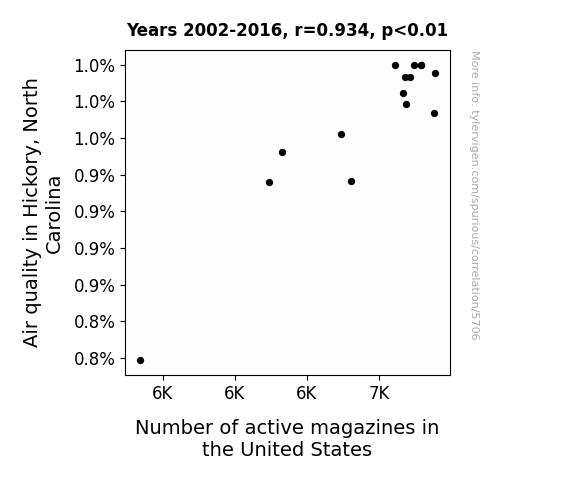
Air Quality in Hickory, North Carolina: A Breath of Fresh Air for the Magazine Industry?
The cleaner air in Hickory led to a surge in productivity at the local magazine printing factory, creating more jobs and demand for active magazines nationwide. You could say it really breathed new life into the industry!
What else correlates?
Air quality in Hickory, North Carolina · all weather
Number of active magazines in the United States · all weird & wacky
Air quality in Hickory, North Carolina · all weather
Number of active magazines in the United States · all weird & wacky


View details about correlation #5,113
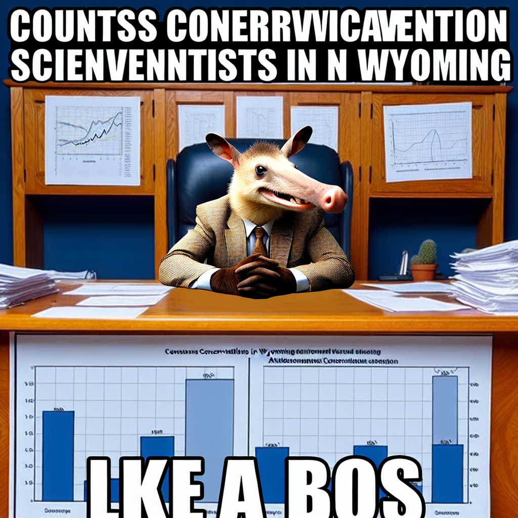
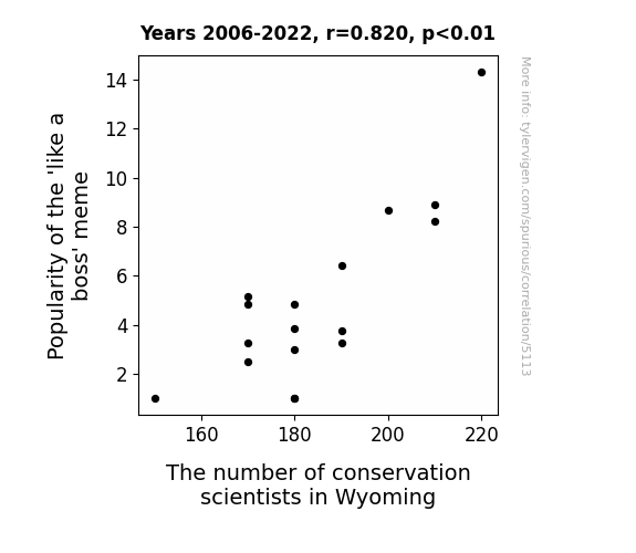
Conservation Bosses: Exploring the Correlation Between the 'Like a Boss' Meme Popularity and Conservation Scientists in Wyoming
As the 'like a boss' meme gained popularity, it sparked a wave of interest in managing natural resources with confidence and authority. This led to more people in Wyoming aspiring to be conservation scientists and protect the environment like true bosses. After all, who wouldn't want to be the boss of preserving wildlife and ecosystems?
What else correlates?
Popularity of the 'like a boss' meme · all memes
The number of conservation scientists in Wyoming · all cccupations
Popularity of the 'like a boss' meme · all memes
The number of conservation scientists in Wyoming · all cccupations


View details about correlation #4,287
Kerosene Kapers: Exploring the Combustible Connection Between MrBeast's YouTube Titles and Central African Republic's Fuel Consumption
As MrBeast's video titles get more lit, so does the kerosene usage in Central African Republic - it's a real spark of entertainment that fuels the nation's brightness!

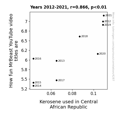
What else correlates?
How fun MrBeast's YouTube video titles are · all YouTube
Kerosene used in Central African Republic · all energy
How fun MrBeast's YouTube video titles are · all YouTube
Kerosene used in Central African Republic · all energy


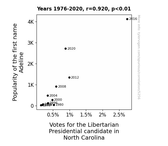
View details about correlation #5,256
Adeline in the Votes: The Libertarian Connection?
As the name Adeline gained popularity, more parents were drawn to its vintage charm. Unbeknownst to them, each time they called out to their little Adeline, it was mistaken for an enthusiastic endorsement of the candidate, leading to a spike in support. It seems the Adeline Effect had everyone voting for a more 'liberated' baby name, with political consequences no one could have predicted!


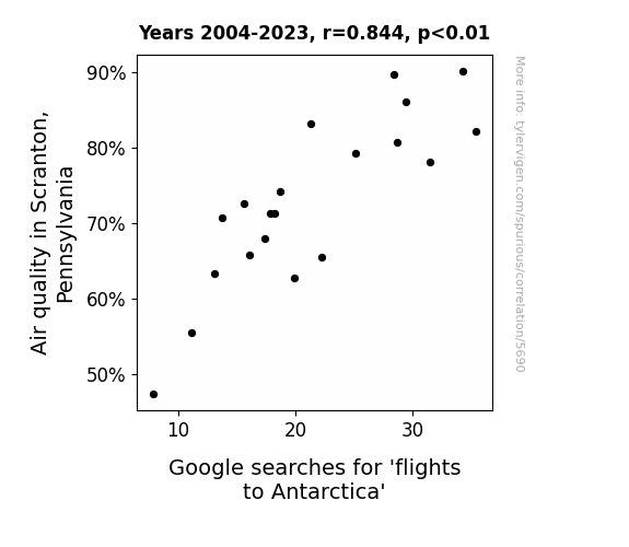
View details about correlation #5,690
Flying South for Clean Air: The Quirky Relationship Between Air Quality in Scranton, Pennsylvania and Google Searches for 'Flights to Antarctica'
Well, you see, as the air quality in Scranton improved, it created a ripple effect in the atmosphere. This led to a localized air current enhancement, affectionately known as the "Dunder Mifflin Draft," which just so happened to facilitate more efficient flight paths to Antarctica. Looks like the penguins might have some new tourists waddling their way!
What else correlates?
Air quality in Scranton, Pennsylvania · all weather
Google searches for 'flights to Antarctica' · all google searches
Air quality in Scranton, Pennsylvania · all weather
Google searches for 'flights to Antarctica' · all google searches


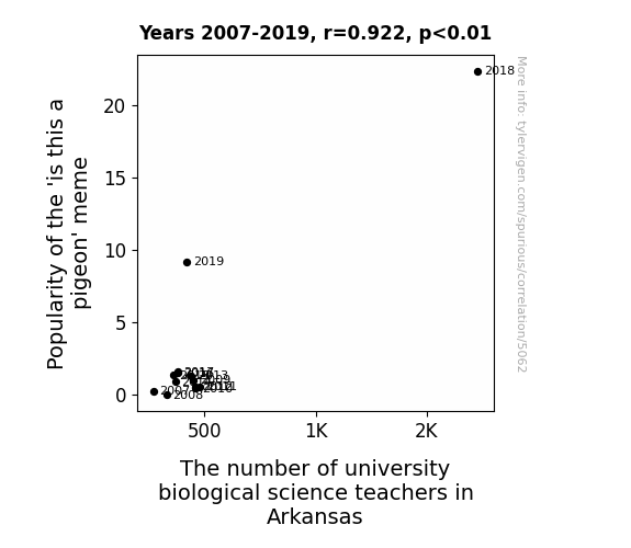
View details about correlation #5,062
Popular Pigeon Perceptions: A Correlative Study on the 'Is this a Pigeon' Meme and University Biological Science Faculty in Arkansas
As the 'is this a pigeon' meme gained popularity, it sparked a renewed interest in identifying different species, leading to an unexpected influx of individuals pursuing careers in biology. This trend was particularly pronounced in Arkansas, where the combination of meme-inspired curiosity and a deep reverence for local wildlife culminated in a surge of aspiring biological science teachers. It seems that sometimes, the flight of educational inspiration can truly be meme-powered!


View details about correlation #3,737
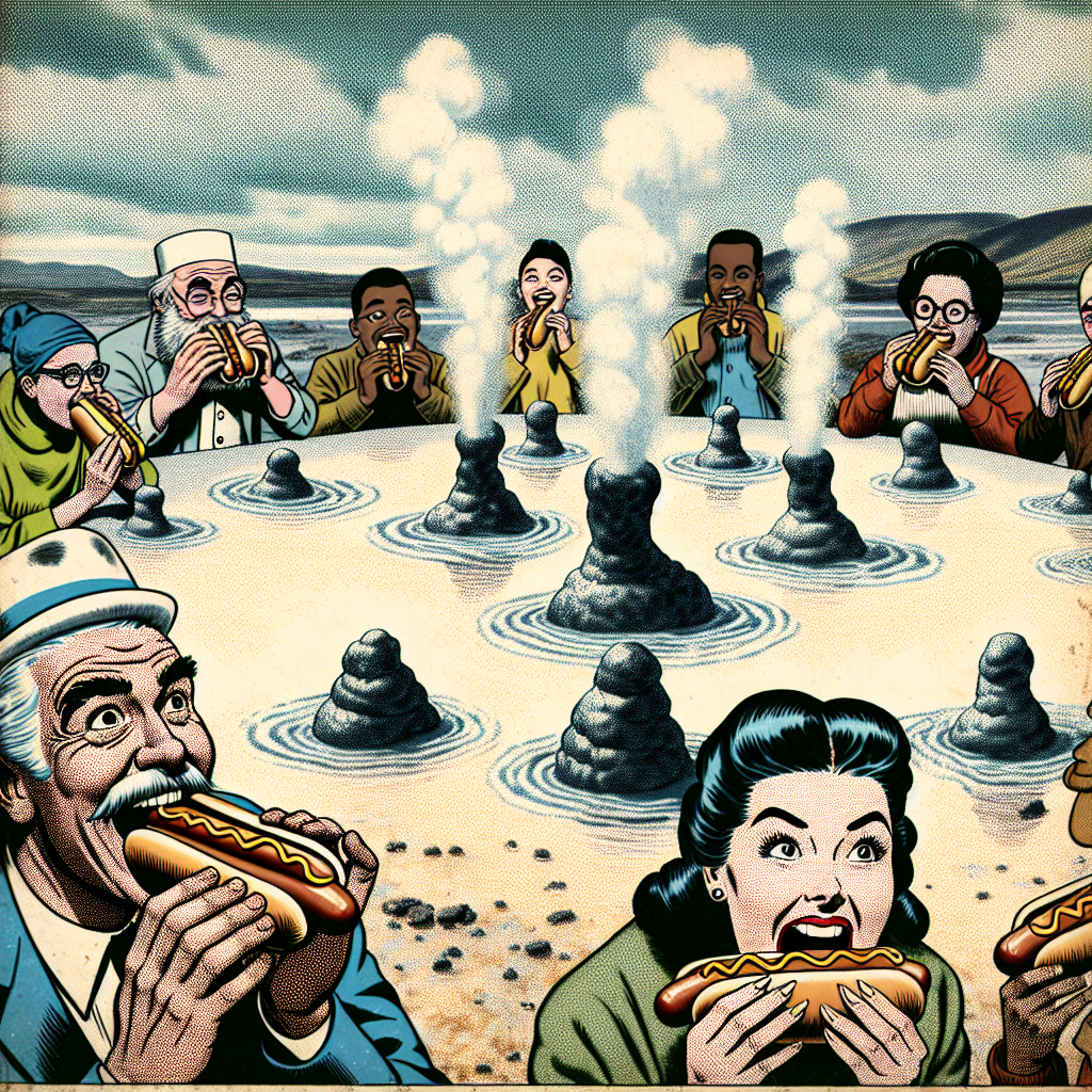
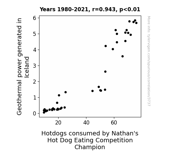
The Sizzling Link: Exploring the Relationship Between Geothermal Power in Iceland and Hotdog Consumption in the Nathan's Hot Dog Eating Competition
The rise in geothermal power in Iceland led to an increase in volcanic activity, which in turn created more underground heat. This inspired the creation of the "Lava Dog," a spicy new hot dog that became a fan favorite at Nathan's. As competitors cranked up their training to handle the heat, they found themselves on a roll, ultimately sausaging their way to victory. It was truly a case of letting off some steam to bring home the mustard-covered glory. The competition was sizzling, and in the end, it was the link between geothermal power and hot dog consumption that proved to be the wurst-kept secret to success.


View details about correlation #5,353
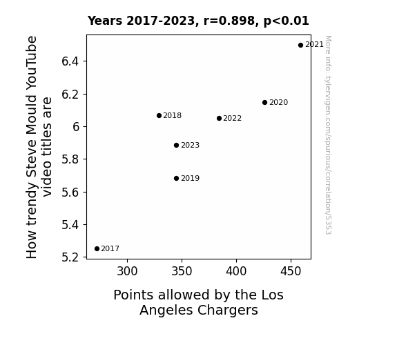
Trending with Touchdowns: A Correlative Analysis of How Steve Mould's YouTube Video Titles Impact the Los Angeles Chargers' Points Allowed
The more Steve Mould's video titles resonate with current trends, the greater the influence on the Chargers' defensive play. It seems the team just can't resist following the latest 'charged' trends to stay current on the field. As Mould's video titles spark a 'shocking' amount of interest, the Chargers' points allowed 'volt' up, showing that even in football, you can't escape the 'electric' pull of trendy content.

What else correlates?
How trendy Steve Mould's YouTube video titles are · all YouTube
Points allowed by the Los Angeles Chargers · all sports
How trendy Steve Mould's YouTube video titles are · all YouTube
Points allowed by the Los Angeles Chargers · all sports


View details about correlation #5,210
Flocking Together: The Correlation Between Republican Votes for Senators in Pennsylvania and Google Searches for 'Where Do Birds Go When It Rains'
As the saying goes, bird of a feather flock together, and it seems the Republican votes and avian precipitation preferences have finally aligned. It appears that the political climate has a direct impact on the feathered community, with the birds opting to take their rainy day activities elsewhere. Whether it's a red or blue state, these birds aren't winging it when it comes to seeking shelter from the storm.


Why this works
- Data dredging: I have 25,237 variables in my database. I compare all these variables against each other to find ones that randomly match up. That's 636,906,169 correlation calculations! This is called “data dredging.”
Fun fact: the chart used on the wikipedia page to demonstrate data dredging is also from me. I've been being naughty with data since 2014.
Instead of starting with a hypothesis and testing it, I instead tossed a bunch of data in a blender to see what correlations would shake out. It’s a dangerous way to go about analysis, because any sufficiently large dataset will yield strong correlations completely at random. - Lack of causal connection: There is probably no direct connection between these variables, despite what the AI says above.
Because these pages are automatically generated, it's possible that the two variables you are viewing are in fact causually related. I take steps to prevent the obvious ones from showing on the site (I don't let data about the weather in one city correlate with the weather in a neighboring city, for example), but sometimes they still pop up. If they are related, cool! You found a loophole.
This is exacerbated by the fact that I used "Years" as the base variable. Lots of things happen in a year that are not related to each other! Most studies would use something like "one person" in stead of "one year" to be the "thing" studied. - Observations not independent: For many variables, sequential years are not independent of each other. You will often see trend-lines form. If a population of people is continuously doing something every day, there is no reason to think they would suddenly change how they are doing that thing on January 1. A naive p-value calculation does not take this into account.
You will calculate a lower chance of "randomly" achieving the result than represents reality.
To be more specific: p-value tests are probability values, where you are calculating the probability of achieving a result at least as extreme as you found completely by chance. When calculating a p-value, you need to assert how many "degrees of freedom" your variable has. I count each year (minus one) as a "degree of freedom," but this is misleading for continuous variables.
This kind of thing can creep up on you pretty easily when using p-values, which is why it's best to take it as "one of many" inputs that help you assess the results of your analysis.
- Y-axes doesn't start at zero: I truncated the Y-axes of the graphs above. I also used a line graph, which makes the visual connection stand out more than it deserves.
Nothing against line graphs. They are great at telling a story when you have linear data! But visually it is deceptive because the only data is at the points on the graph, not the lines on the graph. In between each point, the data could have been doing anything. Like going for a random walk by itself!
Mathematically what I showed is true, but it is intentionally misleading. If you click on any of the charts that abuse this, you can scroll down to see a version that starts at zero. - Confounding variable: Confounding variables (like global pandemics) will cause two variables to look connected when in fact a "sneaky third" variable is influencing both of them behind the scenes.
- Outliers: Some datasets here have outliers which drag up the correlation.
In concept, "outlier" just means "way different than the rest of your dataset." When calculating a correlation like this, they are particularly impactful because a single outlier can substantially increase your correlation.
Because this page is automatically generated, I don't know whether any of the charts displayed on it have outliers. I'm just a footnote. ¯\_(ツ)_/¯
I intentionally mishandeled outliers, which makes the correlation look extra strong. - Low n: There are not many data points included in some of these charts.
You can do analyses with low ns! But you shouldn't data dredge with a low n.
Even if the p-value is high, we should be suspicious of using so few datapoints in a correlation.
Pro-tip: click on any correlation to see:
- Detailed data sources
- Prompts for the AI-generated content
- Explanations of each of the calculations (correlation, p-value)
- Python code to calculate it yourself


