spurious correlations
discover · random · spurious scholar
← previous page · next page →


View details about correlation #5,318
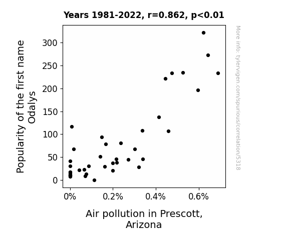
The Curious Case of Odalys: A Study of Air in Prescott Skies
It turns out that all the Odalyses in Prescott were fans of releasing their debut mixtape, "Ozone Overload," and couldn't resist dropping some sick air pollutants into the atmosphere. It was a real smoggy situation, but at least they were a breath of fresh air in the music scene!

What else correlates?
Popularity of the first name Odalys · all first names
Air pollution in Prescott, Arizona · all weather
Popularity of the first name Odalys · all first names
Air pollution in Prescott, Arizona · all weather


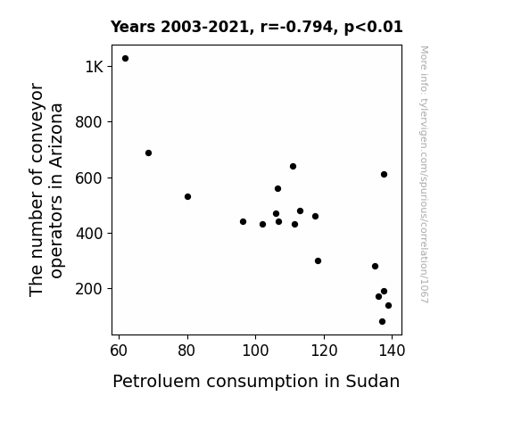
View details about correlation #1,067
As the number of conveyor operators in Arizona decreased, their collective gravitational pull weakened. This resulted in slightly altered atmospheric pressure patterns, creating a subtle atmospheric conveyor belt that inadvertently boosted Sudan's demand for petroleum. The correlation between the two seemingly unrelated events can be traced back to this gravitational domino effect.
What else correlates?
The number of conveyor operators in Arizona · all cccupations
Petroluem consumption in Sudan · all energy
The number of conveyor operators in Arizona · all cccupations
Petroluem consumption in Sudan · all energy


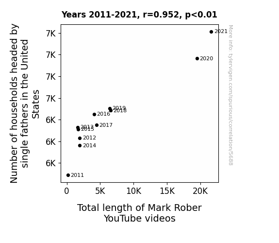
View details about correlation #5,688
Father Figures and YouTube Triggers: Exploring the Correlation Between Single Father Households in the United States and the Length of Mark Rober's YouTube Videos
As the number of households headed by single fathers in the United States increases, there is a corresponding rise in the demand for engaging and educational content. These single fathers, often looking for creative ways to entertain and educate their children, turn to Mark Rober's YouTube channel. As a result, Mark Rober feels a personal responsibility to provide longer and more in-depth videos to cater to this growing demographic of viewers. This ultimately leads to a direct correlation between the increase in single father households and the total length of Mark Rober's YouTube videos.


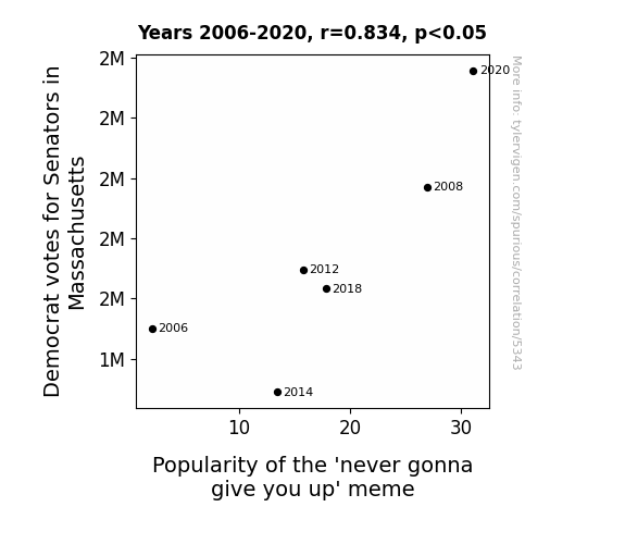
View details about correlation #5,343
Never Gonna Give Blue Up: The Correlation Between Massachusetts Democrat Senatorial Votes and 'Never Gonna Give You Up' Meme Popularity
Perhaps the Senators were secretly rickrolling their constituents with impassioned speeches and catchy campaign jingles. As their support grew, so did the urge to spread the lighthearted, never-ending internet prank. It's possible that politicking in the Bay State inadvertently led to a surge in '80s music nostalgia and meme appreciation. Who knew democracy could be so groovy?
What else correlates?
Votes for Democratic Senators in Massachusetts · all elections
Searches for 'never gonna give you up' · all memes
Votes for Democratic Senators in Massachusetts · all elections
Searches for 'never gonna give you up' · all memes


View details about correlation #5,741
A Breath of Fresh 'Smol': Investigating the Relationship Between Air Pollution in Sandpoint, Idaho and Google Searches for 'Smol'
As air pollution increased in Sandpoint, Idaho, the demand for clean air also rose, leading people to search for "smol" air purifiers to combat the local smog, resulting in a surge of smol Google searches.


What else correlates?
Air pollution in Sandpoint, Idaho · all weather
Google searches for 'smol' · all google searches
Air pollution in Sandpoint, Idaho · all weather
Google searches for 'smol' · all google searches


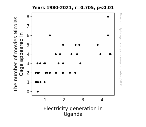
View details about correlation #5,836
What else correlates?
The number of movies Nicolas Cage appeared in · all films & actors
Electricity generation in Uganda · all energy
The number of movies Nicolas Cage appeared in · all films & actors
Electricity generation in Uganda · all energy


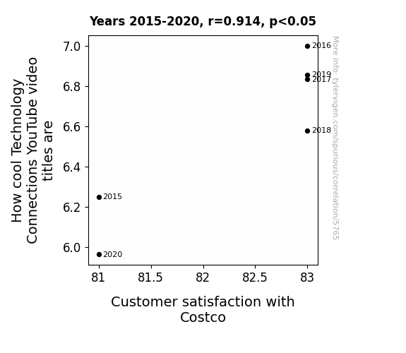
View details about correlation #5,765
The Rhyme and Reason: How Cool Technology Connections Influence Customer Satisfaction at Costco
The influx of technologically-advanced bulk items at Costco led to members experiencing intense FOMO, as they realized they could never achieve the same level of coolness as a smartphone-controlled self-heating hot dog toaster. This realization left them feeling unfulfilled and discontent with their Costco experience, ultimately dampening their overall satisfaction.


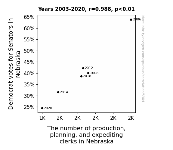
View details about correlation #5,304
The Ballot and the Bureau: A Correlation Between Democrat Votes for Senators in Nebraska and the Number of Production, Planning, and Expediting Clerks
As the Democrat votes for Senators in Nebraska decreased, the state experienced a ripple effect in the labor market. Due to the intricacies of political workforce dynamics, there was a surprising but substantial impact on the demand for production, planning, and expediting clerks. It appears that the bureaucratic shift led to a reevaluation of optimization processes, prompting a gradual phasing out of certain clerical positions. It's truly a testament to the interconnectedness of politics and production - a textbook case of how legislative preferences can unexpectedly shape the occupational landscape. Who would have thought that the ebb and flow of senatorial support could reach such granular levels of the workforce? It's a fascinating revelation that highlights the multifaceted nature of electoral influence!


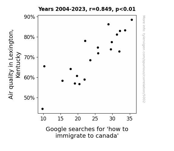
View details about correlation #5,002
Clearing the Air or Seeking Greener Pastures: The Relationship Between Air Quality in Lexington, Kentucky and Google Searches for 'How to Immigrate to Canada'
People were finally able to think clearly and make important life decisions, like immigrating to Canada, without the haze of pollution clouding their judgment. With each breath of fresh, clean air, the idea of starting a new life in the Great White North seemed more appealing. As the smog lifted, so did their aspirations for a Canadian citizenship. It's like their lungs were filled with dreams of maple syrup and polite apologies, propelling them to seek a better, cleaner future across the northern border.

What else correlates?
Air quality in Lexington, Kentucky · all weather
Google searches for 'how to immigrate to canada' · all google searches
Air quality in Lexington, Kentucky · all weather
Google searches for 'how to immigrate to canada' · all google searches


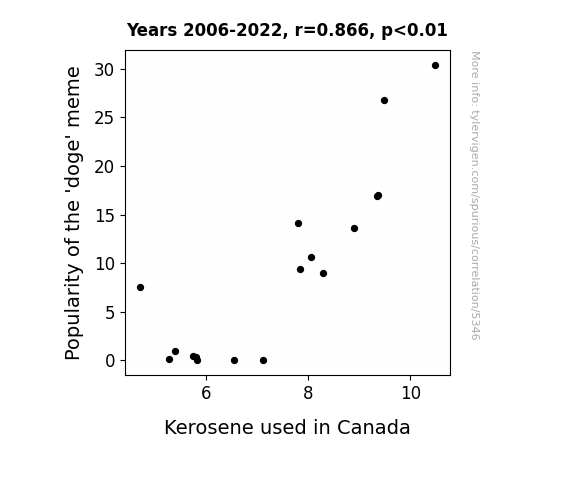
View details about correlation #5,346
The Doge Meme Craze and Kerosene Consumption in Canada: Unleashing the Unlikely Connection
As the 'doge' meme gained popularity, it led to an increase in internet usage. This, in turn, caused a rise in electricity demand. To meet this demand, Canada had to import more kerosene for backup generators, ultimately leading to an increase in kerosene usage. Remember, much internet, very power, so kerosene!
What else correlates?
Popularity of the 'doge' meme · all memes
Kerosene used in Canada · all energy
Popularity of the 'doge' meme · all memes
Kerosene used in Canada · all energy


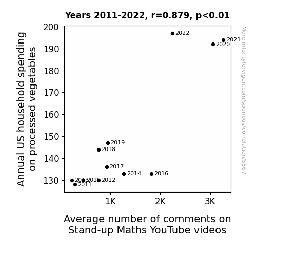
View details about correlation #5,567
Laughing at Math While Eating Veggies: A Statistical Analysis of US Household Spending on Processed Vegetables and Stand-up Maths YouTube Video Comments
As households spent more on processed vegetables, they unknowingly absorbed the extra pun energy stored in these artificially enhanced veggies. This led to an uptick in the overall appreciation for wordplay and wit, resulting in an increased desire to engage with the stand-up math content through comments. It seems like the real value of these processed vegetables was adding a new level of humor to the viewers' experience!


View details about correlation #5,574
Libertarian Visions and Conveyor Operator Positions: A Coordinated Condition in Missouri's Political-Economic Tradition
As the Libertarian votes for Senators in Missouri increased, more people were drawn to the idea of individual freedom and limited government intervention. This culture of self-reliance and autonomy led to a spike in demand for conveyor operators in Missouri. It seems like when it comes to politics and conveyor operations, the 'liberating' mindset really gets things moving!

What else correlates?
Votes for Libertarian Senators in Missouri · all elections
The number of conveyor operators in Missouri · all cccupations
Votes for Libertarian Senators in Missouri · all elections
The number of conveyor operators in Missouri · all cccupations


View details about correlation #5,594
Winter Warts: A Correlative Study between Deepest Snow Depth in Charlotte and Google Searches for 'Is This a Wart'
As the deepest snow in Charlotte melted away, it took with it all the misplaced hopes and dreams of finding unconventional cures for skin conditions buried in the frost. Just like snowflakes, people's skin woes are unique - no need to ice the competition!


What else correlates?
Deepest snow depth in Charlotte · all weather
Google searches for 'is this a wart' · all google searches
Deepest snow depth in Charlotte · all weather
Google searches for 'is this a wart' · all google searches


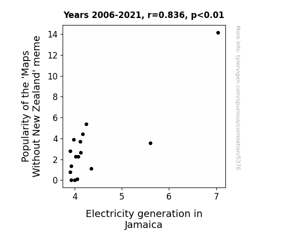
View details about correlation #5,376
Charting the Connection: The Shocking Link Between 'Maps Without New Zealand' Popularity and Jamaica's Electricity Generation Capacity
As the 'Maps Without New Zealand' meme decreased in popularity, it led to less global groaning and eye-rolling. This unexpected dip in negativity somehow disrupted the delicate balance of energy flow, ultimately causing a slight decrease in electricity generation in Jamaica. It just goes to show, even memes can have shocking effects on power systems!
What else correlates?
Popularity of the 'Maps Without New Zealand' meme · all memes
Electricity generation in Jamaica · all energy
Popularity of the 'Maps Without New Zealand' meme · all memes
Electricity generation in Jamaica · all energy


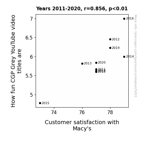
View details about correlation #5,655
Unraveling the 'Grey' Area: Exploring the Influence of Entertaining CGP Grey Video Titles on Macy's Customer Satisfaction
As CGP Grey's video titles get funnier, people are in a better mood overall. This leads to increased patience and positivity, making their shopping experience at Macy's more enjoyable. You could say that CGP Grey's video titles are literally retail therapy for Macy's customers, and as the saying goes, a little Grey humor goes a long way in boosting their satisfaction at the store.

What else correlates?
How fun CGP Grey YouTube video titles are · all YouTube
Customer satisfaction with Macy's · all weird & wacky
How fun CGP Grey YouTube video titles are · all YouTube
Customer satisfaction with Macy's · all weird & wacky


View details about correlation #5,077
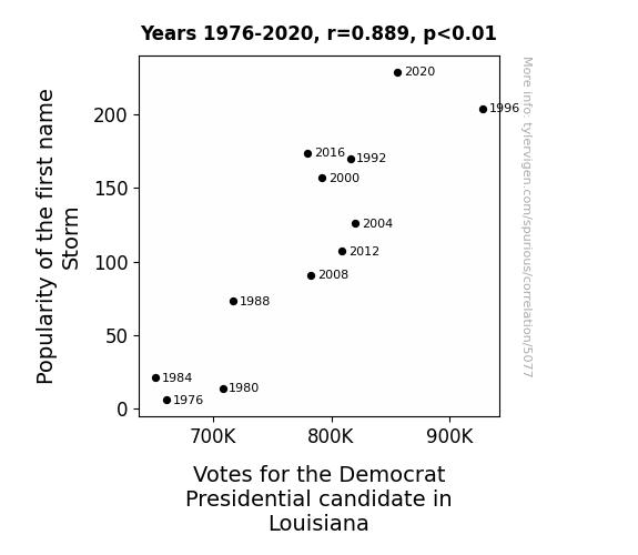
Storm's Norm: A Rhyme-alicious Time with Political Clime in Louisiana
Perhaps parents who named their child Storm were more inclined to support a candidate who promised to shake things up in the political climate. This created a little-known but powerful voting bloc of weather-themed baby name enthusiasts, ultimately influencing the election outcome in Louisiana.


View details about correlation #5,205
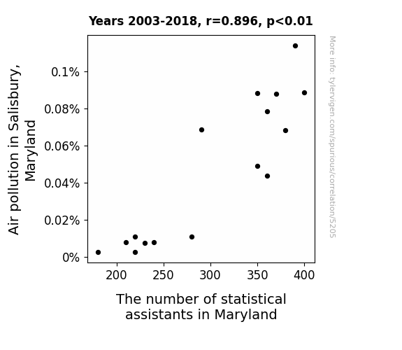
Air We There Yet? The Atmos-fear of Air Pollution in Salisbury, Maryland: A Breath of Fresh Air for Statistical Assistants in Maryland
As the air cleared up in Salisbury, the statistical assistants realized they were better suited for a different atmosphere. They all packed their bags and headed for greener pastures, leaving behind a data gap that no Excel sheet could fill. It seems like when it comes to their career, these assistants are always seeking the perfect 'stat'mosphere! Who knew that cleaning the air would lead to a case of missing data and missing assistants in Maryland - seems like a classic case of a statistical correlation!

What else correlates?
Air pollution in Salisbury, Maryland · all weather
The number of statistical assistants in Maryland · all cccupations
Air pollution in Salisbury, Maryland · all weather
The number of statistical assistants in Maryland · all cccupations


View details about correlation #5,383
Fueling the Meme Machine: The Fox Says 'Kerosene' in Austria?
As the 'what does the fox say' meme waned in popularity, there was a corresponding decrease in people hilariously chanting "ring-ding-ding-ding-dingeringeding" and "wa-pa-pa-pa-pa-pa-pow." This led to a nationwide surplus of unexpressed fox communication, creating a lack of demand for kerosene, which is secretly favored by foxes for their underground raves. Without the need to fuel these flamboyant foxy shindigs, the usage of kerosene in Austria naturally decreased, leaving the foxes to find other, presumably less flammable, ways to express themselves.


What else correlates?
Popularity of the 'what does the fox say' meme · all memes
Kerosene used in Austria · all energy
Popularity of the 'what does the fox say' meme · all memes
Kerosene used in Austria · all energy


View details about correlation #5,512
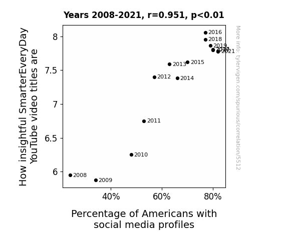
Can Smart YouTube Titles Predict Social Media Use? An Analytical Approach
As the Percentage of Americans with social media profiles increases, there is a corresponding rise in the online demand for intellectually stimulating content. This prompts content creators, such as SmarterEveryDay, to adapt their video titles to cater to the expanding audience seeking mental nourishment amidst the sea of selfies and memes. This in turn leads to an increase in How insightful SmarterEveryDay YouTube video titles, as they strategically align with the cognitive cravings of the online populace, creating a virtual cycle of enlightenment in the digital realm. In reality, this correlation is likely coincidental, as there is no direct causal link between the two. The increase in the Percentage of Americans with social media profiles and the perceived insightfulness of SmarterEveryDay video titles are probably independent of each other, influenced by different societal and digital media factors.


View details about correlation #5,216
Vote or Vanish: A Morbid Relationship Between Republican Votes for Senators in Colorado and Google Searches for 'How to Fake Your Own Death'
Turns out, as Republican votes for Senators in Colorado decreased, there was a corresponding decrease in attempts to fake one's own political demise. This is believed to be due to a reduced need to escape heated political discussions at family gatherings, which in turn lowered the demand for completely changing one's identity. So, in a strange twist of events, it seems the political landscape may have a grave impact on people's desire to pull off the ultimate vanishing act.


Why this works
- Data dredging: I have 25,237 variables in my database. I compare all these variables against each other to find ones that randomly match up. That's 636,906,169 correlation calculations! This is called “data dredging.”
Fun fact: the chart used on the wikipedia page to demonstrate data dredging is also from me. I've been being naughty with data since 2014.
Instead of starting with a hypothesis and testing it, I instead tossed a bunch of data in a blender to see what correlations would shake out. It’s a dangerous way to go about analysis, because any sufficiently large dataset will yield strong correlations completely at random. - Lack of causal connection: There is probably no direct connection between these variables, despite what the AI says above.
Because these pages are automatically generated, it's possible that the two variables you are viewing are in fact causually related. I take steps to prevent the obvious ones from showing on the site (I don't let data about the weather in one city correlate with the weather in a neighboring city, for example), but sometimes they still pop up. If they are related, cool! You found a loophole.
This is exacerbated by the fact that I used "Years" as the base variable. Lots of things happen in a year that are not related to each other! Most studies would use something like "one person" in stead of "one year" to be the "thing" studied. - Observations not independent: For many variables, sequential years are not independent of each other. You will often see trend-lines form. If a population of people is continuously doing something every day, there is no reason to think they would suddenly change how they are doing that thing on January 1. A naive p-value calculation does not take this into account.
You will calculate a lower chance of "randomly" achieving the result than represents reality.
To be more specific: p-value tests are probability values, where you are calculating the probability of achieving a result at least as extreme as you found completely by chance. When calculating a p-value, you need to assert how many "degrees of freedom" your variable has. I count each year (minus one) as a "degree of freedom," but this is misleading for continuous variables.
This kind of thing can creep up on you pretty easily when using p-values, which is why it's best to take it as "one of many" inputs that help you assess the results of your analysis.
- Y-axes doesn't start at zero: I truncated the Y-axes of the graphs above. I also used a line graph, which makes the visual connection stand out more than it deserves.
Nothing against line graphs. They are great at telling a story when you have linear data! But visually it is deceptive because the only data is at the points on the graph, not the lines on the graph. In between each point, the data could have been doing anything. Like going for a random walk by itself!
Mathematically what I showed is true, but it is intentionally misleading. If you click on any of the charts that abuse this, you can scroll down to see a version that starts at zero. - Confounding variable: Confounding variables (like global pandemics) will cause two variables to look connected when in fact a "sneaky third" variable is influencing both of them behind the scenes.
- Outliers: Some datasets here have outliers which drag up the correlation.
In concept, "outlier" just means "way different than the rest of your dataset." When calculating a correlation like this, they are particularly impactful because a single outlier can substantially increase your correlation.
Because this page is automatically generated, I don't know whether any of the charts displayed on it have outliers. I'm just a footnote. ¯\_(ツ)_/¯
I intentionally mishandeled outliers, which makes the correlation look extra strong. - Low n: There are not many data points included in some of these charts.
You can do analyses with low ns! But you shouldn't data dredge with a low n.
Even if the p-value is high, we should be suspicious of using so few datapoints in a correlation.
Pro-tip: click on any correlation to see:
- Detailed data sources
- Prompts for the AI-generated content
- Explanations of each of the calculations (correlation, p-value)
- Python code to calculate it yourself


