spurious correlations
discover · random · spurious scholar
← previous page · next page →


View details about correlation #5,129
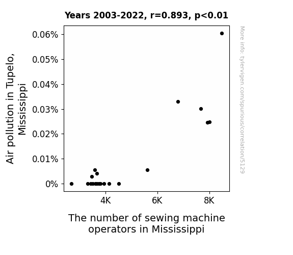
The Buzz in Tupelo: A Stitch in Time? Exploring the Curious Correlation Between Air Pollution and the Number of Sewing Machine Operators in Mississippi
As the air became cleaner, the fabric no longer felt the need to be constantly hemmed and stitched out of self-preservation. This led to a decline in demand for sewing machine operators across the state, as the fabric learned to just let loose and embrace its natural, frayed state. It turns out, all those years of sewing were just a stitch in time to keep the fabric from unraveling, but now it's finally able to breathe easy!

What else correlates?
Air pollution in Tupelo, Mississippi · all weather
The number of sewing machine operators in Mississippi · all cccupations
Air pollution in Tupelo, Mississippi · all weather
The number of sewing machine operators in Mississippi · all cccupations


View details about correlation #5,519
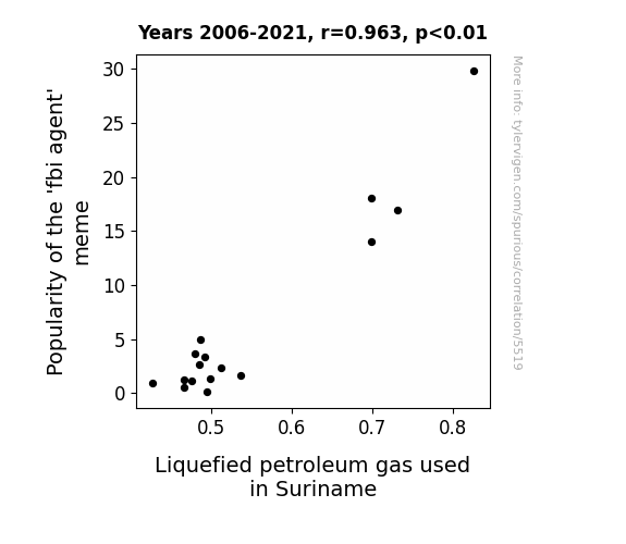
Up in Flames: The Propane-fueled Fad of FBI Agent Meme Popularity
The 'fbi agent' meme has sparked a wave of interest in surveillance technology, leading to an unexpected side effect. As more people share memes and jokes about being watched, there has been a strange surge in demand for LPG in Suriname. It turns out, the meme has somehow created a subliminal connection between FBI agents and LPG, prompting individuals to unknowingly stock up on this flammable gas as a form of lighthearted protest or as a way to confuse their imaginary agents. Who would've thought that internet humor could have such explosive consequences in the world of energy markets?

What else correlates?
Popularity of the 'fbi agent' meme · all memes
Liquefied petroleum gas used in Suriname · all energy
Popularity of the 'fbi agent' meme · all memes
Liquefied petroleum gas used in Suriname · all energy


View details about correlation #5,183
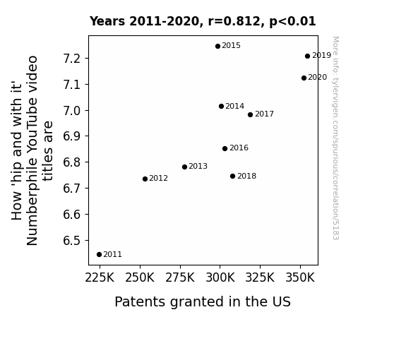
Counting on Creativity: The Correlation between Catchy Numberphile YouTube Video Titles and US Patents Granted
Every new patent granted in the US actually contains a secret dance move or slang word as a hidden requirement, and the Numberphile team has been integrating these patented moves and words into their video titles to stay ahead of the intellectual property game.

What else correlates?
How 'hip and with it' Numberphile YouTube video titles are · all YouTube
Patents granted in the US · all weird & wacky
How 'hip and with it' Numberphile YouTube video titles are · all YouTube
Patents granted in the US · all weird & wacky


View details about correlation #5,319
Chillin' with the Penguins: The Antarctic Connection between Republican Votes for Senators in Pennsylvania and Google Searches
As Republican votes for Senators in Pennsylvania decreased, the polarizing political climate led to a thawing of interest in traveling to Antarctica. With fewer people feeling the chill of partisan politics, the search for ways to reach the icy continent also dropped, as individuals found themselves more warmly inclined towards other destinations.


View details about correlation #5,430
Smog's Hog: The Vogue of the Photographer's Brogue in Knoxville, Tennessee
As the air cleared, it became harder to take smogtastic photos. The photographers just couldn't picture themselves staying in a place with such clean air. So they decided to focus on greener pastures instead of those crystal-clear skies.

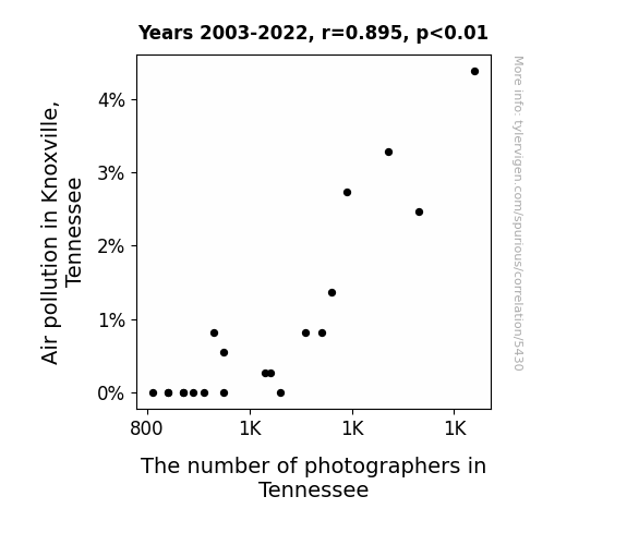
What else correlates?
Air pollution in Knoxville, Tennessee · all weather
The number of photographers in Tennessee · all cccupations
Air pollution in Knoxville, Tennessee · all weather
The number of photographers in Tennessee · all cccupations


View details about correlation #1,221

What else correlates?
The distance between Neptune and the moon · all planets
Popularity of the first name Andrea · all first names
The distance between Neptune and the moon · all planets
Popularity of the first name Andrea · all first names


View details about correlation #4,929
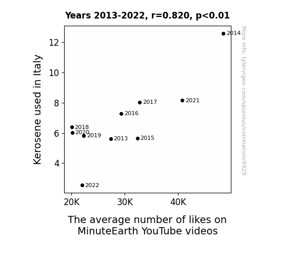
Kerosene Comedy: Illuminating the Connection Between Kerosene Use in Italy and the Liking Patterns of MinuteEarth YouTube Videos
As Italy used less kerosene, it led to a dimmer overall mood. This dimmer mood meant people weren't as easily 'ignited' by MinuteEarth's content, so they didn't feel the 'spark' to hit the like button. The 'likeability' of the videos was quite literally affected by the 'reduced fuel' for enthusiasm in Italy. It's a case of Kerosene-haustion leading to a real 'combustible' situation for MinuteEarth's online engagement. The 'bright spark' of entertainment just couldn't 'ignite' the same level of interest without the 'kerosene' for a positive response.

What else correlates?
Kerosene used in Italy · all energy
The average number of likes on MinuteEarth YouTube videos · all YouTube
Kerosene used in Italy · all energy
The average number of likes on MinuteEarth YouTube videos · all YouTube


View details about correlation #5,615
The Red, the White, and the Queasy: Republican Votes in Washington and Google Searches for 'How to Move to Europe'
The theory that if you can't beat 'em, join 'em has taken an unexpected turn with Republicans in Washington voting for Senators. As the political landscape shifts, so does the mindset of residents, leading to a sudden surge in interest in relocating to Europe. Perhaps it's a quest for new perspectives or just a longing for a more 'continental' approach to life. Looks like the Emerald City might be losing its luster for some!


View details about correlation #5,391
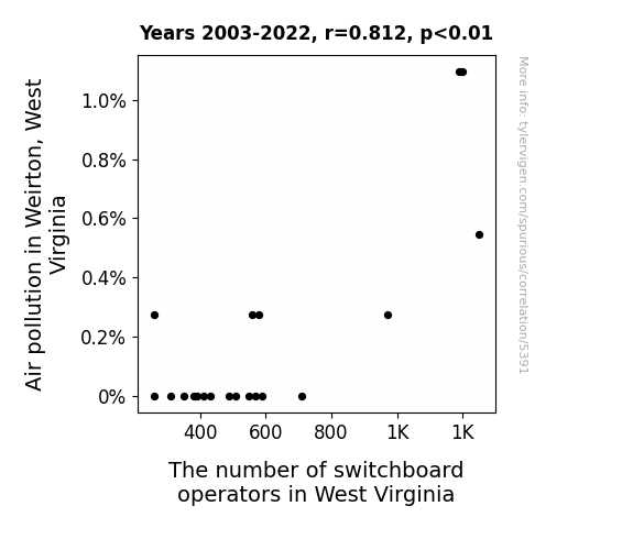
Dialing in on the Polluted Connection: Air Pollution in Weirton, West Virginia and the Decline of Switchboard Operators in the State
With the air cleared up, the city finally made the switch to modern technology, leaving the operators hanging on the line for a new career path.


View details about correlation #5,164
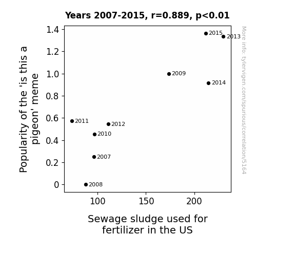
Meme Mania: The Memorable Merge of 'is this a pigeon' Popularity and Peculiar Proliferation of Poo-based Fertilizer in the US
The 'is this a pigeon' meme became so popular that people started printing out the meme and using it as a form of entertainment while on the toilet. This led to an increase in the amount of toilet paper being used, causing more frequent and larger clogs in the sewage system. As a result, sewage sludge production and disposal had to be ramped up to accommodate the meme-induced toilet paper usage, ultimately leading to an unexpected boom in the sewage sludge industry.

What else correlates?
Popularity of the 'is this a pigeon' meme · all memes
Sewage sludge used for fertilizer in the US · all weird & wacky
Popularity of the 'is this a pigeon' meme · all memes
Sewage sludge used for fertilizer in the US · all weird & wacky


View details about correlation #5,513
Paws for Reflection: Exploring the Link Between Simone Giertz's YouTube Views and Petroleum Consumption in the Cayman Islands
As Simone Giertz's average views on YouTube increased, more people were inspired to create and tinker with robots. This led to a surge in demand for robot parts, causing an unexpected need for more petroleum-based products in the manufacturing and transportation of these parts. As a result, even the laid-back Cayman Islands saw a rise in petroleum consumption to support this newfound robotic revolution. Remember, with great automation comes great oil usage!


What else correlates?
Average views of Simone Giertz's YouTube videos · all YouTube
Petroluem consumption in Cayman Islands · all energy
Average views of Simone Giertz's YouTube videos · all YouTube
Petroluem consumption in Cayman Islands · all energy


View details about correlation #5,022
Googling for Votes: The Telephone Tendency of Florida Republicans
The more Republican Senators Florida has, the closer they get to changing the state bird to the Twitter logo. As they tweet up a storm, Floridians just can't resist the urge to slide into the President's DMs for a chat. Every vote for a Republican Senator is like sending a raven carrying a message straight to the Oval Office.


What else correlates?
Votes for Republican Senators in Florida · all elections
Google searches for 'President phone number' · all google searches
Votes for Republican Senators in Florida · all elections
Google searches for 'President phone number' · all google searches


View details about correlation #5,927
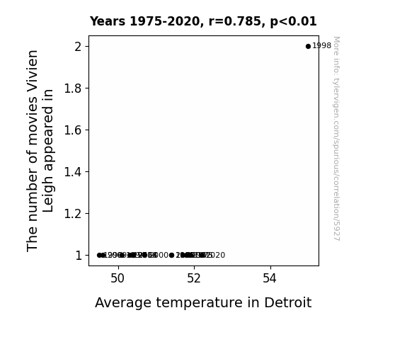
What else correlates?
The number of movies Vivien Leigh appeared in · all films & actors
Average temperature in Detroit · all weather
The number of movies Vivien Leigh appeared in · all films & actors
Average temperature in Detroit · all weather


View details about correlation #5,899
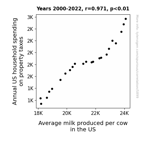
What else correlates?
Annual US household spending on property taxes · all weird & wacky
Average milk produced per cow in the US · all food
Annual US household spending on property taxes · all weird & wacky
Average milk produced per cow in the US · all food


View details about correlation #5,328
The Fuel of Friends: Exploring the Relationship Between Trendy Technology Connections YouTube Video Titles and Petroleum Consumption in Bermuda
As more people in Bermuda watched trendy Technology Connections YouTube videos, they became interested in futuristic cars and gadgets, leading to a higher demand for petroleum. It's a real case of watching online content literally fueling an industry!

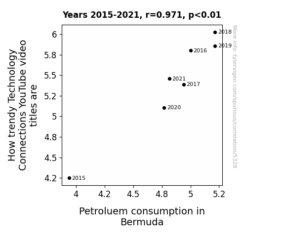
What else correlates?
How trendy Technology Connections YouTube video titles are · all YouTube
Petroluem consumption in Bermuda · all energy
How trendy Technology Connections YouTube video titles are · all YouTube
Petroluem consumption in Bermuda · all energy


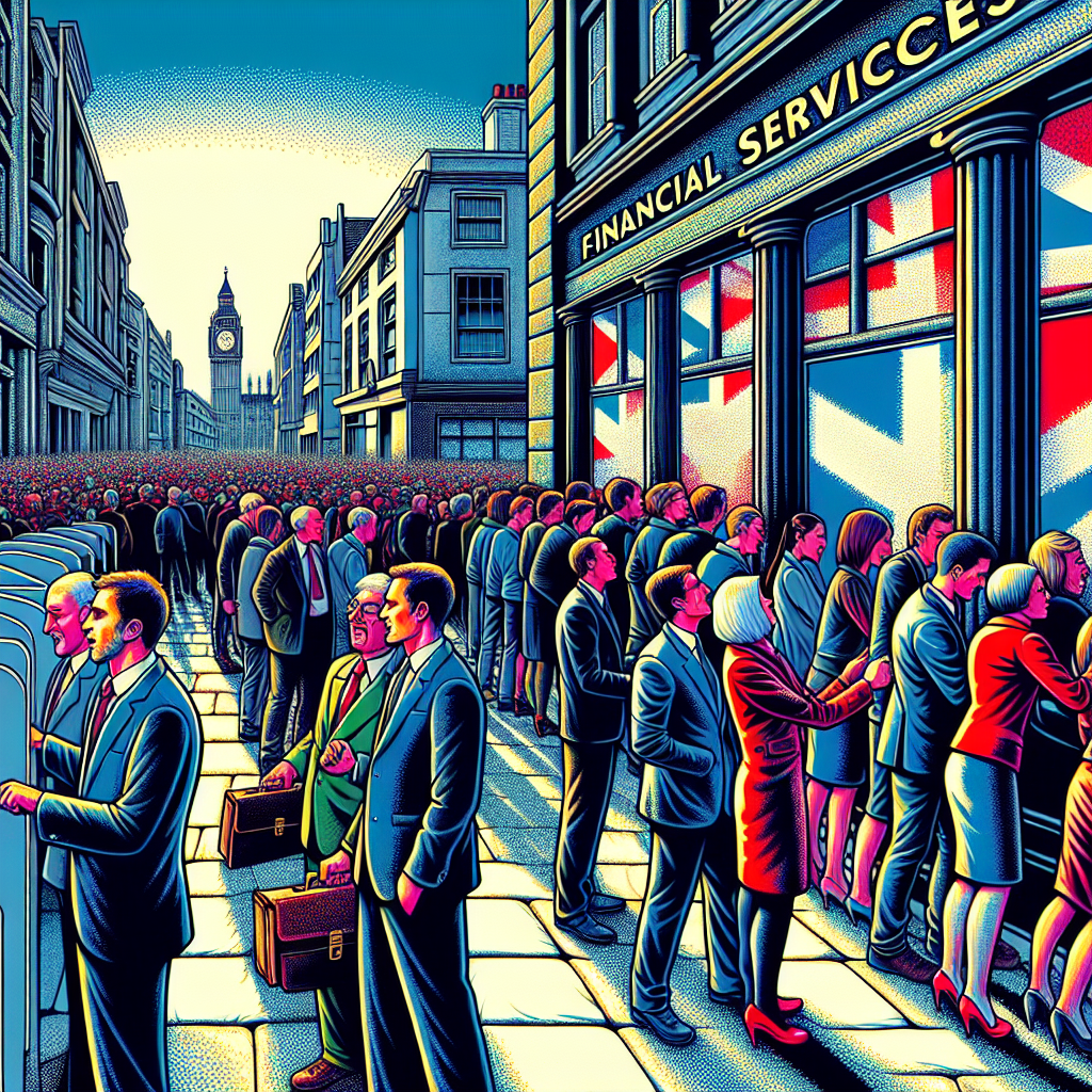
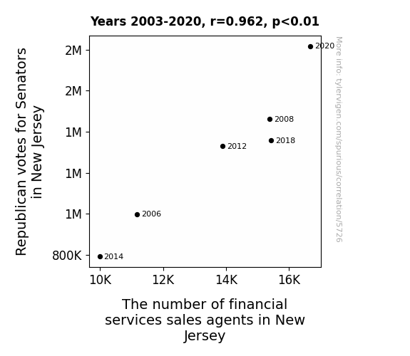
View details about correlation #5,726
Conservative Votes Influence on Financial Agent Flourish in the Garden State: A Jersey-Come-and-See Study
Perhaps the Republican Senators were really good at "campaign managing" and their victory speeches were so inspiring, they motivated a wave of individuals to "vote" with their careers and dive into the financial services industry. It's like they say, when it comes to boosting job numbers, these Senators really know how to "balance the books" of influence!


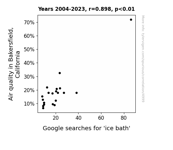
View details about correlation #4,999
Chilling Correlations: The Relationship Between Air Quality in Bakersfield, California, and Google Searches for 'Ice Bath'
As the air quality improved, the local residents suddenly had more energy and a zest for life. This led to a surge in interest in fitness and recovery methods, including taking ice baths. It's amazing what a little extra oxygen can do - Bakersfield became the coolest spot for chilling out, quite literally!

What else correlates?
Air quality in Bakersfield, California · all weather
Google searches for 'ice bath' · all google searches
Air quality in Bakersfield, California · all weather
Google searches for 'ice bath' · all google searches


View details about correlation #4,936
Silly Seafaring: The Curious Correlation Between the 'Dumb Ways to Die' Meme and Pirate Attacks in Indonesia
As the 'dumb ways to die' meme gained popularity, more and more people were drawn to the idea of unconventional and somewhat comical ways of meeting their end. This led to a surge in amateur interest in pirate activities, as individuals sought out adventurous and 'dumb' ways to embrace the pirate lifestyle. The meme inadvertently sparked a 'yo ho ho and a bottle of... oops, there goes my leg' mentality that contributed to the rise in pirate attacks in Indonesia. After all, who wouldn't want to reenact a ridiculous pirate-themed demise from the meme, albeit with a questionable understanding of maritime law and appropriate swashbuckling attire? In a strange twist of fate, the 'dumb ways to die' meme ended up inadvertently romanticizing piracy for a misguided few, proving that even the most absurd internet fads can have unexpected and nonsensical real-world consequences. Yo ho NOOOOOOO!


What else correlates?
Popularity of the 'dumb ways to die' meme · all memes
Number of pirate attacks in Indonesia · all weird & wacky
Popularity of the 'dumb ways to die' meme · all memes
Number of pirate attacks in Indonesia · all weird & wacky


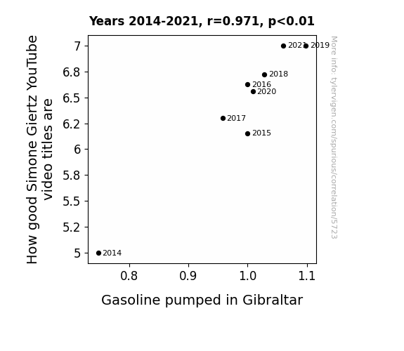
View details about correlation #5,723
Fueling Laughter: The Giggle Gas Connection Between Simone Giertz YouTube Video Titles and Gasoline Pumped in Gibraltar
As the gasoline in Gibraltar is pumped up, it creates a spark of inspiration in the local population. This newfound creativity leads to an upsurge in cleverness, which indirectly elevates the quality of Simone Giertz's YouTube video titles. It's like the fumes of puns and ingenuity are filling the air, propelling her content to new heights! So, you could say that as the petrol potency in Gibraltar rises, so does the pun proficiency of these video titles! It's a real combustion of creativity!

What else correlates?
How good Simone Giertz's YouTube video titles are · all YouTube
Gasoline pumped in Gibraltar · all energy
How good Simone Giertz's YouTube video titles are · all YouTube
Gasoline pumped in Gibraltar · all energy


View details about correlation #5,682
Vivian, Votin', and Voodoo Statistics: A Name-cident Analysis of Republican Votes for Senators in South Carolina
As the number of VIVIANs rose, so did the VIVIANity of the state. This led to a surge in support for candidates who vowed to uphold traditional values and exuded a certain VIVIANesque charm, hence boosting the Republican votes. It was a VIVIANtastic political phenomenon!
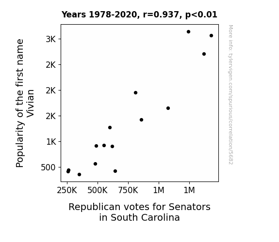
What else correlates?
Popularity of the first name Vivian · all first names
Votes for Republican Senators in South Carolina · all elections
Popularity of the first name Vivian · all first names
Votes for Republican Senators in South Carolina · all elections
Why this works
- Data dredging: I have 25,237 variables in my database. I compare all these variables against each other to find ones that randomly match up. That's 636,906,169 correlation calculations! This is called “data dredging.”
Fun fact: the chart used on the wikipedia page to demonstrate data dredging is also from me. I've been being naughty with data since 2014.
Instead of starting with a hypothesis and testing it, I instead tossed a bunch of data in a blender to see what correlations would shake out. It’s a dangerous way to go about analysis, because any sufficiently large dataset will yield strong correlations completely at random. - Lack of causal connection: There is probably no direct connection between these variables, despite what the AI says above.
Because these pages are automatically generated, it's possible that the two variables you are viewing are in fact causually related. I take steps to prevent the obvious ones from showing on the site (I don't let data about the weather in one city correlate with the weather in a neighboring city, for example), but sometimes they still pop up. If they are related, cool! You found a loophole.
This is exacerbated by the fact that I used "Years" as the base variable. Lots of things happen in a year that are not related to each other! Most studies would use something like "one person" in stead of "one year" to be the "thing" studied. - Observations not independent: For many variables, sequential years are not independent of each other. You will often see trend-lines form. If a population of people is continuously doing something every day, there is no reason to think they would suddenly change how they are doing that thing on January 1. A naive p-value calculation does not take this into account.
You will calculate a lower chance of "randomly" achieving the result than represents reality.
To be more specific: p-value tests are probability values, where you are calculating the probability of achieving a result at least as extreme as you found completely by chance. When calculating a p-value, you need to assert how many "degrees of freedom" your variable has. I count each year (minus one) as a "degree of freedom," but this is misleading for continuous variables.
This kind of thing can creep up on you pretty easily when using p-values, which is why it's best to take it as "one of many" inputs that help you assess the results of your analysis.
- Y-axes doesn't start at zero: I truncated the Y-axes of the graphs above. I also used a line graph, which makes the visual connection stand out more than it deserves.
Nothing against line graphs. They are great at telling a story when you have linear data! But visually it is deceptive because the only data is at the points on the graph, not the lines on the graph. In between each point, the data could have been doing anything. Like going for a random walk by itself!
Mathematically what I showed is true, but it is intentionally misleading. If you click on any of the charts that abuse this, you can scroll down to see a version that starts at zero. - Confounding variable: Confounding variables (like global pandemics) will cause two variables to look connected when in fact a "sneaky third" variable is influencing both of them behind the scenes.
- Outliers: Some datasets here have outliers which drag up the correlation.
In concept, "outlier" just means "way different than the rest of your dataset." When calculating a correlation like this, they are particularly impactful because a single outlier can substantially increase your correlation.
Because this page is automatically generated, I don't know whether any of the charts displayed on it have outliers. I'm just a footnote. ¯\_(ツ)_/¯
I intentionally mishandeled outliers, which makes the correlation look extra strong. - Low n: There are not many data points included in some of these charts.
You can do analyses with low ns! But you shouldn't data dredge with a low n.
Even if the p-value is high, we should be suspicious of using so few datapoints in a correlation.
Pro-tip: click on any correlation to see:
- Detailed data sources
- Prompts for the AI-generated content
- Explanations of each of the calculations (correlation, p-value)
- Python code to calculate it yourself


