spurious correlations
discover · random · spurious scholar
← previous page · next page →


View details about correlation #5,458
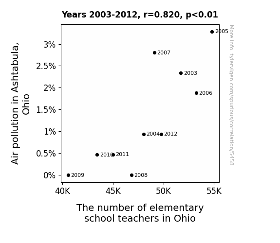
The Polluted Commute: A Tribute to Asthmatics and Academics in Ashtabula
As air quality improved in Ashtabula, Ohio, people felt a sudden urge to leaf the area. This led to a teacher shortage in the state, as the green exodus meant fewer educators to go around. The situation was nothing to sneeze at, as the clean air literally blew the teachers away to greener pastures. The correlation couldn't be swept under the rug, as the fresh breeze of change in Ashtabula wafted its way through the entire state, taking the teaching force with it. In the end, it seems like cleaner air doesn't just lead to healthier lungs, but also to a lesson in the importance of holding onto our valuable teachers!

What else correlates?
Air pollution in Ashtabula, Ohio · all weather
The number of elementary school teachers in Ohio · all cccupations
Air pollution in Ashtabula, Ohio · all weather
The number of elementary school teachers in Ohio · all cccupations


View details about correlation #5,849


View details about correlation #3,850
Fueling the Fire: A Correlational Study on Fossil Fuel Use in Brazil and Hotdog Consumption by the Reigning Champion of Nathan's Hot Dog Eating Competition
The burning of fossil fuels in Brazil led to a greater release of heat-trapping gases, inadvertently raising the global temperature. This, in turn, created the perfect conditions for hot dog crops to thrive, leading to a bumper crop of extra-long, competition-worthy hot dogs specifically sought after by Nathan's Hot Dog Eating Competition Champion.


What else correlates?
Fossil fuel use in Brazil · all energy
Hotdogs consumed by Nathan's Hot Dog Eating Competition Champion · all weird & wacky
Fossil fuel use in Brazil · all energy
Hotdogs consumed by Nathan's Hot Dog Eating Competition Champion · all weird & wacky


View details about correlation #5,767
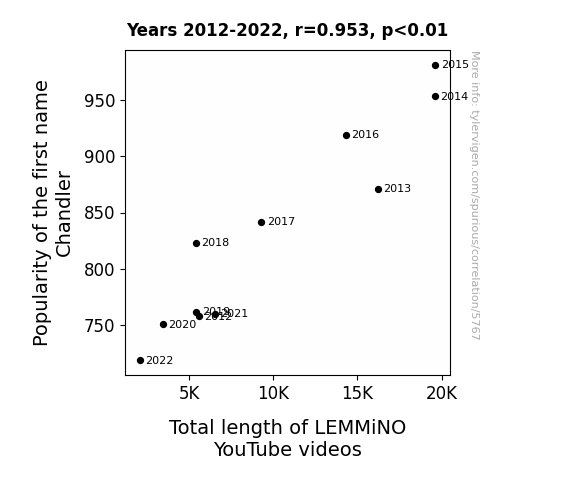
Chillin' with Chandler or Channeling Data: The Correlation Between the Popularity of the Name Chandler and the Length of LEMMiNO YouTube Videos
Every time someone named Chandler was born, a cosmic wave of creativity swept through the universe, inspiring longer and more in-depth LEMMiNO videos. It's as if the name itself contained the secrets of compelling storytelling and extensive research. Remember, if you want more LEMMiNO content, just start naming your kids Chandler!

What else correlates?
Popularity of the first name Chandler · all first names
Total length of LEMMiNO YouTube videos · all YouTube
Popularity of the first name Chandler · all first names
Total length of LEMMiNO YouTube videos · all YouTube


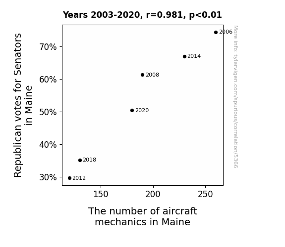
View details about correlation #5,366
Airborne Allegiance: The Correlation Between Republican Votes for Senators in Maine and the Number of Aircraft Mechanics
As Republicans lost support in Maine, their campaign planes received less maintenance, leading to a decrease in demand for aircraft mechanics in the state. Perhaps they should have invested in some 'GOP'-grade engine oil.
What else correlates?
Votes for Republican Senators in Maine · all elections
The number of aircraft mechanics in Maine · all cccupations
Votes for Republican Senators in Maine · all elections
The number of aircraft mechanics in Maine · all cccupations


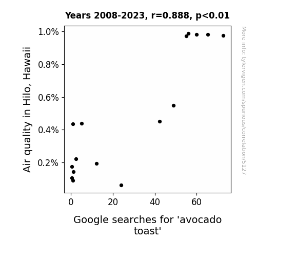
View details about correlation #5,127
Smashing Avocado Toast: A Guacward Connection Between Air Quality in Hilo, Hawaii and Google Searches
As the air quality in Hilo improved, so did the local avocados. These superior avocados led to an unprecedented surge in deliciousness, inspiring more people to Google the perfected avocado toast recipes. It's like Hilo said, "Let's avo-cuddle with cleaner air and tastier toast!"

What else correlates?
Air quality in Hilo, Hawaii · all weather
Google searches for 'avocado toast' · all google searches
Air quality in Hilo, Hawaii · all weather
Google searches for 'avocado toast' · all google searches


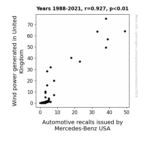
View details about correlation #3,929
Blowin' in the Wind: Uncovering the Aerodynamic Link between UK Wind Power and Mercedes-Benz Recalls
The UK's gusty enthusiasm for wind power was simply blowing Mercedes-Benz USA away, leading to a recall of cars in an attempt to harness some of that renewable energy for their own turbocharged purposes. It seems the air wasn't the only thing getting electric in this shocking correlation!

What else correlates?
Wind power generated in United Kingdom · all energy
Automotive recalls issued by Mercedes-Benz USA · all weird & wacky
Wind power generated in United Kingdom · all energy
Automotive recalls issued by Mercedes-Benz USA · all weird & wacky


View details about correlation #5,163
Geeking Out on YouTube: The CGP Grey Effect on Fidget Spinner Memes
The fidget spinner meme's decline led to a decrease in overall geekiness, prompting CGP Grey to adjust their video titles for a more mainstream appeal. After all, you can't have 'The Politics of Powerpuff Girls' when the world is spinning in a different direction.


What else correlates?
How geeky CGP Grey YouTube video titles are · all YouTube
Popularity of the 'fidget spinner' meme · all memes
How geeky CGP Grey YouTube video titles are · all YouTube
Popularity of the 'fidget spinner' meme · all memes


View details about correlation #5,564
Libertarian Lift: The Link Between Killian and D.C. Ballot Filling
More people naming their kids after Irish saints, and St. Killian is the patron saint of hop-pickers. The demand for craft beer hops skyrocketed, leading to a surge in support for the party that believes in freedom, including the freedom to brew and drink whatever beer you want! Cheers to that!


View details about correlation #5,491
Houston Haze and Texan Postal Praise: The Link Between Air Pollution and Postal Service Machine Operators in Texas
As the air became cleaner, the postal service machine operators no longer needed to battle smog and grime buildup on the machines. With less pollution, the machines stayed cleaner for longer, leading to a reduced need for operators to perform maintenance. The job became so much cleaner that it essentially sorted itself out!


What else correlates?
Air pollution in Houston · all weather
The number of postal service machine operators in Texas · all cccupations
Air pollution in Houston · all weather
The number of postal service machine operators in Texas · all cccupations


View details about correlation #2,627
What else correlates?
Global count of operating nuclear power plants · all weird & wacky
Nuclear power generation in Spain · all energy
Global count of operating nuclear power plants · all weird & wacky
Nuclear power generation in Spain · all energy


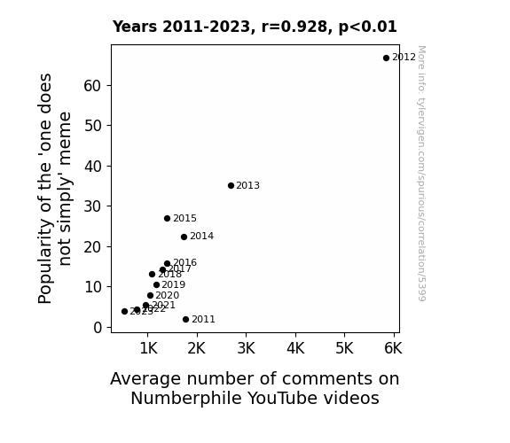
View details about correlation #5,399
One Does Not Simply Comment on Numberphile: Exploring the Correlation Between 'One Does Not Simply' Meme Popularity and Number of Comments on Numberphile YouTube Videos
As the 'one does not simply' meme gained popularity, it sparked a surge in interest in complex or non-intuitive concepts. This indirectly led to more viewers seeking out Numberphile videos to satisfy their newfound curiosity about numbers and mathematical phenomena. After all, one does not simply watch a Numberphile video without being drawn in by the fascinating world of numbers!


View details about correlation #5,523
Say Cheese: The Cheddar Connection - Analyzing the Relationship Between American Cheese Consumption and Republican Votes in Maine
As American cheese consumption increases, so does the likelihood of encountering a cheese-related pun or joke. This leads to a more lighthearted and favorable perception of political candidates who are seen as "grate" or "extra sharp." As a result, voters may feel a subconscious connection between their cheesy sense of humor and the candidate, swaying their votes in favor of the Republican Presidential candidate in Maine.


What else correlates?
American cheese consumption · all food
Votes for the Republican Presidential candidate in Maine · all elections
American cheese consumption · all food
Votes for the Republican Presidential candidate in Maine · all elections


View details about correlation #5,001
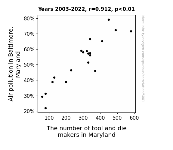
Breath-taking Connections: The Relationship Between Air Pollution in Baltimore, Maryland and the Number of Tool and Die Makers in Maryland
As the air got cleaner in Baltimore, it became a grinding halt for tool and die makers in Maryland. With less pollution, there was less need for them to constantly "ventilate" the situation. It seems the industry just couldn't "screw" around anymore without the smog to "lubricate" their work.

What else correlates?
Air pollution in Baltimore, Maryland · all weather
The number of tool and die makers in Maryland · all cccupations
Air pollution in Baltimore, Maryland · all weather
The number of tool and die makers in Maryland · all cccupations


View details about correlation #1,085
What else correlates?
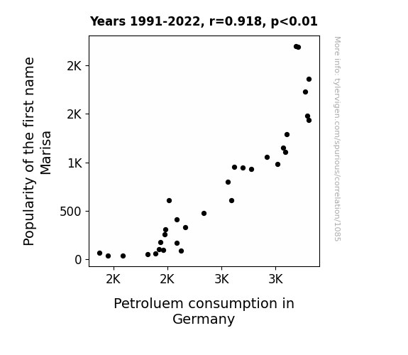
Popularity of the first name Marisa · all first names
Petroluem consumption in Germany · all energy
Popularity of the first name Marisa · all first names
Petroluem consumption in Germany · all energy


View details about correlation #5,505
Space Luck: Exploring the Interstellar Connection Between PBS Space Time Views and Mega Millions Winning Numbers
As the average views of PBS Space Time YouTube videos decreased, so did the collective level of cosmic knowledge among the general population. This led to a decrease in the cosmic energy surrounding the number 4, making it less likely to be a winning Mega Millions number. After all, it's a spaced-out universe out there, and even numbers need some astral support to come out on top! Remember, in this quantum lottery of life, every view counts!


View details about correlation #5,581
Libertarian Leanings and Losing Lamentations: Linking Alabama's Senatorial Supporters to Super Bowl Setbacks
As the Libertarian votes for Senators in Alabama increased, so did the losing team's Points Scored in the Super Bowl. It seems that the push for individual freedom and limited government had a ripple effect on the football field. You could say the losing team was really vying for that "free"dom to score!


What else correlates?
Votes for Libertarian Senators in Alabama · all elections
Points Scored by the losing team in the Super Bowl · all sports
Votes for Libertarian Senators in Alabama · all elections
Points Scored by the losing team in the Super Bowl · all sports


View details about correlation #5,579
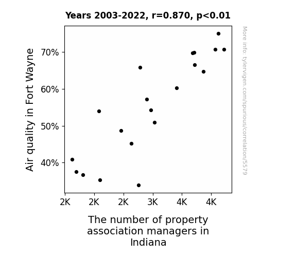
Airfare and Property Care: The Correlation Between Air Quality in Fort Wayne and the Number of Property Association Managers in Indiana
The cleaner air in Fort Wayne led to an influx of new residents, prompting the need for more property association managers statewide. It turns out, nothing attracts people to Indiana like the crisp, refreshing scent of pristine air in Fort Wayne. Who knew that good ol' oxygen could have such a drastic impact on the real estate management industry?

What else correlates?
Air quality in Fort Wayne · all weather
The number of property association managers in Indiana · all cccupations
Air quality in Fort Wayne · all weather
The number of property association managers in Indiana · all cccupations


View details about correlation #5,120
Fueling the Hilarity: Exploring the Correlation between the Popularity of the 'its wednesday my dudes' Meme and Liquefied Petroleum Gas Consumption in Chad
As the 'its wednesday my dudes' meme gained steam, more and more people across the globe were joining in the tradition of celebrating Wednesdays in a truly wild and exhilarating manner. This led to a surge in midweek dance parties, with participants twerking, flossing, and doing the Macarena with unmatched enthusiasm. Deep in the heart of Chad, these energetic dance fests created enough friction to power mini turbines, igniting a sudden fascination with harnessing this untapped source of energy. Before anyone could say "Butane is a gas," the nation was boogieing down to electricity generated from the sheer force of Wednesday hype, all thanks to a meme that knew how to get the world grooving. The power of Internet culture had sparked a dance revolution, proving that when it comes to making an impact, even the smallest spark can set the dance floor - and apparently, the LPG usage statistics - on fire.


What else correlates?
Popularity of the 'its wednesday my dudes' meme · all memes
Liquefied petroleum gas used in Chad · all energy
Popularity of the 'its wednesday my dudes' meme · all memes
Liquefied petroleum gas used in Chad · all energy


View details about correlation #5,469
Maxxing Out Customer Satisfaction: The Ro(be)r Effect of Professional-sounding YouTube Video Titles
Every time Mark Rober releases a video with a title that exudes professionalism, the secret satisfaction algorithm at TJ Maxx gets a little boost. It's like the customers can sense the refined vibes and it elevates their entire discount shopping experience. So, if Mark ever titled a video "The Astrophysics of Bargain Hunting," TJ Maxx might just create a cosmic level of joy in their store!


Why this works
- Data dredging: I have 25,237 variables in my database. I compare all these variables against each other to find ones that randomly match up. That's 636,906,169 correlation calculations! This is called “data dredging.”
Fun fact: the chart used on the wikipedia page to demonstrate data dredging is also from me. I've been being naughty with data since 2014.
Instead of starting with a hypothesis and testing it, I instead tossed a bunch of data in a blender to see what correlations would shake out. It’s a dangerous way to go about analysis, because any sufficiently large dataset will yield strong correlations completely at random. - Lack of causal connection: There is probably no direct connection between these variables, despite what the AI says above.
Because these pages are automatically generated, it's possible that the two variables you are viewing are in fact causually related. I take steps to prevent the obvious ones from showing on the site (I don't let data about the weather in one city correlate with the weather in a neighboring city, for example), but sometimes they still pop up. If they are related, cool! You found a loophole.
This is exacerbated by the fact that I used "Years" as the base variable. Lots of things happen in a year that are not related to each other! Most studies would use something like "one person" in stead of "one year" to be the "thing" studied. - Observations not independent: For many variables, sequential years are not independent of each other. You will often see trend-lines form. If a population of people is continuously doing something every day, there is no reason to think they would suddenly change how they are doing that thing on January 1. A naive p-value calculation does not take this into account.
You will calculate a lower chance of "randomly" achieving the result than represents reality.
To be more specific: p-value tests are probability values, where you are calculating the probability of achieving a result at least as extreme as you found completely by chance. When calculating a p-value, you need to assert how many "degrees of freedom" your variable has. I count each year (minus one) as a "degree of freedom," but this is misleading for continuous variables.
This kind of thing can creep up on you pretty easily when using p-values, which is why it's best to take it as "one of many" inputs that help you assess the results of your analysis.
- Y-axes doesn't start at zero: I truncated the Y-axes of the graphs above. I also used a line graph, which makes the visual connection stand out more than it deserves.
Nothing against line graphs. They are great at telling a story when you have linear data! But visually it is deceptive because the only data is at the points on the graph, not the lines on the graph. In between each point, the data could have been doing anything. Like going for a random walk by itself!
Mathematically what I showed is true, but it is intentionally misleading. If you click on any of the charts that abuse this, you can scroll down to see a version that starts at zero. - Confounding variable: Confounding variables (like global pandemics) will cause two variables to look connected when in fact a "sneaky third" variable is influencing both of them behind the scenes.
- Outliers: Some datasets here have outliers which drag up the correlation.
In concept, "outlier" just means "way different than the rest of your dataset." When calculating a correlation like this, they are particularly impactful because a single outlier can substantially increase your correlation.
Because this page is automatically generated, I don't know whether any of the charts displayed on it have outliers. I'm just a footnote. ¯\_(ツ)_/¯
I intentionally mishandeled outliers, which makes the correlation look extra strong. - Low n: There are not many data points included in some of these charts.
You can do analyses with low ns! But you shouldn't data dredge with a low n.
Even if the p-value is high, we should be suspicious of using so few datapoints in a correlation.
Pro-tip: click on any correlation to see:
- Detailed data sources
- Prompts for the AI-generated content
- Explanations of each of the calculations (correlation, p-value)
- Python code to calculate it yourself


