spurious correlations
discover · random · spurious scholar
← previous page · next page →


View details about correlation #5,645
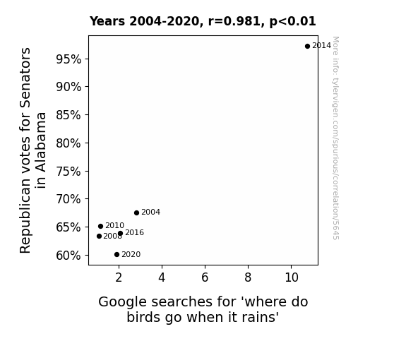
Flipping the Bird: A Correlative Study of Republican Votes for Senators in Alabama and Google Searches for 'Where Do Birds Go When It Rains'
The decrease in Republican votes for Senators in Alabama led to a decrease in hot air being generated, which created a localized anti-cyclonic effect, causing fewer rain showers in the area. So, the birds didn't need to Google for 'where do birds go when it rains' as often because they were experiencing drier conditions overall. One-liner: Seems like the birds were ready to flock to a different forecast!


View details about correlation #5,533
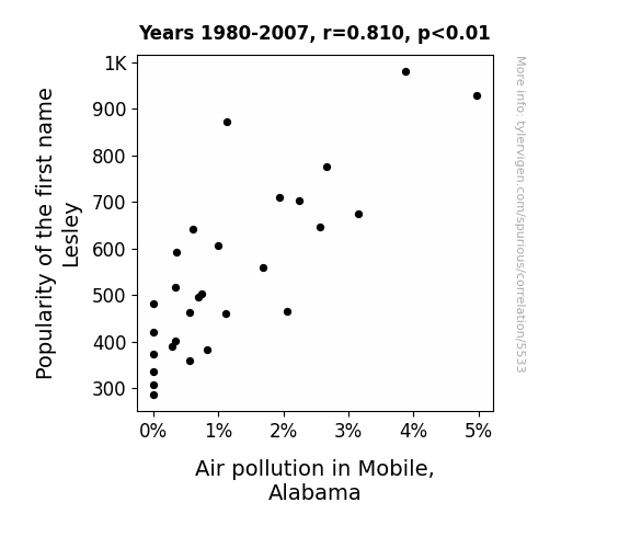
Breathing Easy: The Lesley Effect on Air Quality in Mobile, Alabama
As the popularity of the name Lesley waned, so did the love for using leaf blowers in Mobile, Alabama. With fewer people named Lesley, there were fewer fans of outdoor power equipment, leading to a noticeable decrease in air pollution. It seems the connection between Lesley and less-ley pollution is truly blowing in the wind!

What else correlates?
Popularity of the first name Lesley · all first names
Air pollution in Mobile, Alabama · all weather
Popularity of the first name Lesley · all first names
Air pollution in Mobile, Alabama · all weather


View details about correlation #5,046
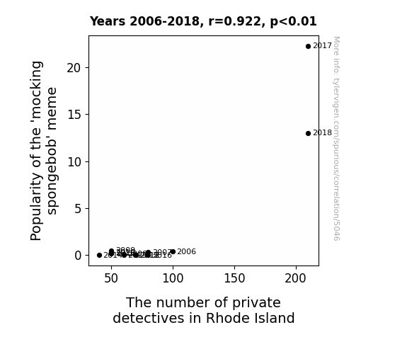
Unraveling the Case: The SpongeBob Mockery Boom and the Private Eye Surge in Rhode Island
As the 'mocking spongebob' meme gained traction, more and more people were imitating the sarcastic tone, causing an epidemic of mimicked conversations. This led to a surge in demand for private detectives in Rhode Island, as individuals sought professional help to uncover the true intent behind these copycat interactions. It seems the case of 'who lives in a pineapple under the sea' has sparked a real undercover operation.

What else correlates?
Popularity of the 'mocking spongebob' meme · all memes
The number of private detectives in Rhode Island · all cccupations
Popularity of the 'mocking spongebob' meme · all memes
The number of private detectives in Rhode Island · all cccupations


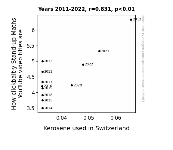
View details about correlation #5,483
From Guffaws to Gasoline: The Correlation between Clickbait-y Stand-up Maths Video Titles and Kerosene Consumption in Switzerland
As the number of clickbait-y Stand-up Maths YouTube video titles increases, so does the Kerosene used in Switzerland. This is because the excessive use of super catchy titles sparks an unintended sense of competitive FOMO among the Swiss population, leading to impromptu dance parties fueled by kerosene - because who can resist a good ol' mathematical conundrum with a side of pyrotechnics? Remember, with great math puns comes great kerosene consumption!

What else correlates?
How clickbait-y Matt Parker's YouTube video titles are · all YouTube
Kerosene used in Switzerland · all energy
How clickbait-y Matt Parker's YouTube video titles are · all YouTube
Kerosene used in Switzerland · all energy


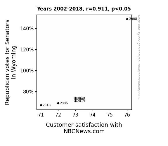
View details about correlation #5,502
Red States and News Rates: An Analysis of the Relationship between Republican Senatorial Votes in Wyoming and Customer Satisfaction with NBCNews.com
As Republican votes for Senators in Wyoming increased, the 'reel' news aficionados felt 'lassoed' in by the coverage, leading to a 'grand ol' party' of satisfied website visitors on NBCNews.com. It seems like when it comes to political views and news reviews, there's a 'Wyoming-come, Wyoming-go' effect that's 'con-senator-ly' shaping perceptions. After all, nothing gets people to 'govern-ment' like a bit of news-induced 'elec-shun' of entertainment.
What else correlates?
Votes for Republican Senators in Wyoming · all elections
Customer satisfaction with NBCNews.com · all weird & wacky
Votes for Republican Senators in Wyoming · all elections
Customer satisfaction with NBCNews.com · all weird & wacky


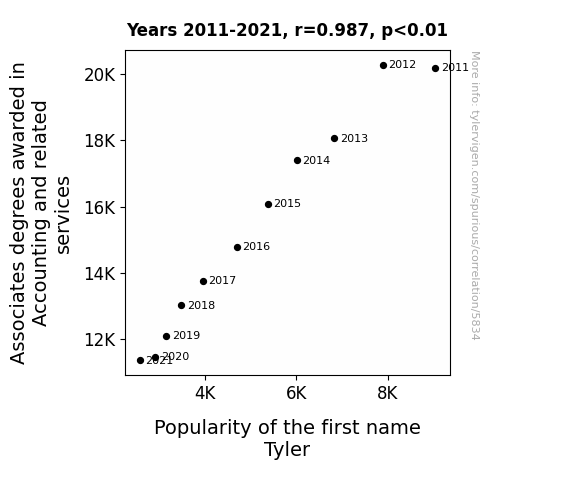
View details about correlation #5,834
What else correlates?
Associates degrees awarded in Accounting · all education
Popularity of the first name Tyler · all first names
Associates degrees awarded in Accounting · all education
Popularity of the first name Tyler · all first names


View details about correlation #5,813
From Crying Jordan to Crying Shame: Unraveling the Bizarre Connection Between Internet Memes and Preschool Education in Arizona
The meme's widespread use led to an upsurge in demand for tissues, boosting the economy and consequently increasing funding for education, including the hiring of more preschool special education teachers in Arizona.


View details about correlation #3,880
Puzzling Pollution: Parsing the Link Between Air Quality in Seneca and Jet Fuel in Burkina Faso
The higher levels of air pollution in Seneca, South Carolina created stronger air currents that inadvertently contributed to more efficient combustion of jet fuel in Burkina Faso. It's like Seneca was unintentionally giving Burkina Faso's jets a literal air-boost!


What else correlates?
Air pollution in Seneca, South Carolina · all weather
Jet fuel used in Burkina Faso · all energy
Air pollution in Seneca, South Carolina · all weather
Jet fuel used in Burkina Faso · all energy


View details about correlation #5,620
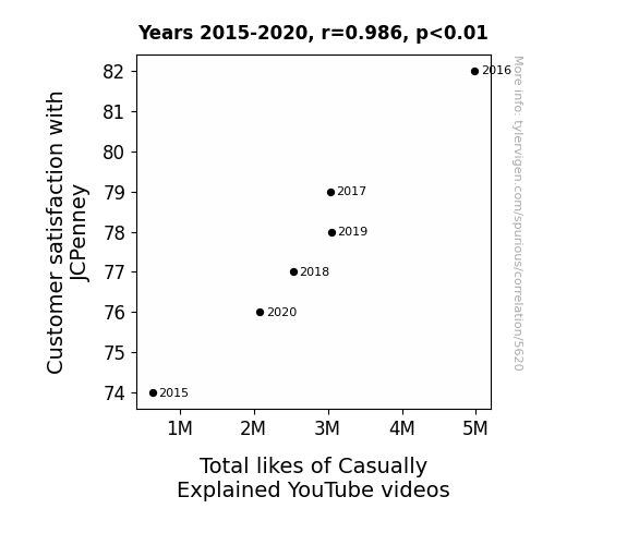
From JCP to Jokes: Exploring the Relationship Between Customer Satisfaction at JCPenney and Total Likes of Casually Explained YouTube Videos
The improvement in customer satisfaction at JCPenney led to a surge in overall happiness. This positivity somehow got channeled into people enjoying the laid-back and amusingly informative content from Casually Explained. It's like the better JCPenney treated its customers, the more people were casually and deeply entertained by those videos. It's a mystery wrapped in a comfy, affordable, and surprisingly stylish package!

What else correlates?
Customer satisfaction with JCPenney · all weird & wacky
Total likes of Casually Explained YouTube videos · all YouTube
Customer satisfaction with JCPenney · all weird & wacky
Total likes of Casually Explained YouTube videos · all YouTube


View details about correlation #5,806
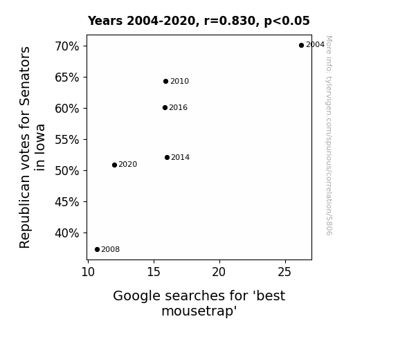
Cheesing the System: Analyzing the Correlation Between Republican Votes for Senators in Iowa and Google Searches for 'Best Mousetrap'
The decrease in Republican votes for Senators in Iowa caused a decrease in Google searches for 'best mousetrap' because as the saying goes, when it comes to politics, it's all about who can 'trap' the most votes. With the demographic shift, it seems the mice weren't the only ones looking for a change in the 'House'!

What else correlates?
Votes for Republican Senators in Iowa · all elections
Google searches for 'best mousetrap' · all google searches
Votes for Republican Senators in Iowa · all elections
Google searches for 'best mousetrap' · all google searches


View details about correlation #5,582
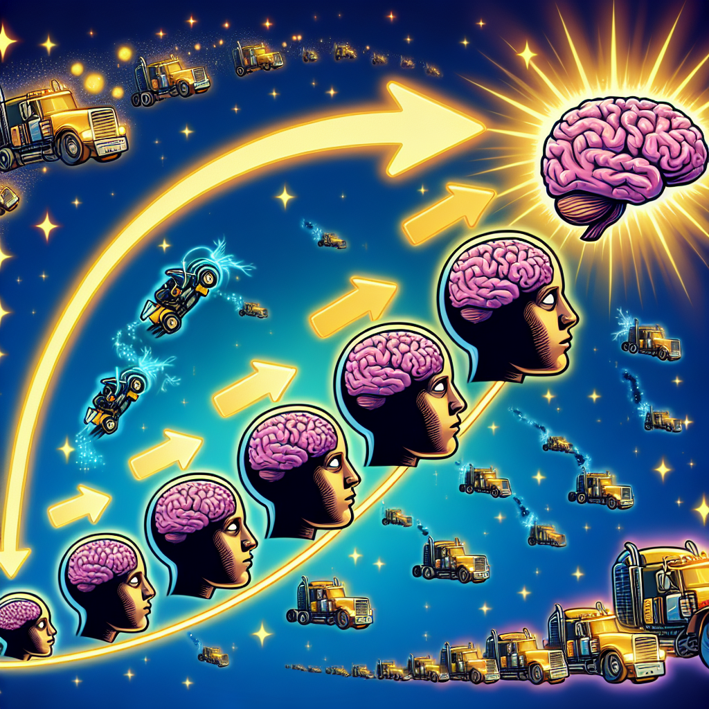
The Big Brain Connection: Unveiling the Relationship Between Virality of the 'Expanding Brain' Meme and the Workforce of Farm Equipment Mechanics in West Virginia
As the 'expanding brain' meme gained traction, it sparked a surge in interest in expanding one's knowledge. This led to more people in West Virginia pursuing careers in farm equipment mechanics, as they saw it as a path to not just regular brain power, but farm brain power. The meme essentially plowed the way for a new generation of mechanically inclined individuals, sowing the seeds of agricultural expertise and harvesting a bumper crop of farm equipment mechanics in the state.


View details about correlation #5,784
The Windy Woes: Warsaw's Air Quality and Latvia's Wind Power
The cleaner air in Warsaw, Indiana has led to an uptick in butterfly populations. These butterflies, with their flapping wings, have inadvertently created a butterfly effect, causing stronger winds to blow in Latvia. This, in turn, has boosted the generation of wind power in the country. So, in a truly whimsical way, the environmental improvements in one location have fluttered their way to positively impact renewable energy production in another.


What else correlates?
Air quality in Warsaw, Indiana · all weather
Wind power generated in Latvia · all energy
Air quality in Warsaw, Indiana · all weather
Wind power generated in Latvia · all energy


View details about correlation #5,497
Legal Eagles and Simone's Steeple: Unraveling the Correlation Between the Number of Lawyers in the United States and Total Likes on Simone Giertz YouTube Videos
As the number of lawyers in the United States increased, so did the amount of paperwork and legal jargon. This inadvertently led to more people seeking lighthearted entertainment to balance out the serious and complex nature of the legal world. Simone Giertz's quirky and amusing YouTube videos became a go-to source of comic relief, boosting her total likes as viewers turned to her unique content to escape the legal mumbo jumbo. It's a case of laughter being the best (legal) medicine! Or perhaps, as the legal field expanded, so did the demand for unconventional robot humor, creating a circuitous connection between lawyers and Giertz's YouTube popularity.


What else correlates?
Number of Lawyers in the United States · all weird & wacky
Total likes of Simone Giertz's YouTube videos · all YouTube
Number of Lawyers in the United States · all weird & wacky
Total likes of Simone Giertz's YouTube videos · all YouTube


View details about correlation #4,932
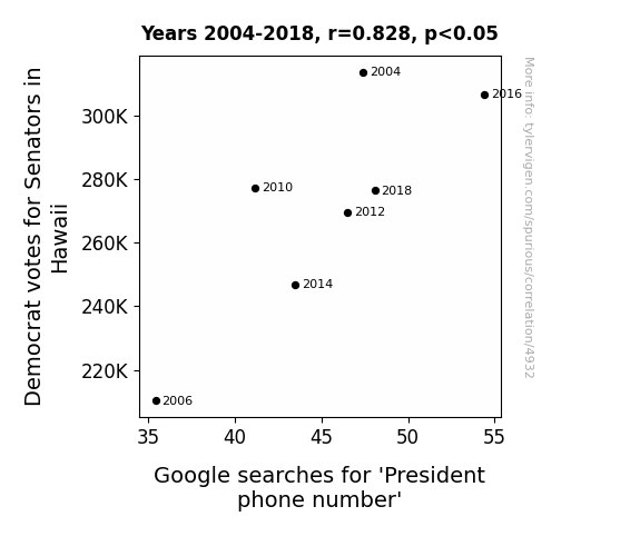
Dialing for Democrats: The Connection Between Senatorial Preferences in Hawaii and Google Searches for the President's Phone Number
The decrease in Democrat votes for Senators in Hawaii caused President phone number (Google searches for 'President phone number') to decrease because as the Democrat votes decreased, so did their ability to use their magical conch shell to directly contact the President in times of need. With fewer Senators to chant the secret presidential summoning chant, the general public realized they would have to find alternative ways to reach the President, leading to a decrease in searches for the elusive digits. It seems even political communication is not free from the waves of aloha and electoral shenanigans!

What else correlates?
Votes for Democratic Senators in Hawaii · all elections
Google searches for 'President phone number' · all google searches
Votes for Democratic Senators in Hawaii · all elections
Google searches for 'President phone number' · all google searches


View details about correlation #4,984
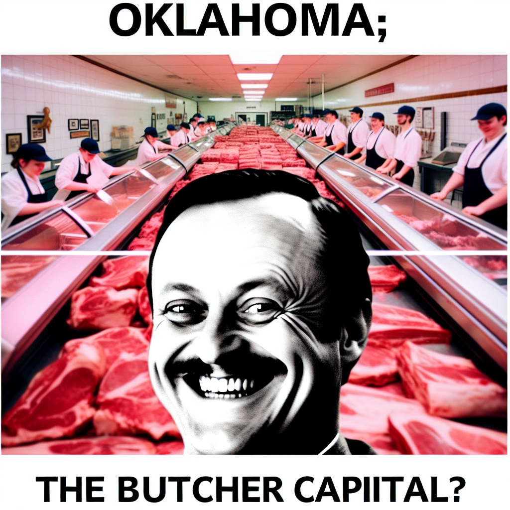
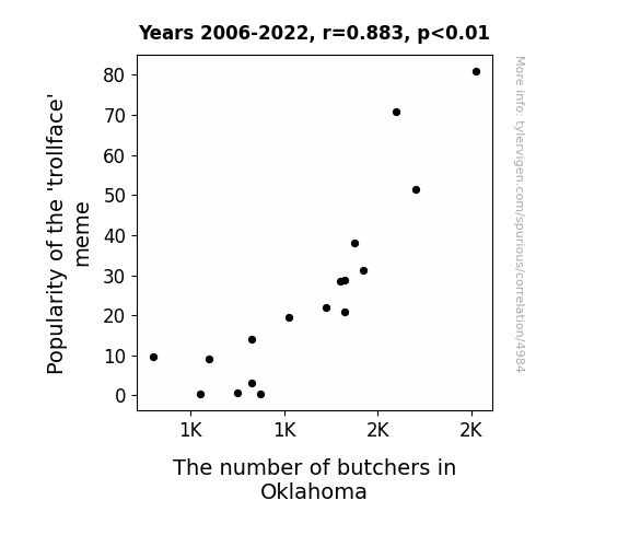
The Butcher's Bill: A Cut Above - Analyzing the Carrion Connection between the 'Trollface' Meme and Butcher Numbers in Oklahoma
As the trollface meme gained more attention, it inadvertently sparked a rise in 'cutting' humor. This led to a surge in demand for butchers in Oklahoma as people realized they wanted to 'meat' the growing appetite for meme-themed BBQs and cookouts. It seems the meme's impact wasn't just a 'joke'—it had real 'steak' in shaping the butchering industry in the state!
What else correlates?
Popularity of the 'trollface' meme · all memes
The number of butchers in Oklahoma · all cccupations
Popularity of the 'trollface' meme · all memes
The number of butchers in Oklahoma · all cccupations


View details about correlation #5,258
Kerosene Kinship: A Correlative Comical Collation between Ponce's Pollutants and Germany's Glow
The cleaner air in Ponce, Puerto Rico led to an increase in butterfly population. These butterflies, known for their sophisticated migration patterns, altered their flight route, inadvertently creating small tornadoes in the skies above. These sky tornadoes, though tiny, managed to disrupt the usual kerosene delivery routes to Germany, West. So, in a strange and indirect way, the smog reduction in Puerto Rico fluttered its way to Germany, West, leading to a decrease in kerosene usage. Never underestimate the impact of a butterfly, or in this case, thousands of them, on the global energy market! It’s a real-life flutter effect!


What else correlates?
Air pollution in Ponce, Puerto Rico · all weather
Kerosene used in Germany, West · all energy
Air pollution in Ponce, Puerto Rico · all weather
Kerosene used in Germany, West · all energy


View details about correlation #5,201
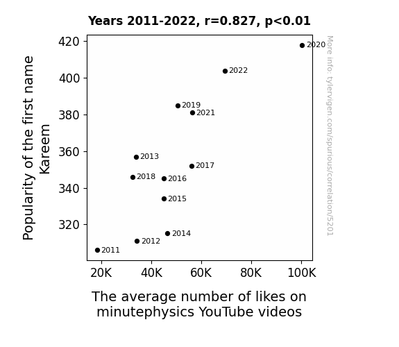
Kareem's Likes: Kinship between Kareem's Name and YouTube's Likes
The name Kareem just has that slam-dunk likeability factor. It seems to have multiplied the quantum of charm in the universe, leading to an influx of likes on minutephysics videos. It's as if every mention of Kareem resonates on a frequency that attracts positive reactions, creating a Kareem wave of admiration. Plus, it's not every day you come across someone named Kareem, so perhaps people just couldn't help but quantum leap at the chance to show their appreciation for minutephysics!


View details about correlation #5,057
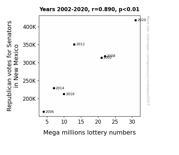
The Blazing Blue and Red Correlation: Exploring the Interplay Between Republican Votes for Senators and Mega Millions Lottery Numbers in New Mexico
The uptick in Republican votes for Senators in New Mexico has led to a surge in demand for red chili peppers, a New Mexico staple. As more and more people clamor for these spicy delights, farmers are experiencing an unexpected boom in business. To keep up with the spicy demand, these farmers are innovating their agricultural practices, inadvertently creating a perfect environment for mega-sized, record-breaking lottery numbers to sprout and ripen. It's a red-hot political phenomenon that's spicing up more than just the Senate race!

What else correlates?
Votes for Republican Senators in New Mexico · all elections
Mega millions lottery numbers · all weird & wacky
Votes for Republican Senators in New Mexico · all elections
Mega millions lottery numbers · all weird & wacky


View details about correlation #5,562
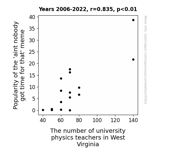
Ain't Nobody Got Time for That: The Correlation Between the Popularity of a Meme and the Number of Physics Teachers in West Virginia Universities
It sparked a sudden interest in the space-time continuum among West Virginians, leading to a higher demand for physics knowledge in the state. This meme's infectious nature somehow created a black hole of physics fascination, pulling in more individuals to pursue careers in teaching the subject. The 'ain't nobody got time for that' mindset ironically made time for mastering physics, causing a quantum shift in the employment of university physics teachers in West Virginia.


View details about correlation #5,737
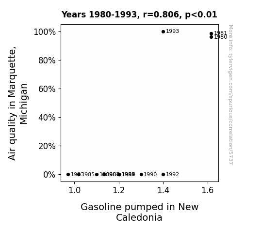
Fueling Fresh Air: An Ecological Analysis of Air Quality in Marquette, Michigan, and Gasoline Consumption in New Caledonia
It's possible that as the air quality in Marquette improved, it sent out positive vibes that somehow traveled all the way to New Caledonia, creating a strange but undeniable craving for gasoline. It's like the gas just wanted to be a part of the clean air club!

What else correlates?
Air quality in Marquette, Michigan · all weather
Gasoline pumped in New Caledonia · all energy
Air quality in Marquette, Michigan · all weather
Gasoline pumped in New Caledonia · all energy
Why this works
- Data dredging: I have 25,237 variables in my database. I compare all these variables against each other to find ones that randomly match up. That's 636,906,169 correlation calculations! This is called “data dredging.”
Fun fact: the chart used on the wikipedia page to demonstrate data dredging is also from me. I've been being naughty with data since 2014.
Instead of starting with a hypothesis and testing it, I instead tossed a bunch of data in a blender to see what correlations would shake out. It’s a dangerous way to go about analysis, because any sufficiently large dataset will yield strong correlations completely at random. - Lack of causal connection: There is probably no direct connection between these variables, despite what the AI says above.
Because these pages are automatically generated, it's possible that the two variables you are viewing are in fact causually related. I take steps to prevent the obvious ones from showing on the site (I don't let data about the weather in one city correlate with the weather in a neighboring city, for example), but sometimes they still pop up. If they are related, cool! You found a loophole.
This is exacerbated by the fact that I used "Years" as the base variable. Lots of things happen in a year that are not related to each other! Most studies would use something like "one person" in stead of "one year" to be the "thing" studied. - Observations not independent: For many variables, sequential years are not independent of each other. You will often see trend-lines form. If a population of people is continuously doing something every day, there is no reason to think they would suddenly change how they are doing that thing on January 1. A naive p-value calculation does not take this into account.
You will calculate a lower chance of "randomly" achieving the result than represents reality.
To be more specific: p-value tests are probability values, where you are calculating the probability of achieving a result at least as extreme as you found completely by chance. When calculating a p-value, you need to assert how many "degrees of freedom" your variable has. I count each year (minus one) as a "degree of freedom," but this is misleading for continuous variables.
This kind of thing can creep up on you pretty easily when using p-values, which is why it's best to take it as "one of many" inputs that help you assess the results of your analysis.
- Y-axes doesn't start at zero: I truncated the Y-axes of the graphs above. I also used a line graph, which makes the visual connection stand out more than it deserves.
Nothing against line graphs. They are great at telling a story when you have linear data! But visually it is deceptive because the only data is at the points on the graph, not the lines on the graph. In between each point, the data could have been doing anything. Like going for a random walk by itself!
Mathematically what I showed is true, but it is intentionally misleading. If you click on any of the charts that abuse this, you can scroll down to see a version that starts at zero. - Confounding variable: Confounding variables (like global pandemics) will cause two variables to look connected when in fact a "sneaky third" variable is influencing both of them behind the scenes.
- Outliers: Some datasets here have outliers which drag up the correlation.
In concept, "outlier" just means "way different than the rest of your dataset." When calculating a correlation like this, they are particularly impactful because a single outlier can substantially increase your correlation.
Because this page is automatically generated, I don't know whether any of the charts displayed on it have outliers. I'm just a footnote. ¯\_(ツ)_/¯
I intentionally mishandeled outliers, which makes the correlation look extra strong. - Low n: There are not many data points included in some of these charts.
You can do analyses with low ns! But you shouldn't data dredge with a low n.
Even if the p-value is high, we should be suspicious of using so few datapoints in a correlation.
Pro-tip: click on any correlation to see:
- Detailed data sources
- Prompts for the AI-generated content
- Explanations of each of the calculations (correlation, p-value)
- Python code to calculate it yourself


