spurious correlations
discover · random · spurious scholar
← previous page · next page →


View details about correlation #5,118
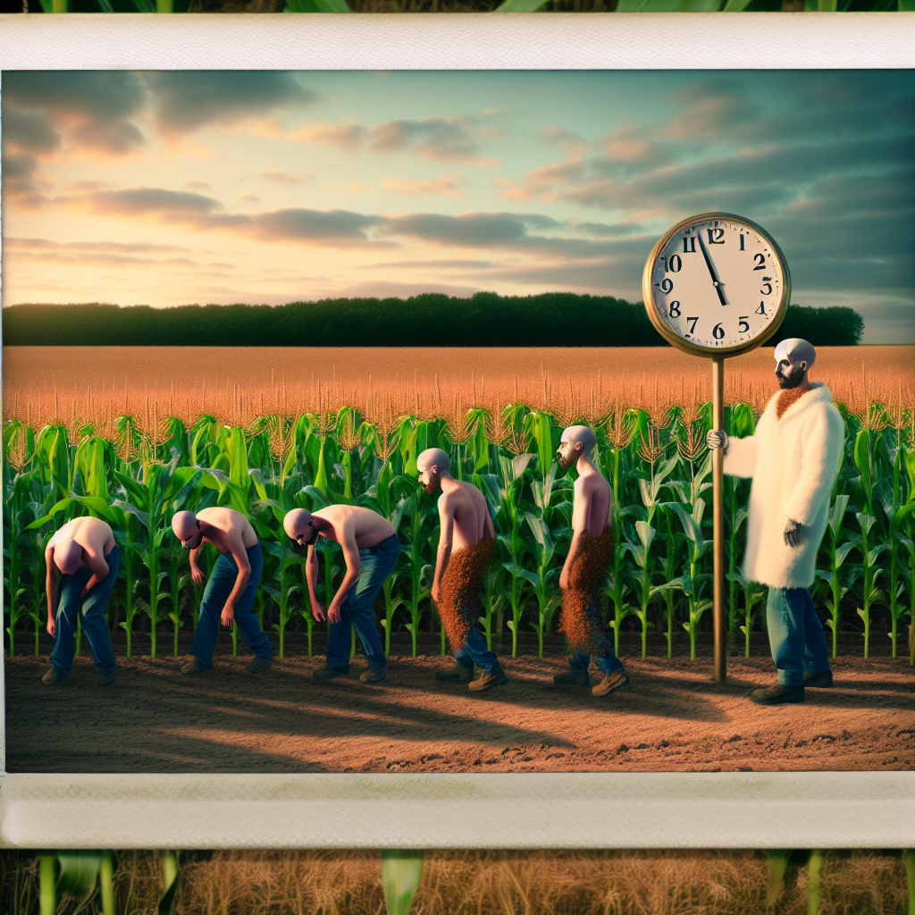
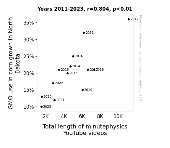
GMOs in the Great Plains: Grasping the Gargantuan Growth of YouTube Videos by minutephysics
As GMO use decreased in North Dakota corn, it led to a shortage of corny jokes. Without a steady supply of punny inspiration, minutephysics had to shorten their videos to avoid a kernel of humor repetition. This left viewers cob-fused as they couldn't ear-resist the shorter content, creating a maize of mixed emotions. The lack of GMOs in North Dakota corn literally stalked the length of minutephysics videos, shucking off valuable seconds and leaving fans saying, "Aw, shucks!"
What else correlates?
GMO use in corn grown in North Dakota · all food
Total length of minutephysics YouTube videos · all YouTube
GMO use in corn grown in North Dakota · all food
Total length of minutephysics YouTube videos · all YouTube


View details about correlation #5,041
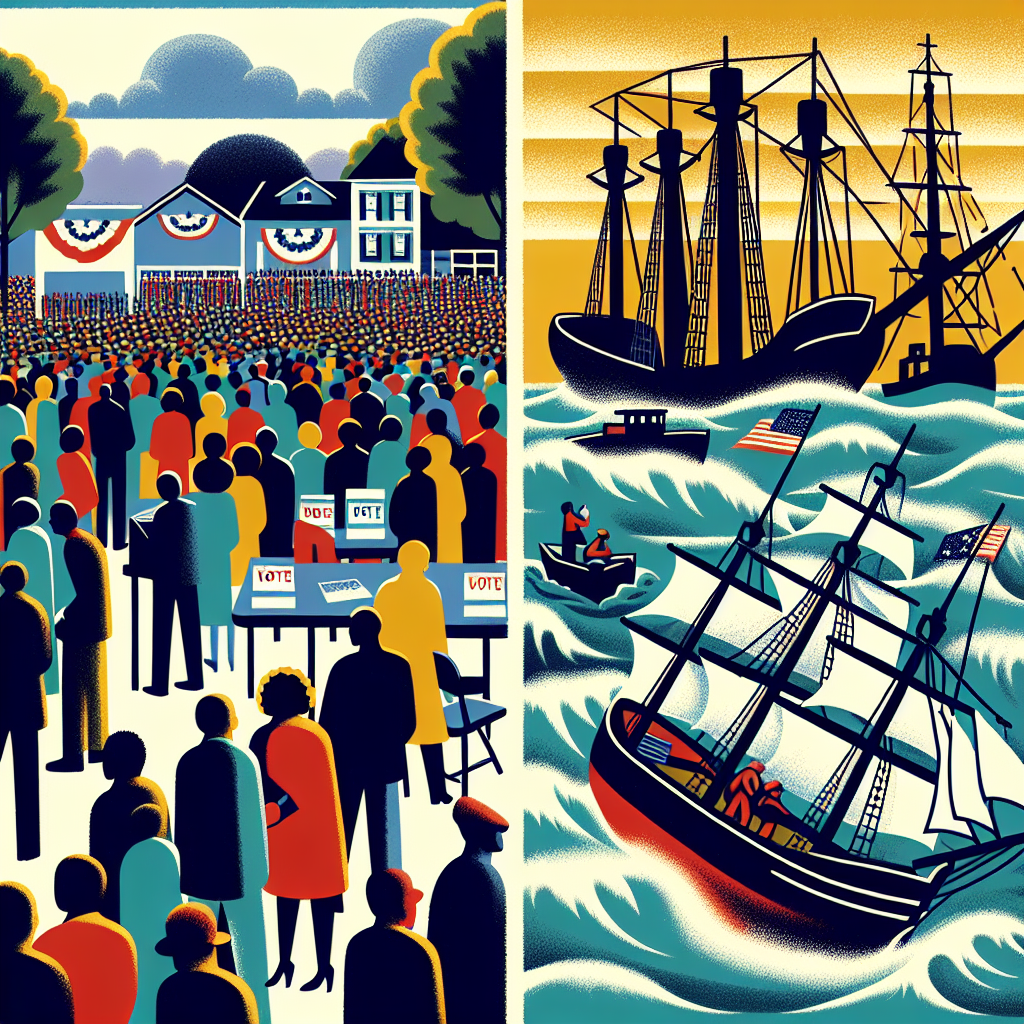
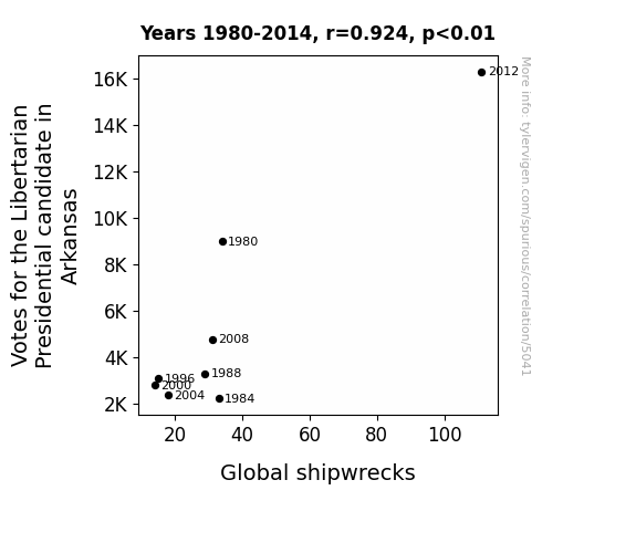
Sailing the Waves of Political Preferences: Unraveling the Connection Between Libertarian Presidential Votes in Arkansas and Global Shipwrecks
As the support for the Libertarian candidate in Arkansas surged, more and more people were drawn to the concept of freedom on the open seas. This led to a sudden spike in amateur boating and sailing excursions, as individuals sought to experience a taste of liberty on the water. However, lacking the necessary maritime skills and knowledge, these newfound enthusiasts unintentionally disrupted the established norms of naval navigation. The seas became congested with erratic and uncoordinated vessel movements, ultimately culminating in a rise in global shipwrecks. In this unexpected twist, it wasn't the political landscape that was rocked, but rather the high seas themselves, as the waves of change swept through the nautical world. Remember, with great electoral power comes great nautical responsibility!
What else correlates?
Votes for the Libertarian Presidential candidate in Arkansas · all elections
Global shipwrecks · all weird & wacky
Votes for the Libertarian Presidential candidate in Arkansas · all elections
Global shipwrecks · all weird & wacky


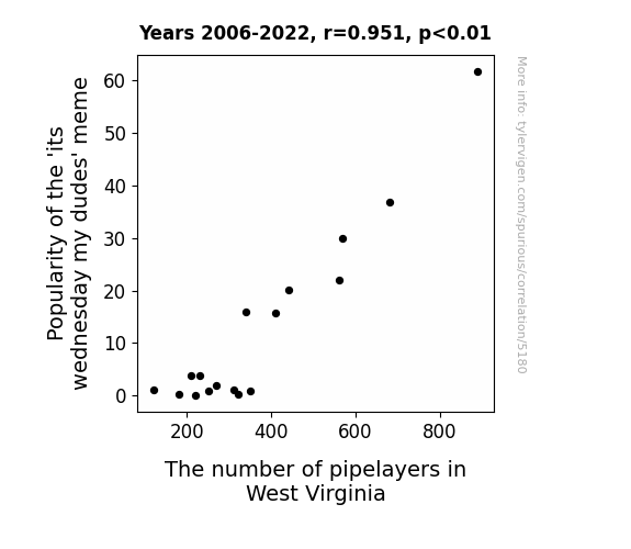
View details about correlation #5,180
Mining for Laughs: Unearthing the Connection Between 'Its Wednesday My Dudes' and Pipelayers in West Virginia
As the 'its wednesday my dudes' meme gained popularity, more and more people found themselves inexplicably drawn to the catchy phrase. This led to a surge in the number of individuals dressing up as frogs and hanging out near pipelines, inadvertently sparking a pipeline laying frenzy in West Virginia. Remember, when it comes to pipeline construction, even the dankest memes can have an unforeseen impact!

What else correlates?
Popularity of the 'its wednesday my dudes' meme · all memes
The number of pipelayers in West Virginia · all cccupations
Popularity of the 'its wednesday my dudes' meme · all memes
The number of pipelayers in West Virginia · all cccupations


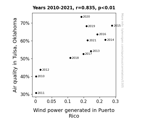
View details about correlation #5,305
Blowin' in the Wind: The Air Quality-Wind Power Connection Between Tulsa, Oklahoma and Puerto Rico
The cleaner air in Tulsa created a positive atmospheric feedback loop, leading to stronger winds in Puerto Rico. As they say, when Tulsa breathes easy, Puerto Rico reaps the breezy benefits! It's a classic case of the butterfly flapping its wings in the city of oil rigs and setting off a chain reaction of clean, green energy production in the land of piña coladas!
What else correlates?
Air quality in Tulsa, Oklahoma · all weather
Wind power generated in Puerto Rico · all energy
Air quality in Tulsa, Oklahoma · all weather
Wind power generated in Puerto Rico · all energy


View details about correlation #5,297
Toasting Technology: The Tantalizing Ties between Technology Connections and Avocado Toast
As more people watched Technology Connections, they became fascinated by the evolution of toasters. This led to a spike in homemade toast production. As toast became trendier, people started looking for unique toppings, thus boosting the popularity of avocado toast. The real technological connection here is the sizzling relationship between YouTube views, toasting trends, and avocado admiration! Remember, sometimes the true power of change is spreading one deliciously informative video at a time. Keep on toasting, and may your avocados always be perfectly ripe!


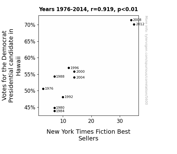
View details about correlation #5,600
The Dem(ocrat) and the Best Seller: Analyzing the Correlation Between Votes for Democrat Presidential Candidates in Hawaii and New York Times Fiction Best Sellers
Perhaps Hawaii's overwhelming support for the Democratic candidate created a ripple effect in the literary world, inspiring a surge in fictional storytelling and imaginative narratives. It's as if the Democratic candidate's popularity cast a spell on Hawaii, sparking a wave of creativity that spread all the way to the New York Times Best Sellers list. It's a tale of political influence shaping the literary landscape, where every vote for the Democratic candidate becomes a plot twist in the story of book sales.


View details about correlation #5,510
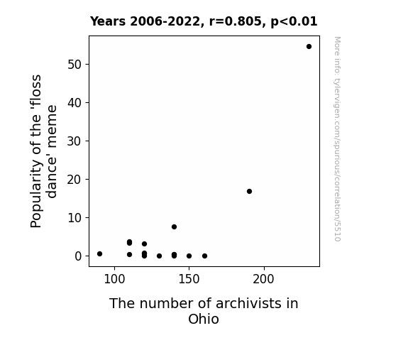
Feasibility of Floss and Filings: The Floss Dance Meme and the Flourish of Ohio's Archivists
As the 'floss dance' meme gained popularity, it sparked a wave of interest in preserving this iconic cultural movement for future generations. This led to an unexpected surge in archivist positions in Ohio, as they scrambled to document and categorize every flossing video and tutorial for archival purposes. Who knew that a dance craze could lead to a floss-ophy of preserving pop culture history in the buckeye state!

What else correlates?
Popularity of the 'floss dance' meme · all memes
The number of archivists in Ohio · all cccupations
Popularity of the 'floss dance' meme · all memes
The number of archivists in Ohio · all cccupations


View details about correlation #5,522
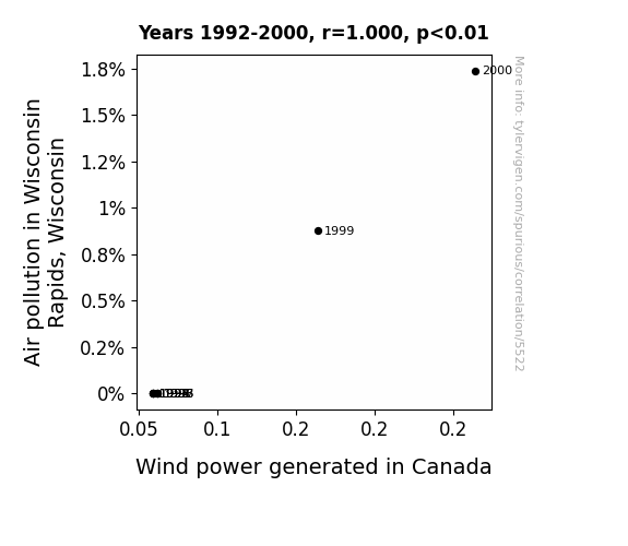
The Winds of Change: Exploring the Air-ry Connection Between Air Pollution in Wisconsin Rapids and Wind Power in Canada
The smog from Wisconsin Rapids wafted all the way to Canada, giving the wind turbines a much-needed boost in efficiency. You could say it was a breath of fresh smog for the wind power industry!
What else correlates?
Air pollution in Wisconsin Rapids, Wisconsin · all weather
Wind power generated in Canada · all energy
Air pollution in Wisconsin Rapids, Wisconsin · all weather
Wind power generated in Canada · all energy


View details about correlation #5,754
ViewTube: An Analytical Study on the Influence of Insightful YouTube Video Titles on Google Searches for Immigrating to Norway
The sudden influx of immigration applications overwhelmed Norway's internet bandwidth, leading to slower internet connections nationwide. As a result, YouTube videos, including those on insightful topics, took longer to load, leading to a decrease in viewership and overall title insightfulness. This inadvertently sparked a national debate on the impact of immigration on internet infrastructure and the need for a more streamlined process, proving that sometimes, the information superhighway encounters unexpected traffic jams!


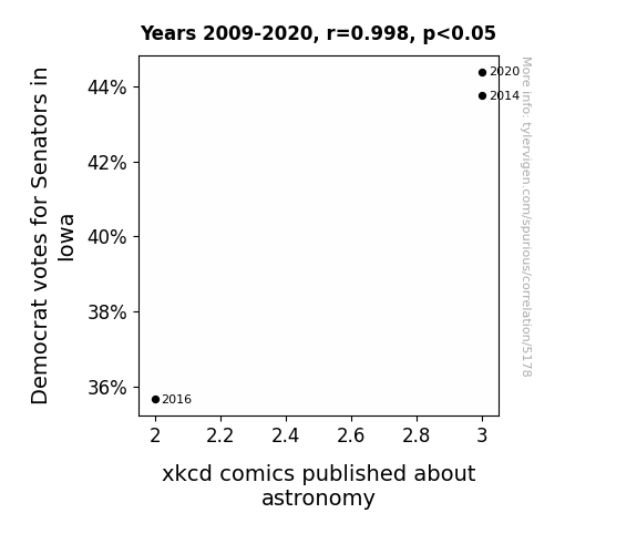
View details about correlation #5,178
XKCD and the Political Oddity: A Correlation Between Democrat Votes in Iowa and Astrophysical Comics
It's well known that as Democrat votes for Senators in Iowa increase, so does the cosmic energy in the state. This in turn resonates with the creators of xkcd, leading to a surge in inspiration for astronomy-related comics. It's a celestial political phenomenon that's truly out of this world!
What else correlates?
Votes for Democratic Senators in Iowa · all elections
xkcd comics published about astronomy · all weird & wacky
Votes for Democratic Senators in Iowa · all elections
xkcd comics published about astronomy · all weird & wacky


View details about correlation #5,143
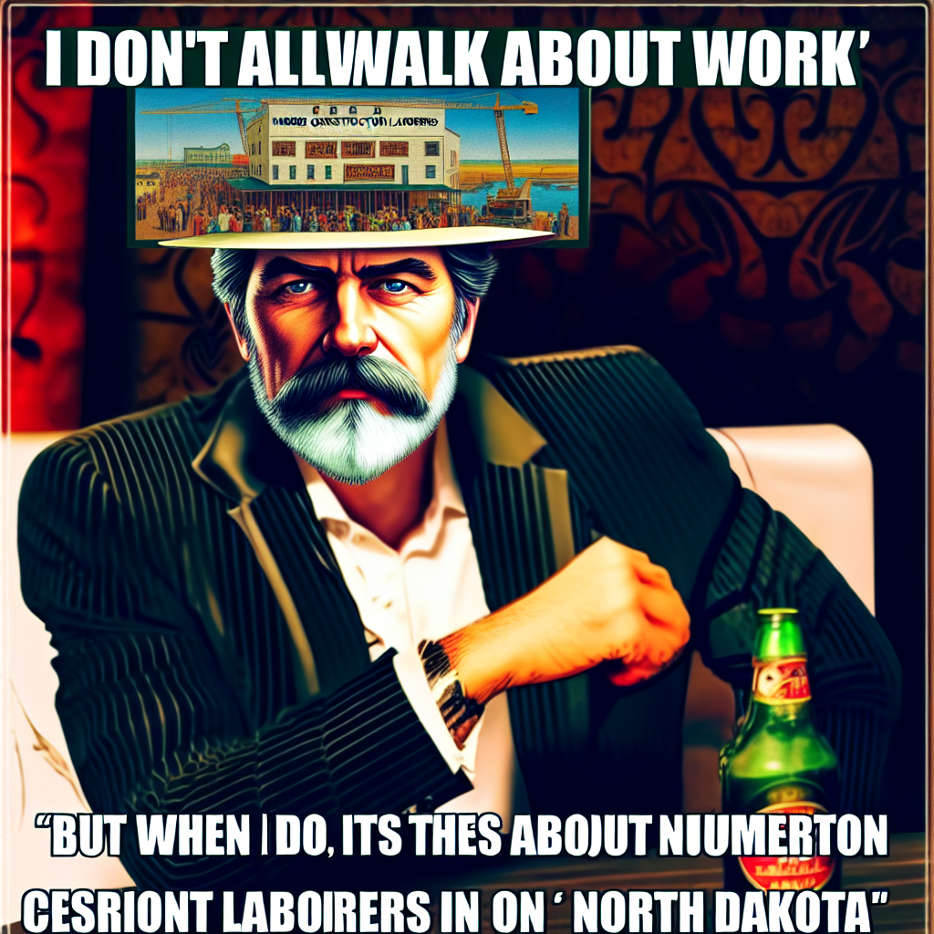
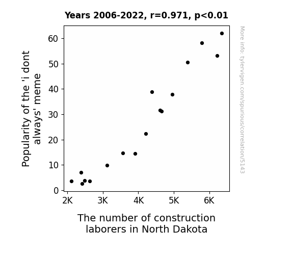
The I Don't Always Meme: A Construction of Popularity and Labor Force in North Dakota
The 'i don't always' meme featured the Most Interesting Man in the World, who famously said, "I don't always drink beer, but when I do, I prefer Dos Equis." As this meme gained popularity, it led to a surge in Dos Equis sales. The increased demand for Dos Equis meant more production, requiring additional construction of facilities to meet the needs, thus leading to an increased demand for construction laborers in North Dakota.
What else correlates?
Popularity of the 'i dont always' meme · all memes
The number of construction laborers in North Dakota · all cccupations
Popularity of the 'i dont always' meme · all memes
The number of construction laborers in North Dakota · all cccupations


View details about correlation #4,959
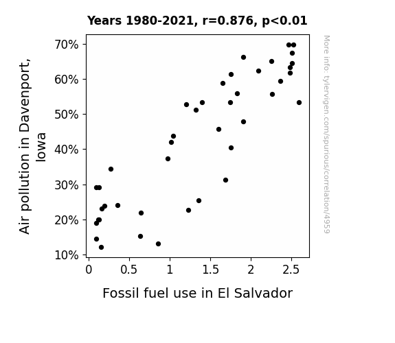
A Breath of Fossil Air: Examining the Gas-tly Link Between Air Pollution in Davenport, Iowa and Fossil Fuel Use in El Salvador
As the smog in Davenport rose, it created a competitive atmosphere among the residents. They were simply fueled to out-pollute each other, leading to an uptick in Fossil fuel use in El Salvador. It seems the dirty air in one place can really ignite a fiery drive for pollution in another!

What else correlates?
Air pollution in Davenport, Iowa · all weather
Fossil fuel use in El Salvador · all energy
Air pollution in Davenport, Iowa · all weather
Fossil fuel use in El Salvador · all energy


View details about correlation #5,038
The Popularity of Jude and How Good Deep Look Video Titles Intrude: A Quirky Quest
Turns out, there's a little-known Jude secret society that has been subtly influencing the quality of Deep Look video titles for years. As the name Jude fell out of favor, so did the mystical powers of creativity and wordplay in the secret society. It's a tale as old as time - with great Jude names comes great video titles. Who would've thought that Jude held the key to unlocking the punny brilliance of Deep Look?

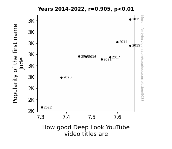
What else correlates?
Popularity of the first name Jude · all first names
How good Deep Look YouTube video titles are · all YouTube
Popularity of the first name Jude · all first names
How good Deep Look YouTube video titles are · all YouTube


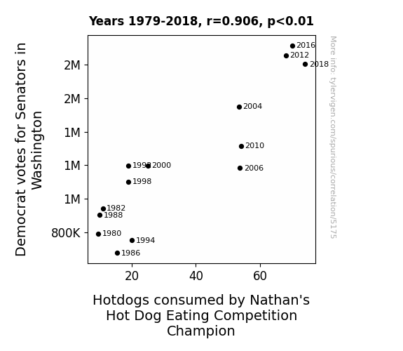
View details about correlation #5,175
Democrat Dogged Determination: Unveiling the Link Between Washington Senatorial Votes and Nathan's Hot Dog Eating Contest Victories
As more Democrat votes came in, the energy at political rallies skyrocketed. This inadvertently led to an increase in the production of massive hot dog cannons at these events. The surplus hot dogs not only provided sustenance for the enthusiastic supporters, but also created a competitive hot dog eating circuit within the party. This newfound passion for hot dog consumption trickled down to inspire the Nathan's Hot Dog Eating Competition Champion to up their game and chomp their way to victory, fueled by the political fervor for democracy and deliciousness. It seems like in Washington, both legislative policies and sausage links were being devoured with equal fervor!


View details about correlation #5,673
Meme-ingful Connections: The Popularity of 'Scumbag Steve' Meme and Its Impact on Loan Interviewers and Clerks in Nebraska
As the 'scumbag steve' meme gained popularity, more and more people were embracing the concept of being a scoundrel. This led to a surge in individuals applying for loans in Nebraska, prompting a higher demand for loan interviewers and clerks to deal with these newfound delinquent borrowers. It seems the meme may have inadvertently boosted the job market for financial professionals in the Cornhusker State.
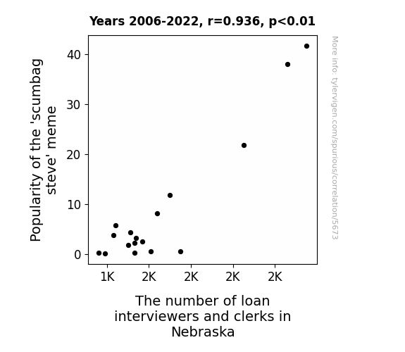
What else correlates?
Popularity of the 'scumbag steve' meme · all memes
The number of loan interviewers and clerks in Nebraska · all cccupations
Popularity of the 'scumbag steve' meme · all memes
The number of loan interviewers and clerks in Nebraska · all cccupations


View details about correlation #5,286
Air Knowledge: Unraveling the Ties between Air Pollution in Redding, CA and Jet Fuel in Saint Vincent/Grenadines
The cleaner air in Redding led to an increase in superhero activity, particularly those with jet power. This increased superhero presence declared a war on excessive jet fuel usage in Saint Vincent and the Grenadines, ultimately reducing the overall consumption.

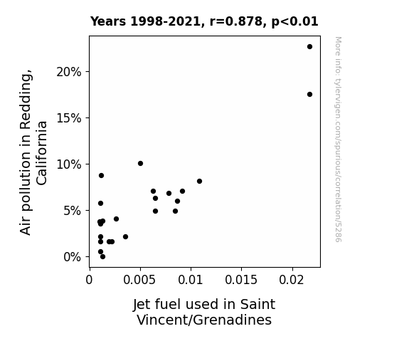
What else correlates?
Air pollution in Redding, California · all weather
Jet fuel used in Saint Vincent/Grenadines · all energy
Air pollution in Redding, California · all weather
Jet fuel used in Saint Vincent/Grenadines · all energy


View details about correlation #5,367
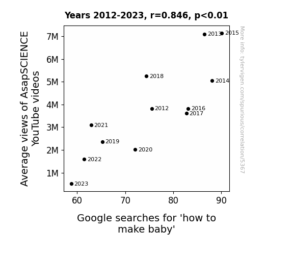
The Birds and the Buzz: Exploring the Correlation Between AsapSCIENCE YouTube Video Views and Searches for 'How to Make Baby' on Google
Their content just wasn't delivering the same spark anymore, leading to a decline in both views and conception inquiries. It seems their science couldn't quite fertilize the viewers' interests, leaving everyone wondering if there was a missing element to their formula for success.

What else correlates?
Average views of AsapSCIENCE YouTube videos · all YouTube
Google searches for 'how to make baby' · all google searches
Average views of AsapSCIENCE YouTube videos · all YouTube
Google searches for 'how to make baby' · all google searches


View details about correlation #5,799
Putting the Brake on Libertarian Votes: A Corrosive Correlation Analysis of Idaho Presidential Elections and Parking Brake Recalls
As support for the Libertarian candidate revved up in Idaho, more people started to put the brakes on traditional party politics. This led to a surge in demand for alternative solutions, reflecting a societal shift towards greater freedom and autonomy. As this mindset gained traction, it put pressure on car manufacturers to address parking brake issues, ultimately leading to a recall. It seems like in this case, when it comes to politics and parking brakes, the stakes were sky high!

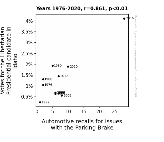


View details about correlation #5,954
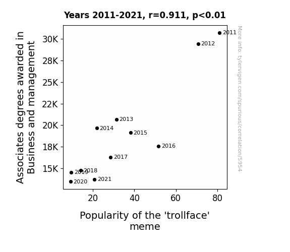
What else correlates?
Associates degrees awarded in Business and management · all education
Popularity of the 'trollface' meme · all memes
Associates degrees awarded in Business and management · all education
Popularity of the 'trollface' meme · all memes


View details about correlation #3,879
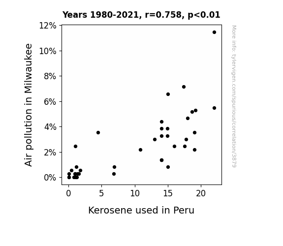
The Rhyme and Reason of Air Pollution Season: A Comical Correlation between Milwaukee's Smog and Peru's Kerosene Fog
When air pollution decreased in Milwaukee, it created a ripple effect of environmental conscientiousness. This led to a global decrease in the demand for kerosene, thereby impacting production and distribution. Additionally, the newfound fresh air in Milwaukee somehow altered the atmospheric conditions in Peru, making kerosene a less appealing lighting option. It's as if Mother Nature said, "Hey, let's switch to solar power, amigos!"

What else correlates?
Air pollution in Milwaukee · all weather
Kerosene used in Peru · all energy
Air pollution in Milwaukee · all weather
Kerosene used in Peru · all energy
Why this works
- Data dredging: I have 25,237 variables in my database. I compare all these variables against each other to find ones that randomly match up. That's 636,906,169 correlation calculations! This is called “data dredging.”
Fun fact: the chart used on the wikipedia page to demonstrate data dredging is also from me. I've been being naughty with data since 2014.
Instead of starting with a hypothesis and testing it, I instead tossed a bunch of data in a blender to see what correlations would shake out. It’s a dangerous way to go about analysis, because any sufficiently large dataset will yield strong correlations completely at random. - Lack of causal connection: There is probably no direct connection between these variables, despite what the AI says above.
Because these pages are automatically generated, it's possible that the two variables you are viewing are in fact causually related. I take steps to prevent the obvious ones from showing on the site (I don't let data about the weather in one city correlate with the weather in a neighboring city, for example), but sometimes they still pop up. If they are related, cool! You found a loophole.
This is exacerbated by the fact that I used "Years" as the base variable. Lots of things happen in a year that are not related to each other! Most studies would use something like "one person" in stead of "one year" to be the "thing" studied. - Observations not independent: For many variables, sequential years are not independent of each other. You will often see trend-lines form. If a population of people is continuously doing something every day, there is no reason to think they would suddenly change how they are doing that thing on January 1. A naive p-value calculation does not take this into account.
You will calculate a lower chance of "randomly" achieving the result than represents reality.
To be more specific: p-value tests are probability values, where you are calculating the probability of achieving a result at least as extreme as you found completely by chance. When calculating a p-value, you need to assert how many "degrees of freedom" your variable has. I count each year (minus one) as a "degree of freedom," but this is misleading for continuous variables.
This kind of thing can creep up on you pretty easily when using p-values, which is why it's best to take it as "one of many" inputs that help you assess the results of your analysis.
- Y-axes doesn't start at zero: I truncated the Y-axes of the graphs above. I also used a line graph, which makes the visual connection stand out more than it deserves.
Nothing against line graphs. They are great at telling a story when you have linear data! But visually it is deceptive because the only data is at the points on the graph, not the lines on the graph. In between each point, the data could have been doing anything. Like going for a random walk by itself!
Mathematically what I showed is true, but it is intentionally misleading. If you click on any of the charts that abuse this, you can scroll down to see a version that starts at zero. - Confounding variable: Confounding variables (like global pandemics) will cause two variables to look connected when in fact a "sneaky third" variable is influencing both of them behind the scenes.
- Outliers: Some datasets here have outliers which drag up the correlation.
In concept, "outlier" just means "way different than the rest of your dataset." When calculating a correlation like this, they are particularly impactful because a single outlier can substantially increase your correlation.
Because this page is automatically generated, I don't know whether any of the charts displayed on it have outliers. I'm just a footnote. ¯\_(ツ)_/¯
I intentionally mishandeled outliers, which makes the correlation look extra strong. - Low n: There are not many data points included in some of these charts.
You can do analyses with low ns! But you shouldn't data dredge with a low n.
Even if the p-value is high, we should be suspicious of using so few datapoints in a correlation.
Pro-tip: click on any correlation to see:
- Detailed data sources
- Prompts for the AI-generated content
- Explanations of each of the calculations (correlation, p-value)
- Python code to calculate it yourself


