spurious correlations
discover · random · spurious scholar
← previous page · next page →


View details about correlation #5,413
The Tantalizing Tie-In: MrBeast YouTube Titles and The Tally of Receptionists in Tucson
As more receptionists in Arizona try to stay updated on the latest trends, they inadvertently raise the coolness bar for everyone, including MrBeast's video titles. It's a secret competition for who can be the ultimate cool, and MrBeast is just inadvertently caught in the middle of it.


What else correlates?
How cool MrBeast's YouTube video titles are · all YouTube
The number of receptionists in Arizona · all cccupations
How cool MrBeast's YouTube video titles are · all YouTube
The number of receptionists in Arizona · all cccupations


View details about correlation #5,780
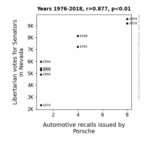
Driven by Politics: The Correlation between Libertarian Votes in Nevada and Automotive Recalls by Porsche
As more Libertarian senators were elected, their push for minimal government intervention extended to the automotive industry. This led to a decrease in regulations for Porsche, ultimately resulting in more frequent quality control oversights and a spike in recalls. It just goes to show, sometimes less oversight can really drive home a point.
What else correlates?
Votes for Libertarian Senators in Nevada · all elections
Automotive recalls issued by Porsche · all weird & wacky
Votes for Libertarian Senators in Nevada · all elections
Automotive recalls issued by Porsche · all weird & wacky


View details about correlation #5,840

What else correlates?
The number of movies Orlando Bloom appeared in · all films & actors
Google searches for 'boujee' · all google searches
The number of movies Orlando Bloom appeared in · all films & actors
Google searches for 'boujee' · all google searches


View details about correlation #5,060
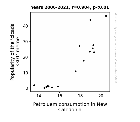
Solving the 'Cicada 3301' Mystery: Buzzing with Petroleum Consumption in New Caledonia
As the 'cicada 3301' meme buzzed around, it inadvertently sparked a surge in online activity. This led to an unexpected spike in New Caledonia's internet usage, prompting more people to drive to their local internet cafes for a share of the meme madness. It seems the meme managed to fuel not just curiosity, but also the cars of New Caledonia, proving that when it comes to petroleum consumption, even the most unexpected memes can have a far-reaching impact.

What else correlates?
Popularity of the 'cicada 3301' meme · all memes
Petroluem consumption in New Caledonia · all energy
Popularity of the 'cicada 3301' meme · all memes
Petroluem consumption in New Caledonia · all energy


View details about correlation #5,685
Clear Skies and Clever Titles: Exploring the Relationship Between Air Quality in Seneca, South Carolina and the Catchiness of Deep Look YouTube Video Titles
The influx of oxygen in Seneca has sparked a creative renaissance, leading to a surge in pun productivity. As the locals breathe in the fresher air, their brains are receiving a steady stream of 'punny' oxygen, inspiring them to come up with the most 'hip and with it' video titles for Deep Look. It's like their creativity is on an all-time high, quite literally reaching new 'air-y' heights!

What else correlates?
Air quality in Seneca, South Carolina · all weather
How 'hip and with it' Deep Look YouTube video titles are · all YouTube
Air quality in Seneca, South Carolina · all weather
How 'hip and with it' Deep Look YouTube video titles are · all YouTube


View details about correlation #5,736
Grinning and Voting: An Analysis of the Correlation Between Republican Senatorial Votes and the Density of Dentists in Indiana
As Republican votes for Senators in Indiana have risen, so have the calls for conservative values. And what's more conservative than preserving those pearly whites? It seems the political shift has sparked a 'filling'-ness in the air, leading to a 'brush' of enthusiasm for dental careers. Perhaps this is all just a 'root canal' effect of the political climate, where every vote counts in shaping not just the legislation, but also the 'tooth' of the matter. It's a 'plaque' I haven't seen before, but it's definitely causing a 'floss' in the number of dentists in Indiana. This correlation is 'extraction'-ly what happens when you mix politics and dental hygiene – a winning smile for the Republicans and a 'drilling' for success in the dental field!


What else correlates?
Votes for Republican Senators in Indiana · all elections
The number of dentists in Indiana · all cccupations
Votes for Republican Senators in Indiana · all elections
The number of dentists in Indiana · all cccupations


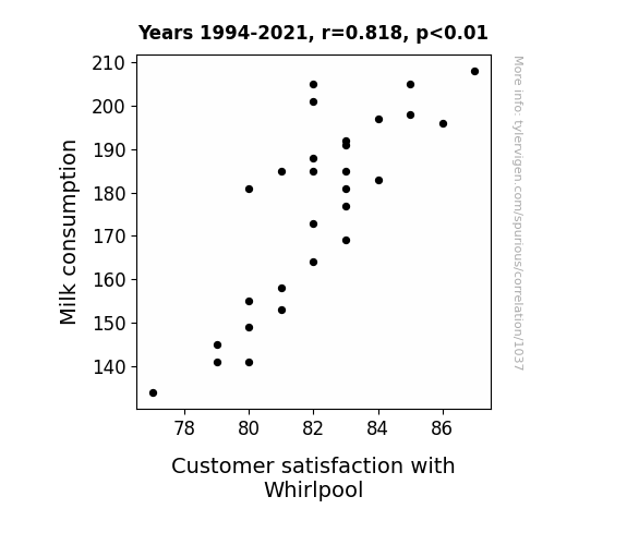
View details about correlation #1,037
What else correlates?
Milk consumption · all food
Customer satisfaction with Whirlpool · all weird & wacky
Milk consumption · all food
Customer satisfaction with Whirlpool · all weird & wacky


View details about correlation #5,028
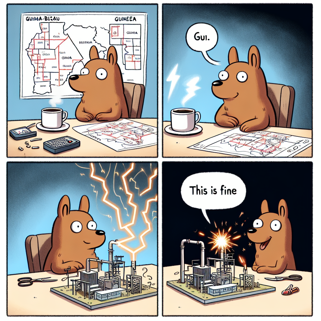
Shocking Connections: The Electrifying Impact of the 'This is Fine' Meme Popularity on Electricity Generation in Guinea-Bissau
The increase in popularity of the 'this is fine' meme led to more people using their devices to view and share it. This surge in electrical device usage created a higher demand for electricity in Guinea-Bissau, prompting an increase in electricity generation to keep up with the 'this is fine' meme craze. Sometimes, even amidst chaos, memes can spark a power(plant)ful reaction!

What else correlates?
Popularity of the 'this is fine' meme · all memes
Electricity generation in Guinea-Bissau · all energy
Popularity of the 'this is fine' meme · all memes
Electricity generation in Guinea-Bissau · all energy


View details about correlation #5,740
Blown Away: A Stormy Correlation Between Atlantic Hurricanes and Extra History Video Length
The increase in hurricanes led to more historical events, which in turn expanded the content of Extra History videos to include these stormy tales. After all, they had to cover every wind-swept moment!


What else correlates?
Number of Atlantic Hurricanes each year · all weather
Average length of Extra History YouTube videos · all YouTube
Number of Atlantic Hurricanes each year · all weather
Average length of Extra History YouTube videos · all YouTube


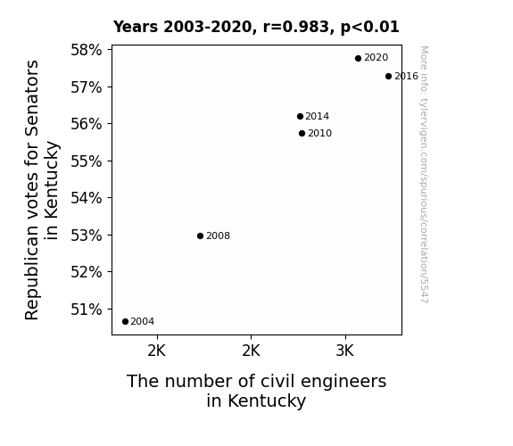
View details about correlation #5,547
Bridging the Gap: The Republican Vote in Kentucky and the Engineering Equation
More Republican Senators means more bridges to build to get over their differences!

What else correlates?
Votes for Republican Senators in Kentucky · all elections
The number of civil engineers in Kentucky · all cccupations
Votes for Republican Senators in Kentucky · all elections
The number of civil engineers in Kentucky · all cccupations


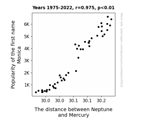
View details about correlation #5,916
What else correlates?
Popularity of the first name Monica · all first names
The distance between Neptune and Mercury · all planets
Popularity of the first name Monica · all first names
The distance between Neptune and Mercury · all planets


View details about correlation #1,060

What else correlates?
Petroluem consumption in Azerbaijan · all energy
Customer satisfaction with Verizon · all weird & wacky
Petroluem consumption in Azerbaijan · all energy
Customer satisfaction with Verizon · all weird & wacky


View details about correlation #5,263
The Master's Connection: Engineering Graduates and YouTube Video Popularity
As the number of Master's degrees awarded in Engineering increased, so did the total likes of Extra History YouTube videos. This is likely due to a heightened appreciation for the complex and intricate storylines presented in the videos. Much like a well-engineered system, the narratives in Extra History are now receiving the higher-level validation they deserve. With a surge in engineering expertise, viewers may be finding innovative ways to connect with the content, creating a positive feedback loop of intellectual engagement. Additionally, the newfound mastery of technical concepts could be helping viewers to efficiently calculate the formula for enjoying historical content, resulting in a significant rise in admiration for Extra History.


What else correlates?
Master's degrees awarded in Engineering · all education
Total likes of Extra History YouTube videos · all YouTube
Master's degrees awarded in Engineering · all education
Total likes of Extra History YouTube videos · all YouTube


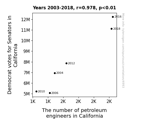
View details about correlation #4,993
Drilling Down: The Political and Petroleum Connection in California
The Democratic senators must have really fueled the demand for petroleum engineers, leading to a gush of new job opportunities! With their support for environmental policies, it's no surprise that the need for innovative engineers in the petroleum industry has risen. It's like they say, when it comes to voting and engineering, the stakes are always high!


View details about correlation #5,854


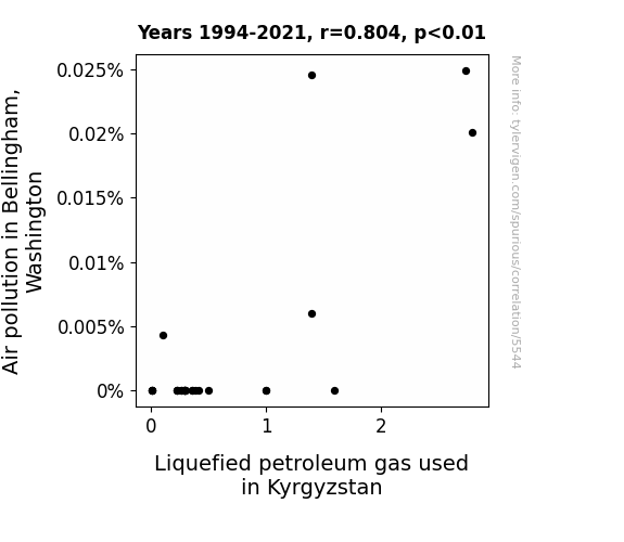
View details about correlation #5,544
When the Smoke Cleared: A Gas-tly Link Between Air Pollution in Bellingham, Washington, and Liquefied Petroleum Gas Use in Kyrgyzstan
The smog in Bellingham inadvertently carried with it tiny, industrious particles that sparked a newfound interest in clean fuel alternatives. It's like the saying goes, when there's smog in Bellingham, there's a gas opportunity in Kyrgyzstan!

What else correlates?
Air pollution in Bellingham, Washington · all weather
Liquefied petroleum gas used in Kyrgyzstan · all energy
Air pollution in Bellingham, Washington · all weather
Liquefied petroleum gas used in Kyrgyzstan · all energy


View details about correlation #5,379
Irene's Popularity and MrBeast's Video Length: An Unanticipated Connection Revealed
As the name Irene gained popularity, more babies were named after their great aunt Irene, who just so happened to have a passion for excessively long storytelling. This influx of baby Irenes eventually led to a mysterious but undeniable spike in demand for epically lengthy MrBeast videos, as if an unseen Irene fan club was secretly pulling the strings of content creation. After all, what could be more fitting than a wave of Irenes indirectly shaping the digital landscape with their inherent love for never-ending narratives?


What else correlates?
Popularity of the first name Irene · all first names
Total length of MrBeast's YouTube videos · all YouTube
Popularity of the first name Irene · all first names
Total length of MrBeast's YouTube videos · all YouTube


View details about correlation #5,093
Blue Wave Votes and Hogged Hotdogs: A Rhyme-tastic Study of Democrat Presidential Candidate Votes in Virginia and Nathan's Hot Dog Eating Competition Champions
As the Democrat votes sizzled in, so did the grills at Nathan's, leading to a bun-believable surge in hotdog consumption. It seems the political heat was just too much to resist, igniting a hunger for victory snags in the champ!


View details about correlation #5,112
When Bad Luck Brian Met Physics: An Unlikely Connection Between Memes and Academic Staffing
As the 'bad luck brian' meme gained popularity, it sparked a renewed interest in the concept of probability, with more people contemplating the likelihood of absurdly unfortunate events. This unexpected fascination with probability caught the attention of individuals in West Virginia, leading them to pursue careers in physics and ultimately becoming university physics teachers. Remember, when it comes to physics in West Virginia, it's all about the luck of the meme!


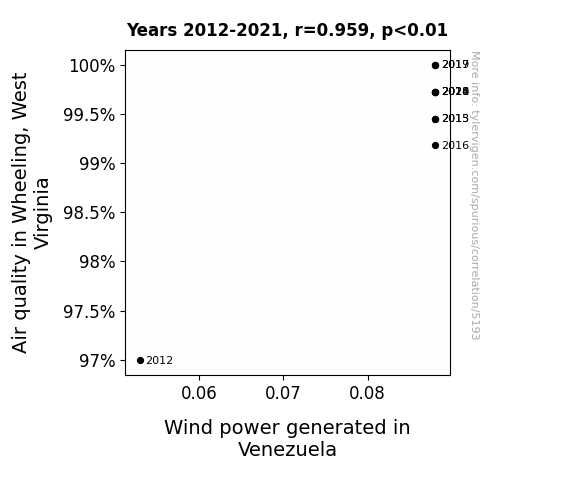
View details about correlation #5,193
Whimsical Wind Power and Wholesome Wheeling: A Wacky Exploration of Air Quality and Wind Energy
The cleaner air in Wheeling, West Virginia led to a decrease in local wind resistance, causing a ripple effect of stronger winds all the way to Venezuela, thus boosting wind power generation. It's like the domino effect, but with air and wind power!

What else correlates?
Air quality in Wheeling, West Virginia · all weather
Wind power generated in Venezuela · all energy
Air quality in Wheeling, West Virginia · all weather
Wind power generated in Venezuela · all energy
Why this works
- Data dredging: I have 25,237 variables in my database. I compare all these variables against each other to find ones that randomly match up. That's 636,906,169 correlation calculations! This is called “data dredging.”
Fun fact: the chart used on the wikipedia page to demonstrate data dredging is also from me. I've been being naughty with data since 2014.
Instead of starting with a hypothesis and testing it, I instead tossed a bunch of data in a blender to see what correlations would shake out. It’s a dangerous way to go about analysis, because any sufficiently large dataset will yield strong correlations completely at random. - Lack of causal connection: There is probably no direct connection between these variables, despite what the AI says above.
Because these pages are automatically generated, it's possible that the two variables you are viewing are in fact causually related. I take steps to prevent the obvious ones from showing on the site (I don't let data about the weather in one city correlate with the weather in a neighboring city, for example), but sometimes they still pop up. If they are related, cool! You found a loophole.
This is exacerbated by the fact that I used "Years" as the base variable. Lots of things happen in a year that are not related to each other! Most studies would use something like "one person" in stead of "one year" to be the "thing" studied. - Observations not independent: For many variables, sequential years are not independent of each other. You will often see trend-lines form. If a population of people is continuously doing something every day, there is no reason to think they would suddenly change how they are doing that thing on January 1. A naive p-value calculation does not take this into account.
You will calculate a lower chance of "randomly" achieving the result than represents reality.
To be more specific: p-value tests are probability values, where you are calculating the probability of achieving a result at least as extreme as you found completely by chance. When calculating a p-value, you need to assert how many "degrees of freedom" your variable has. I count each year (minus one) as a "degree of freedom," but this is misleading for continuous variables.
This kind of thing can creep up on you pretty easily when using p-values, which is why it's best to take it as "one of many" inputs that help you assess the results of your analysis.
- Y-axes doesn't start at zero: I truncated the Y-axes of the graphs above. I also used a line graph, which makes the visual connection stand out more than it deserves.
Nothing against line graphs. They are great at telling a story when you have linear data! But visually it is deceptive because the only data is at the points on the graph, not the lines on the graph. In between each point, the data could have been doing anything. Like going for a random walk by itself!
Mathematically what I showed is true, but it is intentionally misleading. If you click on any of the charts that abuse this, you can scroll down to see a version that starts at zero. - Confounding variable: Confounding variables (like global pandemics) will cause two variables to look connected when in fact a "sneaky third" variable is influencing both of them behind the scenes.
- Outliers: Some datasets here have outliers which drag up the correlation.
In concept, "outlier" just means "way different than the rest of your dataset." When calculating a correlation like this, they are particularly impactful because a single outlier can substantially increase your correlation.
Because this page is automatically generated, I don't know whether any of the charts displayed on it have outliers. I'm just a footnote. ¯\_(ツ)_/¯
I intentionally mishandeled outliers, which makes the correlation look extra strong. - Low n: There are not many data points included in some of these charts.
You can do analyses with low ns! But you shouldn't data dredge with a low n.
Even if the p-value is high, we should be suspicious of using so few datapoints in a correlation.
Pro-tip: click on any correlation to see:
- Detailed data sources
- Prompts for the AI-generated content
- Explanations of each of the calculations (correlation, p-value)
- Python code to calculate it yourself


