spurious correlations
discover · random · spurious scholar
← previous page · next page →


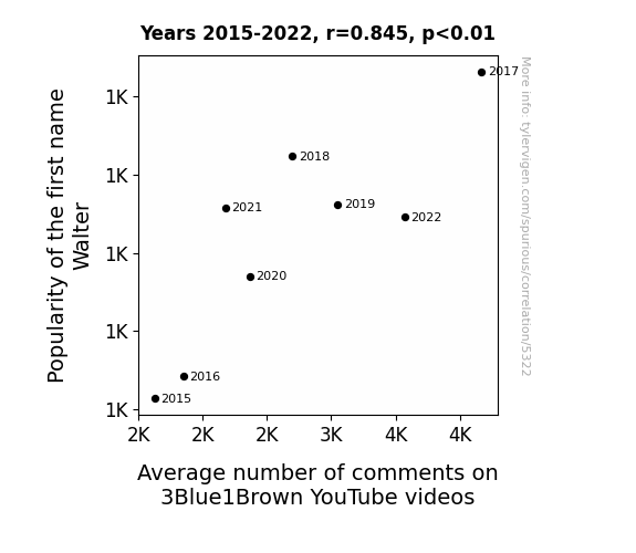
View details about correlation #5,322
The Walter Effect: Analyzing the Impact of Walter on YouTube Comment Counts
Viewers subconsciously associate the name Walter with wisdom and intelligence, leading them to engage more with the mathematical and scientific content on 3Blue1Brown. As the name Walter gains popularity, so does the allure of thought-provoking discussions on the channel.


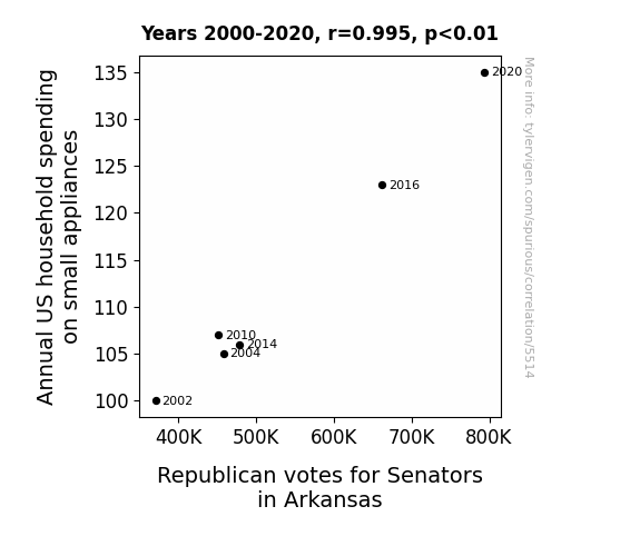
View details about correlation #5,514
Mixing Politics and Toasters: The Electrifying Link Between Small Appliance Spending and Republican Votes in Arkansas
The influx of breakfast sandwich makers and electric potato peelers led to a rise in delicious, politically-charged kitchen aromas, swaying the Senators' favor with every whiff of crispy bacon and perfectly toasted waffles. It's a classic case of appliances sparking not just power outlets, but also unexpected political alliances. Who knew that the path to a senator's heart could be through a state-of-the-art blender?


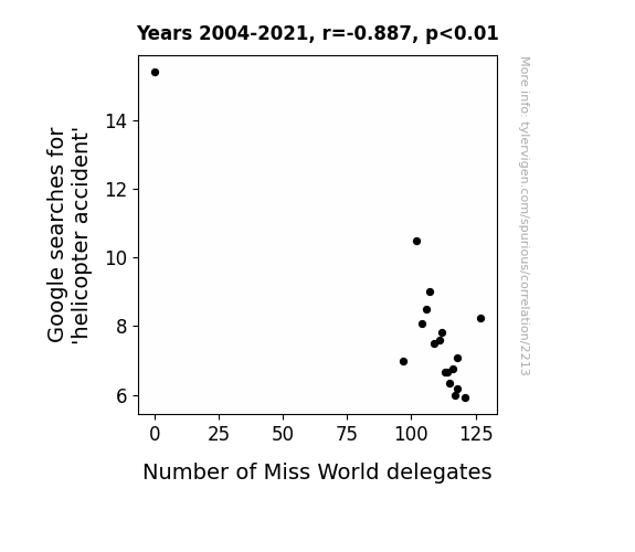
View details about correlation #2,213
What else correlates?
Google searches for 'helicopter accident' · all google searches
Number of Miss World delegates · all sports
Google searches for 'helicopter accident' · all google searches
Number of Miss World delegates · all sports


View details about correlation #5,668
Pollution and Photovoltaics: The Peculiar Pairing of Air Quality in Sonora and Solar Power in Albania
As air pollution in Sonora, California increased, it led to an inadvertent release of airborne solar power-boosting particles. These microscopic pollution particles, when transported across the globe, acted as tiny mirrors, reflecting sunlight onto the solar panels in Albania. It's like a polluted, yet oddly beneficial, game of cosmic hot potato, with solar energy as the ultimate winner.


What else correlates?
Air pollution in Sonora, California · all weather
Solar power generated in Albania · all energy
Air pollution in Sonora, California · all weather
Solar power generated in Albania · all energy


View details about correlation #5,369
The Trendy Tango: Tying Together AsapSCIENCE YouTube Titles and the Troupe of Trainers and Talent Trackers in Kansas
As more coaches and scouts flock to Kansas, their collective coolness is raising the bar for what's considered 'hip and with it', inspiring AsapSCIENCE to up their video title game with a dash of Midwestern pizzazz. After all, there's no place like 'know'.


View details about correlation #5,355
Republi-Car Recalls: A Political and Automotive Analysis of the Relationship Between Votes for the Republican Presidential Candidate in Texas and BMW of North America's Recalls
As more Republican voters proudly displayed their bumper stickers and flags, the sheer force of their political fervor triggered a chain reaction of car problems. It's like their support revved up some kind of mechanical marvel in the BMWs, leading to a recall bonanza. Who knew that political passion could jumpstart a whole new meaning to the term "recall election"? It's a red, white, and vroom situation that nobody saw coming!


View details about correlation #5,914
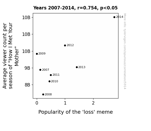
What else correlates?
Average viewer count per season of "How I Met Your Mother" · all films & actors
Popularity of the 'loss' meme · all memes
Average viewer count per season of "How I Met Your Mother" · all films & actors
Popularity of the 'loss' meme · all memes


View details about correlation #5,797
Air Pollution in Richmond, Virginia and Jet Fuel Combustion in Saint Vincent - A Rhyming Riddle
As air pollution decreased in Richmond, Virginia, it created a shortage of smog particles for the jet fuel in Saint Vincent/Grenadines to interact with. This led to a decrease in the consumption of jet fuel as the particles were no longer available to power the jets, ultimately clearing the skies in the Caribbean. It seems like even jet fuel needs a little smog love to keep burning!
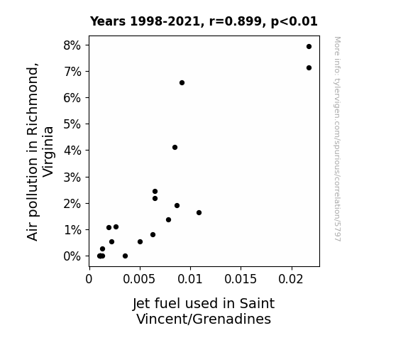
What else correlates?
Air pollution in Richmond, Virginia · all weather
Jet fuel used in Saint Vincent/Grenadines · all energy
Air pollution in Richmond, Virginia · all weather
Jet fuel used in Saint Vincent/Grenadines · all energy


View details about correlation #5,568
Kacey and Effect: Exploring the Correlation Between Name Popularity and Stand-up Maths Video Likes
Astoundingly, it seems that as the first name Kacey rose in prominence, so did the appreciation for stand-up comedy with a mathematical twist. It's as if there's a Kacey fan club specifically dedicated to supporting stand-up math enthusiasts - talk about a prime equation for success!


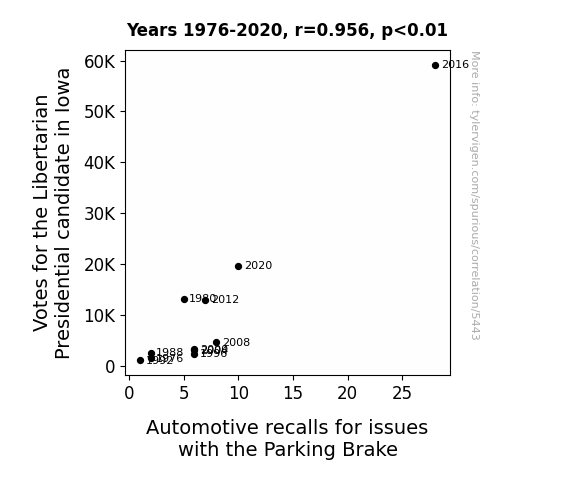
View details about correlation #5,443
Brake for Freedom: Investigating the Correlation between Libertarian Votes and Automotive Recalls in Iowa
As more people leaned towards libertarian ideals of freedom and minimal government intervention, the parking brakes decided to exercise their own free will, leading to a sudden surge in automotive recalls for parking brake issues. It was a true case of "brake-lash" in response to the political shifting of gears.
. The chart goes from 2008 to 2023, and the two variables track closely in value over that time.")

View details about correlation #5,072
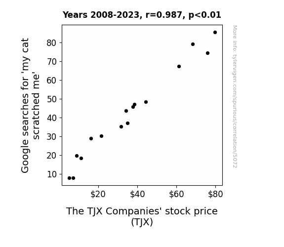
What else correlates?
Google searches for 'my cat scratched me' · all google searches
The TJX Companies' stock price (TJX) · all stocks
Google searches for 'my cat scratched me' · all google searches
The TJX Companies' stock price (TJX) · all stocks


View details about correlation #5,012
Shocking Connections: Unearthing the Electrifying Link Between Air Quality in Grand Forks, North Dakota and Electricity Generation in Azerbaijan
The cleaner air in Grand Forks led to an increase in productivity among the local goose population. These highly motivated geese then embarked on a goodwill tour to Azerbaijan, where they were welcomed as symbols of environmental purity. In a surprising turn of events, the government of Azerbaijan, deeply moved by the avian ambassadors, decided to invest heavily in wind energy as a gesture of solidarity with the geese. And that's how the improved air quality in one part of the world sparked a renewable energy revolution in another. Or, it could all just be a coincidence.

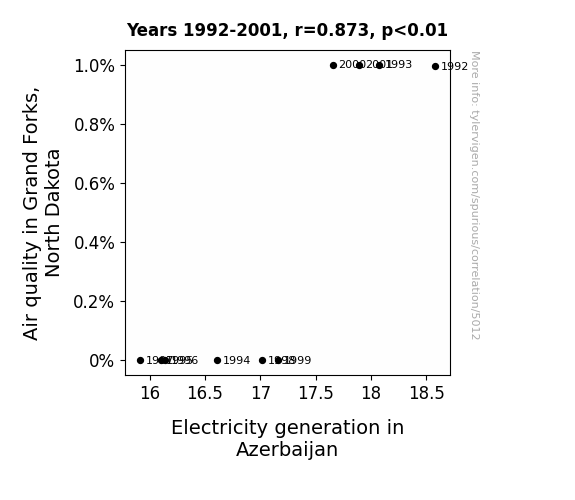
What else correlates?
Air quality in Grand Forks, North Dakota · all weather
Electricity generation in Azerbaijan · all energy
Air quality in Grand Forks, North Dakota · all weather
Electricity generation in Azerbaijan · all energy


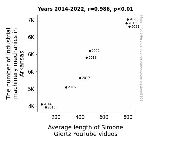
View details about correlation #5,106
Turner's Troublesome Taskmasters: A Quantitative Quirk Between Arkansas Machinery Mechanics and Simone Giertz's Video Vignettes
As the army of machinery mechanics expanded in Arkansas, they inadvertently sparked a wave of creativity in their spare time. With a newfound passion for problem-solving, they began inventing wacky machines to streamline Simone Giertz's video production process. This led to longer, more elaborate contraptions designed to help with filming, editing, and even crafting her signature robotic hats. So, in a surprising twist, the mechanics' mechanical mastery led to an unforeseen surge in both the absurdity and duration of Simone's fantastic creations. Who knew that the real 'machine' behind longer videos was the influx of playful inventors tinkering away in the heart of America? It just goes to show, when Arkansas's mechanics put their gears in motion, Simone Giertz's YouTube channel becomes the ultimate destination for 'mechanical-entertainment'!


View details about correlation #5,589
Rangers' Rundown: Recounting the Relationship between Libertarian Votes and Lighthearted League Lapses
As more people in Hawaii embraced libertarian values, a ripple effect was felt in the behavior of sea turtles off the coast of Texas. These turtles, known for their laid-back attitude, began to bring a sense of calm and non-interference to the Texas Rangers' games. This unexpected support helped the team maintain a zen-like focus, ultimately contributing to their success in the American League West Division. It's a true testament to the power of political ideology on the outcome of sports.


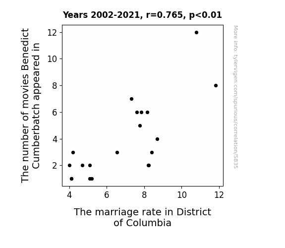
View details about correlation #5,835


View details about correlation #5,743
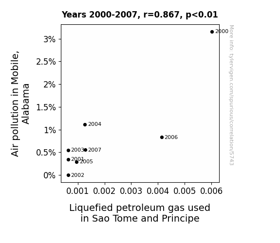
Gas, Gastronomy, and Geography: The Gassy Connection Between Air Pollution in Mobile, Alabama, and Liquefied Petroleum Gas in Sao Tome and Principe
As the air in Mobile cleared up, it led to less gas being passed around. This, in turn, impacted the global supply and demand for Liquefied petroleum, creating a ripple effect all the way to Sao Tome and Principe. It seems like Mobile's cleaner air didn't just lighten the atmosphere, but also had a knack for putting a lid on gas production. It's a situation where a breath of fresh air in one city became a breath of relief for another, all while reminding us that when it comes to air quality, we're truly in this together. So, let's keep supporting cleaner skies and a healthier planet, because the impact is gas-tly significant!

What else correlates?
Air pollution in Mobile, Alabama · all weather
Liquefied petroleum gas used in Sao Tome and Principe · all energy
Air pollution in Mobile, Alabama · all weather
Liquefied petroleum gas used in Sao Tome and Principe · all energy


View details about correlation #5,631
From Grey Matter to Political Science: Unraveling the Geeky Connection Between CGP Grey Video Titles and University Professors in Nebraska
As the number of university political science teachers in Nebraska decreases, there are fewer people to engage in intense discussions about government structure and voting systems. This leads to a statewide lack of interest in niche topics, including the intricacies of electoral colleges and proportional representation. Without the academic influence to appreciate the geeky content, Nebraskan viewers slowly drift towards more mainstream video titles, causing a significant decrease in the overall geekiness level of CGP Grey YouTube videos. It's a politically influenced domino effect that even a gerrymandered explanation couldn't fully map out.


View details about correlation #5,676
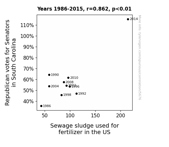
The Republican Vote and Fertilizer Gloat: A Statistical Analysis of the Relationship between South Carolina Senatorial Elections and Sewage Sludge Usage
The more conservative votes in South Carolina created a stink in the political arena, leading to a ripple effect in the agricultural sector. It seems the GOP support fertilized a new wave of sludgy decision-making, proving that in politics, as in farming, crap really does flow downhill!

. The chart goes from 2004 to 2023, and the two variables track closely in value over that time.")

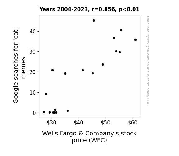
View details about correlation #1,101
What else correlates?
Google searches for 'cat memes' · all google searches
Wells Fargo & Company's stock price (WFC) · all stocks
Google searches for 'cat memes' · all google searches
Wells Fargo & Company's stock price (WFC) · all stocks


View details about correlation #5,495
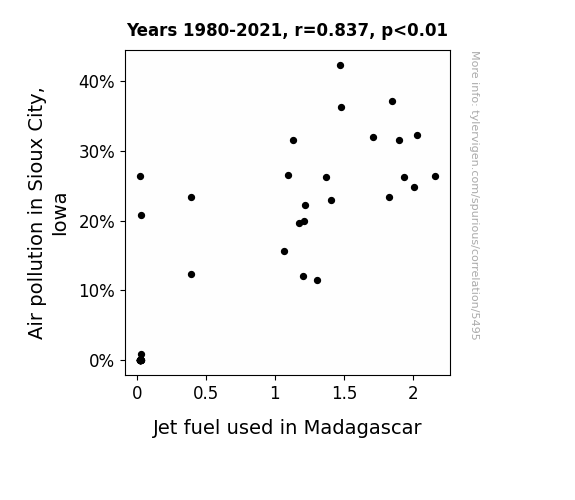
Aerosol Odyssey: Exploring the Correlation Between Air Pollution in Sioux City, Iowa and Jet Fuel Usage in Madagascar
As air pollution in Sioux City, Iowa increased, it created a demand for cleaner air elsewhere. This led to a surge in the production of jet fuel in Madagascar, as a way to jet-ison the pollution problem. So, in a bizarre twist of fate, the dirty air in Sioux City ended up fueling the need for jet fuel in Madagascar. It's a classic case of pollution leading to a global jet-setter mentality, proving that when it comes to air quality, the sky's the limit!

What else correlates?
Air pollution in Sioux City, Iowa · all weather
Jet fuel used in Madagascar · all energy
Air pollution in Sioux City, Iowa · all weather
Jet fuel used in Madagascar · all energy
Why this works
- Data dredging: I have 25,237 variables in my database. I compare all these variables against each other to find ones that randomly match up. That's 636,906,169 correlation calculations! This is called “data dredging.”
Fun fact: the chart used on the wikipedia page to demonstrate data dredging is also from me. I've been being naughty with data since 2014.
Instead of starting with a hypothesis and testing it, I instead tossed a bunch of data in a blender to see what correlations would shake out. It’s a dangerous way to go about analysis, because any sufficiently large dataset will yield strong correlations completely at random. - Lack of causal connection: There is probably no direct connection between these variables, despite what the AI says above.
Because these pages are automatically generated, it's possible that the two variables you are viewing are in fact causually related. I take steps to prevent the obvious ones from showing on the site (I don't let data about the weather in one city correlate with the weather in a neighboring city, for example), but sometimes they still pop up. If they are related, cool! You found a loophole.
This is exacerbated by the fact that I used "Years" as the base variable. Lots of things happen in a year that are not related to each other! Most studies would use something like "one person" in stead of "one year" to be the "thing" studied. - Observations not independent: For many variables, sequential years are not independent of each other. You will often see trend-lines form. If a population of people is continuously doing something every day, there is no reason to think they would suddenly change how they are doing that thing on January 1. A naive p-value calculation does not take this into account.
You will calculate a lower chance of "randomly" achieving the result than represents reality.
To be more specific: p-value tests are probability values, where you are calculating the probability of achieving a result at least as extreme as you found completely by chance. When calculating a p-value, you need to assert how many "degrees of freedom" your variable has. I count each year (minus one) as a "degree of freedom," but this is misleading for continuous variables.
This kind of thing can creep up on you pretty easily when using p-values, which is why it's best to take it as "one of many" inputs that help you assess the results of your analysis.
- Y-axes doesn't start at zero: I truncated the Y-axes of the graphs above. I also used a line graph, which makes the visual connection stand out more than it deserves.
Nothing against line graphs. They are great at telling a story when you have linear data! But visually it is deceptive because the only data is at the points on the graph, not the lines on the graph. In between each point, the data could have been doing anything. Like going for a random walk by itself!
Mathematically what I showed is true, but it is intentionally misleading. If you click on any of the charts that abuse this, you can scroll down to see a version that starts at zero. - Confounding variable: Confounding variables (like global pandemics) will cause two variables to look connected when in fact a "sneaky third" variable is influencing both of them behind the scenes.
- Outliers: Some datasets here have outliers which drag up the correlation.
In concept, "outlier" just means "way different than the rest of your dataset." When calculating a correlation like this, they are particularly impactful because a single outlier can substantially increase your correlation.
Because this page is automatically generated, I don't know whether any of the charts displayed on it have outliers. I'm just a footnote. ¯\_(ツ)_/¯
I intentionally mishandeled outliers, which makes the correlation look extra strong. - Low n: There are not many data points included in some of these charts.
You can do analyses with low ns! But you shouldn't data dredge with a low n.
Even if the p-value is high, we should be suspicious of using so few datapoints in a correlation.
Pro-tip: click on any correlation to see:
- Detailed data sources
- Prompts for the AI-generated content
- Explanations of each of the calculations (correlation, p-value)
- Python code to calculate it yourself


