spurious correlations
discover · random · spurious scholar
← previous page · next page →


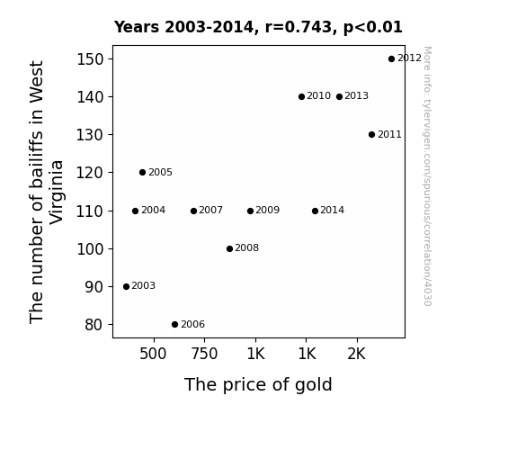
View details about correlation #4,030
Following the Golden Trail: Exploring the Correlation Between Bailiffs in West Virginia and the Price of Gold
As the number of bailiffs in West Virginia increased, more people started feeling the need to hide their valuables. This led to a surge in demand for safe deposit boxes, which are commonly used to store gold. With the sudden spike in demand, the price of gold naturally followed suit, proving that even in the world of economics, you can't escape the long arm of the law!

What else correlates?
The number of bailiffs in West Virginia · all cccupations
The price of gold · all weird & wacky
The number of bailiffs in West Virginia · all cccupations
The price of gold · all weird & wacky


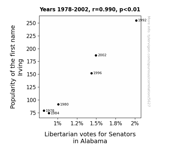
View details about correlation #5,627
Irving's Influence: A Popularity Poll on Libertarian Votes in Alabama
When people heard the name Irving, they couldn't help but think of "I've been" as in "I've been taxed enough already!" This subconscious association sparked a wave of support for Libertarian candidates in Alabama, leading to an unexpected surge in votes. Remember, a name can be mightier than the sword... or the ballot!
What else correlates?
Popularity of the first name Irving · all first names
Votes for Libertarian Senators in Alabama · all elections
Popularity of the first name Irving · all first names
Votes for Libertarian Senators in Alabama · all elections


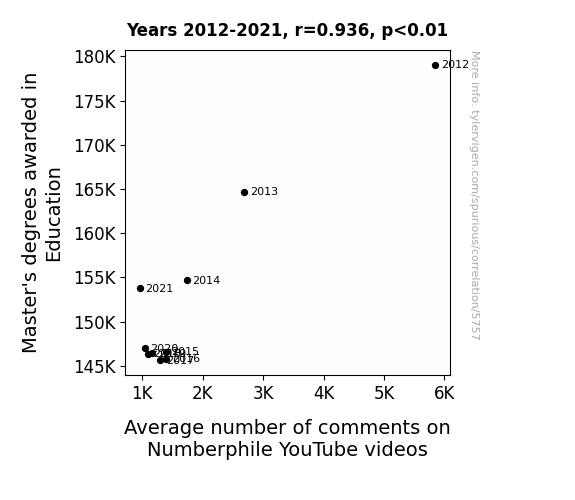
View details about correlation #5,757
Mastering Education: The Educated Guess on Numberphile Comments
The decrease in Master's degrees awarded in Education led to a shortage of educators who could fully appreciate and engage with the math concepts presented in the Numberphile videos, ultimately decreasing the average number of comments. After all, without those Master's degrees, they just couldn't count on the same level of mathematical discourse.


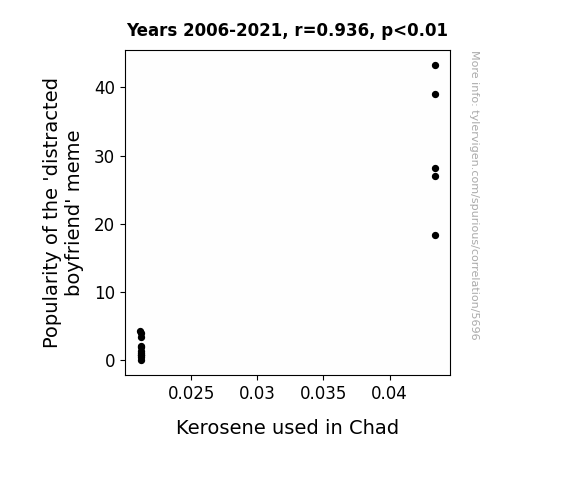
View details about correlation #5,696
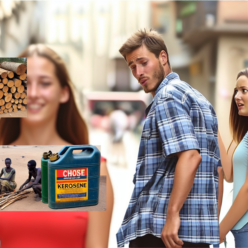
Lighting Up the Internet: A Combustible Connection Between the 'Distracted Boyfriend' Meme and Kerosene Consumption in Chad
As the 'distracted boyfriend' meme gained traction, more and more people in Chad were using their smartphones and devices to view and share it. This led to a surge in demand for electricity, prompting the need for additional kerosene to power generators in certain areas. It's as if the meme set off a chain reaction, creating a spark in kerosene use in Chad!
What else correlates?
Popularity of the 'distracted boyfriend' meme · all memes
Kerosene used in Chad · all energy
Popularity of the 'distracted boyfriend' meme · all memes
Kerosene used in Chad · all energy


View details about correlation #5,282
Shocking Developments: The Electrifying Link Between Air Quality in Sevierville, Tennessee and Automotive Recalls for Issues with the Electrical System
The higher air quality in Sevierville led to cleaner and more conductive air, which in turn increased the flow of electricity in cars. This shocking development left automakers revved up and scrambling to address the surge in electrical system issues. It seems like in this case, the smog was actually providing a spark for optimal car performance!


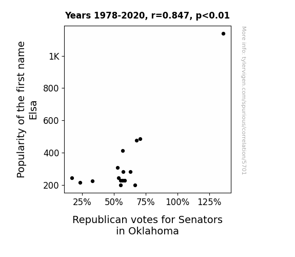
View details about correlation #5,701
Elsa and the Oklahoma Senatesa: An Icy Connection between First Names and Electoral Tendencies
The more Elsas there are, the icier the political climate becomes, leading to a surge in Republican support. It's like they say, "Let it go, let it go... straight to the voting booth to support conservative candidates!" Plus, as Elsa's popularity rises, so does the love for a certain song, and suddenly, it's all about red states and "Let it GOP, Let it GOP!"

What else correlates?
Popularity of the first name Elsa · all first names
Votes for Republican Senators in Oklahoma · all elections
Popularity of the first name Elsa · all first names
Votes for Republican Senators in Oklahoma · all elections


View details about correlation #5,528
The Tipsy Tutorials: Tracking the Ties between Numberphile Views and Hangover Cures
Apparently, as people learned more about complex mathematical concepts, they realized that the best solution to a hangover was simply not to drink in the first place. Who knew the real 'number phile' cure for a hangover was just subtraction – as in, subtracting the cocktails! It's a case of math nerds leading the way to sober mornings for everyone. And if you think about it, the whole situation is a sin wave of events – as the views of Numberphile videos go down, the Google searches for hangover cures also hit a new low. It's just proof that sometimes the best solutions are the ones you don't 'count' on!


View details about correlation #4,165
Sun-Powered Number Crunching: The Actuarial Impact on Solar Energy Harvesting
As the number of actuaries in Utah rises, so does their love for crunching numbers. This creates a ripple effect in the mathematical space-time continuum, leading to a surge in solar power expertise. This newfound kazakhsplendor in solar energy production has the sun working overtime, kind of like a giant math equation with sunshine as the variable. It's like Utah's passion for probabilities is casting a sunny spell all the way to Kazakhstan, where solar power is now multiplying faster than you can say "compound interest." Who knew that the real key to unlocking the potential of solar power lay in the exponents of Utah's actuarial prowess? It's a shining example of how the world of numbers and the power of the sun can come together to create a brighter, more calculated future for us all.

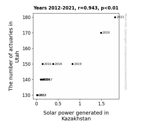
What else correlates?
The number of actuaries in Utah · all cccupations
Solar power generated in Kazakhstan · all energy
The number of actuaries in Utah · all cccupations
Solar power generated in Kazakhstan · all energy


View details about correlation #5,752
Shipping the Loss: A Correlational Study of the 'loss' Meme Popularity and Amazon's Revenue
As the 'loss' meme gained popularity, more people were creating and ordering custom merchandise featuring the meme. This led to a significant increase in the number of small, oddly shaped packages being shipped, ultimately boosting Amazon's shipping revenue. It seems like the real 'loss' was incurred by anyone trying to make sense of this correlation!
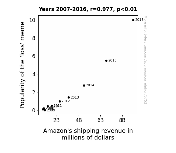
What else correlates?
Popularity of the 'loss' meme · all memes
Amazon's shipping revenue in millions of dollars · all weird & wacky
Popularity of the 'loss' meme · all memes
Amazon's shipping revenue in millions of dollars · all weird & wacky


View details about correlation #5,419
Cloudy with a Chance of Blue States: The Particulate Matter between Air Pollution and Senatorial Preference in Corpus Christi, Texas
The cleaner air led to clearer thinking, prompting some Democrats to reconsider their political views. Without all those pollutants fogging up their brains, they just couldn't resist the allure of the opposition's policies. As Corpus Christi cleared up, so did their party allegiance.

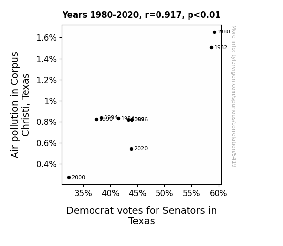
What else correlates?
Air pollution in Corpus Christi, Texas · all weather
Votes for Democratic Senators in Texas · all elections
Air pollution in Corpus Christi, Texas · all weather
Votes for Democratic Senators in Texas · all elections


View details about correlation #5,470
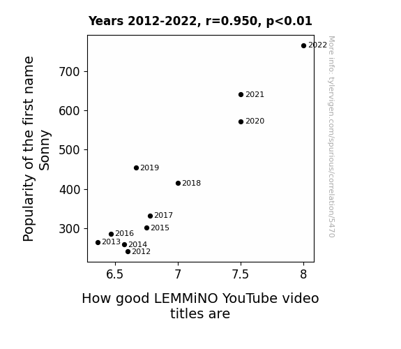
The Sunny Side of Sonny: A LEMMiNO Analysis of YouTube Video Titles
As more and more parents named their babies Sonny after the classic 1970s image of a cool and charismatic guy, the collective awesomeness levels in the world began to rise. This surge in awesomeness directly influenced LEMMiNO's creativity, leading to the production of incredibly good YouTube video titles. It's like a ripple effect of epic proportions, with the name Sonny serving as the catalyst for a golden age of video titling!

What else correlates?
Popularity of the first name Sonny · all first names
How good LEMMiNO YouTube video titles are · all YouTube
Popularity of the first name Sonny · all first names
How good LEMMiNO YouTube video titles are · all YouTube


View details about correlation #3,833
Balancing the Equation: The Quirky Correlation Between Operations Research Analysts in West Virginia and Liquefied Petroleum Gas Consumption in Albania
The influx of analysts sparked a sudden interest in optimizing gas usage. With their number crunching prowess, they revolutionized the transportation and storage of LPG in Albania, inadvertently leading to a surge in its consumption. It's a classic case of Appalachian arithmetic causing a Balkan gas boom!


View details about correlation #5,674
On the Move: The Curious Connection Between Transportation-Related Master's Degrees and the 'Slenderman' Meme Phenomenon
As the number of Master’s degrees awarded in Transportation decreased, there was less 'drive' to keep the 'slenderman' meme going. This led to a drop in overall interest and ultimately caused the meme to hit the brakes on its own popularity. It seems like the connection got lost in transit, leaving the meme stranded without a 'transporting' appeal. The situation just couldn't 'pick up' the same momentum, and the meme ended up taking a wrong turn into obscurity. Who knew that a lack of advanced transportation degrees could derail a creepy internet phenomenon?
What else correlates?
Master's degrees awarded in Transportation · all education
Popularity of the 'slenderman' meme · all memes
Master's degrees awarded in Transportation · all education
Popularity of the 'slenderman' meme · all memes


View details about correlation #4,658
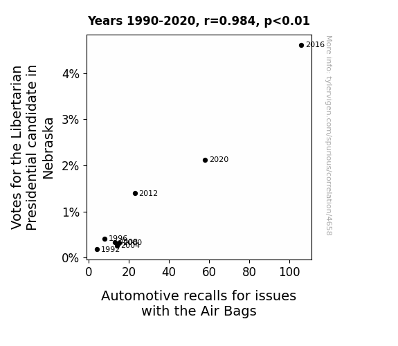
Libertarian Votes and Airbag Recalls in Nebraska: A Correlational Odyssey
As more people embraced the idea of minimal government intervention, it inadvertently led to a laissez-faire attitude in the automotive industry. Without the usual regulations, the air bag manufacturers may have cut corners, leading to more recalls. It seems like even the cars were demanding their own form of autonomy!


View details about correlation #5,252
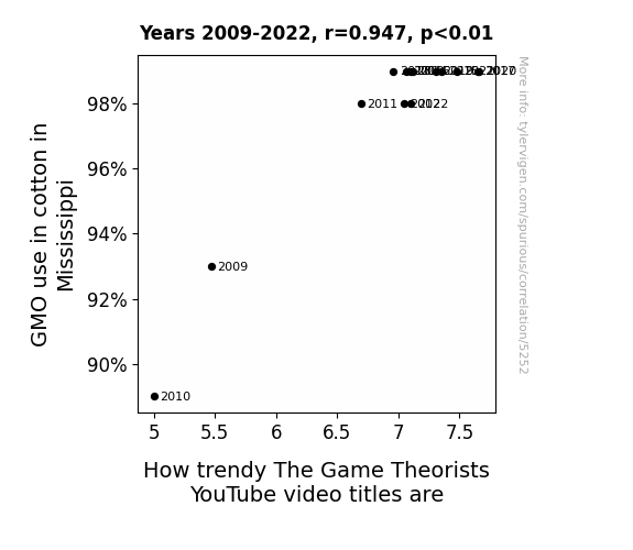
The Cotton Gin-novation: How GMO Cotton Cultivation in Mississippi is Sewing Up The Game Theorists
As GMO cotton in Mississippi flourished, it led to a surplus of cotton which in turn boosted the production of snazzy cotton-based clothing. The Game Theorists, wanting to stay fashion-forward, couldn't help but up their video title game to match the sudden influx of stylish GMO cotton clothing options on the market. Who knew that sartorial decisions in the South could influence YouTube trends?

What else correlates?
GMO use in cotton in Mississippi · all food
How trendy The Game Theorists YouTube video titles are · all YouTube
GMO use in cotton in Mississippi · all food
How trendy The Game Theorists YouTube video titles are · all YouTube


View details about correlation #4,199
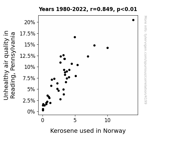
Heating Things Up: The Sooty Relationship Between Air Pollution in Reading, Pennsylvania and Kerosene Consumption in Norway
The decrease in air pollution in Reading, Pennsylvania led to a reduction in the population of pollution-loving airborne kerosene-eating microbes. These microbes, which had inadvertently hitchhiked their way to Norway, had developed a taste for kerosene, causing a significant decrease in its availability. As the kerosene-eating microbes found an alternative and switched to feasting on the pollutants in Reading, their distant cousins in Norway were left hungry and had to seek out a new source of sustenance. This unexpected chain of events highlights the interconnectedness of ecosystems on a global scale and the importance of considering all potential consequences of environmental changes.

What else correlates?
Air pollution in Reading, Pennsylvania · all weather
Kerosene used in Norway · all energy
Air pollution in Reading, Pennsylvania · all weather
Kerosene used in Norway · all energy


View details about correlation #5,812
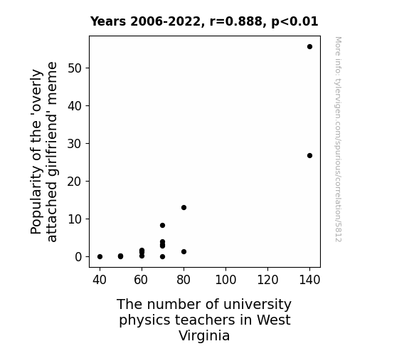
Unraveling the Attractive Force: The Overly Attached Girlfriend Meme's Pull on Physics Teachers in West Virginia
As the meme spread, it unknowingly sparked a sudden interest in the laws of attraction and the physics of clinginess. Soon, West Virginia found itself inundated with physics enthusiasts who were drawn in by the gravitational pull of the 'overly attached girlfriend' meme. This led to a surprising boom in the demand for university physics teachers in the state, as local schools scrambled to find educators who could explain the dynamics of love and the mechanics of devotion. It seems that the meme's impact was not just limited to the internet – it had created a force field of academic curiosity that was simply irresistible.


View details about correlation #4,603
Making a Link Between Republican Votes in Alabama and Nathan's Hot Dog Eating Contest: A Wiener Takes All Approach
As the Republican votes sizzled up in Alabama, it created a real Red-Hot political climate. This, in turn, sparked a Wiener-takes-all mentality among the Nathan's Hot Dog Eating Competition Champion, leading to a surge in their hotdog consumption. The connection? It seems like when it comes to politics and competitive eating, there's just too much at stake to ketchup on any opportunity.


View details about correlation #5,698
Lazaro, the Star-O: A Rhyming Rhapsody on YouTube Video Titles
As more people named Lazaro gained attention, a secret competition arose to create the coolest, most cutting-edge Be Smart video titles. Lazaro just has that innate ability to inspire creativity and trendiness, leading to an influx of 'fresh' and 'on fleek' video titles. It's like the name itself carries an air of effortless coolness that the Be Smart team couldn't help but channel into their content. Who knew that all this time, the key to next-level YouTube titles was simply embracing your inner Lazaro?


View details about correlation #3,955
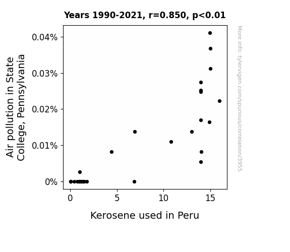
Puzzling Pollution: Pondering the Parallels between Air Pollution in State College and Kerosene in Peru
As air pollution in State College decreased, it led to a decrease in the production of giant air purifiers shaped like kerosene lamps. These purifiers were mistakenly shipped to Peru, where they were promptly confiscated by a confused llama farmer. Remember, when it comes to international kerosene mix-ups, the llama drama is always a potential plot twist!

What else correlates?
Air pollution in State College, Pennsylvania · all weather
Kerosene used in Peru · all energy
Air pollution in State College, Pennsylvania · all weather
Kerosene used in Peru · all energy
Why this works
- Data dredging: I have 25,237 variables in my database. I compare all these variables against each other to find ones that randomly match up. That's 636,906,169 correlation calculations! This is called “data dredging.”
Fun fact: the chart used on the wikipedia page to demonstrate data dredging is also from me. I've been being naughty with data since 2014.
Instead of starting with a hypothesis and testing it, I instead tossed a bunch of data in a blender to see what correlations would shake out. It’s a dangerous way to go about analysis, because any sufficiently large dataset will yield strong correlations completely at random. - Lack of causal connection: There is probably no direct connection between these variables, despite what the AI says above.
Because these pages are automatically generated, it's possible that the two variables you are viewing are in fact causually related. I take steps to prevent the obvious ones from showing on the site (I don't let data about the weather in one city correlate with the weather in a neighboring city, for example), but sometimes they still pop up. If they are related, cool! You found a loophole.
This is exacerbated by the fact that I used "Years" as the base variable. Lots of things happen in a year that are not related to each other! Most studies would use something like "one person" in stead of "one year" to be the "thing" studied. - Observations not independent: For many variables, sequential years are not independent of each other. You will often see trend-lines form. If a population of people is continuously doing something every day, there is no reason to think they would suddenly change how they are doing that thing on January 1. A naive p-value calculation does not take this into account.
You will calculate a lower chance of "randomly" achieving the result than represents reality.
To be more specific: p-value tests are probability values, where you are calculating the probability of achieving a result at least as extreme as you found completely by chance. When calculating a p-value, you need to assert how many "degrees of freedom" your variable has. I count each year (minus one) as a "degree of freedom," but this is misleading for continuous variables.
This kind of thing can creep up on you pretty easily when using p-values, which is why it's best to take it as "one of many" inputs that help you assess the results of your analysis.
- Y-axes doesn't start at zero: I truncated the Y-axes of the graphs above. I also used a line graph, which makes the visual connection stand out more than it deserves.
Nothing against line graphs. They are great at telling a story when you have linear data! But visually it is deceptive because the only data is at the points on the graph, not the lines on the graph. In between each point, the data could have been doing anything. Like going for a random walk by itself!
Mathematically what I showed is true, but it is intentionally misleading. If you click on any of the charts that abuse this, you can scroll down to see a version that starts at zero. - Confounding variable: Confounding variables (like global pandemics) will cause two variables to look connected when in fact a "sneaky third" variable is influencing both of them behind the scenes.
- Outliers: Some datasets here have outliers which drag up the correlation.
In concept, "outlier" just means "way different than the rest of your dataset." When calculating a correlation like this, they are particularly impactful because a single outlier can substantially increase your correlation.
Because this page is automatically generated, I don't know whether any of the charts displayed on it have outliers. I'm just a footnote. ¯\_(ツ)_/¯
I intentionally mishandeled outliers, which makes the correlation look extra strong. - Low n: There are not many data points included in some of these charts.
You can do analyses with low ns! But you shouldn't data dredge with a low n.
Even if the p-value is high, we should be suspicious of using so few datapoints in a correlation.
Pro-tip: click on any correlation to see:
- Detailed data sources
- Prompts for the AI-generated content
- Explanations of each of the calculations (correlation, p-value)
- Python code to calculate it yourself


