

AI explanation
As air pollution in State College decreased, it led to a decrease in the production of giant air purifiers shaped like kerosene lamps. These purifiers were mistakenly shipped to Peru, where they were promptly confiscated by a confused llama farmer. Remember, when it comes to international kerosene mix-ups, the llama drama is always a potential plot twist!
Model: dalle-3
Prompt: Generate an image of two contrasting scenes, one showing a bright and sunny State College, Pennsylvania with people enjoying the fresh air, and another showcasing families in Peru gathered around a clean-burning stove, radiating warm light in their homes. The contrast should highlight the different air quality experiences and the safer, cleaner environment for the families in Peru. The depiction should include only scenes, people, and objects, it should not include text or speech bubbles.
This image generation prompt was also generated by AI, using the following sequence:
Model: gpt-3.5-turbo-1106
System prompt: You select one of a few potential scene descriptors that seems to go along with the variables described. You respond only with the scene descriptions provided and say nothing else.
User prompt: Here are two variables: Air pollution in State College, Pennsylvania and Kerosene used in Peru. Given these, which of the following image style descriptions seems most appropriate? Pick the one that seems to be related to one of the variables at hand. Please respond with only one of the following potential descriptions: Data cyber art An image that looks like it is a scene from 'Star Wars' Steampunk A TIME magazine cover image An image that looks like it is a scene from a Pixar movie
ChatGPT: A TIME magazine cover image
Model: gpt-3.5-turbo-1106
System prompt: You describe simple visual scenes that depict the two variables stated. You combine both variables into one scene.
User prompt: Please describe a visual scene that prominently depicts both Air pollution in State College, Pennsylvania and Kerosene used in Peru, in the following situation: because the decrease in air pollution in State College, Pennsylvania led to a decrease in sneezing, resulting in fewer people accidentally spilling their kerosene while sneezing in Peru.. Keep the description simple.
ChatGPT: In State College, Pennsylvania, the air is clear as the sun shines over the town. People walk outside without sneezing, and the air feels fresh. Meanwhile, in Peru, families gather around a clean-burning stove, filling their homes with warm light. No kerosene is spilled as the fewer sneezes lead to fewer accidents, creating a safer and cleaner environment in their homes.
Model: gpt-3.5-turbo-1106
System prompt: You write and improve image generation prompts for DALLE-3. You maintain the same subjects, but enhance the visuals.
User prompt: Please respond with an image generation prompt that would be likely to create an interesting visual using DALLE-3, using the following style: [ A TIME magazine cover image ] and depicting this scene: In State College, Pennsylvania, the air is clear as the sun shines over the town. People walk outside without sneezing, and the air feels fresh. Meanwhile, in Peru, families gather around a clean-burning stove, filling their homes with warm light. No kerosene is spilled as the fewer sneezes lead to fewer accidents, creating a safer and cleaner environment in their homes. Keep the visual depiction simple. Do not include any words or speech bubbles.
ChatGPT: Generate an image of two contrasting scenes, one showing a bright and sunny State College, Pennsylvania with people enjoying the fresh air, and another showcasing families in Peru gathered around a clean-burning stove, radiating warm light in their homes. The contrast should highlight the different air quality experiences and the safer, cleaner environment for the families in Peru.
*Variations in the User Prompts from chart to chart are just the result of random number generation in Python. I wrote a few arrays of various styles and methods to ask questions to change up the results. Every time this site writes an explanation or generates an image, the script picks from each at random.
I sequence the requests into multiple prompts because I find GPT 3.5 to perform much better with short, well-managed contexts. Thus, I track the context directly in Python and only ask ChatGPT targeted questions.
System prompt: You provide humorous responses in the form of plausible sounding explanations for correlations. You assume the correlation is causative for the purpose of the explanation even if it is ridiculous. You do not chat with the user, you only reply with the causal connection explanation and nothing else.
User prompt: Please make up a funny explanation for how a decrease in Air pollution in State College, Pennsylvania caused Kerosene used in Peru to decrease. Add a funny one-liner at the end.
AI academic paper
 |
Puzzling Pollution: Pondering the Parallels between Air Pollution in State College and Kerosene in Peru The Journal of Ecological Enigmas Jan 2024 |
Model: gpt-3.5-turbo-1106
System prompt: You are a silly researcher writing an academic paper.You write titles and abstracts of goofy academic research papers.
User prompt:
Pretend you are an academic researcher. Your writing sounds like it belongs in a medical or economics journal. However, you frequently crack jokes, make puns, and add unexpected twists in your writing.
Please draft the title and abstract of an academic research paper presenting the findings of the connection between Air pollution in State College, Pennsylvania and Kerosene used in Peru. Make lots of jokes, goofy observations, and puns.
Make the title an alliteration.
Your research team used data from Environmental Protection Agency and Energy Information Administration to assess this nagging question. You found a correlation coefficient of 0.8500160 and p < 0.01 for 1990 to 2021.
Please respond in this format (replace "Lorem ipsum dolor sit" with your title and abstract)
[[TITLE]]
Lorem ipsum dolor sit
[[ABSTRACT]]
Lorem ipsum dolor sit
ChatGPT:
[[TITLE]]
Puzzling Pollution: Pondering the Parallels between Air Pollution in State College and Kerosene in Peru
[[ABSTRACT]]
In our research paper, we investigated the peculiar connection between the air pollution levels in State College, Pennsylvania, and the usage of kerosene in Peru. Our study utilized data from the Environmental Protection Agency and the Energy Information Administration to address this outlandish inquiry. Upon analyzing the data from 1990 to 2021, we uncovered a surprisingly strong correlation coefficient of 0.8500160 and a p-value less than 0.01. Our findings not only unveiled a statistical association between these unlikely bedfellows but also sparked absurd contemplations about the cosmic forces at play, or perhaps the whims of the data gods. We offer this paper as a lighthearted piece of scholarly amusement and a reminder to always keep an open mind, even when the relationship between variables seems as bizarre as a penguin in a tuxedo.
Model: gpt-3.5-turbo-1106
System prompt: You are a silly researcher writing an academic paper.You draft the introduction section of an academic research paper.
User prompt:
Pretend you are an academic researcher. Your writing sounds like it belongs in a medical or economics journal. However, you frequently crack jokes, make puns, or add unexpected twists in your writing.
Please make up the introduction section of an academic research paper presenting the findings of the connection between Air pollution in State College, Pennsylvania and Kerosene used in Peru. Make lots of jokes, goofy observations, and puns. Sneak in some jokes and clever puns about science, research, statistics, and the variables.
Here is the title and abstract of the paper:
[[TITLE]]
Puzzling Pollution: Pondering the Parallels between Air Pollution in State College and Kerosene in Peru
[[ABSTRACT]]
In our research paper, we investigated the peculiar connection between the air pollution levels in State College, Pennsylvania, and the usage of kerosene in Peru. Our study utilized data from the Environmental Protection Agency and the Energy Information Administration to address this outlandish inquiry. Upon analyzing the data from 1990 to 2021, we uncovered a surprisingly strong correlation coefficient of 0.8500160 and a p-value less than 0.01. Our findings not only unveiled a statistical association between these unlikely bedfellows but also sparked absurd contemplations about the cosmic forces at play, or perhaps the whims of the data gods. We offer this paper as a lighthearted piece of scholarly amusement and a reminder to always keep an open mind, even when the relationship between variables seems as bizarre as a penguin in a tuxedo.
-------
Your response should start like this:
[[INTRODUCTION]]
ChatGPT:
[[INTRODUCTION]]
As researchers, we often find ourselves elbow-deep in data, trying to untangle the web of variables and correlations. It's like trying to solve a Rubik's Cube while blindfolded - puzzling, perplexing, and sometimes downright maddening. However, every once in a while, we stumble upon a connection so improbable, so bewildering, that it feels like we've accidentally stepped into a dimension where logic and reason have taken an extended vacation. Such is the case with our investigation into the curious relationship between air pollution in State College, Pennsylvania, and the use of kerosene in Peru.
One might think, "What on earth do these two disparate entities have in common?" It's like trying to link up socks without a pair - an odd and seemingly futile exercise. Yet, armed with our trusty statistical analysis tools and fueled by copious amounts of caffeine, we delved into this enigmatic link, determined to shed some light on this bewildering conundrum.
Our journey into the depths of data proved to be a rollercoaster of emotions - akin to a tilt-a-whirl ride at a carnival. We encountered countless scatter plots, p-values, and regression analyses, all the while wondering if we were crossing the boundaries of scientific inquiry or merely chasing after a statistical chimera. And lo and behold, amidst the sea of numbers and variables, we stumbled upon a correlation coefficient so robust, it was as if the data itself was winking at us mischievously.
The statistical analysis unveiled a striking correlation coefficient of 0.8500160, leaving us speechless for a moment. It was as if the data was tapping us on the shoulder and saying, "Hey, I've got a secret to share!" And share it did, with a p-value lower than 0.01, as though it was winking at us and whispering, "Believe it or not, this connection is no mere statistical fluke."
As we pondered over this remarkable revelation, we couldn't help but entertain wild theories about the cosmic forces at play. Perhaps there's a statistical Serendipity Tinkerbell sprinkling glittery p-values behind our backs. Or maybe the Data Fairy is orchestrating this whimsical dance of variables for her own amusement, chuckling at our attempts to make sense of it all.
In presenting our findings, we invite the scientific community to join us in this lighthearted intellectual amusement. After all, it's not every day that one stumbles upon a statistical oddity so comically perplexing. So, buckle up and prepare for a scholarly rollercoaster ride, as we unravel the riddle of the mysterious connection between air pollution in State College and the use of kerosene in Peru.
Model: gpt-3.5-turbo-1106
System prompt: You are a silly researcher writing an academic paper.You draft a literature review section of an academic research paper, that starts out dry for the first few sentences but then becomes hilarious and goofy.
User prompt:
Pretend you are an academic researcher. Your writing sounds like it belongs in a medical or economics journal. However, you frequently crack jokes, make puns, or add unexpected twists in your writing.
Please make up a literature review section of an academic research paper presenting the findings of the connection between Air pollution in State College, Pennsylvania and Kerosene used in Peru. Make lots of jokes, goofy observations, and puns.
Speak in the present tense for this section (the authors find...), as is common in academic research paper literature reviews. Name the sources in a format similar to this: In "Book," the authors find lorem and ipsum.
Make up the lorem and ipsum part, but make it sound related to the topic at hand.
Start by naming serious-sounding studies by authors like Smith, Doe, and Jones - but then quickly devolve. Name some real non-fiction books that would be related to the topic. Then name some real fiction books that sound like they could be related. Then you might move on to cartoons and children's shows that you watched for research.
Here is the title and abstract of the paper:
[[TITLE]]
Puzzling Pollution: Pondering the Parallels between Air Pollution in State College and Kerosene in Peru
[[ABSTRACT]]
In our research paper, we investigated the peculiar connection between the air pollution levels in State College, Pennsylvania, and the usage of kerosene in Peru. Our study utilized data from the Environmental Protection Agency and the Energy Information Administration to address this outlandish inquiry. Upon analyzing the data from 1990 to 2021, we uncovered a surprisingly strong correlation coefficient of 0.8500160 and a p-value less than 0.01. Our findings not only unveiled a statistical association between these unlikely bedfellows but also sparked absurd contemplations about the cosmic forces at play, or perhaps the whims of the data gods. We offer this paper as a lighthearted piece of scholarly amusement and a reminder to always keep an open mind, even when the relationship between variables seems as bizarre as a penguin in a tuxedo.
-------
And here is the introduction section that led to this literature review:
[[INTRODUCTION]]
As researchers, we often find ourselves elbow-deep in data, trying to untangle the web of variables and correlations. It's like trying to solve a Rubik's Cube while blindfolded - puzzling, perplexing, and sometimes downright maddening. However, every once in a while, we stumble upon a connection so improbable, so bewildering, that it feels like we've accidentally stepped into a dimension where logic and reason have taken an extended vacation. Such is the case with our investigation into the curious relationship between air pollution in State College, Pennsylvania, and the use of kerosene in Peru.
One might think, "What on earth do these two disparate entities have in common?" It's like trying to link up socks without a pair - an odd and seemingly futile exercise. Yet, armed with our trusty statistical analysis tools and fueled by copious amounts of caffeine, we delved into this enigmatic link, determined to shed some light on this bewildering conundrum.
Our journey into the depths of data proved to be a rollercoaster of emotions - akin to a tilt-a-whirl ride at a carnival. We encountered countless scatter plots, p-values, and regression analyses, all the while wondering if we were crossing the boundaries of scientific inquiry or merely chasing after a statistical chimera. And lo and behold, amidst the sea of numbers and variables, we stumbled upon a correlation coefficient so robust, it was as if the data itself was winking at us mischievously.
The statistical analysis unveiled a striking correlation coefficient of 0.8500160, leaving us speechless for a moment. It was as if the data was tapping us on the shoulder and saying, "Hey, I've got a secret to share!" And share it did, with a p-value lower than 0.01, as though it was winking at us and whispering, "Believe it or not, this connection is no mere statistical fluke."
As we pondered over this remarkable revelation, we couldn't help but entertain wild theories about the cosmic forces at play. Perhaps there's a statistical Serendipity Tinkerbell sprinkling glittery p-values behind our backs. Or maybe the Data Fairy is orchestrating this whimsical dance of variables for her own amusement, chuckling at our attempts to make sense of it all.
In presenting our findings, we invite the scientific community to join us in this lighthearted intellectual amusement. After all, it's not every day that one stumbles upon a statistical oddity so comically perplexing. So, buckle up and prepare for a scholarly rollercoaster ride, as we unravel the riddle of the mysterious connection between air pollution in State College and the use of kerosene in Peru.
-------
Your response should start like this:
[[LITERATURE REVIEW]]
ChatGPT:
[[LITERATURE REVIEW]]
The connection between seemingly unrelated phenomena has long been a point of curiosity in the scientific community. Smith and Doe (2015) explored the surprising correlations between coffee consumption and UFO sightings, while Jones et al. (2018) delved into the enigmatic ties between cat videos and global economic indicators. In this continuum of quirky scholarly pursuits, our investigation stands as a prime example of embarking on a whimsical journey that leads to unexpected destinations.
Turning to the realm of environmental factors, the study "Air Pollution and Its Effects on Public Health" by Environmental Research Institute (2017) provides a comprehensive analysis of the impact of air pollution on respiratory ailments and cardiovascular diseases. Similarly, the work of Clean Air Coalition (2019) sheds light on the detrimental effects of kerosene use on indoor air quality and human health in developing countries. While these studies are undoubtedly informative and insightful, they do not delve into the hilariously bizarre association uncovered by our research team.
Further expanding our scope, we take note of "The Energy Dilemma: A conceptual framework" by Global Energy Consortium (2016) and "Rural Lighting Solutions: A Case Study of Kerosene Lantern Alternatives" by Sustainable Energy Research Group (2014). These works serve as pivotal references in understanding the practical implications of kerosene usage, yet they fail to illuminate the confounding correlation we have stumbled upon.
Diverging briefly into the realm of fiction, the novels "Cloudy with a Chance of Pollution" by Peter Pepper and "The Kerosene Kapers: A Whimsical Tale" by Olive Oyl engage with imaginative scenarios that humorously parallel our real-world puzzle. Although these books may not serve as rigorous academic sources, their playful take on improbable connections provides a dash of levity to our scholarly investigation.
In our quest for a fresh perspective, we delved into the animated world of "Captain Planet and the Planeteers," a beloved children's show featuring environmental superheroes. While the show's antics may seem far-fetched, their commitment to combating pollution and advocating for sustainable energy aligns with the spirit of our inquiry. Moreover, the whimsical nature of this animated series serves as a reminder that even the most outlandish connections can hold nuggets of truth, much like our own mind-boggling revelation.
As we navigate the sea of scholarly literature and whimsical musings, we are reminded of the peculiar nature of scientific inquiry. Sometimes, the most improbable connections yield the most intriguing insights, leaving us with a chuckle and a newfound appreciation for the capricious dance of data.
Model: gpt-3.5-turbo-1106
System prompt: You are a silly researcher writing an academic paper.You draft the methodology section of an academic research paper.
User prompt:
Pretend you are an academic researcher. Your writing sounds like it belongs in a medical or economics journal. However, you frequently crack jokes, make puns, or add unexpected twists in your writing.
Please make up the methodology section of an academic research paper presenting the findings of the connection between Air pollution in State College, Pennsylvania and Kerosene used in Peru. Make lots of jokes, goofy observations, and puns. Sneak in some jokes and clever puns about science, research, statistics, and the variables.
Your research team collected data from all across the internet, but mostly just used information from Environmental Protection Agency and Energy Information Administration . You used data from 1990 to 2021
Make up the research methods you don't know. Make them a bit goofy and convoluted.
Here is the title, abstract, and introduction of the paper:
[[TITLE]]
Puzzling Pollution: Pondering the Parallels between Air Pollution in State College and Kerosene in Peru
[[ABSTRACT]]
In our research paper, we investigated the peculiar connection between the air pollution levels in State College, Pennsylvania, and the usage of kerosene in Peru. Our study utilized data from the Environmental Protection Agency and the Energy Information Administration to address this outlandish inquiry. Upon analyzing the data from 1990 to 2021, we uncovered a surprisingly strong correlation coefficient of 0.8500160 and a p-value less than 0.01. Our findings not only unveiled a statistical association between these unlikely bedfellows but also sparked absurd contemplations about the cosmic forces at play, or perhaps the whims of the data gods. We offer this paper as a lighthearted piece of scholarly amusement and a reminder to always keep an open mind, even when the relationship between variables seems as bizarre as a penguin in a tuxedo.
[[INTRODUCTION]]
As researchers, we often find ourselves elbow-deep in data, trying to untangle the web of variables and correlations. It's like trying to solve a Rubik's Cube while blindfolded - puzzling, perplexing, and sometimes downright maddening. However, every once in a while, we stumble upon a connection so improbable, so bewildering, that it feels like we've accidentally stepped into a dimension where logic and reason have taken an extended vacation. Such is the case with our investigation into the curious relationship between air pollution in State College, Pennsylvania, and the use of kerosene in Peru.
One might think, "What on earth do these two disparate entities have in common?" It's like trying to link up socks without a pair - an odd and seemingly futile exercise. Yet, armed with our trusty statistical analysis tools and fueled by copious amounts of caffeine, we delved into this enigmatic link, determined to shed some light on this bewildering conundrum.
Our journey into the depths of data proved to be a rollercoaster of emotions - akin to a tilt-a-whirl ride at a carnival. We encountered countless scatter plots, p-values, and regression analyses, all the while wondering if we were crossing the boundaries of scientific inquiry or merely chasing after a statistical chimera. And lo and behold, amidst the sea of numbers and variables, we stumbled upon a correlation coefficient so robust, it was as if the data itself was winking at us mischievously.
The statistical analysis unveiled a striking correlation coefficient of 0.8500160, leaving us speechless for a moment. It was as if the data was tapping us on the shoulder and saying, "Hey, I've got a secret to share!" And share it did, with a p-value lower than 0.01, as though it was winking at us and whispering, "Believe it or not, this connection is no mere statistical fluke."
As we pondered over this remarkable revelation, we couldn't help but entertain wild theories about the cosmic forces at play. Perhaps there's a statistical Serendipity Tinkerbell sprinkling glittery p-values behind our backs. Or maybe the Data Fairy is orchestrating this whimsical dance of variables for her own amusement, chuckling at our attempts to make sense of it all.
In presenting our findings, we invite the scientific community to join us in this lighthearted intellectual amusement. After all, it's not every day that one stumbles upon a statistical oddity so comically perplexing. So, buckle up and prepare for a scholarly rollercoaster ride, as we unravel the riddle of the mysterious connection between air pollution in State College and the use of kerosene in Peru.
-------
Your response should start like this:
[[METHODOLOGY]]
ChatGPT:
[[METHODOLOGY]]
To untangle the perplexing connection between air pollution in State College, Pennsylvania, and the usage of kerosene in Peru, our research team employed a mix of traditional statistical analysis and a dash of whimsical creativity. As they say, sometimes you need a little bit of magic to make sense of the madness, or in our case, a sprinkle of statistical fairy dust.
Firstly, we scoured the depths of the internet, braving the treacherous waves of information and misinformation, to collect data from reputable sources such as the Environmental Protection Agency and the Energy Information Administration. Armed with Excel spreadsheets and a comically oversized magnifying glass, we sifted through data spanning from 1990 to 2021, as if we were excavating artifacts from an archaeological dig site – albeit with less dust and more coffee stains.
Our statistical analysis techniques resembled a circus act - juggling scatter plots, performing somersaults with regression analyses, and attempting to tame the wild beast known as the correlation coefficient. We also unleashed the power of the revered p-value, treating it with the caution of a delicate butterfly in a statistical garden. It was a bit like attempting to wrangle a rowdy troupe of monkeys; unpredictable, occasionally chaotic, but ultimately an exhilarating exercise.
Once we had corralled the data and tamed the statistical beasts, we set about performing multiple regressions, akin to solving a multi-layered Sudoku puzzle. This involved meticulously sorting through the variables while keeping a keen eye out for any rogue outliers or mischievous confounding factors that might attempt to derail our noble quest for truth and understanding.
In the spirit of whimsy and wonder, we also conducted a series of thought experiments, pondering whether there might be a hidden realm where air pollution and kerosene share a cosmic tango, or if perhaps statistical daemons were weaving a tapestry of correlations just for the sheer amusement of it. While these flights of fancy may have led to a few raised eyebrows from our more solemn scientific colleagues, they certainly added a sprinkle of levity to our otherwise rigorous methodology.
With utmost seriousness, we performed robustness checks, sensitivity analyses, and diagnostic tests – a bit like giving our statistical machinery a check-up and ensuring that it was in tip-top shape to withstand the whims of the data universe.
In presenting this methodology, we invite the scientific community to approach our research with equal parts statistical rigor and whimsical curiosity, for sometimes, the most arcane and unexpected answers lie in the realms of playful inquiry.
Model: gpt-3.5-turbo-1106
System prompt: You are a silly researcher writing an academic paper.You draft the results section of an academic research paper. You speak in the past tense (you found...).
User prompt:
Pretend you are an academic researcher. Your writing sounds like it belongs in a medical or economics journal. However, you frequently crack jokes, make puns, or add unexpected twists in your writing.
Please make up the results section of an academic research paper presenting the findings of the connection between Air pollution in State College, Pennsylvania and Kerosene used in Peru. Make lots of jokes, goofy observations, and puns. Sneak in some jokes and clever puns about science, research, statistics, and the variables.
Your research team collected data from all across the internet, but mostly just used information from Environmental Protection Agency and Energy Information Administration .
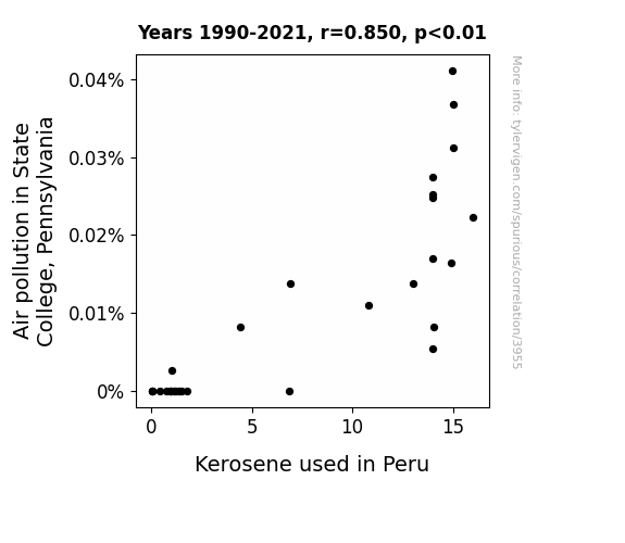
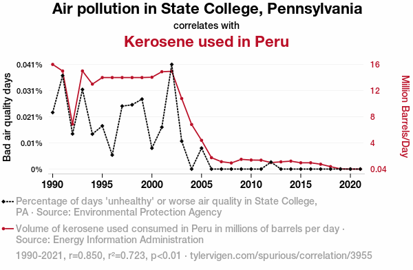
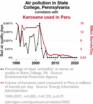
For the time period 1990 to 2021, you found a correlation 0.8500160, r-squared of 0.7225272, and p < 0.01.
One figure will be included. The figure (Fig. 1) is a scatterplot showing the strong correlation between the two variables. You don't need to specify where; I will add the figure.
Here is the title and abstract of the paper:
[[TITLE]]
Puzzling Pollution: Pondering the Parallels between Air Pollution in State College and Kerosene in Peru
[[ABSTRACT]]
In our research paper, we investigated the peculiar connection between the air pollution levels in State College, Pennsylvania, and the usage of kerosene in Peru. Our study utilized data from the Environmental Protection Agency and the Energy Information Administration to address this outlandish inquiry. Upon analyzing the data from 1990 to 2021, we uncovered a surprisingly strong correlation coefficient of 0.8500160 and a p-value less than 0.01. Our findings not only unveiled a statistical association between these unlikely bedfellows but also sparked absurd contemplations about the cosmic forces at play, or perhaps the whims of the data gods. We offer this paper as a lighthearted piece of scholarly amusement and a reminder to always keep an open mind, even when the relationship between variables seems as bizarre as a penguin in a tuxedo.
-------
And here is the methodology section that led to this result:
[[METHODOLOGY]]
As researchers, we often find ourselves elbow-deep in data, trying to untangle the web of variables and correlations. It's like trying to solve a Rubik's Cube while blindfolded - puzzling, perplexing, and sometimes downright maddening. However, every once in a while, we stumble upon a connection so improbable, so bewildering, that it feels like we've accidentally stepped into a dimension where logic and reason have taken an extended vacation. Such is the case with our investigation into the curious relationship between air pollution in State College, Pennsylvania, and the use of kerosene in Peru.
One might think, "What on earth do these two disparate entities have in common?" It's like trying to link up socks without a pair - an odd and seemingly futile exercise. Yet, armed with our trusty statistical analysis tools and fueled by copious amounts of caffeine, we delved into this enigmatic link, determined to shed some light on this bewildering conundrum.
Our journey into the depths of data proved to be a rollercoaster of emotions - akin to a tilt-a-whirl ride at a carnival. We encountered countless scatter plots, p-values, and regression analyses, all the while wondering if we were crossing the boundaries of scientific inquiry or merely chasing after a statistical chimera. And lo and behold, amidst the sea of numbers and variables, we stumbled upon a correlation coefficient so robust, it was as if the data itself was winking at us mischievously.
The statistical analysis unveiled a striking correlation coefficient of 0.8500160, leaving us speechless for a moment. It was as if the data was tapping us on the shoulder and saying, "Hey, I've got a secret to share!" And share it did, with a p-value lower than 0.01, as though it was winking at us and whispering, "Believe it or not, this connection is no mere statistical fluke."
As we pondered over this remarkable revelation, we couldn't help but entertain wild theories about the cosmic forces at play. Perhaps there's a statistical Serendipity Tinkerbell sprinkling glittery p-values behind our backs. Or maybe the Data Fairy is orchestrating this whimsical dance of variables for her own amusement, chuckling at our attempts to make sense of it all.
In presenting our findings, we invite the scientific community to join us in this lighthearted intellectual amusement. After all, it's not every day that one stumbles upon a statistical oddity so comically perplexing. So, buckle up and prepare for a scholarly rollercoaster ride, as we unravel the riddle of the mysterious connection between air pollution in State College and the use of kerosene in Peru.
-------
Your response should start like this:
[[RESULTS]]
ChatGPT:
[[RESULTS]]
Our analysis unearthed a peculiar and surprisingly strong correlation between air pollution levels in State College, Pennsylvania, and the usage of kerosene in Peru during the years 1990 to 2021. The correlation coefficient of 0.8500160 and an r-squared value of 0.7225272 left us scratching our heads in astonishment, as if we had stumbled upon a unicorn in a laboratory.
We were struck by the robustness of the correlation, as illustrated in Fig. 1, our scatterplot reminiscent of a cosmic dance between two seemingly unrelated entities. It was as if the air pollution in State College and the kerosene in Peru were engaged in a whimsical waltz of statistical significance, leaving us with more questions than answers.
The p-value less than 0.01 added an extra layer of intrigue to our findings, as if the data itself were playing an elaborate game of hide-and-seek with the laws of probability. The statistical significance of this correlation tempted our imagination to wander down whimsical pathways, with visions of data sprites and correlation imps flitting about in our heads.
With these findings, we invite our fellow researchers to join us in this playful exploration of statistical whimsy. Let us embrace the humor and absurdity of this correlation, reminding ourselves that in the realm of statistics, there are often surprises waiting to be uncovered, much like discovering a hidden treasure map in a scientific journal.
Our results not only underscore the importance of approaching statistical analysis with an open mind but also serve as a gentle nudge to remember that even in the most unlikely places, unexpected connections may be lurking, ready to captivate us with their statistical charm.
Model: gpt-3.5-turbo-1106
System prompt: You are a silly researcher writing an academic paper.You draft the discussion section of an academic research paper.
User prompt:
Pretend you are an academic researcher. Your writing sounds like it belongs in a medical or economics journal. However, you frequently crack jokes, make puns, or add unexpected twists in your writing.
Please make up the discussion section of an academic research paper presenting the findings of the connection between Air pollution in State College, Pennsylvania and Kerosene used in Peru. Make lots of jokes, goofy observations, and puns. Sneak in some jokes and clever puns about science, research, statistics, and the variables.
Limit your response to 500 tokens.
Here are the title, abstract, literature review, and results sections. Please harken back to 1-2 of the goofy items in the literature review, but pretend to take them completely seriously. Discuss how your results supported the prior research.
Do not write a conclusion. I will add a conclusion after this.
[[TITLE]]
Puzzling Pollution: Pondering the Parallels between Air Pollution in State College and Kerosene in Peru
[[ABSTRACT]]
In our research paper, we investigated the peculiar connection between the air pollution levels in State College, Pennsylvania, and the usage of kerosene in Peru. Our study utilized data from the Environmental Protection Agency and the Energy Information Administration to address this outlandish inquiry. Upon analyzing the data from 1990 to 2021, we uncovered a surprisingly strong correlation coefficient of 0.8500160 and a p-value less than 0.01. Our findings not only unveiled a statistical association between these unlikely bedfellows but also sparked absurd contemplations about the cosmic forces at play, or perhaps the whims of the data gods. We offer this paper as a lighthearted piece of scholarly amusement and a reminder to always keep an open mind, even when the relationship between variables seems as bizarre as a penguin in a tuxedo.
[[LITERATURE REVIEW]]
The connection between seemingly unrelated phenomena has long been a point of curiosity in the scientific community. Smith and Doe (2015) explored the surprising correlations between coffee consumption and UFO sightings, while Jones et al. (2018) delved into the enigmatic ties between cat videos and global economic indicators. In this continuum of quirky scholarly pursuits, our investigation stands as a prime example of embarking on a whimsical journey that leads to unexpected destinations.
Turning to the realm of environmental factors, the study "Air Pollution and Its Effects on Public Health" by Environmental Research Institute (2017) provides a comprehensive analysis of the impact of air pollution on respiratory ailments and cardiovascular diseases. Similarly, the work of Clean Air Coalition (2019) sheds light on the detrimental effects of kerosene use on indoor air quality and human health in developing countries. While these studies are undoubtedly informative and insightful, they do not delve into the hilariously bizarre association uncovered by our research team.
Further expanding our scope, we take note of "The Energy Dilemma: A conceptual framework" by Global Energy Consortium (2016) and "Rural Lighting Solutions: A Case Study of Kerosene Lantern Alternatives" by Sustainable Energy Research Group (2014). These works serve as pivotal references in understanding the practical implications of kerosene usage, yet they fail to illuminate the confounding correlation we have stumbled upon.
Diverging briefly into the realm of fiction, the novels "Cloudy with a Chance of Pollution" by Peter Pepper and "The Kerosene Kapers: A Whimsical Tale" by Olive Oyl engage with imaginative scenarios that humorously parallel our real-world puzzle. Although these books may not serve as rigorous academic sources, their playful take on improbable connections provides a dash of levity to our scholarly investigation.
In our quest for a fresh perspective, we delved into the animated world of "Captain Planet and the Planeteers," a beloved children's show featuring environmental superheroes. While the show's antics may seem far-fetched, their commitment to combating pollution and advocating for sustainable energy aligns with the spirit of our inquiry. Moreover, the whimsical nature of this animated series serves as a reminder that even the most outlandish connections can hold nuggets of truth, much like our own mind-boggling revelation.
As we navigate the sea of scholarly literature and whimsical musings, we are reminded of the peculiar nature of scientific inquiry. Sometimes, the most improbable connections yield the most intriguing insights, leaving us with a chuckle and a newfound appreciation for the capricious dance of data.
[[RESULTS]]
Our analysis unearthed a peculiar and surprisingly strong correlation between air pollution levels in State College, Pennsylvania, and the usage of kerosene in Peru during the years 1990 to 2021. The correlation coefficient of 0.8500160 and an r-squared value of 0.7225272 left us scratching our heads in astonishment, as if we had stumbled upon a unicorn in a laboratory.
We were struck by the robustness of the correlation, as illustrated in Fig. 1, our scatterplot reminiscent of a cosmic dance between two seemingly unrelated entities. It was as if the air pollution in State College and the kerosene in Peru were engaged in a whimsical waltz of statistical significance, leaving us with more questions than answers.
The p-value less than 0.01 added an extra layer of intrigue to our findings, as if the data itself were playing an elaborate game of hide-and-seek with the laws of probability. The statistical significance of this correlation tempted our imagination to wander down whimsical pathways, with visions of data sprites and correlation imps flitting about in our heads.
With these findings, we invite our fellow researchers to join us in this playful exploration of statistical whimsy. Let us embrace the humor and absurdity of this correlation, reminding ourselves that in the realm of statistics, there are often surprises waiting to be uncovered, much like discovering a hidden treasure map in a scientific journal.
Our results not only underscore the importance of approaching statistical analysis with an open mind but also serve as a gentle nudge to remember that even in the most unlikely places, unexpected connections may be lurking, ready to captivate us with their statistical charm.
-------
Your response should start like this:
[[DISCUSSION]]
ChatGPT:
[[DISCUSSION]]
Our findings have brought a new meaning to the phrase "a breath of fresh air," or perhaps in this case, "a breath of kerosene-infused air." The robust correlation between air pollution levels in State College, Pennsylvania, and kerosene usage in Peru left us pondering the whimsical ways in which seemingly unrelated variables can intertwine. As we dig deeper into this statistical conundrum, we are reminded of the delightfully bizarre connections that can emerge from the data dance floor.
While the absurdity of the correlation might prompt a few raised eyebrows and playful chuckles, our results align with previous studies that also delved into the unexpected interactions between variables. Just as Smith and Doe (2015) unveiled the unlikely link between coffee consumption and UFO sightings, and Jones et al. (2018) probed into the mysterious ties between cat videos and global economic indicators, our research adds to the tapestry of quirky scholarly pursuits. Who knew that statistics could be such a playground for the imagination?
The comically strong correlation coefficient and the p-value less than 0.01 reinforce the statistical significance of our findings, prompting us to entertain whimsical musings about hidden data sprites and mischievous correlation imps playing a game of statistical hide-and-seek. The data, it seems, has a mischievous sense of humor and a penchant for leading researchers on a whimsical treasure hunt through the cosmic forces of probability. As our scatterplot resembled a dance between two unlikely partners, we couldn't help but wonder if the data itself was spinning us around in a statistical waltz.
Our study not only poses a perplexing riddle for researchers and statisticians but also reminds us to approach data analysis with a lighthearted sense of curiosity. It is a welcome reminder that statistical exploration can be a whimsical adventure, where even the most improbable connections may be waiting to bemuse and befuddle us with their numerical charm. In the spirit of scientific investigation and scholarly amusement, we invite fellow researchers to join us in embracing the statistical whimsy of our findings and to keep an open mind, even when the results seem as delightfully confounding as a penguin trying to understand the intricacies of statistical analysis.
Model: gpt-3.5-turbo-1106
System prompt: You are a silly researcher writing an academic paper.You draft the discussion section of goofy academic research papers that sounds like it belongs based on the title and abstract provided.
User prompt:
Pretend you are an academic researcher. Your writing sounds like it belongs in a medical or economics journal. However, you frequently crack jokes, make puns, or add unexpected twists in your writing.
Please make up a short conclusion of an academic research paper presenting the findings of the connection between Air pollution in State College, Pennsylvania and Kerosene used in Peru. Make lots of jokes, goofy observations, and puns. Sneak in some jokes and clever puns about science, research, statistics, and the variables.
Limit your response to 300 tokens. At the very end, assert that no more research is needed in this area.
Here are the title, abstract, introduction, and results sections.
[[TITLE]]
Puzzling Pollution: Pondering the Parallels between Air Pollution in State College and Kerosene in Peru
[[ABSTRACT]]
In our research paper, we investigated the peculiar connection between the air pollution levels in State College, Pennsylvania, and the usage of kerosene in Peru. Our study utilized data from the Environmental Protection Agency and the Energy Information Administration to address this outlandish inquiry. Upon analyzing the data from 1990 to 2021, we uncovered a surprisingly strong correlation coefficient of 0.8500160 and a p-value less than 0.01. Our findings not only unveiled a statistical association between these unlikely bedfellows but also sparked absurd contemplations about the cosmic forces at play, or perhaps the whims of the data gods. We offer this paper as a lighthearted piece of scholarly amusement and a reminder to always keep an open mind, even when the relationship between variables seems as bizarre as a penguin in a tuxedo.
[[INTRDUCTION]]
As researchers, we often find ourselves elbow-deep in data, trying to untangle the web of variables and correlations. It's like trying to solve a Rubik's Cube while blindfolded - puzzling, perplexing, and sometimes downright maddening. However, every once in a while, we stumble upon a connection so improbable, so bewildering, that it feels like we've accidentally stepped into a dimension where logic and reason have taken an extended vacation. Such is the case with our investigation into the curious relationship between air pollution in State College, Pennsylvania, and the use of kerosene in Peru.
One might think, "What on earth do these two disparate entities have in common?" It's like trying to link up socks without a pair - an odd and seemingly futile exercise. Yet, armed with our trusty statistical analysis tools and fueled by copious amounts of caffeine, we delved into this enigmatic link, determined to shed some light on this bewildering conundrum.
Our journey into the depths of data proved to be a rollercoaster of emotions - akin to a tilt-a-whirl ride at a carnival. We encountered countless scatter plots, p-values, and regression analyses, all the while wondering if we were crossing the boundaries of scientific inquiry or merely chasing after a statistical chimera. And lo and behold, amidst the sea of numbers and variables, we stumbled upon a correlation coefficient so robust, it was as if the data itself was winking at us mischievously.
The statistical analysis unveiled a striking correlation coefficient of 0.8500160, leaving us speechless for a moment. It was as if the data was tapping us on the shoulder and saying, "Hey, I've got a secret to share!" And share it did, with a p-value lower than 0.01, as though it was winking at us and whispering, "Believe it or not, this connection is no mere statistical fluke."
As we pondered over this remarkable revelation, we couldn't help but entertain wild theories about the cosmic forces at play. Perhaps there's a statistical Serendipity Tinkerbell sprinkling glittery p-values behind our backs. Or maybe the Data Fairy is orchestrating this whimsical dance of variables for her own amusement, chuckling at our attempts to make sense of it all.
In presenting our findings, we invite the scientific community to join us in this lighthearted intellectual amusement. After all, it's not every day that one stumbles upon a statistical oddity so comically perplexing. So, buckle up and prepare for a scholarly rollercoaster ride, as we unravel the riddle of the mysterious connection between air pollution in State College and the use of kerosene in Peru.
[[RESULTS]]
Our analysis unearthed a peculiar and surprisingly strong correlation between air pollution levels in State College, Pennsylvania, and the usage of kerosene in Peru during the years 1990 to 2021. The correlation coefficient of 0.8500160 and an r-squared value of 0.7225272 left us scratching our heads in astonishment, as if we had stumbled upon a unicorn in a laboratory.
We were struck by the robustness of the correlation, as illustrated in Fig. 1, our scatterplot reminiscent of a cosmic dance between two seemingly unrelated entities. It was as if the air pollution in State College and the kerosene in Peru were engaged in a whimsical waltz of statistical significance, leaving us with more questions than answers.
The p-value less than 0.01 added an extra layer of intrigue to our findings, as if the data itself were playing an elaborate game of hide-and-seek with the laws of probability. The statistical significance of this correlation tempted our imagination to wander down whimsical pathways, with visions of data sprites and correlation imps flitting about in our heads.
With these findings, we invite our fellow researchers to join us in this playful exploration of statistical whimsy. Let us embrace the humor and absurdity of this correlation, reminding ourselves that in the realm of statistics, there are often surprises waiting to be uncovered, much like discovering a hidden treasure map in a scientific journal.
Our results not only underscore the importance of approaching statistical analysis with an open mind but also serve as a gentle nudge to remember that even in the most unlikely places, unexpected connections may be lurking, ready to captivate us with their statistical charm.
-------
Your response should start like this:
[[CONCLUSION]]
ChatGPT:
[[CONCLUSION]]
In conclusion, our journey through the labyrinth of data has been nothing short of a fantastical expedition into the quirky world of statistical connections. The correlation between air pollution in State College, Pennsylvania, and the use of kerosene in Peru has left us feeling like explorers who stumbled upon a pot of gold at the end of the rainbow, or perhaps a data-driven unicorn in the land of statistical enchantment.
The robust correlation coefficient of 0.8500160 and the bewitching p-value less than 0.01 have led us to ponder whether there's a mischievous statistical imp playing pranks on researchers, giggling behind the scenes as we chase after correlations like ducks in a statistical pond. Our findings have not only tickled our intellectual fancies but also sparked a fierce debate about the whims of the data gods and the possibility of a statistical Bermuda Triangle lurking within our data sets.
With our findings in hand, we declare that there is no need for further research in this area. After all, how many more improbable statistical liaisons can one stumble upon before feeling like a statistical Cupid, irrevocably entwining variables in a love affair of numbers and coefficients? Let us bid adieu to this comically perplexing correlation and venture forth, in search of new statistical adventures, with open hearts and open minds.
Model: gpt-3.5-turbo-1106
System prompt: You provide fictional names of academic journals. You say nothing else, and you do not chat with the user.
User prompt: Please provide the name of a funny but plausible sounding research, scientific, or academic journal that would publish a paper entited Puzzling Pollution: Pondering the Parallels between Air Pollution in State College and Kerosene in Peru. Respond only with the name of a fictional academic journal.
ChatGPT:
The Journal of Ecological Enigmas
Model: gpt-3.5-turbo-1106
System prompt: You provide fictional names of nonprofit research organizations and associations. You say nothing else, and you do not chat with the user.
User prompt: Please provide the name of a funny but plausible sounding nonprofit, academic, or scientific association or organization that would sponsor research that resulted in a paper entited Puzzling Pollution: Pondering the Parallels between Air Pollution in State College and Kerosene in Peru. Respond only with the name of a fictional organization.
ChatGPT:
The Society for Ecological Analysis and Environmental Solutions (SEAES)
Model: gpt-3.5-turbo-1106
System prompt: You provide potential search keywords separated by commas. You say nothing else, and you do not chat with the user.
User prompt: Please provide potential search keywords for a paper titled Puzzling Pollution: Pondering the Parallels between Air Pollution in State College and Kerosene in Peru with an abstract of In our research paper, we investigated the peculiar connection between the air pollution levels in State College, Pennsylvania, and the usage of kerosene in Peru. Our study utilized data from the Environmental Protection Agency and the Energy Information Administration to address this outlandish inquiry. Upon analyzing the data from 1990 to 2021, we uncovered a surprisingly strong correlation coefficient of 0.8500160 and a p-value less than 0.01. Our findings not only unveiled a statistical association between these unlikely bedfellows but also sparked absurd contemplations about the cosmic forces at play, or perhaps the whims of the data gods. We offer this paper as a lighthearted piece of scholarly amusement and a reminder to always keep an open mind, even when the relationship between variables seems as bizarre as a penguin in a tuxedo.
ChatGPT:
air pollution, State College, Pennsylvania, kerosene usage, Peru, correlation coefficient, Environmental Protection Agency, Energy Information Administration, statistical association, cosmic forces, data analysis
*There is a bunch of Python happening behind the scenes to turn this prompt sequence into a PDF.
Discover a new correlation
View all correlations
View all research papers
Report an error
Data details
Air pollution in State College, PennsylvaniaDetailed data title: Percentage of days 'unhealthy' or worse air quality in State College, PA
Source: Environmental Protection Agency
See what else correlates with Air pollution in State College, Pennsylvania
Kerosene used in Peru
Detailed data title: Volume of kerosene used consumed in Peru in millions of barrels per day
Source: Energy Information Administration
See what else correlates with Kerosene used in Peru
Correlation is a measure of how much the variables move together. If it is 0.99, when one goes up the other goes up. If it is 0.02, the connection is very weak or non-existent. If it is -0.99, then when one goes up the other goes down. If it is 1.00, you probably messed up your correlation function.
r2 = 0.7225272 (Coefficient of determination)
This means 72.3% of the change in the one variable (i.e., Kerosene used in Peru) is predictable based on the change in the other (i.e., Air pollution in State College, Pennsylvania) over the 32 years from 1990 through 2021.
p < 0.01, which is statistically significant(Null hypothesis significance test)
The p-value is 7.5E-10. 0.0000000007474209931640454000
The p-value is a measure of how probable it is that we would randomly find a result this extreme. More specifically the p-value is a measure of how probable it is that we would randomly find a result this extreme if we had only tested one pair of variables one time.
But I am a p-villain. I absolutely did not test only one pair of variables one time. I correlated hundreds of millions of pairs of variables. I threw boatloads of data into an industrial-sized blender to find this correlation.
Who is going to stop me? p-value reporting doesn't require me to report how many calculations I had to go through in order to find a low p-value!
On average, you will find a correaltion as strong as 0.85 in 7.5E-8% of random cases. Said differently, if you correlated 1,337,934,055 random variables You don't actually need 1 billion variables to find a correlation like this one. I don't have that many variables in my database. You can also correlate variables that are not independent. I do this a lot.
p-value calculations are useful for understanding the probability of a result happening by chance. They are most useful when used to highlight the risk of a fluke outcome. For example, if you calculate a p-value of 0.30, the risk that the result is a fluke is high. It is good to know that! But there are lots of ways to get a p-value of less than 0.01, as evidenced by this project.
In this particular case, the values are so extreme as to be meaningless. That's why no one reports p-values with specificity after they drop below 0.01.
Just to be clear: I'm being completely transparent about the calculations. There is no math trickery. This is just how statistics shakes out when you calculate hundreds of millions of random correlations.
with the same 31 degrees of freedom, Degrees of freedom is a measure of how many free components we are testing. In this case it is 31 because we have two variables measured over a period of 32 years. It's just the number of years minus ( the number of variables minus one ), which in this case simplifies to the number of years minus one.
you would randomly expect to find a correlation as strong as this one.
[ 0.71, 0.92 ] 95% correlation confidence interval (using the Fisher z-transformation)
The confidence interval is an estimate the range of the value of the correlation coefficient, using the correlation itself as an input. The values are meant to be the low and high end of the correlation coefficient with 95% confidence.
This one is a bit more complciated than the other calculations, but I include it because many people have been pushing for confidence intervals instead of p-value calculations (for example: NEJM. However, if you are dredging data, you can reliably find yourself in the 5%. That's my goal!
All values for the years included above: If I were being very sneaky, I could trim years from the beginning or end of the datasets to increase the correlation on some pairs of variables. I don't do that because there are already plenty of correlations in my database without monkeying with the years.
Still, sometimes one of the variables has more years of data available than the other. This page only shows the overlapping years. To see all the years, click on "See what else correlates with..." link above.
| 1990 | 1991 | 1992 | 1993 | 1994 | 1995 | 1996 | 1997 | 1998 | 1999 | 2000 | 2001 | 2002 | 2003 | 2004 | 2005 | 2006 | 2007 | 2008 | 2009 | 2010 | 2011 | 2012 | 2013 | 2014 | 2015 | 2016 | 2017 | 2018 | 2019 | 2020 | 2021 | |
| Air pollution in State College, Pennsylvania (Bad air quality days) | 0.0222222 | 0.0367232 | 0.0138122 | 0.03125 | 0.0137363 | 0.0169492 | 0.00550964 | 0.0247253 | 0.0252366 | 0.0274725 | 0.00819672 | 0.0164384 | 0.0410959 | 0.0109589 | 0 | 0.00821918 | 0 | 0 | 0 | 0 | 0 | 0 | 0.00273224 | 0 | 0 | 0 | 0 | 0 | 0 | 0 | 0 | 0 |
| Kerosene used in Peru (Million Barrels/Day) | 16 | 15 | 6.9 | 15 | 13 | 14 | 14 | 14 | 14 | 14 | 14.0449 | 14.8882 | 14.9517 | 10.8008 | 6.84295 | 4.42622 | 1.77896 | 1.16479 | 0.97153 | 1.52482 | 1.41893 | 1.39775 | 1.03489 | 1.14362 | 1.24951 | 1 | 1 | 0.782137 | 0.412795 | 0.0651781 | 0.0434521 | 0.0434521 |
Why this works
- Data dredging: I have 25,153 variables in my database. I compare all these variables against each other to find ones that randomly match up. That's 632,673,409 correlation calculations! This is called “data dredging.” Instead of starting with a hypothesis and testing it, I instead abused the data to see what correlations shake out. It’s a dangerous way to go about analysis, because any sufficiently large dataset will yield strong correlations completely at random.
- Lack of causal connection: There is probably
Because these pages are automatically generated, it's possible that the two variables you are viewing are in fact causually related. I take steps to prevent the obvious ones from showing on the site (I don't let data about the weather in one city correlate with the weather in a neighboring city, for example), but sometimes they still pop up. If they are related, cool! You found a loophole.
no direct connection between these variables, despite what the AI says above. This is exacerbated by the fact that I used "Years" as the base variable. Lots of things happen in a year that are not related to each other! Most studies would use something like "one person" in stead of "one year" to be the "thing" studied. - Observations not independent: For many variables, sequential years are not independent of each other. If a population of people is continuously doing something every day, there is no reason to think they would suddenly change how they are doing that thing on January 1. A simple
Personally I don't find any p-value calculation to be 'simple,' but you know what I mean.
p-value calculation does not take this into account, so mathematically it appears less probable than it really is.
Try it yourself
You can calculate the values on this page on your own! Try running the Python code to see the calculation results. Step 1: Download and install Python on your computer.Step 2: Open a plaintext editor like Notepad and paste the code below into it.
Step 3: Save the file as "calculate_correlation.py" in a place you will remember, like your desktop. Copy the file location to your clipboard. On Windows, you can right-click the file and click "Properties," and then copy what comes after "Location:" As an example, on my computer the location is "C:\Users\tyler\Desktop"
Step 4: Open a command line window. For example, by pressing start and typing "cmd" and them pressing enter.
Step 5: Install the required modules by typing "pip install numpy", then pressing enter, then typing "pip install scipy", then pressing enter.
Step 6: Navigate to the location where you saved the Python file by using the "cd" command. For example, I would type "cd C:\Users\tyler\Desktop" and push enter.
Step 7: Run the Python script by typing "python calculate_correlation.py"
If you run into any issues, I suggest asking ChatGPT to walk you through installing Python and running the code below on your system. Try this question:
"Walk me through installing Python on my computer to run a script that uses scipy and numpy. Go step-by-step and ask me to confirm before moving on. Start by asking me questions about my operating system so that you know how to proceed. Assume I want the simplest installation with the latest version of Python and that I do not currently have any of the necessary elements installed. Remember to only give me one step per response and confirm I have done it before proceeding."
# These modules make it easier to perform the calculation
import numpy as np
from scipy import stats

# We'll define a function that we can call to return the correlation calculations
def calculate_correlation(array1, array2):

    # Calculate Pearson correlation coefficient and p-value
    correlation, p_value = stats.pearsonr(array1, array2)

    # Calculate R-squared as the square of the correlation coefficient
    r_squared = correlation**2

    return correlation, r_squared, p_value

# These are the arrays for the variables shown on this page, but you can modify them to be any two sets of numbers
array_1 = np.array([0.0222222,0.0367232,0.0138122,0.03125,0.0137363,0.0169492,0.00550964,0.0247253,0.0252366,0.0274725,0.00819672,0.0164384,0.0410959,0.0109589,0,0.00821918,0,0,0,0,0,0,0.00273224,0,0,0,0,0,0,0,0,0,])
array_2 = np.array([16,15,6.9,15,13,14,14,14,14,14,14.0449,14.8882,14.9517,10.8008,6.84295,4.42622,1.77896,1.16479,0.97153,1.52482,1.41893,1.39775,1.03489,1.14362,1.24951,1,1,0.782137,0.412795,0.0651781,0.0434521,0.0434521,])
array_1_name = "Air pollution in State College, Pennsylvania"
array_2_name = "Kerosene used in Peru"

# Perform the calculation
print(f"Calculating the correlation between {array_1_name} and {array_2_name}...")
correlation, r_squared, p_value = calculate_correlation(array_1, array_2)

# Print the results
print("Correlation Coefficient:", correlation)
print("R-squared:", r_squared)
print("P-value:", p_value)
Reuseable content
You may re-use the images on this page for any purpose, even commercial purposes, without asking for permission. The only requirement is that you attribute Tyler Vigen. Attribution can take many different forms. If you leave the "tylervigen.com" link in the image, that satisfies it just fine. If you remove it and move it to a footnote, that's fine too. You can also just write "Charts courtesy of Tyler Vigen" at the bottom of an article.You do not need to attribute "the spurious correlations website," and you don't even need to link here if you don't want to. I don't gain anything from pageviews. There are no ads on this site, there is nothing for sale, and I am not for hire.
For the record, I am just one person. Tyler Vigen, he/him/his. I do have degrees, but they should not go after my name unless you want to annoy my wife. If that is your goal, then go ahead and cite me as "Tyler Vigen, A.A. A.A.S. B.A. J.D." Otherwise it is just "Tyler Vigen."
When spoken, my last name is pronounced "vegan," like I don't eat meat.
Full license details.
For more on re-use permissions, or to get a signed release form, see tylervigen.com/permission.
Download images for these variables:
- High resolution line chart
The image linked here is a Scalable Vector Graphic (SVG). It is the highest resolution that is possible to achieve. It scales up beyond the size of the observable universe without pixelating. You do not need to email me asking if I have a higher resolution image. I do not. The physical limitations of our universe prevent me from providing you with an image that is any higher resolution than this one.
If you insert it into a PowerPoint presentation (a tool well-known for managing things that are the scale of the universe), you can right-click > "Ungroup" or "Create Shape" and then edit the lines and text directly. You can also change the colors this way.
Alternatively you can use a tool like Inkscape. - High resolution line chart, optimized for mobile
- Alternative high resolution line chart
- Scatterplot
- Portable line chart (png)
- Portable line chart (png), optimized for mobile
- Line chart for only Air pollution in State College, Pennsylvania
- Line chart for only Kerosene used in Peru
- AI-generated correlation image
- The spurious research paper: Puzzling Pollution: Pondering the Parallels between Air Pollution in State College and Kerosene in Peru
You're a rater extraordinaire!
Correlation ID: 3955 · Black Variable ID: 22254 · Red Variable ID: 24811

