spurious correlations
discover · random · spurious scholar
← previous page · next page →


View details about correlation #4,597
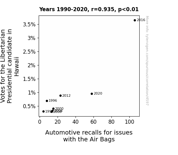
The Airbag Anomaly: A Libertarian Link to Recalls Revealed
The state saw a surge in support for the libertarian candidate and as a result, there was a simultaneous increase in people expressing their desire for maximum freedom - including the freedom for airbags not to deploy when they should. This led to a ripple effect in the automotive industry, where cars suddenly felt the need to assert their individual rights by recalling themselves for airbag issues, because nothing says 'liberty' like a car with a mind of its own!


View details about correlation #4,968
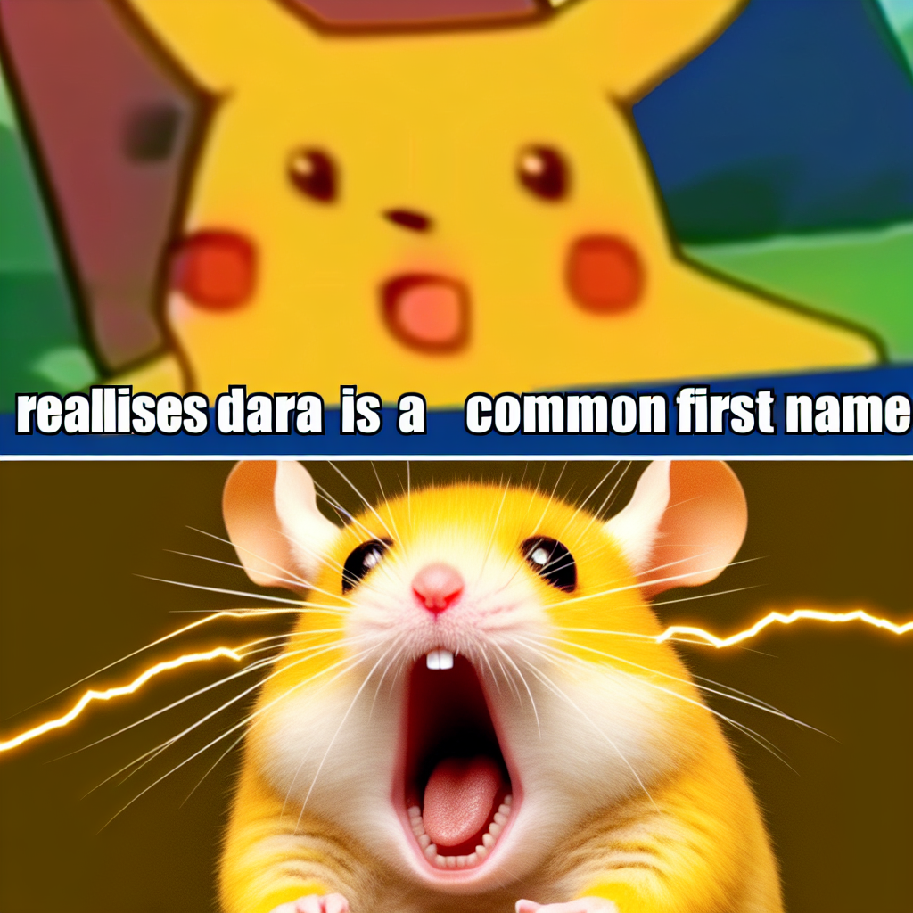
The Tale of Dara's Flare: a Correlational Study between the Popularity of the Name Dara and the 'Surprised Pikachu' Meme
Perhaps every time someone heard the name Dara, they couldn't help but exclaim "Dara Dara Daraaaa!" just like the meme's theme music. This led to a surge in people recreating the surprised Pikachu face, sparking a meme revival.

What else correlates?
Popularity of the first name Dara · all first names
Popularity of the 'surprised pikachu' meme · all memes
Popularity of the first name Dara · all first names
Popularity of the 'surprised pikachu' meme · all memes


View details about correlation #5,261
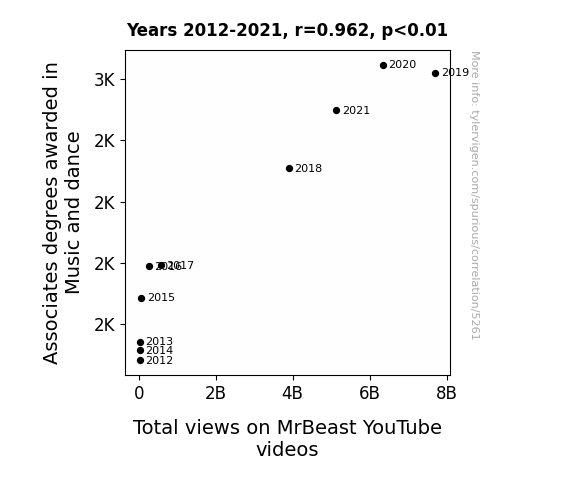
Degree of Dance: The Correlation between Music and Dance Associates Degrees and MrBeast YouTube Views
As more people became musically and rhythmically inclined, they were better able to appreciate the expertly choreographed giveaways and mind-blowing challenges on MrBeast's channel. This led to an uptick in viewership as the audience tapped their feet to the beat of his philanthropic escapades. After all, who can resist a video that's music to their ears and dance to their eyes?

What else correlates?
Associates degrees awarded in Music and dance · all education
Total views on MrBeast's YouTube videos · all YouTube
Associates degrees awarded in Music and dance · all education
Total views on MrBeast's YouTube videos · all YouTube


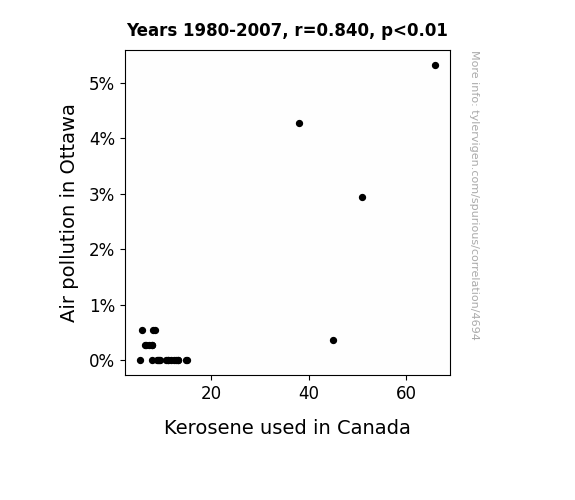
View details about correlation #4,694
Burning the Midnight Oil: Exploring the Relationship Between Air Pollution in Ottawa and Kerosene Consumption in Canada
The clean air in Ottawa was just too pure and classy for kerosene. It politely asked kerosene to take its smoky, pungent business elsewhere, and kerosene, not wanting to cramp Ottawa's style, decided to pack its flammable bags and mosey on out of Canada. After all, you can't bring a foul stench to the fresh-smelling capital!
What else correlates?
Air pollution in Ottawa · all weather
Kerosene used in Canada · all energy
Air pollution in Ottawa · all weather
Kerosene used in Canada · all energy


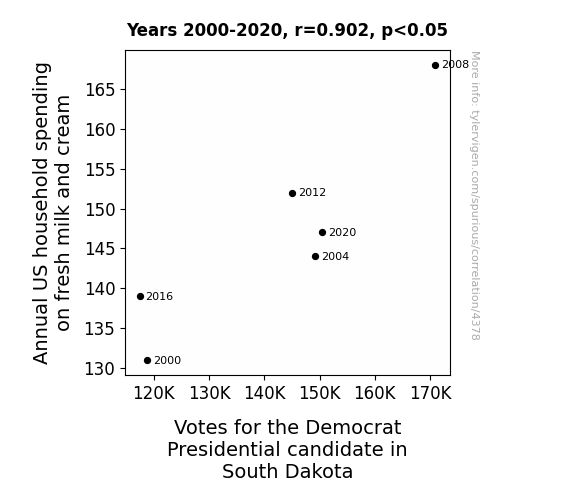
View details about correlation #4,378
Milk and Cream: A Scream or a Dream for the Democratic Presidential Candidate's Regime?
As US household spending on fresh milk and cream increased, more families experienced stronger bones, allowing them to travel to South Dakota. These calcium-charged tourists were utterly impressed by the state, leading them to vote for the Democratic Presidential candidate in a cream of the crop campaign. It seems like dairy really does do a body politic good!


View details about correlation #5,625
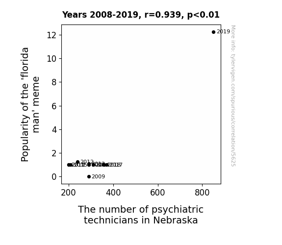
Florida Man-ia: Investigating the 'Sunshine State' of Psychiatric Technicians in Nebraska
As the 'Florida man' meme gained traction, more people started exhibiting behavior that was beyond the norm. This led to a ripple effect across the country, as Nebraskans, in particular, felt the need for extra psychiatric support to deal with the increasing influx of wacky shenanigans. It seems like the meme truly made a *Sunshine State* of mind contagious, prompting Nebraska to up its psychiatric technician game to handle any potential *sunshinin' ills*.
What else correlates?
Popularity of the 'florida man' meme · all memes
The number of psychiatric technicians in Nebraska · all cccupations
Popularity of the 'florida man' meme · all memes
The number of psychiatric technicians in Nebraska · all cccupations


View details about correlation #5,081
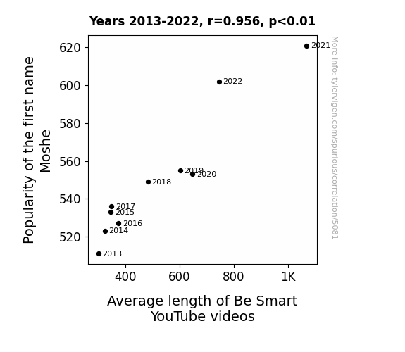
The Name Game: A Moshe-n the Length of Be Smart YouTube Videos
Every time someone named Moshe subscribed, Be Smart decided to make the videos Moshe-length, ensuring that everyone, including those with the attention span of a goldfish, could enjoy and understand the content.

What else correlates?
Popularity of the first name Moshe · all first names
Average length of 'Be Smart' science YouTube videos · all YouTube
Popularity of the first name Moshe · all first names
Average length of 'Be Smart' science YouTube videos · all YouTube


View details about correlation #3,827
In Pursuit of Pollution: The Parallels of Air Quality in Albuquerque and Kerosene Usage in Bolivia
As the air pollution in Albuquerque decreased, it created a ripple effect in the atmosphere, leading to a kerosene-deflating pressure system that wafted its way down to Bolivia, ultimately resulting in a remarkable reduction in kerosene usage. It’s like Mother Nature decided to organize a worldwide emissions-reducing scavenger hunt!


What else correlates?
Air pollution in Albuquerque · all weather
Kerosene used in Bolivia · all energy
Air pollution in Albuquerque · all weather
Kerosene used in Bolivia · all energy


View details about correlation #5,177
Red State Republicans: Relationship between Votes and Virtual Voyages
Every time someone voted Republican in Oklahoma, a tiny bit of extra internet access magic was conjured up for the entire nation. It's like a conservative wave of connectivity spreading across the land, turning every dial-up into high-speed and bringing WiFi to the most unexpected places. Who knew political preferences could have such electric consequences! So, keep on casting those votes, Oklahoma, because apparently, you hold the key to keeping the internet running nationwide!


View details about correlation #4,975
The Wojak Meme Effect: Exploring the Relationship Between Online Popularity and the Beastly Quest for Mr. Beast
As the 'wojak' meme gained more attention, it also raised the 'meme-o' for internet content overall. This led to a surge in online activity, including searches for the generous YouTuber, Mr. Beast. After all, when it comes to memes and Mr. Beast, the internet just can't help but 'meme and shout!'

What else correlates?
Popularity of the 'wojak' meme · all memes
Google searches for 'Mr. Beast' · all google searches
Popularity of the 'wojak' meme · all memes
Google searches for 'Mr. Beast' · all google searches


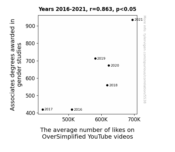
View details about correlation #5,538
Gender Studies Graduates and the Gargantuan Growth of YouTube Likes: An Alliterative Analysis
The deeper understanding of societal norms and historical perspectives led to a rise in appreciation for the simplified yet informative content. It's like the more you know about gender studies, the more you like OverSimplified! Or maybe it's because they've finally cracked the enigma of getting the most 'likes' out of history.


View details about correlation #3,997
Kerosene and Gettysburg's Air: A Pair Made in Polluted Affair
As air pollution in Gettysburg decreased, it created a ripple effect in the global atmospheric conditions. This, in turn, led to a shift in the kerosene-utilization patterns in Peru. The cleaner air in Gettysburg somehow communicated a message to the kerosene users in Peru, prompting them to re-evaluate their fuel choices. It's almost as if Mother Nature said, "Hey, if Gettysburg can clean up its act, so can you, Peru!" The interconnectedness of environmental positivity worked its magic, ultimately contributing to a reduction in kerosene usage in Peru. It's like a whimsical game of environmental dominoes, where a breath of fresh air in one part of the world wafts its way to influence fuel decisions in another!


What else correlates?
Air pollution in Gettysburg, Pennsylvania · all weather
Kerosene used in Peru · all energy
Air pollution in Gettysburg, Pennsylvania · all weather
Kerosene used in Peru · all energy


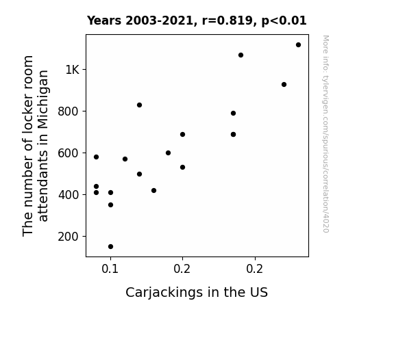
View details about correlation #4,020
Lock and Steal: Exploring the Potential Link between Locker Room Attendants in Michigan and Carjackings in the US
As the number of locker room attendants in Michigan dwindled, so did the availability of fresh towels. This unexpected towel shortage led to a decrease in carjackings across the US, as would-be thieves found it much harder to get a clean getaway. It seems that without those fluffy incentives, the criminals just couldn't make the "heist and dry"!

What else correlates?
The number of locker room attendants in Michigan · all cccupations
Carjackings in the US · all weird & wacky
The number of locker room attendants in Michigan · all cccupations
Carjackings in the US · all weird & wacky


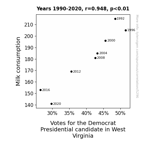
View details about correlation #5,296
The Dairy Dilemma: Democrat Presidential Votes and Dairy Consumption in West Virginia
Fewer milk mustaches led to a decrease in political favor. Turns out, lactose dissent-tolerant voters curdled the results. The dairy-airy election platform failed to butter up the electorate. It seems the state was not in the mooo-d for democratic change.
What else correlates?
Milk consumption · all food
Votes for the Democratic Presidential candidate in West Virginia · all elections
Milk consumption · all food
Votes for the Democratic Presidential candidate in West Virginia · all elections


View details about correlation #5,748
The Jodie Conundrum: A Celestial Connection to PBS Space Time Video Titles
It's a little-known fact that each time a baby is named Jodie, a tiny burst of cosmic creativity is unleashed into the universe. This celestial spark meanders its way through the fabric of space and time, eventually reaching the PBS Space Time team, where it acts as the inspiration for mind-bending video titles. So, as the Jodies of the world continue to multiply, so too does the cosmic influx, leading to an exponential surge in the awesomeness of PBS Space Time YouTube video titles. Who knew that the secret to unlocking the mysteries of the universe lay in the name Jodie? Keep on naming, and keep on space-timing, for the sake of interstellar knowledge and intergalactic puns!

What else correlates?
Popularity of the first name Jodie · all first names
How good PBS Space Time YouTube video titles are · all YouTube
Popularity of the first name Jodie · all first names
How good PBS Space Time YouTube video titles are · all YouTube


View details about correlation #4,313
When Gas Meets Polluted Air: Uncovering the Link Between Liquefied Petroleum Gas in Samoa and Air Pollution in Lumberton, North Carolina
As the smog thickened over Lumberton, it gave rise to a gas-sy situation. This, in turn, created a demand for cleaner-burning fuel, prompting an unexpected surge in the use of LPG all the way in Samoa. It seems pollution in one place really does lead to solution in another!


What else correlates?
Air pollution in Lumberton, North Carolina · all weather
Liquefied petroleum gas used in Samoa · all energy
Air pollution in Lumberton, North Carolina · all weather
Liquefied petroleum gas used in Samoa · all energy


View details about correlation #4,032
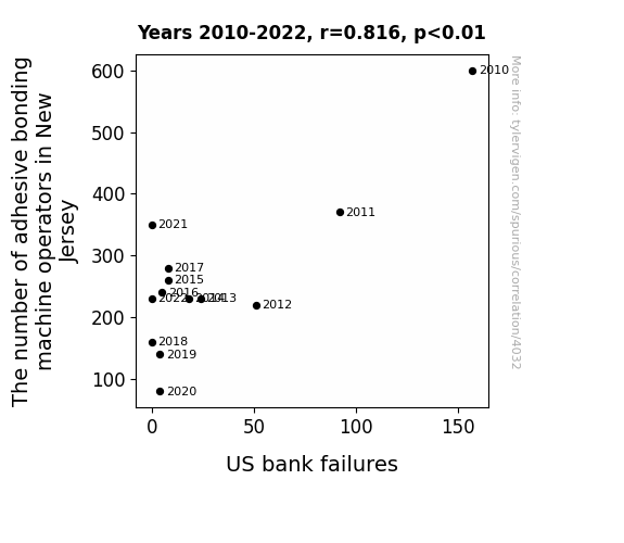
Sticky Situations: The Adhesive Bonding Machine Operators in New Jersey and Their Link to US Bank Failures
The decrease in adhesive bonding machine operators led to less sticky situations overall, which improved the financial stability of banks. It seems the banks were able to bond better without as much operator intervention.

What else correlates?
The number of adhesive bonding machine operators in New Jersey · all cccupations
US bank failures · all weird & wacky
The number of adhesive bonding machine operators in New Jersey · all cccupations
US bank failures · all weird & wacky


View details about correlation #5,295
Please Clap-turing Republican Votes: A Correlational Analysis of Minnesota Senators and Google Searches
The Republican Senators' campaign slogan was "Don't be coy, give us a hand, We're not just fiddlin' around."

What else correlates?
Votes for Republican Senators in Minnesota · all elections
Google searches for 'please clap' · all google searches
Votes for Republican Senators in Minnesota · all elections
Google searches for 'please clap' · all google searches


View details about correlation #5,481
A Troll-Tally Hip-Check: Exploring the Relationship Between Witty Extra History YouTube Video Titles and the Popularity of the Trollface Meme
As the 'trollface' meme started to lose its cool factor, it emitted a wave of un-hipness that directly targeted Extra History's video titles, causing a rapid decline in their perceived trendiness. It's like the meme passed on its lack of swag to the video titles, and now they're just not as fly as they used to be. You could say the meme went from troll to full-on buzzkill, leaving the video titles desperately trying to catch up with the times.


What else correlates?
How 'hip and with it' Extra History YouTube video titles are · all YouTube
Popularity of the 'trollface' meme · all memes
How 'hip and with it' Extra History YouTube video titles are · all YouTube
Popularity of the 'trollface' meme · all memes


View details about correlation #4,895
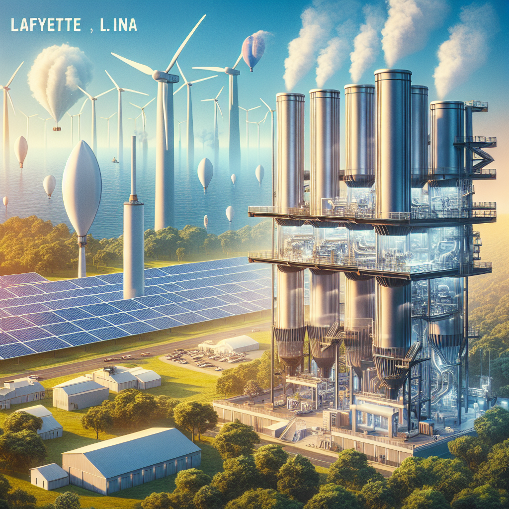
Clearing the Air: A Breath of Fresh Data on the Relationship Between Air Quality in Lafayette, Louisiana and Renewable Energy Production in British Virgin Islands
As the air quality in Lafayette improved, it led to the growth of literal "air farms" where high-quality air was harvested and exported to the British Virgin Islands. This supercharged the wind and solar energy production in the BVI, as the clean, premium Lafayette air provided the perfect conditions for renewable energy sources to thrive. The BVI saw a sudden boom in renewable energy production, all thanks to the refreshing breezes and pristine atmosphere originating from Lafayette.

What else correlates?
Air quality in Lafayette, Louisiana · all weather
Renewable energy production in British Virgin Islands · all energy
Air quality in Lafayette, Louisiana · all weather
Renewable energy production in British Virgin Islands · all energy
Why this works
- Data dredging: I have 25,237 variables in my database. I compare all these variables against each other to find ones that randomly match up. That's 636,906,169 correlation calculations! This is called “data dredging.”
Fun fact: the chart used on the wikipedia page to demonstrate data dredging is also from me. I've been being naughty with data since 2014.
Instead of starting with a hypothesis and testing it, I instead tossed a bunch of data in a blender to see what correlations would shake out. It’s a dangerous way to go about analysis, because any sufficiently large dataset will yield strong correlations completely at random. - Lack of causal connection: There is probably no direct connection between these variables, despite what the AI says above.
Because these pages are automatically generated, it's possible that the two variables you are viewing are in fact causually related. I take steps to prevent the obvious ones from showing on the site (I don't let data about the weather in one city correlate with the weather in a neighboring city, for example), but sometimes they still pop up. If they are related, cool! You found a loophole.
This is exacerbated by the fact that I used "Years" as the base variable. Lots of things happen in a year that are not related to each other! Most studies would use something like "one person" in stead of "one year" to be the "thing" studied. - Observations not independent: For many variables, sequential years are not independent of each other. You will often see trend-lines form. If a population of people is continuously doing something every day, there is no reason to think they would suddenly change how they are doing that thing on January 1. A naive p-value calculation does not take this into account.
You will calculate a lower chance of "randomly" achieving the result than represents reality.
To be more specific: p-value tests are probability values, where you are calculating the probability of achieving a result at least as extreme as you found completely by chance. When calculating a p-value, you need to assert how many "degrees of freedom" your variable has. I count each year (minus one) as a "degree of freedom," but this is misleading for continuous variables.
This kind of thing can creep up on you pretty easily when using p-values, which is why it's best to take it as "one of many" inputs that help you assess the results of your analysis.
- Y-axes doesn't start at zero: I truncated the Y-axes of the graphs above. I also used a line graph, which makes the visual connection stand out more than it deserves.
Nothing against line graphs. They are great at telling a story when you have linear data! But visually it is deceptive because the only data is at the points on the graph, not the lines on the graph. In between each point, the data could have been doing anything. Like going for a random walk by itself!
Mathematically what I showed is true, but it is intentionally misleading. If you click on any of the charts that abuse this, you can scroll down to see a version that starts at zero. - Confounding variable: Confounding variables (like global pandemics) will cause two variables to look connected when in fact a "sneaky third" variable is influencing both of them behind the scenes.
- Outliers: Some datasets here have outliers which drag up the correlation.
In concept, "outlier" just means "way different than the rest of your dataset." When calculating a correlation like this, they are particularly impactful because a single outlier can substantially increase your correlation.
Because this page is automatically generated, I don't know whether any of the charts displayed on it have outliers. I'm just a footnote. ¯\_(ツ)_/¯
I intentionally mishandeled outliers, which makes the correlation look extra strong. - Low n: There are not many data points included in some of these charts.
You can do analyses with low ns! But you shouldn't data dredge with a low n.
Even if the p-value is high, we should be suspicious of using so few datapoints in a correlation.
Pro-tip: click on any correlation to see:
- Detailed data sources
- Prompts for the AI-generated content
- Explanations of each of the calculations (correlation, p-value)
- Python code to calculate it yourself


