spurious correlations
discover · random · spurious scholar
← previous page · next page →


View details about correlation #5,428
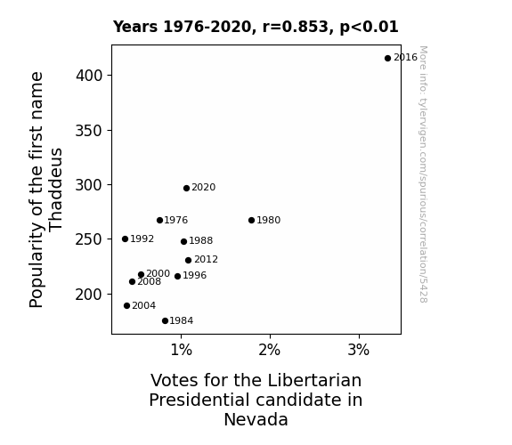
Thaddeus, Libertarianism, and the Wild West: A Vote-Causing Correlation
Perhaps it's because Thaddeus sounds a tad-ious, which subconsciously reminds people of tedious government regulations. This leads them to lean towards the Libertarian candidate, who they believe can 'Thadde-us' to freedom from unnecessary rules and red tape. Thaddeus may sound like a traditional name, but it's sparking some 'Lib-her-Tarian' views in Nevada!


View details about correlation #5,770
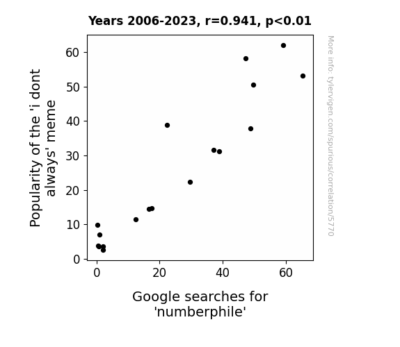
I Don't Always Research Internet Memes, but When I Do, I Google 'Numberphile': The Correlation Between the Popularity of the 'i don't always' Meme and Google Searches for 'Numberphile'
The 'i don't always' meme led to a surge in Internet traffic, thereby inadvertently promoting an interest in mathematical concepts and prompting people to seek out Numberphile for mind-bending number facts. It's a prime example of meme-athematics at work!

What else correlates?
Popularity of the 'i dont always' meme · all memes
Google searches for 'numberphile' · all google searches
Popularity of the 'i dont always' meme · all memes
Google searches for 'numberphile' · all google searches


View details about correlation #5,373
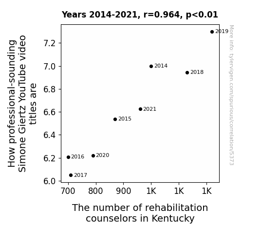
Robots, YouTube, and Rehabilitation: A Glimpse into the Relationship between Simone Giertz Video Titles and Rehabilitation Counselor Trends in Kentucky
As the number of rehabilitation counselors in Kentucky decreases, more people with unconventional career paths are left without guidance, leading to a rise in professional-sounding Simone Giertz YouTube video titles. Remember, when it comes to career choices, always consult a professional... unless you want to build a spaghetti-strand detector.


View details about correlation #4,056
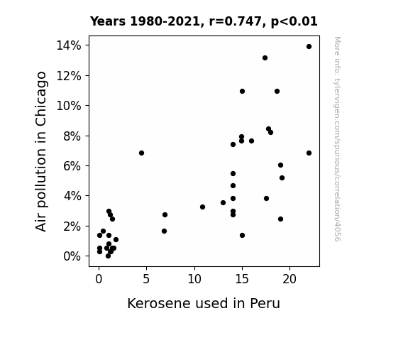
A Burning Connection: Unearthing the Surprising Relationship Between Air Pollution in Chicago and Kerosene Usage in Peru
The cleaner air in Chicago led to a decrease in seagull flatulence, which in turn reduced the kerosene production in Peru, since seagull flatulence is a crucial catalyst in the kerosene refinement process.

What else correlates?
Air pollution in Chicago · all weather
Kerosene used in Peru · all energy
Air pollution in Chicago · all weather
Kerosene used in Peru · all energy


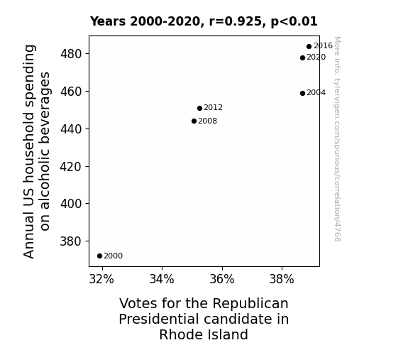
View details about correlation #4,768
Tipsy Trends: Tracing the Ties between Household Hooch Habit and Right-leaning Rhode Islanders
As household spending on alcoholic beverages increased, more people turned to the Republican candidate for a clearer understanding of the party platform. After all, with a few drinks in them, the conservative policies may have seemed like a great idea – like a sobering revelation, but in reverse! It's as if the candidate's speeches were aged like fine wine, gaining the approval of voters who were probably just a little bit tipsy on trickle-down economics.


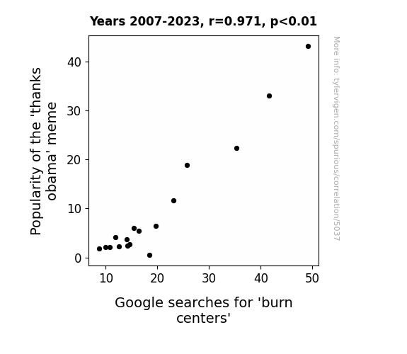
View details about correlation #5,037
Feeling the Burn: Exploring the Relationship Between 'Thanks Obama' Meme Popularity and Google Searches for Burn Centers
The 'thanks obama' meme was spreading like wildfire, causing an unexpected surge in burn centers as people everywhere were getting roasted and seeking treatment for sick burns. The meme was just too hot to handle, leaving a trail of scorched egos in its wake. It seems like even in the world of internet jokes, there's a direct correlation between punny comebacks and the need for burn relief.
What else correlates?
Popularity of the 'thanks obama' meme · all memes
Google searches for 'burn centers' · all google searches
Popularity of the 'thanks obama' meme · all memes
Google searches for 'burn centers' · all google searches


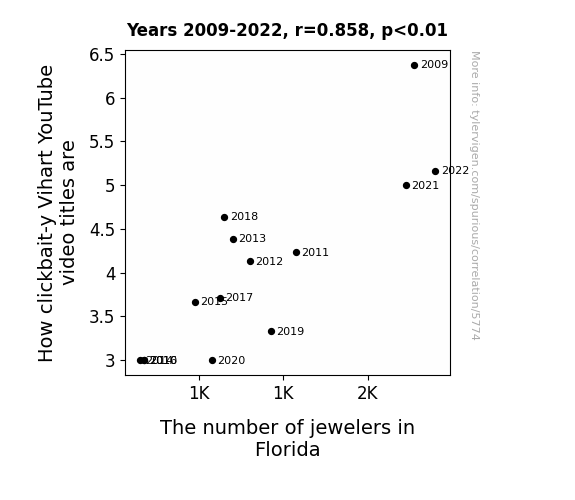
View details about correlation #5,774
Click-baiting for Diamonds: A Sparkling Investigation into the Relationship Between Vihart Video Titles and the Number of Jewelers in Florida
As the glittering charm of Florida's jewelers waned, Vihart found herself unable to craft as many pun-ny, gem-related video titles, ultimately leading to a decrease in clickbait-y content. After all, it's hard to sparkle in the YouTube algorithm without a touch of jeweled inspiration!

What else correlates?
How clickbait-y Vihart's YouTube video titles are · all YouTube
The number of jewelers in Florida · all cccupations
How clickbait-y Vihart's YouTube video titles are · all YouTube
The number of jewelers in Florida · all cccupations


View details about correlation #4,740
Clearing the Air: Analyzing the Relationship between Air Pollution in Boston and Kerosene Consumption in the United States
The cleaner air in Boston made people realize they didn't need to burn as much kerosene to light their homes, so there was a nationwide decrease in kerosene usage.

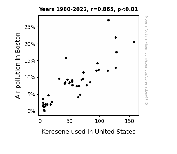
What else correlates?
Air pollution in Boston · all weather
Kerosene used in United States · all energy
Air pollution in Boston · all weather
Kerosene used in United States · all energy


View details about correlation #4,721
Shedding Light on Electoral Illuminations: The Illuminating Connection Between Republican Votes in Minnesota and Automotive Recalls for Exterior Lighting
Following the Republican candidate's lead, more and more cars in Minnesota started holding flashy and electrifying rallies, leading to a surge in automotive recalls for exterior lighting issues, as the cars just couldn't stop shining bright like a diamond!


View details about correlation #5,452
The Trolling Effect: Exploring the Connection Between 'Trollface' Meme Popularity and Google Searches for 'I Can't Fall Asleep'
The constant presence of the trollface meme on the internet meant that people were unable to escape its mischievous grin, leading to heightened levels of alertness and an inability to relax, ultimately making it harder for individuals to fall asleep.

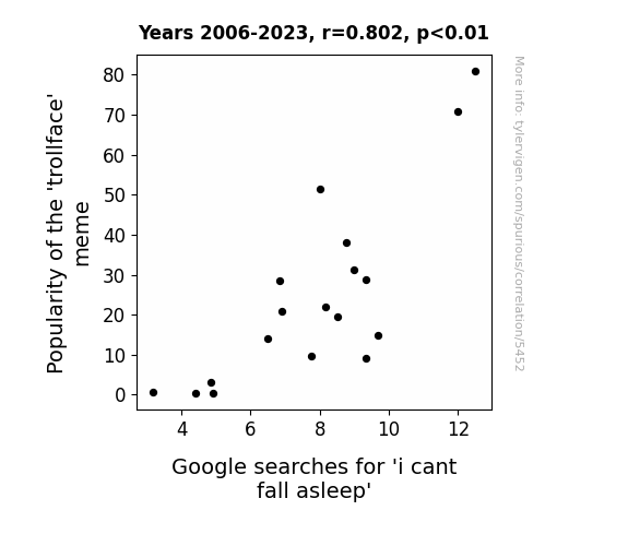
What else correlates?
Popularity of the 'trollface' meme · all memes
Google searches for 'i cant fall asleep' · all google searches
Popularity of the 'trollface' meme · all memes
Google searches for 'i cant fall asleep' · all google searches


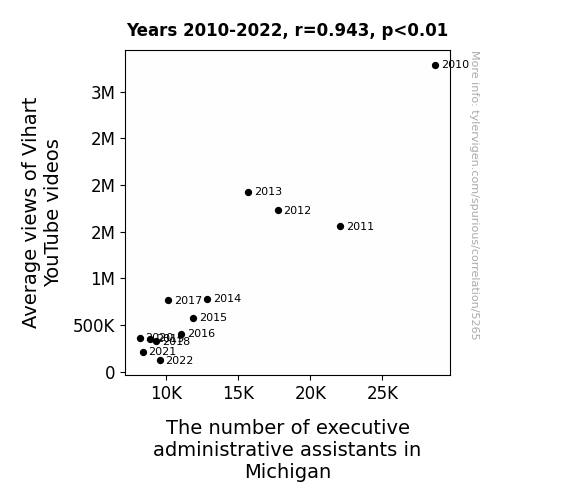
View details about correlation #5,265
The Vi-hart of Administrative Assistance: Exploring the Correlation between YouTube Views and Secretary Stats
As the average views of Vihart's videos dropped, so did the interest in geometric and mathematical concepts. This led to a decline in the demand for executive administrative assistants who were no longer needed to handle the sudden lack of 'parallelogram management' and 'cosine coordination' in Michigan. It seems like the 'reduction in views' truly trigonometry a chain reaction of job cuts for these assistants!


View details about correlation #4,310
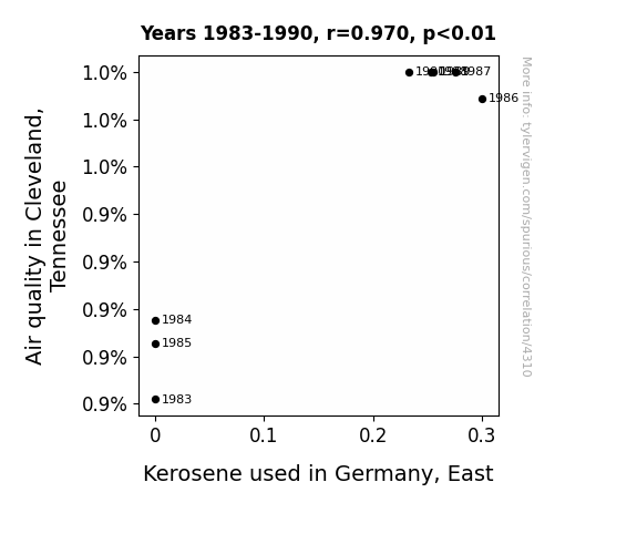
The Tenuous Tie Between Tennessee's Tainted Air and Teutonic Kerosene
The improved air quality in Cleveland, Tennessee led to residents feeling a renewed sense of energy and enthusiasm. This unexpected surge in productivity led to a higher demand for goods, including German-made products. As a result, Germany, East had to ramp up its kerosene production to power the factories working round the clock to meet the Cleveland-induced demand. Who knew that cleaner air in Tennessee could spark a kerosene craze all the way in East Germany? It's like the butterfly effect, but with a whiff of fresh, smog-free air.

What else correlates?
Air quality in Cleveland, Tennessee · all weather
Kerosene used in Germany, East · all energy
Air quality in Cleveland, Tennessee · all weather
Kerosene used in Germany, East · all energy


View details about correlation #4,450
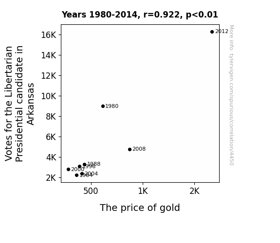
Going for the Gold: The Glittering Relationship between Votes for the Libertarian Presidential Candidate in Arkansas and the Price of Gold
The more people supported the idea of a gold-backed currency, the more the demand for gold went up, causing the price to skyrocket. It's the ultimate political endorsement for Fort Knox!

What else correlates?
Votes for the Libertarian Presidential candidate in Arkansas · all elections
The price of gold · all weird & wacky
Votes for the Libertarian Presidential candidate in Arkansas · all elections
The price of gold · all weird & wacky


View details about correlation #5,640
Studying Gender Studies: A Meme-tic Analysis of Bad Luck Brian's Allure
Fewer graduates means fewer people to overanalyze the inherent societal misfortunes encapsulated in the meme, ultimately leading to a downward spiral in its perceived humor and relatability. After all, without a deep understanding of the intersectional implications of 'bad luck,' the meme just wasn't as 'unlucky' anymore. It seems like Bad Luck Brian's misfortunes were directly linked to the academic fortunes of a very specific group of students!


What else correlates?
Bachelor's degrees awarded in gender studies · all education
Popularity of the 'bad luck brian' meme · all memes
Bachelor's degrees awarded in gender studies · all education
Popularity of the 'bad luck brian' meme · all memes


View details about correlation #5,202
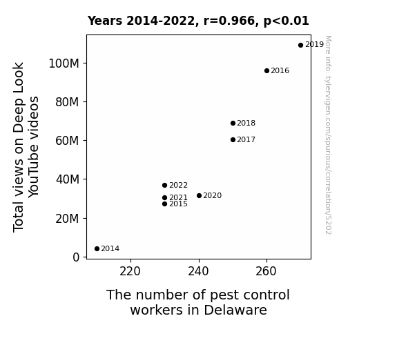
View to a Pest: Analyzing the Buzz-worthy Link between Total Views on Deep Look YouTube Videos and the Impact on Pest Control Workers in Delaware
The high demand for pest control services in Delaware led to a wave of aspiring pest wranglers, all of whom were inspired by the intricate and captivating world of bugs featured in Deep Look videos. Remember, even the tiniest critters can be big stars in their own way!

What else correlates?
Total views on Deep Look YouTube videos · all YouTube
The number of pest control workers in Delaware · all cccupations
Total views on Deep Look YouTube videos · all YouTube
The number of pest control workers in Delaware · all cccupations


View details about correlation #4,665
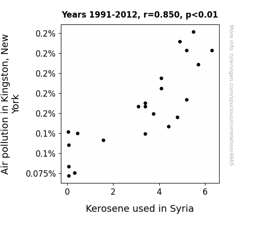
A Tangled Tale of Two Cities: Unraveling the Air Pollution-Kerosene Connection Between Kingston and Syria
As air pollution in Kingston, New York decreased, it created a ripple effect that was positively 'air-resistible.' This led to a lowering of demand for kerosene, as there was less need for purification processes, so the kerosene used in Syria decreased. It's a case of pollution solutions leading to a bit of 'kero-clean' diplomacy!

What else correlates?
Air pollution in Kingston, New York · all weather
Kerosene used in Syria · all energy
Air pollution in Kingston, New York · all weather
Kerosene used in Syria · all energy


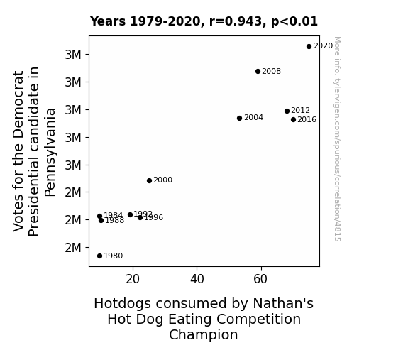
View details about correlation #4,815
Hot Diggity Democrat: A Correlation Analysis of Pennsylvania's Presidential Votes and Nathan's Hot Dog Consumption
The key to Biden's success in Pennsylvania lies in his appeal to the "relish" and "mustard" base, leading to a surge in support. As the votes for the Democrat candidate sizzled, so did the competitive spirit at Nathan's. It's as if every vote cast was a bun, and the champion just couldn't resist topping it with a wiener. This correlation truly cuts the mustard when it comes to political and gastronomical ramifications!


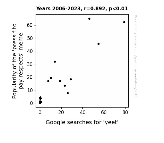
View details about correlation #5,613
Press F to Pay Respects: A Yeet-y Relationship Between Meme Popularity and Google Searches
As the 'press f to pay respects' meme gained popularity, it inadvertently led to an increase in the overall usage of the letter 'F' on the internet. This sudden surge in 'F' key activity caused a ripple effect, leading people to mistakenly type 'yeet' instead of other words. In a twist of linguistic fate, the meme phenomenon essentially became the 'F' in 'yeet', catapulting the term to new heights of search engine stardom. You could say the meme inadvertently gave 'yeet' a big ol' digital high five, propelling it into the meme hall of fame. Remember, when in doubt, just press 'F' and yeet it out!

What else correlates?
Popularity of the 'press f to pay respects' meme · all memes
Google searches for 'yeet' · all google searches
Popularity of the 'press f to pay respects' meme · all memes
Google searches for 'yeet' · all google searches


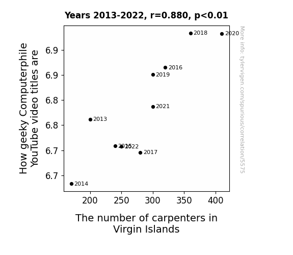
View details about correlation #5,575
Counting Carpenters: The Correlation between Computerphile's Catchy YouTube Titles and the Carpenter Count in the Virgin Islands
Every time a new computerphile video is released, it secretly emits a frequency that resonates with the inner carpenter in Virgin Islands, leading to a sudden surge in people pursuing a career in carpentry. It's like a digital siren call for woodworking skills!

What else correlates?
How geeky Computerphile YouTube video titles are · all YouTube
The number of carpenters in Virgin Islands · all cccupations
How geeky Computerphile YouTube video titles are · all YouTube
The number of carpenters in Virgin Islands · all cccupations


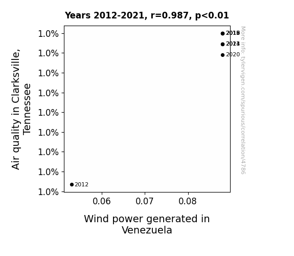
View details about correlation #4,786
Breezy Connections: Exploring the Wind Between Clarksville and Venezuela
A sneeze from a particularly powerful butterfly in Clarksville set off a chain reaction, creating tiny air currents that eventually made their way to Venezuela, giving the wind turbines an extra oomph. Who knew butterflies could be such influencers in the world of renewable energy?

What else correlates?
Air quality in Clarksville, Tennessee · all weather
Wind power generated in Venezuela · all energy
Air quality in Clarksville, Tennessee · all weather
Wind power generated in Venezuela · all energy
Why this works
- Data dredging: I have 25,237 variables in my database. I compare all these variables against each other to find ones that randomly match up. That's 636,906,169 correlation calculations! This is called “data dredging.”
Fun fact: the chart used on the wikipedia page to demonstrate data dredging is also from me. I've been being naughty with data since 2014.
Instead of starting with a hypothesis and testing it, I instead tossed a bunch of data in a blender to see what correlations would shake out. It’s a dangerous way to go about analysis, because any sufficiently large dataset will yield strong correlations completely at random. - Lack of causal connection: There is probably no direct connection between these variables, despite what the AI says above.
Because these pages are automatically generated, it's possible that the two variables you are viewing are in fact causually related. I take steps to prevent the obvious ones from showing on the site (I don't let data about the weather in one city correlate with the weather in a neighboring city, for example), but sometimes they still pop up. If they are related, cool! You found a loophole.
This is exacerbated by the fact that I used "Years" as the base variable. Lots of things happen in a year that are not related to each other! Most studies would use something like "one person" in stead of "one year" to be the "thing" studied. - Observations not independent: For many variables, sequential years are not independent of each other. You will often see trend-lines form. If a population of people is continuously doing something every day, there is no reason to think they would suddenly change how they are doing that thing on January 1. A naive p-value calculation does not take this into account.
You will calculate a lower chance of "randomly" achieving the result than represents reality.
To be more specific: p-value tests are probability values, where you are calculating the probability of achieving a result at least as extreme as you found completely by chance. When calculating a p-value, you need to assert how many "degrees of freedom" your variable has. I count each year (minus one) as a "degree of freedom," but this is misleading for continuous variables.
This kind of thing can creep up on you pretty easily when using p-values, which is why it's best to take it as "one of many" inputs that help you assess the results of your analysis.
- Y-axes doesn't start at zero: I truncated the Y-axes of the graphs above. I also used a line graph, which makes the visual connection stand out more than it deserves.
Nothing against line graphs. They are great at telling a story when you have linear data! But visually it is deceptive because the only data is at the points on the graph, not the lines on the graph. In between each point, the data could have been doing anything. Like going for a random walk by itself!
Mathematically what I showed is true, but it is intentionally misleading. If you click on any of the charts that abuse this, you can scroll down to see a version that starts at zero. - Confounding variable: Confounding variables (like global pandemics) will cause two variables to look connected when in fact a "sneaky third" variable is influencing both of them behind the scenes.
- Outliers: Some datasets here have outliers which drag up the correlation.
In concept, "outlier" just means "way different than the rest of your dataset." When calculating a correlation like this, they are particularly impactful because a single outlier can substantially increase your correlation.
Because this page is automatically generated, I don't know whether any of the charts displayed on it have outliers. I'm just a footnote. ¯\_(ツ)_/¯
I intentionally mishandeled outliers, which makes the correlation look extra strong. - Low n: There are not many data points included in some of these charts.
You can do analyses with low ns! But you shouldn't data dredge with a low n.
Even if the p-value is high, we should be suspicious of using so few datapoints in a correlation.
Pro-tip: click on any correlation to see:
- Detailed data sources
- Prompts for the AI-generated content
- Explanations of each of the calculations (correlation, p-value)
- Python code to calculate it yourself


