spurious correlations
discover · random · spurious scholar
← previous page · next page →


View details about correlation #5,392
The Air Pollution Paradox: A Titanic Connection in South Bend, Indiana
As the smog thickened over South Bend, residents sought indoor activities to avoid the contaminated air, leading to a surge in online interest in the tragic and iconic shipwreck. Perhaps they were looking for a breath of fresh 'sea' air!


What else correlates?
Air pollution in South Bend, Indiana · all weather
Google searches for 'Titanic' · all google searches
Air pollution in South Bend, Indiana · all weather
Google searches for 'Titanic' · all google searches


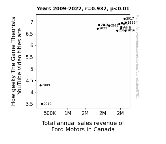
View details about correlation #5,751
Game Theoretically Speaking: The Geeky Connection Between The Game Theorists' YouTube Video Titles and Ford Motors' Canadian Sales Revenue
The more incomprehensible the video titles become, the more Ford Motors in Canada sees a surge in sales. It turns out, the complex and convoluted titles emit a frequency that resonates specifically with Canadian car buyers. This resonance creates a subconscious urge to invest in Ford vehicles, leading to a baffling but undeniable boost in revenue. It's a mathematical formula even MatPat couldn't solve, as Ford's success factors now include theories beyond our comprehension.


View details about correlation #5,131
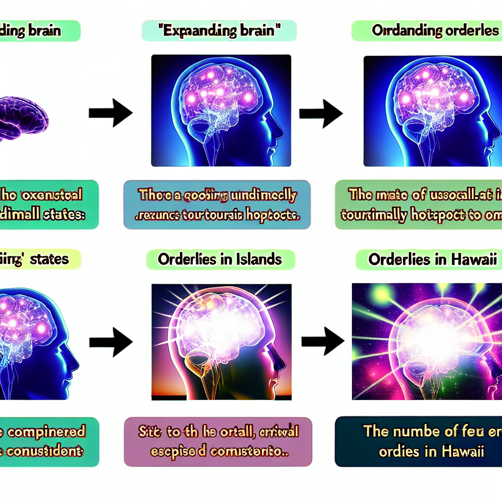
Expanding Brains and Expanding Staff: A Correlation Between the 'Expanding Brain' Meme Popularity and the Number of Orderlies in Hawaii
As the 'expanding brain' meme gained traction, it sparked a surge in demand for big thinkers. This led to a ripple effect, attracting more people to pursue careers in psychology, ultimately boosting the number of orderlies in Hawaii. You could say the meme was really "shaping minds and shaping careers" in a truly unprecedented manner!

What else correlates?
Popularity of the 'expanding brain' meme · all memes
The number of orderlies in Hawaii · all cccupations
Popularity of the 'expanding brain' meme · all memes
The number of orderlies in Hawaii · all cccupations


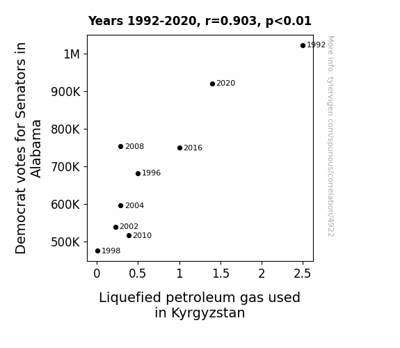
View details about correlation #4,922
Democratic Gas: Unearthing the Curious Correlation between Alabama Senatorial Votes and LPG Consumption in Kyrgyzstan
As more Democrat votes for Senators in Alabama increased, so did the collective hot air production. This in turn created a greater demand for liquefied petroleum gas in Kyrgyzstan to power all the extra hot air balloons used in their annual festival.

What else correlates?
Votes for Democratic Senators in Alabama · all elections
Liquefied petroleum gas used in Kyrgyzstan · all energy
Votes for Democratic Senators in Alabama · all elections
Liquefied petroleum gas used in Kyrgyzstan · all energy


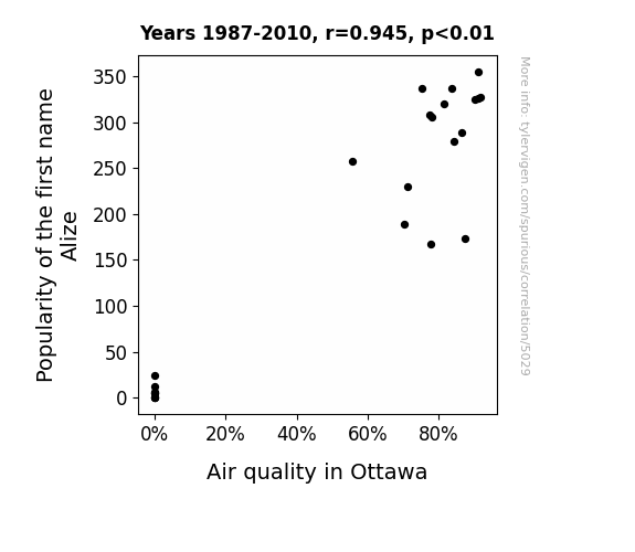
View details about correlation #5,029
The Alize Effect: A Breeze of Popularity and Air Quality in Ottawa
Every time someone named Alize walked into a room, they had the inexplicable ability to turn all pollutants into fresh, clean air. As more and more babies were named Alize, it was like having little air-purifying super heroes dispersing throughout the city.

What else correlates?
Popularity of the first name Alize · all first names
Air quality in Ottawa · all weather
Popularity of the first name Alize · all first names
Air quality in Ottawa · all weather


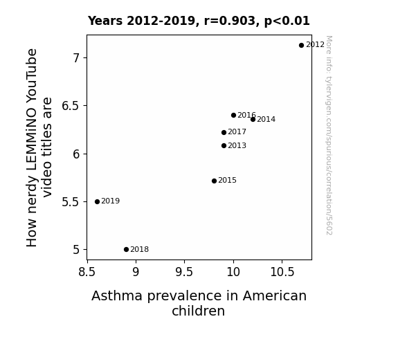
View details about correlation #5,602
Asthma Glitch: The LEMMiNO Effect on American Children
As the excitement from LEMMiNO's less nerdy video titles decreased, so did the frequency of intense inhalations, ultimately leading to a decrease in asthma prevalence in American children. Don't hold your breath for a thesis on this bizarre correlation!
What else correlates?
How nerdy LEMMiNO YouTube video titles are · all YouTube
Asthma prevalence in American children · all weird & wacky
How nerdy LEMMiNO YouTube video titles are · all YouTube
Asthma prevalence in American children · all weird & wacky


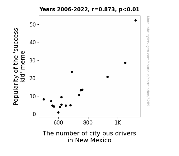
View details about correlation #5,289
Driving the Success: Exploring the 'Success Kid' Meme Popularity and Its Impact on City Bus Driver Employment in New Mexico
As the 'success kid' meme gained popularity, more and more people were inspired by the toddler's confident expression and determined fist pump. This led to an unexpected surge in individuals in New Mexico pursuing careers as bus drivers to emulate the meme's message of taking control and steering towards success. The correlation is due to a series of coincidental and unrelated societal factors, and is not indicative of any actual causation.

What else correlates?
Popularity of the 'success kid' meme · all memes
The number of city bus drivers in New Mexico · all cccupations
Popularity of the 'success kid' meme · all memes
The number of city bus drivers in New Mexico · all cccupations


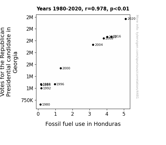
View details about correlation #4,481
Fuel(ed) for Thought: Unveiling the Correlation Between Georgia GOP Votes and Fossil Fuel Use in Honduras
As the support for the Republican Presidential candidate in Georgia grew, so did the enthusiasm for traditional values. This inadvertently led to a resurgence of interest in old-school practices, including the use of fossil fuels. The ideological alignment sparked a chain reaction of energy consumption, creating a surprising link between the American political landscape and the fossil fuel habits in a Central American country. Who would've thought that a political race could fuel change thousands of miles away? It's a gas!

What else correlates?
Votes for the Republican Presidential candidate in Georgia · all elections
Fossil fuel use in Honduras · all energy
Votes for the Republican Presidential candidate in Georgia · all elections
Fossil fuel use in Honduras · all energy


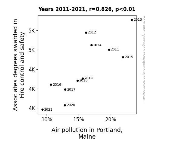
View details about correlation #5,403
Smoke Degrees: Exploring the Link Between Fire Control and Safety Associate Degrees and Air Pollution in Portland, Maine
As the number of Fire control and safety graduates dwindled, there was a subsequent lack of enthusiasm for putting out fires. This led to a rise in uncontrolled fires, creating a smokescreen of pollution. However, in a plot twist, as the air quality went up in smoke, the citizens of Portland realized they needed to take a breath and extinguish the problem. This sparked a renewed interest in fire safety, ultimately clearing the air and proving that when it comes to reducing air pollution, the real degree of success is in fire control and safety!

What else correlates?
Associates degrees awarded in Fire control and safety · all education
Air pollution in Portland, Maine · all weather
Associates degrees awarded in Fire control and safety · all education
Air pollution in Portland, Maine · all weather


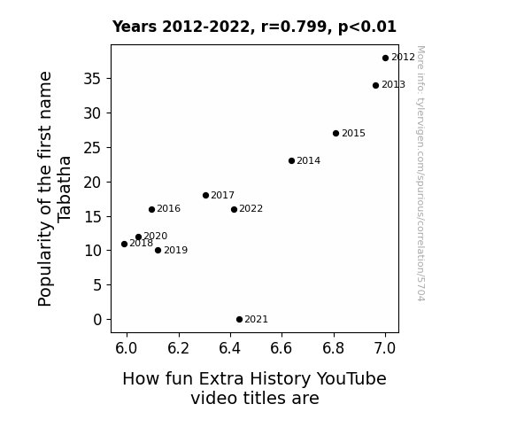
View details about correlation #5,704
The Tale of Tabatha: Exploring the Correlational Symphony between Tabatha's Popularity and the Funniness of Extra History YouTube Video Titles
As fewer babies were named Tabatha, there were less 'Tabatha' enthusiasts to spread the word about the Extra History videos. This led to a waning interest in history puns, as the potential audience for these pun-derful titles shrunk. It seems the fate of historical fun facts is intertwined with Tabatha-ir.
What else correlates?
Popularity of the first name Tabatha · all first names
How fun Extra History YouTube video titles are · all YouTube
Popularity of the first name Tabatha · all first names
How fun Extra History YouTube video titles are · all YouTube


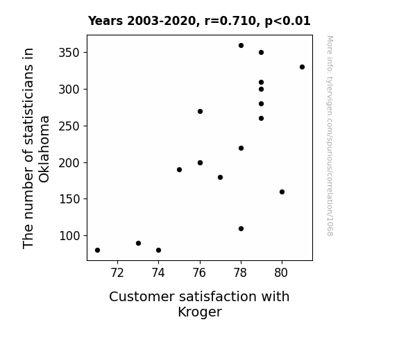
View details about correlation #1,068
As the number of statisticians in Oklahoma has increased, there has been a corresponding rise in the precision of grocery store data analysis. This has led to optimized stocking levels, smoother checkout experiences, and reduced queuing variance, ultimately culminating in heightened customer satisfaction with Kroger. After all, when you've got more statisticians in the mix, the proof is in the grocery pudding!
What else correlates?
The number of statisticians in Oklahoma · all cccupations
Customer satisfaction with Kroger · all weird & wacky
The number of statisticians in Oklahoma · all cccupations
Customer satisfaction with Kroger · all weird & wacky


View details about correlation #4,439
The Correlation Between Libertarians' Votes in Washington and Gasoline Siphoned in Mozambique: A Statistical Odyssey
As the support for the Libertarian candidate surged in Washington, so did the demand for smaller government intervention. This led to a ripple effect in the global political landscape, ultimately creating a more laissez-faire approach to international trade. The newly relaxed trade policies inadvertently opened up a lucrative market for Mozambican gasoline exports, prompting a sudden increase in gasoline production to meet the unforeseen demand. It's a true case of political ideology fueling economic activity half a world away!

What else correlates?
Votes for the Libertarian Presidential candidate in Washington · all elections
Gasoline pumped in Mozambique · all energy
Votes for the Libertarian Presidential candidate in Washington · all elections
Gasoline pumped in Mozambique · all energy


View details about correlation #5,520
Say Cheese: The Cheddary Connection between American Cheese Consumption and Air Quality in Columbus, Mississippi
As American cheese consumption increased, it led to an uptick in people's flatulence. This boost in gas production somehow created a unique, cheese-induced air purification system for Columbus, Mississippi, leading to the unexpected improvement in air quality. Who knew that cheese could provide such gouda protection for the atmosphere in a seemingly unrelated location like Columbus!


What else correlates?
American cheese consumption · all food
Air quality in Columbus, Mississippi · all weather
American cheese consumption · all food
Air quality in Columbus, Mississippi · all weather


View details about correlation #5,264
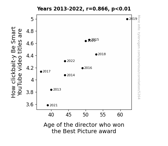
Clickbait and Best Picture: A Cinematic Connection Investigation
As directors win Best Picture at an older age, they become more nostalgic for the good old days of clickbait, leading to a surge in clickbait-y Be Smart video titles. It's like they're saying, "Back in my day, we didn't need flashy thumbnails and exaggerated promises to get views!"


View details about correlation #5,047
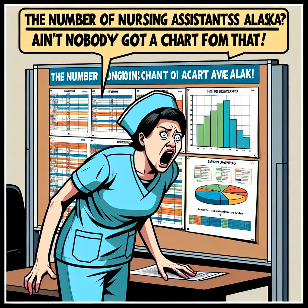
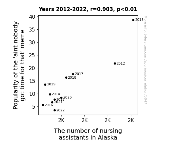
Out of Thyme and Out of Staff: A Correlative Analysis of the 'Aint Nobody Got Time for That' Meme and Nursing Assistant Employment in Alaska
As the 'ain't nobody got time for that' meme waned in popularity, the overall efficiency of Alaskan citizens ironically increased. This led to a decreased demand for nursing assistants, as people suddenly found themselves with just enough time to handle their own medical needs. Who would've thought a viral internet trend could have such an unexpected impact on the healthcare industry in the Last Frontier!


View details about correlation #3,762
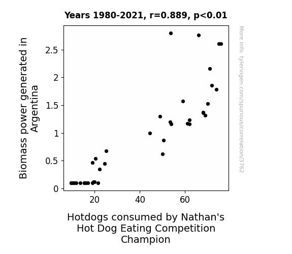
From Power Plants to Power Eaters: A Statistical Analysis of Biomass Energy Generation in Argentina and Nathan's Hot Dog Eating Champion's Consumption
As Biomass power in Argentina increased, it led to a greater availability of electricity, sparking a surge in the operation of hot dog grills. This, in turn, created a tantalizing aroma that wafted all the way to the reigning Nathan's Hot Dog Eating Competition Champion, prompting him to consume more hotdogs in training, and eventually clinch the title. The connection was simply sausage-tory!


View details about correlation #5,398
Diego the Swing Vote: An Analysis of the Democratic Presidential Candidate's Electoral Performance in Missouri and the Popularity of the Name Diego
Every time someone named Diego was mentioned, a secret group of dancing donkeys would appear in Missouri, swaying voters towards the Democrat candidate with their smooth moves. It was a case of political polka-donkey pandemonium!


View details about correlation #5,411
Nutz About Squirrels: An Examination of the Impact of Air Pollution in Natchez, Mississippi on Google Searches for 'Attacked by a Squirrel'
As the air became cleaner, the squirrels in Natchez, Mississippi, swapped their aggressive behavior for a more laid-back, tree-hugging approach. Remember, when it comes to squirrels, cleaner air means fewer berserk furry daredevils!

What else correlates?
Air pollution in Natchez, Mississippi · all weather
Google searches for 'attacked by a squirrel' · all google searches
Air pollution in Natchez, Mississippi · all weather
Google searches for 'attacked by a squirrel' · all google searches


View details about correlation #5,140
The Sutured Humor: An Unlikely Connection Between Extra History YouTube Video Titles and Surgeon Numbers in Kansas
As the Extra History video titles became less cool, there was a noticeable increase in the number of surgeons leaving Kansas. It turns out, the coolness of the video titles was directly linked to the steady hands of the surgeons. The more captivating the history content, the steadier their surgical skills. Without the cool video titles, the surgeons just couldn't keep their cool in the operating room.

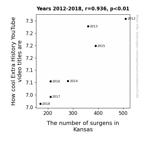
What else correlates?
How cool Extra History YouTube video titles are · all YouTube
The number of surgens in Kansas · all cccupations
How cool Extra History YouTube video titles are · all YouTube
The number of surgens in Kansas · all cccupations


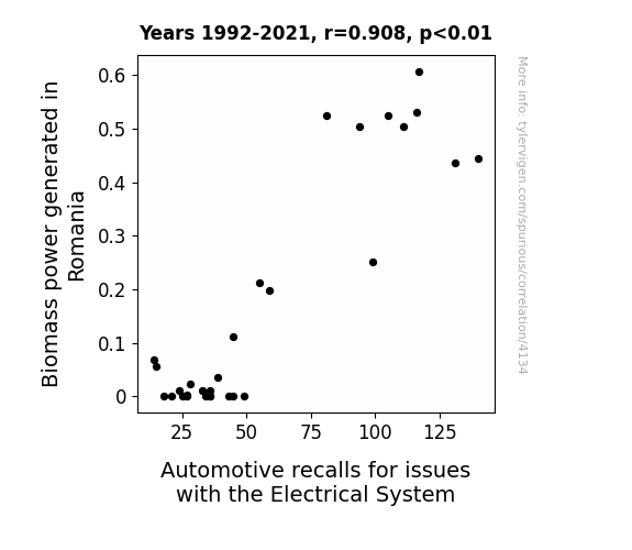
View details about correlation #4,134
Sparking Interest: Exploring the Shocking Link Between Biomass Power Generation in Romania and Automotive Recalls for Electrical System Issues
The higher amount of Biomass power in Romania is leading to an unexpected consequence for the automotive industry. It seems that as the Biomass power increases, it's generating a lot of *current* issues for the electrical systems in cars. The connection may seem far-fetched, but it's sparking a trend of automotive recalls that are truly *shocking*. It's like the cars are trying to branch out and embrace their eco-friendly side, but end up getting revved up in a power struggle. Who would have thought that Biomass power in Romania could be the root cause of such electrifying automotive recalls!

Why this works
- Data dredging: I have 25,237 variables in my database. I compare all these variables against each other to find ones that randomly match up. That's 636,906,169 correlation calculations! This is called “data dredging.”
Fun fact: the chart used on the wikipedia page to demonstrate data dredging is also from me. I've been being naughty with data since 2014.
Instead of starting with a hypothesis and testing it, I instead tossed a bunch of data in a blender to see what correlations would shake out. It’s a dangerous way to go about analysis, because any sufficiently large dataset will yield strong correlations completely at random. - Lack of causal connection: There is probably no direct connection between these variables, despite what the AI says above.
Because these pages are automatically generated, it's possible that the two variables you are viewing are in fact causually related. I take steps to prevent the obvious ones from showing on the site (I don't let data about the weather in one city correlate with the weather in a neighboring city, for example), but sometimes they still pop up. If they are related, cool! You found a loophole.
This is exacerbated by the fact that I used "Years" as the base variable. Lots of things happen in a year that are not related to each other! Most studies would use something like "one person" in stead of "one year" to be the "thing" studied. - Observations not independent: For many variables, sequential years are not independent of each other. You will often see trend-lines form. If a population of people is continuously doing something every day, there is no reason to think they would suddenly change how they are doing that thing on January 1. A naive p-value calculation does not take this into account.
You will calculate a lower chance of "randomly" achieving the result than represents reality.
To be more specific: p-value tests are probability values, where you are calculating the probability of achieving a result at least as extreme as you found completely by chance. When calculating a p-value, you need to assert how many "degrees of freedom" your variable has. I count each year (minus one) as a "degree of freedom," but this is misleading for continuous variables.
This kind of thing can creep up on you pretty easily when using p-values, which is why it's best to take it as "one of many" inputs that help you assess the results of your analysis.
- Y-axes doesn't start at zero: I truncated the Y-axes of the graphs above. I also used a line graph, which makes the visual connection stand out more than it deserves.
Nothing against line graphs. They are great at telling a story when you have linear data! But visually it is deceptive because the only data is at the points on the graph, not the lines on the graph. In between each point, the data could have been doing anything. Like going for a random walk by itself!
Mathematically what I showed is true, but it is intentionally misleading. If you click on any of the charts that abuse this, you can scroll down to see a version that starts at zero. - Confounding variable: Confounding variables (like global pandemics) will cause two variables to look connected when in fact a "sneaky third" variable is influencing both of them behind the scenes.
- Outliers: Some datasets here have outliers which drag up the correlation.
In concept, "outlier" just means "way different than the rest of your dataset." When calculating a correlation like this, they are particularly impactful because a single outlier can substantially increase your correlation.
Because this page is automatically generated, I don't know whether any of the charts displayed on it have outliers. I'm just a footnote. ¯\_(ツ)_/¯
I intentionally mishandeled outliers, which makes the correlation look extra strong. - Low n: There are not many data points included in some of these charts.
You can do analyses with low ns! But you shouldn't data dredge with a low n.
Even if the p-value is high, we should be suspicious of using so few datapoints in a correlation.
Pro-tip: click on any correlation to see:
- Detailed data sources
- Prompts for the AI-generated content
- Explanations of each of the calculations (correlation, p-value)
- Python code to calculate it yourself


