spurious correlations
discover · random · spurious scholar
← previous page · next page →


View details about correlation #3,788
Cartographers in Oklahoma and xkcd Comics: A Rhyme in Space and Time
As the cartographers fled Oklahoma, they took with them the state's unique ability to appreciate and inspire nerdy chart humor. Without their map-making expertise, the xkcd creator found himself lost in a sea of data, unable to navigate the ever-changing landscape of chart comedy. It turns out, when it comes to creating xkcd comics about charts, Oklahoma cartographers were the true legends of 'X' marks the spot!

What else correlates?
The number of cartographers in Oklahoma · all cccupations
xkcd comics published about charts · all weird & wacky
The number of cartographers in Oklahoma · all cccupations
xkcd comics published about charts · all weird & wacky


View details about correlation #4,969
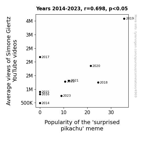
The Meme Machine: A Surprising Connection Between Simone Giertz's Average YouTube Views and the Popularity of the 'Surprised Pikachu' Meme
As Simone Giertz's videos gained more Average views, her quirky sense of humor and infectious laughter began to subtly alter the neural pathways of her viewers. Unbeknownst to them, they were becoming more prone to finding random things utterly delightful, much like the 'surprised pikachu' meme. In a strange twist of internet fate, the meme's popularity skyrocketed as more and more people experienced an inexplicable surge of joy upon encountering Simone's content. It seems that her unique brand of comedic charm inadvertently conditioned an entire online community to embrace the meme with open arms, proving once and for all that laughter is truly contagious, even in the digital realm. The world may never understand the full extent of Simone Giertz's impact on internet culture, but one thing is for certain: behind every successful meme, there may just be a Swedish robotics enthusiast with a penchant for engineering hilarity.

What else correlates?
Average views of Simone Giertz's YouTube videos · all YouTube
Popularity of the 'surprised pikachu' meme · all memes
Average views of Simone Giertz's YouTube videos · all YouTube
Popularity of the 'surprised pikachu' meme · all memes


View details about correlation #5,665
Dusty Musty: A Study of the Link between the Popularity of the First Name Dusty and Air Quality in Corpus Christi, Texas
Less people were named Dusty, so there was less dust kicked up as they walked, leading to a reduction in air pollution in Corpus Christi, Texas.


What else correlates?
Popularity of the first name Dusty · all first names
Air pollution in Corpus Christi, Texas · all weather
Popularity of the first name Dusty · all first names
Air pollution in Corpus Christi, Texas · all weather


View details about correlation #4,660
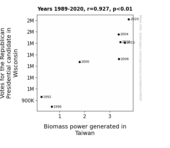
Red Votes and Pre-Fired Quotes: The Relationship Between GOP Ballots in Wisconsin and Biomass Watts in Taiwan
As the Republican candidate gained support in Wisconsin, it sparked a surge in political fervor. This led to an unexpected ripple effect, as people across the globe, including in Taiwan, felt the 'power' of the Wisconsin votes. This, in turn, ignited a 'biomass' of interest and action in Taiwan's energy sector. It seems like the political heat from Wisconsin traveled all the way to Taiwan, creating a 'republican' demand for biomass power! Those Wisconsin votes must've really 'fired up' the energy enthusiasts in Taiwan, proving that when it comes to influencing biomass power, it's all about generating the right kind of 'political spark'!

What else correlates?
Votes for the Republican Presidential candidate in Wisconsin · all elections
Biomass power generated in Taiwan · all energy
Votes for the Republican Presidential candidate in Wisconsin · all elections
Biomass power generated in Taiwan · all energy


View details about correlation #3,797
The Trade of Trimmers and Troubles at Sea: A Tale of Two Tides
As the number of merchandise displayers and window trimmers in District of Columbia increased, more and more ships passing by were getting distracted by the fabulous displays, leading to an increase in global shipwrecks. It seems like the 'retail tide' was just too strong for them to resist!


View details about correlation #5,546
Techy Tactics: Tracing the Tendency Toward 'How to Fake Your Own Death' Searches with Geeky Technology Connections
As interest in faking your own death wanes, people are no longer as concerned with the intricate technological details needed to pull off an elaborate disappearance. It's a classic case of the fake-it-till-you-make-it mentality inadvertently leading to a decline in tech geekiness. So, remember, the next time you're considering a career change to become a professional hermit, think about the unintended consequences on the tech world!


View details about correlation #5,260
The Jaylen Effect: A Breath of Fresh Air or Just Hot Air?
As the popularity of the name Jaylen grew, so did the demand for customized "J" car decals. This led to a sudden spike in car sticker production in Madison, Wisconsin, ultimately contributing to air pollution as factories cranked out the trendy J-themed accessories. Who knew that a linguistic preference could have such an unforeseen impact on the local atmosphere!

What else correlates?
Popularity of the first name Jaylen · all first names
Air pollution in Madison, Wisconsin · all weather
Popularity of the first name Jaylen · all first names
Air pollution in Madison, Wisconsin · all weather


View details about correlation #4,719
Libertarian Votes in Georgia and Sudan's Fossil Fuel Bonanza: A Rhyming Analysis
As Libertarian votes for Senators in Georgia increased, it prompted a wave of unconventional energy enthusiasts in Sudan to form a coalition, advocating for the use of fossil fuels in their country. This unexpected uptick in libertarian support somehow led to a domino effect, ultimately boosting Sudan's reliance on fossil fuels, much to the bewilderment of political analysts everywhere.


What else correlates?
Votes for Libertarian Senators in Georgia · all elections
Fossil fuel use in Sudan · all energy
Votes for Libertarian Senators in Georgia · all elections
Fossil fuel use in Sudan · all energy


View details about correlation #3,899
Exploring the Link Between Extraterrestrial Sightings and Hotdog Consumption: A Close Encounter of the Culinary Kind
As more UFOs zipped through South Dakota skies, they unknowingly beamed down extra appetites, giving the locals a hankering for some out-of-this-world hotdogs. This sparked a chain reaction, boosting the overall hotdog demand across the state. Little did we know, these UFOs were the real wurst-omental factor behind the champion's record-breaking hotdog consumption. Turns out, when it comes to devouring hotdogs, the sky's the limit!


View details about correlation #5,192
The Astounding Affiliation between Associates degrees in Emergency Medical Tech and Awesome Numberphile YouTube Titles
As more people became EMTs, they were better equipped to solve mathematical emergencies, leading to an influx of prime content from Numberphile. "Looks like these EMTs know how to handle the real number crunching!"


View details about correlation #5,763
Biological Floss-ilogical: Unraveling the Dance of Demand for Biology Teachers in Arkansas
As the floss dance meme gained popularity, it inadvertently activated a dormant DNA sequence in Arkansan residents, leading to a surge in interest in biological sciences. The rhythmic and coordinated movements of the dance somehow sparked a fascination with the intricate biological processes, ultimately prompting a higher demand for university biological science teachers in Arkansas. It's as if the meme became a catalyst for a spontaneous evolution of academic pursuits in the state!


View details about correlation #4,462
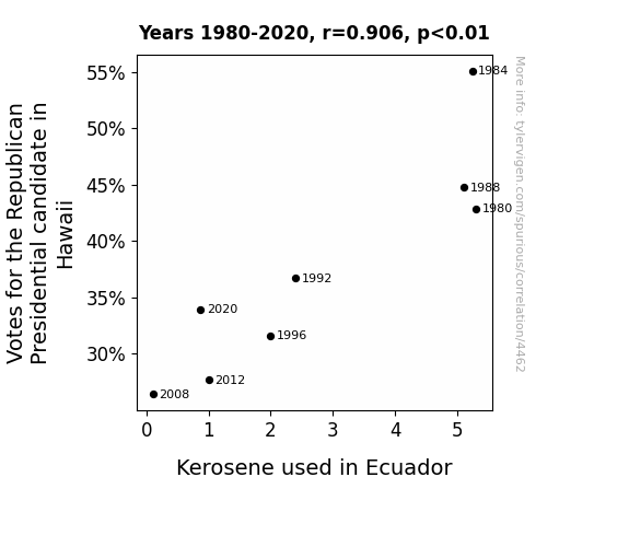
Burning Down the House: Correlating Votes for the Republican Presidential Candidate in Hawaii with Kerosene Consumption in Ecuador
It seems that as the Republican support in Hawaii dwindles, there's a ripple effect on a global scale. Perhaps it's a case of 'losing steam' as the political landscape shifts. As the votes for the Republican candidate in Hawaii go down, the kerosene usage in Ecuador follows suit. One could say it's a classic case of 'republican't power leading to less 'kero-scene' in Ecuador. It's a connection that really burns bright!

What else correlates?
Votes for the Republican Presidential candidate in Hawaii · all elections
Kerosene used in Ecuador · all energy
Votes for the Republican Presidential candidate in Hawaii · all elections
Kerosene used in Ecuador · all energy


View details about correlation #4,654
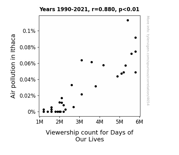
Airing the Affect of Air Pollution: An Alliterative Analysis of the Astounding Association between Ithaca's Air Quality and Days of Our Lives Viewership
As the air quality improved, the residents of Ithaca were finally able to go outside and enjoy activities other than watching TV, like hiking, cycling, and picnicking. They traded soap operas for fresh air operas!

What else correlates?
Air pollution in Ithaca · all weather
Viewership count for Days of Our Lives · all weird & wacky
Air pollution in Ithaca · all weather
Viewership count for Days of Our Lives · all weird & wacky


View details about correlation #5,092
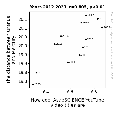
Pluto-nium and Beyond: Exploring the Interstellar Connection Between Celestial Distance and YouTube Titles
Well, you see, as the gap between Uranus and Mercury narrows, it creates a gravitational fluctuation that directly affects the pun production in the brains of the AsapSCIENCE team. It's like their creativity is orbiting closer to the puniverse, leading to a pun-demic of cooler video titles. So, as Uranus and Mercury get cozy, the countdown to wittier content begins - it's a real astROFLonomical connection! Remember, it's all fun and games until Uranus moves in for a celestial selfie with Mercury, and then it's pun-believable!
What else correlates?
The distance between Uranus and Mercury · all planets
How cool AsapSCIENCE YouTube video titles are · all YouTube
The distance between Uranus and Mercury · all planets
How cool AsapSCIENCE YouTube video titles are · all YouTube


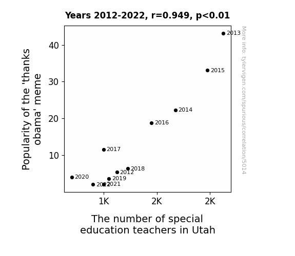
View details about correlation #5,014
Trendy Memes and Education schemes: Exploring the Relationship between 'Thanks Obama' Popularity and Special Education Teacher Numbers in Utah
As the 'thanks Obama' meme gained popularity, it sparked a wave of sarcastic gratitude. This outpouring of thanks inadvertently led to an increase in the production of salt, a key component in preserving food. This surplus of preserved food prompted a higher demand for special education teachers in Utah, as the state experienced a boom in pickle-related behavioral incidents.
What else correlates?
Popularity of the 'thanks obama' meme · all memes
The number of special education teachers in Utah · all cccupations
Popularity of the 'thanks obama' meme · all memes
The number of special education teachers in Utah · all cccupations


View details about correlation #4,408
Fuel the Vote: Exploring the Connection Between Votes for the Libertarian Presidential Candidate in Indiana and Petroleum Consumption in Mozambique
As more people in Indiana showed support for the Libertarian candidate, it sparked a wave of interest in individual freedom and self-reliance. This unconventional enthusiasm sent ripples of independence across the globe, reaching all the way to Mozambique. Inspired by the idea of self-governing and non-intervention, the people of Mozambique decided to express their own personal liberty by taking spontaneous road trips, leading to a surge in petroleum consumption. Who knew that the road to political change could also be the one paved with...well, more road trips!


View details about correlation #5,074
Kianna Clear: The Relationship Between the Popularity of the Name Kianna and Air Pollution in Harrison, Arkansas
More people were buying personalized car air fresheners with overly fragrant scents like "Kiwi Kianna" and "Tropical Kianna Breeze," leading to a surge in localized air pollution from Harrison's rush hour traffic. Looks like Kianna's rise to the top was just a little too air-o-dynamic for Harrison!

What else correlates?
Popularity of the first name Kianna · all first names
Air pollution in Harrison, Arkansas · all weather
Popularity of the first name Kianna · all first names
Air pollution in Harrison, Arkansas · all weather


View details about correlation #5,766
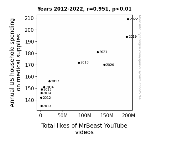
The Price is Right: An Examination of the Link Between Household Medical Spending and MrBeast YouTube Likes
As household spending on medical supplies rises, families stock up on first aid kits. This leads to a surge in bandage availability, inspiring MrBeast to create wacky videos where he and his friends compete in extreme bandage challenges. When it comes to boosting MrBeast's likes, it seems like medical supplies are the real healers of his content!

What else correlates?
Annual US household spending on medical supplies · all weird & wacky
Total likes of MrBeast's YouTube videos · all YouTube
Annual US household spending on medical supplies · all weird & wacky
Total likes of MrBeast's YouTube videos · all YouTube


View details about correlation #5,648
The FBI Agent Frenzy and the Flourishing of Function Fanatics: A Funny Foray into Fandom and Formulae in Colorado
The 'FBI agent' meme led to a surge in interest in surveillance technology, inadvertently inspiring more people to pursue careers in mathematics to develop advanced encryption methods and outsmart their own hypothetical FBI agents. After all, what better way to keep a tab on your privacy than to outmath the math whizzes at the FBI? As a result, Colorado saw a sudden influx of individuals trading in their ski passes for algorithms, all thanks to the unexpected mathematical consequences of internet humor.


What else correlates?
Popularity of the 'fbi agent' meme · all memes
The number of mathematicians in Colorado · all cccupations
Popularity of the 'fbi agent' meme · all memes
The number of mathematicians in Colorado · all cccupations


View details about correlation #4,809
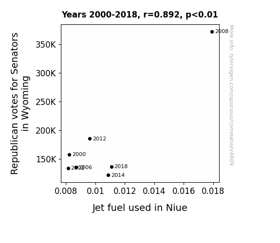
Flying High: The Link Between Wyoming's GOP Votes and Niue's Jet Fuel Use
When Republican senators in Wyoming fly high with their policies, it really fuels the airwaves. You could say their political ambitions have refueled the demand for Jet fuel in Niue, propelling the nation to new heights!
What else correlates?
Votes for Republican Senators in Wyoming · all elections
Jet fuel used in Niue · all energy
Votes for Republican Senators in Wyoming · all elections
Jet fuel used in Niue · all energy
Why this works
- Data dredging: I have 25,237 variables in my database. I compare all these variables against each other to find ones that randomly match up. That's 636,906,169 correlation calculations! This is called “data dredging.”
Fun fact: the chart used on the wikipedia page to demonstrate data dredging is also from me. I've been being naughty with data since 2014.
Instead of starting with a hypothesis and testing it, I instead tossed a bunch of data in a blender to see what correlations would shake out. It’s a dangerous way to go about analysis, because any sufficiently large dataset will yield strong correlations completely at random. - Lack of causal connection: There is probably no direct connection between these variables, despite what the AI says above.
Because these pages are automatically generated, it's possible that the two variables you are viewing are in fact causually related. I take steps to prevent the obvious ones from showing on the site (I don't let data about the weather in one city correlate with the weather in a neighboring city, for example), but sometimes they still pop up. If they are related, cool! You found a loophole.
This is exacerbated by the fact that I used "Years" as the base variable. Lots of things happen in a year that are not related to each other! Most studies would use something like "one person" in stead of "one year" to be the "thing" studied. - Observations not independent: For many variables, sequential years are not independent of each other. You will often see trend-lines form. If a population of people is continuously doing something every day, there is no reason to think they would suddenly change how they are doing that thing on January 1. A naive p-value calculation does not take this into account.
You will calculate a lower chance of "randomly" achieving the result than represents reality.
To be more specific: p-value tests are probability values, where you are calculating the probability of achieving a result at least as extreme as you found completely by chance. When calculating a p-value, you need to assert how many "degrees of freedom" your variable has. I count each year (minus one) as a "degree of freedom," but this is misleading for continuous variables.
This kind of thing can creep up on you pretty easily when using p-values, which is why it's best to take it as "one of many" inputs that help you assess the results of your analysis.
- Y-axes doesn't start at zero: I truncated the Y-axes of the graphs above. I also used a line graph, which makes the visual connection stand out more than it deserves.
Nothing against line graphs. They are great at telling a story when you have linear data! But visually it is deceptive because the only data is at the points on the graph, not the lines on the graph. In between each point, the data could have been doing anything. Like going for a random walk by itself!
Mathematically what I showed is true, but it is intentionally misleading. If you click on any of the charts that abuse this, you can scroll down to see a version that starts at zero. - Confounding variable: Confounding variables (like global pandemics) will cause two variables to look connected when in fact a "sneaky third" variable is influencing both of them behind the scenes.
- Outliers: Some datasets here have outliers which drag up the correlation.
In concept, "outlier" just means "way different than the rest of your dataset." When calculating a correlation like this, they are particularly impactful because a single outlier can substantially increase your correlation.
Because this page is automatically generated, I don't know whether any of the charts displayed on it have outliers. I'm just a footnote. ¯\_(ツ)_/¯
I intentionally mishandeled outliers, which makes the correlation look extra strong. - Low n: There are not many data points included in some of these charts.
You can do analyses with low ns! But you shouldn't data dredge with a low n.
Even if the p-value is high, we should be suspicious of using so few datapoints in a correlation.
Pro-tip: click on any correlation to see:
- Detailed data sources
- Prompts for the AI-generated content
- Explanations of each of the calculations (correlation, p-value)
- Python code to calculate it yourself


