spurious correlations
discover · random · spurious scholar
← previous page · next page →


View details about correlation #5,241
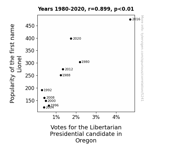
Lionel and Libertarians: A Name-Candidate Connection
Perhaps there was a secret society of Lionel enthusiasts who believed in free market principles and individual freedoms. As the number of babies named Lionel grew, so did this underground movement of tiny, but fierce, supporters. It's the Lio-nation of Liberty making waves in the world of politics!


View details about correlation #5,753
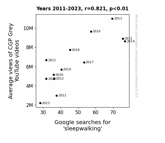
Sleepwalking in the YouTubephere: A Cozy Correlation Between CGP Grey's Video Views and Google Searches for Sleepwalking
As people watched fewer CGP Grey videos, their brains received less high-quality information, leading to a decline in mental activity. This decrease in mental stimulation somehow resulted in reduced instances of sleepwalking, as if the intricate explanations and thought-provoking content acted as a mental roadblock to late-night subconscious strolls. It's as if the viewers' brains said, "Nope, we need to process these fascinating facts instead of engaging in nocturnal ambulation."

What else correlates?
Average views of CGP Grey YouTube videos · all YouTube
Google searches for 'sleepwalking' · all google searches
Average views of CGP Grey YouTube videos · all YouTube
Google searches for 'sleepwalking' · all google searches


View details about correlation #4,789
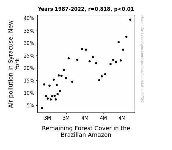
Breathe Easy, Save Trees: The Surprising Link Between Air Pollution in Syracuse, New York and Remaining Forest Cover in the Brazilian Amazon
As air pollution in Syracuse decreased, the smog particles must have undergone a career change and decided to try their luck as stowaways on international flights. Making their way to the Brazilian Amazon, these wayward particles settled on the lush green leaves, leading to a case of mistaken identity. The once camouflaged trees found themselves constantly being mistaken for towering, photosynthesizing skyscrapers, attracting hordes of disgruntled city-dwelling birds. Faced with noise complaints, airbnb requests, and demands for 24/7 coffee shops, the trees panicked and, in a desperate attempt to reclaim their peace and quiet, decided to downsize. And just like that, the Amazonian forest cover decreased as the trees sought to maintain their status as the Amazon, not the Amazofficedistrict.

What else correlates?
Air pollution in Syracuse, New York · all weather
Remaining Forest Cover in the Brazilian Amazon · all weird & wacky
Air pollution in Syracuse, New York · all weather
Remaining Forest Cover in the Brazilian Amazon · all weird & wacky


View details about correlation #4,128
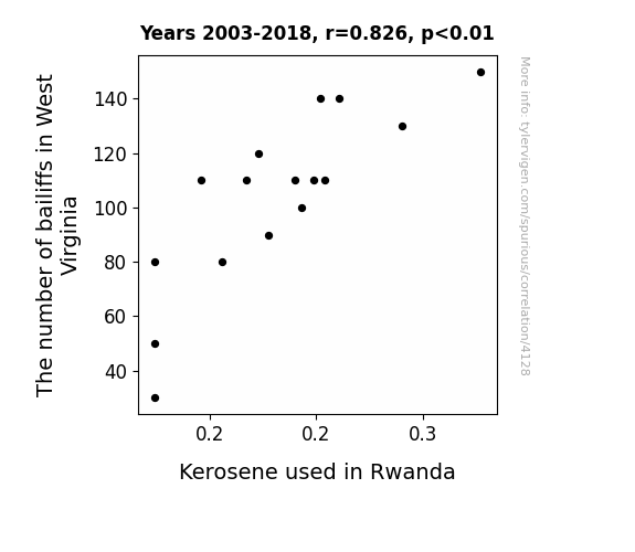
Navigating Through Data Seas: An Unlikely Correlation Between Bailiffs in West Virginia and Kerosene Consumption in Rwanda
As the number of bailiffs in West Virginia increased, it led to a surge in square dancing popularity. This in turn created a higher demand for sparkly outfits, causing a nationwide shortage of glitter. Desperate for alternative sources of shimmer, Rwanda saw a significant spike in kerosene use as citizens attempted to create DIY disco balls for their impromptu dance parties. It seems that a little bit of West Virginian law enforcement action really set the night on fire in Rwanda!

What else correlates?
The number of bailiffs in West Virginia · all cccupations
Kerosene used in Rwanda · all energy
The number of bailiffs in West Virginia · all cccupations
Kerosene used in Rwanda · all energy


View details about correlation #5,509
Killian It at the Ballot Box: An Examination of the Name's Influence on Libertarian Votes in Kansas
It turns out that every time someone named Killian made a new friend or fan, they insisted on giving them a "vote" in their own personal libertarian utopia. So really, it's a case of name-based micro-politics.


View details about correlation #5,603
Spreading the News: The Margarine of Error in Assessing the Relationship between Butter Consumption and Likes on OverSimplified YouTube Videos
As butter consumption increased, people's brains were getting extra slippery, making it easier for them to slide into a good mood while watching history and science being OverSimplified. This led to a buttery smooth increase in the average number of likes on OverSimplified YouTube videos.


What else correlates?
Butter consumption · all food
The average number of likes on OverSimplified YouTube videos · all YouTube
Butter consumption · all food
The average number of likes on OverSimplified YouTube videos · all YouTube


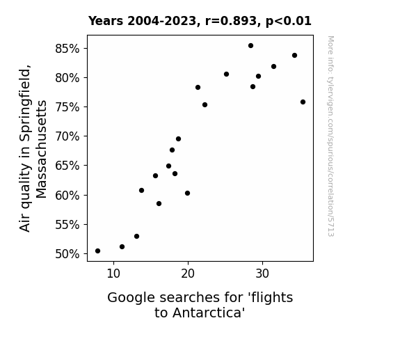
View details about correlation #5,713
Plane Crazy: The Icy Connection Between Air Quality in Springfield, Massachusetts and Google Searches for 'Flights to Antarctica'
The cleaner air in Springfield led to a rise in productivity, prompting people to work extra hard and earn those extra vacation days. This, in turn, meant more folks could afford to take the plunge and book flights to Antarctica. It's like they say, when the air quality goes up, so does the penguin popularity! The connection is crystal clear - fresher air in Springfield is taking flight to the icy continent!

What else correlates?
Air quality in Springfield, Massachusetts · all weather
Google searches for 'flights to Antarctica' · all google searches
Air quality in Springfield, Massachusetts · all weather
Google searches for 'flights to Antarctica' · all google searches


View details about correlation #2,858
Blowin' in the Wind: A Statistical Analysis of the Relationship Between Jordanian Wind Power and LP/Vinyl Album Sales
As the wind turbines twirled, they inadvertently created a groovy, retro breeze. This unique phenomenon wafted its way into the hearts of the people, rekindling a love for the vintage crackling sounds of vinyl. It's like the turbines were secretly whispering, "You spin me right round, baby, right round" to the residents, sparking a nostalgic desire to dust off their old record collections and embrace the classic vibes. Who knew clean energy could also blow in a resurgence of analog music appreciation?


What else correlates?
Wind power generated in Jordan · all energy
Sales of LP/Vinyl Albums · all weird & wacky
Wind power generated in Jordan · all energy
Sales of LP/Vinyl Albums · all weird & wacky


View details about correlation #5,292
The Mapless Craze: Does the 'Maps Without New Zealand' Meme Influence the Men in Green? A Texas Case Study
As the 'Maps Without New Zealand' meme lost its appeal, internet users turned to creating and sharing 'Fish and Game Wardens Without Texas' memes instead. This sudden surge in demand for this bizarrely specific meme genre led to an unexpected shortage of fish and game wardens in Texas, as more and more people were inspired to pursue alternative careers in meme-worthy law enforcement. The Texas Department of Wildlife even reported an increase in inquiries about job openings, with many citing the memes as their motivation. It seems like the power of internet humor has reeled in a new wave of interest in protecting wildlife, one meme at a time.


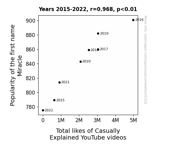
View details about correlation #5,316
Statistically Miraculous: Investigating the Link between the First Name Miracle and YouTube Video Likes
As the name Miracle gained popularity, more people started believing in the power of unlikely and wondrous occurrences. This newfound faith translated to viewers experiencing mini miracles of laughter and enlightenment while watching Casually Explained videos. Each like became a digital miracle, contributing to the overall positivity associated with the name Miracle. It's a chain reaction of serendipitous nomenclature leading to a likeable boost in the YouTube video appreciation index. Miracle truly is the casually explained secret ingredient to spreading joy and internet stardom! It's a name-ceptional phenomenon!

What else correlates?
Popularity of the first name Miracle · all first names
Total likes of Casually Explained YouTube videos · all YouTube
Popularity of the first name Miracle · all first names
Total likes of Casually Explained YouTube videos · all YouTube


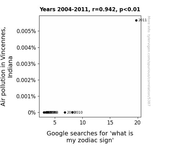
View details about correlation #5,387
Starry-Eyed in Smoggy Skies: The Zodiac Sign Query and Air Pollution Association in Vincennes, Indiana
As the air pollution in Vincennes, Indiana rises, it creates a mystical smog that shrouds the city. This smog is inadvertently tuned to the cosmic frequencies of the universe, leading to a surge in zodiac energy. Citizens find themselves inexplicably drawn to pondering their astrological identities amidst the hazy horizons, as if the pollution has cosmically charged the very essence of their being. So, while the skies may be unclear, one thing is certain - the stars have never been more in sync with Vincennes.

What else correlates?
Air pollution in Vincennes, Indiana · all weather
Google searches for 'what is my zodiac sign' · all google searches
Air pollution in Vincennes, Indiana · all weather
Google searches for 'what is my zodiac sign' · all google searches


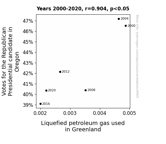
View details about correlation #4,905
Fill 'Er Up with Votes: The Gas-Tastic Connection Between Republican Presidential Votes in Oregon and Liquefied Petroleum Gas Consumption in Greenland
As the support for the Republican candidate waned in Oregon, it created a ripple effect that ultimately led to a decrease in political hot air. This, in turn, lowered the overall temperature of discussions, resulting in a cooler attitude towards Liquefied Petroleum Gas, or LPG, in Greenland. It seems the connection between the presidential race and gas in Greenland was more than just a pipe dream. Remember, when it comes to elections and energy, the stakes are always evolving!


View details about correlation #4,164
Unraveling the Stitch: The Thread Between Insulation Workers and Child Seat Recalls in the Automotive Industry
As the number of insulation workers in South Carolina has increased, so has the production of exceedingly fluffy and cushiony insulation materials. These workers have inadvertently created a state full of irresistibly cozy car interiors, leading to a surge in sleepy baby passengers. This, in turn, has resulted in an uptick in automotive recalls for child seat issues, as car manufacturers scramble to address the unexpected need for built-in baby snuggle support features. Remember, the fluff struggle is real!


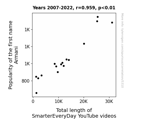
View details about correlation #5,310
The Armani Effect: Exploring the Correlation Between the Popularity of the Name 'Armani' and the Total Length of SmarterEveryDay YouTube Videos
As the name Armani gained popularity, more babies were destined for lives of sophistication and style. These babies grew up to become fans of SmarterEveryDay, inspiring Destin to create longer, more intellectually suave videos to match their exquisite tastes. It's a case of sartorial elegance leading to the expansion of smartorial content!

What else correlates?
Popularity of the first name Armani · all first names
Total length of SmarterEveryDay YouTube videos · all YouTube
Popularity of the first name Armani · all first names
Total length of SmarterEveryDay YouTube videos · all YouTube


View details about correlation #5,649
Clearing the Air: An Examination of the Relationship Between Air Pollution in Ithaca and Arson in the United States
As the air in Ithaca cleared up, it also cleared the minds of potential arsonists across the United States. With easier access to clean, oxygen-rich air, their fiery tendencies just couldn't ignite the way they used to. It's a case of environmental improvement leading to a nationwide cool-down in criminal activity.
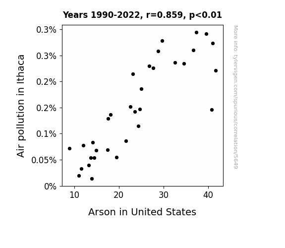
What else correlates?
Air pollution in Ithaca · all weather
Arson in United States · all random state specific
Air pollution in Ithaca · all weather
Arson in United States · all random state specific


View details about correlation #4,806
Jetting to the Polls: Exploring the Connection Between Republican Votes in Montana and Jet Fuel Consumption in Somalia
As the support for the Republican candidate in Montana soared, a surge of patriotic fervor was ignited. This led to an unusual but undeniable spike in the demand for fireworks across the state. As fate would have it, a local entrepreneur decided to capitalize on this booming market and started a new business venture - importing rare, artisanal fireworks from Somalia. Eager to showcase their fiery support, the residents of Montana celebrated with extravagant displays, unknowingly creating a strangely direct link between their political enthusiasm and the jet fuel used to transport these 'explosive' goods. So, in a bizarre twist of fate, as the Republican votes skyrocketed in Montana, so did the jet fuel usage in Somalia, all thanks to a combustible combination of politics, pyrotechnics, and a touch of entrepreneurial spirit!
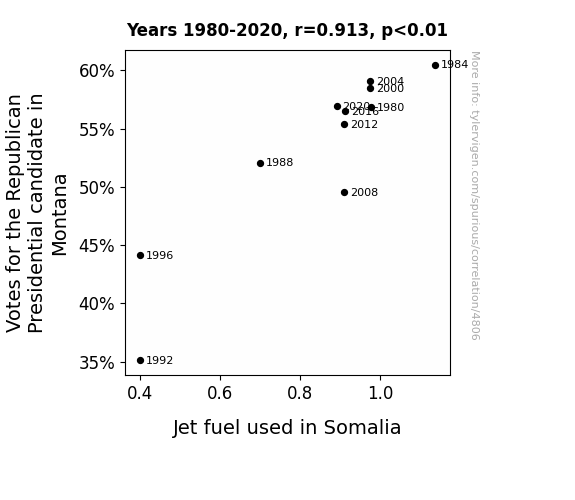
What else correlates?
Votes for the Republican Presidential candidate in Montana · all elections
Jet fuel used in Somalia · all energy
Votes for the Republican Presidential candidate in Montana · all elections
Jet fuel used in Somalia · all energy


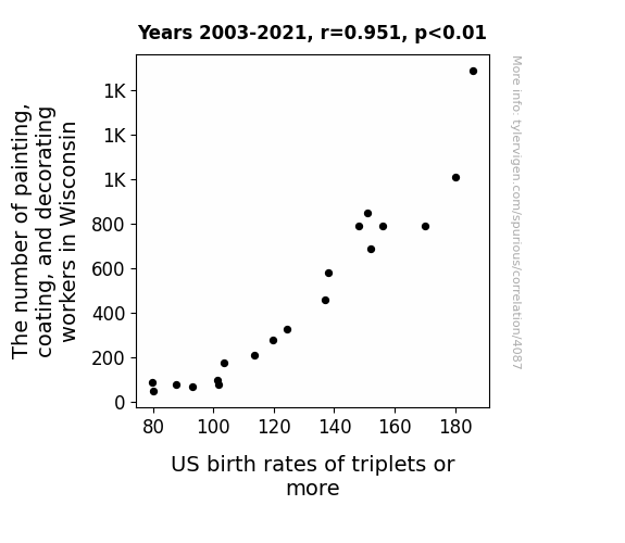
View details about correlation #4,087
Stroke of Luck: The Painters' Paradox - A Correlation between Painting, Coating, and Decorating Workers in Wisconsin and US Birth Rates of Triplets or More
The decrease in painting, coating, and decorating workers in Wisconsin has led to fewer instances of 'triple-coating' in households. This has subsequently resulted in a smoother and less fertile environment, reducing the likelihood of multiple births. So, in a way, you could say that the lack of painters in Wisconsin is thinning out the population growth in more ways than one.


View details about correlation #5,065
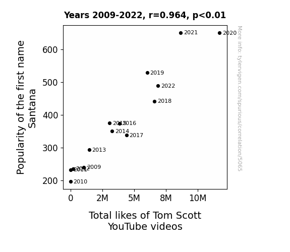
The Name Game: A Correlational Study of Santana, Smooth, and Scott
Because every time someone named Santana liked a video, it strummed a chord in the hearts of viewers, leading to a smooth, infectious wave of appreciation for Tom Scott's content. This led to a harmonic convergence of support, as if the universe was saying "Smooth move, Tom, you've got the name game on lock." It's almost as if the act of hitting 'like' was imbued with a hint of supernatural, guitar-wielding charm. Tom Scott's videos were no longer just informative, they were irresistibly catchy, leaving everyone thinking, "Oye como va, I can't get enough of this content!"

What else correlates?
Popularity of the first name Santana · all first names
Total likes of Tom Scott's YouTube videos · all YouTube
Popularity of the first name Santana · all first names
Total likes of Tom Scott's YouTube videos · all YouTube


View details about correlation #5,728
A Breath of Fresh Air: The Perplexing Link Between Air Quality in Pittsfield, Massachusetts and Google Searches for 'smol'
As the air quality improved, it led to an unexpected proliferation of smol particles in the atmosphere. These tiny, adorable specks of matter quickly captivated the residents of Pittsfield, prompting them to embark on a smol search frenzy. It seems that when the air got cleaner, it also got cuter, much to the delight of the locals.


What else correlates?
Air quality in Pittsfield, Massachusetts · all weather
Google searches for 'smol' · all google searches
Air quality in Pittsfield, Massachusetts · all weather
Google searches for 'smol' · all google searches


View details about correlation #4,478
Burning Up the Ballot Box: The Flammable Relationship Between Democratic Votes in Ohio and Kerosene Consumption in Ethiopia
The rise in Votes for the Democrat Presidential candidate in Ohio has led to an increase in political fervor. This surge of passion has somehow sparked a series of international chain reactions, ultimately causing a spike in Kerosene used in Ethiopia. It's as if the political heat traveled through the earth's core and ignited a kerosene craze halfway across the globe. Who would've thought that a political campaign in Ohio could fuel the flames of kerosene consumption in Ethiopia? It's a real political power play with some unexpected global combustion!


What else correlates?
Votes for the Democratic Presidential candidate in Ohio · all elections
Kerosene used in Ethiopia · all energy
Votes for the Democratic Presidential candidate in Ohio · all elections
Kerosene used in Ethiopia · all energy
Why this works
- Data dredging: I have 25,237 variables in my database. I compare all these variables against each other to find ones that randomly match up. That's 636,906,169 correlation calculations! This is called “data dredging.”
Fun fact: the chart used on the wikipedia page to demonstrate data dredging is also from me. I've been being naughty with data since 2014.
Instead of starting with a hypothesis and testing it, I instead tossed a bunch of data in a blender to see what correlations would shake out. It’s a dangerous way to go about analysis, because any sufficiently large dataset will yield strong correlations completely at random. - Lack of causal connection: There is probably no direct connection between these variables, despite what the AI says above.
Because these pages are automatically generated, it's possible that the two variables you are viewing are in fact causually related. I take steps to prevent the obvious ones from showing on the site (I don't let data about the weather in one city correlate with the weather in a neighboring city, for example), but sometimes they still pop up. If they are related, cool! You found a loophole.
This is exacerbated by the fact that I used "Years" as the base variable. Lots of things happen in a year that are not related to each other! Most studies would use something like "one person" in stead of "one year" to be the "thing" studied. - Observations not independent: For many variables, sequential years are not independent of each other. You will often see trend-lines form. If a population of people is continuously doing something every day, there is no reason to think they would suddenly change how they are doing that thing on January 1. A naive p-value calculation does not take this into account.
You will calculate a lower chance of "randomly" achieving the result than represents reality.
To be more specific: p-value tests are probability values, where you are calculating the probability of achieving a result at least as extreme as you found completely by chance. When calculating a p-value, you need to assert how many "degrees of freedom" your variable has. I count each year (minus one) as a "degree of freedom," but this is misleading for continuous variables.
This kind of thing can creep up on you pretty easily when using p-values, which is why it's best to take it as "one of many" inputs that help you assess the results of your analysis.
- Y-axes doesn't start at zero: I truncated the Y-axes of the graphs above. I also used a line graph, which makes the visual connection stand out more than it deserves.
Nothing against line graphs. They are great at telling a story when you have linear data! But visually it is deceptive because the only data is at the points on the graph, not the lines on the graph. In between each point, the data could have been doing anything. Like going for a random walk by itself!
Mathematically what I showed is true, but it is intentionally misleading. If you click on any of the charts that abuse this, you can scroll down to see a version that starts at zero. - Confounding variable: Confounding variables (like global pandemics) will cause two variables to look connected when in fact a "sneaky third" variable is influencing both of them behind the scenes.
- Outliers: Some datasets here have outliers which drag up the correlation.
In concept, "outlier" just means "way different than the rest of your dataset." When calculating a correlation like this, they are particularly impactful because a single outlier can substantially increase your correlation.
Because this page is automatically generated, I don't know whether any of the charts displayed on it have outliers. I'm just a footnote. ¯\_(ツ)_/¯
I intentionally mishandeled outliers, which makes the correlation look extra strong. - Low n: There are not many data points included in some of these charts.
You can do analyses with low ns! But you shouldn't data dredge with a low n.
Even if the p-value is high, we should be suspicious of using so few datapoints in a correlation.
Pro-tip: click on any correlation to see:
- Detailed data sources
- Prompts for the AI-generated content
- Explanations of each of the calculations (correlation, p-value)
- Python code to calculate it yourself


