spurious correlations
discover · random · spurious scholar
← previous page · next page →


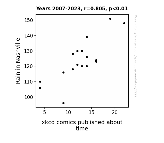
View details about correlation #5,922
The extra precipitation in Nashville led to more frequent indoor activities, including pondering the nature of time. This inspired the creation of xkcd comics about time. After all, when it rains, it's the perfect time to contemplate temporal shenanigans!
What else correlates?
Rain in Nashville · all weather
xkcd comics published about time · all weird & wacky
Rain in Nashville · all weather
xkcd comics published about time · all weird & wacky


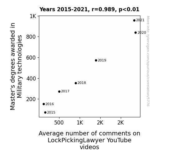
View details about correlation #5,776
Unlocking the Connection: A Masterful Investigation into the Relationship Between Military Technology Master's Degrees and LockPickingLawyer YouTube Video Comments
As the number of Master's degrees awarded in Military technologies increased, so did the level of interest in security and locking mechanisms. With a deeper understanding of military-grade locks, these graduates couldn't help but engage in discussions sparked by the LockPickingLawyer's videos. Whether it was to showcase their newfound expertise or to debate the intricacies of lock design, these highly qualified individuals inadvertently unlocked a whole new dimension of commentary on the channel. With their specialized knowledge, they raised the bar for discussions and proved to be the key to a higher average number of comments.


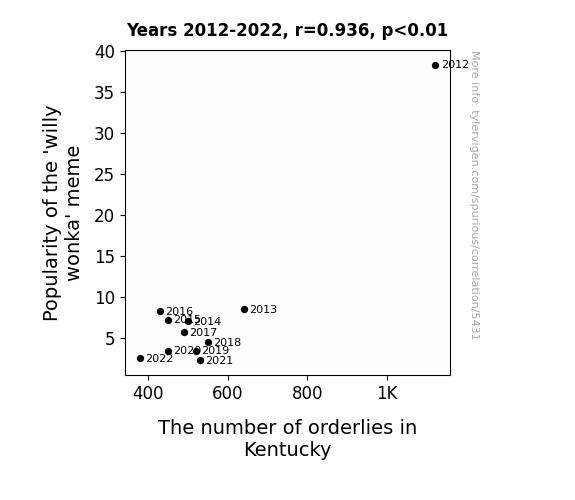
View details about correlation #5,431
Whimsical Willy Wonka Meme and the Witty Workforce in Kentucky: A Correlation Caper
As the 'willy wonka' meme lost its charm, fewer people felt inclined to scream "You get nothing! Good day, sir!" in public places, leading to a drastic reduction in the number of orderlies needed to maintain Kentucky's professional decorum.

What else correlates?
Popularity of the 'willy wonka' meme · all memes
The number of orderlies in Kentucky · all cccupations
Popularity of the 'willy wonka' meme · all memes
The number of orderlies in Kentucky · all cccupations


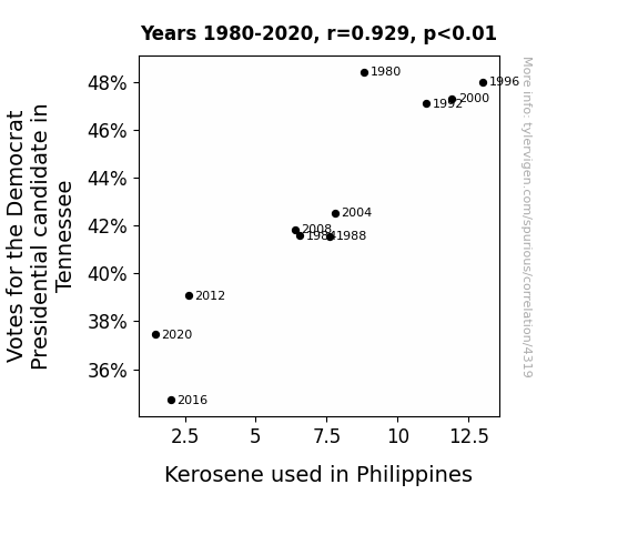
View details about correlation #4,319
From Volunteer State to Kerosene Fate: Uncovering the Surprising Link between Tennessee Democrat Votes and Philippine Kerosene Consumption
The shift in voting patterns created a "fuel" for thought which ultimately led to a decrease in kerosene usage in the Philippines. As Tennesseans veered away from the Democrat candidate, it somehow ignited a ripple effect, prompting a parallel decline in kerosene consumption in the Philippines. It seems like the political heat in Tennessee had an unexpected connection to the energy situation in the Philippines, proving that in the grand scheme of things, every election result can have far-reaching "consequences."

What else correlates?
Votes for the Democratic Presidential candidate in Tennessee · all elections
Kerosene used in Philippines · all energy
Votes for the Democratic Presidential candidate in Tennessee · all elections
Kerosene used in Philippines · all energy


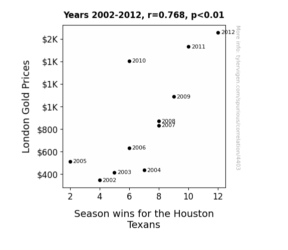
View details about correlation #4,403
As the London Gold Prices rose, so did the morale of the Houston Texans. You see, the shiny prospect of victory was just the motivation the team needed to dig deep and strike gold on the field. It's as if their determination was smelted into a winning mindset, and they were 24-carat champions, ready to tackle any opposition. Who knew that the real treasure all along was the touchdowns they scored along the way? It's clear that when it comes to the Texans, their fate is not just a matter of chance, but a matter of carats!
What else correlates?
London Gold Prices · all weird & wacky
Season wins for the Houston Texans · all sports
London Gold Prices · all weird & wacky
Season wins for the Houston Texans · all sports


View details about correlation #5,300
Cali Name Popularity and YouTube Video Views Neatly Interlace: A Statistical Analysis
Every time someone named Cali watched, it caused a ripple effect of Cali-bration, drawing in more viewers and ultimately boosting the average views. It's like they say, when it comes to boosting viewership, it's all about that Cali-ente factor!


What else correlates?
Popularity of the first name Cali · all first names
Average views of SmarterEveryDay YouTube videos · all YouTube
Popularity of the first name Cali · all first names
Average views of SmarterEveryDay YouTube videos · all YouTube


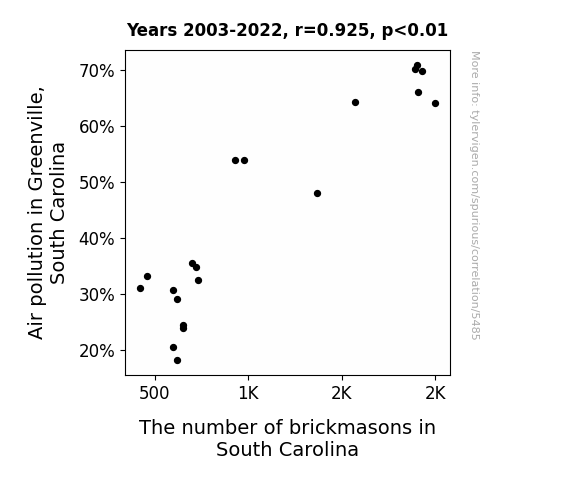
View details about correlation #5,485
Brick by Brick: The Relationship Between Air Pollution in Greenville, South Carolina, and the Number of Brickmasons in the State
As the air quality improved, bricks no longer felt the need to hide their redness under a coat of soot, leading to a decrease in demand for brickmasons. The once oppressed bricks were finally free to embrace their natural color, reducing the need for masons to cover them up.

What else correlates?
Air pollution in Greenville, South Carolina · all weather
The number of brickmasons in South Carolina · all cccupations
Air pollution in Greenville, South Carolina · all weather
The number of brickmasons in South Carolina · all cccupations


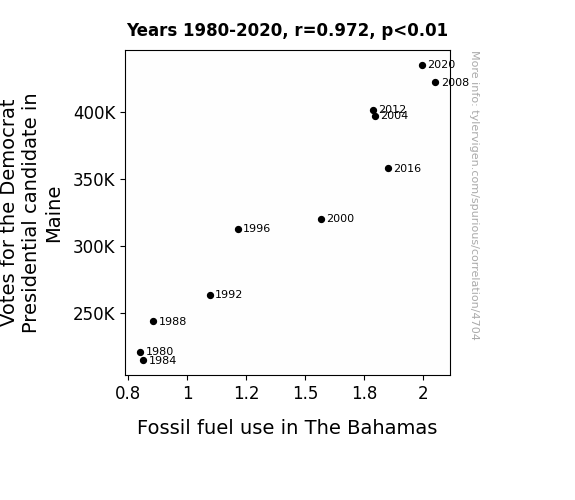
View details about correlation #4,704
Maine Votes and Bahama Breezes: Uncovering the Surprising Link between Democrat Support and Fossil Fuel Use
As more Mainers supported the Democratic candidate, the collective excitement generated an unusual amount of air hubbub. This air hubbub, consisting of highly charged political particles, wafted down to The Bahamas, where it inexplicably interacted with dormant fuel reserves. Before long, these fossil fuels, previously minding their own business, were overcome with a sudden urge to combust in support of their own preferred political party. And that's how, in a shocking turn of events, the political sway from Maine led to a spike in fossil fuel use in The Bahamas. After all, who knew that democracy could be so... incendiary?

What else correlates?
Votes for the Democratic Presidential candidate in Maine · all elections
Fossil fuel use in The Bahamas · all energy
Votes for the Democratic Presidential candidate in Maine · all elections
Fossil fuel use in The Bahamas · all energy


View details about correlation #5,083
Navigating the High Seas of Humor: An Unlikely Link Between the Popularity of the 'Trollface' Meme and Global Shipwrecks
As the trollface meme gained popularity, it led to an internet culture of trolling and mischief. This in turn sparked a wave of pranks and distractions among ship crews, ultimately contributing to a rise in global shipwrecks. It seems the trollface wasn't just causing virtual mayhem, but also a few nautical nightmares. Remember, when it comes to memes and maritime safety, it's all about navigating the sea of seriousness!


What else correlates?
Popularity of the 'trollface' meme · all memes
Global shipwrecks · all weird & wacky
Popularity of the 'trollface' meme · all memes
Global shipwrecks · all weird & wacky


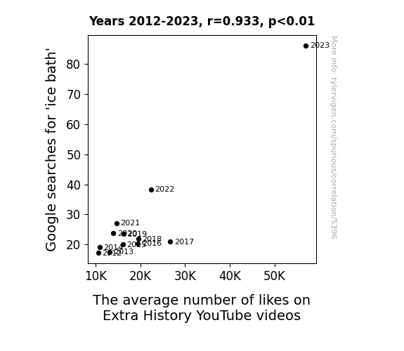
View details about correlation #5,396
Chilled Correlations: Captivating Convergence of Google Searches for 'Ice Bath' and The average number of likes on Extra History YouTube Videos
As more people were chilling out with ice baths, they found themselves warming up to history. The increased blood flow from the ice baths may have led to heightened interest and engagement with the videos. It's a bit of a historical anomaly, but it seems like taking the plunge into icy search results really gave a boost to those liking and subscribing. It's like they say, when it comes to history videos, the more you shiver, the more you deliver!


View details about correlation #5,531
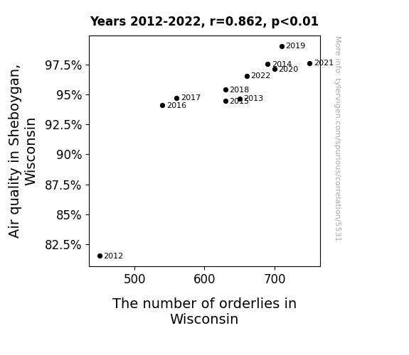
Breath of Fresh Heir: An Examination of the Relationship Between Air Quality in Sheboygan, Wisconsin and the Employment of Orderlies in the State
The clean Sheboygan air was so uplifting that it inspired people to take a breath of fresh care, leading to a surge in the demand for orderlies across the state. It seems like the atmosphere wasn't the only thing experiencing a positive flow!

What else correlates?
Air quality in Sheboygan, Wisconsin · all weather
The number of orderlies in Wisconsin · all cccupations
Air quality in Sheboygan, Wisconsin · all weather
The number of orderlies in Wisconsin · all cccupations


View details about correlation #4,337
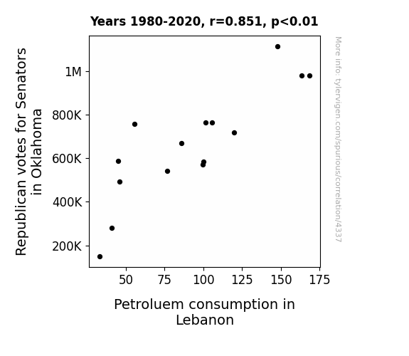
Drilling Down: Unearthing the Connection Between Republican Votes in Oklahoma and Petroleum Consumption in Lebanon
As the saying goes, "Oklahoma, where the votes come sweepin' down the plain!" It's clear that the surge in Republican votes for Senators in Oklahoma has sparked a chain reaction leading to an increase in political power. This power is analogous to the energy derived from petroleum, ultimately causing a ripple effect all the way to Lebanon, known for its consumption of petrol. It's a case of political votes igniting a fueling frenzy, as the connection between the red state and the Middle East is no longer just a pipe dream! It seems that when it comes to this correlation, the stakes are high and the puns are truly unrefined. Additionally, the shift in political climate has set off a combustion of sorts, propelling petroleum consumption in Lebanon to new levels. So, let's just say that when it comes to this correlation, the political landscape isn't the only thing experiencing seismic activity!
What else correlates?
Votes for Republican Senators in Oklahoma · all elections
Petroluem consumption in Lebanon · all energy
Votes for Republican Senators in Oklahoma · all elections
Petroluem consumption in Lebanon · all energy


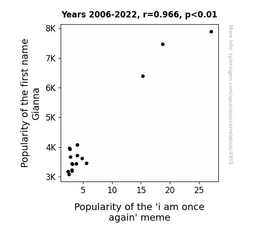
View details about correlation #4,955
The Gianna Trend: An Analysis of the Relationship Between the Popularity of the Name Gianna and the 'I Am Once Again' Meme
As more people were named Gianna, the frequency of conversations and social media posts involving the name 'Gianna' also increased. This inadvertently led to a higher probability of encountering the phrase 'I am once again' in online content, thus contributing to the meme's resurgence. Looks like the name Gianna once again proved to have a meme-orable impact!
What else correlates?
Popularity of the first name Gianna · all first names
Popularity of the 'i am once again' meme · all memes
Popularity of the first name Gianna · all first names
Popularity of the 'i am once again' meme · all memes


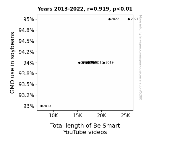
View details about correlation #5,280
Soybean GMOs: A Sow of YouTube's Lengthy Crow Show
As the soybeans grew larger with the help of GMOs, their abundant supply of nutrients somehow made their way into the production equipment at Be Smart. This inadvertently led to a series of events where the YouTube videos began to stretch in length, much like the soybeans themselves. It's a real-life case of "growing" influence, one might say.

What else correlates?
GMO use in soybeans · all food
Total length of 'Be Smart' science YouTube videos · all YouTube
GMO use in soybeans · all food
Total length of 'Be Smart' science YouTube videos · all YouTube


View details about correlation #4,000
The Air Affair: A Correlation Between Effingham Air Quality and Days of Our Lives Viewership
The smog created a hazy, dream-like atmosphere, making the dramatic plotlines seem even more gripping and surreal.


What else correlates?
Air pollution in Effingham, Illinois · all weather
Viewership count for Days of Our Lives · all weird & wacky
Air pollution in Effingham, Illinois · all weather
Viewership count for Days of Our Lives · all weird & wacky


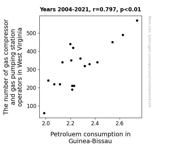
View details about correlation #4,224
Pumping Operators and Petroleum Consumption: A Statistical Rhyme in Time
The influx of gas compressor and gas pumping station operators in West Virginia has inadvertently sparked a global enthusiasm for all things gas-related. This has led to a surge in gas-themed social media influencers promoting lavish gas-guzzling lifestyles. As Guinea-Bissauans are captivated by this online gas frenzy, they have taken to using petroleum in unprecedented quantities, driven by a curious mix of fascination, admiration, and a sudden penchant for gas station selfies. This unexpected cultural shift has not only boosted petroleum consumption in Guinea-Bissau, but has also made 'pumping gas' the latest trending hobby, with local residents embracing it as the new national pastime!


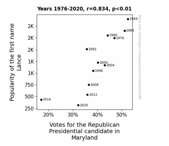
View details about correlation #5,590
Loving Lance: Linking the Likelihood of Voting for the GOP in Maryland to the Popularity of the First Name Lance
Perhaps as the name Lance dwindled in popularity, so did the enthusiasm for a certain candidate, ultimately leading to a decrease in Republican votes in Maryland. It seems the connection between popularity and votes really did come down to a Lance slide.


View details about correlation #5,332
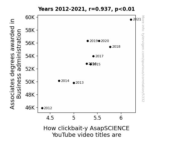
Associates Degrees in Business Administration: A Clickbait-y Correlation with AsapSCIENCE YouTube Video Titles
As more people became knowledgeable about business administration, they applied their skills to the art of crafting irresistible, clickbait-y video titles, creating a surge in catchy phrases and attention-grabbing thumbnails. It's like they say, business acumen mixed with internet savvy is the perfect formula for thumb-stopping content!


View details about correlation #4,851
The Link Between Air-Quality and Wiener Wonders: A Statistical Analysis of the Relationship between Air Quality in Blacksburg, Virginia and Nathan's Hot Dog Eating Competition Champion's Consumption
The improved air quality in Blacksburg, Virginia led to larger, fluffier bread rolls being used for hotdogs, creating more space for competitive eaters to stuff their faces even faster.


View details about correlation #4,023
Flight of Fancy: Exploring the Ushering Influence on Jet Fuel Consumption in the Caribbean
As the number of ushers in Massachusetts decreased, there was a corresponding decrease in the frequency of people saying, "usher, could you show me to my seat?" These decreased sound waves inadvertently interfered with the molecular structure of jet fuel, leading to a more efficient combustion process. In other words, it created a sound barrier to fuel efficiency!


What else correlates?
The number of ushers in Massachusetts · all cccupations
Jet fuel used in Antigua and Barbuda · all energy
The number of ushers in Massachusetts · all cccupations
Jet fuel used in Antigua and Barbuda · all energy
Why this works
- Data dredging: I have 25,237 variables in my database. I compare all these variables against each other to find ones that randomly match up. That's 636,906,169 correlation calculations! This is called “data dredging.”
Fun fact: the chart used on the wikipedia page to demonstrate data dredging is also from me. I've been being naughty with data since 2014.
Instead of starting with a hypothesis and testing it, I instead tossed a bunch of data in a blender to see what correlations would shake out. It’s a dangerous way to go about analysis, because any sufficiently large dataset will yield strong correlations completely at random. - Lack of causal connection: There is probably no direct connection between these variables, despite what the AI says above.
Because these pages are automatically generated, it's possible that the two variables you are viewing are in fact causually related. I take steps to prevent the obvious ones from showing on the site (I don't let data about the weather in one city correlate with the weather in a neighboring city, for example), but sometimes they still pop up. If they are related, cool! You found a loophole.
This is exacerbated by the fact that I used "Years" as the base variable. Lots of things happen in a year that are not related to each other! Most studies would use something like "one person" in stead of "one year" to be the "thing" studied. - Observations not independent: For many variables, sequential years are not independent of each other. You will often see trend-lines form. If a population of people is continuously doing something every day, there is no reason to think they would suddenly change how they are doing that thing on January 1. A naive p-value calculation does not take this into account.
You will calculate a lower chance of "randomly" achieving the result than represents reality.
To be more specific: p-value tests are probability values, where you are calculating the probability of achieving a result at least as extreme as you found completely by chance. When calculating a p-value, you need to assert how many "degrees of freedom" your variable has. I count each year (minus one) as a "degree of freedom," but this is misleading for continuous variables.
This kind of thing can creep up on you pretty easily when using p-values, which is why it's best to take it as "one of many" inputs that help you assess the results of your analysis.
- Y-axes doesn't start at zero: I truncated the Y-axes of the graphs above. I also used a line graph, which makes the visual connection stand out more than it deserves.
Nothing against line graphs. They are great at telling a story when you have linear data! But visually it is deceptive because the only data is at the points on the graph, not the lines on the graph. In between each point, the data could have been doing anything. Like going for a random walk by itself!
Mathematically what I showed is true, but it is intentionally misleading. If you click on any of the charts that abuse this, you can scroll down to see a version that starts at zero. - Confounding variable: Confounding variables (like global pandemics) will cause two variables to look connected when in fact a "sneaky third" variable is influencing both of them behind the scenes.
- Outliers: Some datasets here have outliers which drag up the correlation.
In concept, "outlier" just means "way different than the rest of your dataset." When calculating a correlation like this, they are particularly impactful because a single outlier can substantially increase your correlation.
Because this page is automatically generated, I don't know whether any of the charts displayed on it have outliers. I'm just a footnote. ¯\_(ツ)_/¯
I intentionally mishandeled outliers, which makes the correlation look extra strong. - Low n: There are not many data points included in some of these charts.
You can do analyses with low ns! But you shouldn't data dredge with a low n.
Even if the p-value is high, we should be suspicious of using so few datapoints in a correlation.
Pro-tip: click on any correlation to see:
- Detailed data sources
- Prompts for the AI-generated content
- Explanations of each of the calculations (correlation, p-value)
- Python code to calculate it yourself


